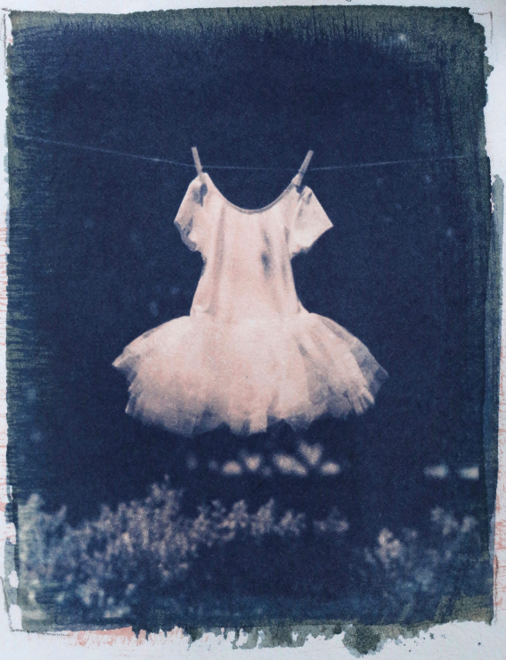
Figure 4.1. Tutu, gum wash over classic cyanotype, printed with a 4″ × 5″ film negative © Kim Sinclair 2018. Kim Sinclair is a fine art photographer who has been working with 19th century photographic processes for over twenty years. Born and raised in Toronto, Canada, Sinclair graduated with a diploma in Photomedia in 1996 from the Ontario College of Art & Design. At a time when digital photography was beginning its great revolution, Sinclair continued to work in traditional silver gelatin print methods and historic photographic processes, primarily cyanotype and Vandyke and now carbon, photogravure, and gum bichromate. Sinclair worked and exhibited for nearly ten years in Toronto before moving to Canberra, Australia in 2001, where she continues to work and teach classes in traditional darkroom and alternative photographic practices. Influence from an early drawing and painting background is evident in the loosely brushed, paint-like application Sinclair often utilizes. Multiple imagery, layering techniques and sequencing methods are also arrangements characteristically recognized throughout much of her work.
Digital Negatives for Cyanotype
Figure 4.2. Iceland, swc cyanotype curved with the swc curve on Hahnemühle Platinum Rag © Christina Z. Anderson 2018
Cyanotype is often labeled a “short scale” process, one that doesn’t have an extended, smooth tonal scale from deepest shadows to highest highlights, but blocked up shadows and blown out highlights. This is only the case when the process is improperly practiced with an incorrectly prepared negative and most likely printed on an unsuitable paper. This chapter is all about how to create a proper digital negative.
Since cyanotype is a contact printing process with the negative exposed in direct contact with the sensitive emulsion, the final image is the same size as the negative. Before digital photography, negatives were always from a large format camera. Today, most often the negative originates in an ink jet printer. This chapter will walk you through a step-by-step method of making ink jet negatives, starting with finding the correct exposure time to give the darkest blue without overexposure. This can be done two ways, one low tech and one high tech. Once that exposure time is determined—and it varies with each paper—then that exposure time is matched with a contrast adjustment curve which helps all tones in the image to be printed correctly, without blocking up on either the shadow or the highlight end. One final adjustment that is helpful with classic cyanotype is to the negative’s ink density if desired (see p. 52).
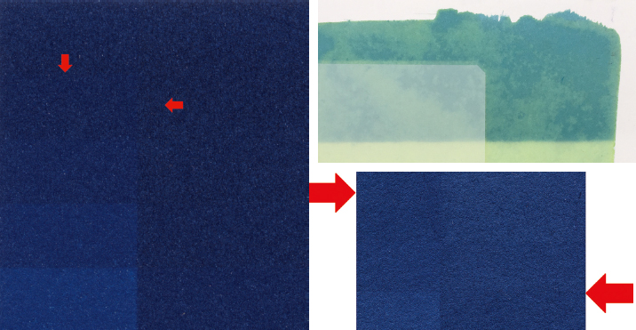
Figures 4.3–4.5. In the left image, the left half of the paper was covered with Pictorico and the right not (see unexposed image, top right). Note where two steps on the OHP side merge to the same maximum blue, and the side covered with OHP and the side not covered with OHP also merge to maximum blue, indicating the correct exposure time. The image on the right illustrates overexposure; cyanotype will lighten or “solarize” when overexposed. The step just below solarization is the correct exposure time—maximum blue without solarization.
Digital inks have a density range from black to white (full ink to no ink) greater than most alt processes can handle. Thus the curve is usually a contrast-lowering curve. With a correct exposure time and a correctly curved negative, perfect cyanotype prints will result. The good news: if one’s practice remains consistent, these digital steps only have to be done once for a particular paper.
Transparency film (OHP or overhead projection film) is made by Pictorico, Arista, Fixxons, Inkpress, and others. My new favorite is Fixxons (fixxons.com) at a quarter the price of Pictorico. It tends not to curl. When OHP film curls ever so slightly, it will jam in the printer. My next favorite is Pictorico because it has an excellent ink-receiving layer on one side and also remains flat. Pictorico comes in Premium and Ultra which has a thicker ink-receiving layer. Use Premium.
Determining exposure the low tech way
The aim is to determine the minimum uv exposure needed to obtain maximum blue when printing through the OHP negative.
1. Coat paper with cyanotype solution and dry.
2. Place a sheet of OHP over half of the paper.
3. Place a sheet of opaque material so it covers both halves and leaves a strip exposed at the top.
4. Make a 5-minute exposure (1-minute for new cyanotype).
5. Move the opaque material down to uncover another strip and make another 5-minute exposure (1-minute for new cyanotype).
6. Continue this process for 45–60 minutes (15 minutes for new cyanotype), until there is a series of 5-minute (1-minute) exposures.
7. Develop the test sheet and dry it. Note the step where there is no difference between the OHP and non-OHP side. This is the minimum exposure that is capable of giving maximum blue. Tip: for classic cyanotype, it can be between 5 and 45 minutes under UVBL exposure but with 100+ papers I found it most often 19–30 minutes. For new cyanotype it can be between 2 and 15 minutes under UVBL exposure but with 100+ papers I found it most often 5–8 minutes.
8. Once this standard printing time (SPT) is determined for that paper, it does not change.
Determining exposure the high tech way
The most accurate method to determine exposure is with a Stouffer film step wedge. The step wedge is used to find the amount of time it takes to get cyanotype as dark as it needs to be and no darker (overexposure; note cyanotype will get lighter/ solarize at a certain point of overexposure). The Stouffer step wedge is calibrated in either ½ stop (21-step) or ⅓ stop (31-step) increments. The 31-step wedge is easier to fine-tune your time.
Each increment of the 31-step wedge corresponds to ⅓ stop and a mathematical number of 0.794 (.8 for ease) which is used to add time (by dividing the exposure time) or subtract time (by multiplying the exposure time) depending on how many maximum blue steps are showing on the print. This is found by first overexposing the step wedge to make sure two or more steps on the Stouffer’s merge together with no differentiation. Once that is done the rest can be calculated mathematically. No standing there moving an opaque piece of material every 5 minutes while a test print is being made! The math is very easy. If math is not your thing, note the number of the first darkest step and consult Tables 4.1 (classic cyanotype) or 4.2 (new cyanotype).
1. For classic cyanotype use an initial overexposure time of 45 minutes which should be overkill enough to merge at least two steps. For new cyanotype use 15 minutes.
2. Note the step that is the first darkest step, e.g. most likely steps 2–8.
3. Find that step in Table 4.1 (classic cyanotype) or 4.2 (new cyanotype) and note your final exposure time. Once this exposure time is found it never changes for that paper.
The math: for every step moved back towards Step 1, multiply by .794. Example: if Steps 1–4 are all maximum black, Step 4 needs to move 3 steps back to Step 1. The initial 45-minute exposure time is multiplied 3x consecutively by .794. Then the film density is subtracted since you won’t be printing through film (multiply by .89) and then add ½ stop to account for Pictorico OHP density by dividing the final amount by ½ stop or .707. Tip: if you forget these numbers, use easy to remember numbers .7, .8, and .9.
45-minute exposure CC (Baseline Printing Time BPT) |
Final exposure (rounded up) (Standard Printing Time SPT) |
If Step 1 is max black: |
57 minutes |
If Step 2 is max black: |
45 minutes |
If Step 3 is max black: |
36 minutes |
If Step 4 is max black: |
29 minutes |
If Step 5 is max black: |
23 minutes |
If Step 6 is max black: |
18 minutes |
If Step 7 is max black: |
15 minutes |
If Step 8 is max black: |
12 minutes |
If Step 9 is max black: |
9 minutes |
If Step 10 is max black: |
7 minutes |
15-minute exposure NC (Baseline Printing Time BPT) |
Final exposure (rounded up) (Standard Printing Time SPT) |
If Step 1 is max black: |
19 minutes |
If Step 2 is max black: |
15 minutes |
If Step 3 is max black: |
12 minutes |
If Step 4 is max black: |
10 minutes |
If Step 5 is max black: |
8 minutes |
If Step 6 is max black: |
6 minutes |
If Step 7 is max black: |
5 minutes |
If Step 8 is max black: |
4 minutes |
If Step 9 is max black: |
3 minutes |
If Step 10 is max black: |
2 minutes |
Tables 4.1 and 4.2. Use the top table 4.1 for classic cyanotype and the bottom table 4.2 for new cyanotype.
These cyanotype curves are based on Epson printers that use Ultrachrome inks. The current models you may own are the 3880, the P600 or the P800. There are other printers on the market that may be excellent printers for other purposes, but for digital negatives Epson printers have the market cornered: the ink is dense enough, and the printer driver has the ability to lay down more or less ink when necessary, and with classic cyanotype (not new cyanotype!) it is often helpful to cut back on the ink density a bit even up to as much as -30% on a P800.
Table 4.3 shows the input/output curve points to build generic curves that will get you in the ballpark to making a great print. The curve creation process for all negatives is the same: you plug in a set of coordinates in the Photoshop curve dialog box. The difference is in the actual coordinate numbers.
There are five curve choices below. Two are for classic cyanotype (cc)—a generic curve for all papers and a slightly different one for washi like Hahnemühle Sumi-e and Japanese Mulberry. One is for new cyanotype (NC). One is for combining the two formulas (swc). And one is for palladium. Surprisingly, the NC curve is very close to the palladium curve as to be almost interchangeable (which means a negative made for new cyanotype can be used for palladium, too).
CC |
CC Washi |
NC |
SWC |
Palladium |
0/0 |
0/0 |
0/0 |
0/0 |
0/0 |
13/24 |
13/8 |
13/11 |
13/23 |
13/6 |
25/30 |
25/15 |
26/15 |
26/30 |
25/11 |
38/34 |
38/20 |
38/19 |
39/36 |
38/14 |
51/37 |
51/25 |
51/22 |
51/41 |
51/19 |
69/41 |
64/29 |
69/27 |
64/45 |
64/22 |
89/46 |
89/36 |
89/32 |
89/55 |
89/29 |
115/54 |
115/45 |
115/41 |
115/66 |
115/36 |
140/66 |
140/54 |
140/49 |
140/79 |
140/46 |
166/82 |
166/68 |
166/58 |
166/96 |
166/57 |
191/103 |
191/88 |
191/71 |
191/119 |
191/73 |
204/117 |
204/106 |
204/81 |
204/132 |
204/84 |
217/139 |
217/126 |
215/99 |
217/147 |
217/96 |
229/164 |
229/148 |
229/134 |
229/166 |
228/111 |
238/188 |
239/175 |
237/161 |
239/187 |
238/135 |
255/255 |
255/255 |
255/255 |
255/255 |
255/255 |
Table 4.3. Sets of coordinates for generic curves for classic cyanotype (CC), new cyanotype (NC), combination classic and new cyanotype (SWC), and palladium.
1. Open an image in Photoshop.
2. Add a curve layer (Layer>New Adjustment Layer>Curves) (Figure 4.6).

3. Go to the dropdown menu in the Curves Panel located at the very top right corner and select Curves Display Options to make sure the Curves Panel is set to Light and 0–255
(Figure 4.7).
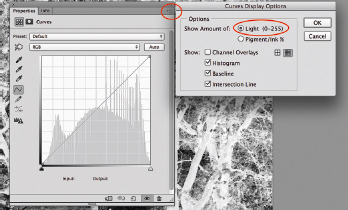
Figure 4.7.
4. Click on the diagonal line just above the bottom left to create a point on the curve. The Input/Output numbers will appear in the Curves panel at the bottom (Figure 4.8).
5. Enter the Input/Output numbers, starting with the 13/xx pair.
6. Continue to click a new point and add the next set of numbers. Don’t enter 0/0 or 255/255 because the diagonal line already has those points anchored at the bottom and top. That means there are only 14 sets of numbers to enter.

Figure 4.8.
7. The curve will look a bit funky until all the numbers are entered. When all are entered, it should be smooth. Select one of the points and use the +/- keys to toggle up and down the curve from point to point to check all input/output values.
8. In the dropdown menu in the Curves Panel click Save Curves Preset and name it with a name you will remember like CyanotypeHPR19mn-20ink.acv (Figure 4.9). Your curve work is done!

Figure 4.9.

Figures 4.10 and 4.11. Note in the top screen shot that Arches Platine and Hahnemühle Platinum Rag respond almost the same to the cyanotype solution (NC). The Bergger Cot 320 curve is slightly different but still very close. The bottom screenshot is a visual of the five curves included in this chapter. Note that the palladium curve and the NC curve are almost interchangeable. It is important to remember that although generic curves come close, they are not the best practice in making alternative process prints. It is always best to calibrate each paper and process with more “high tech” curve systems like Precision Digital Negatives (PDN). Even though curves look so similar in shape, small changes in points translate to larger changes in the print.
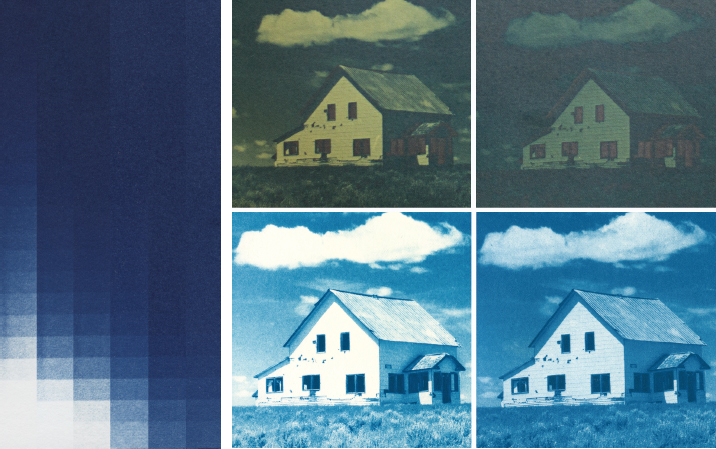
Figures 4.12 and 4.13. Left is a cut and paste of digital step wedge prints put side by side, made from 0% to -50% ink densities from left to right. Note how the highlights and shadows respond. The strip on the far left has blown out highlights. It’s not until the -10% and -20% where the highlights are well printed (only one bottom square should be paper white). The far right strip has no paper white and thus is too thin. In the strip on the left the shadows are not maximum blue until the -10% and -20% strips. Then from -30% to -50% the shadows are overexposed and have begun to lighten/solarize. -15% would be the best choice for this paper. The house images on the right are printed exactly the same, but the left pair is a CC print with a 0% negative before and after development, the right pair a CC print with a -15% negative before and after development. I rarely use a 0% negative with classic cyanotype, unless the image is one with a limited tonal range. I always use a +/- 0% with new cyanotype. Note: this particular image is my test image because of the extreme tonal range from white to black. If the puffy white clouds and the minute black slats on the side of the house facing the sun both have detail, the negative density is correctly chosen.
Epson printers have a feature in the printer driver, usually found under Advanced Media Control, where you can vary the amount of ink sprayed onto the paper from +50% to -50%. I hadn’t given this feature much thought, or used it, until I bought my first 3880 printer. For the first time I had to use more ink to get a dense enough negative for alt. This need was greater when printing salted paper which needs a very dense negative, probably denser than all alt processes.
Cyanotype is on the opposite side of the spectrum from salt. One day I grossly overexposed a cyanotype print, but I noticed that the highest highlights—in this particular image it was in the puffy white clouds—were still paper white with little detail. I printed a series of step wedges: 0%, -10%, -20% -30%, -40%, and -50%, and was surprised to find that highlight detail improved, exposure time lessened, and the overall print looked remarkably better somewhere between 0% to -20% on an Epson 3880 and up to -30% on an Epson P800 which seems to print a denser black. Past -30% the negative was too thin and didn’t hold back enough light to keep the highlights bright. I now often use a -10% to -20% negative for classic cyanotype but no ink density change for new cyanotype. I encourage you to test different negative densities, too.

Figure 4.14.
1. Open a digital image and convert it to 16 bit RGB (Image>Mode>16 bit) and Adobe 1998 (Edit>Convert to Profile>Adobe 1998).
2. Size it to 360 ppi no more than 8″ × 10″ to fit on 8.5″ × 11″ OHP film with enough borders, and “save as” (File>Save As>imagename_negative.psd) so as not to write over the original.
3. Do any kind of image adjustments needed and for the final step do one or two sharpening steps if desired: a) Filter>Sharpen>Unsharp Mask Amount 50–150%, Radius 0.5, Threshold 0 and/or b) Layer>Duplicate Layer then with that layer selected, Filter>Other>High Pass Radius 10. Set that layer at blend mode of Soft Light on the layer’s panel dropdown menu. View the image at 50%, and with the duplicate layer active, play with the opacity slider at the top right of the Layers panel to see when it looks sharp enough but not too sharp. Flatten the two layers (Layer>Flatten Layers or Command+E). Save (Command+S).
4. Make the image monochrome (Image> Adjust>Black and White). The image will still be in RGB mode though it will look monochrome.
5. Invert the image (Command+I).
6. Apply a curves adjustment layer to the image (Layer>New Adjustment Layer>Curves).
7. Click the dropdown menu in the curves panel, click Load Preset and load the cyanotype curve (Figure 4.14).
8. Save the image (Command+S). Do not flatten these two layers but save the negative with the curve always separate. That way the image can be printed with a different curve, if desired.
9. Go to File/Print. Document should be in Adobe 1998 (this lays down more ink).
10. In the print dialog panel under Color Handling select Photoshop Manages Colors and select Epson Premium Glossy Photo Paper or something similarly glossy in the Printer Profile menu.
11. Check Send 16-bit data if the image is in 16-bit.
12. Select Normal Printing.
13. Rendering Intent: Perceptual.
14. Black Point Compensation unchecked.
15. Dropdown menu click Printer Settings.
16. Under Basic click:
Media Type: Premium Glossy
Super Photo 2880
High Speed unchecked
Mirror Image (or Flip Horizontal) checked
Finest Detail unchecked
16-bit Output checked
17. Under Advanced Color Settings see that the Epson Driver Color Management is off.
18. For cyanotype, under Advanced Media Control choose between 0% to -20% ink density using the Advanced Media Control slider (even -30% on an Epson P800). For NC no need to change the slider from the normal +/- 0%.
19. Save and print. Be sure to print on the correct side of the OHP film. Tip: do the “lick and stick” test—lick a finger and see if it sticks to a corner of the OHP; if so, that is the side to print on. If the Pictorico cut-off corner is at the top right, that means the printable side is facing you.
20. Let a negative dry for at least an hour face up with nothing on top, or dry it with a blow dryer on warm. Then store it in a notebook sleeve.
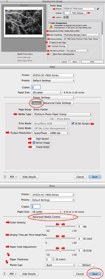
Figures 4.15–4.17. These show typical Epson printer settings from the first panel that pops up when selecting File/Print to the panels that appear in the dropdown menu under Print Settings.
I learned this ingenious method from Sam Wang. This digital negative workflow is for printing cyanotype over palladium. The method starts with a full color image which is then split into three color separation negatives (RGB). RGB negatives actually print their opposite colors of CMY—R (red) prints C (cyan or blue), G (green) prints M (magenta) and B (blue) prints Y (yellow). The two negatives that print the warm colors of the image are combined to yield a single negative that is used to print the palladium part of the equation, and the R which prints blue is used for cyanotype.
1. Open a color digital image and convert it to 16 bit RGB (Image>Mode>16 bit) and Adobe 1998 (Edit>Convert to Profile>Adobe 1998).
2. Size it to 360 ppi no more than 8″ × 10″ to fit on 8.5″ × 11″ OHP film with enough borders, and “save as” (File>Save As>imagename_negative. psd) so as not to write over the original.
3. Do any kind of image adjustments needed and for the final step do one or two sharpening steps if desired: a) Filter>Sharpen>Unsharp Mask Amount 50–150%, Radius 0.5, Threshold 0 and/or b) Layer>Duplicate Layer then with that layer selected, Filter>Other>High Pass Radius 10. Set that layer at blend mode of Soft Light on the layer’s panel dropdown menu. View the image at 50%, and with the duplicate layer active, play with the opacity slider at the top right of the Layers panel to see when it looks sharp enough but not too sharp. Flatten the two layers (Layer>Flatten Layers or Command+E). Save (Command+S).
4. Invert the image (Command+I) and save at this step because the next step you can’t undo (File>Save or Command+S).
5. In the Layers Panel select the Channels tab; image must be flattened (Layer>Flatten Image) or this will not work!
6. In the dropdown menu on the Channels tab select Split Channels. You will suddenly have three duplicate grayscale images, named R, G, and B.
7. Convert each negative from grayscale back to RGB mode Adobe 1998 (Image>Mode>RGB and Edit>Convert to Profile>Adobe (1998)).
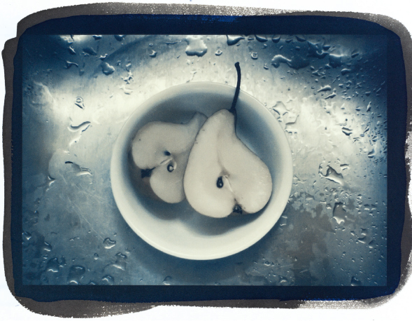
Figure 4.18. Pear Halves, cyanotype over palladium created with duotone negatives © Sam Wang 2018
8. Save the R negative immediately as imagename_COOLneg.psd. This negative prints cyanotype.
9. Apply a curves adjustment layer to the image (Layer>New Adjustment Layer>Curves).
10. Click the dropdown menu in the curves panel, click Load Preset and load the cyanotype curve. This negative is ready to print using 0% to -30% ink density as required.
11. Take the G image and with the shift key held down, the move tool selected in the Photoshop tools panel, and the mouse or track pad clicked, drag and drop the G image directly on top of the B image and release.
12. With the G layer selected, move the opacity slider in the Layers panel to 50% so that the G layer is at 50% opacity on top of the B layer at 100% opacity. This way both the G (which prints magenta) and the B (which prints yellow) are at 50/50, equally contributing. Flatten these two layers and save the G/B negative as imagename_WARMneg.psd—this negative prints palladium.
13. Apply a curves adjustment layer to the image (Layer>New Adjustment Layer>Curves).
14. Click the dropdown menu in the curves panel, click Load Preset and load the palladium curve. This negative is ready to print with no adjustment to the ink density.
15. Now you are ready to print both negatives. Select File>Print. In the first print dialog panel that comes up, makes these selections:
Under Color Handling select Photoshop Manages Colors
Select Epson Premium Glossy Photo Paper or something similarly glossy in the Printer Profile menu
Check Send 16-bit data if the image is in 16-bit
Select Normal Printing
Rendering Intent: Perceptual
Black Point Compensation unchecked
16. In the dropdown menu click Printer Settings and under Basic click:
Media Type: Premium Glossy
Super Photo 2880
High Speed unchecked
Mirror Image (or Flip Horizontal) checked
Finest Detail unchecked
16-bit Output checked
17. Under Advanced Color Settings see that the Epson Driver Color Management is off.

Figure 4.19. I chose as extreme a color example as I could find for this visual! Left is the original image. Middle, the image is converted to CMYK and in the Channels panel, the magenta and yellow layers are hidden to see what the image looks like. Note how the image is pale because of the missing layers. The image on the right has the magenta and yellow layers deleted, and a levels adjustment layer was used to darken and add contrast before the channels are split into the C and K negatives which will print cyanotype and palladium.

Figure 4.20.
18. Under Advanced Media Control only for the cyanotype negative change the ink density slider to 0% to -30%; the platinum negative remains at 0%.
19. Save and print. Be sure to print on the correct side of the OHP film. Tip: do the “lick and stick” test—lick a finger and see if it sticks to a corner of the OHP; if so, that is the side to print on. If the Pictorico cut-off corner is at the top right, that means the printable side is facing you.
20. Let the negatives dry for at least an hour face up with nothing on top, or dry them with a blow dryer on warm. Then store them in notebook sleeves.
Note: when working with CMYK, each color prints itself and not its opposite as in RGB. In other words, C prints cyan/blue, M prints magenta, Y prints yellow and K prints black.
1. Open a color digital image and convert it to 16 bit (Image>Mode>16 bit) and CMYK (Image>Mode>CMYK Color).
2. Size it to 360 ppi no more than 8″ × 10″ to fit on 8.5″ × 11″ OHP film with enough borders, and “save as” (File>Save As>imagename_negative. psd) so as not to write over the original.
3. Do any kind of image adjustments needed and for the final step do one or two sharpening steps if desired: a) Filter>Sharpen>Unsharp Mask Amount 50–150%, Radius 0.5, Threshold 0 and/or b) Layer>Duplicate Layer then with that layer selected, Filter>Other>High Pass Radius 10. Set that layer at blend mode of Soft Light on the layer’s panel dropdown menu. View the image at 50%, and with the duplicate layer active, play with the opacity slider at the top right of the Layers panel to see when it looks sharp enough but not too sharp. Flatten the two layers (Layer>Flatten Layers or Command+E). Save (Command + S).
4. In the Layers Panel select the Channels tab; note that there are four channels, cyan, magenta, yellow, and black. With the shift key held down, click on the magenta and yellow channels to make them active, and click on the garbage can at the bottom right of the Channels panel and discard the two channels. You will be left with just the cyan and black channels (Figure 4.20).

Figure 4.21. Morning Fog © Hua Cheng 2018. A perfectly calibrated digital negative will show all detail from highlights to shadows, including high key fog.
5. At this point, the image will look a bit pale and washed out because you have deleted the layers, so do a Levels Adjustment (Image>Adjustments>Levels) and play with the sliders until the image looks sufficiently dark and hit OK.
6. In the dropdown menu on the Channels tab select Split Channels. Image must be flattened (Layer>Flatten Image) or this will not work! You will have two grayscale images, named CYAN and BLACK.
7. Convert each image from grayscale back to RGB mode Adobe 1998 (Image>Mode>RGB and Edit>Convert to Profile>Adobe (1998)).
8. Invert each image (Command+I) and save each negative (File>Save or Command +S) as imagename_CYANOneg.psd and imagename_PDneg.psd.
9. Apply a curves adjustment layer to each negative (Layer>New Adjustment Layer>Curves); click the dropdown menu in the curves panel, click Load Preset and load the curves. The negatives are ready to print using 0% ink density for the palladium negative and 0–30% ink density for the cyanotype negative depending on whether using classic or new cyanotype.
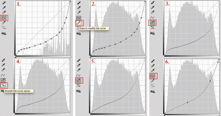
Figure 4.22. Guerrilla fix to adjust contrast. Click the Pencil icon to remove the points. Click the Smooth Icon from 1 to 7 times. Each click will smooth the curve closer to the diagonal line and raise contrast globally.
Troubleshooting the digital negative
• Posterization, where one tone in a continuous tone image plateaus and creates dull, flat areas in a print, has multiple causes. Photographing a high-contrast scene in jpeg mode is one. Over-editing an image, in 8-bit mode and not 16-bit mode, and using too drastic a curve are others. With any camera, use as lossless and uncompressed a capture system as you can (RAW for digital SLRs or at least TIFF, never JPEG) and always edit in 16-bit mode. However, if the curves produce posterized images, or ones that are slightly low in contrast, there is a “guerrilla” fix available in the Curves Panel that can be used in a pinch. This fix will move the adjustment curve towards the diagonal line in the curves panel in small increments. The guerrilla fix uses the Pencil icon to temporarily hide curve points and the Smooth icon to smooth the curve closer and closer to the diagonal line with each click. Contrast will rise globally across the negative. Sometimes a little drama with more contrast works.
1. Screen Shot 1 shows the original curve that needs a contrast tweak with the curve icon active.
2. Click on the Pencil icon shown in Screen Shot 2; when clicked and made active as it is in Screen Shot 3, it will remove all points and show the “naked” curve.
3. Just below the pencil icon is the Smooth icon as in Screen Shot 4. Click on this button to activate it.
4. Once activated, click from 1 to 7 times on this button to move the curve “bowl” towards the diagonal line. With each click towards that line, contrast increases. Be judicious; small point movements make big changes. Note in Screen Shot 5 that the adjustment is global, meaning it will affect the highlights as well as the shadows.
5. After the desired amount of clicks, click the curve icon and the points will appear, though there will be fewer of them (Screen Shot 6).
• Be sure to check your negatives for pizza wheel marks when there are large areas of highlights in the negative (e.g. clouds, sky), microscopic pinprick dots where the teeth on the track wheels that advance the paper in the printer mar the ink. They can only be seen by holding the negative obliquely against something dark and looking through a loupe. They end up printing microscopic black dots marching across the image. To alleviate this somewhat, under Advance Media Control change the slider next to Increase Drying Time per Pass to +20–+50, the Paper Thickness to 15, and the Platen Gap to Wider. If that doesn’t work, use the front load feeder of the printer. Some alt practitioners have devised a method of disengaging the pizza wheels entirely by tricking the printer into thinking the front load feeder is being used when it is not, and then using the top paper feeder with the pizza wheels disengaged; search the web for this method.
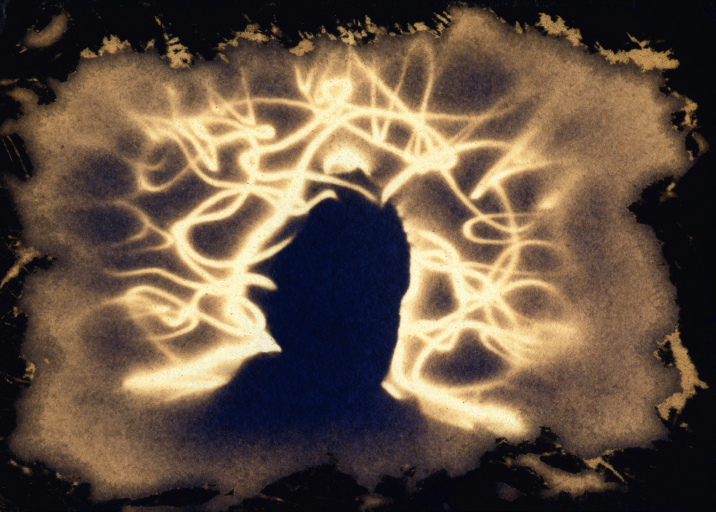
Figure 4.23. Self Portrait with Sun, digital print from a scanned in-camera cyanotype negative made from traditional cyanotype on Arches Hot Press, 14″ × 11″ © John Beaver 2005. “I have used what I call cyanonegative photography—using cyanotype as ‘film’ in homemade cameras. The long time exposures combined with shallow depth of focus, necessary for cyanonegative photography, compresses time and erases movement. The result can be unsettling, but the process of it calms me.” For nearly 20 years, John Beaver has used old processes to make new negatives, often in ways that can only be realized as a print with digital scanning and printing. This includes his development of the cyanonegative process, innovative work (in collaboration with Teresa Patrick) with instant film, and most recently his development of an accelerated, unfixed printing-out process he calls “Ephemeral-Process photography.” He is Professor of Physics and Astronomy at University of Wisconsin—Fox Valley. His three-volume The Physics and Art of Photography is forthcoming from Morgan and Claypool publishers. To see more of his work, visit www.JohnEBphotography.com.
• As the curve increases in slope towards the diagonal line in the curve dialog box, contrast increases; as it moves away from the diagonal line contrast decreases.
• The bottom left of the curve box closest to 0/0 represents the blacks in the image which, since this is a curve on a negative, will affect the density and contrast of the blacks in the negative which correspond to the highlights. The top right represents the whites in the image which, since this is a negative, will affect the density and contrast of the clears in the negative which correspond to the shadows.