
Chapter 4
Dealing with Nonnormality via Response Transformations
No experiments are useless.
Thomas Edison
At the end of Chapter 3, we showed you how to check for normality—a fundamental assumption of the statistical analysis for design of experiments (DOE). In this chapter, we discuss how to deal with nonnormality (and nonconstant variance) via transformation of the response data. The most common transformation, the logarithm, is illustrated with a case study. This is the most complex DOE shown thus far: a two-level design on four factors, requiring 16 runs for all the combinations. After detailing this DOE, we will use fractional designs to squeeze more factors into the same number of runs.
Skating on Thin Ice
The data in this chapter comes from an exercise called tabletop hockey. It works well as an in-class experiment for workshops on DOE. The objective of the hockey experiment is to learn how to shoot a puck for distance with a flexible, 15-centimeter (cm) ruler. The puck is made of two or more quarters (25-cent coins) stuck together with a gum adhesive. A simple wooden block acts as a fixture for the ruler. The response is the distance the puck slides over a smooth tabletop.
After some brainstorming, a team of workshop students decided to study four factors at the levels shown in Table 4.1.
Figure 4.1 is a template for the tabletop hockey exercise. The circles show the various locations for the factor named stick length. The marks below the line of the ruler relate to the factor called windup. The last factor, named puck place, is not shown on the figure. The low level for puck place is 0%, which means it is kept at the original position in front of the ruler and slapped. The high level for puck place is 100%, which puts it against the ruler so it can be flung forward, much like a wrist shot in the real game of hockey.

Table 4.2 lists the runs in standard order with factors in coded form. The actual experiment was performed in random order. The response (Y) covers a broad range, from 3 to 190 centimeters; more than a 60-fold change. When data spans an order of magnitude (10-fold) or more, model fitting is often simplified by applying a logarithm to the response. Therefore, we added a column for the log base 10 of the response. This is called a transformation.
Data for tabletop hockey (response Y is distance in centimeters)
|
Standard |
A |
B |
C |
D |
Y |
Log10 Y |
|
1 |
– |
– |
– |
– |
38.2 |
1.582 |
|
2 |
+ |
– |
– |
– |
23.3 |
1.367 |
|
3 |
– |
+ |
– |
– |
3.0 |
0.477 |
|
4 |
+ |
+ |
– |
– |
7.6 |
0.881 |
|
5 |
– |
– |
+ |
– |
110.0 |
2.041 |
|
6 |
+ |
– |
+ |
– |
90.6 |
1.957 |
|
7 |
– |
+ |
+ |
– |
20.6 |
1.314 |
|
8 |
+ |
+ |
+ |
– |
18.9 |
1.276 |
|
9 |
– |
– |
– |
+ |
36.6 |
1.563 |
|
10 |
+ |
– |
– |
+ |
38.0 |
1.580 |
|
11 |
– |
+ |
– |
+ |
47.4 |
1.658 |
|
12 |
+ |
+ |
– |
+ |
44.9 |
1.652 |
|
13 |
– |
– |
+ |
+ |
190.0 |
2.279 |
|
14 |
+ |
– |
+ |
+ |
116.8 |
2.067 |
|
15 |
– |
+ |
+ |
+ |
137.5 |
2.138 |
|
16 |
+ |
+ |
+ |
+ |
84.5 |
1.927 |
Ultimately, we will show that the logarithmic scale works best, but for comparison sake, let’s first analyze the data without a transformation. (In Table 4.2 and those that follow, ignore the column(s) labeled “Log10” for now.) From the 16 unique combinations that result from the 24 factorial (2 * 2 * 2 * 2 = 16), 15 effects can be estimated, as shown in Table 4.3. A computer does the calculations much faster and more accurately than most people, with the possible exception of statisticians. The tricky part for nonstatisticians is understanding the terminology and interpreting the outputs, but the reader who has gone over all the nuts and bolts of two-level factorials in Chapter 3 has nothing to fear.
Table of effects
|
Term |
Effect (Y) |
Effect (Log10 Y) |
|
A |
−19.8375 |
−0.045 |
|
B |
−34.8875 |
−0.39 |
|
C |
66.2375 |
0.53 |
|
D |
47.9375 |
0.50 |
|
AB |
6.6875 |
0.078 |
|
AC |
−16.9875 |
−0.091 |
|
AD |
−11.9875 |
−0.062 |
|
BC |
−26.5875 |
−0.035 |
|
BD |
18.1125 |
0.36 |
|
CD |
24.2375 |
−0.043 |
|
ABC |
2.7875 |
−0.066 |
|
ACD |
−14.2875 |
−0.088 |
|
ABD |
−2.6125 |
−0.013 |
|
BCD |
0.9625 |
−0.081 |
|
ABCD |
3.2375 |
0.076 |
Once again you see data transformed by the logarithm. We will be getting back to the “logged” data very soon, but for now let’s proceed with the analysis of the data as it was originally collected, before being transformed mathematically. The next step is to view the untransformed effects (Figure 4.2).

The students working on the experiment could not see any obvious division of effects on this plot, so they simply focused on the largest effect, C. The analysis of variance (ANOVA) (not shown) did produce a significant probability for the resulting model (intercept plus main effect C), but the residual plots looked odd (Figure 4.3a,b,b).

The residuals did not line up on the normal plot and they clearly increased with the predicted level, forming the unwanted megaphone pattern. The students knew enough from prior training to recognize that these patterns indicate problems in the statistics. The analysis required a different approach.
Log Transformation Saves the Data
The tabletop hockey data demonstrates a very common characteristic—as the response increases, the variance does too. This is a case of constant percent error. For example, a system may exhibit 10% error, so at a level of 10 the standard deviation is 1; however, at a level of 100, the standard deviation becomes 10, and so on. Transforming such a response with the logarithm will stabilize the variance.
Luckily, we anticipated the need for a log after seeing the wide range of response. Using the transformed effects from Table 4.3, the workshop participants generated the half-normal plot shown in Figure 4.4.

The transformation was amazing, revealing a subset of relatively large effects, including interaction BD. Moreover, as one would expect from seeing such a dramatic half-normal plot, the subsequent analysis of variance indicated that all four chosen effects (B, C, D, and BD) were highly significant (Table 4.4).
ANOVA for transformed response
|
Source |
Sum of Squares |
DF |
Mean Square |
F Value |
Prob > F |
|
Model |
3.23 |
4 |
0.81 |
46.19 |
< 0.0001 |
|
B |
0.60 |
1 |
0.60 |
34.24 |
0.0001 |
|
C |
1.11 |
1 |
1.11 |
63.66 |
< 0.0001 |
|
D |
0.99 |
1 |
0.99 |
56.76 |
< 0.0001 |
|
BD |
0.53 |
1 |
0.53 |
30.11 |
0.0002 |
|
Residual |
0.19 |
11 |
0.017 |
||
|
Cor Total |
3.43 |
15 |
The residuals from the transformed model now looked much better (Figure 4.5a,b).

In the final analysis, the students found that the distance of the shot is most affected by factor C: the windup of the ruler (Figure 4.6).

As hockey aficionados might expect, larger windups produced longer shots. The weight of the puck (Factor A) had no effect, at least over the range tested. On the other hand, the significant interaction between B and D (Figure 4.7) yielded results that may be surprising.

The effect of stick length (B) depends on puck placement (D). The D+ (100% setting) line is flat, with overlapping least significant difference (LSD) bars at either end. This indicates that stick length from 7.5 to 15 cm makes no difference when you fling the puck at the D+ level. However, when the puck is left at the original ruler line (0% setting) and slapped at this D− level, the longest shot comes with the shorter stick (B−). This is counterintuitive for most students who participate in this exercise, and thus it provides a good lesson on why one ought to conduct experiments rather than relying only on instinct.
To see the combined effect of the three significant factors, view the cube plots in Figure 4.8a,b. The left cube is in transformed units to be consistent with the previous effect graphs done in the as-analyzed (log) metric. But, what you really want to know is the distance in original units. This can be generated by taking the antilog of the predicted responses. The right cube in Figure 4.8a,b presents the results after taking this reverse transformation.
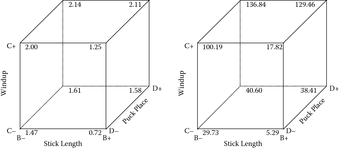
The best results, well over 100 centimeters, can be seen at the upper, back side with long windup (C+) and the puck placed against the stick (D+). At these settings of C and D, the stick length makes little difference, but by choosing the shorter level (B−) you lessen the impact of potential variations in the placement of the puck.
Now that we are back in original scale, let’s revisit the interaction plot, illustrated in Figure 4.9. It was produced with factor C set at its optimal level: high (+).

After untransforming the responses to put them back in the original scale of distance in centimeters, two things become noticeable:
- The curvilinear shape that is most pronounced at the low level of “puck place” (D−).
- How small the LSD bar gets at the short distance resulting from longest stick length (15 cm) at D−.
It makes sense that variation will be much reduced at this extremely low median response level of 5.29 centimeters versus what you would expect at (median) 136.84 centimeters, the predicted extremes in original scale (you can read these values off the right-hand cube in Figure 4.8a,b). Now you really see the reason for applying the log transformation to stabilize variances at all levels of response so they can be properly pooled for statistical purposes.
Choosing the Right Transformation
The abnormal residual plots shown on Figure 4.3a,b exhibit a relatively common “power law” relationship between the standard deviation and the mean response. Statistically, this situation is symbolized as follows:
where the Greek letter sigma is the true standard deviation (of response y), which is proportional to the true mean (mu) to some power (alpha). Table 4.5 shows just a few of the possibilities for this power law, along with the appropriate transformations.
Variance-stabilizing transformations
|
Power (α) |
Transformation |
Comment |
|
0 |
None |
Normal |
|
0.5 |
Square root |
Counts |
|
1 |
Logarithm |
Constant percent error |
|
2 |
Inverse |
Rate data |
Ideally, there is no power law relationship (α = 0), so no transformation is needed. In some cases, such as counts of imperfections, the standard deviation increases with the mean to the 0.5 power. The direct power relation (α = 1) implies that the error is a constant percent of the response. This is a very common problem, which is remedied by a log transformation. In some cases, particularly when the response is a rate (e.g., liters per second), the standard deviation increases with the square of the mean (power of 2). Then the inverse transformation is indicated (e.g., seconds per liter).
Transformations, such as those shown in Table 4.5, may stabilize the residual variance, satisfying the assumptions for ANOVA. They may be supported by scientific knowledge of the underlying relationship between factor(s) and response. For example, material scientists studying spider silk discovered a remarkable exponential relationship between extension (x) and the external force (f): f = ex/k where k is a constant (see H. Zhou, Polymers and Filaments: The Elasticity of Silk, Max Planck Institute Biannual Report 2003–2004, p. 122). In this and similar cases, a log transformation is the obvious remedy for linear modeling.
If you are uncertain whether or not a transformation will help, try one. However, if you don’t see a definite improvement in the ANOVA (F-test) and residuals, you may find that the transformation actually complicates matters. If you do use a transformation, remember to reverse the process by applying the inverse function, such as the antilog for a logged response. Otherwise you might get some grief about your goofy predictions!
Practice Problem
Problem 4.1
This problem demonstrates that design of experiments can be applied to any system, even one that does not involve manufacturing. It addresses a question debated by producers of goods and services aimed at a technical audience: Would this data-driven personality type react favorably to fancy four-color printing on a direct mail piece? Conventional wisdom says the answer will be yes, but, on second thought, this “yes” may not be absolute. While it may apply to nontechnical consumers, a cheaper, two-color printing might work as well (or better) for technical types.
In addition to considering the color factor, market researchers looked at two postcard sizes (small versus big) and two types of paper stock (thin versus thick). The eight resulting postcard designs (23) were sent to eight equal segments of the company’s client list, chosen at random. To garner more response, the researcher offered a free technical report to anyone who faxed back the reply side of the postcard. The postcards incorporated the standard two-level code to facilitate measurement. For example, the first and last combinations in standard order were coded:
- − − − (= two-color, small card on thin stock)
- + + + (= four-color, big card on thick stock)
Table 4.6 shows the number of requests generated by each postcard configuration.
Results from postcard experiment
|
Standard |
A: Color |
B: Size |
C: Thickness |
Requests (Count) |
Printing Cost (Cents/Card) |
|
1 |
Two |
Small |
Thin |
152 |
6 |
|
2 |
Four |
Small |
Thin |
57 |
10 |
|
3 |
Two |
Large |
Thin |
258 |
8 |
|
4 |
Four |
Large |
Thin |
31 |
12 |
|
5 |
Two |
Small |
Thick |
250 |
8 |
|
6 |
Four |
Small |
Thick |
131 |
12 |
|
7 |
Two |
Large |
Thick |
398 |
10 |
|
8 |
Four |
Large |
Thick |
96 |
14 |
The cost of printing the cards is also shown for reference. This is a “deterministic” response because it depends only on the factor levels. The four-color, large, thick postcard was the most expensive combination.
Analyze this data. Given that this section of the book focuses on the use of transformations, consider trying one. (Hint: The response is a count.) Determine the combination that maximizes response. You might be surprised by the results.
(Suggestion: Use the software provided with the book. Set up a factorial design, similar to the one you did for the tutorial that comes with the program, for three factors in 8 runs with two responses. Sort the design by standard order to match Table 4.6, enter the data, and do the analysis as outlined in the tutorial. Then go back and reanalyze after first choosing the square root as a response transformation. Compare the model and resulting residual plots before and after doing the transformation.)
Went to a Fight and a Hockey Game Broke Out
True hockey fans, particularly at the college level, appreciate the planning and organization of a well-coached team. The rink-long breakaways and resounding checks may arouse the crowd, but good passing and discipline win out in the end. Similarly, a hit-or-miss approach to experimentation may achieve goals in spectacular fashion, but the odds over the long haul favor the well-planned factorial approach.
“Ice hockey is a form of disorderly conduct in which the score is kept.”
Doug Larson
When Residuals Misbehave, Hit Them with a Log
Logarithms are used as a scaling function for many measurements, including decibels of sound, the Richter scale for earthquakes, the pH rating of acidity, and astronomical units for stellar brightness. We encourage you to try rescaling your response to log when residual diagnostic plots show abnormalities, but this advice comes with a cautionary note. Don’t expect much of an impact if the range of response is threefold or less. In this case, the response transformation may create more trouble than it’s worth. Also, remember that you cannot take the log of a negative number. Overcome this obstacle by adding a constant to the responses so that all become positive.
Boom-Boom: The Master at Slapping a Puck
Bernie Geoffrion, a hockey Hall of Famer who passed away in 2006, invented the slap shot. The sound of the puck coming off his stick and almost instantaneously smashing into the boards soon earned him the nickname “Boom-Boom.” Unfortunately, although the nickname reflects the power of the slap shot, Bernie’s shot was hard, but not very accurate and usually missed the goal net. But, as hockey great Wayne Gretzky pointed out, it is better to try and fail than not to try at all:
“You miss 100% of the shots you never take.”
Mean Predictions Biased When Transforming Back from Log Scale
You sharp-eyed readers may be wondering why the captions for the graphs in original scale are noted to be at the median. It turns out that the process of transforming back from log scale creates a bias in the mean predictions, the results being somewhat underestimated (but correct as median values). For example, the extreme predicted median values of 5.29 and 136.84 shift upward a bit via a bias correction to 5.53 and 143.19 at their means. Good software will either note (as done here) that predictions are at the median and/or apply the necessary correction.
(Stop here if you prefer not wracking your brain.)
The reason for the bias relates to some simple math using logs. Consider a set of data ranging from 10 to 100. Now apply the logarithm in base 10 to produce data that are normally distributed (bell-shaped) with a transformed range of 1 to 2. Take the middle value of 1.5 and antilog it. The result is 31.6; not 55 as you might have thought from the original data. The end result is a skewed distribution (think of a hill with a skier sliding down to the right) where the median falls to the left of the mean. This is what creates the bias. If you are great at mathematics and wish to learn more about this problem, search the Internet on “retransformation bias” and look for detailing of “homoskedastic error” and “smearing estimators.” (We warned you.)
“Taking the logarithm of a set of numbers squashes the right tail of the distribution.”
Andy Field, Discovering Statistics, Exploring Data: The Beast of Bias, StatisticsHell.com
The Deathly Count
Counts of traffic accidents and deaths follow the Poisson distribution, where the standard deviation is a function of the mean. A practical application of this was demonstrated by Ladisclaus Bortkiewicz, who kept track of Prussian cavalry soldiers killed by their horses between 1875 and 1894 (The Law of Small Numbers, 1898). Pity the poor soldiers who became statistics.
A Plot That Advises When a Response Would Best Be Transformed
In RSM Simplified (Productivity Press, 2004), we detail the Box–Cox plot for transformations (see the appendix in Chapter 5). The plot, which can be generated by the software provided with this book and other programs like it, pinpoints the power (α) for the response transformation that minimizes residuals. It is very handy!
A Rose by Any Other Name
In its March 11, 1996 issue, Forbes magazine introduced the concept of design of experiments to the business world. The title of the article, The New Mantra MVT, coined a new acronym (MVT), which stands for multivariable testing. Admittedly, the reference to multivariable testing conveys a major benefit to this style of experimentation. However, the case studies presented in the article show that MVT is simply design of experiments applied to business and marketing problems. Nevertheless, whether you call it DOE or MVT, it is a powerful methodology that can be applied to any system for which one can manipulate inputs and measure outputs.
“If you test factors one at a time, there’s a very low probability that you’re going to hit the right one before everybody gets sick of it and quits.”
Forbes
Obtain Enough Responses to Generate Statistical Significance
To get good, reliable results from tests on direct-mail pieces, you must generate a significant response from every configuration. Market researchers advise a minimum of 20 responses per row (or “cell”). For simple comparison, where only two varieties are tested on a split mailing list, the following rule of thumb is often applied: If the difference between the test results is two times greater than the square root of the total, it is a significant difference. Because responses may continue to trickle in for many weeks, market researchers often extrapolate the early returns in order to generate preliminary findings. For example, they might double the response received after two weeks’ time.