
Chapter 4
Using Power BI Visualizations
In This Chapter
• Power BI Desktop
• Interacting with a Power BI Report
• Changing the Data with Slicers and Filters
• Navigating Power BI Reports
Part of what puts the power in Power BI is the fact that data visualizations are not static representations of your data. Instead, Power BI reports are highly interactive. We are able to navigate through the data to gain deeper meaning.
In this chapter, you will walk through these interactive features. You will learn how to use those features to truly analyze the data. This will enable you to follow the data where it leads you in the pursuit of insight.
Power BI Desktop
In most situations, when you are viewing and interacting with an existing Power BI report, you will do so through a browser. The report will be published and made available to you through PowerBI.com in the cloud or saved to a Power BI Report Server instance within your organization’s infrastructure. In either case, you would access that report using a browser.
For the training exercises in this chapter, we are going to use a slightly different approach in order to keep things simple. In this chapter, we will open a Power BI report file (.pbix file extension) on your computer using the Power BI Desktop application. As explained earlier, Power BI Desktop is the authoring tool for Power BI content. However, because Power BI Desktop is a “what you see is what you get” (WYSIWYG) authoring tool, it can also be used to view and interact with the report.
By using Power BI Desktop for these exercises, we avoid the necessity of setting up a PowerBI.com location for publishing the report or having an existing Power BI Report Server available to which the report can be saved. With a couple of minor differences, which I will point out as we go along, you will get the exact same experience interacting with the report in Power BI Desktop as you would in either of the browser-based environments.
Obtaining What You Need
As you will have gathered from the preceding paragraphs, you need to install a copy of Power BI Desktop in order to complete the exercises in this chapter (and indeed, much of the rest of the book). You will also need to download the supporting materials for this book from the McGraw-Hill website to obtain the completed Power BI report we will be working with. The instructions for obtaining both of these items are found in the “Where to Find What You Need” section in Chapter 1 of this book.
Please follow the instructions found in Chapter 1 to download and install the Power BI Desktop software. If you already have Power BI Desktop installed, use the About button on the Help tab of the ribbon to verify that it is the July 2019 version or later. If you have an earlier version of Power BI Desktop, you will need to upgrade to the July 2019 or later version in order to successfully complete all the exercises in this book. If you need to upgrade, simply download and install the latest version using the instructions from Chapter 1. This will upgrade any existing Power BI Desktop version on your computer.
Also, please follow the instructions found in Chapter 1 to download the ZIP file containing the supporting materials (source code) for this book. Once you have downloaded the ZIP file, double-click the file to navigate its content. Locate the file called “Population-GDP-CO2 by Country.pbix,” copy this file, and save it to a location in your file system (outside of the ZIP file). Be sure to remember the location where you saved this file.
Opening the Report/Preparing the Environment
With Power BI Desktop installed and the “Population-GDP-CO2 by Country.pbix” file in a convenient location, we are ready to begin. Follow these steps to open the report in Power BI Desktop and prepare the Power BI Desktop environment for our data exploration. In this chapter, we will be using Power BI Desktop only as a means of displaying the report so we can interact with it. We won’t be needing any of the report authoring tools, so we will go ahead and hide those for now.
Opening the Population-GDP-CO2 by Country Report in Power BI Desktop
1. Locate the “Population-GDP-CO2 by Country.pbix” file in the file system location where you placed it.
2. Double-click the “Population-GDP-CO2 by Country.pbix” file. This will open the file in Power BI Desktop.
3. If this is the first time you have run Power BI Desktop, you will see the Welcome to Power BI dialog box, as shown in Figure 4-1. Unfortunately, this information is the “price” of the free software. Enter the required information and click Done.
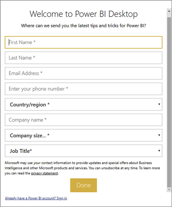
Figure 4-1 The Welcome to Power BI dialog box
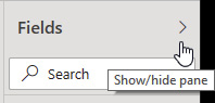
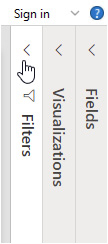
4. Locate the Fields pane on the right side of the Power BI Desktop window. Click the arrow to the right of the “Fields” heading to hide the Fields pane.
5. Locate the Visualizations pane on the right side of the Power BI Desktop window. Click the arrow to the right of the “Visualizations” heading to hide the Visualizations pane.

6. Locate the Filters pane on the right side of the Power BI Desktop window. Click the arrow to the right of the “Filters” heading to hide the Filters pane.
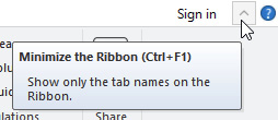
7. Locate the blue circle containing the question mark in the upper-right corner of the Power BI Desktop window. Click the arrow just to the left of the blue circle. This will hide the ribbon.

NOTE
If you have trouble minimizing either the Fields pane, the Visualizations pane, Filters pane, or the ribbon, try minimizing the entire Power BI Desktop window and then maximize the window again. Now retry the steps from this section that were unsuccessful.
Your Power BI Desktop window should now appear, as shown in Figure 4-2.

Figure 4-2 Power BI Desktop, ready for report viewing
Interacting with a Power BI Report
We will begin by looking at ways to interact with the items of the Power BI report itself. Most Power BI reports have multiple items on each report page. We will see how to make it easier to focus on a single report item. In addition, we will see how report items interact with each other when we consider the report page as a whole. At the end of this section, we will see how report items can help us interpret what we are seeing.
The “Population-GDP-CO2 by Country” report contains multiple pages. Each page is represented by a tab across the bottom of the report. The report should have defaulted to the “Population, CO2, GDP Overview” page. You can click the various tabs to page through the report if you like. We will spend more time exploring each report page in detail as we progress through this chapter.
The “Population, CO2, GDP Overview” page of the report contains several items. A title appears in the upper-left corner, and a “Q&A” button appears in the upper-right corner (more on that button later). Finally, three charts make up the bulk of the page content.
Working with a Single Report Item
Our report, shown in Figure 4-2, opened showing the entire content of the “Population, CO2, GDP Overview” report page by default. However, we don’t always have to see the entire page. Let’s explore the options for viewing a report page.
Page View
We begin by essentially zooming in to a portion of the report page or zooming out to see the entire page using Page View. Follow these steps:
1. At the top of the Power BI Desktop window, click the View tab. (Remember, the ribbon is hidden, so all you see are the ribbon tabs until you click one of them.) Clicking the View tab will display the content of the View tab of the ribbon.
2. Click the Page View dropdown item. You will see three Page View options.

3. Click Actual Size. Depending on your screen resolution and Power BI Desktop window size, you may now see only a portion of the report visible in the Power BI Desktop window and the content will be larger. You are now seeing the report content at its actual size. The content actually visible will vary depending on your screen resolution and the size of the Power BI Desktop window. This is one way to focus attention on one area of a Power BI report and make the content of that area easier to read. When a portion of the Power BI report is not visible, scrollbars allow you to move left and right, up and down to view the entire report.
4. Click the View tab and then the Page View dropdown item again. This time select Fit to Width. With this view option, you will see all of the report page content side to side but, depending on your screen resolution and window size, you may not see all of the report page content top to bottom.
5. Click the View tab and then the Page View dropdown item. Now select Fit to Page to return to our original view.
NOTE
Each page in a Power BI report can have its own default Page View setting. Be sure to always be aware of whether you are seeing the entire report page or only a portion of the page.
Focus Mode
Focus Mode provides another way to concentrate our attention on one particular item on the report page. To explore this mode, follow these steps:
1. Hover your mouse pointer over the “CO2 Level by Continent” pie chart. Notice that a new header bar appears above the chart with several icons. One of the icons shows a smaller rectangle inside a larger rectangle with an arrow going from the smaller to the larger. This is the Focus Mode icon.
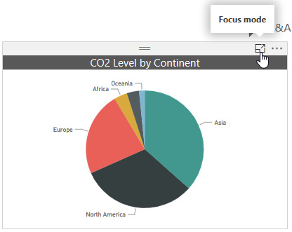
2. While being careful to keep your mouse pointer over the rectangle that defines the entire pie chart item, click the Focus Mode icon. Focus Mode gives the entire focus to one report item, making it easier to read and to interact with.
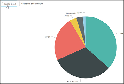
3. To return to the full report page, click “Back to Report” in the upper-left corner of the Focus Mode view.
Tooltips
Tooltips enable us to know the exact quantity represented by a chart item. To practice using these tooltips, follow these steps:
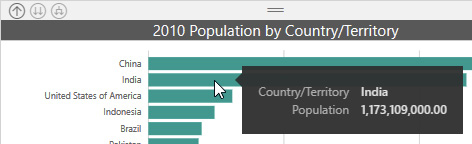
1. Hover your mouse pointer over the bar representing India in the 2010 Population by Country/Territory bar chart. You will see a tooltip showing the exact population amount being represented by this bar.
2. Now hover your mouse over the wedge representing Africa in the CO2 Level by Continent pie chart. Not only does the tooltip show the exact CO2 level being represented, but it also shows what percentage this is relative to the entire pie.

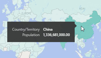
3. Click the World Population Map tab to switch to this page of the report. On this report page, population is represented by darker and lighter shading on a map rather than by bars on a bar chart.
4. Hover your mouse pointer over China on the map. You will see a tooltip showing the exact population amount represented by the shading.
Changing Sort Order in a Table or a Matrix
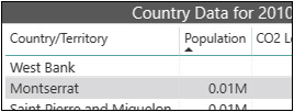
We can change the order with which items are sorted within the report items. There are a couple different ways to change sort order depending on the type of data visualization with which you are working. We’ll start by working with a table of values, as shown in the Country Data for 2010 table on the World Population Map page of our report.
The Country Data for 2010 table is sorted by Population in descending order (largest to smallest). This is indicated by the downward-pointing triangle underneath the Population column heading. Only table and matrix visualizations (visualizations with rows and columns of numeric values) have this sort indicator as part of a column header. (You’ll learn more about matrix visualizations later in this chapter.)

1. Click the Population column heading in the Country Data for 2010 table. The sort order changes to ascending order by population (smallest to largest). The triangle underneath the Population column heading is now pointing upward.
2. Click the GDP column heading in the Country Data for 2010 table. The sort order changes to descending order by GDP. The triangle has moved underneath the GDP column heading and it is pointing downward. Numeric columns default to descending order when you click the column heading for the first time. The assumption is the bigger quantities are more interesting than the smaller quantities.
3. Click the GDP column heading again to change the sort order to ascending order by GDP.
4. Click the Country/Territory column heading in the Country Data for 2010 table. The sort order changes to ascending order by Country/Territory. The triangle has moved underneath the Country/Territory column heading and it is pointing upward. Alphabetic columns default to ascending (alphabetic) order when you click the column heading for the first time. The assumption is ascending alphabetic order is most likely the desired result.
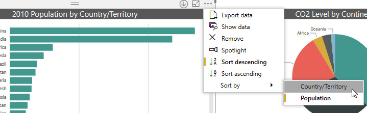
Change the Sort Order in Any Visualization
Whereas clicking the column heading to change sort order only works for a table or a matrix, there is another mechanism for changing sort order that works for all data visualizations. We will use this second method to return the Country Data for 2010 table to its original sort order, then we will try it out on a bar chart. Follow these steps:
1. In the upper-right corner of the Country Data for 2010 table, to the right of the Focus Mode icon, is the More Options icon represented by three dots (ellipsis). (If you don’t see the More Options icon, you may need to hover your mouse pointer over the Country Data for 2010 table.) Click the More Options icon to view the More Options dropdown list.
2. Hover your mouse pointer over the Sort by option in the dropdown list. You will see a secondary dropdown list of the columns in the table. Note the yellow bar next to the Country/Territory item in the secondary dropdown list. This indicates the list is currently sorted by Country/Territory. The yellow bar next to the Sort ascending entry in the first dropdown list indicates the sort order is currently ascending. Click the Population item in the secondary dropdown list.

3. The table changes to sort by population, but the sort order remains ascending. The method does not default the sort of a numeric column to descending. We need to do that ourselves. Click the More Options icon. The More Options dropdown list appears.
4. Click Sort descending in the More Options dropdown list. The Country Data for 2010 table is once again sorted by population in descending order.
5. Click the Population, CO2, GDP Overview tab to return to the Population, CO2, GDP Overview page of the report.
6. Hover your mouse pointer over the 2010 Population by Country/Territory bar chart and click the More Options icon.
7. In the More Options dropdown list, hover your mouse pointer over Sort by. The Sort by dropdown list appears.
8. Click Country/Territory in the Sort by dropdown list.
9. The chart is now sorted by Country/Territory, but in descending order. Click the More Options icon.
10. In the More Options dropdown list, select Sort ascending. We may like seeing the country/territory names in alphabetic order, but this sort order is not very helpful when trying to analyze population. Changing a visualization to sort by a particular quantity rather that alphabetically (or even chronologically) can be one way to aid your interpretation of the data.
11. Use the More Options menu to return the 2010 Population by Country/Territory bar chart to being sorted by population in descending order.
Interacting with Multiple Report Items
One of the most powerful features of Power BI is the fact that multiple data visualizations on a single report page will interact with one another. With that in mind, let’s move from working with a single visualization to working with the entire report page.
Selecting a Chart Element
We can select an element within a chart—a single column in a column chart or a single wedge in a pie chart. Doing so focuses our attention on the selected item by dimming the other elements in that chart. Beyond that, the presentation of the data in the other visualizations on the page will also change. Follow these steps to try out this interaction:
1. In the GDP by Year column chart on the Population, CO2, GDP Overview page of the report, click the column for the year 2005. The 2005 column remains the same, but the other columns in the chart are dimmed. Note the wedges in the CO2 Level by Continent chart now contain a dual-color pattern. Part of each wedge is its original color while the rest of each wedge is now dimmed.
2. Hover over the wedge for Asia in the CO2 Level by Continent chart. There are now three lines in the resulting tooltip. The continent and the CO2 level represented by the full wedge are shown along with a new entry called “Highlighted.” This is the value represented by the non-dimmed portion of the wedge. Because the year 2005 is selected in the other chart, this highlighted area represents the portion of the total Asia CO2 level from 2005.
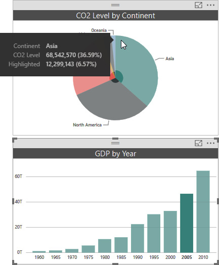
3. Click different year bars in the GDP by Year chart to compare the highlighted CO2 levels in the CO2 Level by Continent pie chart.
4. Click the Asia wedge in the CO2 Level by Continent pie chart. Notice that each of the columns in the GDP by Year column chart have both a dimmed and a highlighted portion. The highlighted portion represents the portion of that year’s GDP coming from Asian countries.

5. Click the Asia wedge again and all of the charts return to their original state.
6. Click the China bar in the 2010 Population by Country/Territory bar chart. The portion of the Asia CO2 coming from China is highlighted in the pie chart. The portion of the GDP coming from China is highlighted in the GDP by Year column chart, but only in the 2010 column. As the title indicates, the Population bar chart includes a filter that limits its data to the year 2010 (more on that later in this chapter). When we click a bar in this chart, we create highlighted regions in the other charts based not only on the country represented by that bar, but also by only 2010 data. This is done so that when we are looking at highlighted areas across multiple visualizations, we are comparing “apples to apples” as much as possible. In this case, we are comparing data for China in 2010 in all three charts.

7. Hold down CTRL and click the United States of America bar in the 2010 Population by CountryTerritory bar chart. This allows us to multi-select two items at the same time. The highlighted portion of the Asia wedge in the pie chart represents China’s portion of the CO2 level, and the highlighted portion of the North America wedge represents the United States’ portion of the CO2 level. The highlighted portion of the 2010 column in the GDP by Year chart represents the combined China and United States GDP for 2010.
Selecting a Map Region or Table Row
We have seen how things work with chart visualizations. Now let’s try maps and tables.
1. Click the World Population Map tab to navigate to this page of the report.
2. Click China on the world map. This will limit the data in the Population Trend area chart and in the Country Data for 2010 table. Because the map is limited to 2010 data, when a country is selected, only that country’s 2010 data is visible in the other items on the page.
3. Click China on the world map again and the page returns back to its original state. This is always the case; if you click a bar, column, wedge, country, or whatever, and then click that same item a second time, everything returns back to its original state.
4. Click Indonesia in the Country Data for 2010 table. Now, only the Indonesian data for 2010 is shown in the other items on the page. Because only Indonesia is highlighted on the map, the map auto-zooms in on Indonesia.
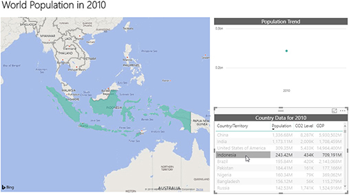
5. Click Indonesia in the Country Data for 2010 table again to return things to their original state.
Changing the Data with Slicers and Filters
Up to this point, we have manipulated the data that was provided to us on each page of the report. Next, we are going to look at ways to change the data displayed on a report page. To do this, we will look at slicers and filters.
Slicers and filters differ in form rather than in function. Both slicers and filters allow us to limit the data we are seeing in the visualizations on a report page. The big difference is how easy each of these is to get at and, therefore, how frequently each is meant to be changed.
Slicers
Slicers provide a way to change the data on a report page. Slicers are easily found, because they are laid out as part of the report page itself. Slicers come in multiple forms: buttons, dropdowns, lists, and even sliders, to name just a few.
A Dropdown Slicer
We begin by looking at a dropdown slicer:
1. Click the CO2 KPI tab to move to that page of the report.
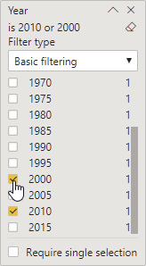
2. The dropdown slicer for changing the year of the data being shown on this page is in the upper-right corner of the page itself. Click the down arrow to the right of “2010” to expand the dropdown list.
3. Scroll down in the list until the 2010 option with the filled-in selection box is visible.
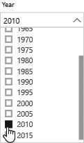
4. Click 2000 in the list. The report page changes to show data for the year 2000.
5. Click the up arrow to collapse the dropdown list. The dropdown slicer clearly indicates the year 2000 is selected.
6. Click the down arrow to expand the dropdown list.
7. Hold down CTRL and click 2005. Now data for both 2000 and 2005 is shown together on the report page. Note the slicer now says “Multiple selections” at the top of the dropdown list. You can select as many items as you like using CTRL.
8. Release CTRL and click 2010. As soon as an item is clicked without CTRL, only that single item is selected.
9. Click 2010 again. Clicking the only selected item causes it to become unselected. This shows you one of the unique things about slicers in Power BI. When nothing is selected in a slicer, Power BI acts like all the items in the slicer are selected. Note the slicer now says “All” at the top of the dropdown list. We are seeing data on the report page for all years added together.
10. Use CTRL and select several years in the dropdown list.
11. Hover your mouse pointer over the Year heading above the dropdown list. An icon will appear to the right of the heading. This icon is meant to evoke the big pink eraser some of us may have had back in grade school—although you may need to squint a little to see the resemblance. This is the Clear selections icon. There is a down arrow to the right of the Clear selections icon. That down arrow is used for report authoring, so we will ignore it for now.
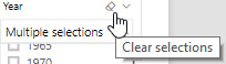
12. Click the Clear selections icon. The Clear selections icon provides a quick way to clear out all the selected items in a slicer.
Interacting with Related Slicers
A report page can contain multiple slicers in different formats. In some cases, the data shown in the slicers will be interrelated. This can be useful, but can also lead to some odd interactions. Follow these steps to interact with related slicers:
1. Click the Yearly Data tab to move to that page of the report.
2. The rectangles showing six of the seven continents across the top of the page are slicer buttons. (We don’t have any data from Antarctica, so that continent is not in the list.) There is another slicer showing a scrolling list of countries/territories down the right side of the page. This is a list slicer. Click the button for the Africa continent.
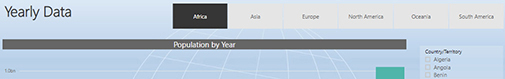
3. The reverse coloring clearly shows Africa is selected. Only data for African countries is included in the column chart. In fact, the Continent slicer is also filtering the values shown in the Country/Territory slicer. Only African countries/territories are shown in the list slicer. Click Angola in the Country/Territory slicer.
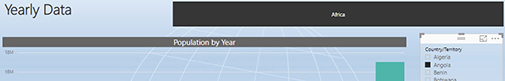
4. Now only data for Angola is displayed in the column chart. However, something odd has happened to the Continent slicer. It only has one big button for Africa. All of the other continents have disappeared. Just as the Country/Territory slicer is limiting what data is shown on the column chart, it is also limiting what data is shown in the Continent slicer. Only the continent associated with the selected value, Angola, is displayed. In order to select a different continent, we first have to clear the Country/Territory slicer. Click Angola again to deselect this item.
5. All of the continent options are back. Click South America.
Synchronized Slicers
Almost as graceful as synchronized swimming, synchronized slicers can save you time when working with multipage reports. Follow these steps to interact with synchronized slicers:
1. Click the GDP and CO2 Map tab to move to that page of the report.
2. Note that South America is selected in the Continent slicer and only data for South American countries is displayed. Click Africa in the Continent slicer.
3. Click the Yearly Data tab to move back to that page of the report. Now only data for African countries is displayed here.
4. Hold down CTRL and click Europe in the Continent slicer.
5. Click the GDP and CO2 Map tab.
As you can see, the Continent slicer is linked between these two pages. Any change made to the Continent slicer on one page also takes effect on the other page. When synchronized slicers are in place, you can make data selections on one page of the report and then view data from one or more other pages using the same selection criteria without having to reselect it.
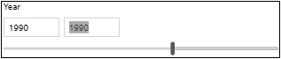
A Range Slicer
In some cases, we may want to select a contiguous range of values. Holding down CTRL and clicking numerous values in that range could be tedious. The range slicer provides a convenient alternative.
The GDP and CO2 Map page of the report is designed to allow us to view data for a selected range of years. The Between Slider slicer makes this easy, as shown next:
1. Click the left end of the slider range and drag to the left until 1980 appears in the left (start of range) box.
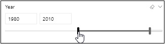
2. Click the right end of the slider range and drag it to the left until 2005 appears in the right (end of range) box. Note data for 1980 through 2005 now appears in the GDP and CO2 column chart and is reflected on the map.
3. Click in the left slicer box so you see an edit cursor.
4. Delete 1980.
5. Type 1965 and press ENTER.

6. Click in the right slicer box so you see an edit cursor.
7. Delete 2005.
8. Type 1990 and press ENTER. Now data from 1965 through 1990 is shown in the GDP and CO2 column chart and is reflected on the map.
9. Click the left end of the slider range and drag it until it is on top of the right end of the slider range. Now only a single value, 1990, is selected.
10. Double-click anywhere on the horizontal bar to the right of the slider range to see both the start and end points of the slider range.
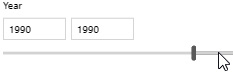
11. Now click the right end of the slider range and drag it to the right until 2005 appears in the right box.
Filters
Filters work like slicers, but are somewhat hidden away. Whereas slicers are part of the report’s user interface, filters are placed to the side on the Filters pane. Filters provide a less interactive but more flexible and powerful mechanism for modifying what is included in the report.
Power BI uses three different types of filters:
• Filters on this visual
• Filters on this page
• Filters on all pages
Filters on this visual affect the data shown in a single visualization on the report page. Filters on this page affect the data in all the visualizations on the report page. Filters on all pages affect the data in all the visualizations on all of the report pages.
Filters are located on the Filters pane. The Filters pane is often hidden on the right side of the screen. In order to view any filters or make changes to a filter, we need to show the Filters pane.
NOTE
The following instructions assume the updated Filters pane interface is being used. If you are seeing the filter definitions on the bottom of the Visualizations pane, go to File | Options and Settings | Options. In the Options dialog box, go to the Current File | Report Settings page and check the “Enable the updated filter pane, and show filters in the visual header for this report” option.
The Filters Pane
Let’s use the Filters pane to modify one of the filters in our report. Earlier in this chapter we noted that the 2010 Population by Country/Territory bar chart on the Population, CO2, GDP Overview page of the report only displays population data for 2010. There is a filter on that visual that causes this behavior.
1. Click the Population, CO2, GDP Overview tab.
2. Click the arrow above the word “Filters” to show the Filters pane. Note there are no “Filters on this page” and no “Filters on all pages.” No visualization is currently selected, so the “Filters on this visual” area is not visible.
3. Click somewhere in the 2010 Population by Country/Territory bar chart to select this visualization. The “Filters on this visual” area is now visible in the Filters pane. Most of the visual level filters show “(All),” indicating they are not restricting the data being shown. Only the Year filter says “Year is 2010,” indicating only data for 2010 is being displayed in this visualization.

4. Hover over the Year area in the Filters pane and click the arrow to the right of the Year heading to expand the Year filter.
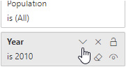
5. Scroll down in the year values until you can see 2000.
6. Check the box next to 2000, so both 2000 and 2010 are checked. You do not need to use CTRL to select multiple values for a filter. Despite what the heading is telling us, the 2010 Population by Country/Territory bar chart is now showing data for both 2000 and 2010.
7. Click the China bar in the 2010 Population by Country/Territory bar chart. In the GDP by Year column chart are highlighted regions for the years 2000 and 2010. As we saw previously, any filtering in effect for a given visualization becomes part of the interaction with other visualizations.

8. Let’s put the filter back the way it was before we cause any confusion. Uncheck the 2000 entry in the Year visual level filter.
Excluded and Included
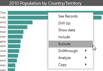
There are times when we are analyzing data when we may want to remove outlier values from a visualization in order to make it easier to evaluate the remaining values. The 2010 Population by Country/Territory bar chart is an example of this. The China and India population values are an order of magnitude larger than all the other population values. Because these bars are so much longer than the others, it is difficult to compare the relative lengths of the bars for the rest of the countries. The Excluded filter enables us to remove outliers.
At other times, we may want to create our own custom grouping of the data. We can then focus our analysis on the members of this custom grouping. The Included filter enables us to focus analysis on a select subset of the data. Let’s explore using the Excluded and Included filters.
1. Click the China bar in the 2010 Population by Country/Territory bar chart so it is no longer highlighted.
2. Right-click the China bar in the 2010 Population by Country/Territory bar chart.
3. Select Exclude from the popup menu that appears. The China bar disappears from the chart.
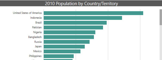
4. Right-click the India bar and select Exclude from the popup menu. The India bar disappears from the chart. It is now much easier to compare the relative populations of the next-largest countries in the chart.
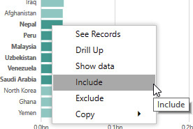
5. Scroll down until you see the entry for Nepal.
6. Click Nepal. Note you can click the “Nepal” label to select it or you can click the bar next to it.
7. Hold down CTRL and click the labels for the following countries:
• Peru
• Malaysia
• Uzbekistan
• Venezuela
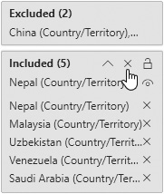
• Saudi Arabia
8. Right-click the data bar for one of the six selected items and select Include from the popup menu. Note that you must right-click the data bar, not the label for this part of the operation. Now only these six countries/territories are included in the chart.
9. Look at the “Filters on this visual” area of the Filters pane. A new entry called Excluded has been created for the two countries/territories excluded from the chart. Also, a new entry called Included has been created for the six countries/territories included in the chart. Click the down arrow to the right of the Included heading to see the items in the Included filter.

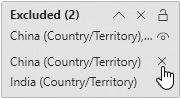
10. Click the “X” to the right of the Included filter entry for Peru (Country/Territory). This will remove Peru from the Included filter and consequently remove it from the chart. When an Included filter is present, only the items in the Included filter are present in the chart.

11. Click the “X” to the right of the Included filter heading to remove the entire Included filter. The chart now contains all of the countries/territories except for those in the Excluded filter.
12. Click the down arrow to the right of the Excluded heading to see the items in the Excluded filter.
![]()
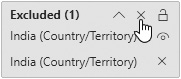
13. Click the “X” to the right of the Excluded filter entry for China (Country/Territory).
14. Click the “X” to the right of the Excluded filter heading to remove the entire Excluded filter.
Play Axis
One visualization within Power BI, the scatter chart, includes a feature that acts like a dynamic visual level filter. This feature is called the play axis. The play axis enables us to put the data in motion and animate it over a specified time period.
First, a bit about the scatter chart. The scatter chart allow us to analyze three variables at the same time—one on the horizontal axis, one on the vertical axis, and one controlling the size of each circle created on the chart. In the scatter chart on the Group of 20 Analysis page of our report, GDP is shown on the horizontal axis. The further to the right a country’s circle travels, the bigger its GDP for that year. Population is shown on the vertical axis. The further up a country’s circle travels, the bigger its population in that year.
Finally, CO2 level is shown by the size of the circle. The larger the circle, the bigger the CO2 level. The play axis runs from the year 1960 to 2010. So, we can see how all three of these variables interact over that 50-year period for the Group of 20 member nations.
1. Click the Group of 20 Analysis tab.
2. Click the play button to the left of the play (time) axis. The chart will animate the circles for each of the 20 nations.
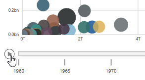
3. We can assist our analysis by highlighting certain countries. Click the light orange circle representing China. The path and size of the circle representing China are illustrated for each of the time stops along the play axis.

4. Hold down CTRL and click the gray circle representing the United States.
5. Click the play button again to observe the behavior of the highlighted data points.
6. Drag the cursor bar on the play axis from 2010 back to 2000.

Navigating Power BI Reports
Up to this point, we have been interacting with the data contained in the report—selecting data and data elements as well as slicing and filtering. Now, we are going to switch to navigations. Navigating through levels of data using drill down and navigating through different pages of the report using drillthrough. After that we will look at buttons and bookmarks.
We will end the chapter by exploring ways to go after the underlying data directly. We will use an innovative method of querying our data using natural language statements. Finally, we will view and export the underlying data used to create our visualizations.
Drill Down and Drillthrough
Data analysis often takes us from looking at high-level summary data to digging through low-level detail data. We want to have a mechanism for finding a summary number that has some interest to us, and then drilling into the detail behind that number. Drill down and its corresponding drill up operation enable us to navigate up and down through levels of detail to find the answers we are looking for. Drillthrough takes us from a report page showing summary information to another report page showing the detail behind a particular number.
Drill Down in a Matrix
Several different types of Power BI visualizations support drill down. We begin by using drill down in a matrix.
NOTE
Drill down operations are available in a matrix only if the report author set up several levels of detail when the matrix was created. The presence or absence of the drill down context menu options and icons will let you know whether drill down is available in any given matrix. Drill down is not available in a table.
1. Click the CO2 KPI tab.
2. Select 2000 in the Year dropdown slicer.
3. In the CO2 Actual vs Goal matrix, we see that only Oceania is yellow at 116.69% of its CO2 reduction goal. Let’s drill down to see what the values are for each Oceanian country. Right-click Oceania in the Continent column and select Drill Down from the context menu.

4. This drills into the Oceania continent, showing each of the countries that make up that continent along with the total for the continent as a whole. Right-click any of the countries and select Drill Up from the context menu.
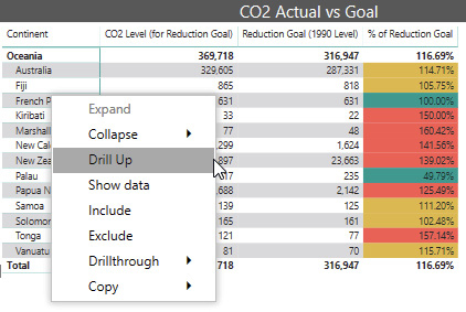
5. There are a number of alternative ways we can perform this drill down operation. Right-click Oceania again, but this time select Expand | Selection from the context menu.
6. Using this method, we continue to see all of the entries at the continent level along with the detail for the countries of Oceania. Rather than right-clicking to drill up this time, we will use the Drill Up icon in the upper-left corner of this visualization. This is the up arrow inside the circle. Click the Drill Up icon.

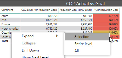
7. Right-click Oceania again and select Expand | Entire level from the context menu.

8. This method expands all the continent entries (the entire level) to show the countries within each continent. Scroll down to find the Oceanian countries.

9. Click the Drill Up icon.
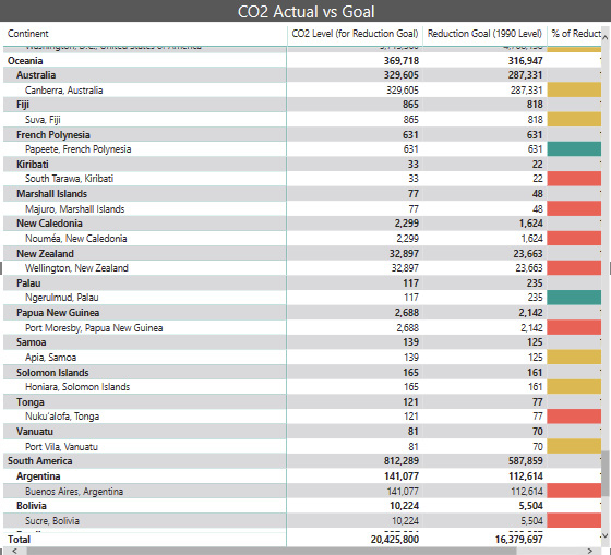
10. Right-click Oceania again and select Expand | All from the context menu.

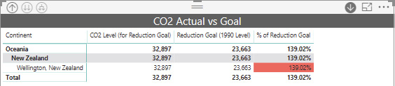
11. This method expands all items and drills down all levels. In this case, the capital city is included as a third level beneath continent and country. Again, scroll down to find the Oceanian countries and their capital cities.
12. Click the Drill Up icon to remove the capital city level from the matrix.
13. Click the Drill Up icon again to remove the country level from the matrix so only the continents are visible.
14. Right-click Oceania and select Show Next Level from the context menu.
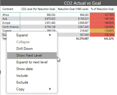
15. This method shows all of the countries and no longer shows any of the continent information. Scroll down to find New Zealand in the list of countries.
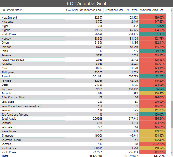
16. Click the Drill Up icon.
17. Right-click Oceania and select “Expand to next level” from the context menu.

18. This method functions exactly the same as the Expand | Entire Level option. Click the Drill Up icon.
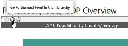
19. There are also icons that allow us to drill down. Click the circle containing the two parallel arrows. This is the “Go to the next level in the hierarchy” icon. (I will call this the double-arrow icon for short.)
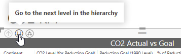
20. This icon functions exactly the same as selecting Show Next Level from the context menu. Click the Drill Up icon.
21. Click the circle containing the arrow with one tail branching into two heads. This is the “Expand all down one level in the hierarchy” icon. (I will call this the forked-arrow icon.)
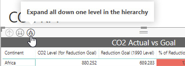
22. This icon functions exactly the same as the Expand | Entire Level option (and “Expand to next level” option). Click the Drill Up icon.
23. Finally, if that wasn’t enough, there is an icon to turn on one-click drill down. This is the circle containing the down arrow on the right side of this item. Click the icon to turn on one-click drill down. When one-click drill down is on, its icon will have a gray background with a white down arrow.
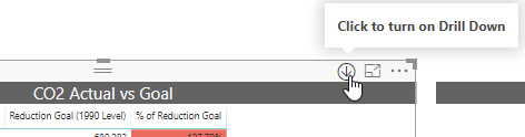
24. Click Oceania in the Continent column. A simple click now executes a drill down equivalent to selecting Drill Down from the context menu.
25. Click New Zealand. This drills down another level to New Zealand’s capital city.
26. Click the Drill Up icon twice.
27. Click the one-click drill down icon to turn off this feature. The icon returns to a white background with a gray down arrow.
Drill Down in a Chart
Drill down in a chart works in a manner similar to drill down in a matrix, but with slightly fewer options, as demonstrated next:
NOTE
Drill down operations are available in a chart only if the report author set up several levels of detail when the chart was created. The presence or absence of the drill down context menu options and icons will let you know whether drill down is available in any given chart.
1. Select the Population, CO2, GDP Overview tab.
2. It turns out the 2010 Population by Country/Territory bar chart is initially set to a lower level of drill down detail when the report opened. We will drill up and then examine the drill down options available to us. Click the Drill Up icon.
3. Right-click the bar for Africa and select Drill Down from the context menu.

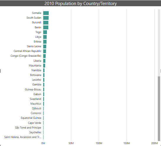
4. The chart shows the data for the African countries. Scroll down to find Somalia.
5. Click the Drill Up icon.
6. Right-click the bar for Africa again and select Show Next Level from the context menu.

7. The chart shows the data for all the countries from all continents. This is the format the chart was in initially. Click the Drill Up icon.
8. Right-click the bar for Africa again and select “Expand to next level” from the context menu.

9. The chart shows the data for all the countries for all continents, but it has combined the continent name with the country name. Scroll down to find the entry for “Europe Ukraine.”

10. Click the Drill Up icon.
11. Click the double-arrow icon above this chart.
12. This icon functions the same as selecting Show Next Level from the context menu. Click the Drill Up icon.
13. Click the forked-arrow icon above this chart.

14. This icon functions the same as selecting “Expand to next level” from the context menu. Click the Drill Up icon.
15. Click the one-click drill down icon above this chart to turn on one-click drill down. When the one-click drill down feature is on, the one-click drill down icon will have a gray background with a white down arrow.
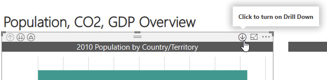
16. Click the bar for Africa.
17. Clicking a bar in the chart now functions the same as selecting Drill Down from the context menu. Click the Drill Up icon.
18. Click the one-click drill down icon to turn off one-click drill down. The icon returns to a white background with a gray down arrow.
19. Click the double-arrow icon to return the chart to the state in which we found it.
Drillthrough
We used drill down to get to a new level of data within a visualization. Now let’s see how we can use drillthrough to get to an entire page of detail. In this case, let’s suppose that, as we look at data for a country in one specific visualization, we want to see more detail about the country in general.
1. In the 2010 Population by Country/Territory bar chart, right-click the bar for Mexico. You will see there is an entry in the context menu for Drillthrough. Because we right-clicked a chart element linked to a particular country, the presence of the Drillthrough option indicates the report contains one or more pages that are set up for drillthrough.
2. Hover your mouse pointer over the Drillthrough entry. You see a submenu with an entry called Country Detail. This corresponds to the Country Detail page of the report. One entry will appear in this submenu for each report page that is set up for drillthrough based on the item selected (in this case, a country).

3. Click Country Detail in the submenu.
4. You navigate to the Country Detail page of the report (the Country Detail tab). Detail information for Mexico is shown.
5. There is a circle with a left arrow in the upper-left corner of the report page. This is a Back button. It will return us to whatever report page we were on when we made the selection from the Drill Down menu. Hover your mouse pointer over the Back button.

NOTE
The tooltip with this button instructs you to press CTRL and click the button. Interacting with buttons is one of the few things that functions differently when in Power BI Desktop versus interacting with a Power BI report through a browser. When clicking buttons in Power BI Desktop, we need to hold down CTRL. We can click a button without holding down CTRL when using a browser.
6. Hold down CTRL and click the Back button.
7. We return to the Population, CO2, GDP Overview page. Right-click the bar for Nigeria and select Drillthrough | Country Detail from the context menu. We are taken back to the Country Detail page, but information about Nigeria is being displayed.
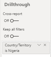
8. Click the arrow above the word “Visualizations” to show the Visualizations pane. At the bottom of this pane is the Drillthrough area. (Scroll down within the pane, if necessary.) Notice the Drillthrough area contains a special filter that states “Country/Territory is Nigeria.” This drillthrough filter is what enables us to see detail for the selected country.
9. Hold down CTRL and click the Back button.
10. Right-click the bar for Vietnam and select Drillthrough | Country Detail from the context menu.
11. The Country Detail page now contains information about Vietnam and the drillthrough filter has been changed to “Country/Territory is Vietnam.” Hold down CTRL and click the Back button.
12. Click the Drill Up icon for the 2010 Population by Country/Territory bar chart.
13. Right-click the bar for Asia. Notice there is no Drillthrough option in the context menu. That is due to the fact that we are no longer at the country level in the chart. The drillthrough filter for the Country Detail page only reacts at the country level.

14. Click the double-arrow icon to return the bar chart to the country level.
15. Click the World Population Map tab.
16. Right-click Russia on the map.

17. Because we are selecting a particular country, the Drillthrough option is available. Select Drilldown | Country Detail from the context menu.
18. Press CTRL and click the Back button.
19. In the Country Data for 2010 table, right-click Pakistan.

20. Again, because we are at a country level in the table, the Drillthrough option is available. Select Drillthrough | Country Detail from the context menu.
21. Press CTRL and click the Back button.
22. Click the CO2 KPI tab.
23. Right-click Oceania in the CO2 Actual vs Goal matrix. There is no Drillthrough option because we are not at a country level.
24. Select Drill Down from the context menu.
25. Right-click Australia in the CO2 Actual vs Goal matrix.
26. Now we are at the country level. Select Drillthrough | Country Detail.
27. Press CTRL and click the Back button.
28. Hide the Filters and Visualization panes.
Buttons
Buttons are used by the report author to create a richer user interface for our reports. Buttons can be used to navigate us to different pages within a report. They can also be used to change what we are seeing on a report page. Finally, they can be used to provide direct access to other features within Power BI.
Using a Button to Change Report Pages
We have already seen a button in action. The Back button allowed us to return from the Country Detail drillthrough page to whichever report page we were on when we activated drillthrough. Buttons can even be used to create a table of contents for a multipage report. I think you get the idea, so we won’t be clicking any more buttons just to switch report pages.
Using a Button to Change Report Layout
What we haven’t looked at yet is a button changing the report layout. Let’s give that a try:
1. Click the Yearly Data tab.
2. There are three rectangles below the Population by Year column chart. These are buttons. Hover over the CO2 button.

3. Again, notice the instruction to use CTRL when clicking this button. Press CTRL and click the CO2 button.

4. The Population by Year column chart is replaced by the CO2 Level by Year column chart. Press CTRL and click the GDP button.
5. Again, the chart changes, this time to GDP by Year. Press CTRL and click the Population button to change the page back to the way we found it.
Bookmarks
Bookmarks provide a way to save the setting of slicers, the drill down level within visualizations, and any selections in visualizations. This can be useful when we want to be able to return to a report page in a given state. Our report has some bookmarks saved for items on the GDP and CO2 Map page of the report. Let’s see how these can be put to use.
Telling a Data Story
One way we often use bookmarks is to tell a story. By saving a series of states of a report page to a set of bookmarks, we step through states quickly to make a point with the data. This works much better than to have to manually change a number of slicers or drill downs to reach a certain point in the data when we have an audience.
1. Click View in the menu bar to see the View ribbon.
2. Check the box next to Bookmarks Pane.
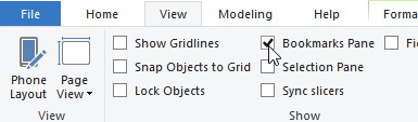
3. The Bookmarks pane appears. You may need to drag the Bookmarks pane wider so you can see the entire name of the bookmarks.

4. Click the “GDP & CO2 Map-Europe 1960-2010” entry. The entry will expand to show it is actually a grouping of several bookmarks. We can see they are for years 1960 to 2010.
5. Click the “GDP & CO2 Map-Europe 1960” entry. This will start us at the first bookmark in the grouping.
6. Click the View button.

7. Several things happen when you view the set of bookmarks. You are taken to the GDP and CO2 Map page of the report. Europe is selected in the continent slicer and 1960 is selected in the year slicer. The bottom of the report area shows a bookmark navigation control. Click the right arrow in the bookmark navigation control to move to the next bookmark.

8. Continue to click the right arrow to walk through the bookmarks for the years up to 2010.
9. Click the “X” in the bookmark navigation control to exit the bookmark viewer.
10. Click the “GDP & CO2 Map-Asia 1960-2010” grouping entry to expand it.
11. Click the “GDP & CO2 Map-Asia 1960” bookmark.
12. Click the View button.
13. Use the bookmark navigator to move through the bookmarks in this grouping.
14. Close the bookmark navigator when you are done.
![]()
15. Use the “X” in the upper-right corner of the Bookmarks pane to close that pane.
Additional Data Interactions
Power BI provides a few ways for us to get at the underlying data. We aren’t seeing the actual raw data behind the report. Instead, we are seeing representations of that data in various ways.
Q&A
The Q&A tool provides a way to ask questions of the data using natural language—sort of a Siri or Alexa for your Power BI data. “Sort of” because you have to type the question rather than speak it, and because it can still have its rough spots.
We will make use of another button in the report that was set up to give us direct access to the Q&A feature. To do so, follow these steps:
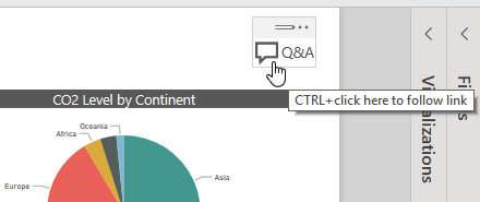
1. Click the Population, CO2, GDP Overview tab.
2. Press CTRL and click the Q&A button in the upper-right corner.
3. The Q&A dialog box appears. Several sample questions have been generated as possible starting points. Click in the “Ask a question about your data” area.
4. Type total GDP by continent for 2010 and press ENTER.

5. The Q&A feature creates a bar chart on the fly to answer our question. Click the “Ask a related question” button.
6. Type total GDP by continent for 1990 and press ENTER.
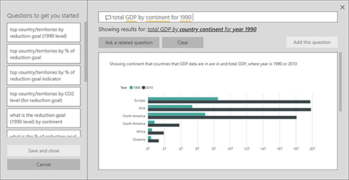
7. The Q&A feature created a second bar chart comparing the GDP for each continent in 1990 and 2010. Click the “X” in the upper-right corner to close the Q&A dialog box.
Show Data
The Show Data feature allows us to look at the data used to create a particular visualization. We see the data at the same level of granularity it is currently being shown at in the visualization. Follow these steps to use the Show Data feature:
1. Hover your mouse pointer over the 2010 Population by Country/Territory bar chart.
2. Click the Drill Up icon.
3. Click the More Options (…) icon in the upper-right corner of the 2010 Population by Country/Territory bar chart.
4. Select Show data from the popup menu.

5. The visualization along with the underlying data is displayed. Note that we see the population totals at the continent level because that’s the current drill down level of the visualization. Click the icon to show the visualization and data side by side rather than one atop the other.

6. Click the double-arrow icon.
7. The visualization and the data are now shown at the Country level.
8. Click Back to Report.
Export Data
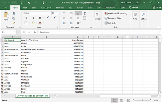
The Export Data feature works the same as the Show Data feature in that it exports the data used to create a particular visualization at the granularity level being shown in the visualization. The data is exported as comma-separated values, otherwise known as a CSV file. The CSV format is used because it can be easily opened in Excel. Follow these steps to use the Export Data feature:
1. Hover your mouse pointer over the 2010 Population by Country/Territory bar chart.
2. Click the More Options (…) icon.
3. Select Export Data from the popup menu.
4. The Save As dialog box appears. Select the folder where you would like to store the export file.
5. By default, the file is given the same name as the title of the visualization with “.csv” on the end. Click Save.
6. If you have Excel installed on your computer, navigate to the folder where you just saved the file and double-click the new CSV file.
7. The file will open in Excel. After viewing the data, close Excel.
A Cloudy Forecast
You now have a good idea of the ways you can interact with and explore a Power BI report. In Chapter 5, we look at ways to manage Power BI reports in PowerBI.com. We will be headed from working in a local Windows application to life in the cloud.