
![]()
Handling Missing Data
3.1. Introduction
In the previous chapters, you were introduced to many high-level concepts that we are going to study in this book. One of the concepts was missing values. You studied what missing values are, how missing values are introduced in the datasets, and how they affect statistical models. In this chapter, you will see how to basically handle missing values.
3.2. Complete Case Analysis
Complete case analysis (CCA), also known as list-wise deletion, is the most basic technique for handling missing data. In CCA, you simply move all the rows or records where any column or field contains a missing value. Only those records are processed where an actual value is present for all the columns in the dataset. CCA can be applied to handle both numerical and categorical missing values.
The following table contains fictional record of patients in a hospital.
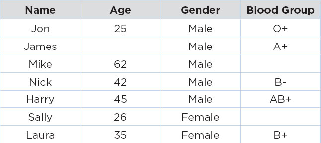
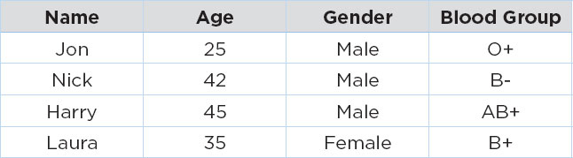
In the table above, the age of patient James is missing, while the blood groups for patients Mike and Sally are missing. If we use the CCA approach to handle these missing values, we will simply remove the records with missing values, and we will have the following dataset:
Advantages of CCA
The assumption behind the CCA is data is missing at random. CCA is extremely simple to apply, and no statistical technique is involved. Finally, the distribution of the variables is also preserved.
Disadvantages of CCA
The major disadvantage of CCA is that if a dataset contains a large number of missing values, a large subset of data will be removed by CCA. Also, if the values are not missing randomly, CCA can create a biased dataset. Finally, statistical models trained on a dataset on which CCA is applied are not capable of handling missing values in production.
As a rule of thumb, if you are sure that the values are missing totally at random and the percentage of records with missing values is less than 5 percent, you can use CAA to handle those missing values.
In the next sections, we will see how to handle missing numerical and categorical data.
3.3. Handling Missing Numerical Data
In the previous chapter, you studied different types of data that you are going to encounter in your data science career. One of the most commonly occurring data type is the numeric data, which consists of numbers. To handle missing numerical data, we can use statistical techniques. The use of statistical techniques or algorithms to replace missing values with statistically generated values is called imputation.
3.3.1. Mean or Median Imputation
Mean or median imputation is one of the most commonly used imputation techniques for handling missing numerical data. In mean or median imputation, missing values in a column are replaced by the mean or median of all the remaining values in that particular column.
For instance, if you have a column with the following data:

In the above Age column, the second value is missing. Therefore, with mean and median imputation, you can replace the second value with either the mean or median of all the other values in the column. For instance, the following column contains the mean of all the remaining values, i.e., 25 in the second row. You could also replace this value with the median if you want.

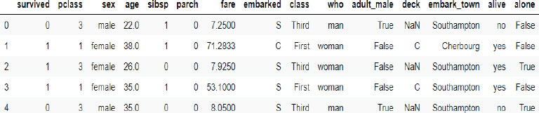
Let’s see a practical example of mean and median imputation. We will import the Titanic dataset and find the columns that contain missing values. Then, we will apply mean and median imputation to the columns containing missing values, and finally, we will see the effect of applying mean and median imputation to the missing values.
You do not need to download the Titanic dataset. If you import the Seaborn library, the Titanic data will be downloaded with it. The following script imports the Titanic dataset and displays its first five rows.
Script 1:
import matplotlib.pyplot as plt
import seaborn as sns
plt.rcParams[“figure.figsize”] = [8,6]
sns.set_style(“darkgrid”)
titanic_data = sns.load_dataset(‘titanic’)
titanic_data.head()
Output:
Let’s filter some of the numeric columns from the dataset, and see if they contain any missing values.
Script 2:
titanic_data = titanic_data[[“survived”, “pclass”, “age”, “fare”]]
titanic_data.head()
Output:

To find the missing values from the aforementioned columns, you need to first call the isnull() method on the titanic_ data dataframe, and then you need to call the mean() method as shown below:
Script 3:
titanic_data.isnull().mean()
Output:
survived 0.000000
pclass 0.000000
age 0.198653
fare 0.000000
dtype: float64
The output shows that only the age column contains missing values. And the ratio of missing values is around 19.86 percent.
Let’s now find out the median and mean values for all the non-missing values in the age column.
Script 4:
median = titanic_data.age.median()
print(median)
mean = titanic_data.age.mean()
print(mean)
Output:
28.0
29.69911764705882
The age column has a median value of 28 and a mean value of 29.6991.
To plot the kernel density plots for the actual age and median and mean age, we will add columns to the Pandas dataframe.
Script 5:
import numpy as np
titanic_data[‘Median_Age’] = titanic_data.age.fillna(median)
titanic_data[‘Mean_Age’] = titanic_data.age.fillna(mean)
titanic_data[‘Mean_Age’] = np.round(titanic_data[‘Mean_Age’], 1)
titanic_data.head(20)
The above script adds Median_Age and Mean_Age columns to the titanic_data dataframe and prints the first 20 records. Here is the output of the above script:
Output:

The highlighted rows in the above output show that NaN, i.e., null values in the age column, have been replaced by the median values in the Median_Age column and by mean values in the Mean_Age column.
The mean and median imputation can affect the data distribution for the columns containing the missing values.
Specifically, the variance of the column is decreased by mean and median imputation now since more values are added to the center of the distribution. The following script plots the distribution of data for the age, Median_Age, and Mean_Age columns.
Script 6:
plt.rcParams[«figure.figsize»] = [8,6]
fig = plt.figure()
ax = fig.add_subplot(111)
titanic_data[‘age’] .plot(kind=’kde’, ax=ax)
titanic_data[‘Median_Age’] .plot(kind=’kde’, ax=ax, color=’red’)
titanic_data[‘Mean_Age’] .plot(kind=’kde’, ax=ax, color=’green’)
lines, labels = ax.get_legend_handles_labels()
ax.legend(lines, labels, loc=’best’)
Here is the output of the script above:

You can clearly see that the default values in the age columns have been distorted by the mean and median imputation, and the overall variance of the dataset has also been decreased.
Recommendations
Mean and Median imputation could be used for missing numerical data in case the data is missing at random. If the data is normally distributed, mean imputation is better, or else median imputation is preferred in case of skewed distributions.
Advantages
Mean and median imputations are easy to implement and are a useful strategy to quickly obtain a large dataset. Furthermore, the mean and median imputations can be implemented during the production phase.
Disadvantages
As said earlier, the biggest disadvantage of mean and median imputation is that it affects the default data distribution and variance and covariance of the data.
3.3.2. End of Distribution Imputation
The mean and median imputation and the CCA are not good techniques for missing value imputations in case the data is not randomly missing. For randomly missing data, the most commonly used techniques are end of distribution/ end of tail imputation. In the end of tail imputation, a value is chosen from the tail end of the data. This value signifies that the actual data for the record was missing. Hence, data that is not randomly missing can be taken to account while training statistical models on the data.
In case the data is normally distributed, the end of distribution value can be calculated by multiplying the mean with three standard deviations. In the case of skewed data distributions, the Inter Quartile Rule can be used to find the tail values.
IQR = 75th Quantile – 25th Quantile
Upper IQR Limit = 75th Quantile + IQR x 1.5
Lower IQR Limit = 25th Quantile – IQR x 1.5
Let’s perform the end of tail imputation on the age column of the Titanic dataset.
The following script imports the Titanic dataset, filters the numeric columns and then finds the percentage of missing values in each column.
Script 7:
import matplotlib.pyplot as plt
import seaborn as sns
plt.rcParams[“figure.figsize”] = [8,6]
sns.set_style(“darkgrid”)
titanic_data = sns.load_dataset(‘titanic’)
titanic_data = titanic_data[[“survived”, “pclass”, “age”, “fare”]]
titanic_data.isnull().mean()
Output:
survived 0.000000
pclass 0.000000
age 0.198653
fare 0.000000
dtype: float64
The above output shows that only the age column has missing values, which are around 20 percent of the whole dataset.
The next step is plotting the data distribution for the age column. A histogram can reveal the data distribution of a column.
Script 8:
titanic_data.age.hist(bins=50)
Output:
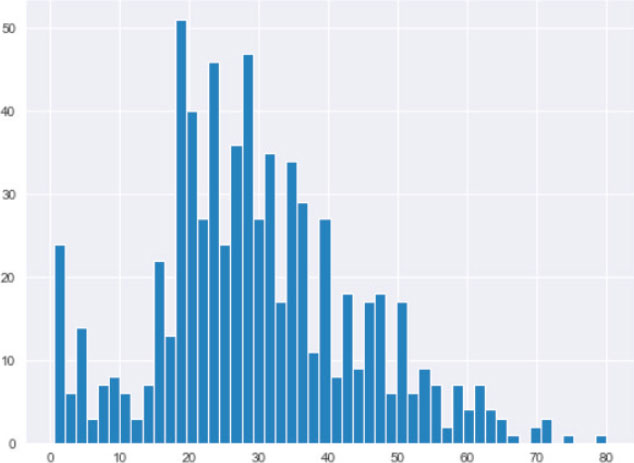
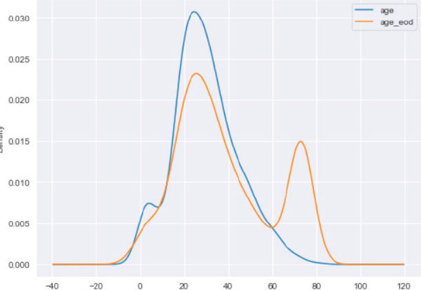
The output shows that the age column has an almost normal distribution. Hence, the end of the distribution value can be calculated by multiplying the mean value of the age column by three standard deviations.
The above output again shows that,
Script 9:
eod_value = titanic_data.age.mean() + 3 * titanic_data.age. std()
print(eod_value)
Output:
73.278
Finally, the missing values in the age column can be replaced by the end of tail value calculated in script 9.
Script 10:
import numpy as np
titanic_data[‘age_eod’] = titanic_data.age.fillna(eod_value)
titanic_data.head(20)
Output:

The above output shows that the end of distribution value, i.e., ~73, has replaced the NaN values in the age column.
Finally, you can plot the kernel density estimation plot for the original age column and the age column with the end of distribution imputation.
Script 11:
plt.rcParams[«figure.figsize»] = [8,6]
fig = plt.figure()
ax = fig.add_subplot(111)
titanic_data[‘age’] .plot(kind=’kde’, ax=ax)
titanic_data[‘age_eod’] .plot(kind=’kde’, ax=ax)
lines, labels = ax.get_legend_handles_labels()
ax.legend(lines, labels, loc=’best’)
Output:
Advantages and Disadvantages
One of the main advantages of the end of distribution imputation is that it can be applied to the dataset where values are not missing at random. The other advantages of end of distribution imputation include its simplicity to understand, ability to create big datasets in a short time, and applicability in the production environment.
The disadvantages include the distortion of data distribution, variance, and covariance.
3.3.3. Arbitrary Value Imputation
In the end of distribution imputation, the values that replace the missing values are calculated from data, while in arbitrary value imputation, the values used to replace missing values are selected arbitrarily.
The arbitrary values are selected in a way that they do not belong to the dataset; rather, they signify the missing values. A good value to select is 99, 999, or any number containing 9s. In case the dataset contains only positive value, a –1 can be chosen as an arbitrary number.
Let’s apply the arbitrary value imputation to the age column of the Titanic dataset.
The following script imports the Titanic dataset, filters some of the numeric columns, and displays the percentage of missing values in those columns.
Script 12:
import matplotlib.pyplot as plt
import seaborn as sns
plt.rcParams[“figure.figsize”] = [8,6]
sns.set_style(“darkgrid”)
titanic_data = sns.load_dataset(‘titanic’)
titanic_data = titanic_data[[“survived”, “pclass”, “age”, “fare”]]
titanic_data.isnull().mean()
Output:
survived 0.000000
pclass 0.000000
age 0.198653
fare 0.000000
dtype: float64
The output shows that only the age column contains some missing values. Next, we plot the histogram for the age column to see data distribution.
Script 13:
titanic_data.age.hist()
Output:

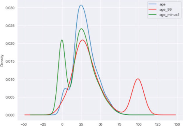
The output shows that the maximum positive value is around 80. Therefore, 99 can be a very good arbitrary value. Furthermore, since the age column only contains positive values, –1 can be another very useful arbitrary value. Let’s replace the missing values in the age column first by 99, and then by –1.
Script 14:
import numpy as np
titanic_data[‘age_99’] = titanic_data.age.fillna(99)
titanic_data[‘age_minus1’] = titanic_data.age.fillna(-1)
titanic_data.head(20)
Output:

The final step is to plot the kernel density plots for the original age column and for the age columns where the missing values are replaced by 99 and –1. The following script does that:
Script 15:
plt.rcParams[«figure.figsize»] = [8,6]
fig = plt.figure()
ax = fig.add_subplot(111)
titanic_data[‘age’] .plot(kind=’kde’, ax=ax)
titanic_data[‘age_99’] .plot(kind=’kde’, ax=ax, color=’red’)
titanic_data[‘age_minus1’] .plot(kind=’kde’, ax=ax, color=’green’)
lines, labels = ax.get_legend_handles_labels()
ax.legend(lines, labels, loc=’best’)
Output:
The advantages and disadvantages of arbitrary value imputation are similar to the end of distribution imputation.
It is important to mention that arbitrary value imputation can be used for categorical data as well. In the case of categorical data, you can simply add a value of missing in the columns where categorical value is missing.
In this section, we studied the three approaches for handling missing numerical data. In the next section, you will see how to handle missing categorical data.
3.4. Handling Missing Categorical Data
3.4.1. Frequent Category Imputation
One of the most common ways of handling missing values in a categorical column is to replace the missing values with the most frequently occurring values, i.e., the mode of the column. It is for this reason frequent category imputation is also known as mode imputation. Let’s see a real-world example of the frequent category imputation.
We will again use the Titanic dataset. We will first try to find the percentage of missing values in the age, fare, and embarked_ town columns.
Script 16:
import matplotlib.pyplot as plt
import seaborn as sns
plt.rcParams[«figure.figsize»] = [8,6]
sns.set_style(«darkgrid»)
titanic_data = sns.load_dataset(‘titanic’)
titanic_data = titanic_data[[«embark_town», «age», «fare»]]
titanic_data.head()
titanic_data.isnull().mean()
Output:
embark_town 0.002245
age 0.198653
fare 0.000000
dtype: float64
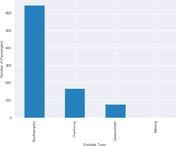
The output shows that embark_town and age columns have missing values. The ratio of missing values for the embark_ town column is very less. Let’s plot the bar plot that shows each category in the embark_town column against the number of passengers.
Script 17:
titanic_data.embark_town.value_counts().sort_values(ascending=False).plot.bar()
plt.xlabel(‘Embark Town’)
plt.ylabel(‘Number of Passengers’)
The output clearly shows that most of the passengers embarked from Southampton.
Output:

Let’s make sure if Southampton is actually the mode value for the embark_town column.
Script 18:
titanic_data.embark_town.mode()
Output:
0 Southampton
dtype: object
Next, we can simply replace the missing values in the embark town column by Southampton.
Script 19:
titanic_data.embark_town.fillna(‘Southampton’, inplace=True)
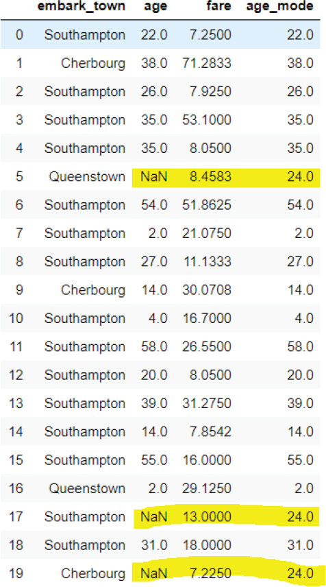
Let’s now find the mode of the age column and use it to replace the missing values in the age column.
Script 20:
titanic_data.age.mode()
Output:
24.0
The output shows that the mode of the age column is 24. Therefore, we can use this value to replace the missing values in the age column.
Script 21:
import numpy as np
titanic_data[‘age_mode’] = titanic_data.age.fillna(24)
titanic_data.head(20)
Output:
Finally, let’s plot the kernel density estimation plot for the original age column and the age column that contains the mode of the values in place of the missing values.
Script 22:
plt.rcParams[«figure.figsize»] = [8,6]
fig = plt.figure()
ax = fig.add_subplot(111)
titanic_data[‘age’] .plot(kind=’kde’, ax=ax)
titanic_data[‘age_mode’] .plot(kind=’kde’, ax=ax, color=’red’)
lines, labels = ax.get_legend_handles_labels()
ax.legend(lines, labels, loc=’best’)
Output:

Advantages and Disadvantages
The frequent category imputation is easier to implement on large datasets. Frequent category distribution doesn’t make any assumption on the data and can be used in a production environment.
The downside of frequent category imputation is that it can overrepresent the most frequently occurring category in case there are too many missing values in the original dataset. In the case of very small values in the original dataset, the frequent category imputation can result in a new label containing rare values.
3.4.2. Missing Category Imputation
Missing category imputation is similar to arbitrary value imputation. In the case of categorical value, missing value imputation adds an arbitrary category, e.g., missing in place of the missing values. Take a look at an example of missing value imputation. Let’s load the Titanic dataset and see if any categorical column contains missing values.
Script 23:
import matplotlib.pyplot as plt
import seaborn as sns
plt.rcParams[«figure.figsize»] = [8,6]
sns.set_style(«darkgrid»)
titanic_data = sns.load_dataset(‘titanic’)
titanic_data = titanic_data[[«embark_town», «age», «fare»]]
titanic_data.head()
titanic_data.isnull().mean()
Output:
embark_town 0.002245
age 0.198653
fare 0.000000
dtype: float64
The output shows that the embark_town column is a categorical column that contains some missing values too. We will apply missing value imputation to this column.
Script 24:
titanic_data.embark_town.fillna(‘Missing’, inplace=True)
After applying missing value imputation, plot the bar plot for the embark_town column. You can see that we have a very small, almost negligible plot for the missing column.
Script 25:
titanic_data.embark_town.value_counts().sort_values(ascending=False).plot.bar()
plt.xlabel(‘Embark Town’)
plt.ylabel(‘Number of Passengers’)
Output:
| Hands-on Time – Exercise |
| Now, it is your turn. Follow the instruction in the exercise below to check your understanding of the advanced data visualization with Matplotlib. The answers to these questions are given at the end of the book. |
Exercise 3.1
Question 1:
What is the major disadvantage of mean and median imputation?
A.Distorts the data distribution
B.Distorts the data variance
C.Distorts the data covariance
D.All of the Above
Question 2:
Which imputation should be used when the data is not missing at random?
A.Mean and Median Imputation
B.Arbitrary Value Imputation
C.End of Distribution Imputation
D.Missing Value Imputation
Question 3:
How should the end of tail distribution be calculated for normal distribution?
A.IQR Rule
B.Mean x 3 Standard deviations
C.Mean
D.Median
Exercise 3.2
Replace the missing values in the deck column of the Titanic dataset by the most frequently occurring categories in that column. Plot a bar plot for the updated deck column.