7
Classification

An important application of machine learning involves looking at a set of inputs, comparing each one to a list of possible classes (or categories), and assigning each input to its most probable class. This process is called classification or categorization, and we say that it’s carried out by a classifier. We can use classes for tasks as diverse as identifying the words someone has spoken into their cell phone, what animals are visible in a photograph, or whether a piece of fruit is ripe or not.
In this chapter, we look at the basic ideas behind classification. We don’t consider specific classification algorithms here because we will get into those in Chapter 11. Our goal now is just to become familiar with the principles. We also look at clustering, which is a way to automatically group together samples that don’t have labels. We wrap up by looking at how spaces of four and more dimensions can often foil our intuition, leading to potential problems when we’re training a deep learning system. Things can work in unexpected and surprising ways in spaces of more than three dimensions.
Two-Dimensional Binary Classification
Classification is a big topic. Let’s start with a high-level overview of the process and then dig into some specifics.
A popular way to train a classifier uses supervised learning. We begin by gathering a collection of samples, or pieces of data, that we want to classify. We call this the training set. We also prepare a list of classes, or categories, such as what animals might be in a photo, or what genre of music should be assigned to an audio sample. Finally, we manually consider each example in the training set, and determine which class it should be assigned to. This is called that sample’s label.
Then we provide the computer with each sample, one at a time, but we don’t give it the label. The computer processes the sample and comes up with its own prediction of what class it should be assigned to. Now we compare the computer’s prediction with our label. If the classifier’s prediction doesn’t match our label, we modify the classifier a little so that it’s more likely to predict the correct class if it sees this sample again. We call this training, and say that the system is learning. We do this over and over, often with thousands or even millions of samples, recycled over and over. Our goal is to gradually improve the algorithm until its predictions match our labels so often that we feel it’s ready to be released to the world, where we expect it will be able to correctly classify new samples it’s never seen before. At that point we test it with new data to see how well it really works, and if it’s ready to be used for real.
Let’s look at this process a little more closely.
To get started, let’s assume that our input data belongs to only two different classes. Using only two classes simplifies our discussion of classification, without missing any key points. Because there are only two possible labels (or classes) for every input, we call this binary classification.
Another way to make things easy is to use two-dimensional (2D) data, so every input sample is represented by exactly two numbers. This is just complicated enough to be interesting, but still easy to draw, because we can show each sample as a point on the plane. In practical terms, it means that we have a bunch of points, or dots, on the page. We can use color and shape coding to show each sample’s label and the computer’s prediction. Our goal is to develop an algorithm that can predict every label accurately. When it does, we can turn the algorithm loose on new data that doesn’t have labels and rely on it to tell us which inputs belong to which class.
We call this a 2D binary classification system, where “2D” refers to the two dimensions of the point data, and “binary” refers to the two classes.
The first set of techniques that we’re going to look at are collectively called boundary methods. The idea behind these methods is that we can look at the input samples drawn on the plane and find a line or curve that divides up the space so that all the samples with one label are on one side of the curve (or boundary), and all those with the other label are on the other side. We’ll see that some boundaries are better than others when it comes to predicting future data.
Let’s make things concrete using chicken eggs. Suppose that we’re farmers with a lot of egg-laying hens. Each of these eggs might be fertilized and growing a new chick, or unfertilized. Let’s suppose that if we carefully measure some characteristics of each egg (say, its weight and length), we can tell if it’s fertilized or not. (This is completely imaginary, because eggs don’t work that way! But let’s pretend they do.) We bundle the two features of weight and length together to make a sample. Then we hand the sample to the classifier, which assigns it either the class “fertilized” or “unfertilized.”
Because each egg that we use for training needs a label, or a known correct answer, we use a technique called candling to decide if an egg is fertilized or not (Nebraska 2017). Someone skilled at candling is called a candler. Candling involves holding up the egg in front of a bright light source. Originally candlers used a candle, but now they use any strong light source. By interpreting the fuzzy dark shadows cast by the egg’s contents onto the eggshell, a skilled candler can tell if that egg is fertilized or not. Our goal is to get the classifier to give us the same results as the labels determined by a skilled candler.
To summarize, we want our classifier (the computer) to consider each sample (an egg) and use its features (weight and length) to make a prediction (fertilized or unfertilized). Let’s start with a bunch of training data that gives the weight and length of some eggs. We can plot this data on a grid with weight on one axis and length on the other. Figure 7-1 shows our starting data. Fertilized eggs are shown with a red circle and unfertilized eggs with a blue box. With this data, we can draw a straight line between the two groups of eggs. Everything on one side of the line is fertilized, and everything on the other is unfertilized.
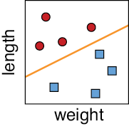
Figure 7-1: Classifying eggs. The red circles are fertilized. The blue squares are unfertilized. Each egg is plotted as a point given by its two dimensions of weight and length. The orange line separates the two clusters.
We’re done with our classifier! When we get new eggs (without known labels), we can just look to see which side of the line they lie on when plotted. The eggs that are on the fertilized side get assigned the class “fertilized,” and those on the unfertilized side are assigned the class “unfertilized.” Figure 7-2 shows the idea.

Figure 7-2: Classifying eggs. Left: The boundary. Second from left: Showing the two regions, or domains, made by the boundary. Third from left: Four new samples to be classified. Far right: The classes assigned to the new samples.
Let’s say that this works out great for a few seasons, and then we buy a whole lot of chickens of a new breed. Just in case their eggs are different than the ones we’ve had before, we candle a day’s worth of new eggs from both breeds manually to determine if they’re fertilized or not, and then we plot the results as before. Figure 7-3 shows our new data.

Figure 7-3: When we add some new types of chickens to our flock, determining which eggs are fertilized based just on the weight and length may get trickier.
The two groups are still distinct, which is great, but now they’re separated by a squiggly curve rather than a straight line. That’s no problem, because we can use the curve just like the straight line from before. When we have additional eggs to classify, each egg gets placed on this diagram. If it’s in the red zone it’s predicted to be fertilized, and if it’s in the blue zone it’s predicted to be unfertilized. When we can split things up this nicely, we call the sections into which we chop up the plane decision regions, or domains, and the lines or curves between them decision boundaries.
Let’s suppose that word gets out and people love the eggs from our farm, so the next year we buy yet another group of chickens of a third variety. As before, we manually candle a bunch of eggs and plot the data, this time getting the diagram shown in Figure 7-4.
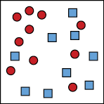
Figure 7-4: Our new purchase of chickens has made it much harder to distinguish the fertilized eggs from the unfertilized eggs.
We still have a mostly red region and a mostly blue region, but we don’t have a clear way to draw a line or curve to separate them. Let’s take a more general approach and, rather than predict a single class with absolute certainty, let’s assign each possible class its own probability.
Figure 7-5 uses color to represent the probability that a point in our grid has a particular class. For each point, if it’s bright red, then we’re very sure that egg is fertilized, while diminishing intensities of red correspond to diminishing probabilities of fertility. The same interpretation holds for the unfertilized eggs, shown in blue.

Figure 7-5: Given the overlapping results shown at the far left, we can give every point a probability of being fertilized, as shown in the center where brighter red means the egg is more likely to be fertilized. The image at the far right shows a probability for the egg being unfertilized.
An egg that lands solidly in the dark-red region is probably fertilized, and an egg in the dark-blue region is probably unfertilized. In other places, the right class isn’t so clear. How we proceed depends on our farm’s policy. We can use our ideas of accuracy, precision, and recall from Chapter 3 to shape that policy and tell us what kind of curve to draw to separate the classes. For example, let’s say that “fertilized” corresponds to “positive.” If we want to be very sure we catch all the fertilized eggs and don’t mind some false positives, we might draw a boundary as in the center of Figure 7-6.
On the other hand, if we want to find all the unfertilized eggs, and don’t mind false negatives, we might draw the boundary as in the right of Figure 7-6.

Figure 7-6: Given the results at the far left, we may choose a policy shown in the center, which accepts some false positives (unfertilized eggs classified as fertilized). Or we may prefer to correctly classify all unfertilized eggs, with the policy shown at the right.
When the decision regions have sharp boundaries and don’t overlap, as in the center and right images in Figure 7-6, the probabilities for each sample are easy: the class where the sample falls is a certainty with probability 1, and the other classes have probability 0. But in the more frequent case, when the regions are fuzzy or overlap, as in Figure 7-5, both classes might have nonzero probabilities.
In practice, eventually we always have to convert probabilities into a decision: is this egg fertilized or not? Our final decision is influenced by the computer’s prediction, but ultimately, we also need to account for human factors and what the decision means for us.
2D Multiclass Classification
Our eggs are selling great, but there’s a problem. We’ve only been distinguishing between fertilized and unfertilized eggs. As we learn more about eggs, we discover that there are two different ways an egg ends up as unfertilized. An egg that is unfertilized because it was never fertilized is called a yolker. These are good for eating. Fertilized eggs we can sell to other farmers are called winners. But in some fertilized eggs the developing embryo stopped growing for some reason and died. Such an egg is called a quitter (Arcuri 2016). We don’t want to sell quitters, because they can burst unexpectedly and spread harmful bacteria. We want to identify the quitters and dispose of them.
Now we have three classes of egg: winners (viable fertilized eggs), yolkers (safe unfertilized eggs), and quitters (unsafe fertilized eggs). As before, let’s pretend that we can tell these three kinds of eggs apart just on the basis of their weight and length. Figure 7-7 shows a set of measured eggs, along with the classes we manually assigned to them by candling the eggs.
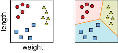
Figure 7-7: Left: Three classes of eggs. The red circles are fertilized. The blue squares are unfertilized but edible yolkers. The yellow triangles are quitters that we want to remove from our incubators. Right: Possible boundaries and regions for each class.
The job of assigning one of these three classes to new inputs is called multiclass classification. When we have multiple classes, we again find the boundaries between the regions associated with different classes. When a trained multiclass classifier has been released to the world and receives a new sample, it determines which region the sample falls into, and then assigns that sample the class corresponding to that region.
In our example, we might add in more features (or dimensions) to each sample, such as egg color, average circumference, and the time of day the egg was laid. This would give us a total of five numbers per egg. Five dimensions is a weird place to think about, and we definitely can’t draw a useful picture of it. But we can reason by analogy to the situation we can picture. In 2D, our data points tended to clump together in their locations, allowing us to draw boundary lines (and curves) between them. In higher dimensions, the same thing is true for the most part (we discuss this idea more near the end of the chapter). Just as we broke up our 2D square into several smaller 2D shapes, each one for a different class, we can break up our 5D space into multiple, smaller 5D shapes. These 5D regions also each define a different class.
The math doesn’t care how many dimensions we have, and the algorithms we build upon the math don’t care, either. That’s not to say that we, as people, don’t care, because typically, as the number of dimensions goes up, the running time and memory consumption of our algorithms goes up as well. We’ll come back to some more issues involved in working with high-dimensional data at the end of the chapter.
Multiclass Classification
Binary classifiers are generally simpler and faster than multiclass classifiers. But in the real world, most data have multiple classes. Happily, instead of building a complicated multiclass classifier, we can build a whole bunch of binary classifiers and combine their results to produce a multiclass answer. Let’s look at two popular methods for this technique.
One-Versus-Rest
Our first technique goes by several names: one-versus-rest (OvR), one-versus-all (OvA), one-against-all (OAA), or the binary relevance method. Let’s suppose that we have five classes for our data, named with the letters A through E. Instead of building one complicated classifier that assigns one of these five labels, let’s instead build five simpler, binary classifiers and name them A through E for the class each one focuses on. Classifier A tells us whether a given piece of data does or does not belong to class A. Because it’s a binary classifier, it has one decision boundary that splits the space into two regions: class A and everything else. We can now see where the name “one-versus-rest” comes from. In this classifier, class A is the one, and classes B through E are the rest.
Our second classifier, named Classifier B, is another binary classifier. This time it tells us whether a sample is, or is not, in class B. In the same way, Classifier C tells us whether a sample is or is not in class C, and Classifiers D and E do the same thing for classes D and E. Figure 7-8 summarizes the idea. Here we used an algorithm that takes into account all of the data when it builds the boundary for each classifier.

Figure 7-8: One-versus-rest classification. Top row: Samples from five different classes. Bottom row: The decision regions for five different binary classifiers. The colors from purple to pink show increasing probability that a point belongs to that class.
Note that some locations in the 2D space can belong to more than one class. For example, points in the upper-right corner have nonzero probabilities from classes A, B, and D.
To classify an example, we run it through each of our five binary classifiers in turn, getting back the probability that the point belongs to each class. We then find the class with the largest probability, and that’s the class the point is assigned to. Figure 7-9 shows this in action.
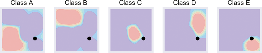
Figure 7-9: Classifying a sample using one-versus-rest. The new sample is the black dot.
In Figure 7-9, the first four classifiers all return low probabilities. The classifier for class E assigns the point a larger probability than the others, so the point is predicted to be from class E.
The appeals of this approach are its conceptual simplicity and its speed. The downside is that we have to teach (that is, learn boundaries for) five classifiers instead of just one, and we have to then classify every input sample five times to find which class it belongs to. When we have large numbers of classes with complex boundaries, the time required to run the sample through lots of binary classifiers can add up. On the other hand, we can run all five classifiers in parallel, so if we have the right equipment, we can get our answers in the same amount of time it takes for any one of them. For any application, we need to balance the tradeoffs depending on our time, budget, and hardware constraints.
One-Versus-One
Our second approach that uses binary classifiers for multiple classes is called one-versus-one (OvO), and it uses even more binary classifiers than OvR. The general idea is to look at every pair of classes in our data and build a classifier for just those two classes. Because the number of possible pairings goes up quickly as the number of classes increases, the number of classifiers in this method also grows quickly with the number of classes. To keep things manageable, let’s work with only four classes this time, as shown in Figure 7-10.

Figure 7-10: Left: Four classes of points for demonstrating OvO classification. Right: Names for the clusters.
We start with a binary classifier that is trained with data that is only from classes A and B. For the purposes of training this classifier, we simply leave out all the samples that are not labeled A or B, as if they don’t even exist. This classifier finds a boundary that separates the classes A and B. Now every time we feed a new sample to this classifier, it tells us whether it belongs to class A or B. Since these are the only two options available to this classifier, it classifies every point in our dataset as either A or B, even when it’s neither one. We’ll soon see why this is okay.
Next, we make a classifier trained with only data from classes A and C and another for classes A and D. The top row of Figure 7-11 shows this graphically. Now we keep going for all the other pairings, building binary classifiers that are trained with data only from classes B and C, and B and D, as in the second row of Figure 7-11. Finally, we get to the last pairing of classes C and D, in the bottom row of Figure 7-11. The result is that we have six binary classifiers, each of which tells us which of two specific classes the data most belongs to.
To classify a new example, we run it through all six classifiers, and then we select the label that comes up the most often. In other words, each classifier votes for one of two classes, and we declare the winner to be the class with the most votes. Figure 7-12 shows one-versus-one in action.

Figure 7-11: Building the six binary classifiers we use for performing OvO classification on four classes. Top row: Left to right, binary classifiers for classes A and B, A and C, and A and D. Second row: Left to right, binary classifiers for classes B and C, and B and D. Bottom row: A binary classifier for classes C and D.
In this example, class A got three votes, B got one, C got two, and D got none. The winner is A, so that’s the predicted class for this sample.
One-versus-one usually requires far more classifiers than one-versus-rest, but it’s sometimes appealing because it provides a clearer understanding of how the sample was evaluated with respect to each possible pair of classes. This can make a system more transparent, or explainable, when we want to know how it came up with its final answer. When there’s a lot of messy overlap between multiple classes, it can be easier for us humans to understand the final results using one-versus-one.
The cost of this clarity is significant. The number of classifiers that we need for one-versus-one grows very fast as the number of classes increases. We’ve seen that with 4 classes we’d need 6 classifiers. Beyond that, Figure 7-13 shows just how quickly the number of binary classifiers we need grows with the number of classes. With 5 classes we’d need 10, with 20 classes we’d need 190, and to handle 30 classes we’d need 435 classifiers! Past about 46 classes we need more than 1,000.

Figure 7-12: OvO in action, classifying a new sample shown as a black dot. Top row: Left to right, votes are A, A, and A. Second row: Left to right, votes are C and B. Bottom row: Vote is class C.
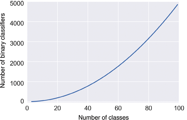
Figure 7-13: As we increase the number of classes, the number of binary classifiers we need for OvO grows very quickly.
Each of these binary classifiers has to be trained, and then we need to run every new sample through every classifier, which is going to consume a lot of computer memory and time. At some point, it becomes more efficient to use a single, complex, multiclass classifier.
Clustering
We’ve seen that one way to classify new samples is to break up the space into different regions and then test a point against each region. A different way to approach the problem is to group the training set data itself into clusters, or similar chunks. Let’s suppose that our data has associated labels. How can we use those to make clusters?
In the left image of Figure 7-14 we have data with five different labels, shown by color. For these nicely separated groups, we can make clusters just by drawing a curve around each set of points, as in the middle image. If we extend those curves outward until they hit one another so that each point in the grid is colored by the cluster that it’s closest to, we can cover the entire plane as in the right image.
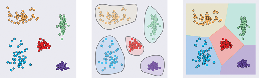
Figure 7-14: Growing clusters. Left: Starting data with five classes. Middle: Identifying the five groups. Right: Growing the groups outward so that every point has been assigned to one class.
This scheme required that our input data had labels. What if we don’t have labels? If we can somehow automatically group our unlabeled data into clusters, we can still apply the technique we just described.
Recall that problems that involve data without labels fall into the type of learning we call unsupervised learning.
When we use an algorithm to automatically derive clusters from unlabeled data, we have to tell it how many clusters we want it to find. This “number of clusters” value is often represented with the letter k (this is an arbitrary letter and doesn’t stand for anything in particular). We say that k is a hyperparameter, or a value that we choose before training our system. Our chosen value of k tells the algorithm how many regions to build (that is, how many classes to break up our data into). Because the algorithm uses the geometric means, or averages, of groups of points to develop the clusters, the algorithm is called k-means clustering.
The freedom to choose the value of k is a blessing and a curse. The upside of having this choice is that if we know in advance how many clusters there ought to be, we can say so, and the algorithm produces what we want. Keep in mind that the computer doesn’t know where we think the cluster boundaries ought to go, so although it chops things up into k pieces, they may not be the pieces we’re expecting. But if our data is well separated, so samples are clumped together with big spaces between the clumps, we usually get what we expect. The more the cluster boundaries get fuzzy, or overlap, the more things can potentially surprise us.
The downside of specifying k upfront is that we may not have any idea of how many clusters best describe our data. If we pick too few clusters, then we don’t separate our data into the most useful distinct classes. But if we pick too many clusters, then we end up with similar pieces of data going into different classes.
To see this in action, consider the data in Figure 7-15. There are 200 unlabeled points, deliberately bunched up into five groups.
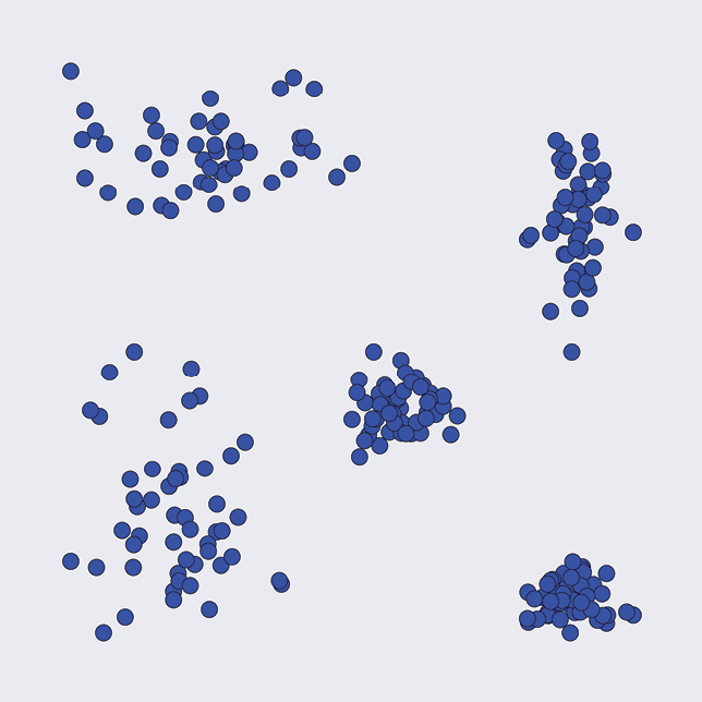
Figure 7-15: A set of 200 unlabeled points. They seem to visually fall into five groups.
Figure 7-16 shows how k-means clustering splits up this set of points for different values of k. Remember, we give the algorithm the value of k as an argument before it begins working.

Figure 7-16: The result of automatically clustering our data in Figure 7-15 for values of k from 2 to 7
It’s no surprise that k = 5 is doing the best job on this data, but we’re using a cooked example in which the boundaries are easy to see. With more complicated data, particularly if it has more than two or three dimensions, it can be all but impossible for us to easily identify the most useful number of clusters beforehand.
All is not lost, though. A popular option is to train our clustering model several times, each time using a different value for k. By measuring the quality of the results, this hyperparameter tuning lets us automatically search for a good value of k, evaluating the predictions of each choice and reporting the value of k that performed the best. The downside, of course, is that this takes computational resources and time. This is why it’s so useful to preview our data with some kind of visualization tool prior to clustering. If we can pick the best value of k right away, or even come up with a range of likely values, it can save us the time and effort of evaluating values of k that won’t do a good job.
The Curse of Dimensionality
We’ve been using examples of data with two features, because two dimensions are easy to draw on the page. But in practice, our data can have any number of features or dimensions. It might seem that the more features we have, the better our classifiers will be. It makes sense that the more features the classifiers have to work with, the better they should be able to find the boundaries (or clusters) in the data.
That’s true to a point. Past that point, adding more features to our data actually makes things worse. In our egg-classifying example, we could add in more features to each sample, like the temperature at the time the egg was laid, the age of the hen, the number of other eggs in the nest at the time, the humidity, and so on. But, as we’ll see, adding more features often makes it harder, not easier, for the system to accurately classify the inputs.
This counterintuitive idea shows up so frequently that it has earned a special name: the curse of dimensionality (Bellman 1957). This phrase has come to mean different things in different fields. We’re using it in the sense that applies to machine learning (Hughes 1968). Let’s see how this curse comes about, and what it tells us about training.
Dimensionality and Density
One way to picture the curse of dimensionality is to think about how a classifier goes about finding a boundary curve or surface. If there are only a few points, then the classifier can invent a huge number of curves or surfaces that all divide the data. In order to pick the boundary that will do the best job on future data, we’d want more training samples. Then the classifier can choose the boundary that best separates that denser collection. Figure 7-17 shows the idea visually.
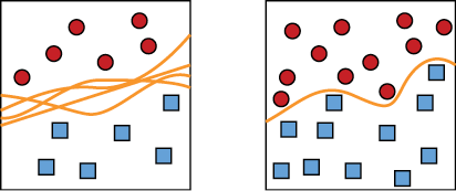
Figure 7-17: To find the best boundary curve, we need a good density of samples. Left: We have very few samples, so we can construct lots of different boundary curves. Right: With a higher density of samples, we can find a good boundary curve.
As Figure 7-17 shows, finding a good curve requires a dense collection of points. But here’s the key insight: as we add dimensions (or features) to our samples, the number of samples we need in order to maintain a reasonable density in the sample space explodes. If we can’t keep up with the demand, a classifier does its best, but it doesn’t have enough information to draw a good boundary. It is stuck in the situation of the left diagram in Figure 7-17, where it’s just guessing at the best boundary, which may lead to poor results on future data.
Let’s look at the problem of loss of density using our egg example. To keep things simple, let’s use a convention that all the features we may measure for our eggs (their volume, length, etc.) lie in the range 0 to 1. Let’s start with a dataset that contains 10 samples, each with one feature (the egg’s weight). Since we have one dimension describing each egg, we can plot it on a one-dimensional line segment from 0 to 1. Because we want to see how well our samples cover every part of this line, let’s break it up into pieces, or bins, and see how many samples fall into each bin. The bins are just conceptual devices to help us estimate density. Figure 7-18 shows how one set of data might fall on an interval [0,1] with 5 bins.

Figure 7-18: Our 10 pieces of data have one dimension each.
There’s nothing special about the choices of 10 samples and 5 bins. We just chose them because it makes the pictures easy to draw. The core of our discussion is unchanged if we pick 300 eggs or 1,700 bins.
The density of our space is the number of samples divided by the number of bins. It gives us a rough way to measure how well our data is filling up the space of possible values. In other words, do we have examples to learn from for most values of the input? We can see problems start to creep in if we have too many empty bins. In this case, the density is 10 / 5 = 2, telling us each bin (on average) has 2 samples. Looking at Figure 7-18, we see that this is a pretty good estimate for the average number of samples per bin. In one dimension, for this data, a density of 2 lets us find a good boundary.
Let’s now include the weight in each egg’s description. Because we now have two dimensions, we can pull our line segment of Figure 7-18 upward to make a 2D square, as in Figure 7-19.

Figure 7-19: Our 10 samples are now each described by two measurements, or dimensions.
Breaking up each of the sides into 5 segments, as before, we have 25 bins inside the square. But we still have only 10 samples. That means most of the regions won’t have any data. The density now is 10 / (5 × 5) = 10 / 25 = 0.4, a big drop from the density of 2 we had in one dimension. As a result, we can draw lots of different boundary curves to split the data of Figure 7-19.
Now let’s add a third dimension, such as the temperature at the time the egg was laid (scaled to a value from 0 to 1). To represent this third dimension, we push our square back into the page to form a 3D cube, as in Figure 7-20.
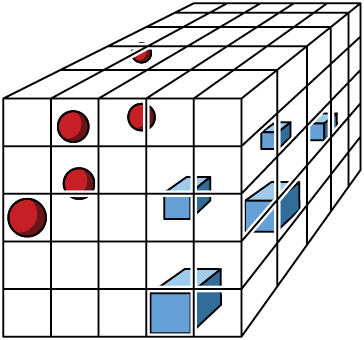
Figure 7-20: Now our 10 pieces of data are represented by three measurements, so we draw them in a 3D space.
By splitting each axis into 5 pieces, we now have 125 little cubes, but we still have only 10 samples. Our density has dropped to 10 / (5 × 5 × 5) = 10 / 125 = 0.08. In other words, the average cell contains 0.08 samples. We’ve gone from a density of 2, to 0.4, to 0.08. No matter where the data is located in 3D, the vast majority of the space is empty.
Any classifier that splits this 3D data into two pieces with a boundary surface is going to have to make a big guess. The issue isn’t that it’s hard to separate the data, but rather that it’s too easy. It’s not clear how to best separate the data so that our system will generalize, that is, correctly classify points we get in the future. The classifier is going to have to classify lots of empty boxes as belonging to either one class or the other, and it just doesn’t have enough information to do that in a principled way.
In other words, who knows where new samples are going to end up once our system is deployed? At this point, nobody. Figure 7-21 shows one guess at a boundary surface, but as we saw in Figure 7-17, we can fit all kinds of planes and curvy sheets through the big open spaces between the two sets of samples. Most of them are probably not going to generalize very well. Maybe this one is too close to the red balls. Or maybe it’s not close enough. Or maybe it should be a curved surface rather than a plane.
The expected low quality of this boundary surface when we use it to predict the classes for new data is not the fault of the classifier. This plane is a perfectly good boundary surface, given the data available to the classifier. The problem is that because the density of the samples is so low, the classifier just doesn’t have enough information to do a good job. The density drops like a rock with each added dimension, and as we add yet more features, the density continues to plummet.
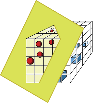
Figure 7-21: Passing a boundary surface through our cube, separating the red and blue samples
It’s hard to draw pictures for spaces with more than three dimensions, but we can calculate their densities. Figure 7-22 shows a plot of the density of a space for our 10 samples as the number of dimensions goes up. Each curve corresponds to a different number of bins for each axis. Notice that as the number of dimensions goes up, the density drops to 0 no matter how many bins we use.
If we have fewer bins, we have a better chance of filling each one, but before long, the number of bins becomes irrelevant. As the number of dimensions goes up, our density always heads to 0. This means our classifier ends up guessing at where the boundary should be. Including more features with our egg data improves the classifier for a while, because the boundary is better able to follow where the data is located. But eventually we need enormous amounts of data to keep up with the density demands made by those new features.
There are some special cases where the lack of density resulting from new features won’t cause problems. If our new features are redundant, then our existing boundaries are already fine and don’t need to change. Or if the ideal boundary is simple, like a plane, then increasing the number of dimensions doesn’t change that boundary’s shape. But in the general case, new features add refinement and details to our boundary. Because adding new dimensions to accommodate those features causes the density to drop toward 0, that boundary becomes harder to find, so the computer ends up essentially guessing at its shape and location.

Figure 7-22: This is how the density of our points drops off as the number of dimensions increases for a fixed number of samples. Each of the colored curves shows a different number of bins along each axis.
The curse of dimensionality is a serious problem, and it could have made all attempts at classification fruitless. After all, without a good boundary, a classifier can’t do a good job of classifying. What saved the day is the blessing of non-uniformity (Domingos 2012), which we prefer to think of as the blessing of structure. This is the name for the observation that, in practice, the features that we typically measure, even in very high-dimensional spaces, tend not to spread around uniformly in the space of the samples. That is, they’re not distributed equally across the line, square, and cube we’ve seen, or the higher-dimensional versions of those shapes we can’t draw. Instead, they’re often clumped in small regions, or spread out on much simpler, lower-dimensional surfaces (such as a bumpy sheet or a curve). That means our training data and all future data will generally land in the same regions. Those regions will be dense, while the great majority of the rest of the space will be empty. This is good news, because it says that it doesn’t matter how we draw the boundary surface in those big empty regions, because no data will appear there. Having good density where the samples themselves actually fall is what we want and what we usually find.
Let’s see this structuring in action. In our cube of Figure 7-20, instead of having the samples spread around more or less uniformly throughout the cube, we might find that the samples from each class are located on the same horizontal plane. That means that any roughly horizontal boundary surface that splits the groups probably does a good job on new data, too, as long as those new values also tend to fall into those horizontal planes. Figure 7-23 shows the idea.
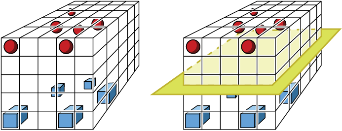
Figure 7-23: In practice, our data often has some structure in the sample space. Left: Each group of samples is mostly in the same horizontal slice of the cube. Right: A boundary plane passed between the two sets of points.
Most of the cube in Figure 7-23 is empty, and thus has low density, but the parts we’re interested in have high densities, so we can find a sensible boundary. Although the curse of dimensionality dooms us to have a low density in our overall space, even with enormous amounts of data, the blessing of structure says that we usually get reasonably high density where we need it. On the right side of Figure 7-23, we show a boundary plane across the middle of the cube. This does the job of separating the classes, but since they’re so well clumped, and since the space between them is empty, almost any boundary surface that splits the groups would probably do a good job of generalizing.
Note that both the curse and blessing are empirical observations, and not hard facts we can always rely on. So the best solution for this important practical problem is usually to fill out the sample space with as much data as we can get. In Chapter 10, we’ll see some ways to reduce the number of features in our data if it seems to be producing bad boundaries.
The curse of dimensionality is one reason why machine learning systems are famous for requiring enormous amounts of data when they’re being trained. If the samples have lots of features (or dimensions), we need lots and lots of samples to get enough density to make good class predictions.
Suppose we want enough points to get a specific density, say 0.1 or 0.5. How many points do we need as the number of dimensions increases? Figure 7-24 shows that the number of points needed explodes in a hurry.
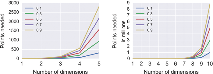
Figure 7-24: The number of points we need to achieve different densities, assuming we have five divisions on each axis
Speaking generally, if the number of dimensions is low, and we have lots of points, then we probably have enough density for the classifier to find a surface that has a good chance of generalizing well to new data. The values for low and lots in that sentence depend on the algorithm we’re using and what our data looks like. There’s no hard and fast rule for predicting these values; we generally take a guess, see what performance we get, and then make adjustments. Generally speaking, when it comes to training data, more really is more. Get all the data you ethically can.
High-Dimensional Weirdness
Since the samples in real-world data usually have many features, we often work in spaces with many dimensions. We saw earlier that if the data is locally structured, we are often okay: our ignorance of the boundary in the big empty regions doesn’t work against us, since no input data lands there. But what if our data isn’t structured or clumped?
It’s tempting to look at pictures like Figures 7-19 and 7-20 and let our intuition guide our choices in designing a learning system, thinking that spaces of many dimensions are like the spaces we’re used to, only bigger. This is very much not true! There’s a technical term for the characteristics of high-dimensional spaces: weird. Things simply work out in ways that we don’t expect. Let’s look at two cautionary tales about the weirdness of geometry in higher dimensions in order to train our intuitions not to jump to generalizations from the low-dimensional spaces we’re familiar with. This will help us stay on our toes when designing learning systems.
The Volume of a Sphere Inside a Cube
A famous example of the weirdness of high-dimensional spaces involves the volume of a sphere inside a cube (Spruyt 2014). The setup is simple: take a sphere and put it into a cube, then measure how much of the cube is occupied by the sphere. Let’s first do this in one, two, and three dimensions. Then we’ll keep going to higher dimensions and track the percentage of the cube occupied by the sphere as the number of dimensions goes up.
Figure 7-25 gets us started in the 1D, 2D, and 3D cases.

Figure 7-25: Spheres in cubes. Left: A 1D “cube” is a line segment, and the “sphere” covers it completely. Middle: A 2D “cube” is a square, and the “sphere” is a circle that touches the edges. Right: A 3D cube surrounds a sphere, which touches the center of each face.
In one dimension, our “cube” is just a line segment, and the sphere is a line segment that covers the whole thing. The ratio of the contents of the sphere to the contents of the “cube” is 1:1. In 2D, our “cube” is a square, and the sphere is a circle that just touches the center of each of the four sides. The area of the circle divided by the area of the box is about 0.8. In 3D, our cube is a normal 3D cube, and the sphere fits inside, just touching the center of each of the six faces. The volume of the sphere divided by the volume of the cube is about 0.5.
The amount of space taken up by the sphere relative to the box enclosing it is dropping. If we work out the math and calculate the volume of the sphere to the volume of its cube for higher dimensions (where they’re called a hypersphere and hypercube), we get the results in Figure 7-26.

Figure 7-26: The amount of a box occupied by the largest sphere that fits into that box for different numbers of dimensions
The amount of volume taken up by the hypersphere drops down toward 0. By the time we reach 10 dimensions, the largest sphere we can fit into its enclosing box takes up almost none of the box’s volume!
This is not what most of us would expect based on our experience in the 3D world. We’ve found that if we take a hypercube (of many dimensions) and place inside of it the largest possible hypersphere (of the same number of dimensions) that will fit, the volume of that hypersphere is just about 0.
There’s no trick to this, and nothing’s going wrong. When we work out the math, this is what happens. We saw the pattern starting in the first three dimensions, but we can’t really draw the rest, so it’s hard to picture how in the heck this can be going on. But it does happen this way, because higher dimensions are weird.
Packing Hyperspheres into Hypercubes
To make sure our intuitions get the message, let’s look at another weird result from packing hyperspheres into hypercubes. Let’s suppose we want to transport some particularly fancy oranges and make sure they’re not damaged in any way. Each orange’s shape is close to spherical, so we decide to ship them in cubical boxes protected by air-filled balloons. We put one balloon in each corner of the box, so that each balloon touches both the orange and the sides of the box. The balloons and orange are all perfect spheres. What’s the biggest orange we can put into a cube of a given size?
We want to answer this question for cubes (and balloons and oranges) with any number of dimensions, so let’s start with just two dimensions. Our box is then a 2D square of size 4 by 4, and the four balloons are each a circle of radius 1, placed in the corners, as in Figure 7-27.

Figure 7-27: Shipping a circular 2D orange in a square box, surrounded by circular balloons in each corner. Left: The four balloons each have a radius of 1, so they fit perfectly into a square box of side 4. Right: The orange sitting inside the balloons.
Our orange in this 2D diagram is also a circle. In Figure 7-27 we show the biggest orange we can fit. A little geometry tells us that the radius of this orange circle is about 0.4.
Now let’s move to 3D, so we have a cube (again, 4 units on a side). We can now fit eight spherical balloons, each of radius 1, into the corners, as in Figure 7-28. As always, the orange goes into the space in the middle of the balloons.
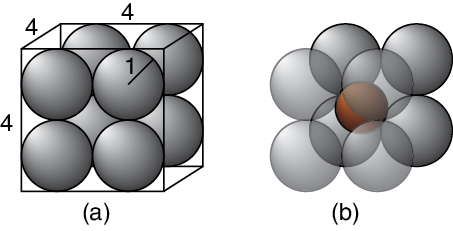
Figure 7-28: Shipping a spherical orange in a cubical box surrounded by spherical balloons in each corner. Left: The box is 4 by 4 by 4, and the eight balloons each have a radius of 1. Right: The orange sits in the middle of the balloons.
Another bit of geometry (this time in 3D) tells us that this orange has a radius of about 0.7. This is larger than the radius of the orange in the 2D case, because in 3D, there’s more room for the orange in the central gap between spheres.
Let’s take this scenario into 4, 5, 6, and even more dimensions, where we have hypercubes, hyperspheres, and hyperoranges. For any number of dimensions, our hypercubes are always 4 units on every side, there is always a hypersphere balloon in every corner of the hypercube, and these balloons always have a radius of 1.
We can write a formula that tells us the radius of the biggest hyperorange we can fit for this scenario in any number of dimensions (Numberphile 2017). Figure 7-29 plots this radius for different numbers of dimensions.
We can see from Figure 7-29 that in four dimensions, the biggest hyperorange we can ship has a radius of exactly 1. That means that it’s as large as the hyperballoons around it. That’s hard to picture, but it gets much stranger.
Figure 7-29 also tells us that in nine dimensions, the hyperorange has a radius of 2, so its diameter is 4. That means the hyperorange is as large as the box itself, like the 3D sphere in Figure 7-25. That’s despite being surrounded by 512 hyperspheres of radius 1, each in one of the 512 corners of this 9D hypercube. If the orange is as large as the box, how are the balloons protecting anything?
But things get much crazier. At 10 dimensions and higher, the hyperorange has a radius that’s more than 2. The hyperorange is now bigger than the hypercube that was meant to protect it. It seems to be extending beyond the sides of the cube, even though we constructed it to fit both inside the box and the protective balloons that are still in every corner. It’s hard for those of us with 3D brains to picture 10 dimensions (or more), but the equations check out: the orange is simultaneously inside the box and extending beyond the box.

Figure 7-29: The radius of a hyperorange in a hypercube with sides 4, surrounded by hyperspheres of radius 1 in each corner of the cube
The moral here is that our intuition can fail us when we get into spaces of many dimensions (Aggarwal 2001). This is important because we routinely work with data that has tens or hundreds of features.
Any time we work with data that has more than three features, we’ve entered the world of higher dimensions, and we should not reason by analogy with what we know from our experience with two and three dimensions. We need to keep our eyes open and rely on math and logic, rather than intuition and analogy.
In practice, that means keeping a close eye on how a deep learning system is behaving during training when we have multidimensional data, and we should always be alert to seeing it act strangely. The techniques of Chapter 10 can reduce the number of features in our data, which may help. Throughout the book we’ll see other ways to improve a system that isn’t learning well, whether because of high-dimensional weirdness or other causes.
Summary
In this chapter we looked at the mechanics of classifying. We saw that classifiers can break up the space of data into domains that are separated by boundaries. A new piece of data is classified by identifying which domain it falls into. The domains may be fuzzy, representing probabilities, so the result of the classifier is a probability for each class. We also looked at an algorithm for clustering. Lastly, we saw that our intuition often gets it wrong when we work in spaces of more than three dimensions. Things frequently just don’t work the way we expect. Those higher-dimensional spaces are weird, and full of surprises. We learned that when working with multidimensional data, we should proceed carefully and monitor our system as it learns. We should never rely on guesswork based on our experience in 3D!
In the next chapter, we’ll look at how to efficiently train a learning system, even when we don’t have a lot of data.