Chapter 2
Color Fundamentals
The Identity of Color
Chromatic Interaction
Color Systems
Emotions and Messages
If one says “red” and there are fifty people listening, it can be expected that there will be fifty reds in their minds. And ... all these reds will be very different. Colors present themselves in continuous flux, constantly related to changing neighbors and changing conditions.
Josef Albers
Artist, visual theorist, and educator; from Interaction of Color, Yale University Press
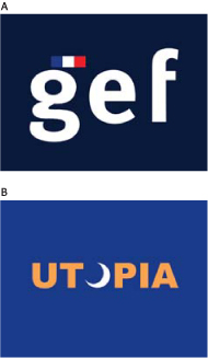
COLOR PLAYS IMPORTANT, yet very different, communicative roles in these two logotypes. In the GEF logo, the dark blue of the color field feels stable and personable; the more vivid, lighter blue field in the Utopia logo is energetic and cool. The color break in the GEF logo creates a recognizable flag; in the Utopia logo, the color break enhances the moon-like quality of the O form.
A Made In Space, Inc. United States
B Raidy Printing Group Lebanon
The Identity of Color
Chromatic Interaction
Color Systems
Emotions and Messages
![]()
There are few visual stimuli as powerful as color; it is a profoundly useful communication tool. But the meaning transmitted by color, because it results from reflected light waves transmitted through an imperfect organ—the eyes—to an imperfect interpreter—the brain—is also profoundly subjective. The mechanism of color perception is universal among humans. What we do with it once we see it is another thing altogether, and controlling it for the sake of communication depends on understanding how its optical qualities behave.
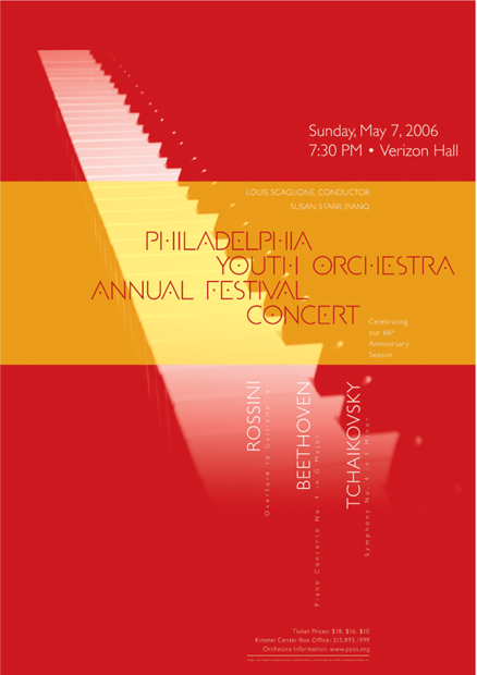
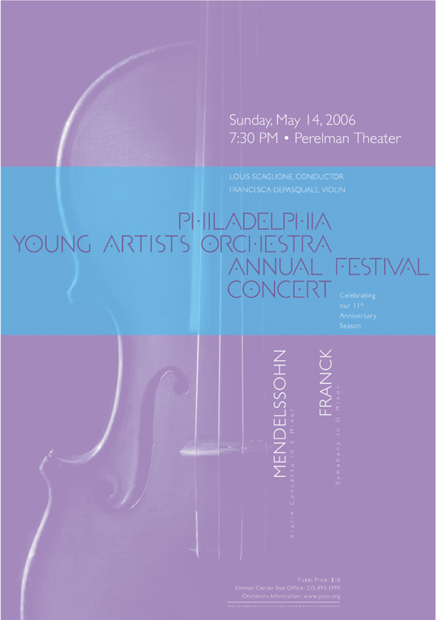
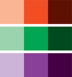
THESE TWO POSTERS exemplify the different characteristics that define a color’s identity and quality. The red poster is warm in temperature, darker in value, and more intense or saturated than the violet poster—which is cool in temperature and lighter in value.
Paone Design Associates United States

COLOR IN TYPOGRAPHY is highly effective in enhancing spatial relationships, as well as creating relationships between text and image. In this brochure spread, the warm golden type helps push the type closer to the spatial position of the mantis, but contrasts with the cool violet tones of the beetle, helping it to optically advance in space.
Carolyn Calles The Art Institute, Orange County, United States
![]()
Hue This term refers to the identity of a color—red, violet, orange, and so on. This identity is the result of how we perceive light being reflected from objects at particular frequencies. When we see a green car, what we’re seeing isn’t a car that is actually green; we’re seeing light waves reflected off the car at a very specific frequency while all other frequencies are absorbed. Of color’s four intrinsic attributes, the perception of hue is the most absolute: we see a color as red or blue, for example. But all color perception is relative, meaning that a color’s identity is really knowable only when there’s another color adjacent with which it can be compared. ![]() Some hues we are able to perceive are absolutes of a sort, what we call the primary colors. These colors—red, blue, and yellow—are as different from each other in terms of their frequency as can be perceived by the human eye. Even a slight change in frequency in any one of the primary colors will cause the eye to perceive that it has shifted slightly toward one of the other primary colors.
Some hues we are able to perceive are absolutes of a sort, what we call the primary colors. These colors—red, blue, and yellow—are as different from each other in terms of their frequency as can be perceived by the human eye. Even a slight change in frequency in any one of the primary colors will cause the eye to perceive that it has shifted slightly toward one of the other primary colors. ![]() When we are presented with a light frequency between those of two primary colors, we perceive a hue that evenly mixes them. These hues are the secondary colors: between red and yellow is the frequency perceived as orange; between yellow and blue, green; and between blue and red, violet. Further intermixing produces the tertiary hues: red orange, orange-yellow, yellow-green, blue-green, blue-violet, and violet-red.
When we are presented with a light frequency between those of two primary colors, we perceive a hue that evenly mixes them. These hues are the secondary colors: between red and yellow is the frequency perceived as orange; between yellow and blue, green; and between blue and red, violet. Further intermixing produces the tertiary hues: red orange, orange-yellow, yellow-green, blue-green, blue-violet, and violet-red.
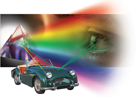
When light is split by a prism, the separate wavelengths are perceived as individual colors. The same is true of light that is reflected by an object: the material of the object absorbs some wavelengths and reflects others; the reflected wavelengths are what cause us to understand an object to have a particular hue.
The Identity of Color
Chromatic Interaction
Color Systems
Emotions and Messages

THE PRIMARY TEXT in this ad changes in hue but generally maintains similar value and intensity. Since hue is tied intrinsically to the perception of temperature, that variable also changes.
BBK Studio United States
RED-ORANGE AND RED-VIOLET are loosely analogous, appearing on either side of red on the color wheel. The red component makes both colors feel a little passionate; the orange component adds adventure or risk; the violet component adds mystery and a touch of sensuality.
Ames Bros. United States
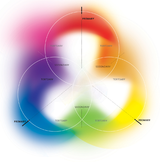
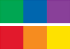
The primary colors of an additive system (in which all colors mix together to create white) are red, blue, and green. These wavelengths are as different from each other in frequency as can be discerned by the rods and cones in the human optical system. The secondary colors in an additive system—orange, green, and violet—represent shifts in frequency toward one primary color or another. The tertiary colors are still smaller shifts perceptible between the secondary colors and their parent primaries.
![]()
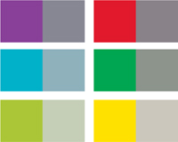
Saturation The color’s saturation describes its intensity, or brilliance. A saturated color is very intense or vibrant. Colors that are dull are said to be desaturated; colors in which almost no hue is visible—such as a warm gray or a very dull brown—are said to be neutral. As with hue, the apparent saturation of a color will change if it can be compared to an adjacent color. ![]() Bringing together hues that are as different from each other in frequency as possible, meaning closer to either of the opposing primaries, will cause the intensity of both colors to increase dramatically.
Bringing together hues that are as different from each other in frequency as possible, meaning closer to either of the opposing primaries, will cause the intensity of both colors to increase dramatically.
This effect is even more pronounced if the amount of the two colors is very different; the color present in a smaller amount will become much more intense against a large field of the second color. Interestingly, a small amount of a desaturated—even neutral—color, presented against a large field of another color, will appear to gain in intensity and shift hue toward the opposite end of the spectrum.
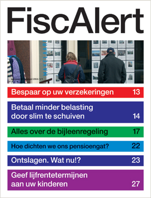
HIGHLY SATURATED bands of color help advance the idea of “alert” in this newsletter cover.
Martin Oostra Netherlands
The Identity of Color
Chromatic Interaction
Color Systems
Emotions and Messages

DESATURATED colors, all of a similar temperature, create a feeling of sophistication and repose in the splash page of this website.
BBK Studio United States
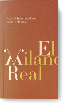
THE BACKGROUND OF this book cover is darker but less saturated than the type, which is lighter and more saturated (intense or vibrant).
LSD Spain

LIKE A PHOTOGRAPH that is considered “good,” this drawing exhibits a great deal of value change—a full range from deep shadows, through a generous number of middle tones, up through a bright highlight or white. However, the values are not distributed evenly across the format; they progress from one side to another, and they are concentrated in specific places to create contrast.
Raidy Printing Group Lebanon
The Identity of Color
Chromatic Interaction
Color Systems
Emotions and Messages
![]()
Value A color’s value is its intrinsic darkness or lightness. Yellow is perceived as being light; violet is perceived as being dark. Again, it’s all relative. One color can be considered darker or lighter only compared to another. Yellow, even, appears darker than white, which has the lightest possible value of any color. An extremely deep blue or violet appears quite luminous against a maximal black, which has the darkest value of any color (black being technically the absence of any reflected light). Lightening the value of an intensely saturated hue tends to desaturate it. Darkening the value of a moderately to intensely saturated hue will initially intensify its saturation, but if the value is darkened too much, the hue will become less vibrant. Placing any color on a darker color will make it seem lighter, as will increasing the amount of a color. If you’ve ever had the unfortunate experience of picking out a paint swatch for your living room only to find that it’s three or four values too light once you paint an entire wall, you already know this to be true. Bringing two hues of the same value together, regardless of their relative intensities, creates an odd “bleeding” effect that messes with our ability to see a sharp, distinct boundary between the two. The more different the two hues, or the more similar they are in intensity, the more pronounced this effect becomes; at some magical intersection of hue and saturation, the boundary between two colors of the same value will be nearly impossible to see.
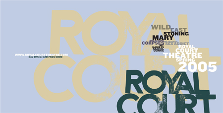
THE COLOR VALUES in this brochure spread affects the reading order, or hierarchy, of the text. The darkest elements read first because they have the most value contrast with the color of the background; middle-value and lighter elements read later because they have less value contrast against the background.
Research Studios United Kingdom
![]()
Temperature The temperature of a color is a subjective quality that is related to experiences. Colors considered “warm,” such as red or orange, remind us of heat; cool colors, such as green or blue, remind us of cold objects or environments, such as ice. Colors of a particular temperature remind us of these specific kinds of objects or substances because those substances reflect similar wavelengths of light. The temperature of any color will be thrown in one direction or another if compared to any other color. Placing a hot red near an even hotter orange will make that red seem cool; conversely, placing a slightly cooler magenta next to the same hot red will simply enhance the perception of its intrinsic temperature.
The Identity of Color
Chromatic Interaction
Color Systems
Emotions and Messages
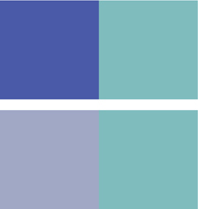
THE WARM, SLIGHTLY desatu-rated orange square appears to advance, while the cool blue-green pattern appears to recede, enhancing the separation created by the translucent jacket.
Shinnoske, Inc. Japan
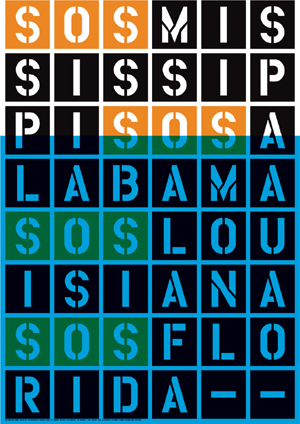
WARMER COLORS SEEM more aggressive and alive, while cooler colors seem more passive. In the right context, this contrast can convey a message that negates energy and, therefore, a sense of life. In this poster, the SOS in yellow-orange seems to call out urgently; the cooler blue overlapping the yellow-orange type quiets it down. This simple change alludes to flooding and, possibly, death.
Stereotype Design United States
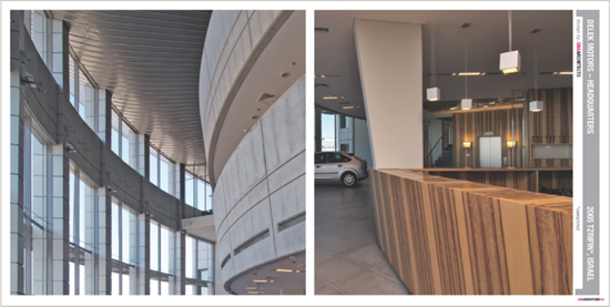
A COOLER IMAGE on the left-hand page of this brochure spread—with blue-green and pale violet tones—contrasts with the warmth of the wood in the image on the right-hand page. The contrast is important to help add interest, as both images share a repeating pattern of linear, curving, and angular elements.
Not From Here United States
![]()
Color Relationships Since the fifteenth century, artists and scientists have been creating methods for organizing color perception in visual models. A color model helps a designer see these relationships for planning color ideas. Of these, the most common is the color wheel, developed by Albert Munsell, a British painter and scientist. Munsell’s color wheel is a circular representation of hue—the differences in wavelength that distinguish blue from yellow from red—modified along two axes that describe the color’s darkness or lightness (its value) and its relative brilliance (its saturation). Johannes Itten, a Bauhaus master at Weimar, Germany, in the 1920s, posited a color sphere—a three-dimensional model that integrates the value scale of Munsell’s color wheel into a globe—in his landmark book The Art of Color, published in 1961. Both models focus on hue as color’s defining aspect, radiating at full intensity around the outside of a circular form and decreasing in intensity toward the center. In Itten’s sphere, the decrease in intensity toward the center of the solid globe is the result of mixing hues that are situated opposite each other (as they are on Munsell’s color wheel) and results in a cancelling out toward a neutral. ![]() These color models were developed to describe how color works with refracted light, but, for the most part, graphic designers work with color derived from mixing chemical pigments—paint or inks. The relative color relationships described by these models, however, work in much the same way with mixed pigments; the difference is simply how these relationships are achieved in a physical sense. When working with inks (see page 108), the type of ink being used contributes to the designer’s consideration of color relationships. If the inks being combined are solids, the beginning color relationships are much more direct and have a more aggressive effect on each other when added together; they will define the secondary and tertiary colors by virtue of their printing on top of each other. If color is being produced by a buildup of primary colors—as in process, or CMYK printing—a wider range of colors is possible.
These color models were developed to describe how color works with refracted light, but, for the most part, graphic designers work with color derived from mixing chemical pigments—paint or inks. The relative color relationships described by these models, however, work in much the same way with mixed pigments; the difference is simply how these relationships are achieved in a physical sense. When working with inks (see page 108), the type of ink being used contributes to the designer’s consideration of color relationships. If the inks being combined are solids, the beginning color relationships are much more direct and have a more aggressive effect on each other when added together; they will define the secondary and tertiary colors by virtue of their printing on top of each other. If color is being produced by a buildup of primary colors—as in process, or CMYK printing—a wider range of colors is possible.

AN ABSTRACTED MODEL for additive, or light-based, color, forms the symbol for this media company’s brand signature.
Paone Design Associates United States
The Identity of Color
Chromatic Interaction
Color Systems
Emotions and Messages
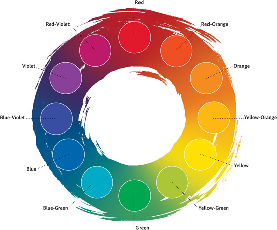
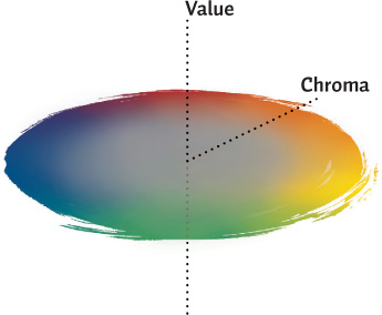
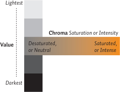
Relationships between colors are defined by their relative position on the Munsell color wheel. The various hues—differences in light wavelengths—exhibit a value (darkness or lightness) and a chroma, also called saturation or brilliance. These attributes are mapped along different axes in the model diagram at right.
THIS COLOR STUDY is interesting for its examination of relationships between warmer and cooler colors as well as between analogous and complementary colors.
Diana Hurd Carnegie Mellon University, United States
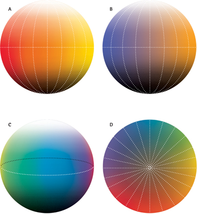
The color sphere, developed from earlier models by Swiss artist and theorist, Johannes Itten, extrapolates the color wheel into a three-dimensional model. Shown here are (A) the warm hemisphere of the sphere; (B) the cool hemisphere; (C) a cross-section of the sphere, cut vertically between warm and cool hemispheres; and (D) a cross-section cut horizontally, separating the top (lighter) half from the lower (darker) half—in this cross-section, we’re looking down at the bottom half.
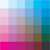
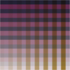
In a subtractive color model, such as that which defines ink mixtures for printing shown above, successive layers of ink result in darker, more saturated colors, to a point. Once the ink layers no longer permit a substantial amount of light to reflect from the printed surface, the combined colors become less saturated and eventually neutral and black. Subtractive color is also altered by the chemical makeup of the pigments used to color the inks.
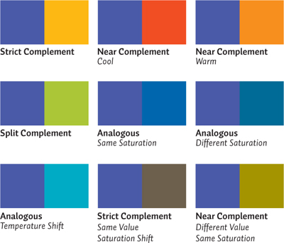
Hue Relationships Designers can create interaction between different hues, independent of their saturation or value, according to where they lie on the color wheel. The closer together the colors appear on the wheel, the more similar their optical qualities and, hence, the more harmonious or related. The further apart colors are on the wheel, the more their optical qualities contrast.
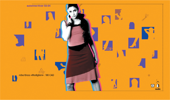
THE YELLOW-ORANGE background of this Web page is complementary to the blue-violet inset images, and is analogous to the two colors wrapped around the central figure.
Sub Communication Canada
The Identity of Color
Chromatic Interaction
Color Systems
Emotions and Messages
BLUE-GREEN AND VIOLET are loosely analogous, being separated by pure blue and blue-violet on the color wheel.
Templin Brink Design United States
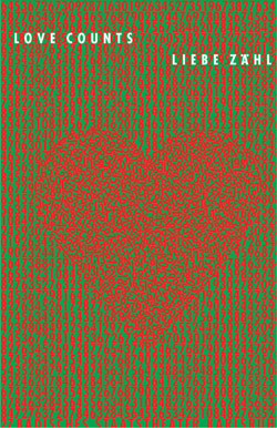
COMPLEMENTARY COLORS buzz when they get close to each other, and neutralize each other when mixed. If you cover up the heart and blur your vision, you’ll perceive a less intense olive color where the pure red and green mix more evenly. The increase in red numbers in the heart area appropriately changes its relative intensity.
Gunter Rambow Germany
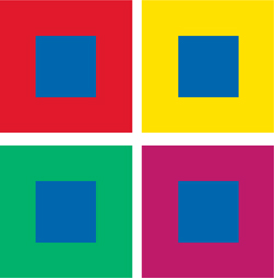

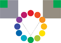
Simultaneous Contrast This optical illusion results in a perceived change of one color’s identity when it comes into contact with other colors. In this example, the same blue appears surrounded by fields of different colors, but its apparent hue is different in each case.

A CHANGE IN VALUE from dark to light among the type elements, culminating in the reversed white title, correspond to the value changes in the woman’s head in the photograph.
Research Studios United Kingdom
The Identity of Color
Chromatic Interaction
Color Systems
Emotions and Messages
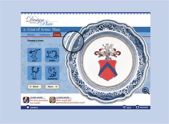
VALUE CHANGES IN the base blue are used to highlight important content and clarify navigation in this website.
Swim Design United States
![]()
Value Relationships Regardless of their specific hues, the colors selected for a palette will have relationships of darkness or lightness. By varying the number of jumps from value to value, or by how dramatically the values among the colors change, a designer can create contrast and rhythm among darker and lighter areas—even if the number of hues used, or how different they are, is limited.

USING A LIGHTER VALUE for the word “taxi” in this logo makes the image that it conjures feel lighter or have less impact, reinforcing the concept “eco,” which appears in a deeper value.
Kropp Associates United States


Simultaneous Contrast This optical illusion results in a perceived change of one color’s value when it comes into contact with colors of differing value. The effect in this case is that one color appears to be lighter or darker depending on the values of colors surrounding it. In this example, a blue of the same value appears surrounded by fields of different value, causing it to appear lighter or darker in turn.

THE PINK OF THE letterform, whose value is also lighter, is less saturated than the red droplet, enhancing its vitality and symbolic quality.
LSD Spain
The Identity of Color
Chromatic Interaction
Color Systems
Emotions and Messages
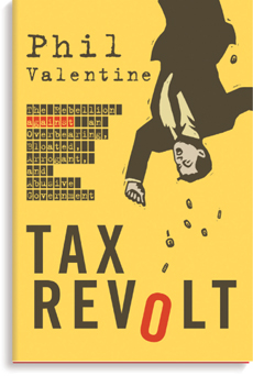
THE IDEA OF EXTENSION is manipulated for this book cover. The background yellow is relatively intense, more so than the medium gray of the title type; the effect of extension renders the type slightly bluish or violet, the complement of yellow. At the same time, the red elements are intensified through their analogous relationship—in hue and saturation—with the background.
Red Canoe United States
![]()
Saturation Relationships Saturation relationships may occur independently of hue relationships, but will usually have an effect on value or temperature. As a hue is desaturated, it may appear to become darker adjacent to a different hue of greater saturation, but it may also appear to become cooler if the adjacent hue is a warm color. Grouping analogous hues of similar intensity, but changing the intensity of one, will create a rich, intimately harmonious palette. Grouping complementary hues, or split complements, all with similar values but different saturations, will create a rich color experience.
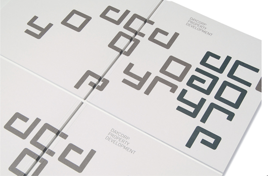
A PROGRESSION IN VALUE and saturation from less intense to more intense imparts rhythm and movement to the rigidly grid-shaped typography.
Voice Australia

THE EFFECT OF DIAMETRIC opposition occurs here; the more intense squares in this logo (T, E) cause the viewer to see the complement in the desaturated squares. Looking at the T and E tiles will cause the others to appear greenish.
Drotz Design United States


Simultaneous Contrast With regard to saturation, this optical illusion results in the perceived change of a color’s intensity when it appears adjacent to colors whose intensity changes. In this example, the same blue-green appears surrounded by fields of different saturation, appearing more saturated in some contexts and less saturated in others.
TEMPERATURE RELATIONSHIPS tie together each page of this magazine spread (note the locations of the warmer green elements) and separate elements in the hierarchy.
AdamsMorioka United States
The Identity of Color
Chromatic Interaction
Color Systems
Emotions and Messages

THE ANALOGOUS shift in temperature—added warmth that transforms a blue-green into green—not only adds visual interest, but evokes a sense of sky and landscape.
Cobra Norway
![]()
Temperature Relationships Designers can establish relationships within a color palette based on relative temperature. Grouping colors with similar temperature, together with one or two variations on the same hues that are warmer or cooler—for example, a cool green, blue, and violet with a warmer green—can generate enormous possibilities for combining the colors while maintaining a tightly-controlled color environment.

A CLOSE-IN PROGRESSION in temperature is the most important aspect of this logo, although value also plays a role. The light element in the M symbol is the warmest, being closer to the yellow range of greens. Each stroke of the M becomes progressively cooler; the full logotype is the coolest. As green becomes cooler and deeper, it communicates less about refreshment and more about economic growth and stability.
Jelena Drobac Serbia


Simultaneous Contrast This optical illusion affects the apparent temperature of a color in much the same way it affects its hue, value, or saturation. A given color will appear warmer when situated against cooler colors, but cooler when against warmer colors. In this example, the same green appears surrounded by fields of different warmth and coolness; the result is a corresponding change in the green’s perceived warmth or coolness in turn.
![]()
Color: Form and Space Color exhibits a number of spatial properties. Cool colors appear to recede while warm colors appear to advance. Of the primary colors, blue appears to recede and yellow to advance, but red appears to sit statically at a middle depth within space. ![]() Applying color to a composition will have an immediate effect on hierarchy, the relative order of importance of the forms in space. The intrinsic relationships in a black-and-white composition might be exaggerated through the application of chromatic color, or made purposely ambiguous. Color distinctions can greatly enhance the perception of spatial depth and force greater separation between the hierarchic levels. For example, if an element at the top of a hierarchy is set in a deep, vibrant orange-red, while secondary forms are colored a cool gray, these two levels of the hierarchy will be separated visually to a much greater degree. Although the values of the colors are similar, the saturated orange form will advance in space, and the cool gray one will recede.
Applying color to a composition will have an immediate effect on hierarchy, the relative order of importance of the forms in space. The intrinsic relationships in a black-and-white composition might be exaggerated through the application of chromatic color, or made purposely ambiguous. Color distinctions can greatly enhance the perception of spatial depth and force greater separation between the hierarchic levels. For example, if an element at the top of a hierarchy is set in a deep, vibrant orange-red, while secondary forms are colored a cool gray, these two levels of the hierarchy will be separated visually to a much greater degree. Although the values of the colors are similar, the saturated orange form will advance in space, and the cool gray one will recede. ![]() The application of color to the ground within a composition can further enhance the hierarchy. A form in one color, set on a field of another color, will join closely with it or separate aggressively, depending on their color relationship. If the colors of foreground and background elements are related, the elements will occupy a similar spatial depth. If they are complementary in nature, the two will occupy very different spatial depths.
The application of color to the ground within a composition can further enhance the hierarchy. A form in one color, set on a field of another color, will join closely with it or separate aggressively, depending on their color relationship. If the colors of foreground and background elements are related, the elements will occupy a similar spatial depth. If they are complementary in nature, the two will occupy very different spatial depths.

EACH COLOR—blue, red, and yellow—assumes a place in space: blue recedes, red stays in the middle, and yellow advances. In this case, the application of color enhances the desired spatial location of each element.
Thomas Csano Canada
The Identity of Color
Chromatic Interaction
Color Systems
Emotions and Messages
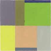
COLORS OF SIMILAR VALUE will appear to cluster together into one form, as do the grayish and olive green areas at the upper left of this study. Because their values are similar, the boundary between them appears less pronounced than those between other areas whose values are much different, even if their intensities are also very different. Note the relative lack of separation between the desaturated orange and light gray at the lower right.
JRoss Design United States
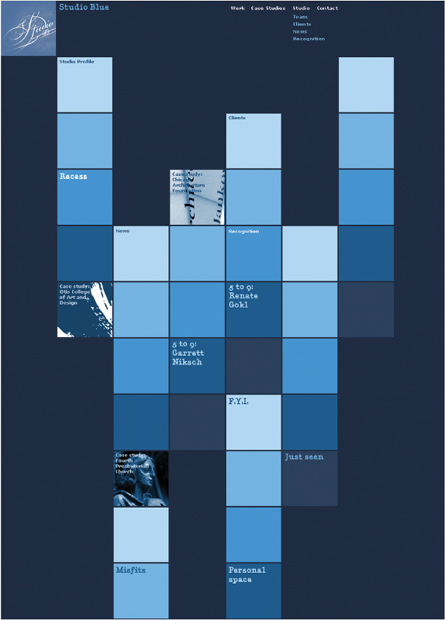
THE SPATIAL DIFFERENCE between the squares in this website creates hierarchy: the lighter squares advance and so become the more important, or sequentially primary, elements in the navigation.
Studio Blue United States
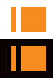
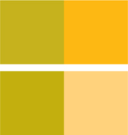
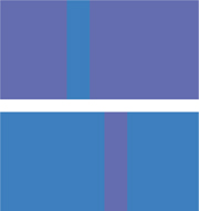
The amount of color that can be perceived—and its intensity and value—are all affected by volume. The orange of the narrow line appears darker and less intense against the white field of the page than either the thicker line or the larger square. The opposite is true when the same elements cross over a dark field.
![]()
Color Stories: Coding with Color Within a complex visual environment, color can help distinguish different kinds of information, as well as create relationships among components or editions of a publication. A designer might develop, for example, a palette for graphic and typographic elements that helps readers distinguish between specific text components (headlines, subheads, and body) or between sections of information. Or, a designer might use a general palette for all elements that is based on the color or thematic content of photographs. Perhaps this palette has a consistent base, like a selection of warm neutrals that remains constant, while accent colors change. ![]() The use of colors can be coded—assigning colors to identify sections or components—or not. Color coding is one option for using color as a system. To be effective, color coding must be relatively simple and must be easily identifiable. Using more colors for coding creates confusion, as the viewer is forced to try to remember which color relates to which information. Color coding within a related set of hues—a deep blue, an aqua blue, and a green, for example—can help distinguish subcategories of information within an overall grouping, but ensure that the viewer is able to perceive the differences between the colors. Pushing the colors further apart in relation to each other might help—for example, the deep blue might be skewed toward the violet while yellow is added to the green.
The use of colors can be coded—assigning colors to identify sections or components—or not. Color coding is one option for using color as a system. To be effective, color coding must be relatively simple and must be easily identifiable. Using more colors for coding creates confusion, as the viewer is forced to try to remember which color relates to which information. Color coding within a related set of hues—a deep blue, an aqua blue, and a green, for example—can help distinguish subcategories of information within an overall grouping, but ensure that the viewer is able to perceive the differences between the colors. Pushing the colors further apart in relation to each other might help—for example, the deep blue might be skewed toward the violet while yellow is added to the green.
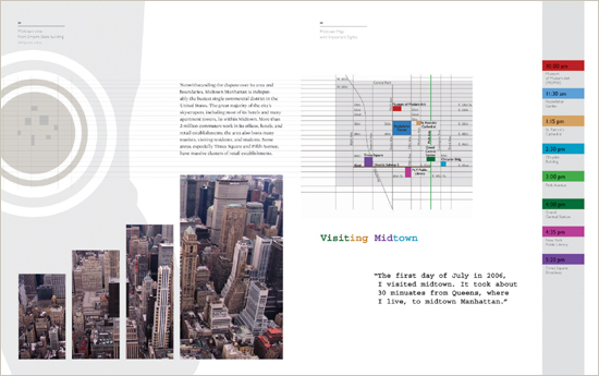
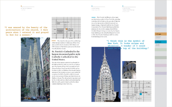
COLOR ACTS AS INFORMATION in these book spreads about New York City neighborhoods. In the overview map, each location’s color is made different enough to clearly separate them; in subsequent detail maps, the specific coloration of a location indicates that this is the subject currently in focus. Color connects map locations with associated text, as well as the time of a visit to that location displayed in the chronological list at the right.
Myung Ha Chang School of Visual Arts, United States
The Identity of Color
Chromatic Interaction
Color Systems
Emotions and Messages
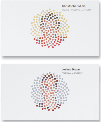
IN ADDITION TO the optical game created by the super-coarse dot screen, color relationships are used as part of the identity system in these business cards.
Sagmeister United States
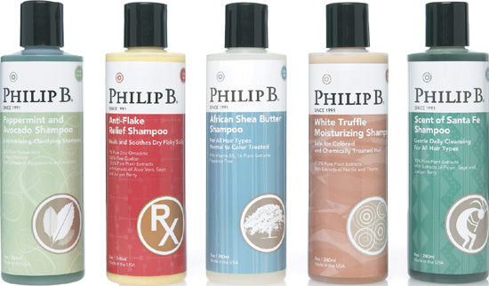
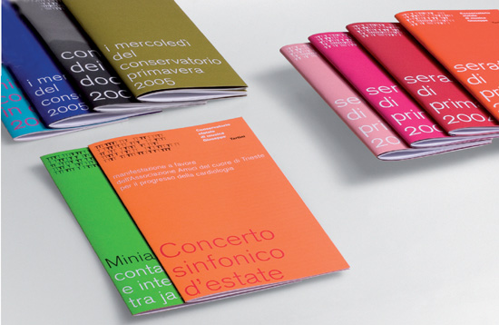
THIS SERIES DISTINGUISHES products with a hue change but maintains a similar saturation among the colors.
AdamsMorioka United States
![]()
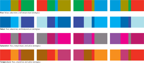
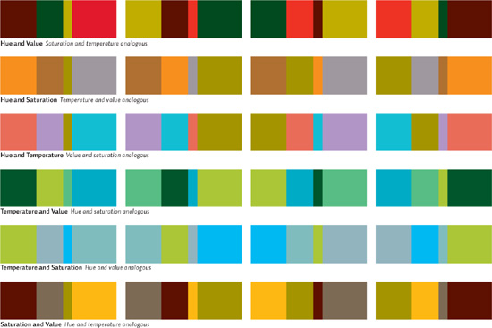
Color Proportioning Establishing some flexibility in a system is always important. For one thing, the components in a system—such as a family of brochures—might change over time, or new ones might be added to the system that weren’t accounted for during initial planning. ![]() Furthermore, the various parts of the system need to be distinguishable from each other while maintaining a clear family appearance; in this way, the color coding not only helps a viewer separate the components from each other quickly, but also continues to enhance the unity of the system. One possibility to investigate is to develop a family of a few colors, along with several formal elements, and swap the colors among those elements. The colors could all be the same hue but occur in differing values and intensities; or, there could be a selection of intense hues that are split complements of each other. The number of colors selected, and how closely they are related, will have to be determined by evaluating how many components within the system must be delineated.
Furthermore, the various parts of the system need to be distinguishable from each other while maintaining a clear family appearance; in this way, the color coding not only helps a viewer separate the components from each other quickly, but also continues to enhance the unity of the system. One possibility to investigate is to develop a family of a few colors, along with several formal elements, and swap the colors among those elements. The colors could all be the same hue but occur in differing values and intensities; or, there could be a selection of intense hues that are split complements of each other. The number of colors selected, and how closely they are related, will have to be determined by evaluating how many components within the system must be delineated.
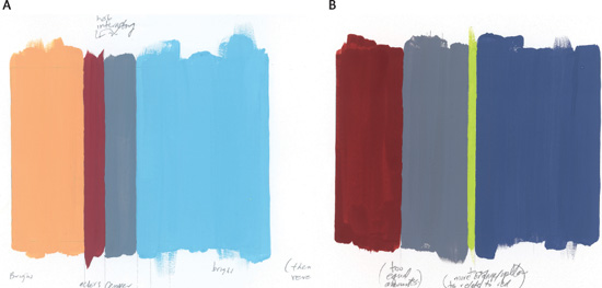
COLOR STUDIES improve understanding of color in a deeper way than simply selecting colors strictly for a project. Each study pits relationships of value (A) or intensity (B) against the extension of colors of varying temperatures.
JRoss Design United States
The Identity of Color
Chromatic Interaction
Color Systems
Emotions and Messages
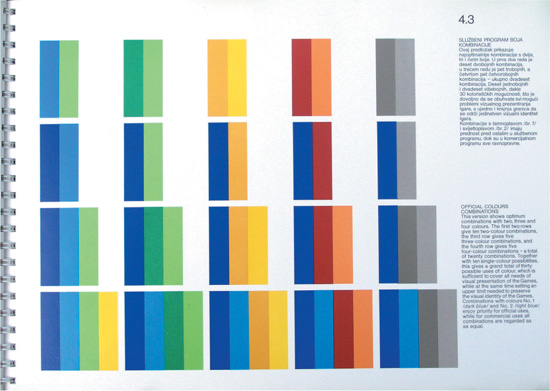
THIS PAGE FROM an identity manual shows how colors from the supporting color palette can be combined with the primary corporate color in the system, the medium-value blue. The supporting colors are strictly controlled for their value and intensity relationships so that the corporate blue is always the deepest and most intense.
Studio International Croatia
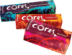
GROUPINGS OF ANALOGOUS colors can provide a very flexible, yet very consistent, system for color coding, as seen in this packaging system. Each wrapper uses two analogous colors to identify its specific product in the system—blue-violet and aqua, red and yellow-orange, violet-red and orange—and each item’s base color is also analogous in relation to each other.
A10 Design Brazil
![]()
Limited Color Systems While a great number of projects call for full-color—process, or cmyk—imagery, choosing to use specific colored inks instead—called “spot” color—offers exciting possibilities. Spot color need not be limited to small-run or low-budget projects; a palette of even two thoughtfully-selected colors may communicate just as powerfully and further unify materials. This approach is particularly useful for branding, where the interrelation of inks can be used to clarify different publications in a literature system while reinforcing the identity of the brand. ![]() When a designer is working with only two or three ink colors, choosing colors with dynamic chromatic interaction is of greatest concern. Printing a job with two complements as counterparts, for example, is an intuitive first possibility. Their complementary nature need not be exact, that is, as with blue and orange; skewing this relationship can create interesting combinations but retain their inherent contrast: a blue-violet and orange, for example.
When a designer is working with only two or three ink colors, choosing colors with dynamic chromatic interaction is of greatest concern. Printing a job with two complements as counterparts, for example, is an intuitive first possibility. Their complementary nature need not be exact, that is, as with blue and orange; skewing this relationship can create interesting combinations but retain their inherent contrast: a blue-violet and orange, for example. ![]() Most printing inks are translucent, so a designer has the option not only to print each ink at full strength—or “tinting” them to lighten their values—but also to print the inks on top of each other, either at full strength or in combinations of tints. Printing one ink on top of another is called “surprinting,” and creates new colors because of their overlap. Such new colors will vary in hue, saturation, and value, depending on the base ink colors selected; usually the resulting third color (and tinted variations) will be darker and less saturated. If the base inks are very intense or pure, however, the surprint color will also be relatively intense.
Most printing inks are translucent, so a designer has the option not only to print each ink at full strength—or “tinting” them to lighten their values—but also to print the inks on top of each other, either at full strength or in combinations of tints. Printing one ink on top of another is called “surprinting,” and creates new colors because of their overlap. Such new colors will vary in hue, saturation, and value, depending on the base ink colors selected; usually the resulting third color (and tinted variations) will be darker and less saturated. If the base inks are very intense or pure, however, the surprint color will also be relatively intense. ![]() Photographic images, or illustrations with varied tonality, are excellent material with which to explore ink coloration: an image might be printed in one, two, three, or more spot colors, with different portions of the image’s tonal range acted upon by the inks at different levels. Such options give the designer an opportunity to customize images for a client, enrich the dialogue of color among images, type, and other graphic elements, and to bring images into closer visual alignment with brand-related color messages.
Photographic images, or illustrations with varied tonality, are excellent material with which to explore ink coloration: an image might be printed in one, two, three, or more spot colors, with different portions of the image’s tonal range acted upon by the inks at different levels. Such options give the designer an opportunity to customize images for a client, enrich the dialogue of color among images, type, and other graphic elements, and to bring images into closer visual alignment with brand-related color messages.
The Identity of Color
Chromatic Interaction
Color Systems
Emotions and Messages
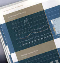
OVERLAPPING SPOT COLORS create rich color interaction among typographic and graphic elements in this detail of a financial report.
UNA (Amsterdam) Designers Netherlands
Be careful when tinting a color that is being used for type, especially if it’s relatively light to begin with. Getting a printer to run a press proof to test the effect of tinting on type and images will be an additional cost, but in the end it’s worth it to see exactly what’s going to happen in the actual press run.

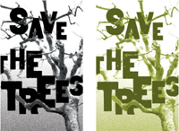
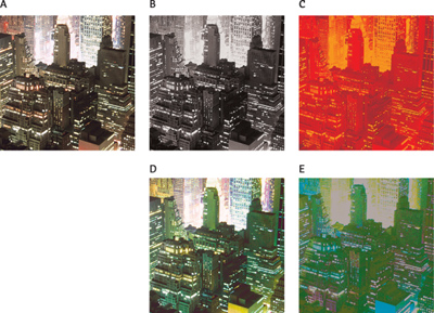
Color Halftone Also called a monotone, an image printed using a single ink color is called a color halftone. The top image is printed directly on a white field; in the bottom image, the color halftone is shown crossing over a supporting color, which changes the appearance of the halftone’s color.

Duotone When an image is printed using two ink colors, the result is a duotone. The image at the top is printed using two similar color inks to enhance its overall tonal range; in the lower example, the image is printed using two ink colors that are very different.

Tritone Similar to a duotone, a tritone results from printing an image using three different ink colors. Both tritones above share two ink colors, but differ in their use of a third ink color.

By using image-manipulation software, the amount of a given ink color applied to specific tonal ranges in an image can be adjusted. In this example, the two colors used in the duotone are distributed differently. In the top image, color 1 has been pushed toward the shadow range; in the bottom image, color 1 has been pushed toward the highlight range
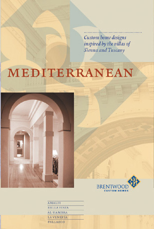

A THREE-COLOR PALETTE not only unifies the components in this literature system, it allows the designer to diferentiate different product offerings and still reinforce the core identity of the brand. The signature (logo) retains its color identity, and the components all seem intrinsically related to it, as well as to each other.
STIM Visual Communication United States
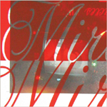
SURPRINTING A FIELD of red ink on top of found, make-ready sheets means budget-conscious production with interesting visual effects in this detail of a poster. The ink’s transparency allows a haze of the surprinted image to show through.
Brett Yasko United States
![]()
Color Psychology With color comes a variety of psychological messages that can be used to influence content—both imagery and the verbal meaning of typography. This emotional component of color is deeply connected to human experience at an instinctual and biological level. Colors of varying wavelengths have different effects on the autonomic nervous system—warmer colors, such as red and yellows, have long wavelengths, and so more energy is needed to process them as they enter the eye and brain. The accompanying rise in energy level and metabolic rate translates as arousal. Conversely, the shorter wavelengths of cooler colors—such as blue, green, and violet—require far less energy to process, resulting in the slowing of our metabolic rate and a soothing, calming effect. ![]() The psychological properties of color, however, also depend highly on a viewer’s culture and personal experience. Many cultures equate red with feelings of hunger, anger, or energy because red is closely associated with meat, blood, and violence. By contrast, vegetarians might associate the color green with hunger. In Western cultures, which are predominantly Christian, black is associated with death and mourning, but Hindus associate the color white with death. Christians associate white with purity or cleanliness. Because of the history of Western civilization, violet conveys authority, status, and luxury to members of that culture. Most cultures respond to blue with an association of water and, therefore, of life. Blue is also often perceived as deeply spiritual or contemplative, perhaps because of this particular association.
The psychological properties of color, however, also depend highly on a viewer’s culture and personal experience. Many cultures equate red with feelings of hunger, anger, or energy because red is closely associated with meat, blood, and violence. By contrast, vegetarians might associate the color green with hunger. In Western cultures, which are predominantly Christian, black is associated with death and mourning, but Hindus associate the color white with death. Christians associate white with purity or cleanliness. Because of the history of Western civilization, violet conveys authority, status, and luxury to members of that culture. Most cultures respond to blue with an association of water and, therefore, of life. Blue is also often perceived as deeply spiritual or contemplative, perhaps because of this particular association. ![]() Clearly, selecting a color for specific words in a composition can add meaning by linking its associations to the verbal message. A headline or title set in one color might take on additional, or completely different, meaning when set in another color. Comparing color options for type simultaneously helps determine which color may be the most appropriate for a given communication.
Clearly, selecting a color for specific words in a composition can add meaning by linking its associations to the verbal message. A headline or title set in one color might take on additional, or completely different, meaning when set in another color. Comparing color options for type simultaneously helps determine which color may be the most appropriate for a given communication.

DEEP OLIVES AND BROWNS evoke a sense of history, especially in the context of photographs, which were tinted brownish and sometimes olive in the early stages of photography.
Studio Blue United States
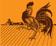
THE ROOSTER appears in a field of friendly, dynamic orange.
Apeloig Design France
The Identity of Color
Chromatic Interaction
Color Systems
Emotions and Messages
THE RELIABILITY and strength of brown protect the growing green plant.
Sohyun Kim Iowa State University, United States
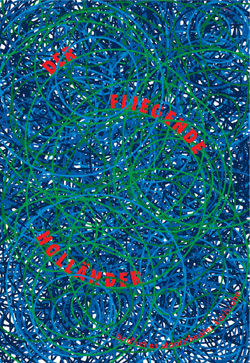
BLUE AND BLUE-VIOLET are cool and waterlike. In this poster, their calming quality represents the ocean as a contrast to the hectic movement of the red title.
Gunter Rambow Germany
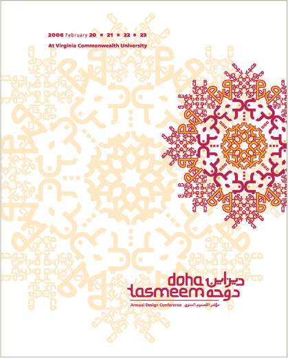
PALE YELLOW, YELLOW-ORANGE, and fuchsia make reference to the cultural environment of Qatar but also evoke the sun, energy, and happiness.
VCU Qatar Qatar
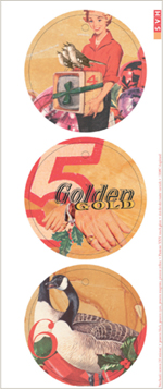
IN WESTERN CULTURE, groupings of reds, golds, and deeper green evoke the winter holiday season.
BBK Studio United States
![]()
Changing Color, Changing Meaning
Because color so strongly evokes emotional response, its effect on imagery—both abstract and representational—is of great concern to the designer. ![]() First, the issue of “local color” in subject matter—the empirical color of objects—comes into play, influencing emotional responses in the viewer. For example, a corporate executive in a blue suit is approachable, but in a dark gray suit, possibly arrogant or shady; wearing a striped green tie, inexperienced, but wearing a solid red one, commanding and assured. Second, manipulation of the overall tonal balance of an image—warm or cool, intense or dull, greenish or blueish—will usually skew an image’s feeling in one direction or another. Last, in considering color application to typography or abstract form elements, the designer must anticipate the powerful directness of any associations created as the color is embodied by forms that the mind is attempting to interpret.
First, the issue of “local color” in subject matter—the empirical color of objects—comes into play, influencing emotional responses in the viewer. For example, a corporate executive in a blue suit is approachable, but in a dark gray suit, possibly arrogant or shady; wearing a striped green tie, inexperienced, but wearing a solid red one, commanding and assured. Second, manipulation of the overall tonal balance of an image—warm or cool, intense or dull, greenish or blueish—will usually skew an image’s feeling in one direction or another. Last, in considering color application to typography or abstract form elements, the designer must anticipate the powerful directness of any associations created as the color is embodied by forms that the mind is attempting to interpret.

RICH SEPIA COLORATION augments the fragmented, historical quality of this treated photograph; the deeper values add a somber, reflective note.
Thomas Csano Canada
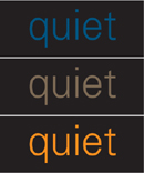
Color forcefully changes the feeling of words, sometimes enhancing their meaning and sometimes opposing the meaning or altering it. Subdued colors, especially those that are cool or desaturated, enhance the meaning of the word “quiet;” interestingly, the word’s meaning is intensely appreciated when set in a vibrant color.
The Identity of Color
Chromatic Interaction
Color Systems
Emotions and Messages

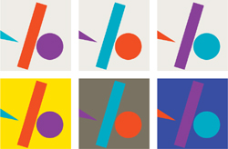
In attempting to identify a form and thereby assign it some meaning, viewers will focus on color after they appreicate the form’s shape—but the two messages are nearly simultaneous. As a result, the color message will exert tremendous force on perception. Comparing the dots above, guess which is being presented as a sun, and which the earth.
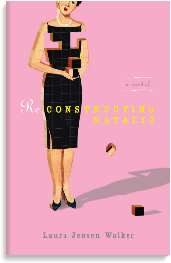
PINK WAS ONCE associated strictly with femininity. This book uses that color to evoke the time period in which that idea was prevalent.
Red Canoe United States
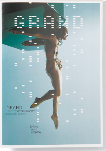
A GREENISH-BLUE HAZE transforms the upside-down figure into one that appears to be floating in water.
Frost Design Australia


