CHAPTER 1
Why You Can’t Ignore Animation
The recent advancements in the animation field aren’t the only reason there’s a growing interest in web animation right now. A bigger reason is the fact that much of the audience has changed its attitude toward the screens.
Thanks to the popularity of smartphones and the blurring of lines between phones, tablets, and computers, the expectations of what interacting with an interface should feel like have changed. These small pocket-sized computers have become a part of daily life, and their interfaces feel more alive with their gestures, depth, and animation.
The increased use of interface animations started with smartphones and native apps, but now they can be found almost everywhere. Even major operating systems like Windows and OSX have begun using animation as a core part of their design and interactions.
In comparison, static interfaces—the kind that the web defaulted to for so long, due to a lack of options—can feel dated and even a bit dull. When compared, at best, they seem to lack the sophistication of interfaces that include animation as part of their design. At worst, static interfaces feel broken and frustrating. Well-designed animation is becoming part of the definition of sophisticated, current, and trustworthy design. Teams like the people behind Stripe Checkout have purposely used animation in their design efforts with the goal of designing a more sophisticated product.1 It’s a big reason why so many designers have started to look at animation more seriously. If your design goals include an interface that feels modern and sophisticated, well-designed animation is one of the ways to get there.
Recognizing that animation can make your designs feel modern and sophisticated is probably what got you curious about interface animation in the first place, too. The reasons why animation has that effect, and where animation can have the most positive impact, are a bit more nebulous. So let’s look under the hood at the reasons why animation can make an interface feel more intuitive and easier to use.
Animation Has Brain Benefits
Sometimes, you might feel that an animated solution you’ve come up with is easier to understand or follow than the non-animated version, but you can’t put your finger on exactly why. Actually, your gut feeling is right, and it’s more than just a feeling—there’s research to back it up as well.
Once you start digging, you’ll find a surprising number of academic studies have been done on the effectiveness of animation on different kinds of learning outcomes. One common theme that comes up in a number of research studies is that animating between the different states of your interface can reduce cognitive load for your users. Essentially, animating an element’s movement makes that change in position visible on-screen, which means that your users don’t have to keep track of where things have moved. The effort they would have used to track the object is essentially off-loaded from their brain to the visible animation on-screen. They expend less energy keeping track of where things are, and can then focus their efforts on more important things, such as your content or the task at hand. That’s definitely a win-win situation.
TIP COGNITIVE LOAD DEFINED
Cognitive load refers to the total amount of mental effort being used in working memory.
A number of academic studies have researched different ways that animation can potentially reduce cognitive load. Among them, two studies from Erasmus University Rotterdam (2007) found that well-designed animation could reduce extraneous cognitive load for problem-solving tasks.2 It also found that cueing techniques in complex animations could enhance learning performance and free up learners’ working memory resources to focus on learning more efficiently.3 A similar study from the University of New Mexico4 showed that students learning a specific skill with animated study aids outperformed other groups and reported lower levels of cognitive load.
The results of these studies, and others like them, can back up that gut feeling you get when an animated interface just feels easier to use. It feels easier because you, as the user, have to do less work to keep track of what’s happening on-screen—a huge advantage of well-designed animation. Of course, the results of those studies don’t mean that every interface out there can be improved with animation alone. But they do prove that there is a strong potential for animation to be beneficial in the right context. (See Chapters 4-8.)
Reducing cognitive load is a big plus, but the potential brain benefits of animation don’t stop there. Other studies have shown that animation can improve decision-making capabilities5 and even help people learn and remember spatial relationships.6 Helping users keep track of spatial relationships is a big plus. Spatial relationships in an interface become more and more important as you find yourself designing for different-sized screens. The limited screen real estate on smaller screens means that it’s just not possible to have every available interface item on-screen at all times. Animation can help make it clear which items have moved off-screen and where they can be found again.
Establishing spatial relationships with animation can be equally helpful for interfaces that have different content on different layers as well. It doesn’t have to be limited to objects that are out of view to the left and right of the screen. It can also be more temporal and related to which layer in a stack of layers you’re currently viewing. Transitioning between the layers can help demonstrate what order the layers of the interface are stacked in and how your users can navigate between them.
That’s the highlight reel of academic research on animation as it applies to interface design. If you find these facts interesting, you can follow the nearly endless trail of research papers by looking at each study’s references list. Not all of the references apply as directly to interface animation as the ones mentioned here, but they all reveal some interesting facts about human behavior and computers.
Animation Communicates
Animation adds yet another dimension to your design work—the dimension of time—and it communicates on a different level than your other design tools, such as type or color. It’s human nature to assign meaning to why something is moving, based on your experience with real-world physics or by anthropomorphizing the animated objects.
When you see something move on-screen, you look for a reason as to why it moved the way it did. Did another object push it? Is it falling? Did it bounce off the edge of the screen or another object? All of those questions (and others like them) are ways you might try to explain motion on-screen based on your experience with real-world physics. After all, you’ve spent a lot of time in the real world, and you’re very familiar with how it works. By looking for an explanation of the motion in the realm of what you already know, you can make what you’re seeing on-screen feel more familiar.
Physical things like gravity and friction don’t actually apply to animation on a screen, but you still evaluate the movement you see on-screen based on what you know of the real world.7 This is why interface animation that reflects some aspects of the physical world feels more familiar. And conversely, it’s why interface animation that significantly contrasts with what you see in the physical world without good reason can be so disorienting or unsettling.
Sometimes, the objects on-screen can even seem like they have personalities, motivations, or emotions—essentially anthropomorphizing these objects into characters. A 1944 Smith College study by Fritz Heider and Marianne Simmel8 found that the vast majority of participants who were shown a film of animated geometric shapes interpreted the shapes as characters and created a story to explain the shapes’ movements. The shapes were triangles, lines, and other simple shapes—and there was no actual story at play. Still, nearly all of the participants saw one. Your users will find similar emotional ties and motivations in the animations you design, regardless of whether or not you put it there intentionally.
Knowing that your animations will be interpreted through one or both of those lenses—applying the rules of the physical world or as characters—creates a solid case for consciously designing what you want your animations to say. No matter what you do, they will be saying something. You can leave this additional message up to chance, or you can intentionally design it, taking advantage of that additional layer of communication to connect with your audience. It seems like a waste to pass up a chance to communicate something meaningful.
Animation Connects Contexts
Animation is a valuable design tool for creating a common feel throughout your design, even when it’s viewed in different contexts or on different devices. Designing an experience that feels cohesive and connected, despite the fact that your audience might be using any device under the sun to access your work, and maybe even more than one of them at once, is a big challenge of modern web design. Even in the world of native apps, your users are likely to encounter your product’s mobile app, desktop app, and website all within a short window of time. The considered use of animation can help you tie the experience together by creating a common feel across all those contexts.
The current responsive web design (RWD) landscape makes it especially important to unify the experience in some way across all the various contexts and devices your audience may be viewing your work on. You can use animation as a way to connect these contexts and create a common feel across all mediums and contexts. In fact, it’s a very powerful one. Considering the big picture of how all your interface animations appear as a group is a big part of doing animation well.
Even if RWD isn’t a specific concern for you, your audience will encounter your product or brand in a variety of ways—on their phones, laptops, in ads, on social media, and more—and the more common threads of design you have that can make all these contexts feel related or connected, the better. Even when you’re dealing with apps authored for different platforms from a different codebase, intentionally designing common threads in how your animation looks and behaves can help make them feel more consistent. When you have interface elements that animate in a similar manner on screens of all sizes or platforms, that’s one more thing that can remain constant, even while things like the layout may change.
The way all the individual interface animations you design work together at the big-picture level is what affects how connected these different contexts can be. By considering the choreography for all your animations as a group, you can better control the common factors that are communicated with animation across different layouts and viewport sizes. Two ways that the design of your animations as a whole can bridge the gaps between contexts are:
• Considering the choreography of the UI
• Giving similar content items similar animation behaviors
UI Choreography
Having a considered plan for the choreography of your interface animations can also help tie the experiences together and make them feel like one cohesive entity. Traditional choreographers design sequences for dances or shows, making sure that all the dance steps and movements work together as a whole. Considering UI choreography is a bit like playing director or choreographer with all the interface animations you design. As you plan the actions and movements of the elements on-screen (your “actors”), you’re also checking back with the big picture view to make sure that the overall message is intact and that all the actors are working as a cohesive ensemble.
When your animation’s personality doesn’t match the personality of your brand, things can feel off. For years, Apple’s navigation on apple.com was completely mismatched to its brand (see Figure 1.1). This animation drove me a little crazy every time I saw it, and I was surprised it was left unchanged for years. (Thankfully, it was redesigned in 2015 right around the release of the iPhone 6s, but it had been on Apple’s site since at least 2011.)
The animation was exaggerated as each product scaled bouncily into place and then zipped off out of sight, making an equally bouncy exit. The products moved in and out more like happy dancing Muppets than the sleek streamlined products they really were. The animation didn’t match the personality of the product, or the brand for that matter. That made it stand out for the wrong reasons.
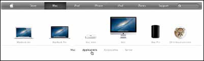
FIGURE 1.1
Apple.com’s old menu animations didn’t fit the simple sleek nature of its brand. You can see the old menu in action in this video: https://vimeo.com/162711355.
That mismatched motion didn’t stop anyone from buying their next Apple product, and it didn’t render the whole design a failure. But it was a missed opportunity to use a consistent voice across all aspects of the design. I’m sure I wasn’t the only one who paused to wonder why it was bouncing around like that.
Compare the feeling of mismatched design and animation to the UI animation in the game Dots. The transitions applied to the menus and settings screens echo the motion found in the game.
The animation, even while you’re just editing settings, fits the mood of the app and reinforces its brand by using transitions that echo the ones you see during game play (see Figure 1.2). Pretty clever, right? You can almost picture a conductor conducting each bit of motion to ensure that each fits into the bigger picture. In fact, it fits so well, you may have hardly given it a second thought until someone pointed it out.
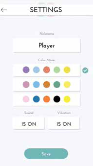
FIGURE 1.2
The Dots’ game setting menu from around the same time had the same kind of animation, but it fit the personality of its brand and game. You can see it in action in this video: https://vimeo.com/162712539.
A key part of designing good UI animations is remembering that adding animation is an opportunity to communicate a little something more. Any motion you add is going to communicate something; it’s really more a question of whether it’s saying what you’d like it to say.
A cohesive-feeling UI choreography can be achieved by designing all your interface animations to have similar or shared traits. The more they seem to match, the more they’ll feel as if they’re working together.
On a more granular level, you can use animation to reinforce commonalities among similar content items. Animation can be used as an additional clue to help inform the purpose or nature of different kinds of content. You likely do this already with things like color and typography. For example, all your navigation items probably have a similar look and feel to them with the colors and shapes they use. Using similar animation for all of them will strength this connection.
You can use animation to reinforce hierarchy within these groups of similar content as well. For example, you might have all the buttons on a site use the same blue-to-green color change animation, except for the delete button, which has a blue-to-red color fade. That would establish a common behavior for all buttons—they change color when activated. But the delete button has a slight variation on that behavior to help make the importance and severity of clicking it more apparent.
TIP DON’T FORGET THE VIDEOS
Many of the figures in this book have corresponding videos to show you their animation in action. Don’t forget to watch these videos to get the full picture!
Animation Grabs Attention
Of all the design tools at your disposal when designing for the web, animation is the one most likely to use its outside voice. Motion gets people’s attention,9 especially motion in the periphery of their vision. That’s the motivation behind animated banner ads vying for your attention while you try to read an article online. It’s even the driving force behind those silly windsock creatures outside car dealerships that try to catch your eye as you drive down the highway. In general, it’s hard for you not to look when you see something moving out of the corner of your eye. In the past, that instinct was probably used to save humankind from terrible danger, but now it’s mostly just used to exploit and annoy you.
The attention-grabbing powers of animation can be used in more positive ways. Using it well, and with more positive intentions, gives you the ability to reinforce the hierarchy of content and to highlight what’s most important at a specific point in time. Color, type, and layout can be used to create a static hierarchy, and animation can add to that by reacting to actions or timing that changes what is most important at any given time. In Chapter 5, “Using Animation to Direct Focus and Attention,” we’ll cover some specific tactics you can use to direct attention with animation, based on what’s most important to your users.
Animation’s potential to communicate, connect, get attention, and reduce things like cognitive load lays the groundwork for what animation can offer to interface design. By basing your use of animation on these known strengths and researched benefits, you can use animation more effectively in your work and support your decision to use it better. Grounding your reasons for using animation in one or more of these high-level areas can be a very effective way to sell the idea of interface animation to your boss or colleagues. In the following chapters, we’ll dig into the details of exactly how to harness these potential benefits of animation in your own work and how to do it all with an expert sense of style.