In 2002, a research group discovered something interesting. The Stanford Web Credibility Project[1] set out to learn what causes people to trust or distrust web sites, and much of what they found made intuitive sense: company reputation, customer service, sponsorships, and ads all helped users decide whether or not a web site was credible.
But the most important factor—number one on their list—was the appearance of the web site. Users did not trust sites that looked amateurish. Sites that made the effort to craft a nice, professionally designed look made a lot more headway with users, even if those users had few other reasons to trust the site.
Here’s another data point. Donald Norman, one of the best-known gurus of interaction design, concluded that “positive affect enhances creative, breadth-first thinking whereas negative affect focuses cognition, enhancing depth-first processing and minimizing distractions.” He added that “Positive affect makes people more tolerant of minor difficulties and more flexible and creative in finding solutions.”[2] Interfaces actually become more usable when people enjoy using them.
Looking good matters.
For many chapters now, we’ve talked about the structure, form, and behavior of an application; now we’ll focus more on its “skin” or its “look-and-feel.” Chapter 4, Layout, discussed some graphic design basics. That chapter covered visual hierarchy, visual flow, focal points, and the Gestalt principles of proximity, similarity, continuity, and closure. These topics form the foundation of page organization, and should not be shortchanged.
But there’s more to a nice house than just its room layout, though. When you pay for a well-designed new house, you also expect beautiful carpets, paint colors, wall textures, and other surface treatments. Without them, a house can be perfectly functional but uninspiring. Completing the job means paying attention to detail, fit, and finish.
Beautiful details don’t necessarily affect the efficiency with which people accomplish tasks in the house or interface (although research indicates that it sometimes does). But they certainly affect whether or not people enjoy it. That, in turn, affects other behavior—like how long they linger and explore, whether they choose to go there again, and whether they recommend it to other people.
You could even think about it as a moral issue. What kind of experience do you want your users to have? Do you want to give them an all-gray application that bores them, or a flashy ad-filled application that irritates them? Would you rather give them something they enjoy looking at, maybe for hours at a time?
Of course, far more than visual style influences a user’s emotional response (affect). Chapter 1 began discussing other considerations, such as how well you anticipate their usage habits. Software can pleasantly surprise people with considerate design. Tightly packed layouts evoke a different affective response than sparse, open layouts. Language and verbal tone play a huge part in this response, as does the quality of the software itself—does it “just work,” and is it fast and responsive?
A well-designed interface takes all of these factors into account. When content, meaning, and interactive behavior all work in concert with your visual style, you can evoke a chosen emotional response very effectively.
With products and web sites, stylistic elements are often designed to support branding. The design of any software product or site expresses something about the organization that produced it (even if it’s a loosely-knit group of open-source developers). It might say something neutral, or it might send a focused message: “You can trust us,” “We’re cool,” “We build exciting things.” A brand identity encompasses more than just a logo and tagline. It runs throughout an organization’s product designs, its web site, and its advertising materials—in fact, the brand’s chosen color schemes, fonts, iconography, and vocabulary show up everywhere. When planned well, a complete brand identity is coherent and intentional.
A brand identity is important because it establishes familiarity and sets expectations for someone’s experience with an organization’s products. Ultimately, a good brand should make people feel better about using those products. Look at what Apple was able to do with brand loyalty: many people love Apple products and seek them out.
In any case, whether or not they are intended to support a brand, stylistic elements make statements about your product. They communicate attributes like reliability, excitement, playfulness, energy, calmness, strength, tension, and joy. What do you want to communicate?
This chapter discusses more visual design concepts, this time focusing less on formal structure and more on these emotionally based attributes. The chapter won’t make an artist out of you—that takes serious practice and study. But the patterns capture some techniques commonly found on well-designed artifacts and explain why they work.
To explore how styles evoke different visceral and emotional reactions, we can try applying different visual styles to identical content. The actual content isn’t even that important—we’re looking for immediate, pre-rational reactions here, not the impressions gained from reading and interacting with the content.
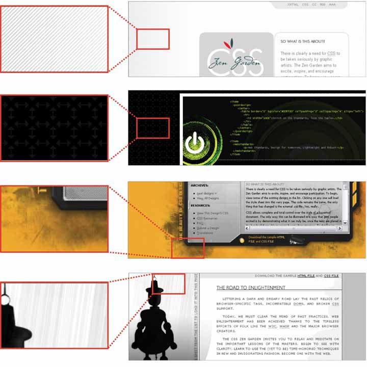
The "CSS Zen Garden” web site (http://csszengarden.com) offers us exactly that situation. Invented as a showcase for CSS-based web design, this site provides a single HTML page to all participants—everyone gets the same body text, the same HTML tags, and the same lists of links. Participants then create unique CSS files to define new visual designs for the page, and contribute them to the site. Visitors can browse through all the contributed CSS designs. It’s a delightful way to spend an hour or three, especially if you’re teaching yourself about visual design and trying to understand what you do and do not like.
The following eight figures present a sample of these designs. In each case, the basic content is the same; only the design has changed. Take some time to observe each one. When you look at each design, what is your immediate, visceral reaction? What words come to mind that describe the page? Does it draw you in, repel you, make you nervous, or delight you?
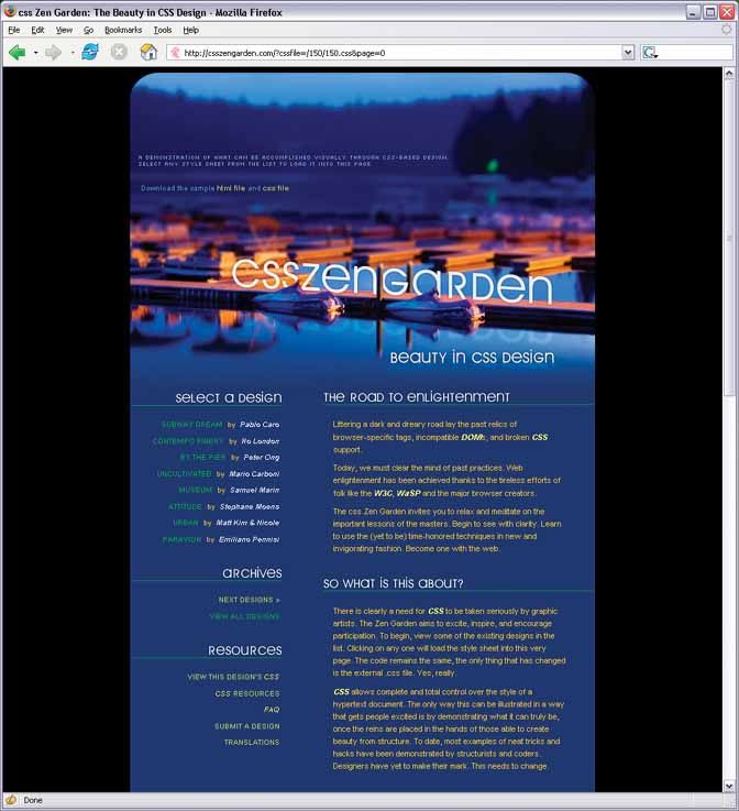

As you looked at the Zen Garden examples, you might have observed how they achieve such different impressions—a page’s color scheme may cause you to either smile or cringe, for example. Using these examples as a touchstone, we can talk about some of the principles of good visual design.
You might recall that we’ve already covered some visual design principles in Chapter 4, Layout, and Chapter 6, Information Graphics. Those chapters explored how the human visual system responds cognitively to certain inputs. The time it takes for someone to click on an orange square out of a field of blue squares, for example, doesn’t depend upon a user’s aesthetic sense or cultural expectations.
But now we’re talking about emotional and visceral reactions—does a single orange square add tension, brightness, balance, or nothing at all to a design? The answer depends on so many factors that it’s genuinely hard to get it “right” without a lot of practice. The cognitive aspects of these design choices certainly play a part; for starters, you can make a page hard or easy to read (a cognitive effect). But each person is unique. Each person has a different history of experiences, associations, and preferences; and each person is part of a culture that imposes its own meanings on color, typography, and imagery.
Furthermore, the context of the design affects the user’s response. Users see your design as a part of a genre (such as office applications, games, or e-commerce sites), and they will have certain expectations about what’s appropriate, trite or original, dull or interesting. Branding also sets expectations. So here’s the problem: as soon as you learn a “rule” for evoking an emotional reaction using a design principle, you can find a million exceptions.
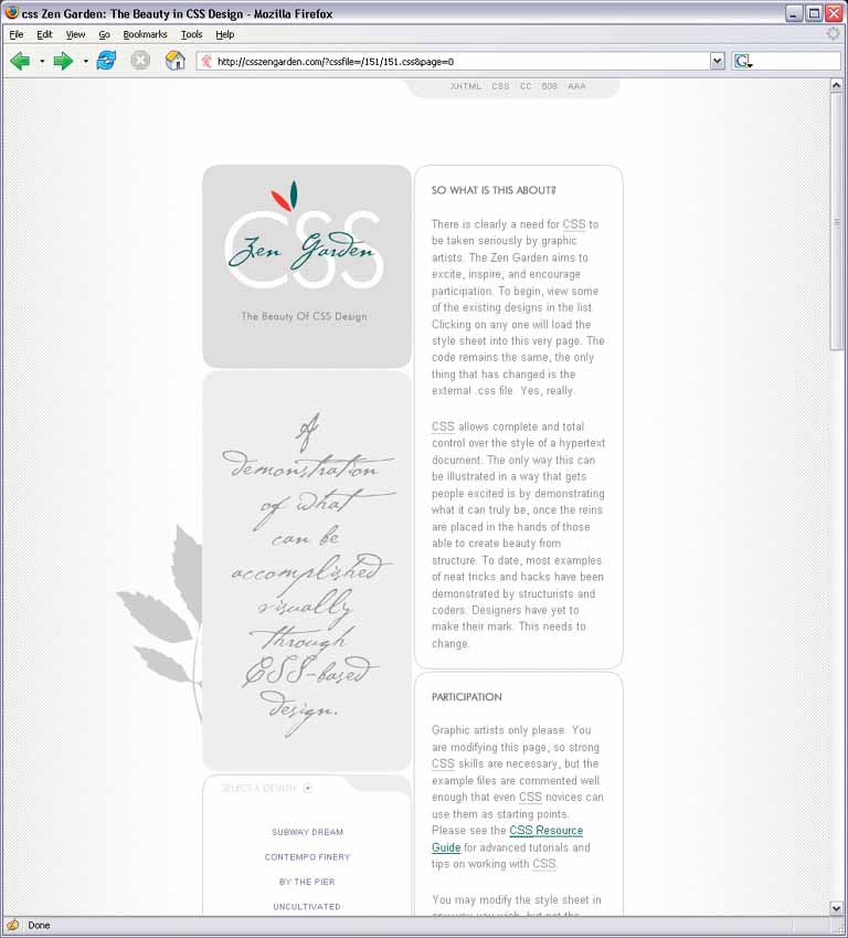
That said, if you know your audience well, visceral and emotional responses are surprisingly predictable. For example, most readers of this book probably thought that the first CSS example was a calm, soothing design, but that the second one was noisier and more tense. Why is that?
The answer lies in a combination of many factors working in concert: color, typography, spaciousness, angles and shapes, repeated visual motifs, texture, images, and cultural references.
Color is immediate. It’s one of the first things you perceive about a design, along with basic forms and shapes. Yet the application of color to art and design is infinitely subtle—master painters have studied it for centuries. We can only scratch the surface here.
When devising a color scheme for an interface, first rule out anything that makes it impossible to read:
Always put dark foregrounds against light backgrounds, or vice versa—to test, pull the design into an image tool like Photoshop and desaturate it (make it grayscale).
Never use red versus green as a critical color distinction, since many colorblind people won’t be able to see the difference. Statistically, 10 percent of men have some form of colorblindness, as do about 1 percent of women.
Never put bright blue small text on a bright red or orange background, or vice versa, because human eyes can’t read text written in complementary colors (on opposite sides of the color wheel).
With that out of the way, here are some very approximate guidelines for color usage.
- Warm versus cool
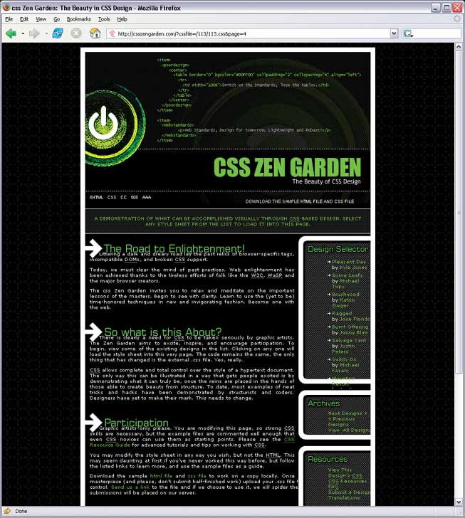
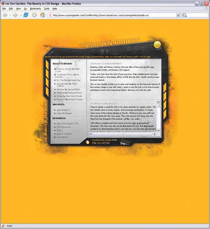
Red, orange, yellow, brown, and beige are considered “warm” colors. Blue, green, purple, gray (in large quantities), and white are considered “cool.” The yellow CSS Zen Garden in Design 6 feels vividly “hot,” despite the cool gray metallic surface used behind the content itself. Sites and interfaces that need to connote respectability and conservativeness often use predominantly cool colors (especially blue). Still, warm and cool colors can combine very effectively to achieve a balanced look—and they frequently do, in classic paintings and poster designs.
- Dark versus light background
The pages with light backgrounds—white, beige, and light gray—feel very different from the ones with very dark backgrounds. Light is more typical of computer interfaces (and printed pages); dark pages can feel edgier, more somber, or more energetic, depending on other design aspects. Actually, dark palettes are rarely used in form-style interfaces because desktop-native controls, such as text fields and buttons, don’t look good on dark backgrounds.
- High versus low contrast
Whether the background is dark or light, the elements on that background might have either high or low contrast against it. Strong contrast evokes tension, strength, and boldness; low contrast is more soothing and relaxing.
- Saturated versus unsaturated
Highly saturated, or pure, colors—brilliant yellows, reds, and greens, for example—evoke energy, vividness, brightness, and warmth. They are daring; they have character. But when overused, they can tire the eyes, so most UI designers use them sparingly; they often choose only one or two. Muted colors, either dark or light (tones or tints, respectively), make up the bulk of most color palettes. The green-and-blue Zen Garden design, Design 3, gets away with two saturated colors by using white borders, white text, and dark halos to separate the green and blue. (Even so, you probably wouldn’t want to stare at that green all day long in a desktop application.)
- Combinations of hues
Once you start combining colors, interesting effects happen. Two saturated colors can evoke far more energy, motion, or richness than one alone. A page that combines one saturated color with a set of muted colors directs attention to the saturated color, and sets up “layers” of color—the brighter and stronger ones appear closer to the viewer, while the grayer and paler colors recede. Strong dimensionality can make a design dramatic. Flatter designs, with more muted or lighter colors, are calmer. See the Few Hues, Many Values pattern for more discussion.
By choosing a font (properly called a typeface) for a piece of text, you decide what kind of voice that text is “spoken” in. The voice might be loud or soft, friendly or formal, colloquial or authoritative, hip or old-fashioned.
As with color, readability—the cognitive part—comes first when choosing type. Small text, or what’s called “body text” in print and on web sites, demands careful choice. The following considerations for body text also apply to “label fonts” in GUIs, used to caption text fields and other controls.
On computer displays, sans-serif fonts often work better at small point sizes, unlike print, in which the serifed fonts tend to be more readable as body text. Pixels aren’t big enough to render tiny serifs well. (Some serifed fonts, like Georgia, do look okay, though.) Display technologies such as anti-aliasing affect legibility greatly, so test the candidate fonts on your application’s destination platforms.
Avoid italicized, cursive, or otherwise ornamental fonts; they are unreadable at small sizes.
Highly geometric fonts, with circular letters (e, c, d, o, etc.), tend to be difficult to read at small point sizes. Those letters are hard to differentiate. Futura, Univers, and some other mid-twentieth-century fonts are like this.
All-caps is too hard to read for body text, though it’s okay for headlines and short texts, if the font is chosen carefully. Capital letters tend to look similar, and are hard for a reader to differentiate.
Set large amounts of text in a medium-width column when possible—say around 10 to 12 English words, on average. Don’t right-justify narrower columns of text; let it be “ragged right.”
Now for the visceral and emotional aspects. Fonts have distinctive voices, or colors, if you prefer. They have different graphic characteristics and textures on the page. For instance, some fonts are dense and dark, while others are more open. Look at the thickness of strokes and the relative sizes of letter openings for clues. Some fonts have narrower letters than others, and some font families have “condensed” versions to make them even narrower. The separation between lines of text (the leading) might be distant or close, making the block of text look either more open or more solid.
Serifs and curves add another dimension to font color or texture. Serifs add a level of scale that’s much smaller than the letterform itself, and that adds refinement to the font’s texture—the thick sans-serif fonts look blunt, strong, or even coarse in comparison (especially Helvetica). The curves and angles used in each letterform, including those that form the serifs, combine to form an overall texture. Compare an old-fashioned typeface such as Goudy Old Style to another classic serifed font such as Didot; they look very different on the page (Figure 9-9).
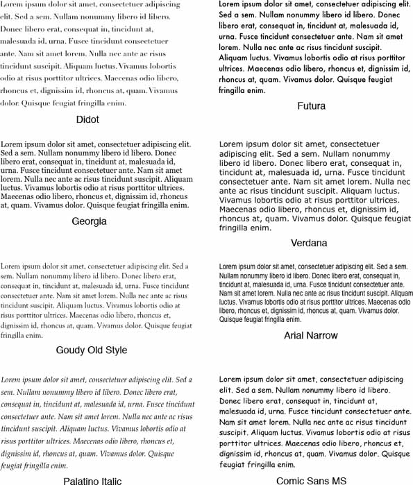
Figure 9-9. Eight fonts, as rendered on Mac OS X. Notice the different sizes, densities, textures, and formalities.
Though it’s not always easy to explain why, some fonts speak with a formal voice, while others speak with an informal voice. Comic Sans and other playful fonts are certainly informal, but so is Georgia, when compared to Didot. All-caps and capitalized words speak more formally than lowercase; italics speak informally. In the CSS Zen Garden designs shown earlier, Design 8 uses an all-caps, sans-serif font to speak in a cool and removed voice. Meanwhile, Design 5 (which uses Georgia) speaks in a warm and informal voice.
Cultural aspects come into play here too. Old-fashioned fonts, usually with serifs, tend to look—wait for it—old-fashioned, although anything set in Futura (a sans-serif font) still looks like it came from a 1963 science textbook. Verdana has been used so much on the Web that it’s now standard for that medium. And Chicago always will be the original Mac font, no matter what context it’s used in.
Some of the CSS Zen Garden designs use plenty of whitespace, while others crowd the page elements together. Spaciousness on a page gives an impression of airiness, openness, quiet, calmness, freedom, or stateliness and dignity, depending on other design factors.
Crowded designs can evoke urgency or tension under some circumstances. Why? Because text and other graphic elements need to “breathe”—when they’re colliding against each other, or against the edges or borders of the page, they cause visual tension. Our eyes want to see margins around things. We get slightly disturbed by designs such as CSS Zen Garden Design 2 (the black one with white arrows), which shoves the headlines right against the text. Likewise, Design 6’s compact layout somehow contributes to the busy, industrial feel of the page, though it doesn’t have collisions like Design 2.
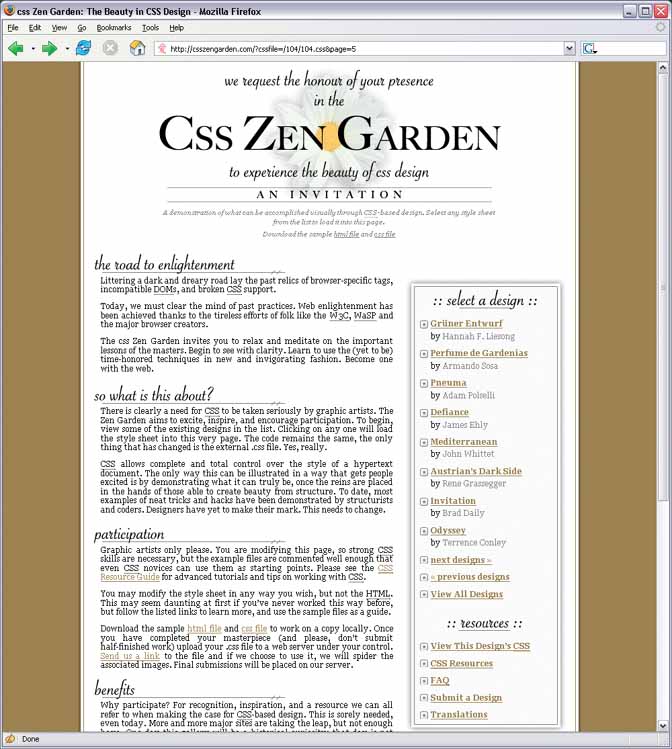
However, not all crowded designs evoke that kind of tension. Some connote friendliness and comfort. If you give the text and other elements just enough space, and reduce the interline spacing (leading) to the smallest amount that is comfortably readable, then you might achieve a friendlier and less rarified look. Design 5, the one with the daisy, illustrates this well.
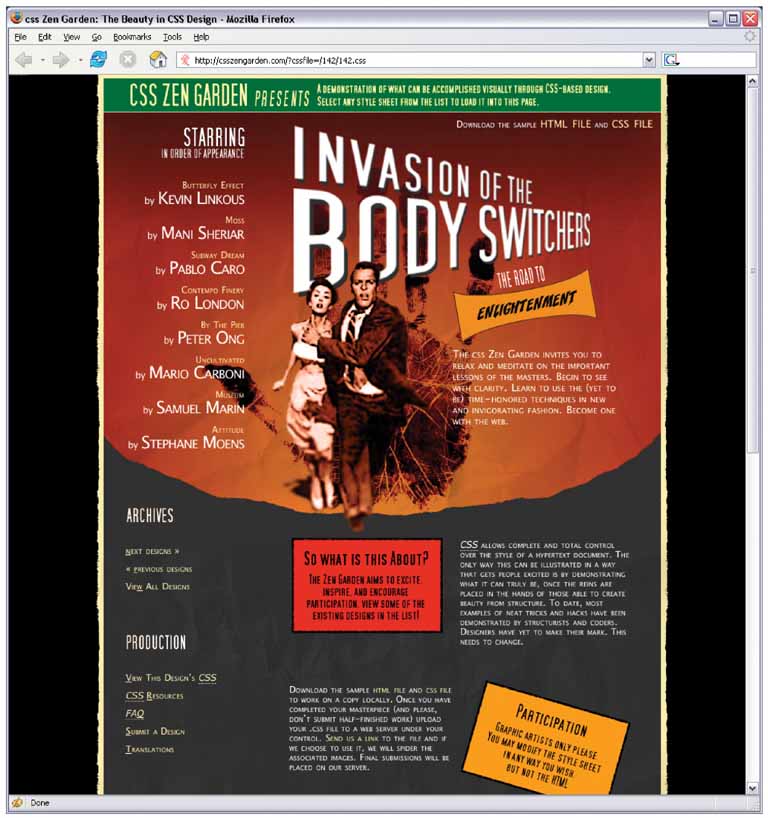
A page composed of straight up-and-down lines and right angles generally looks calmer and more still than a page containing diagonal lines and non-rectangular shapes. Likewise, a page with many different angles has more apparent motion than a page with a single repeated angle on it—see Design 7 for an dramatic example. Design 6 uses angles to create uneasiness and visual interest.
Curves also can add motion and liveliness, but not always. A design made with a lot of circles and circular arcs can be calming and restful. But a curve swooping through a page sets the whole design in motion, and a few carefully chosen curves in an otherwise rectangular design add sophistication and interest. Design 8 uses a single large elliptical curve for a dramatic effect—it contrasts strongly against the otherwise rectilinear design, so its impact is high.
Wherever two curves intersect, notice what the geometrical tangents to those curves are doing. Are the tangents at right angles? That results in a calmer, more still composition; if they cross at a more acute angle, the design has more tension and apparent motion. (Again, these aren’t hard-and-fast rules, but they’re generally true.)
When using angles, curves, and non-rectangular shapes, think about where the focal points are: at sharp angles, where lines cross, and where multiple lines converge, for instance. Use these focal points to draw the viewer’s eye where you want it to go.
Texture adds richness to a visual design. As described in the “Typography” section, text forms its own texture,[3] and you can control the look of that texture by choosing good fonts. For many pages and interfaces, fonts are the most important texture element.
But other kinds of textures deserve attention too. Blank regions, like the strips of empty space down the sides of a web page, can look much better when filled with a texture. You also can use textures to surround strong visual elements and set them off, as done in Designs 6 and 7. Textures add visual interest, and depending on what they look like, they can add warmth, richness, excitement, or tension.
The most effective textures in interface design are subtle, not vivid checkerboards of eye-hurting colors. They use gentle color gradations and very tiny details. When spread over large areas, their impact is greater than you might think. Figure 9-10 shows some of the margin textures in the CSS designs. Single-pixel dots, parallel lines, and finely-drawn grids are nice geometric textures; they’re easy to generate and render, and they add refinement to a design. See the Hairlines pattern.
Be careful when using textures behind words on a computer screen—it rarely works. All but the most subtle textures interfere with the readability of small text. You can put them behind large text, but watch the way the edges of the letterforms interact with the different colors in the texture, as that can visually distort the letters. Try fading a texture into a solid color as it approaches a block of text.
Each of the CSS Zen Garden designs reproduced here uses imagery. Some are photographs, and others are iconic semi-abstract pictures. In all cases, the images exist purely to set the mood of the design. These particular designs can go as far as they need to set that mood, since in the CSS Zen Garden, the design is more important than the content.
Your situation probably is different. In most applications and web applications, content and ease of use are more important than style. You should use purely decorative images sparingly and with great care on functional GUIs, since they tend to be distracting.
That said, you should look at the functional icons and images in your design—such as toolbar icons and Illustrated Choices (see Chapter 7)—and see if they make the emotional statement you want the whole design to make. Use the same criteria listed here: color, texture, angles, curves, spacing, and so on. Specifically, color schemes, angles, and curves should be consistent across an icon set. Don’t make them look too much alike, though, or users won’t see the differences easily. Larger icons usually “feel” better than small ones, partly because you can draw them more generously, and partly because of the crowding and space issues discussed earlier.
Back to decorative imagery. Photographs are extraordinary tools for evoking emotional responses. How many web pages have you seen showing happy, smiling faces? Kids flying kites? Competent-looking businesspeople in crisp suits? How about roads winding through beautiful mountain scenery? Sunsets or beaches? Rolling grassy hills under sunny blue skies? (You may find this one on something other than a web page.)
These kinds of pictures appeal to our deepest human instincts, and they all predispose the viewer to respond positively—as long as the context is right. If you try to put powerful images like these on an unassuming little utility application, users might laugh or criticize it as marketing overkill. This is a delicate area, and if you’re not sure something works, test it with users.
A design might remind you of something cultural—a brand, movie, art style, historical era, literary genre, or an inside joke. A familiar reference may evoke memories or emotions strong enough to trump all these other design factors, though the best designs make cultural references work in concert with everything else.
Design 7 might remind you of a 1950s movie poster. That’s almost certainly deliberate. The feel of the page is informal, lively, and playful—note the angles, color, and typography. The emotional reaction from most American adults probably will be “silly,” “nostalgic,” “retro cool,” or something like that. Everything in this design works together to produce a specific gut reaction. Some other CSS designs not shown here replicate the styles of Bauhaus, Art Nouveau, Dadaism, comic books, and even Soviet-era Communist propaganda posters.
Obviously, if you make overt cultural references, consider your audience. A 10-year-old will not get the 1950s movie-poster reference. Chances are good that a young adult in India won’t either. But if your audience is sufficiently well-defined for you to know that a cultural reference will be familiar to them, then it can be a good “hook” to engage a viewer emotionally with your design.
Cultural references rarely are used in functional application designs, but you can see them in Skins for applications such as Winamp. Its library of user-contributed skins include a Klingon style, an iPod imitation, and one that looks like an Etch-a-Sketch. The user-contributed GNOME backgrounds and themes are a rich source of references, too.
You also can find cultural references in applications like Quickbooks, in which some pages are designed to look like checks and bills. They actually move beyond a stylistic treatment and become an interaction metaphor, but the metaphor still is entirely cultural—someone who’s never seen a checkbook wouldn’t respond in the same way as someone who has.
A good design has unity: it hangs together as one entity, with each element supporting the others structurally and viscerally. That’s a hard goal to achieve. I can’t give you hard-and-fast rules on how to do it; it takes skill and practice.
But one thing that contributes greatly toward visual unity is the repetition of visual elements or motifs. We’ve already talked about angles and curves; you can use diagonal lines of the same angle, or lines with similar curvature, as repeated elements in a design. The Corner Treatments pattern talks about a common way to do this.
Also consider typography. Use only one main body-text font, though other fonts work very effectively in small areas like sidebars or navigation links. (Their contrast to the main font make them stand out.) If you have several headlines or titled sections, use the same headline font for them. You also can pull smaller graphic elements—line width and color, for instance—out of your fonts into the rest of the design. See the Borders that Echo Fonts pattern.
When similar groupings of text or controls repeat along a line, a visual rhythm results. You can see this especially in the “Select a Design” sections of Designs 3, 4, and 8. They show each of the design name/author pairs in a well-defined grouping, and then repeat that grouping along a column. You easily could accomplish the same effect with form fields, palette buttons, and other UI elements.
Rhythms like these can be powerful design tools. Use them with care, and apply them to groups of comparable things—users will assume that similarity in form means similarity in function. Incidentally, visual rhythm is what makes Small Multiples (Chapter 6) look so attractive when done well.
Those of you who work on web sites might already be familiar with everything discussed so far. People expect web sites—and by extension, web applications—to have strong graphic styling, and you will rarely find them looking completely plain and neutral.
But what if you work on desktop applications? If you try to apply these principles just to the controls’ look-and-feel—how the controls are drawn—you don’t have many choices. Java applications get to choose from a few look-and-feel options, most of which are native looking or fairly neutral (like Swing’s Metal look-and-feel). Linux applications have some nice choices, too, such as GNOME’s application themes. But native Windows or Mac applications generally use the standard platform look-and-feel, unless you’re willing to work hard to develop a custom one.
Given the situation, you can be forgiven for just using the platform look-and-feel standards, and concentrating your graphic design attentions elsewhere.
But some applications now look more “webbish” or “designery” than they used to, and they generally look better for it. Microsoft Money 2000 was one of the first mainstream applications to break the mold. Its designers chose to use background images in the top margins, gradient fills, anti-aliased headline fonts, and an unusual color scheme. Other applications have since done similar things. Winamp, as another example, has used creatively-designed skins for a long time; now most other media players have very distinctive looks, too.
Even if you do use a neutral look-and-feel for your actual widgetry, there still are ways to be creative.
- Backgrounds
Inobtrusive images, gradient fills, and subtle textures or repeated patterns in large background areas can brighten up an interface to an amazing extent. Use them in dialog or page backgrounds; tree, table, or list backgrounds; or box backgrounds (in conjunction with a box border). See the Deep Background pattern for more.
- Colors and fonts
You often can control overall color schemes and fonts in a native-looking UI, too. For instance, you might draw headlines in an unusual font, at several point sizes larger than standard dialog text, and maybe even on a strip of contrasting background color. Consider using these if you design a page layout with Titled Sections (Chapter 4).
- Borders
Borders offer another possibility for creative styling. Again, if you use Titled Sections or any other kind of physical grouping, you might be able to change how box borders are drawn. Solid-color boxes of narrow widths work best; beveled borders look very 1990s now. See Corner Treatments and Borders that Echo Fonts.
- Images
In some UI toolkits, certain controls let you replace their standard look-and-feel with custom images on a per-item basis. Buttons often allow this, for instance, so your buttons, including their borders, can look like anything you want. Tables, trees, and lists sometimes permit you to define how their items are drawn (in Java Swing, you have complete control over item rendering, and several other toolkits at least let you use custom icons). You also can place static images on UI layouts, giving you the ability to put images of any dimension just about anywhere.
The biggest danger here is accessibility. Operating systems like Windows let users change desktop color/font themes, and that’s not just for fun—visually impaired users use desktop themes with high-contrast color schemes and giant fonts just so they can see what they’re doing. Make sure your design works with those high-contrast themes. It’s the right thing to do.[4]
Along the same lines, you might replace ordinary text labels with images containing unusual fonts, maybe with halos, or drop-shadow effects, or complex backgrounds. This is common in web pages. If you insist on using an image for text, you need to provide enough information with that image to let a screen-reader like JAWS read it aloud. (How exactly you do that depends entirely upon the UI technology you’re using.)
Another danger is fatiguing your users. If you design an application meant to be used at full size or for a long time, then tone down the saturated colors, huge text, high contrast, and eye-catching textures—make the design quiet, not loud. More importantly, if your application is meant to be used in high-stress situations, like a control panel for heavy machinery, strip out anything superfluous that might distract users from the task. Here, cognitive concerns are far more important than aesthetics.
That said, I hope this discussion gives you some ideas about how to make your desktop UI a little more interesting. Figure 9-11 gives you some examples of controls with custom look-and-feels that still are relatively usable.
All of these patterns except Skins draw on the concepts described in the introduction. They talk about specific ways to apply those concepts; Corner Treatments, for instance, captures one kind of repeated visual motif, and Borders that Echo Fonts captures another. Deep Background touches on texture choice, but so does Hairlines, and fonts are discussed in Contrasting Font Weights.
The Skins pattern is different. It deals more with meta-design—it says nothing about how you design the skin or look-and-feel of your application, but it does address how you design your application to let others replace your look-and-feel with their own designs.
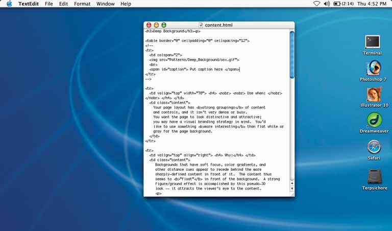
Place an image or gradient into the page’s background that visually recedes behind the foreground elements.
Your page layout has strong visual elements (such as text blocks, groups of controls, or windows), and it isn’t very dense or busy. You want the page to look distinctive and attractive; you may have a visual branding strategy in mind. You’d like to use something more interesting than flat white or gray for the page background.
Backgrounds that have soft focus, color gradients, and other distance cues appear to recede behind the more sharply defined content in front of it. The content thus seems to “float” in front of the background. This pseudo-3D look results in a strong figure/ground effect—it attracts the viewer’s eye to the content.
Fancy explanations aside, it just looks good.
Use a background that has one or more of these characteristics:
- Soft focus
Keep lines fuzzy and avoid too much small detail—sharp lines interfere with readability of the content atop it, especially if that content is text or small icons. (You can kind of get away with sharp lines if they are low-contrast, but even then, text doesn’t work well over them.)
- Color gradients
Bright, saturated colors are okay, but again, hard lines between them are not. Allow colors to blend into each other. In fact, if you don’t have an image to use in the background, you can create a simple color gradient in your favorite drawing tool—it still looks better than a solid color. (You don’t need to store or download pure gradients as images, either. On the Web, you can create them by repeating one-pixel-wide strips, either horizontally or vertically. In systems where you can use code to generate large areas of color, gradients generally are easy to program.)
- Depth cues
Fuzzy detail and vertical color gradients are two features that tell our visual systems about distance. To understand why, imagine a photograph of a hilly landscape—the farther away something is, the softer and hazier the color is. Other depth cues include texture gradients (features that get smaller as they get farther away) and lines radiating from vanishing points.
- No strong focal points
The background shouldn’t compete with the main content for the user’s attention. Diffuse (weak) focal points can work, but make sure they contribute to a balanced composition on the whole page, rather than distract the viewer from seeing the parts of the page they should look at instead. See Figure 9-13.
As you design an interface with a deep background, consider what happens when the user changes the size of the page. How will the background accommodate a larger (or smaller) size? Will it rescale to fit, or will the window just clip an unscaled image? Clipping is probably less unsettling to the user; it’s how most web pages behave, and it feels more stable. Besides, you don’t have to worry about changing aspect ratios, which is problematic with many images.
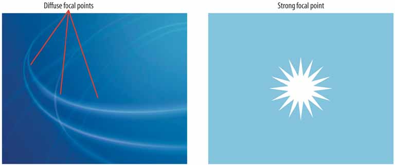

Figure 9-14. The Netscape 7 look-and-feel shows the use of gradient-based sculpturing behind UI controls. The gradient works well with other visual features—barely-visible drop shadows, contouring around the “Home” and “Radio” buttons, and even the shading in the etched group box around the Search field and button—to create a finished “two-and-a-half-D” look.

Figure 9-15. The Mercedes-Benz web site uses an image as a background. This image has some very strong focal points—the cars, of course—and they are the central feature of the page. But the outer parts of the image, which are much softer, are deep backgrounds for other content: the search box, the four small images at bottom, and the “4MATIC All-Wheel Drive” tagline. The most interesting aspect of this figure is the darker band running down the lefthand side. The site needed a navigation bar with small text, but layering those links directly over the background image wouldn’t have worked—the words may have been unreadable over small detail, and would have gotten lost in the composition. A translucent smoked-glass background highlights those white links by increasing contrast; it balances the page (which otherwise is right-weighted); it doesn’t obscure the nice background image; and it adds a sense of layered depth. See http://www.mbusa.com/brand/index.jsp.
Choose one, two, or at most three major color hues to use in the interface. Create a color palette by selecting assorted values (brightnesses) from within those few hues.
You decide on a color scheme for an application or site. You want to avoid a flashy, rainbow-colored, “angry fruit salad” look, but you still want the interface to have some character.
Where colors are concerned, sometimes less is better. Too many color hues scattered throughout the interface, especially when they’re bright and saturated, make a design noisy and cluttered. The colors compete for the user’s attention.
But when you use many subtle variations on a single color, you can create a design that has depth and dimension. Consider the gray and brown colors used in the example above, reproduced in the color strip below (Figure 9-17). Notice how the darker and grayer shades appear to recede, and the lighter and brighter tints appear to move forward. This contributes to the pseudo-3D effects—such as beveling, drop shadows, and gradients—that form the contours of the UI.
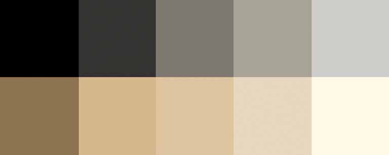
As mentioned earlier, pick one, two, or even three main hues. You get black and white for free, but gray counts. In fact, gray works very well in multiple values and brightnesses; it’s a versatile color, especially if you add a little color to make it more blue (cool), or more beige (warm).
Within those hues, vary the color value to get a range of bright and dark shades. You also can vary the saturation at the same time; this can produce more subtle color combinations than you would get by varying just the value. Use as many of these colors as you want to compile a color palette for the application.
You can, of course, use other colors in the interface besides these hues. Just use them sparingly. Icons, ads, and other features that take up relatively small spaces don’t have to fit this restricted color scheme. You might want to choose only one or two accent colors, too, like using red or cyan to mark points of interest. In fact, using a single hue for the “background” of the UI actually emphasizes these minor colors because they don’t get lost in a sea of color hues.

Figure 9-18. This graph uses two hues, blue and pink, to show its data. Blue represents boys’ names, and pink represents girls’ names. Within those colors, the color value represents the popularity of those names in 2003. A third color, dark gray, shows the frame around the data—the grid lines, the numbers, and the title—and a dark blue highlights the selected name (“Dale”). This color combination is very effective, both cognitively and aesthetically. The hues and values mean something with respect to the data, and the coding is very easy to follow—you hardly even need the legend once you’ve looked at it once. Aesthetically, the whole thing has a layered richness that isn’t garish, as rainbow hues would have been. And in American culture, people understand light blues and pinks as “baby” colors, so the emotional and cultural connection is there too. See http://babynamewizard.com.

Instead of using ordinary right angles, use diagonals, curves, or cutouts for some of the interface’s box corners. Make these corner treatments consistent across the interface.
The repetition of visual motifs helps unify a design. When you devise a single “corner” motif and use it consistently in many places, it gives a distinctive look to the whole design. It’s certainly less boring than ordinary right-angled corners.
Many web sites use curved corners. Others use diagonal lines, and a few use cutouts. What you choose depends on the overall look of your site—do you have a logo, an image, or a font that has eye-catching visual elements to it? Use one of those visual elements. Are you going for something soothing (as curves often are), edgy, or energetic? Try out several different ideas.
Not all of the rectangular elements in the interface need to use corner treatments—don’t use too much of a good thing. But group boxes or panels usually do, and tabs commonly are done this way too. If you use corner treatments on one group box, do them all, for consistency.
Furthermore, not every corner on a given box needs to use a corner treatment. Sometimes two opposing corners get it, such as the upper right and lower left. Sometimes it’s just one corner, usually the upper left or upper right.
Everywhere the element is repeated, make sure it resembles the others. In other words, curved corners should use the same type of curve (though not necessarily the same radius). Angles should be the same angle—don’t mix a 45-degree angle motif with a 20-degree angle, for instance.
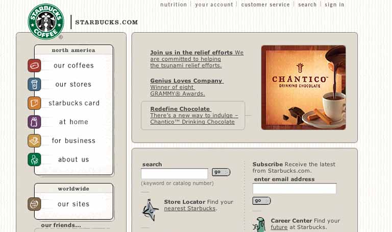
The Starbucks web site, shown at the top of this pattern, takes advantage of its circular logo by echoing that curve in rectangle corners all over the page—in panel borders, icons, and even the “go” buttons. The overall effect is restful and unified.
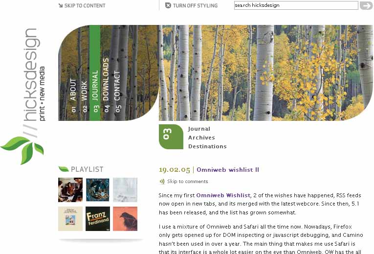
Figure 9-21. This personal web site uses rounded leaf-like corners as a major design element. Not every corner is rounded, and not every curve has the same radius, but it’s still a repeated motif. The design still works. See http://hicksdesign.co.uk.

Figure 9-22. This K2 site has an entirely different look. This one uses lime-green borders with angled bottom corners. Notice that most angles are on the lower-right corners, but to the far left, one is on the lower left corner. Also note that the angles are the same as those on K2’s logo in the bottom right.

When drawing borders and other lines, use the same color, thickness, and curves used by one of the design’s major fonts.
Your design contains a font carefully chosen for its visual effect, such as the font used in headlines, a title, or a logotype.
The repetition of visual motifs helps unify a design. Fonts and borders work at similar scales in a design—only a few pixels wide—and when they reinforce each other visually, their effect is magnified. When they clash (especially if you use many different kinds of borders), their contributions are weakened.
First, pick a font from your design. Title and headline fonts often work well, as do fonts used in logotypes, but sometimes body text works too. Observe its formal properties: color, primary line thickness, texture, curve radius, angles, and spacing.
Now try to draw borders and lines that use some of those same properties. The color should be the same as the font’s, though you can cheat on thickness and make it a bit thinner than the font’s strokes. If the font has pronounced circular curves, as many modern sans-serif fonts do, try using that same curve radius on the border corners.
If it’s a particularly interesting font, ask yourself what makes it interesting. See if you can pull those visual elements from the font into the rest of the design.
You don’t need to do this with all the borders in your interface, of course; just a few will do, especially if the lines are thick. Be careful not to make borders too thick or coarse. Thick borders make a strong statement, and after a point, they overwhelm whatever’s inside them. Images usually can handle a thicker border than lightweight body text, for instance. You can use single-pixel lines effectively in combination with heavier borders.
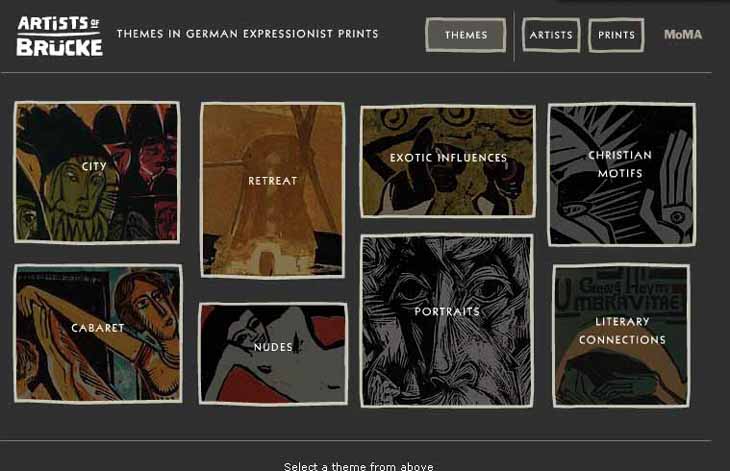
The example at the top of this pattern, Figure 9-25, uses borders that echo the logotype (“Artists of Brücke”). The logotype has a hand-drawn, roughedged look to it. The rest of the UI’s text is smooth and tiny; if the thick hand-drawn look hadn’t been picked up elsewhere in the design, it wouldn’t be such a strong design element. But since the borders work with it in concert, the whole page hangs together visually. It’s a nice contrast to the thin smooth fonts and lines.

Figure 9-26. You can see this pattern at work in many web sites where modern sans-serif fonts are echoed in thick, solid-color borders. The “Earnings” headline picks up elements of HP’s logo font—white and four to five pixels thick—and the five-pixel white borders pick them up again. Here’s something that’s hard to see without a magnifier: the vertical lines in the “Earnings” font actually are only three pixels thick, but the font still looks similar to the five-pixel borders. Perception is more important than precision. See http://hp.com.
Figure 9-27. This works similarly, though again, the font doesn’t exactly match the thickness of the borders. But that’s okay. See http://www.planetkaizen.com.
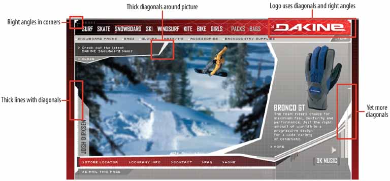
Figure 9-28. Dakine’s web site mixes it up a bit. It uses many varied design elements, but the jagged white lines do in fact echo the logo font. Altogether, they lend a feeling of motion, tension, and edginess to the page, which was undoubtedly what its designers were after—Dakine sells sports equipment to a young demographic. See http://dakine.com.
When your design is made up of larger elements, such as blocks of body text, areas of different color, and images, hairlines add a level of scale to the design that may not be present otherwise. The design will look more refined.
Here are some of the many ways you can use hairlines in an interface:
To demarcate Titled Sections, by underlining the titles
To separate different content areas, either with horizontal or vertical rules, or with closed borders
As guidelines to lead the eye through a composition
Between areas of different background colors, to clarify the boundary between them
In textures, such as a grid or a block of horizontal lines
In icons, images, and drawn graphics
As borders around controls, such as buttons
Hairlines look particularly good when placed near very thin sans-serif fonts. Remember that a gray line looks thinner than a black line, even if both are a single pixel wide. The same is true for other lighter colors, like the teal used in the NIH example at the top of the pattern. The less contrast between the line and its background, the thinner and lighter it appears.
Another way you can lighten a hairline—and add another texture while you’re at it—is to make it a dotted line instead of a solid line. As of this writing, finely-drawn dotted lines are becoming common on the Web, even as underlines for links.
A trick to increase the tension and edginess in a design is to push a hairline flush up against the bottom of a line of text. Design 8 of the CSS Zen Garden designs does exactly that with its title and headlines (see Figure 9-8, back in the introduction to this chapter).
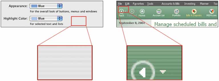
Figure 9-30. Both Microsoft and Apple have used subtle hairline textures in their UI designs. Here are two examples—one from an OS X standard dialog, and the other from Microsoft Money. Both designs place small text against the textured background, which is a little risky. But the colors in these textures are so close that the difference is only barely detectable, so the texture doesn’t interfere with readability.
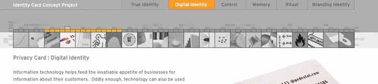
Figure 9-31. IDEO’s special identity-card web feature uses hairlines as a major design element, as does the NIH site at the top of the pattern. Notice that hairlines demarcate the title, the major navigation links (“Digital Identity”), the minor links (the square icons), and the decorative bricks. The design uses a horizontal hairline texture again behind the major links. These hairlines harmonize nicely with the small sans-serif font. See http://www.ideo.com/identity/.
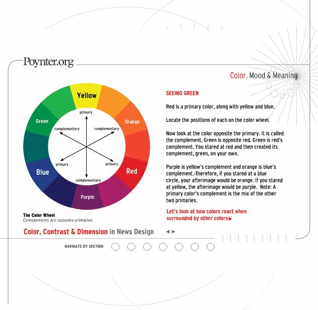
Figure 9-32. This design uses hairlines to frame the content and to create a strong focal point on the title (“Color, Mood & Meaning”). This time many of the lines are curved rather than straight, but the same principles apply. See http://poynterextra.org/cp/index.html.
Use two contrasting fonts—one thin and lightweight, and the other heavier and darker—to separate different levels of information and add visual interest.
Text makes up important elements on the page, and you want the page’s organization to be very clear at first glance. You want the page to look dramatic.
When two fonts differ in weight, they form a strong and vibrant visual contrast. Aesthetically, contrast contributes to a dramatic and eye-catching look. High typographic contrast, which includes size, texture, and color—but especially weight—guarantees that your page will not look dull.
You can use this contrast to structure the text on the page. For instance, heavier-looking letters can form titles and headlines, thus helping build a visual hierarchy. The bold text in the above figure pulls the eye towards it. Thus, contrasting font weights contribute to the cognitive perception of the page as much as the aesthetics.
This pattern has many possible applications. This book already mentioned the use of bold text for headlines, but applications might include:
Separating labels from data in a two-column listing
Separating navigational links from information
Indicating selection, such as selected links or list items
Emphasizing words in a phrase
Separating one word from another in a logotype
If you’re using fonts that are larger than body text, such as the logotypes on the following page, make sure that the contrast is strong enough to be noticed. When the font family offers several weights, as does Helvetica Neue, pick fonts that are at least a couple of steps apart. If the contrast is weak, it looks accidental, not intentional. (The same goes for other font attributes. If you make two text elements different sizes, make them really different; if you want to mix font families, make sure they don’t look too much alike!)

Figure 9-34. Adaptive Path’s home page has not one, not two, but three uses of contrasting font weights. The first is in the logotype—the heavier font weight and darker color emphasize the shorter word “path”. The graphic figure underneath it adds additional emphasis. (Also note the use of Deep Background and Hairlines in this screenshot.) The second usage is in the tagline, where the important words “value” and “experience” are heavily weighted. The design still uses spaces here to separate words, so the value of contrasting font weights is in the emphasis of some words over others. The third usage is in the navigation bar, where the current page (“home,” in this screenshot) gets a heavier font weight than the others. You should consider all the links to be one family of objects, but the current page ought to stand out, so the font is the same for all links except for the weight.

Figure 9-35. When you work with data written in body text, you can use bold letters to separate labels from data. In this little window, users will be more interested in the data than the labels, so that’s what gets the eye-catching bold text. See http://lukew.com/portfolio/.
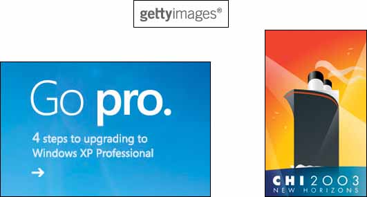
Figure 9-36. Several more arbitrary examples of emphasis and separation: the Getty Images logo, a tagline from http://microsoft.com, and the CHI 2003 logo.

Open up the look-and-feel architecture of your application so users can design their own graphics and styles.
Your user base includes a large population of people who know your interface well. For those people, the interface has relatively low cognitive requirements—it’s not used in high-stress situations, for instance—so it’s not necessary to make all widgets look standard.
Furthermore, these users like to tinker. They value style, and they are inclined to set software preferences to suit their tastes.
When people rearrange and customize their personal space, physical or virtual, they derive a sense of ownership of that space. This is a basic human need (though not all people act on it; many people are perfectly content with software’s “factory settings”). Changing simple color and font preferences is one common way to customize someone’s software environment, but skins go far beyond color schemes and fonts.
There’s evidence all over the Internet that users really like skins. Actually, we’re talking about two groups of users here: those who download and use skins, and those who not only use them but also design them. Those who design them see skinning as an opportunity to be creative, and to get their work out into the public eye. Many are graphic artists. These people may get to know your UI design very, very well.
In any case, there are numerous applications out there—most of them open-source, but Windows XP is one too—that are skinnable, and the sheer number of user-designed skins is enormous. The number of person-hours spent on these skins is testimony to the power of the creative impulse. For the skin designers, skinnable applications fulfill another basic human need: creativity.
Exactly how to design and implement a skinnable application depends entirely on the UI technologies you use, so it’s very hard to generalize anything here.
First, remember that any native Windows XP application already is subject to skinning by a product called WindowBlinds (see http://www.stardock.com/products/windowblinds). It literally changes the way native controls are drawn.
Second, here’s how application-specific skinning might work. Some skinnable applications let skinners define simple bitmap fragments, or “slices,” that are fitted into the application frame at specific pixel locations. So a skinner might create images for corner tiles, horizontal slices (which are repeated along a horizontal line as many times as is necessary), vertical slices, and buttons in their various states: for example, checked, pressed, or rollover. ICQ skins work like this; see Figure 9-38. Your original page layout will remain stable in these cases.
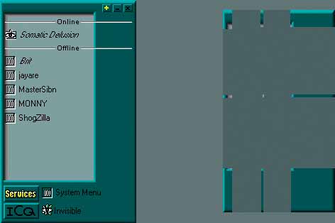
Figure 9-38. Static bitmap skin implementation, courtesy of the tutorial at http://www.geocities.com/bakerstr33t/
However, some applications, including Winamp 3, allow skins to rearrange the location of controls, reshape the application frame, and even add new functionality. Some scripting is involved, and these skins are correspondingly harder to produce. And your UI gets rearranged! Your choices of functionality and navigation are preserved, but not much else is.
One objection often raised to skins is that they make interfaces harder to use. That’s true about many badly designed skins. Ask yourself, though: How much does that matter? Does each application have to be cognitively perfect? (Default look-and-feels aren’t perfect, though they’re certainly more usability-tested than skins are.) For an application that someone already knows well and doesn’t place high cognitive demands on, there’s a point at which its basic usability is “good enough” and personal aesthetic preferences take over. When skins are available, people make that choice for themselves, whether or not they’ve educated themselves about usability.
To an extent, you can—and should, as part of a designer’s responsibility—decide at which level to permit skinning. You may only allow icons to be changed. You may permit bitmap-level skinning that preserves layout, like ICQ. Or you may allow full customizability, like Winamp 3; it’s up to you to decide if that kind of freedom is likely to make the interface criminally hard to use.
I’m going to speculate that excellent application design—for example, well-chosen functionality, easily understood organizational models, appropriate navigation, good page layout, and standard widgetry—can make an interface more resilient to bad skins. Design it as well as you can, and then put it out there for people to customize at a level you decide is appropriate. See what happens!

Figure 9-39. Many high-end cell phones can have skins installed, along with ring tones and other customizations. This figure shows a few skins for the Nokia 6600. Note that all the text and buttons stay in the same places; only details like wallpaper, icons, and particular widget graphics are skinnable. See http://mangothemes.com.
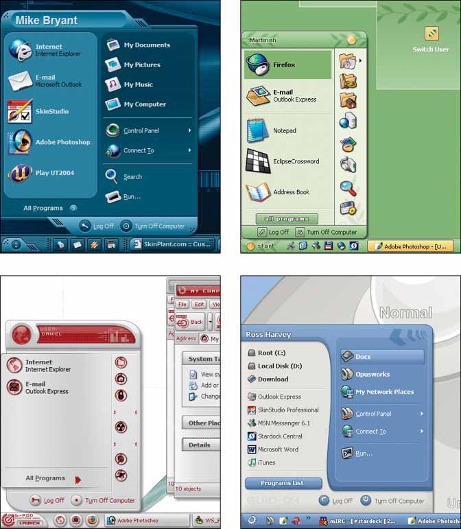
Figure 9-40. Start Menu details from four WinXP skins, found at http://browse.deviantart.com/skins/windows/windowblindsxp/. WindowBlinds makes the entire Windows XP desktop skinnable, along with native applications, as mentioned earlier. These screenshots show some elaborate skins for Windows XP. Notice how they use many of the techniques and patterns discussed in this chapter: the use of only one or two main hues with many values, deep backgrounds and pseudo-3D detailing, dynamic curves and angles, and interesting corner treatments.
[1] See http://credibility.stanford.edu.
[2] See Donald Norman, “Emotion and Design: Attractive Things Work Better,” at http://www.jnd.org/dn.mss/Emotion-and-design.html. See also his book on the subject, Emotional Design: Why We Love (or Hate) Everyday Things (Basic Books).
[3] On an interesting etymological note, the English words “text,” “texture,” and “textile” all derive from the same Latin root, texere, meaning “to weave.” Isn’t that evocative?
[4] And, depending on who buys your software, it may also be the correct legal thing to do. The United States government, for example, requires that all software used by federal agencies be accessible to people with disabilities. See http://www.section508.gov for more information.