
Chapter 10. Long-Time Listener, First-Time Caller
Flatter me, and I may not believe you. Criticize me, and I may not like you. Ignore me, and I may not forgive you. Encourage me, and I will not forget you. Love me, and I may be forced to love you.
—WILLIAM ARTHUR WARD
Soliciting Feedback
SOLICITING FEEDBACK FROM PEOPLE, no matter the form, is one of the easiest ways to engage your community. After all, everyone has an opinion. Giving feedback is also considered one of the lowest barriers to entry for user engagement and is often the first step on the ladder of user participation.
User ratings are potentially the easiest item to add to a site to gather user opinions and can start a user down the participation road. Additionally, as you build up the engine around ratings, you can use the information to understand your users and create more value for them through recommendations (see Recommendations) and other socially driven features. Ecommerce benefits greatly from the inclusion of ratings and reviews. There is a level of trust and authenticity that consumers respond to even with the inclusion of negative reviews. Research has shown that people are more likely to buy if a product site includes ratings and reviews. Amazon has been quite successful at this, using purchasing behavior and ratings to infer which new products might be interesting to the purchaser.
Finally, leaving comments (which is the first step in having a user-to-user conversation about an item), giving feedback, and reviewing an item are all activities that will potentially grab your user for longer-term activity. Each of these encourages registration and repeat visitation. You can combine these patterns with one of the rating styles and tagging to create a suite of user opinion around original or user-generated content and form the foundation of a robust reputation system.
General Considerations
There are several types of user ratings, and each has its place depending on the context of use. However, they all share some common principles and benefits.
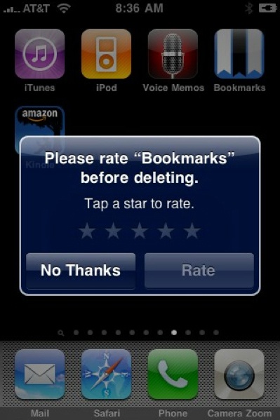
The ability to rate an item should entail nothing more than a minimal amount of investment by the user. The mechanism should be associated with the item and easy to find and positioned in a user flow at the optimal instance, such as after reading an article or making a purchase. The option to leave a rating or review should not be presented at a moment of bias, such as when they are about to delete an app from their phone, as is shown in Figure 10-1.
Users who write reviews or leave comments should be held accountable. They should have an identity associated with their words and opinions—both to keep them honest and to help build the reputation of that identity. They should only be allowed to vote once lower the risk of some users gaming the system.
It should be very clear what users are rating or to what they’re lending their opinion. They should be leaving this information about a service, experience, or thing, not about a person—although with services such as a real estate broker, rating an agent’s knowledge and expertise is helpful to others. The criteria for rating should be clearly articulated. The simpler the rating mechanism, the less clear this becomes.
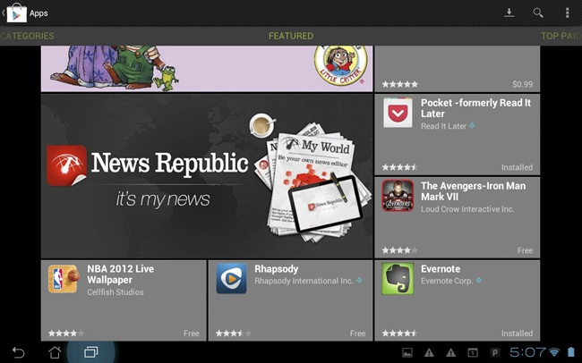
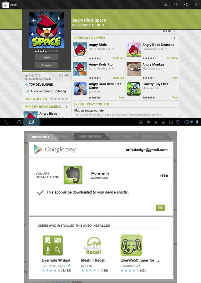
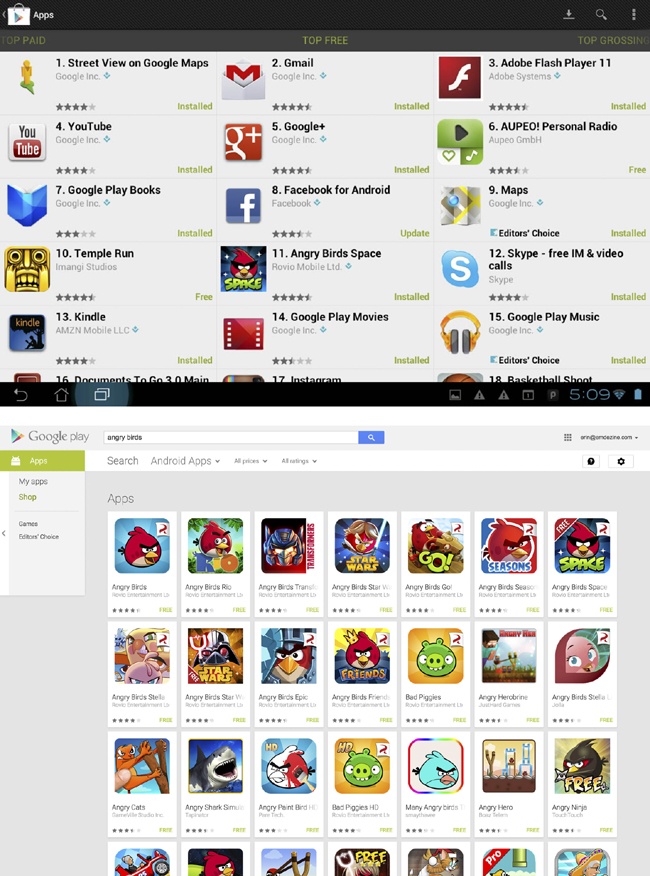
You should expose ratings everywhere. For example, you could reveal the rating for an item in search results, on browse screens, and details screens. You can use them to clarify searches and filter results regardless of the type of rating pattern used (see Figure 10-2 through Figure 10-5).
Because ratings and reviews help to build reputation, there should be recognition for a person’s quality contributions—they should be reflected back to themselves and the community. People are more likely to trust another user’s reviews over a critic, especially if that person is qualified, is like them, and is presented as being authentic and honest. You can present and clarify all of these attributes in the reviewers profile and through your identity system.
Lastly, don’t just implement it and walk away. You should analyze the data collected from ratings, reviews, and feedback and use that data to modify, tweak, and adjust the offerings to your users based on the things they tell you. The pact that you make when asking someone to sign up and give feedback is improvements to the content, the quality, or personalization of their experience.
Vote to Promote
What
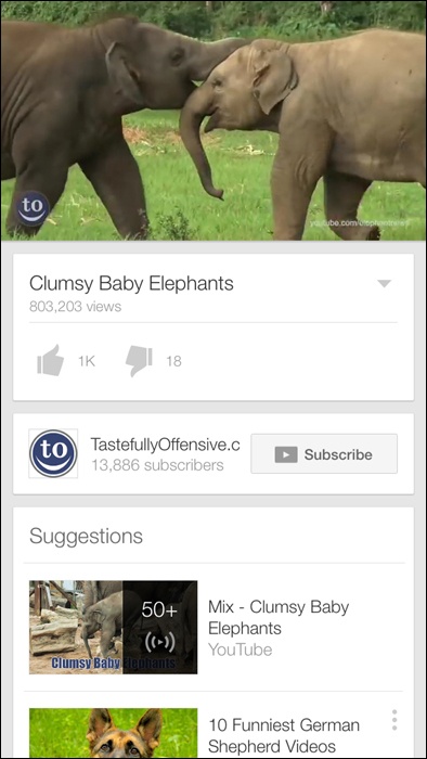
The user wants to promote a particular piece of content within a community in which they participate. This promotion takes the form of an upvote for that item, and items with more votes rise in the rankings and are displayed with more prominence, as depicted in Figure 10-6.

Use when
Users in the community have the ability to submit content to a “pool” of resources.
Some democratic form of judgment is needed so that the community can compare the subjective quality of one submission to another.
A fairly large community is required. Ideally, to make comparisons meaningful, popular submissions in the pool should receive significantly more votes (dozens, hundreds?) than those that are unpopular.
How
Provide a voting mechanism, attached to each item in the community pool. Clicking this mechanism counts as a vote in favor of that item’s promotion:
Each user gets only one vote per item.
Display a user’s vote back to him so that he can confirm the item for which he cast a vote.
Users can change their votes after they are cast.
Highlight popular items:
Display the most popular items prominently on a home page or section screen.
Display them first in search results.
Prominently display the number of votes that an item has received.
Try to ensure that users are voting on items that they have actually consumed (read, watched, listened to):
On article pages, place vote controls after the article.
Consider withholding the ability to vote on high-level listing pages. Make readers go into an article page before voting.
Provide a standalone voting mechanism that third-party publishers can include on destination sites.
Items with fewer votes are not punished for their lack of popularity; they merely fall into obscurity, and disappear into the deep end of the popularity-ranked pool.
You might want to consider a moderation control that lets the community decide to remove an item altogether, but don’t make this control prominent. The emphasis for this pattern is on promoting the good, not punishing the bad. You should downplay the downvote or exclude it altogether.
Be aware that a vote to promote type rating is often used as a substitute for Favorites or Bookmarks by some people. It is important to periodically analyze what the community is doing to see if both types of mechanisms need to be part of the available actions, as shown in Figure 10-7.

Why
This pattern is popular with a lot of user-contributed content aggregation sites (most notably on the link-popularity sites Digg, Reddit, and Newsvine, and the Q and A sites such as Quora). Such systems for collective choice are a good way to promote community participation; they provide a low-cost means for promoting popular content. Note, however, that popular content does not necessarily equate to quality content, so no promises of content quality should be made.
Special considerations
Community voting systems do present a number of challenges. In particular is the possibility that members of the community might try to game the system, out of any number of motivations, including the following:
- Malice
Perhaps against another member of the community and that member’s contributions
- Gain
To realize some reward, monetary or otherwise, from influencing the placement of certain items in the pool
- An overarching agenda
Always promoting certain viewpoints or political statements, with little regard for the actual quality of the content for which the user has voted
There are a number of ways to attempt to safeguard against this type of abuse, though nothing can stop gaming altogether. Here are some ways to minimize or hinder abusers in their efforts:
Vote for things, not people. Don’t offer users the ability to directly vote on another user: their looks, their likeability, intelligence, or anything else. It’s alright for the community to vote on a person’s contributions but not on the quality of her character.
Consider rate-limiting of votes:
Allow the user only a certain number of votes within a given time period.
Limit the number of times (or the rate at which) a user votes down a particular user’s content (to prevent ad hominem attacks).
Weigh other factors besides just the number of votes. The algorithm might consider things such as story source (is it a blog repost, or the original story?), user history, traffic levels of the category the story falls under, and user comments. Consider keeping the exact algorithm a secret from the community, or discuss the factored inputs only in general terms.
If relationship information is available, consider weighting user votes accordingly. Perhaps prohibit users with formal relationships from voting for each other’s submissions.
This is a popular pattern on the Web, but it is important to consider the contexts in which we use it. Very active and popular communities (Reddit is an excellent example) that include community voting can also engender a certain negativity of spirit (mean comments, opinionated cliques, group attacks on “outlier” viewpoints).
Thumbs Up/Down Ratings
What
A user wants to express a like/dislike (love/hate) type of opinion about an object (person, place, or thing) he is consuming, reading, or experiencing, as illustrated in Figure 10-8.
Use when
You want to provide the ability to quickly grab a user’s opinion on an object.
You want to offer an easy, fun way to begin engaging users in the community.
Polarized opinions are more appropriate for the experience than degrees of opinion.
You want to adjust what types of content is shown to the user based on her likes and dislikes (see Figure 10-9).

How
Do consider thumb ratings when opinions about a rated asset will tend to be strongly polarized. For example, if you can state the question simply as, “Did you like this, or did you not?” thumbs might be appropriate. If it seems more natural to state the question as, “How much did you like this?” star ratings are probably more appropriate.
Do consider using thumb ratings for developing personalized recommendations.
For example, Pandora uses declared music interests to create a personalized playlist of songs that are similar in style. It then uses the thumbs-up rating (Figure 10-10) on a song to add more songs like this to the music stream and a thumbs down to remove that song from the music stream.

The benefit of rating is expressed to the user by instantly stopping the play of the song.
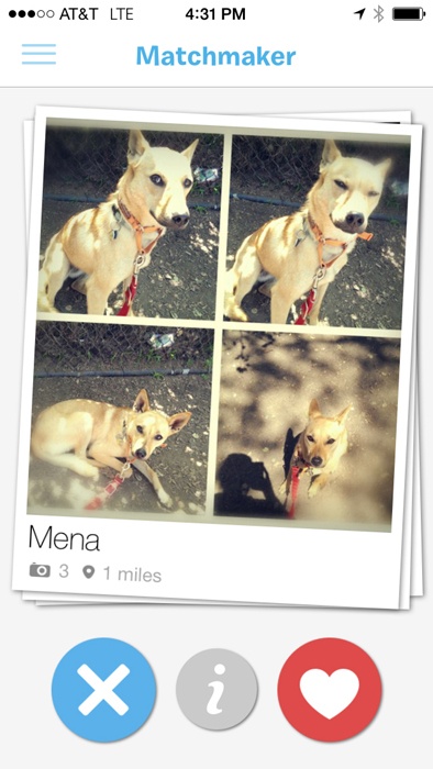
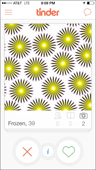
You can see a simple yes/no, like or dislike, thumbs-up or thumbs-down action for personalizing content or for giving the system instant feedback in mobile apps ranging from dating apps such as Tinder and Grindr, to the pet matchmaking app BarkBuddy, to voting apps such as Thumb (see Figure 10-11 and Figure 10-12).
In mobile experiences for which a quick like/dislike is associated with imagery, also consider using the equivalent swipe gestures—left for no and right for yes are the current interaction pattern.
Do not consider thumbs for rating multiple facets of an asset. For example, don’t provide multiple thumbs widgets for a product review intended to register a user’s satisfaction with that product’s price, quality, design, and features. Generally, thumbs should be associated with an asset in a one-to-one relationship: one asset gets one thumb up or down. (After all, Emperor Nero would never let a gladiator’s arm survive but put his leg to death! Think of thumbs as “all or nothing.”)
Do use thumb ratings when an easy, lightweight ratings mechanism is desired. The context for these ratings should be appropriately fun and light-hearted, as well.
Do not use thumb ratings when you want to provide qualitative data comparisons between assets. For example, in a long listing of DVDs available for rental, you might want to permit sorting of the list by rating. If you provide thumb ratings, this sort would have very little practical utility for the user. Instead, you should consider a scalar, 5-star rating style.
Recommendations
Place the thumb rating widget in close proximity to the asset being rated.
Ensure that the rating widget is secondary in prominence to the primary call to action, unless rating is the primary task (Figure 10-11). For example, in a shopping context, it is probably appropriate to keep “Add to Cart” for an item as the predominant call to action, with “Rate This” being less noticeable.
Be consistent in the treatment of the imagery used for thumbs across the site (or group of sites if applicable).
Indicate to the user whether he has previously rated the item.
If possible, refresh the widget inline as a user votes and clearly indicate what was selected.
Provide a way for the user to change his vote at any time.
If using gestures to capture intent, provide an alternate touch method for voting (e.g., a plus or minus, X, or heart).
Present community consensus tallies as whole numbers rather than percentages for simplicity and ease of understanding.
Consider highlighting items that have reached a certain level of positive votes over a long amount of time from a large amount of people.
Be cautious about promoting the lowest-rated or least-favored items, because the negativity can appear insensitive or rude.
Considerations
Vote counts: Why not percentages?
Percentage comparisons between two or more rated items are problematic, due to response liquidity: when there are few ratings (as there will be, initially, for any rated item), small differences of opinion can yield big perceived differences in rating.
For example, if two out of three users give Movie A a thumbs down, it appears that community consensus is 66 percent negative, which is technically accurate, but might not represent an accurate picture of the tastes of the larger community. Really, two out of three votes just doesn’t count for much.
However, if 666 out of 1,000 users slam Movie B (expressed as a percentage, also 66 percent), this is probably a significant indicator of the larger community’s opinion about that item.
When viewing Movie A alongside Movie B in a feature on “Hot Movies Opening This Weekend,” it’s misleading to represent their approval ratios as percentages. It’s better to just give your users the numbers (how many positive, how many negative, and how many overall) and let them figure it out.
Note that this is not the ideal situation, which is why we recommend that any context that relies on heavy data comparisons (e.g., the ability to sort, filter, or promote content based on ratings) might not be an appropriate use of thumb-style ratings.
Also note that this “liquidity problem” is not unique to thumb ratings. It is, in fact, a well-known factor in economics (http://en.wikipedia.org/wiki/Liquidity).
Thumbs-up only
Use a thumbs-up-only type rating only when you don’t want negative ratings to appear insensitive or inappropriate, such as rating a person.
A thumbs-up, positive-only variation might be contextually appropriate for the assets that you want people to rate. If you strongly suspect that opinions about a type of asset will concentrate toward the positive pole of opinion (consistently), offer them only that option.
A thumbs-up-only option gives users a way to easily participate, with a “Me, too” or “I agree” opinion.
A thumbs-up, positive-only variation can be more culturally appropriate to present. In some cultures it is deemed less-than-appropriate to express a strong negative opinion about something. (Remember, thumb ratings are recommended for contexts in which opinions are strongly polarized.) For these locales, it might be preferable to provide positive-only opinions, and just let the absence of a rating connote a negative opinion.
International considerations
The concept of thumb ratings can be problematic for some locales.
First, the symbolism of an extended and raised thumb is problematic: in some locales, it is considered an insult, thus a plus/minus widget would probably be more appropriate; in other locales, representations of any body part (especially disembodied ones) are considered offensive; and, finally, some locales will just not “get it.”
Second, the very notion of a binary, black-or-white, love-it-or-hate-it ratings system might not be a natural fit for some cultures. Many locales have stated a preference for “shades of gray” in a polarized scale. (Note this is subtly different from star ratings, which imply “I like it exactly this much.”)
Third, in some areas it is considered rude to criticize things openly. In this instance, consider the thumbs-up-only variation.
Why
The benefit to other users with thumbs-up/-down style ratings is that these ratings, when assessed in aggregate, can quickly give a sense of the community’s opinion of a rated object. They can also be helpful for drawing quick qualitative comparisons between like items (this is better than that), but this is of secondary importance with this rating type.
As seen on
YouTube (http://www.youtube.com)
Pandora (http://www.pandora.com)
StumbleUpon (http://www.stumbleupon.com)
BarkBuddy (mobile application)
Tinder (mobile application)
Ratings (Stars or 1–5)
What
A user wants to quickly leave her opinion on an object, with minimal interruption to any other task flow she is involved in, as depicted in Figure 10-13.
Use when
Use this pattern when the user wants to leave an opinion quickly.
Use in combination with reviews for a richer experience.
Use to quickly tap into the existing “community” of a product.
Use when ratings are collected together to present an average rating of an object from the collective user set.
How
Show clickable items (stars are used most often) that light up on rollover to infer clickability. Users are generally so familiar with a typical 5-item scale that you don’t need to use stars to understand intent, as exemplified in Petco’s ratings widget (see Figure 10-13).
Initial state should be “empty” and show invitational text above to invite the user to rate the object (e.g., “Rate It!”).
As the mouse pointer moves over the icons, indicate the level of rating (by means of a color change) and display a text description of the rating at each point (e.g., “Excellent”).
When the user has clicked the rating (fifth star, third star, etc.), the rating should be saved and added to the average rating, which should be displayed separately.
The saved rating should be indicated with a change in final color of the items and a text indication that the rating is saved.
You also should display an aggregate or average rating.
Users should be able to adjust their ratings later if they change their mind.
Considerations
Consideration should be made for presenting the call to action for a rating if a user is not logged in.
Labels are important because they help the user decide which rating to select and how that compares to the average.
Don’t conflate a critic’s rating with user ratings. Be clear whose is whose and disambiguate appropriately.
Why
Rating an object provides a lightweight model for user engagement. Ratings are often tied with reviews to encourage richer user contributions and activity.
Accessibility
Use JavaScript and CSS for displaying the rollover states and for instant collection of the rating. For cases in which this is not possible, you can add a Save Rating button to confirm the final selection of the rating.
As seen on
Amazon.com (http://www.amazon.com)
Petco (http://www.petco.com)
Zappos (http://www.zappos.com)
Yelp (http://www.yelp.com)
Netflix (http://www.netflix.com)
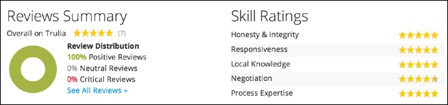
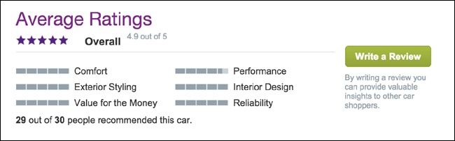
Multifaceted Ratings
What
Multifaceted ratings provide a mechanism for users to give nuanced feedback about a product or service, even if they don’t write a lengthy review (see Figure 10-14).
Use when
Users want to compare and contrast conflicting attributes; for example, performance of a car versus comfort.
You want to give people the ability to hone in on the attributes that matter most.
An experience, service or product has a lot of dimensions and a single rating doesn’t appropriately capture the depth.
How
Ensure that people understand the attributes for which they are rating.
Roll up the facets into an overall aggregate rating for the item. Be transparent in how facets roll up and affect the overall rating, such as in Figure 10-15.
Ensure that your math makes sense.
Pair with reviews to add context.
Don’t mistake tags and the ability for users to add tags for a rated facet.
Why
Faceted ratings can be a powerful research tool for consumers looking to make a purchase. They are useful for skimming in search results and offer a lot of valuable information in a smaller footprint than lengthy reviews.
As seen on
Cars.com (http://www.cars.com)
Trulia (http://www.trulia.com)
What type of items are rateable?
Items that should be rateable by the community share some common traits.
Rateable items should have some intrinsic value.
We should never ask users to provide metadata (basically “add value”) to an item whose own apparent value is low. Or, more specifically, we should be careful to only ask for user participation in a way that acknowledges an item’s intrinsic value: it might be OK to ask someone to give a thumbs-up rating to someone else’s blog comment (because the “cost” to do so is low, basically a click), but it would be inappropriate to ask for a full-blown review of the comment. There would be more effort and thought involved in writing the review than there was in the initial comment!
Rateable items should persist for some length of time.
Rateable items must remain in the “community pool” long enough for all members of the community to cast their votes. There’s also little use in asking for a bunch of metadata for an item if others cannot come along afterward and enjoy the benefit of that metadata (Figure 10-16).
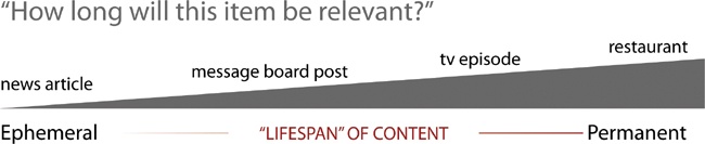
Highly ephemeral items such as News articles that disappear after 48 or 72 hours probably aren’t good candidates for rating.
Juxtapose this with TiVo (which is kind of the canonical example) where thumbs (up and down) are used to rate TV shows for recommendation purposes. The programs being rated have high value (i.e., they cost money to produce, and we get entertainment value out of them), and they’re highly persistent (they’ll recur at the same time next week, and in reruns, and in syndication, etc.; for all intents and purposes, TV episodes are immortal). And TiVo’s entire user experience (including user-education movies that ship with the unit, its printed manual, and, heck, the dang remote has ‘em hardcoded on there) is oriented around the thumbs-up and thumbs-down voting. I’d venture that thumb voting and the recommender system are a huge part of why many people buy TiVo in the first place. (OK, that plus “pause live TV.”)
Items with a great deal of persistence (on the extreme end are real-world establishments, such as restaurants or businesses) make excellent candidates for rateability. Furthermore, the types of ratings we can ask for can be more involved. Because these establishments will persist, we can be reasonably sure that others will always come along afterward and benefit from the work that the community has put into the item.
When it comes to explicitly input recommender systems, we should acknowledge the limitations of folks’ interest in “feeding the machine.” If they understand the benefit, and they think that the work they’ll put in will at some point be worth something to them, then people will play along.
BRYCE GLASS, COAUTHOR, BUILDING WEB REPUTATION SYSTEMS (http://buildingreputation.com)
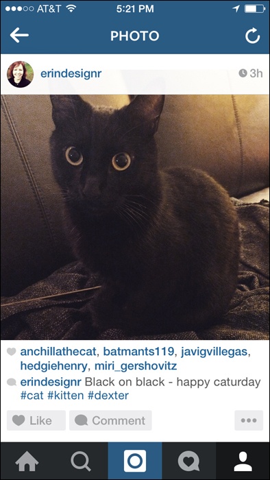
Comments
What
A user has a comment or opinion about an item she is viewing on the site and wants to share it, as demonstrated in Figure 10-17.

Use when
You want comments associated with an object (person, place, or thing) on your site.
You want to give users a means to express an opinion in relation to an article or blog post or begin a public conversation.
How
Provide a text entry field for the comment that is large enough for several lines of text.
Associate the comment call to action in close proximity to the item (image, article, blog post) on which the user is commenting, as shown in Figure 10-18.
Ask for an identifier in order to attribute the comment (username or nickname).
Provide a method for anonymous commenting, through either a drop-down selection or by allowing the user to leave the identifier blank and then automatically noting that as anonymous.
If the user is already registered in the system, autofill the attribution field.
Link the user attribution to the user’s site profile. If there is no profile system, give the user a way to link the name to a website of her choice (see Attribution).
To reduce spambots, present some type of validation option (CAPTCHA, Image Captcha, etc.) that only a real person can answer.
To further preclude spambots, require user registration before a use can leave a comment the site. Use this as an opportunity for progressive registration (see Sign-Up or Registration).
Consider some community moderation to filter out trolls, spam, and other bad participants who post spam or illegal or hateful comments (see Group Moderation).
Ensure that the community Terms of Service and rules of conduct are clearly articulated for users in advance.
When comments are removed, be clear about the reason and make sure it falls within the guidelines for the site.
Don’t remove comments just because you disagree with them. Dissent and opposing opinions make for a lively discussion.
Don’t be afraid to ban someone and shut down his account if he is continually abusive and inappropriate. However, this action should only come after an appropriate warning has been issued.
Consider utilizing the technique of disemvoweling (http://en.wikipedia.org/wiki/Disemvoweling) to censor unwanted comments or spam without having to actually delete the posts or comments. By using the practice in public, the site sends a message that this behavior is unacceptable, and the bad apple looks stupid.
Considerations
When making the decision to add comments to your site, consider whether you will be creating a commenting system from scratch, requiring a robust identity system, spam controls, and possibly moderation or whether you might implement a third-party system.
Third-party systems such as Disqus, CommentLuv, LiveFyre or Wordpress commenting plug-ins make it possible for users to leave comments on your content but authenticate through other systems with an identity they already own. This lowers the barrier to entry for community conversation and, ideally, the amount of technical work the content owner has to do.
The trade-off, though, is that these other companies are building their social graph, gathering demographic data and using that for their own business agendas which might not be in harmony with your own.
Why
Comments are an easy way to promote user participation on your site and can be a conduit for multiuser conversation. Comments associated with an item give context to the conversations and the participation.
Related patterns
Reviews (next section)
As seen on
Medium (http://www.medium.com)
Instagram (instagram app)
The New York Times (http://nyti.ms/1gnj2gG)
Most blogs, including those using WordPress (http://wordpress.com/) and other blogging tools
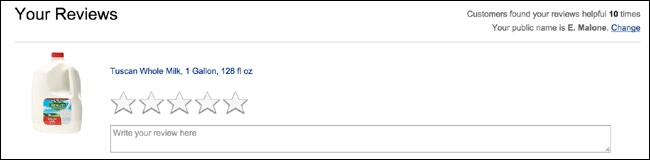
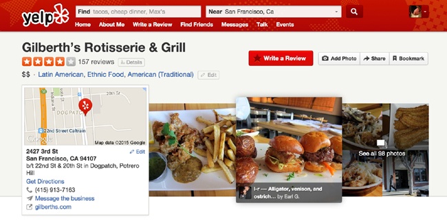
Reviews
What
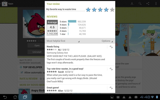
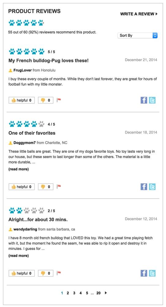
A user wants to share her opinion with others about an object (person, place, or thing) in greater detail than a simple rating or comment, as illustrated in Figure 10-19.
Use when
A user wants to write a review of an object.
You want to supplement the content of a product/website with user-generated reviews.
You are also using the “Rating an Object” pattern (see Ratings (Stars or 1–5)). Combined, they will help to obtain better review feedback.
You are also using reputation rankings (for encouraging quality user-generated content).
How
Provide contextually relevant links with which the user can initiate the process of writing a review.
Provide a clear call to action in your text, such as “Write a Review” (see Figure 10-20 and Figure 21).
Figure 10-20. Yelp (http://www.yelp.com) uses a slightly larger button in a brighter color (red) for the “Write a Review” call to action.Include the following five fundamentals in the review form:
The ability to input a user’s quantitative (rating) assessment
A field to enter the user’s qualitative (review) assessment of the object
Guidelines for helping the user write a review
Any legal disclaimers
User identity, most often a required field or prepopulated if the user is logged in
Clearly indicate which fields are required.
Organize the fields to be most conducive to completing the review rather than exactly how they will appear when published.
Utilize maximum and minimum character restrictions on fields to encourage the desired field length (short and concise versus narrative).
After the user has completed her review, present the options to submit (primary call to action), preview, or cancel the review.
If the user submits the review and has filled out the required fields, consider showing a confirmation page or message.
Set expectations regarding when the review will be published.
Provide a clear path back to the review’s initiation point.
Provide additional, relevant objects for review if possible.
Provide appropriate in-line error messaging on the review form if required fields are not completed.
If a user previews the review, display how it will appear when published, and then give him the option to either edit or submit his review.
If a user cancels a review, return him to the review’s initiation point.

Considerations
Consider providing a mechanism by which users can rate the reviews on an item. Amazon’s use of “Was this Review Helpful” has helped elevate quality and useful reviews. This is especially helpful when there are hundreds of reviews.
Consider utilizing a “Top Reviewer” label for users who consistently contribute quality reviews (based on the Helpful Review rating).
Pair reviews with ratings to allow quick input as well as the context of a review.
Why
Qualitative fields such as Pros and Cons seem to be easier for users to create than a full narrative. They do not need to think in complete sentences, and they have more specific direction regarding what to write (positives and negatives). Additionally, readers find them easier to scan than a narrative.
Related patterns
Soliciting Feedback
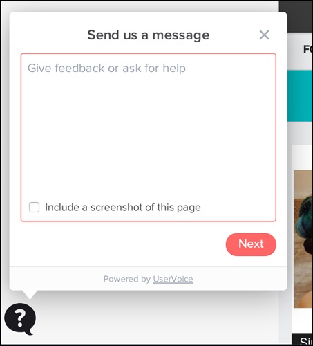
What
The site owners want to be able to collect feedback about the site from its users, as depicted in Figure 10-22.
Use when
You need a mechanism to collect user feedback about your site or service.
You want to capture feature improvements or new feature ideas.
You want to better understand your users and how they interact with your site.
How
Provide a clear “Give Feedback” or “Leave Feedback” call to action (see Figure 10-23).
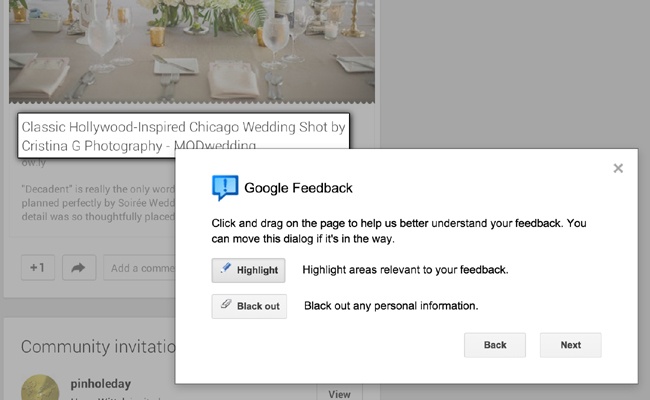
Figure 10-23. Give the user a way to scope what the feedback is about. Google’s feedback process on Google+ makes it possible for users to actively highlight the area of concern and to black out personal information (http://plus.google.com).For many sites and applications, the feedback link is relegated to the footer of the site or in the settings screen. This means that only the most tenacious people end up finding it. If you are actively soliciting feedback, consider a different placement, such as a side tab call-to-action or a modal prompt.
Prompt for feedback after some number of visits or uses or after a purchase flow has been completed.
Don’t forget to ask for feedback directly and overtly, as shown in Figure 10-24.
Provide a free-form field for the user to write out and explain her feedback.
Be clear about the intent of the feedback form. If no one associated with Customer Support or Help will ever see this information, say so, and give the user an opportunity to access help.
Provide a way for the user to identify himself. This is especially important if the feedback is presented in a public forum.
Give the user a means to select a method for a company representative to get in touch. Keep that contact information private.
Consider aggregating all user suggestions together and letting users browse through the comments, feedback, and suggestions of the community.
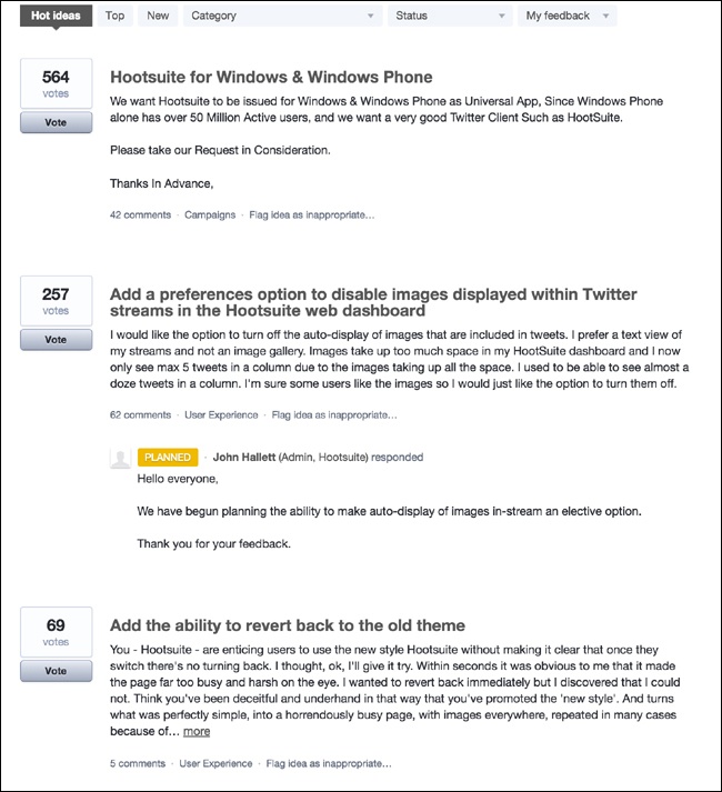
Consider including a tool for users to rate other people’s suggestions. You can use the highest-rated feedback to help inform new features and prioritize product improvements, as illustrated in Figure 10-25.
Figure 10-25. User suggestions on Hootsuite are ordered based on community popularity (http://www.hootsuite.com).If the feedback or suggestion is really a bug or a help question, provide a way for the user to filter the scope in the interface, and then behind the scenes send the request, help, or bug to the appropriate people in the organization. If a user knows that someone is listening to a channel, she will use that channel for all her issues, regardless of your intent or labeling.

Considerations
Providing a feedback mechanism for your site, whether you build it yourself or use a third-party service, requires a commitment on your part.
If you build the feedback mechanism yourself, you need to create a system to filter the feedback into a few buckets for action. Feature requests should be separated from bugs. Bugs need to be triaged and compared against an existing list of bugs. You should provide acknowledgment of the feedback in some form so that users know they aren’t speaking into a black hole.
When you create your own system, you own everything and can adjust and manage the flow as time and people permit, but the support of this part of the software can often take an amount of effort that you might not have been anticipated.
Leaving your feedback system to a third party such as GetSatisfaction or UserVoice still requires effort to filter and engage with the community, but the management of the operations of the system is covered. On the other hand, any changes to the system are out of your control, and the feedback site is not integrated with your service.
Either way you choose involves issues and benefits and should be weighed against staffing, operational costs, and long-term goals.
Why
Giving your users the tools to offer feedback and suggestions imbues them a sense of ownership over the site. If the site is extremely social and houses a person’s online identity (see Chapter 4), users already have a sense of ownership for the site. They are using the site frequently and most likely in ways that you had never predicted. Tap into that passion.
Tapping into the community is a way to gather new ideas for improvements and future features, and can give insight into how your users perceive the site experience and your brand.
As seen on
Get Satisfaction (http://www.getsatisfaction.com)
UserVoice (http://www.uservoice.com)
Hootsuite (http://bit.ly/1Ns78MW)
We Chat (mobile application)
Further Reading
Farmer, F. Randall and Bryce Glass. Building Web Reputation Systems. O’Reilly Media, 2010.
“The Digg Effect.” ReadWriteWeb, December 6, 2007. http://bit.ly/1LOoGDM.
Frauenfelder, Mark. “Revenge of the Know-It-Alls: Inside the Web’s free-advice revolution.” Wired Magazine, July 2000. http://wrd.cm/1LOoNPV.
“Reviews are Good.” Revenue Magazine, July/August 2007:104.
Blackshaw, Pete. Satisfied Customers Tell Three Friends, Angry Customers Tell 3,000: Running a Business in Today’s Consumer-Driven World. Broadway Business, 2008.