
Chapter 8. Layout: Page Framework
Now that you’ve established your goals, researched your users, and planned your information architecture, it’s time to put those plans into action!
Although it might be tempting to approach your wireframes on a page-by-page basis, don’t do it!
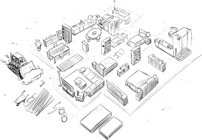
If you’re building a house, you don’t start with the rooms and furniture. You start with the walls. This is one of those “measure twice, cut once” kind of things. As a general rule, you should do your wireframes like you do your tattoos: start with the big parts, then fill in the details. In this case the big parts are the elements that will appear on all of the pages: navigation and footers.
Huge Submenus Are Never a Good Idea
I am always surprised when someone tries to argue that their mega-menu is the best idea available. That actually means the Information Architecture (and the information architect) sucks.
Everything-in-one-menu is the laziest design in the universe. Do better.
Menus are like dating: if you need more than seven or eight choices, it’s time to break somebody’s heart—maybe your own.
tl;dr
Create navigation and footers that work for all of the pages/screens in your app before you get into content. You’ll thank me later.