
Before You Begin
One of the powerful features in JMP is its linked analyses. The graphs and reports that you create are linked to each other through the data table. As shown in Figure 6.1, data that are selected in the data table are also selected in the three report windows. As you work through the examples in this chapter, keep the JMP windows open to see these interactions yourself.
Explore Data in Multiple Platforms
Which cereals are part of a healthy diet? The Cereal.jmp sample data (real data gathered from boxes of popular cereals) provides statistics on fiber content, calories, and other nutritional information. To identify the healthiest cereals, you step through interpreting histograms and descriptive statistics, correlations and outlier detection, scatterplots, and cluster analysis.
Analyze Distributions
The Distribution platform illustrates the distribution of a single variable (univariate analysis) using histograms, additional graphs, and reports. The word univariate simply means involving one variable instead of two (bivariate) or many (multivariate). However, you can examine the distribution of several individual variables within a single report. The report content for each variable changes depending on whether the variable is categorical (nominal or ordinal) or continuous.
• For categorical variables, the initial graph is a histogram. The histogram shows a bar for each level of the ordinal or nominal variable. The reports show counts and proportions.
• For continuous variables, the initial graphs show a histogram and an outlier box plot. The histogram shows a bar for grouped values of the continuous variable. The reports show selected quantiles and summary statistics.
Once you know how your data are distributed, you can plan the appropriate type of analysis going forward.
Note: For details about the Distribution platform, see the Distributions chapter in the Basic Analysis book.
Scenario
You want to view the nutritional values of cereals so that you can eat more healthily. Analyzing distributions of cereal data reveals answers to the following questions:
• Which cereals contain the highest amount of fiber?
• What is the average, minimum, and maximum number of calories?
• What is the average amount of fat?
• Which cereal contains the most fat?
• Are there any outliers in the data?
Create the Distributions
1. Select Help > Sample Data Library and open Cereal.jmp.
2. Select Analyze > Distribution.
3. Press Ctrl and click Manufacturer, Calories, Fat, and Fiber.
4. Click Y, Columns and then click OK.
Figure 6.2 Distributions for Manufacturer, Calories, Fat, and Fiber

In the Fiber distributions, notice the following:
‒ Fiber One and All-Bran with Extra Fiber contain the most fiber as shown in the Fiber box plot. These cereals are outliers in terms of fiber content.
To display the name of the cereal next to a data point in graphs, the row that contains Fiber One in Cereal.jmp is labeled. To see the entire label, drag the right-most vertical border to the right. Place your cursor over the unlabeled data point to see “All Bran with Extra Fiber”.
In the Fat distributions, notice the following:
‒ Place your cursor over the top data point (the x marker) in the Fat box plot to see that 100% Nat. Bran Oats & Honey is the highest in fat.
‒ In the Fat Quantiles report, the median amount of fat is 1 gram.
In the Calories Quantiles report, notice the following:
‒ The maximum number of calories is 250.
‒ The minimum number of calories is 50.
5. In the Manufacturer histogram, click on the bar for Nabisco.
Figure 6.3 Distributions for Nabisco Cereals

The Calories, Fat, and Fiber distributions for Nabisco cereals are highlighted in the other histograms. You can view the Calories, Fat, and Fiber distributions for the Nabisco cereals relative to the Calories, Fat, and Fiber distributions for the overall data. For example, the Fat distribution of Nabisco cereals seems to be lower than the Fat distribution for the overall data.
6. Click below the last Fiber bar to deselect all bars.
7. Press Shift and click all histogram bars in the Fiber histogram with a value above 8.
Figure 6.4 High-Fiber Cereals

The highest-fiber cereals are highlighted in the Calories and Fat histograms. Because the histograms are linked, note that some of the high-fiber cereals are also low in fat.
8. Press Ctrl and Shift and deselect the two Calories histogram bars that are at or near 200.
High calorie cereals are eliminated from the histograms.
Figure 6.5 High-Fiber and Low-Calorie Cereals

Tip: Leave the Distributions report open. You will use it later in a cluster analysis. See “Analyze Similar Values”.
Interpret the Results
Looking at the results, you can answer the following questions:
Which cereals are highest in fiber?
The Fiber box plot shows that All-Bran with Extra Fiber and Fiber One have the highest amount of fiber. These two cereals are outliers.
What is the average, minimum, and maximum number of calories?
The Calories histogram shows that the number of calories range from 50 to 275. The Calories Quantiles show that the number of calories range from 50 to 250, and the median number of calories is 120. The distribution is not uniform.
What is the average amount of fat?
The Fat Quantiles report shows that the median amount of fat is 1 gram.
Which cereal contains the most fat?
The Fat box plot shows that 100% Nat. Bran Oats & Honey is the highest in fat. This cereal is an outlier.
Draw Conclusions
To increase the amount of fiber in your diet, you decide to try All-Bran with Extra Fiber and Fiber One. These cereals also happen to have a low number of calories and fat. Most cereals do not greatly increase the amount of fat in your diet, but you plan to avoid the high fat 100% Nat. Bran Oats & Honey. And although most cereals are relatively low in fat, they are not necessarily low in calories.
Analyze Patterns and Relationships
Now that you have identified which cereals to eat or avoid, you want to see how the cereal variables relate to each other. The Multivariate platform enables you to observe patterns and relationships between variables. From the Multivariate report, you can do the following:
• summarize the strength of the linear relationships between each pair of response variables using the Correlations table
• identify dependencies, outliers, and clusters using the Scatterplot Matrix
• use other techniques to examine multiple variables, such as partial, inverse, and pairwise correlations, covariance matrices, and principal components
Note: For details about the Multivariate platform, see the Correlations and Multivariate Techniques chapter in the Multivariate Methods book.
Scenario
You want to see the relationships between variables such as fat and calories. Analyzing the cereal data in the Multivariate platform reveals answers to the following questions:
• Which pairs of variables are highly correlated?
• Which pairs of variables are not correlated?
Create the Multivariate Report
1. In the Cereal.jmp data table, click the bottom triangle at the top of the Columns panel to deselect the rows (Figure 6.6).
Figure 6.6 Deselecting Rows

2. Select Analyze > Multivariate Methods > Multivariate.
3. Select Calories through Potassium, click Y, Columns, and then click OK.
The Multivariate report appears. The report contains the Correlations report and Scatterplot Matrix by default. The Correlations report is a matrix of correlation coefficients that summarizes the strength of the linear relationships between each pair of response (Y) variables. The dark numbers indicate a higher degree of correlation.
Figure 6.7 Correlations Report
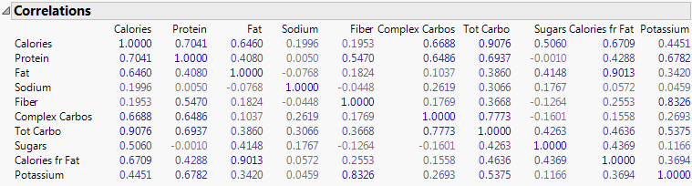
Note the following:
‒ In the Calories column, the number of calories is highly correlated with all variables except for sodium and fiber.
‒ In the Fiber column, fiber and potassium appear to be highly correlated.
‒ In the Sodium column, sodium is not highly correlated with the other variables.
The density ellipses in the Scatterplot Matrix further illustrates relationships between variables. Figure 6.8 shows a portion of the plot.
Figure 6.8 Portion of the Scatterplot Matrix

By default, a 95% bivariate normal density ellipse is in each scatterplot. Assuming that each pair of variables has a bivariate normal distribution, this ellipse encloses approximately 95% of the points. If the ellipse is fairly round and is not diagonally oriented, the variables are uncorrelated. If the ellipse is narrow and diagonally oriented, the variables are correlated.
Note the following:
‒ The ellipses are fairly round in the Sodium row. This shape indicates that Sodium is uncorrelated with other variables.
‒ The blue x markers, which represent Nat. Bran Oats & Honey, Cracklin’ Oat Bran, and Banana Nut Crunch, appear outside the ellipses in the Fat row. This placement indicates that the data is an outlier (due to the amount of fat in the cereal).
You will further explore a scatterplot matrix later.
4. Select Pairwise Correlations from the Multivariate red triangle menu to display the Pairwise Correlations report.
Figure 6.9 Portion of the Pairwise Correlations Report

The Pairwise Correlations report lists the Pearson product-moment correlations for each pair of Y variables. The report also shows significance probabilities and compares the correlations in a bar chart.
5. To quickly see which pairs are highly correlated, right-click in the report and select the Sort by Column, Signif Prob, Ascending checkbox, and then click OK.
The most highly correlated pairs appear at the top of the report. The small p-values for the pairs indicate evidence of correlation. The most significant correlation is between Tot Carbo (total carbohydrates) and Calories.
Figure 6.10 Small p-values for Pairs

Interpret the Results
Looking at the results, you can answer the following questions:
Which pairs of variables are highly correlated?
The Correlations report and Scatterplot Matrix show that the number of calories is highly correlated with all variables except for sodium and fiber. The Pairwise Correlations report shows that Tot Carbo (total carbohydrates) and Calories is the most correlated pair of variables.
Which pairs of variables are not correlated?
The Correlations report and Scatterplot Matrix show that Sodium is not correlated with the other variables.
Draw Conclusions
You confirm the previous decision to avoid the high fat 100% Nat. Bran Oats & Honey. Trying All-Bran with Extra Fiber and Fiber One was also a smart decision. These two high-fiber cereals have the added benefit of contributing a lower number of calories, fat, and sugars and a higher amount of potassium. You also decide to avoid high-carbohydrate cereals because they likely contain a large number of calories.
Analyze Similar Values
Clustering is a multivariate technique that groups observations together that share similar values across a number of variables. Hierarchical clustering combines rows in a hierarchical sequence that is portrayed as a tree. Cereals with certain characteristics, such as high-fiber cereals, are grouped in clusters so that you can view similarities among cereals.
Note: For details about hierarchical clustering, see the Hierarchical Cluster chapter in the Multivariate Methods book.
Scenario
You want to know which cereals are similar to each other and which ones are dissimilar. Analyzing clusters of cereal data reveals answers to the following questions:
• Which cluster of cereals provides little nutritional value?
• Which cluster of cereals is high in vitamins and minerals and contains a low amount of sugar and fat?
• Which cluster of cereals contains high fiber and low calories?
Create the Hierarchical Cluster Graph
1. With Cereal.jmp displayed, select Analyze > Clustering > Hierarchical Cluster.
2. Select Calories through Enriched, click Y, Columns, and then click OK.
The Hierarchical Clustering report appears. Figure 6.11 shows a portion of the report. The clusters are colored according to the data table row states.
Figure 6.11 Portion of the Hierarchical Clustering Report

3. Select Color Clusters from the Hierarchical Clustering red triangle menu.
The clusters are colored according to their relationships in the dendrogram.
Figure 6.12 Colored Clusters

The cereals have similar characteristics within each cluster. For example, judging by the names of the cereals in cluster one, you guess that the cereals are high in fiber.
Notice how All-Bran with Extra Fiber and Fiber One are grouped in cluster one. These cereals are more similar to each other than the other two cereals in the cluster.
Figure 6.13 Similar Cereals in Cluster One
4. To select cluster one, click on the red horizontal line on the right.
The four cereals are highlighted in red.
Figure 6.14 Selecting a Cluster
5. To see the similar characteristics in the cluster, select Cluster Summary from the red triangle menu.
The Cluster Summary graph at the bottom of the report shows the mean value of each variable across each cluster. For example, the cereals in this cluster contain more fiber and potassium than cereals in other clusters.
Figure 6.15 Cluster Summary

6. Select Scatterplot Matrix from the red triangle menu.
This option is an alternative to creating a scatterplot matrix in the Multivariate platform.
Note the Fiber plot in the Potassium row. The selected cereals are located on the right side of the plot between 8 and 13 grams. This location indicates that the cereals in cluster one are high in fiber and potassium.
Figure 6.16 Cluster One Characteristics

Note: The points are also selected in the previous scatterplot matrix that you created if it is still open.
Interpret the Results
Clicking through the clusters and looking at the Cluster Summary report, you can see the following characteristics:
• Cluster one cereals, such as Fiber One and All-Bran, contain high fiber and potassium and low calories.
• Cluster two, which contains many favorite children’s cereals, is high in sugar and low in fiber, complex carbohydrates, and protein.
• Cluster three cereals (Puffed Rice and Puffed Wheat) are low in calories but provide little nutritional value.
• Cluster four cereals, such as Total Corn Flakes and Multi-Grain Cheerios, provide 100% of your daily requirement of vitamins and minerals. They are low in fat, fiber, and sugar.
• Cluster five cereals are high in protein and fat and low in sodium. The cluster consists of cereals such as Banana Nut Crunch and Quaker Oatmeal.
• Cluster six cereals are low in fat and high in sodium and carbohydrates. Traditional cereals such as Wheaties and Grape-Nuts are in this cluster.
• Cluster seven cereals are high in calories and low in fiber. Many cereals that include dried fruit are in this cluster (Mueslix Healthy Choice, Low Fat Granola w Raisins, Oatmeal Raisin Crisp, Raisin Nut Bran, and Just Right Fruit & Nut).
• Cluster eight cereals are low in sodium and sugar, and high in complex carbohydrates, protein, and potassium. Shredded Wheat and Mini-Wheat cereals are in this cluster.
By looking at the joins in the dendrogram, you can see which cereals in each cluster are most similar.
• In cluster one, Fiber One is similar in nutritional value to All-Bran with Extra Fiber. 100% Bran and All-Bran are also similar. Each pair of similar cereals are made by different companies, so the cereals are competing against each other.
• In cluster two, Frosted Flakes and Honey Frosted Wheaties are similar even though one is a corn flake and the other is a wheat flake. Lucky Charms and Frosted Cheerios are similar. Cap’n’Crunch and Trix are also similar.
Draw Conclusions
Based on your desire to eat more fiber and fewer calories, you decide to try the cereals in cluster one. You will avoid cereals in cluster three, which consists of puffed wheat and puffed rice and have little nutritional value. And you will try cereals in the highly nutritious cluster four.
..................Content has been hidden....................
You can't read the all page of ebook, please click here login for view all page.