
2
Appendix: Simulation Studies
The Bias-Variance Tradeoff in PLS
A Utility Script to Compare PLS1 and PLS2
Using PLS for Variable Selection
Computation of Result Measures
Simulation studies can be very useful when trying to understand the efficacy and nuances of different approaches to statistical modeling. This is because, in order to generate the data to analyze in the first place, the true model must be known. This appendix presents two simulation studies that provide insight on how PLS is likely to work in practice. Bear in mind, though, that any true model used to generate data is at best only representative of reality. So simulation studies always have a restricted, but hopefully relevant, scope.
The first study addresses the bias-variance tradeoff in PLS. This study is of particular interest when your modeling objective is prediction. The second study builds on the material in More on VIPs in Appendix 1. It is of relevance when you are using PLS in an explanatory context, and specifically when your goal is variable selection. The code for the simulations is written entirely in JSL.
The Bias-Variance Tradeoff in PLS
The prediction error of a statistical model can be expressed in terms of three components:
1. The noise, which is irreducible and intrinsic to any statistical approach.
2. The squared bias, where bias is the difference between the average of the predictions and the true value.
3. The variance, which is the mean squared difference between the predictions and their average.
Generally, whichever modeling approach is used, increasing model complexity (measured in an appropriate way) reduces the squared bias but increases the variance. In the context of supervised learning, this phenomenon is called the bias-variance tradeoff. Finding an appropriate balance between the contributions from the squared bias and the variance can lead to smaller prediction errors. When the modeling goal is prediction, it is important to find this balance.
Details of the bias-variance tradeoff in the predictive modeling context can be found in Hastie et al. 2001. But the essentials are easily grasped through the following examples.
We have already seen a simple example of the bias-variance tradeoff in the case of polynomial regression in our discussion in “Underfitting and Overfitting: A Simulation” in Chapter 2. In that section’s example, the order of the polynomial chosen for the fit is the measure of model complexity.
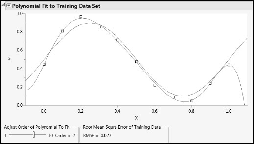
Run the script PolyRegr2.jsl found in the Appendix 2 material in the master journal file. This script shows the underlying true model with a blue curve, and shows the fitted polynomial model in red. By running this script several times to produce different random realizations of the true model, you can investigate fits for a simple model (say Order = 1) and a complex model (say Order = 7).
Figures A2.1 and A2.2 show representative plots. For Order = 1 you see that the red curve, which is a line in this case, changes very little from run to run (has low variance). But for Order = 7, the curve changes greatly (has high variance) because it follows the points as they move around. Open the Model Generalization to New Data report to see how the RMSE for the test set increases with the order of the polynomial.
Figure A2.1: Simple Model: Low Variance, High Bias Fits
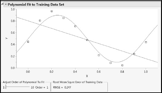
Figure A2.2: Complex Model: High Variance, Low Bias Fits
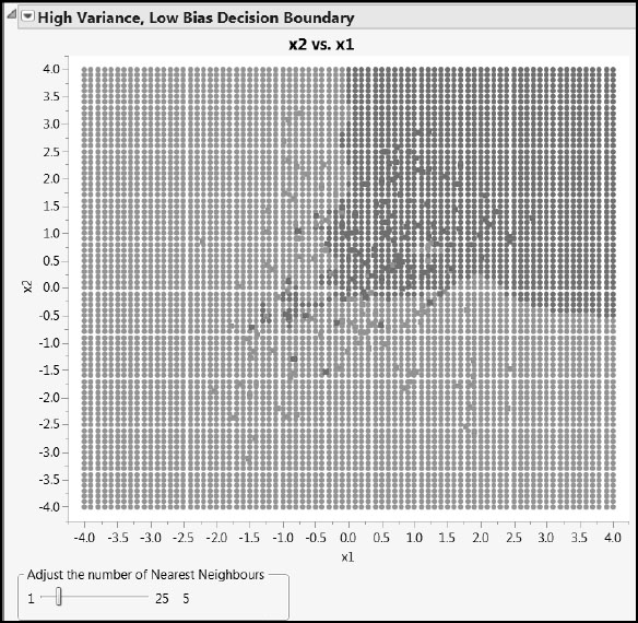
A second example is provided by the script BiasAndVarianceOf2DClassifiers.jsl. Run this script by clicking on its link in the master journal. The simulation involves two continuous predictors, x1 and x2, and a single categorical response, Output Class. Output Class assumes only two values, “0” (colored green) and “1” (colored red).
We can view the responses as located on a plane, with points colored appropriately. The underlying, true model is the generative Gaussian process, which produces some intermingling of red and green points. Running this script produces a random realization from the generative Gaussian.
The script uses two approaches to predict class membership for the simulated data:
• A nominal logistic regression of Output Class in terms of x1 and x2 (Fit Model with the Nominal Logistic personality).
• A kth nearest neighbor approach, in which a fine grid is defined, and the color of each grid point is defined by voting over a neighborhood defined by the value of k.
The script plots the data, along with the classification into red and green that is provided by the two different model fits. Use the slider in the High Variance, Low Bias Decision Boundary report to set the number of nearest neighbors used in defining the classification. Figures A2.3 and A2.4 show some typical output.
Figure A2.3: Decision Boundary from Nominal Logistic Regression
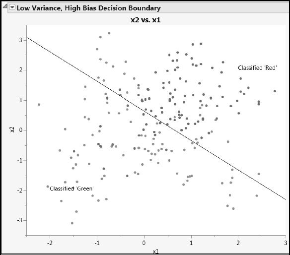
Figure A2.4: Decision Boundary with 5 Nearest Neighbors
Because of its nature, the decision boundary for the nominal logistic fit is a line. Points on one side of the line are classified as being red; those on the other are classified as green. Figure A2.3 shows that many points are misclassified. This model may not be complex enough to provide low prediction error.
The nearest neighbor approach, on the other hand, can provide a wiggly decision boundary that appears better able to separate the red and green points. (See Figure A2.4, where misclassified points are marked with an x.). However, note that small values of k can provide extremely wiggly boundaries and high variance, low bias, fits. As k increases, causing more neighbors to enter the average used to predict class membership, the complexity of the model decreases, resulting in decreased variance and increased bias. The goal is to find the balance between variance and bias that minimizes prediction error.
Running BiasAndVarianceOf2DClassifiers.jsl several times gives a better appreciation of what data can come from the same underlying model, and how the two different fitting approaches predict class membership.
The PLS literature sometimes alludes to a PLS analysis involving a single Y with the acronym PLS1 and a PLS analysis involving multiple Ys with the acronym PLS2. For example, the water quality example in Chapter 7 is an example of a PLS2 analysis, since it requires the prediction of four responses (Ys).
Recall that the Ys are laboratory measurements of water quality from 86 samples taken at specific locations in the Savannah River basin, whereas the 26 Xs are features of the terrain local to the sample locations, extracted from remote sensing data. Figure 7.36, reproduced here as Figure A2.5 for convenience, shows actual versus predicted values for the test set of six rows. (Recall that two test set rows were missing values on HAB.)
Figure A2.5: Predictions on Test Set for PLS2 Pruned Model
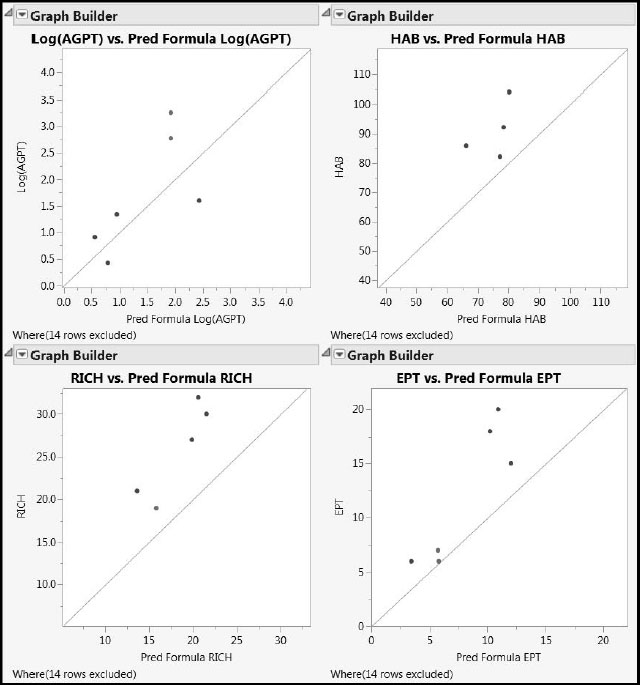
The apparent bias in Figure A2.5, coupled with the general importance of the bias-variance tradeoff as described in this chapter’s “Introduction”, motivates the simulation study presented next. This study also presents an opportunity to study differences between the PLS approaches (PLS1 or PLS2) and the fitting algorithms used (NIPALS and SIMPLS). However, because the results given by NIPALS and SIMPLS are identical in the case of a single Y (PLS1), there are actually only three combinations to investigate, not four.
The Model
Our underlying model consists of five Ys and five Xs. Twenty sets of values for the five Xs were simulated with a particular correlation structure to mimic data that is typically analyzed using PLS. The correlation structure of the Xs is described in detail in the second simulation study in this appendix.
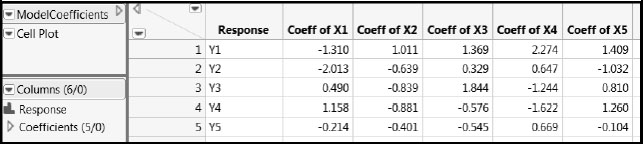
Twenty sets of true values for the Ys were generated from known linear functions of the Xs defined by the coefficients shown in Figure A2.6. This process produces a data set with 20 rows and 10 columns. Note that each of the five Xs is active in the sense that each contributes to some degree to the prediction of each of the Ys. These coefficients are saved in ModelCoefficients.jmp, which we link to in the master journal for your reference.
Figure A2.6: Coefficients for the True PLS Model
The Simulated Xs
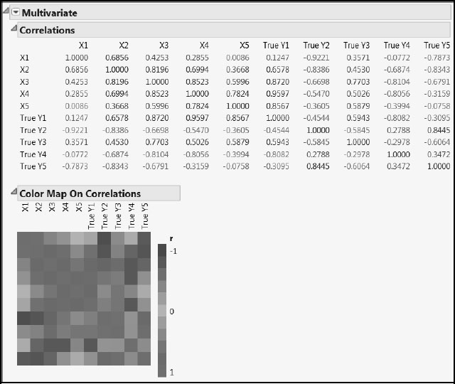
The 20 simulated values for X1 through X5 and the corresponding true Ys are given in PLSSimulation_OneModel.jmp, also included in the master journal. The correlation structure induced between the Ys as a result of these functional dependencies is shown in Figure A2.7. The figure also shows the correlations among the Xs and between the Xs and the Ys. Run the script All Correlations to obtain these reports.
Figure A2.7: Correlations in the True PLS Model with Twenty Observations
The Study
Recall that PLS1 refers to fitting each response using a PLS model, while PLS2 refers to fitting a single PLS model to all responses. In our case, PLS1 indicates that five PLS models were fit, one for each response.
PLS fits, using one to five factors, were obtained using each of the following three approaches in turn:
1. NIPALS with PLS1 (identical to PLS1 with SIMPLS)
2. NIPALS with PLS2
3. SIMPLS with PLS2
The results of the simulations are given in Results_OneModel.jmp, available in the master journal. Four factors define the study:
• NObs (number of observations): 4 or 20
• Standard deviation Sigma: 1.00, 1.50, and 2.00
• Method and Variant at three levels: NIPALS with PLS1, NIPALS with PLS2, and SIMPLS with PLS2
• Number of Factors to be fit: 1–5
For each value of Sigma, 3,000 random realizations of the true model were generated for the case where NObs = 20. The Xs with the fixed values shown in the table PLSSimulation_OneModel.jmp were used. Random normal noise with mean zero and standard deviation Sigma was added to each Y. Each simulation produced five Ys with random values for analysis. This process provided three sets of 1,000 simulations, one for each of NIPALS with PLS1, NIPALS with PLS2, and SIMPLS with PLS2.
For each simulation previously obtained, four of the 20 rows of generated data were randomly selected to create data for the NObs = 4 scenarios. This added another three sets of 1,000 simulations. These scenarios mimic wide data, as the resulting data had 10 columns and only four rows.
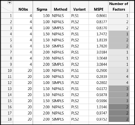
PLS analyses were then run on the six sets of simulations according to the specified values of Method and Variant and Number of Factors, resulting in a total of 90 (6 x 3 x 5) combinations. The summary measures for all of these simulations are given in rows 1 through 90 of Results_OneModel.jmp.
For each combination of Method and Variant, Number of Factors, Sigma, and NObs conditions, the Squared Bias, Variance, and mean squared prediction error (MSPE) for the 1,000 simulations were calculated. These values were averaged over the five responses, giving one value of each of these measures for each set of conditions, as shown in the table Results_OneModel.jmp.
For the case where NObs = 20, Figures A2.8, A2.9, and A2.10 compare the three Method and Variant approaches in terms of their MSPE, Squared Bias, and Variance, respectively, across Number of Factors. To explore these measures for the case where only four rows are used, run the scripts MSPE Across Factors, Squared Bias Across Factors, and Variance Across Factors, setting NObs in the Local Data Filter to 4.
Figure A2.8: Mean Squared Prediction Error, NObs = 20
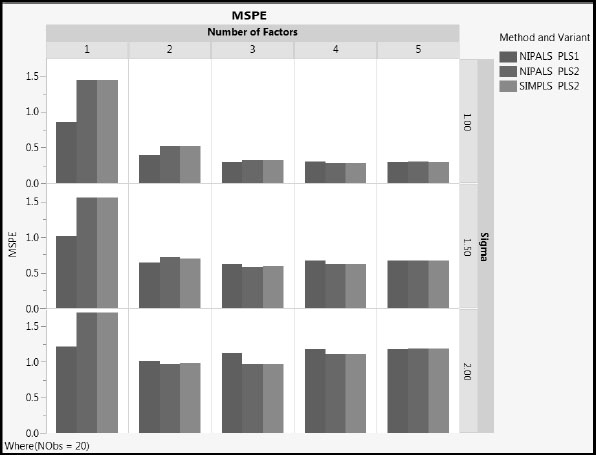
Figure A2.9: Squared Bias, NObs = 20
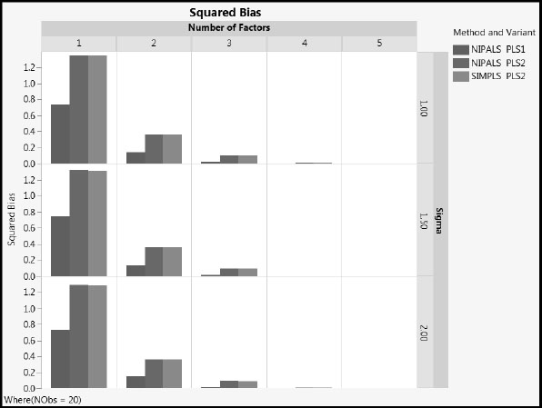
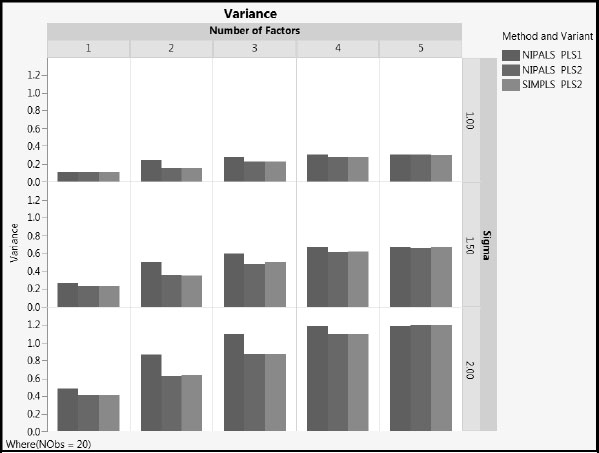
Figure A2.10: Variance, NObs = 20
You see the following:
1. MSPE increases with the value of sigma, as expected. The increase is due to increased variance. The squared bias is unaffected by sigma.
2. As the number of factors increases, squared bias decreases and variance increases. MSPE remains fairly constant for two or more factors.
3. NIPALS PLS2 and SIMPLS PLS2 have similar values for all three of MSPE, squared bias, and variance, regardless of the number of factors extracted (compare the red and green bars).
4. For the one and two factor models, MSPE for NIPALS PLS1 is generally lower than for both PLS2 methods. NIPALS PLS1 has lower squared bias than PLS2, and slightly higher variance.
When NObs = 4, these remarks apply as well, in general terms.
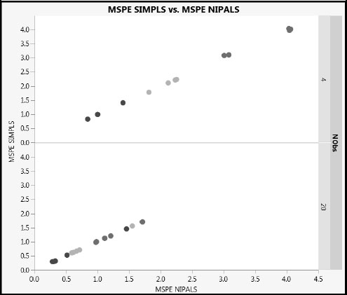
Figure A2.8 shows that the MSPE values for NIPALS and SIMPLS with PLS2 are essentially identical when NObs = 20. Figure A2.11 shows how closely the MSPE values track, for both NObs = 4 and NObs =20. Sigma is colored using a blue to red intensity scale, with blue representing Sigma = 1 and red representing Sigma = 3. Note the expected higher prediction error for the fits where NObs = 4 and for larger values of Sigma. (The figure can be constructed by running the Graph Builder script in the table Results_OneModel_PLS2Split.jmp, found in the master journal.)
Figure A2.11: Comparison of Mean Squared Prediction Error for PLS2
For prediction, the model with the lowest MSPE is preferable. Figure A2.12 compares the three approaches for various sample sizes and values of sigma. For this underlying model at least, the fitted PLS1 model with the lowest MSPE for a given NObs, Method, and Sigma never has more latent variables than the corresponding PLS2 model. Note that our current simulation does not investigate the use of different cross validation schemes to identify the optimal number of latent variables. This would be an interesting extension.
Figure A2.12: Best Models
Even though it is widely used in many diverse application areas, PLS still has unresolved aspects. Results from the simulation study described here suggest that, in the PLS2 context, models fit with NIPALS and SIMPLS have very similar predictive ability. Depending on the number of factors and the degree of noise, relative to the coefficients of the true model, PLS1 might result in lower or higher mean squared prediction errors than PLS2, but the differences are small. An important finding is that PLS1 seems to produce less bias than PLS2.
A Utility Script to Compare PLS1 and PLS2
The previous simulation study shows that when you have multiple Ys in your study there can be differences between the results of the PLS1 and PLS2 approaches. This is not surprising given the way that PLS works.
If you have multiple Ys, conducting PLS1 can be burdensome because you have to manually analyze each Y on its own. If you use PLS2, once you have finished your modeling, it can be interesting to see how your results stack up against the PLS1 equivalents.
The utility script ComparePLS1andPLS2.jsl is designed to help you decide whether to use PLS1 or PLS2 in analyzing your data. You can run this script by clicking on its link in the master journal.
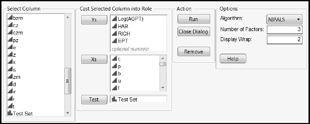
Before opening the script, you need to make the data table of interest the current data table. Figure A2.13 shows how to populate the launch window for the data in the table WaterQuality_BlueRidge.jmp found in the section “A First PLS Model for the Blue Ridge Ecoregion” in Chapter 7. Setting Display Wrap to 2 in the launch window gives two plots per row in the final report. Click the Help button for other details.
Figure A2.13: Populated Launch Window for Comparing PLS1 and PLS2 Predictions
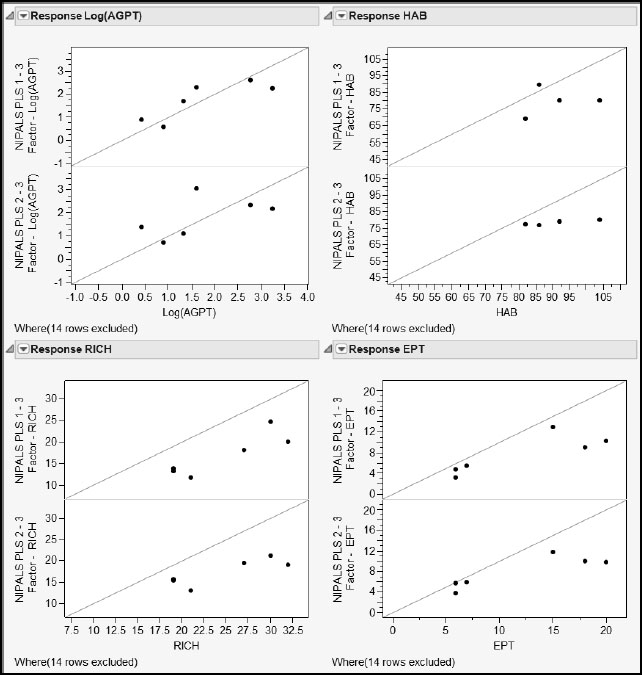
With the window populated as shown in Figure A2.13, click Run to obtain the report shown in Figure A2.14. Using this report, you can easily compare the predictions made for each response by PLS1 and by PLS2. In each pair of plots, the top plot shows PLS1 predicted values, while the bottom plot shows PLS2 predicted values. PLS2 seems to have more bias for HAB than does PLS1. For the other responses, both methods seem to behave similarly: the plots for HAB, RICH, and EPT suggest that both PLS1 and PLS2 result in some bias.
Figure A2.14: Comparison of PLS1 and PLS2 Predictions Using the Utility Script
Using PLS for Variable Selection
Selecting only the active variables from a set of potential predictors can be of immense explanatory value. In the case of MLR, one standard approach is to use stepwise regression. Even within the stepwise regression framework, though, there is considerable complexity and sophistication, leading to a number of alternative prescriptions.
In the case of PLS, the VIP values and standardized coefficients of model terms are often used to reduce the number of terms in the model. If the goal is prediction, such a reduction is reasonable if it does not compromise predictive ability. But if the goal is explanation, care is required. PLS, by its nature, is of value when correlations exist among the Xs. The script Multicollinearity.jsl, discussed in the section “The Effect of Correlation Among Predictors: A Simulation” in Chapter 2, shows the difficulties that can arise when trying to interpret coefficients under such conditions in the MLR setting. The data table PLSvsTrueModel.jmp in the section “An Example Exploring Prediction” in Chapter 4 illustrates a consequence of variable selection in PLS when two predictors are highly correlated.
In Appendix 1, the script Compare_NIPALS_VIP_and_VIPStar.jsl in the section “More on VIPs” compared two alternative approaches to computing VIP values in a NIPALS fit. The simulation study here extends this considerably by exploring the efficacy of different prescriptions for variable selection via PLS.
As mentioned previously, simulations can only be indicative rather than exhaustive. In terms of representing real studies, here are several important things to consider:
1. The numbers of Xs, Ys, and observations.
2. The correlation structure of the Xs.
3. The number of active Xs, and how the active and inactive Xs are arranged within the correlation structure.
4. The functional form that links the active Xs to the Ys.
5. The level of intrinsic noise.
The simulation study we describe next attempts to deal with all these aspects in a limited but useful way. All simulations were done using JSL directly, not using any JMP platforms.
The Numbers of Xs, Ys, and Observations
The study considered 6 Ys and 20 Xs, with 20 observations for each combination.
The Correlation Structure of the Xs
Two types of correlation structure were simulated, cType = 1 and cType = 2.
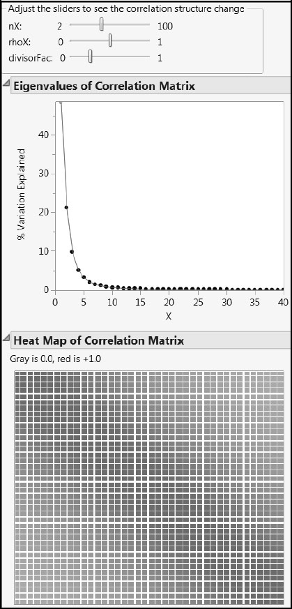
The correlation structure cType = 1 is the same as the correlation structure used in the first simulation study. For some visual intuition, run the script cType_1_CorrelationStructure.jsl by clicking on the corresponding link in the master journal (Figure A2.15). The parameter rhoX controls the rate at which correlation values fall off as you move away from the leading diagonal. The parameter nX is the number of Xs, and divisorFac is another parameter that is set to 0.25 in the simulation. The correlations themselves are given in the report following the plots. For this correlation structure, the correlation coefficients are always positive.
Figure A2.15: X Correlation Structure Type 1
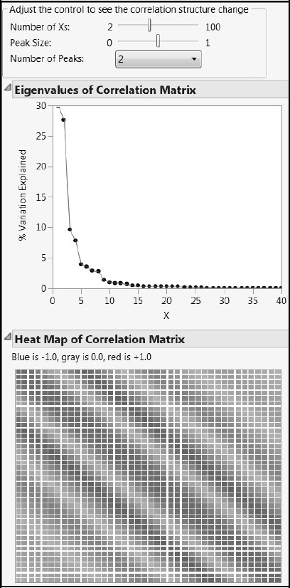
You can explore the second type of correlation structure, cType = 2, using the script cType_2_CorrelationStructure.jsl. Click on the corresponding link in the master journal. Again, nX is the number of Xs. One or two peaks can be selected from the drop-down list. The parameter peakSize controls the proportion of the Xs affected by the peak.
Figure A2.16 shows a situation with two peaks. The correlation values fall off as you move away from the leading diagonal and the secondary peak. In this structure, negative correlations can occur.
Figure A2.16: X Correlation Structure Type 2
Once the type of correlation structure was selected, along with the associated parameter values, the correlation matrix for the 20 predictors (nX = 20) was computed. Then, we generated 20 observations from a mean zero multivariate Gaussian distribution with that correlation matrix. This gives the required X matrix.
Active Xs and Their Arrangement
The total number of Xs was 20 (nX = 20). The number of active Xs, nXactive, was assigned values of 2, 4, 6, 8, or 10. In each simulation a “coefficient budget”, coeffTot, varying between 1 and 10 in integer increments, was used to constrain the nXactive terms in their relationship with the Ys. The locations of the nXactive terms in the list of nX terms were controlled by another variable, coeffType. The variable coeffType assumed one of four possible values: Equal Left, Unequal Left, Equal Random, and Unequal Random. As might be expected, “Left” implies that all the nXactive terms were placed first in the list of 20. “Random” indicates that all the nXactive terms were placed at random in the list of 20. “Equal” indicates that the available budget was allocated equally among the active terms. Finally, “Unequal” indicates that the budget was allocated unequally, specifically according to a binomial-like distribution, among the active terms. This is a generalization of the scheme used in Chong and Jun (2005).
The Functional Relationship
Once coefficients were defined for the nXactive terms by particular choices for coeffTot and coeffType, true values for all the Ys were calculated as linear functions of the Xs using these coefficients. This gave a YTrue matrix to be paired with the X matrix generated earlier. Call the combined matrix TrueData.
Once True Data had been constructed, random normal noise with standard deviation Sigma was added to each Y. Sigma values of 0.01, 0.1, 1.0, 2.0, 3.0 were used.
For each row of TrueData and for each value of Sigma, 100 realizations were generated from TrueData. We call the resulting matrix, which we used for PLS modeling, Data. Each realization was then fit using the NIPALS and SIMPLS algorithms, and a = 1, 2, 3, 4, 5, 6 factors were extracted. Cutoff values of 0.8 and 1.0 were applied to obtain results.
The simulation runs conducted made up a full-factorial design of all the relevant variables. Focusing on the case of cType = 1, the simulation factors and levels were as shown in Table A2.1.
Table A2.1: Full Factorial Design for Correlation Type 1
| Simulation Factor | Levels | Number of Levels |
| rhoX | 0.0 to 0.9 in increments of 0.1 | 10 |
| nXactive | 2 to 10 in increments of 2 | 5 |
| coeffTot | 1 to 10 in increments of 1 | 10 |
| coeffType | Equal Random, Unequal Random, Equal Left, Unequal Left | 4 |
| Sigma | 0.01, 0.1, 1.0, 2.0, 3.0 | 5 |
| a | 1 to 6 in increments of 1 | 6 |
| Cutoff | 0.8, 1.0 | 2 |
For the case cType = 1, this gives 120,000 different treatment combinations to consider. For the case cType = 2, the factors and levels were the same as in Table 1, except that rhoX was replaced by peakSize (0.05 to 0.50 in 0.05 increments, giving 10 levels) and nPeak (1 or 2, giving 2 levels). So in this case there were 240,000 different treatment combinations.
Thus the design matrix for the simulation contains 360,000 rows. For each of the 30,000 combinations consisting of a row of TrueData and a value of Sigma, 100 simulations were generated. For each of these, the number of factors, a, was varied, and the two Cutoff values were applied.
Computation of Result Measures
For each row of TrueData, we know by construction which specific factors are active, and also the true coefficient values involved. For each simulated data set, we attempt to identify these active factors from the fits using Cutoff values of 0.8 and 1.0 for the NIPALS VIP, NIPALS VIP*, and SIMPLS VIP values. We also compare the predicted values and estimated coefficients. Specifically, we calculate the following:
• The true positive and false positive rates for NIPALS VIP, SIMPLS VIP, and VIP* for both cut-off values. The true positive rate for a simulation is the number of active factors that exceed the cut-off divided by the number of active factors. The false positive rate is the number of inactive factors that exceed the cut-off divided by the number of inactive factors.
• The overall error rates for NIPALS VIP, SIMPLS VIP, and VIP* for both cut-off values. The overall error rate for a simulation is the number of active factors that do not exceed the cut-off plus the number of inactive factors that do exceed the cut-off, divided by the total number of factors (20).
• The maximum absolute difference of the NIPALS and SIMPLS predictions.
More specifically, we calculate values for the following metrics:
1. TP NIPALS VIP (true positive rate for terms identified using NIPALS VIP values).
2. FP NIPALS VIP (false positive rate for terms identified using NIPALS VIP values).
3. Overall Error Rate VIP.
4. TP NIPALS VIP* (true positive rate for terms identified using NIPALS VIP* values).
5. FP NIPALS VIP* (false positive rate for terms identified using NIPALS VIP* values).
6. Overall Error Rate VIP*.
7. TP SIMPLS VIP (true positive rate for terms identified using SIMPLS VIP values).
8. FP SIMPLS VIP (false positive rate for terms identified using SIMPLS VIP values).
9. Overall Error Rate SIMPLS VIP.
10. MAD Beta BetaSIMP (maximum absolute difference between NIPALS coefficients and SIMPLS coefficients).
11. MAD PredY PredYSIMP (maximum absolute difference between NIPALS predicted values and SIMPLS predicted values).
12. MAD VIP VIPStar (maximum absolute difference between NIPALS VIP and NIPALS VIP* values).
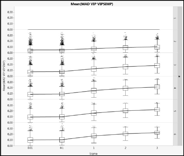
13. MAD VIP VIPSIMP (maximum absolute difference between NIPALS VIP and SIMPLS VIP values).
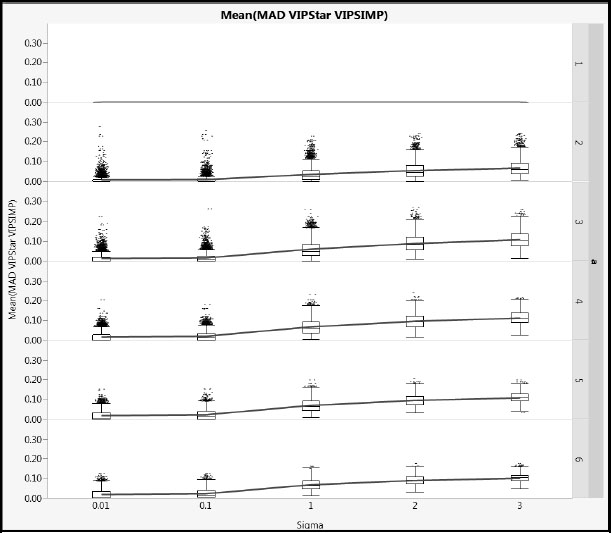
14. MAD VIPStar VIPSIMP (maximum absolute difference between NIPALS VIP* and SIMPLS VIP values).
For each of the 360,000 treatment combinations, these metrics were averaged over the 100 simulations.
Comparison of VIP Values
We begin by exploring the differences between the NIPALS and SIMPLS VIP values. This is interesting in relation to the commonly used threshold values of 0.8 and 1.0 for detecting active terms.
Figures A2.17 and A2.18 show mean absolute difference results for cType = 1 and cType = 2, respectively, using a common vertical scale. Note that, when a = 1, the VIP values are identical because no deflation is involved. For a > 1, as Sigma increases, the differences increase. The impact of the different correlation types of the Xs is small. The blue lines link mean values.
Figure A2.17: Differences between NIPALS VIP and SIMPLS VIP for Type 1 Correlation
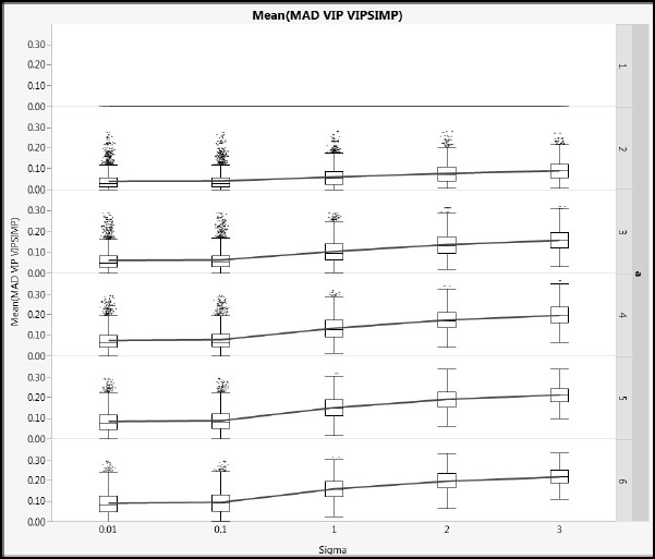
Figure A2.18: Differences between NIPALS VIP and SIMPLS VIP for Type 2 Correlation
Figures A2.19 and A2.20 show mean absolute difference results between the NIPALS VIP* and the SIMPLS VIP values (using the same scales as Figures A2.17 and A2.18. Based on the details in the section “More on VIPs” in Appendix 1, we might expect these differences to be smaller, and these plots verify this. The X correlation type has even less impact than for the NIPALS and SIMPLS VIP comparison.
Figure A2.19: Differences between NIPALS VIP* and SIMPLS VIP for Type 1 Correlation
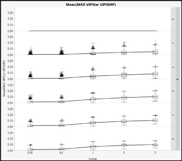
Figure A2.20: Differences between NIPALS VIP* and SIMPLS VIP for Type 2 Correlation
Comparison of Variable Selection Error Rates
For the variable selection problem, Error Rate VIP, Error Rate VIP*, and Error Rate SIMPLS are perhaps the most important metrics. Each is the sum of the number of false positives and false negatives identified by the corresponding method (NIPALS VIP, NIPALS VIP*, and SIMPLS VIP), divided by the number of Xs (20). Without more information about the specific study objectives, it is difficult to say whether false positives or false negatives are more damaging, so we confine ourselves to discussing the results for these overall error rates.
Furthermore, knowing that NIPALS VIP* values are fairly close to SIMPLS VIP values, and because the JMP PLS platform does not calculate VIP* values directly, we further confine the rest of the discussion to comparing the NIPALS VIP error rate to the SIMPLS VIP error rate (Error Rate VIP and Error Rate SIMPLS).
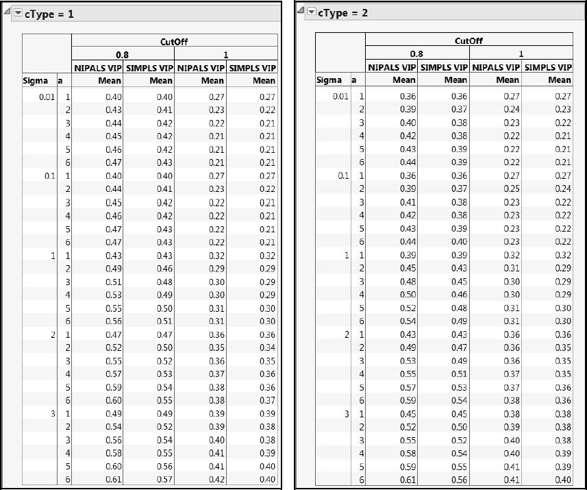
A tabular comparison of mean error rates based on NIPALS and SIMPLS VIPs and for cType = 1 and cType = 2 is shown in Figure A2.21. The overall error rates for the 1.0 cut-off are considerably lower than for the 0.8 cut-off. Overall error rates computed using SIMPLS VIPs tend to be lower than those using NIPALS VIPs. This particular study suggests that SIMPLS VIPs outperform NIPALS VIPs for both types of errors, but especially for false positives. We caution, though, that this is a limited study. Also, one needs to better understand the false positive/false negative tradeoff before making a determination relative to which cut-off or method is best.
Also note that, for the cut-off value of 0.8, the error rates for cType = 2 are always less than or equal to those for cType = 1. When the cut-off is 1.0, the error rates are fairly similar.
Figure A2.21: Comparison of Error Rates for NIPALS and SIMPLS VIPs
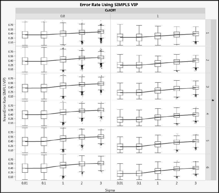
Next, we illustrate how error rates vary with Sigma. Figures A2.22 and A2.23 show Error Rate VIP and Error Rate SIMPLS for cType = 1, and Figures A2.24 and A2.25 show the same metrics for cType = 2. Generally, the distributions are wide, but the advantage of using a cut-off value of 1.0 rather than 0.8 relative to overall error rate is clear. As Sigma increases, the mean error rate increases (shown by the blue line) and its variability decreases (shown by both the interquartile range and the total range).
Figure A2.22: Error Rate for NIPALS VIP for Type 1 Correlation
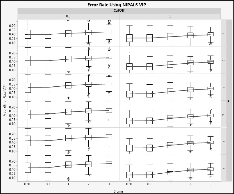
Figure A2.23: Error Rate for SIMPLS VIP for Type 1 Correlation
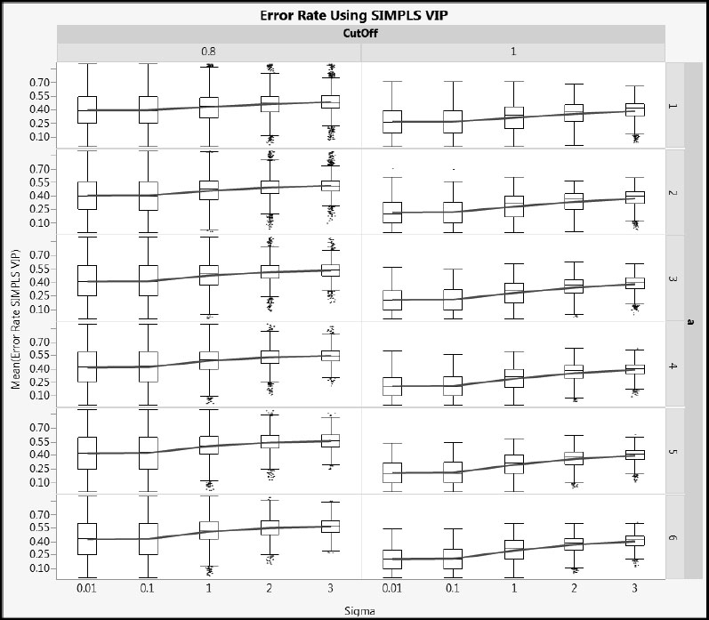
Figure A2.24: Error Rate for NIPALS VIP for Type 2 Correlation
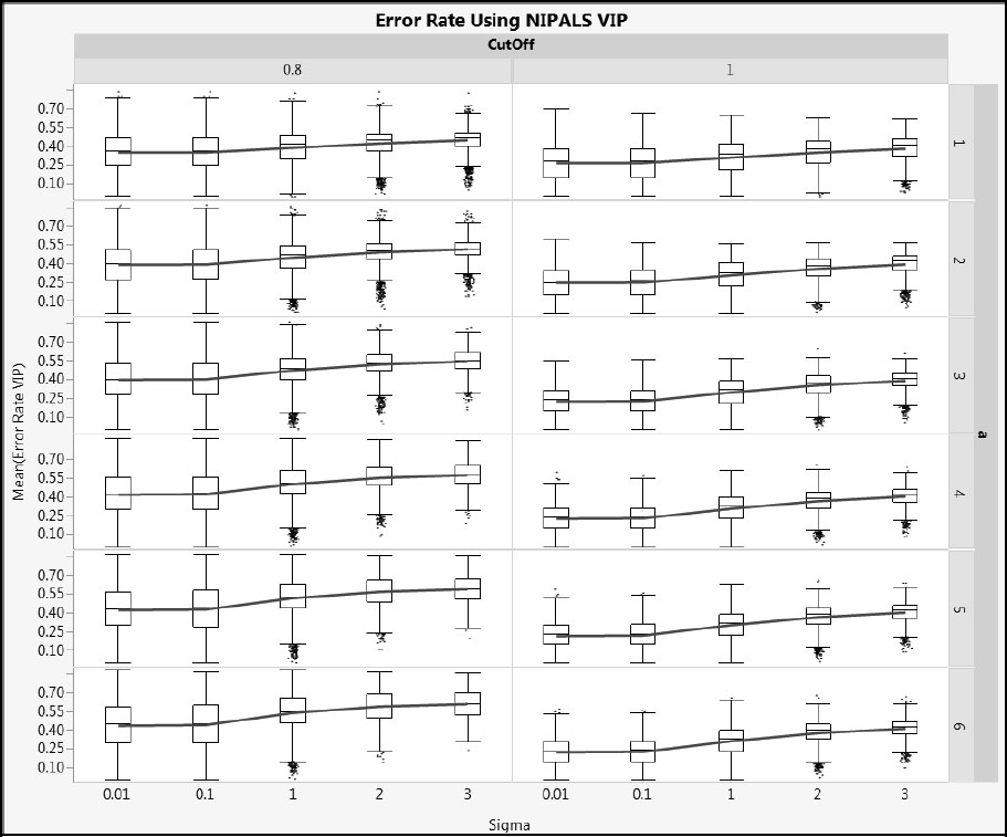
Figure A2.25: Error Rate for SIMPLS VIP for Type 2 Correlation
Let’s delve a bit more deeply into if and how the error rates change with other important factors such as nXactive, coeffTot, and coeffType.
Figure A2.26 shows NIPALS VIP error rates for cType = 1, but using histograms rather than box plots as we did in Figure A2.22. In addition, all rows corresponding to coeffTtype == Equal Left and Unequal Left have been selected, so that the conditional distribution of the “Left” arrangement of coefficients is highlighted. This also allows a comparison with the two “Random” arrangements of coefficients.
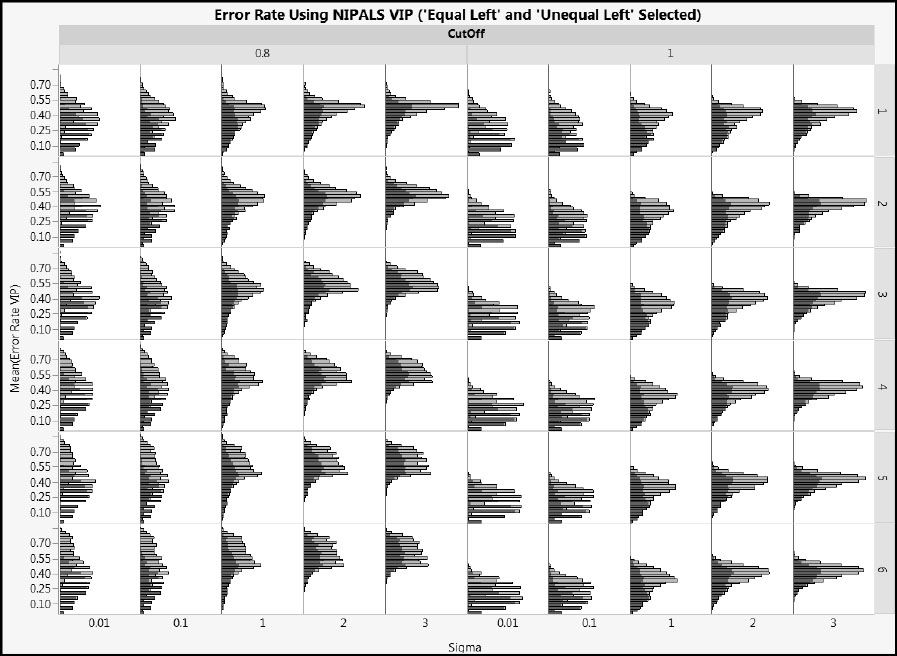
Figure A2.26 clearly shows that, for small values of Sigma, the “Left” arrangement produces lower error rates than the “Random” arrangement. These differences lessen as Sigma increases. Figure A2.27 shows NIPALS VIP error rates for cType = 2. This figure leads to the same conclusions as does Figure A2.26.
Figure A2.26: Effect of CoeffType on NIPALS VIP Error Rate for Type 1 Correlation
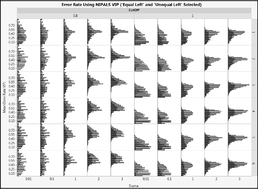
Figure A2.27: Effect of CoeffType on NIPALS VIP Error Rate for Type 2 Correlation
In spite of the complexity revealed by the simulation, the major findings are clear. The SIMPLS VIP and NIPALS VIP* appear to outperform the NIPALS VIP by a slight margin. The cut-off value has a major impact on the error rate, with a cut-off of 1.0 resulting in lower overall error rates than a cut-off of 0.8. We recommend using the 1.0 cut-off if you are interested in the overall error rate. If you are interested in maximizing true positives, you should use the 0.8 cut-off. Not surprisingly, the error rates are also affected by the correlation structure of the Xs and how the active factors are dispositioned within the correlation structure.
Variable selection in PLS is a complex problem. We suggest caution and encourage you to compare your results with those obtained by alternative approaches when these exist.
A secondary conclusion from our simulation study, for which we did not present details, is that NIPALS and SIMPLS tend to give similar predictions.