
Now that we have followed the frontend developer's path of taking a design or mockup and converting it into a working Drupal 8 theme, we have to ask that burning question, what next? The answer to that question depends on the problems we need to solve.
For example, what about theming some more common, but often forgotten, admin sections, such as the local tasks menu or status messages block? How about extending Twig templates to reduce having to manage markup in multiple places? However, the most common question is what about contributed modules that can help us with our theming?
In this final chapter, we will take a look at answering these last-minute questions, as we cover the following:
- We will begin with cleaning up our theme by adding some additional Twig templates for both the local tasks menu and the status messages block.
- Next, we will take a look at extending Twig templates by using template inheritance to reduce the amount of markup we have to manage in our theme.
- Finally, we will take a look at the state of some common Drupal contributed modules, such as Display Suite.
While we work through each section, we have the ability to refer back to the Chapter12 exercise files folder. Each folder contains start and end folders with files that we can use to compare our work when needed. These also include database snapshots that will allow us all to start from the same point when working through various lessons.
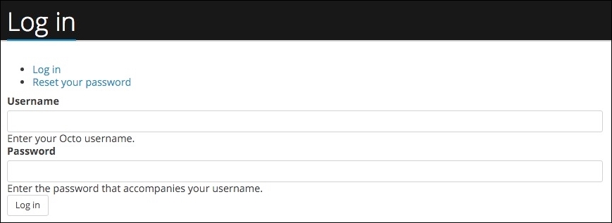
One of the most common content blocks within Drupal 8 that is often forgotten about when creating a theme is Local Tasks, often referred to as Tabs. We can see an example of the Tabs block whenever a user needs to perform some sort of action, such as viewing and editing a Node, or even when logging in to Drupal. If we make sure that we are logged out of Drupal Admin and then navigate to /user/login, we will see the Log in and Reset your password links that make up the tabs on the user login page:
If we input our admin credentials and log in to our Drupal instance we will see that the local tasks menu changes to display View, Shortcuts, and Edit links. The local tasks menu will change, based on the type of page we are on and the permissions that each user has been assigned.
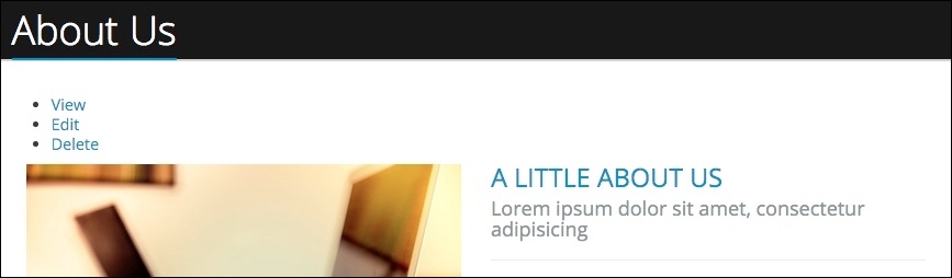
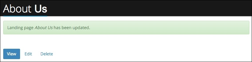
If we navigate to the About Us page located at /about, we will see that our local tasks menu now provides us with the ability to View, Edit, or Delete the current Node.
Now that we have a better understanding of how the Local Tasks menu or tab changes, lets dive into how we would go about theming it.
Local tasks, or the Tabs menu, is quite simple to theme. Drupal provides us with two Twig templates, menu-local-tasks.html.twig and menu-local-task.html.twig, which we can modify using techniques we are familiar with. For this exercise, we will simply add some classes to the template so that it styles our links as the pill buttons provided by the Twitter Bootstrap framework.
Begin by creating a copy of menu-local-tasks.html.twig located in the core/modules/system/templates folder and add it to our themes/octo/templates folder. Next, we will open the template and replace the markup with the following:
New markup
{% if primary %}
  <h2 class="visually-hidden">{{ 'Primary tabs'|t }}</h2>
  <ul class="nav nav-pills primary">{{ primary }}</ul>
{% endif %}
{% if secondary %}
  <h2 class="visually-hidden">{{ 'Secondary tabs'|t }}</h2>
  <ul class="nav nav-pills secondary">{{ secondary }}</ul>
{% endif %}
Make sure to save our changes, clear Drupal's cache and then refresh the browser. Our local tasks are now displayed inline and if we hover over each item, we will see the outline of the pill formatting. Next, we need to add the active class to each list item to help differentiate which action is currently being displayed.
Begin by creating a copy of menu-local-task.html.twig, located in the core/modules/system/templates folder, and add it to our themes/octo/ templates folder. Next, we will open the template and replace the markup with the following:
New markup
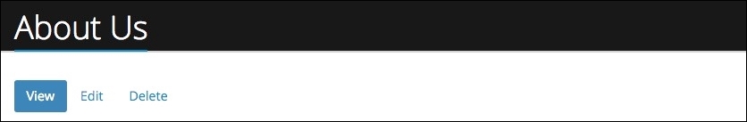
<li{{ attributes.addClass(is_active ? 'active') }}>{{ link }}</li>Make sure to save our changes, clear Drupal's cache, and then refresh the browser. The markup we added looks to see whether the list item is active and if it is, we add the active class to it. This then displays as a blue pill button within our webpage:
Great, we have now themed our first Admin component. The next item we will look at implementing is our Status messages block.
The Status messages block is what Drupal uses to inform users of specific actions they have completed, as well as to display any PHP warnings or errors. If we navigate to the Block layout admin, we can see that the Status messages block is currently assigned to the Highlighted region of our theme.

However, we are currently not outputting this region within our page template, which means that any messages Drupal is trying to display will not be seen. Let's remedy this by printing the region to our page.html.twig template.
Begin by opening page.html.twig, located in our themes/octo/templates folder. We will want to modify our markup to add the page.highlighted region variable to our template. We can add it between our title_bar and before_content regions as shown here:
New markup
{{ page.title_bar }}
{{ page.highlighted }}
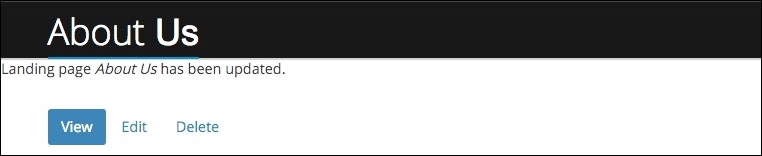
{{ page.before_content }} Make sure to save our changes, clear Drupal's cache, and then refresh the browser. If we are on the About Us page, we simply need to click on the Edit button to modify the page content and then click on the Save and keep published button to trigger our status message.
It is easy to see how a user visiting our site could miss any status messages that we may want them to see, simply because we forgot to theme this component.
It is important to ensure that any messages that we display to the end user are visible and invoke the proper message, based on whether the action was successful or whether the action returned an error. For this purpose, we can borrow from the Twitter Bootstrap Alert component.
If we inspect the page, we can see that Drupal is using the status-messages.html.twig template. Begin by creating a copy of status-messages.html.twig, located in the core/modules/system/templates folder, and add it to our themes/octo/templates folder. Next, we will open the template and replace the markup with the following:
New markup
<div class="container">
  {% for type, messages in message_list %}

    {% if type == 'error' %}
      {% set classes = ['alert', 'alert-danger', 'alert--' ~
       type] %}
    {% else %}
      {% set classes = ['alert', 'alert-success', 'alert--' ~
       type] %}
    {% endif %}

      <div {{ attributes.addClass(classes) }} role="alert">
        {% if messages|length > 1 %}
          <ul>
            {% for message in messages %}
              <li>{{ message }}</li>
            {% endfor %}
          </ul>
        {% else %}
          {{ messages|first }}
        {% endif %}
      </div>

    {# Remove type specific classes #}
    {{ attributes.removeClass(classes) }}

  {% endfor %}
</div>
Make sure to save our changes, clear Drupal's cache, and then refresh the browser. If we click on the Edit button and then click on the Save and keep published button, we will trigger our status message to display. However, this time it is displayed with the proper styling:
There are a couple of things to point out regarding our modification of the status-messages.html.twig template:
- First, we added a block element to wrap our status message block with a class attribute of
containerto ensure we had proper margin and constraints on the content. - Next, we tested for the
typeof message Drupal was outputting and added the proper alert type to theclassesvariable. We then appended our classes variable to any existing classes on our alert element, using theattributes.addClass()function. - Finally, since we may have multiple messages of varying types being displayed, we removed the
classesvariable using the Twig functionattributes.removeClass()through each iteration, so that we display the proper alerts.
We have now successfully themed both our tabs and status messages. This provides us with a cleaner user interface and allows for messages to be clearly displayed.