This chapter explores the pack geometry manager that positions widgets on the screen.
Geometry managers arrange widgets on the screen. This chapter describes the pack geometry manager, which is a constraint-based system. The next two chapters describe the grid and place geometry managers. The pack and grid geometry managers are quite general, while place is used for special-purpose applications. This book uses pack a lot because it was the original geometry manager for Tk. The grid geometry manager was added in Tk 4.1.
A geometry manager uses one widget as a parent, and it arranges multiple children (also called slaves) inside the parent. The parent is almost always a frame, but this is not strictly necessary. A widget can only be managed by one geometry manager at a time, but you can use different managers to control different widgets in your user interface. If a widget is not managed, then it doesn't appear on your display at all.
For each individual manager widget — such as a frame, a labelframe, or a toplevel — you have the choice of using either pack or grid to manage all of its immediate children. Attempting to use both in the same manager results in an endless loop as both geometry managers try to control the window layout. This restriction applies only to the immediate children of a manager widget; you can use a different geometry manager for “descendents” that aren't immediate children. For example, you can choose to pack all of the immediate children of the . toplevel. Then, if one of the children of . is a frame, you can choose to use either pack or grid to manage the children of that frame.
The packer is a powerful constraint-based geometry manager. Instead of specifying in detail the placement of each window, the programmer defines some constraints about how windows should be positioned, and the packer works out the details. It is important to understand the algorithm the packer uses; otherwise, the constraint-based results may not be what you expect.
This chapter explores the packer through a series of examples. The background of the main window is set to black, and the other frames are given different colors so you can identify frames and observe the effect of the different packing parameters. When consecutive examples differ by a small amount, the added command or option is printed in bold courier to highlight the addition.
The following example creates two frames and packs them toward the top side of the main window. The upper frame, .one, is not as big and the main window shows through on either side. The children are packed toward the specified side in order, so .one is on top. The four possible sides are: top, right, bottom, and left. The top side is the default.
Example 25-1. Two frames packed inside the main frame
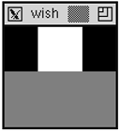
# Make the main window black
. config -bg black
# Create and pack two frames
frame .one -width 40 -height 40 -bg white
frame .two -width 100 -height 50 -bg grey50
pack .one .two -side top
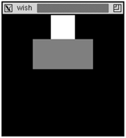
In the previous example, the main window shrank down to be just large enough to hold its two children. In most cases this is the desired behavior. If not, you can turn it off with the pack propagate command. Apply this to the parent frame, and it will not adjust its size to fit its children:
In general, you use either horizontal or vertical stacking within a frame. If you mix sides such as left and top, the effect might not be what you expect. Instead, you should introduce more frames to pack a set of widgets into a stack of a different orientation. For example, suppose we want to put a row of buttons inside the upper frame in the examples we have given so far:
Example 25-3. A horizontal stack inside a vertical stack
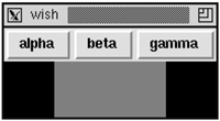
frame .one -bg white
frame .two -width 100 -height 50 -bg grey50
# Create a row of buttons
foreach b {alpha beta gamma} {
   button .one.$b -text $b
   pack .one.$b -side left
}
pack .one .two -side top
Example 25-4. Even more nesting of horizontal and vertical stacks
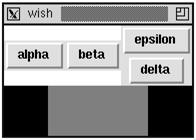
frame .one -bg white
frame .two -width 100 -height 50 -bg grey50
foreach b {alpha beta} {
   button .one.$b -text $b
   pack .one.$b -side left
}
# Create a frame for two more buttons
frame .one.right
foreach b {delta epsilon} {
   button .one.right.$b -text $b
   pack .one.right.$b -side bottom
}
pack .one.right -side right
pack .one .two -side top
You can build more complex arrangements by introducing nested frames and switching between horizontal and vertical stacking as you go. Within each frame pack all the children with either a combination of -side left and -side right, or -side top and -side bottom.
Example 25-4 replaces the .one.gamma button with a vertical stack of two buttons, .one.right.delta and .one.right.epsilon. These are packed toward the bottom of .one.right, so the first one packed is on the bottom.
The frame .one.right was packed to the right, and in the previous example, the button .one.gamma was packed to the left. Despite the difference, they ended up in the same position relative to the other two widgets packed inside the .one frame. The next section explains why.
Example 25-5. Mixing bottom and right packing sides
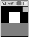
# pack two frames on the bottom.
frame .one -width 100 -height 50 -bg grey50
frame .two -width 40 -height 40 -bg white
pack .one .two -side bottom
# pack another frame to the right
frame .three -width 20 -height 20 -bg grey75
pack .three -side right
When we pack a third frame into the main window with -side left or -side right, the new frame is positioned inside the cavity, which is above the two frames already packed toward the bottom side. The frame does not appear to the right of the existing frames as you might have expected. This is because the .two frame occupies the whole bottom side of the packing cavity, even though its display does not fill up that side.
Can you tell where the packing cavity is after this example? It is to the left of the frame .three, which is the last frame packed toward the right, and it is above the frame .two, which is the last frame packed toward the bottom. This explains why there was no difference between the previous two examples when .one.gamma was packed to the left, but .one.right was packed to the right. At that point, packing to the left or right of the cavity had the same effect. However, it will affect what happens if another widget is packed into those two configurations. Try out the following commands after running Example 25-3 and Example 25-4 and compare the difference.[*]
button .one.omega -text omega
pack .one.omega -side right
Each packing parent has its own cavity, which is why introducing nested frames can help. If you use a horizontal or vertical arrangement inside any given frame, you can more easily simulate the packer's behavior in your head!
The packer distinguishes between packing space and display space when it arranges the widgets. The display space is the area requested by a widget for the purposes of painting itself. The packing space is the area the packer allows for the placement of the widget. Because of geometry constraints, a widget may be allocated more (or less) packing space than it needs to display itself. The extra space, if any, is along the side of the cavity against which the widget was packed.
The -fill packing option causes a widget to fill up the allocated packing space with its display. A widget can fill in the X or Y direction, or both. The default is not to fill, which is why the black background of the main window has shown through in the examples so far:
Example 25-6. Filling the display into extra packing space
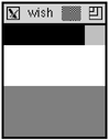
frame .one -width 100 -height 50 -bg grey50
frame .two -width 40 -height 40 -bg white
# Pack with fill enabled
pack .one .two -side bottom -fill x
frame .three -width 20 -height 20 -bg red
pack .three -side right -fill x
This is just like Example 25-5, except that -fill x has been specified for all the frames. The .two frame fills, but the .three frame does not. This is because the fill does not expand into the packing cavity. In fact, after this example, the packing cavity is the part that shows through in black. Another way to look at this is that the .two frame was allocated the whole bottom side of the packing cavity, so its fill can expand the frame to occupy that space. The .three frame has only been allocated the right side, so a fill in the X direction will not have any effect.
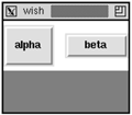
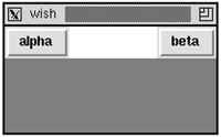
Another use of fill is for a menu bar that has buttons at either end and some empty space between them. The frame that holds the buttons is packed toward the top. The buttons are packed into the left and right sides of the menu bar frame. Without fill, the menu bar shrinks to be just large enough to hold all the buttons, and the buttons are squeezed together. When fill is enabled in the X direction, the menu bar fills out the top edge of the display:
Example 25-7. Using horizontal fill in a menu bar
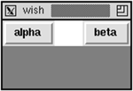
frame .menubar -bg white
frame .body -width 150 -height 50 -bg grey50
# Create buttons at either end of the menubar
foreach b {alpha beta} {
   button .menubar.$b -text $b
}
pack .menubar.alpha -side left
pack .menubar.beta -side right
# Let the menu bar fill along the top
pack .menubar -side top -fill x
pack .body
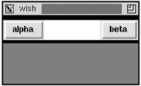
Another way to get more fill space is with the -ipadx and -ipady packing options that request more display space in the X and Y directions, respectively. Due to other constraints the request might not be offered, but in general you can use this to give a widget more display space. The next example is just like the previous one except that some internal padding has been added:
Example 25-8. The effects of internal padding (-ipady)
# Create and pack two frames
frame .menubar -bg white
frame .body -width 150 -height 50 -bg grey50
# Create buttons at either end of the menubar
foreach b {alpha beta} {
   button .menubar.$b -text $b
}
pack .menubar.alpha -side left -ipady 10
pack .menubar.beta -side right -ipadx 10
# Let the menu bar fill along the top
pack .menubar -side top -fill x -ipady 5
pack .body
The alpha button is taller and the beta button is wider because of the internal padding. The frame has internal padding, which reduces the space available for the packing cavity, so the .menubar frame shows through above and below the buttons.
Some widgets have attributes that result in more display space. For example, it would be hard to distinguish a frame with width 50 and no internal padding from a frame with width 40 and a -ipadx 5 packing option. The packer would give the frame 5 more pixels of display space on either side for a total width of 50.
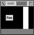
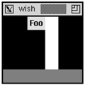
Buttons have their own -padx and -pady options that give them more display space, too. This padding provided by the button is used to keep its text away from the edge of the button. The following example illustrates the difference. The -anchor e button option positions the text as far to the right as possible. Example 40-5 on page 617 provides another comparison of these options:
Example 25-9. Button padding vs. packer padding
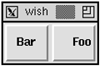
# Foo has internal padding from the packer
button .foo -text Foo -anchor e -padx 0 -pady 0
pack .foo -side right -ipadx 10 -ipady 10
# Bar has its own padding
button .bar -text Bar -anchor e -pady 10 -padx 10
pack .bar -side right -ipadx 0 -ipady 0
In all cases, you can specify the amount of padding using any type of screen distance recognized by Tk. A simple numeric value is interpreted as pixels. You can also follow a number with one of i, m, c, or p, which is interpreted as inches, millimeters, centimeters, or typographic points, respectively.
The packer can provide external padding that allocates packing space that cannot be filled. The space is outside of the border that widgets use to implement their 3D reliefs. Example 40-2 on page 614 shows the different reliefs. The look of a default button is achieved with an extra frame and some padding:
Example 25-10. The look of a default button
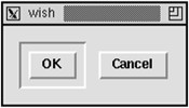
. config -borderwidth 10
# OK is the default button
frame .ok -borderwidth 2 -relief sunken
button .ok.b -text OK
pack .ok.b -padx 5 -pady 5
# Cancel is not
button .cancel -text Cancel
pack .ok .cancel -side left -padx 5 -pady 5
The .ok.b button looks the same even if it is packed with -fill both. The child widgets do not fill the external padding provided by the packer.
Example 25-10 handcrafts the look of a default button. Tk 8.0 added a -default attribute for buttons that gives them the right appearance for the default button on the current platform. It looks somewhat like this on UNIX, but the appearance is different on Macintosh and Windows.
Tk 8.4 added the ability to specify asymmetric padding as a list of two screen distances. For example, the following adds 5 pixels of padding to the left and right of the widgets, 3 pixels above them, and 6 pixels below them:
pack .ok .cancel -side left -padx 5 -pady {3 6}
The -expand true packing option lets a widget expand its packing space into unclaimed space in the packing cavity. Example 25-6 could use this on the small frame on top to get it to expand across the top of the display, even though it is packed to the right side. The more common case occurs when you have a resizable window. When the user makes the window larger, the widgets have to be told to take advantage of the extra space. Suppose you have a main widget like a text, listbox, or canvas that is in a frame with a scrollbar. That frame has to be told to expand into the extra space in its parent (e.g., the main window) and then the main widget (e.g., the canvas) has to be told to expand into its parent frame. Example 24-1 on page 378 does this.
In nearly all cases the -fill both option is used along with -expand true so that the widget actually uses its extra packing space for its own display. The converse is not true. There are many cases where a widget should fill extra space but not attempt to expand into the packing cavity. The examples below show the difference.
Now we can investigate what happens when the window is made larger. The next example starts like Example 25-7 on page 400, but the size of the main window is increased:
Example 25-11. Resizing without the expand option
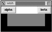
# Make the main window black
. config -bg black
# Create and pack two frames
frame .menubar -bg white
frame .body -width 150 -height 50 -bg grey50
# Create buttons at either end of the menubar
foreach b {alpha beta} {
   button .menubar.$b -text $b
}
pack .menubar.alpha -side left
pack .menubar.beta -side right
# Let the menu bar fill along the top
pack .menubar -side top -fill x
pack .body
# Resize the main window to be bigger
wm geometry . 200x100
# Allow interactive resizing
wm minsize . 100 50
The only widget that claims any of the new space is .menubar because of its -fill x packing option. The .body frame needs to be packed properly:
Example 25-12. Resizing with expand turned on
# Use all of Example 25–11 then repack .body
pack .body -expand true -fill both
If more than one widget inside the same parent is allowed to expand, then the packer shares the extra space between them proportionally. This is probably not the effect you want in the examples we have built so far. The .menubar, for example, is not a good candidate for expansion.
If a widget is left with more packing space than display space, you can position it within its packing space using the -anchor packing option. The default anchor position is center. The other options correspond to points on a compass: n, ne, e, se, s, sw, w, and nw:
Example 25-14. Setup for anchor experiments
# Make the main window black
. config -bg black
# Create two frames to hold open the cavity
frame .prop -bg white -height 80 -width 20
frame .base -width 120 -height 20 -bg grey50
pack .base -side bottom
# Float a label and the prop in the cavity
label .foo -text Foo
pack .prop .foo -side right -expand true
The .base frame is packed on the bottom. Then the .prop frame and the .foo label are packed to the right with expand set but no fill. Instead of being pressed up against the right side, the expand gives each of these widgets half of the extra space in the X direction. Their default anchor of center results in the positions shown. The next example shows some different anchor positions:
Example 25-15. The effects of noncenter anchors
. config -bg black
# Create two frames to hold open the cavity
frame .prop -bg white -height 80 -width 20
frame .base -width 120 -height 20 -bg grey50
pack .base -side bottom
# Float the label and prop
# Change their position with anchors
label .foo -text Foo
pack .prop -side right -expand true -anchor sw
pack .foo -side right -expand true -anchor ne
The label has room on all sides, so each of the different anchors will position it differently. The .prop frame only has room in the X direction, so it can only be moved into three different positions: left, center, and right. Any of the anchors w, nw, and sw result in the left position. The anchors center, n, and s result in the center position. The anchors e, se, and ne result in the right position.
If you want to see all the variations, type in the following commands to animate the different packing anchors. The update idletasks forces any pending display operations. The after 500 causes the script to wait for 500 milliseconds:
The packer maintains an order among the children that are packed into a frame. By default, each new child is appended to the end of the packing order. The most obvious effect of the order is that the children first in the packing order are closest to the side they are packed against. You can control the packing order with the -before and -after packing options, and you can reorganize widgets after they have already been packed:
Example 25-17. Controlling the packing order
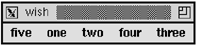
# Create five labels in order
foreach label {one two three four five} {
   label .$label -text $label
   pack .$label -side left -padx 5
}
# ShuffleUp moves a widget to the beginning of the order
proc ShuffleUp { parent child } {
   set first [lindex [pack slaves $parent] 0]
   pack $child -in $parent -before $first
}
# ShuffleDown moves a widget to the end of the order
proc ShuffleDown { parent child } {
   pack $child -in $parent
}
ShuffleUp . .five
ShuffleDown . .three
The pack slaves command returns the list of children in their packing order. The ShuffleUp procedure uses this to find out the first child so that it can insert another child before it. The ShuffleDown procedure is simpler because the default is to append the child to the end of the packing order.
When a widget is repacked, then it retains all its packing parameters that have already been set. If you need to examine the current packing parameters for a widget, use the pack info command.
pack info .five
=> -in . -anchor center -expand 0 -fill none -ipadx 0
     -ipady 0 -padx 0 -pady 0 -side left
In nearly all of the examples in this chapter, a widget is packed into its parent frame. In general, it is possible to pack a widget into any descendent of its parent. For example, the .a.b widget could be packed into .a, .a.c or .a.d.e.f. The -in packing option lets you specify an alternate packing parent. One motivation for this is that the frames introduced to get the arrangement right can cause cluttered names for important widgets. In Example 25-4 on page 398, the buttons have names like .one.alpha and .one.right.delta, which is not consistent. Here is an alternate implementation of the same example that simplifies the button names and gives the same result:
Example 25-18. Packing into other relatives
# Create and pack two frames
frame .one -bg white
frame .two -width 100 -height 50 -bg grey50
# Create a row of buttons
foreach b {alpha beta} {
   button .$b -text $b
   pack .$b -in .one -side left
}
# Create a frame for two more buttons
frame .one.right
foreach b {delta epsilon} {
   button .$b -text $b
   pack .$b -in .one.right -side bottom
}
pack .one.right -side right
pack .one .two -side top
When you do this, remember that the order in which you create widgets is important. Create the frames first, then create the widgets. The stacking order for windows will cause the later windows to obscure the windows created first. The following is a common mistake because the frame obscures the button:
button .a -text hello
frame .b
pack .a -in .b
If you cannot avoid this problem scenario, then you can use the raise command to fix things up. Stacking order is also discussed on page 409.
raise .a
The pack forget command removes a widget from the packing order. The widget gets unmapped, so it is not visible. If you unpack a parent frame, the packing structure inside it is maintained, but all the widgets inside the frame get unmapped. Unpacking a widget is useful if you want to suppress extra features of your interface. You can create all the parts of the interface, and just delay packing them in until the user requests to see them. Then you can pack and unpack them dynamically.
Keep these rules in mind about the packer:
Pack vertically (
-side topand-side bottom) or horizontally (-side leftand-side right) within a frame. Only rarely will a different mixture of packing directions work out the way you want. Add frames to build more complex structures.By default, the packer puts widgets into their parent frame, and the parent frame must be created before the children that are packed into it.
If you put widgets into other relatives, remember to create the frames first so the frames stay underneath the widgets packed into them.
By default, the packer ignores
-widthand-heightattributes of frames that have widgets packed inside them. It shrinks frames to be just big enough to allow for its border width and to hold the widgets inside them. Usepack propagateto turn off the shrink-wrap behavior.The packer distinguishes between packing space and display space. A widget's display might not take up all the packing space allocated to it.
The
-filloption causes the display to fill up the packing space in the X or Y directions, or both.The
-expand trueoption causes the packing space to expand into any room in the packing cavity that is otherwise unclaimed. If more than one widget in the same frame wants to expand, then they share the extra space.The
-ipadxand-ipadyoptions allocate more display space inside the border, if possible.The
-padxand-padyoptions allocate more packing space outside the border, if possible. The widget never fills this space. These values may be specified as a list of two values to get asymmetric padding (Tk 8.4.)
Table 25-1 summarizes the pack command. Table 25-2 summarizes the packing options for a widget. These are set with the pack configure command, and the current settings are returned by the pack info command.
Table 25-1. The pack command
| This is just like |
| Packs one or more widgets according to the |
| Unpacks the specified windows. |
| Returns the packing parameters of |
| Queries or sets the geometry propagation of |
| Returns the list of widgets managed by |
Table 25-2. Packing options
| Packs after |
| Anchors: |
| Packs before |
| Controls expansion into the unclaimed packing cavity. |
| Controls fill of packing space. Style: |
| Packs inside |
| Horizontal internal padding, in screen units. |
| Vertical internal padding, in screen units. |
| Horizontal external padding, in screen units. May be a list of two screen units for asymmetric padding (Tk 8.4). |
| Vertical external padding, in screen units. May be a list of two screen units for asymmetric padding (Tk 8.4). |
| Sides: |
The raise and lower commands control the window stacking order. The stacking order controls the display of windows. Windows higher in the stacking order obscure windows lower in the stacking order. By default, new windows are created at the top of the stacking order so they obscure older windows. Consider this sequence of commands:
button .one
frame .two
pack .one -in .two
If you do this, you do not see the button. The problem is that the frame is higher in the stacking order so it obscures the button.
You can change the stacking order with the raise command:
raise .one .two
This puts .one just above .two in the stacking order. If .two was not specified, then .one would be put at the top of the stacking order.
The lower command has a similar form. With one argument, it puts that window at the bottom of the stacking order. Otherwise, it puts it just below another window in the stacking order.
You can use raise and lower on top-level windows to control their stacking order among all other top-level windows. For example, if a user requests a dialog that is already displayed, use raise to make it pop to the foreground of their cluttered desktop. To determine the stacking order of toplevel windows, use the wm stackorder command. (See “Toplevel Size, Placement, and Decoration” on page 658.)
[*] Answer: After Example 25-3 the new button is to the right of all buttons. After Example 25-4 the new button is between .one.beta and .one.right.