The entry widget provides a single line of text for use as a data entry field. The string in the entry can be linked to a Tcl variable. A spinbox is an extended entry that also allows the user to move, or “spin,” through a fixed set of values.
Entry widgets are specialized text widgets that display a single line of editable text. They have a subset of the functionality of the general-purpose text widget described in Chapter 36. The entry is commonly used in dialog boxes when values need to be filled in, or as a simple command entry widget. A very useful feature of the entry is the ability to link it to a Tcl variable. The entry displays that variable's value, and editing the contents of the entry changes the Tcl variable.
Spinbox widgets, introduced in Tk 8.4, are entry widgets that include up and down arrows, allowing the user to “spin” through a fixed set of values such as dates or times. A spinbox normally allows a user to type any arbitrary text into the text area, but you can also configure a spinbox so that users can only spin through the valid choices.
The entry widget supports editing, scrolling, and selections, which make it more complex than label or message widgets. Fortunately, the default settings for an entry widget make it usable right away. You click with the left button to set the insert point and then type in text. Text is selected by dragging out a selection with the left button. The entry can be scrolled horizontally by dragging with the middle mouse button.
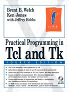
One common use of an entry widget is to associate a label with it, and a command to execute when <Return> is pressed in the entry. The grid geometry manager is ideal for lining up several entries and their labels. This is implemented in the following example:
Example 34-1. Associating entry widgets with variables and commands
foreach {field label} {name Name address1 Address
          address2 {} phone Phone} {
   label .l$field -text $label -anchor w
   entry .e$field -textvariable address($field) -relief sunken
   grid .l$field .e$field -sticky news
   bind .e$field <Return> UpdateAddress
}
Example 34-1 creates four entries that are linked to variables with the textvariable attribute. The variables are elements of the address array. The -relief sunken for the entry widget sets them apart visually. Widget relief is described in more detail on page 614. The Tcl command UpdateAddress is bound to the <Return> keystroke. The UpdateAddress procedure, which is not shown, can get the current values of the entry widgets through the global array address.
As of Tk 8.3, entry widgets gained several new options that make it easy to prevent users from entering invalid text into an entry.
The validate attribute determines when validation should take place. A value of none (the default) disables validation. Other supported values are: focusin (receiving keyboard focus), focusout (losing focus), focus (gaining or losing focus), key (any keypress), and all.
For validation to take effect, you must also provide a value for the validateCommand (or -vcmd) attribute. This is a Tcl script to execute whenever validation takes place. If the script returns a Boolean True, the proposed change to the widget is accepted; if the script returns a Boolean False, the proposed change is rejected and the widget's text remains the same.
Optionally, you can also assign a Tcl script to the invalidCommand attribute. This script executes if the validation script returns False.
The validateCommand validation script can contain “percent substitutions,” just like in an event binding. These substitutions occur before executing the script, whenever validation is triggered. Table 34-1 lists the validation substitutions:
Table 34-1. Entry and spinbox validation substitutions
| The type of action that triggered validation: 1 for insert; 0 for delete; -1 for focus, forced or textvariable validation. |
| Index of the character string to be inserted or deleted, if any; otherwise -1. |
| The value of the widget should the change occur. |
| The current value before the proposed change. |
| The type of validation currently set (that is, the current value of the |
| The type of validation that triggered the callback: |
| The name of the widget that triggered the validation. |
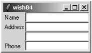
Example 34-2 demonstrates using validation to allow a user to enter only integer values into an entry.
Example 34-2. Restricting entry text to integer values
proc ValidInt {val} {
   return [ expr {[string is integer $val]
      || [string match {[-+]} $val]} ]
}

entry .e -validate all -vcmd {ValidInt %P}
pack .e
If an uncaught error occurs during the validation callback, then the validate attribute is set to none, preventing further validation from taking place. Additionally, if the return value of the validation callback is anything other than a Boolean value, validation is also disabled. Therefore, you should take care not to raise errors or return non-Boolean values from your validation callback.
Using textvariables for read-only purposes never causes a problem. However, you can run into trouble if you try to change the value of an entry using its textvariable. If you set the textvariable to a value that wouldn't be accepted by the validation script (that is, it would return False), then Tk allows the change to occur, but disables further validation by setting validate to none. So in general, you should use textvariables only to read an entry's value if you also have validation enabled.
The other caveat to validation is that if you change the value of the widget while evaluating either the validation script or the invalidCommand script, validate is set to none, disabling further validations. The intent is to prevent the change from triggering yet another validation check, which could attempt to change the widget and trigger another validation, and so on in an endless cycle.
For most validation applications, this is not a major restriction. In most cases, you simply want to prevent an invalid change from taking place, which you accomplish simply by returning Boolean False from your validation script.
But some sophisticated validation schemes might require edits to the widget's text. If you need to change the value of the entry from either the validateCommand or invalidCommand script, the script should also schedule an idle task to reset the validate attribute back to its previous value. Example demonstrates this with a validation command that ensures all letters inserted into an entry are upper case, by converting all characters to upper case as they are inserted. As this example modifies the value of the widget directly, it must reestablish validation in an idle task.
$entry xview moveto 1.0
The show attribute is useful for entries that accept passwords or other sensitive information. If show is not empty, it is used as the character to display instead of the real value:
$entry config -show *
The state attribute determines if the contents of an entry can be modified. Set the state to disabled to prevent modification and set it to normal to allow modification.
$entry config -state disabled ;# read-only
$entry config -state normal   ;# editable
Tcl 8.4 added a new state, readonly, in which the contents of the widget can't be edited, just like disabled. However, the readonly state allows the user to select and copy the widget contents. If the widget is a spinbox, the user can also use the up and down spinbuttons to change the value displayed while the widget is in readonly state (but not if it is in the disabled state).
The middle mouse button (<Button-2>) is overloaded with two functions. If you click and release the middle button, the selection is inserted at the insert cursor. The location of the middle click does not matter. If you press and hold the middle button, you can scroll the contents of the entry by dragging the mouse to the left or right.
The spinbox widget is based on the entry widget, and therefore all of the options and operations available for an entry are also available for a spinbox. Additional options and operations give access to the spinbox's enhanced functionality.
In addition to the text entry field, a spin box has up and down arrow buttons, allowing the user to “spin” through a fixed set of values such as dates or times. A spinbox normally allows a user to type any arbitrary text into the text area, but you can also configure a spinbox so that users can only spin through the valid choices.
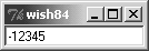
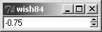
There are two ways to set the range of values for a spinbox. The first is to set numerical minimum, maximum, and increment values with the from, to, and increment attributes, respectively. Each time the user clicks the up or down arrow, the spinbox adjusts the displayed value by the increment. For example, the spinbox in Example 34-4 has a range of -10 to 10, and uses the default increment of 1.
Particularly if you start using floating-point values and increments, you might need to specify the format for displaying the value. You do so by setting a value for the format attribute in the form %<pad>.<pad>f, as used with the format command. (Note that no other format-like conversion specifiers are supported by the spinbox.) Example 34-5 demonstrates using the format attribute.
Example 34-5. Formatting numeric values in a spinbox
spinbox .s2 -from -10 -to 10 -increment .25 -format %4.2f
pack .s2
Another option for specifying values for a spinbox is to enumerate them. Simply provide the spinbox's values attribute a list of values. If you set a spinbox's values attribute, it ignores its from, to, and increment attributes.
Additionally, if you set the wrap attribute of a spinbox to True, then the spinbox wraps around from the last value to the first (or vice versa) while spinning through the values. With the default wrap setting of False, the spinbox stops spinning values once it reaches the beginning or end. You can use the wrap feature with either enumerated values (values) or value ranges (from and to).
Example 34-6 demonstrates both using enumerated values and wrapping in a spinbox.
Example 34-6. Enumerating spinbox values and wrapping
set states [list Arizona California Nevada "New Mexico"]
spinbox .s3 -values $states -wrap 1
pack .s3
In all of the spinbox examples shown so far, the user is free to type any arbitrary text into the entry portion, rather than selecting one of the spinbox values. In some applications this is acceptable, and you could use standard validation features to ensure reasonable values. (See “Validating Entry Contents” on page 508.) However, sometimes you want to allow a user to select only one of the preset spinbox values. The easiest way to accomplish this is to set the spinbox state attribute to readonly. Unlike the disabled state, which makes the widget insensitive to user actions and prevents programmatic changes to the widget's contents, the readonly state allows a user to spin through the values. You can also programmatically change the contents of the spinbox with the set operation, and even change the values while the spinbox is in the readonly state.
Example 34-7 shows an example of using the readonly state for several spinboxes, allowing the user to select a date. The spinboxes are linked by textvariables to elements in a global array, so that after the user selects the date, you can easily retrieve the values from the array.
Example 34-7. Using the spinbox readonly state
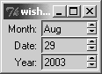
set months {Jan Feb Mar Apr May Jun Jul Aug Sep Oct Nov Dec}

spinbox .month -values $months -textvariable date(month)
   -state readonly -width 8
spinbox .date -from 1 -to 31 -textvariable date(date)
   -state readonly -width 8
spinbox .year -from 2003 -to 2010 -textvariable date(year)
   -state readonly -width 8

label .l_month -text "Month:"
label .l_date -text "Date:"
label .l_year -text "Year:"

grid .l_month .month
grid .l_date .date
grid .l_year .year
grid .l_month .l_date .l_year -padx 2 -sticky e
grid .month .date .year -sticky ew
Table 34-2 gives the bindings for entry and spinbox widgets. When the table lists two sequences, they are equivalent.
Table 34-2. Entry and spinbox bindings
| Sets the insert point and starts a selection. |
| |
| |
| Selects all text in the widget. |
| |
| |
| |
| Scrolls horizontally. |
| “Spins” up to the next value. Spinbox only. |
| “Spins” down to the previous value. Spinbox only. |
| Moves insert cursor one character left and starts the selection. |
| |
| Moves cursor left one word and starts the selection. |
| Moves cursor left one word and extends the selection. |
| Moves right one character and starts the selection. |
| |
| Moves right one word and starts the selection. |
| Moves cursor right one word and extends the selection. |
| Moves cursor to beginning of widget. |
| Moves cursor to beginning and extends the selection. |
| Moves cursor to end of widget. |
| Moves cursor to end and extends the selection. |
| |
| |
| Selects all the text in the entry. |
| Clears the selection in the entry. |
| Deletes the selection or deletes next character. |
| Deletes the selection or deletes previous character. |
| |
| Deletes next word. |
| Deletes to the end of the entry. |
| |
| |
| Copies the selection to the clipboard. |
| Inserts the clipboard contents at the position of the insertion cursor. |
Table 34-3 lists the entry and spinbox widget attributes. The table lists the resource name, which has capitals at internal word boundaries. In Tcl commands these options are specified with a dash and are all lowercase.
Table 34-3. Entry and spinbox attribute resource names
| Background color for active elements. Spinbox only. (Tk 8.4) |
| Background color (also |
| Extra space around the edge of the text (also |
| Background color for up and down buttons. Spinbox only. (Tk 8.4) |
| Tcl script to invoke whenever a spinbutton is invoked. The script can include the percent substitutions as described in Table 34-1. Spinbox only. (Tk 8.4) |
| |
| Background color when the widget is disabled. (Tk 8.4) |
| Foreground color when the widget is disabled. (Tk 8.4) |
| If true, selected text is exported via the X selection mechanism. |
| Font for the text. |
| Foreground color (also |
| Alternate format for spinbox numeric values, used only when |
| Floating-point value corresponding to the lowest value for a spinbox, used in conjunction with -to and |
| |
| Focus highlight color when widget has focus. |
| Thickness of focus highlight rectangle. |
| Floating-point value specifying the increment. When used with |
| |
| Width of cursor border. Non-zero for 3D effect. |
| |
| Time, in milliseconds the insert cursor blinks on. |
| Width of insert cursor. Default is 2. |
| Tcl script to execute when the |
| Text justification: |
| Background color when the widget is read-only. (Tk 8.4) |
|
|
| The number of milliseconds a spin button must be held down before it begins to auto-repeat. Spinbox only. (Tk 8.4) |
| The number of milliseconds between auto-repeats. Spinbox only. (Tk 8.4) |
| Background color of selection. |
| Foreground color of selection. |
| Width of selection border. Nonzero for 3D effect. |
| A character (e.g., |
| State: |
| |
| Name of Tcl variable whose value will be synchronized with the widget. |
| Floating-point value corresponding to the highest value for a spinbox, used in conjunction with -from and |
| When validation should occur: |
| Tcl script to execute to validate widget contents. Must return 1 if new widget value is valid or 0 if new widget value is invalid, in which case the widget contents don't change. (Tk 8.3) |
| List of spinbox values. Overrides any |
| Width, in characters. |
| Boolean value. True causes the spinbox to wrap values of data in the widget. Default is False. Spinbox only. (Tk 8.4) |
|
The default bindings for entry and spinbox widgets are fairly good. However, you can completely control the entry with a set of widget operations for inserting, deleting, selecting, and scrolling. The operations involve addressing character positions called indices. The indices count from zero. The entry defines some symbolic indices such as end. The index corresponding to an X coordinate is specified with @xcoord, such as @26. Table 34-4 lists the formats for indices.
Table 34-4. Entry and spinbox indices
| Index of the first character. |
| The index of the anchor point of the selection. |
| Index just after the last character. |
| |
| The character right after the insertion cursor. |
| The first character in the selection. |
| The character just after the last character in the selection. |
| The character under the specified X coordinate. |
Table 34-5 summarizes the operations on entry and spinbox widgets. In the table, $w is an entry or spinbox widget.
Table 34-5. Entry and spinbox operations
| Returns a list of 4 numbers describing the bounding box of the character given by index. |
| Returns the value of the configuration option. |
| Queries or modifies the widget configuration. |
| Deletes the characters from |
| |
| Moves the insert cursor. |
| Identifies the spinbox element at the given x/y coordinate: |
| Returns the numerical index corresponding to |
| |
| Invokes the spinbox |
| Starts a scroll operation. |
| |
| Moves the boundary of an existing selection. |
| |
| Sets or gets the currently selected spinbox element. Spinbox only. (Tk 8.4) |
| Sets the anchor position for the selection. |
| Returns 1 if there is a selection in the entry. |
| Selects the characters from |
| |
| Gets or sets the value of the spinbox, triggering validation if it is on. Spinbox only. (Tk 8.4) |
| Force an evaluation of the |
| Returns the offset and span of visible contents. These are both real numbers between 0 and 1.0. |
| Shifts the display so the character at |
| Shifts the display so that |
| Scrolls the contents by the specified number of |
For example, the binding for <Button-1> includes the following commands:
%W icursor @%x
%W select from @%x
if {[%W cget -state] == "normal"} {focus %W}
Recall that the % triggers substitutions in binding commands, and that %W is replaced with the widget pathname and %x is replaced with the X coordinate of the mouse event. Chapter 29 describes bindings and these substitutions in detail. These commands set the insert point to the point of the mouse click by using the @%x index, which will be turned into something like @17 when the binding is invoked. The binding also starts a selection. If the entry is not in the disabled state, then keyboard focus is given to the entry so that it gets KeyPress events.