
A good illustration transmits dense and complex information at a glance. It also helps a reader retain more information. Combining text and images focuses attention and helps a reader filter data quickly for specific information. As documentation moves online, you might find yourself in the role of a screenwriter or director as you blend text, still images, video, audio, and animation in online multimedia documents.
A high level of image quality is essential to visual communication in any medium. From the printed page, to paint on canvas, to dots on a computer screen, similar rules apply. Even though the elements of good visual art can sometimes defy simple explanation, most people can say they know quality when they see it. In basic terms, the human eye should be able to scan a quality image without backtracking to retrace a path or disengaging to refocus. Quality images also contain balanced elements, consistent line weights, and a discernible flow.
Images of poor quality are usually easy to identify, even though beauty is sometimes in the eye of the beholder. In general, images of poor quality contain unbalanced proportions, jarring colors, jagged or crossed lines, or illegible or blurry elements. If the images in your document appear substandard, contact your illustrator or production specialist immediately for assistance.
This chapter discusses the following topics:
“Working With an Illustrator” on page 200
“Illustration Formats, Styles, and Types” on page 201
“Examples of Illustrations” on page 203
“Placing Illustrations” on page 211
“Writing Captions for Illustrations” on page 213
“Writing Callouts for Illustrations” on page 214
“Creating Quality Screen Captures” on page 217
“Creating Leader Lines” on page 219
“Simplifying Online Illustrations” on page 220
If your document contains visual elements, include an illustrator on your team. Illustrators are experts in visual communication and have access to specialized graphics tools and graphics repositories.
Involving an illustrator means that any work that is created can be shared with other writers. The work might also be added to an image library or catalog and be made to adhere to approved graphics standards.
The illustrator can do the following:
Review your documentation plans and devise a visual strategy.
Collaborate with you as the document changes throughout its life cycle.
Resolve file format, platform, and tools issues.
Maintain a consistent look and feel throughout the document.
Reuse illustrations in other documents while maintaining quality.
Writers who have illustration skills and tools can still work with an illustrator for several reasons:
Time spent on complex drawings can compromise deadlines.
Illustrators can usually handle difficult or complex drawings more efficiently and effectively.
Artwork created by illustrators can be archived and shared with others.
Visual consistency is enhanced when all work is done by illustrators who are equipped with the same tools and templates.
Maintaining open relationships and communication with illustrators speeds up the production process and improves quality.
Involve illustrators at the outset of a documentation project in the following instances:
When you are unable to locate existing illustrations to meet your needs
When existing illustrations must be modified
When composite illustrations combining text layers and backgrounds must be created
When you have concerns about the quality of illustrations in your document
When you have a concept or a rough sketch that needs professional execution
When requesting help with illustrations, remember to include information that the illustrator needs to know:
Number of documents in your project and their identification numbers
Estimated number of illustrations
Marked hard copies or changes to existing illustrations
Original source files for illustrations to be modified
Hand-drawn sketches or concept diagrams
Estimated production dates or deadlines
See “Artwork Request Form” on page 306 in Appendix B for a sample form.
This section describes the basics of the formats, styles, and types of illustration.
Formats establish how files are recognized and handled by the computer and the printer.
Styles are broad categories of illustration, such as 2–D, 3–D, and photographic.
Types include data processes, line drawings, concept drawings, screen captures, cartoons, icons, and glyphs.
Understanding graphics formats can help you choose the best approach for your project. Two main file types are used in illustrations: vector and raster.
Vector-based images contain mathematical image data based on x, y coordinates. Vector graphics can therefore be scaled to any size without quality loss and with a lower relative file size. Vector graphics are ideal for print use because they can be output to printers at any resolution setting. The most common vector-based file type extension is Encapsulated PostScript (.eps). Vector-based images are used for line art and composite images with typography.
Raster images are also known as bit-mapped images or paint files. Raster images contain a grid of colored pixels that are fixed in place. Unlike vector graphics, raster images cannot be easily scaled without distortion. Raster images are most useful for screen captures, digital photography, and web graphics. Common file extensions are .tif, .gif, and .jpg. Contact your illustrator or production specialist for help understanding and choosing the best file format for your project.
For guidelines on rasterized screen captures, see “Creating Quality Screen Captures” on page 217.
Four common styles of illustration are used in computer documents:
Isometric drawings are a type of perspective drawing often used in engineering manuals. The mathematical structure puts all lines at angles of 30, 60, or 90 degrees.
3–D drawings are online images designed to be viewed from all angles. Typically, you can rotate, bisect, and scale these images.
2–D drawings are the most common style of illustration. They might be drawn in perspective, depending upon the subject matter.
Photographs, video stills, and animation are styles that are appropriate for online use.
Illustrations can be broken down into these main types:
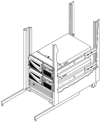
Hardware line drawings are common in technical manuals. Examples include black-and-white line drawings of disk drives, drawings of “exploded” SCSI ports, and drawings of people installing SIMMs. Line drawings can be shown in 3–D, 2–D, isometric, and other styles.
Clip art is “generic” art that you can use as-is or in combination with other graphics. The subject matter is fairly nonspecific. For example, the art would be a picture of a monitor rather than an illustration of a specific, identifiable monitor.
Icons and glyphs are visual cues that represent an object (such as hardware or an application window), a process (such as an application), or a structure (such as a network).
Icons are interactive and are used online. These small, mnemonic graphic images serve as visual placeholders for a larger object or process.

Glyphs are noninteractive symbols that convey easily recognized information, often without the use of text. Examples of glyphs include the lightning bolt set inside a triangle to represent Cautions, and the broken wine glass found on the sides of cartons indicating that the contents are fragile.

Graphs and charts depict a process or a flow of information. What that information is and how it relates to other types of information is up to the writer. Examples include marketing graphs showing profits by years, flowcharts of a process, roadmaps of a procedure, and charts depicting the course of a project.
Screen captures, sometimes called screen shots, are “snapshots” of screen images that make very effective graphics. Use them as you would any other illustration.
Cartoons lend an air of informality to your document. While often used humorously, cartoons can also be sketches of activities or situations. Humor is a tricky technique in a global market. See “Illustrations and Screen Captures” on page 145 in Chapter 7 for more information.
This section illustrates the types of illustrations commonly used in technical documentation.
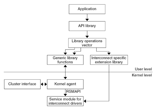
Diagrams encompass a wide range of illustration uses, from simple flowcharts and presentation aids to complex architectural diagrams.

Online graphics include drawings, icons, and navigational buttons. Online graphics are usually raster images that are highly compressed and optimized for web delivery. If online graphics must be altered, locate the original source files and submit the files to the technical illustrator on your team.

Line art illustrations of hardware are usually based on engineering diagrams or computer-aided design (CAD) drawings. When possible, try to locate the original vector-based source file and use it in your document. The vector format preserves quality and also provides the most versatile image editing options.
A screen capture is always created as a raster image. Screen captures represent an exact snapshot of the dots that are displayed on a computer monitor. Once created, screen captures cannot be easily resized without distortion. A technical illustrator can advise you on the proper way to scale and crop screen captures, if necessary.
See “Creating Quality Screen Captures” on page 217 for more information.

A composite illustration is a vector graphic or raster image with text labels or callouts placed on top. Localization considerations dictate that the background images must exist on a layer separate from the layer displaying the superimposed text labels.

Photographs can be captured in raster format from a digital camera or scanned from a photo print. File sizes can be large, depending on the resolution, size, and number of colors used. The technical illustrator on your team can edit and manipulate photographs.

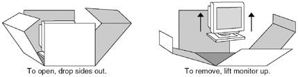
You do not have to reserve animation for films or online documents. You can use animation effectively in print. The following example shows an animation that illustrates how to unpack a shipping carton.
Web animations can be created as vector graphics or raster images. The file format and tools that illustrators use to create animations often depend on the web browser capability of the end user. Animations can impact download times, so they must be well designed and used sparingly. An illustrator’s help is critical to the design of effective and compact animations.

Your illustrations must appear to belong in your document. You can achieve this effect in print and on the web by using consistent placement, spacing, and alignment.
Some publishing tools handle spacing automatically, but others do not. This section contains guidelines for spacing your illustrations and for aligning illustrations with the other elements in your document.
Do not insert an illustration between the beginning of a sentence and the end of the sentence.
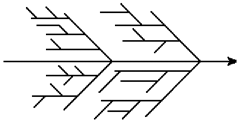
Incorrect:
This diagram

is commonly called a fishbone or Ishikawa diagram.
Correct:
The following diagram is commonly called a fishbone or Ishikawa diagram.
The following table contains guidelines for how much spacing to allow between an illustration and printed text above and below it.
Align illustrations and callouts flush-left to the margin of the text column in most instances. If the drawing is wider than the text column, align the drawing flush-left to the page margin. Example 11-3 shows an illustration that is flush-left to the margin of the text column. Example 11-10 shows an illustration that is flush-left to the page margin.
When placing illustrations in online documents, apply the following guidelines:
Follow a consistent spacing and alignment method on all of your web pages to create a consistent look and feel.
Follow any preexisting guidelines for your project that might already be documented by previous webmasters or content creators in your group.
Know the minimum sizing and performance limitations of your audience’s web browser.
Keep your design within those parameters.
Captions help set the context of the illustrations within the document. Captions also uniquely identify each illustration for cross-referencing. This section contains guidelines for writing unique captions.
Use captions consistently when doing so can help your reader. For example, sometimes an illustration of a menu does not need a caption, whereas a conceptual illustration does require a caption. Use captions in the following instances:
When you want to cross-reference the illustrations
When you want to generate a list of figures
Follow these guidelines when writing captions:
Use the same capitalization style for figure captions as you use for section headings.
Do not start a figure caption with an article. For example, write “File Menu,” not “The File Menu.”
Limit the figure caption text to one line.
Introduce the context of the illustration to the reader in the text preceding the illustration.
Ensure that the figure captions are numbered sequentially throughout the document if your authoring tool does not number figure captions automatically.
Callouts help connect illustrations to the surrounding text. This section contains guidelines for integrating callouts and illustrations. When creating callouts, also follow these guidelines:
Use the minimum number of callouts necessary.
Use the shortest and fewest words possible.
Move lengthy callouts to a note or legend outside the drawing.
Capitalize the first word in a callout.
Capitalize proper nouns, abbreviations and acronyms as you do in text. Also capitalize prepositions of four or more letters. All other words are lowercase.
Similar to text, callouts must be translated when a document is localized. See Chapter 7 for more information about making sure that your callouts can be easily translated.
The following table contains style specifications for callouts.
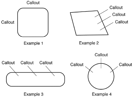
Arrange callouts consistently throughout a document. Place callouts far enough apart to be read clearly. Space callouts evenly so that the illustration does not look cluttered and is not difficult to read.
The following examples show callouts with appropriate spacing.
The following figure shows numbered callouts in a legend, with line art.

The following figure shows callout placement in a flow diagram.
Including screen captures in your documents is an effective way to help communicate graphical user interface (GUI) operations.
When creating screen captures, follow these guidelines:
Check your capture settings.
Screen capture tools often default to 72 dots per inch (dpi) when capturing images. Make sure that you capture your images at an acceptable size and resolution for your target document.
Note that the dpi of printed raster images affects physical size. For example, a 72-dpi capture shrinks 50 percent when printed at 144 dpi. Print standards often require 300 dpi or higher, while 72 dpi is sufficient for online viewing.
When creating screen captures for print, use a printer-friendly color palette or use a greyscale desktop color scheme.
Save your screen capture in a high-quality format, such as
.tif(for print) or.gif(for the web).Do not resize your screen capture by dragging or stretching its boundaries.
This method causes image distortion.
When including screen captures in online documents, place them at chosen points to serve as guideposts in navigation. These guideposts can help readers remain properly oriented and confirm that the document is proceeding as expected.
Including too many screen captures can be redundant. Avoid using screen captures in the following instances:
When forms and dialog boxes are designed consistently across the GUI
When GUI forms are self-explanatory and require no further explanation
When data entry fields are labeled clearly and consistently
When the GUI provides adequate feedback when used incorrectly
For example, when users enter invalid data, feedback is generated.
Ensure that screen captures in online documents are not mistaken for actual software interfaces. Even sophisticated readers can confuse the two. For guidance on cropping, highlighting with color, and other strategies to make the distinction more obvious, contact your illustrator or production expert.
A leader is a line that points from a callout to a specific part of an illustration. This section contains instructions for creating leader lines and guidelines for using leader lines in illustrations.
The following table contains recommended specifications for leader lines.
When creating leader lines, follow these guidelines:
Arrange callouts so that leader lines cross as few illustration lines as possible.
Arrange leader lines so that the lines never cross.
Terminate the leader line on the element.
Begin the leader line at the corner closest to the callout.
Complicated illustrations that work effectively in print work less well online because of screen readability problems. What is legible in print might not display clearly online.
To keep illustrations simple and to facilitate online reading, apply the following guidelines:
Increase line weights and text size.
Fine lines and small text are difficult to read online.
Use fewer details online.
Due to low resolution on some monitors, details that are effective in printed illustrations might be unreadable online.
Reduce the size of large illustrations and crop them tightly.
Limit the number of illustrations per page.
Try to use tables instead of illustrations.
When deciding whether to use an illustration, ask yourself: Would a table convey the information better? If a table and an illustration offer equal benefit, use a table. A table is simpler to create and maintain than an illustration.