
B. Binding Data in WinFx Applications
Windows presentation foundation (WPF), formerly code-named Avalon, is the presentation (user interface) subsystem of the WinFx development platform for Windows Vista, Windows XP, and Windows Server 2003. WinFx is the successor to the Win32 development platform and is based on the .NET Framework. Also part of WinFx is the Windows Communication Foundation (formerly code-named Indigo). WinFx presentation capabilities are designed to revolutionize the development of rich user interfaces for both the desktop and the browser. The WinFx rendering engine is designed to better harness the power of modern graphics cards and displays.
WinFx doesn’t make Windows Forms programming or applications obsolete. Windows Forms applications will continue to run fine on current Windows platforms and on Windows Vista as well. Windows Forms is the best option for developing desktop applications today and will remain the best choice for portable applications until you no longer want to support Windows 2000 clients. However, WinFx provides a lot of new capabilities that you may want to start taking advantage of, particularly if you are writing graphics-intensive applications or need a lot of control and customization of the look-and-feel of your applications. Many books and articles will be written on WinFx programming in the future, and you will need to dive into those to really become a WinFx programmer (one great resource is Programming Windows Presentation Foundation by Chris Sells and Ian Griffiths). In this appendix, I want to give you a quick introduction to WinFx user interface development and an idea of how data binding works there as compared to Windows Forms.
At the time of this writing, I am using the WinFx SDK Beta 1 with Visual Studio 2005 Beta 2. To work with Beta development tools like this, I strongly recommend you use a virtual machine, such as Microsoft Virtual PC or VMware Workstation. If you want to run the samples for this appendix, you will need to first install the WinFx Beta 1 Runtime Components, then the WinFx SDK Beta 1, then Visual Studio 2005 Beta 2, then the Visual Studio 2005 Extensions for WinFx Beta 1.
 NOTE
NOTE
One big caveat about this appendix is that it is written against these volatile early Beta bits. Every Beta and Community Technology Preview (CTP) that comes out will see significant changes in class names, class member names, functionality, and the like. It is very possible that by the time this book goes to print, the sample code in this appendix won’t run against current bits as is, and you will have to do some tweaking to migrate the code to where WinFx has evolved to.
However, the basic principals discussed and demonstrated through the code in this appendix should remain roughly the same, so learning the material in this appendix will give you a good jump-start for building data-bound WinFx applications, even if you have to do some playing to get it all to work.
WinFx introduces a number of new concepts and approaches to developing user interface applications for Windows. WinFx takes a new approach to targeting the display device and rendering graphics, introduces several new approaches to programming UI elements, and provides a new declarative language for specifying UI applications.
One of the first things that WinFx does is to try to break out of the pixel-based programming model for low-level graphics rendering on users’ desktops. Current and near-future displays are capable of rendering at incredibly high resolution. If you base the size of elements rendered to the display on pixels, as is commonly done in Windows applications today, you will get vastly different UI element sizes when applications run on different devices and displays. Although there are ways to do size transformations in GDI and GDI+ today to logical units, the primary programming model is based on pixels. In WinFx, that model is reversed; the primary APIs for performing drawing operations are based on logical units.
Additionally, the primary graphics rendering approach in Windows today is based on raster operations—drawing items on the display based on a matrix of pixels. But most things being drawn represent geometric shapes, such as rectangles and curves, which are more easily specified and rendered using vector graphics. As such, WinFx makes vector graphics the primary rendering technique for low-level drawing. This makes it much easier to do something like put UI elements on the screen and then perform transformations on them, such as to rotate, scale, or move them. This makes programming animated effects much easier and more natural.
Under the covers, WinFx uses the DirectX graphics engine to do all drawing to the screen, which significantly boosts performance of many graphics operations and enables programming of complex multimedia applications using a single, managed, object-oriented API instead of having to choose between the simpler GDI+ API or low-level DirectX API. In WinFx, you will have a similar and simpler programming experience whether you are drawing custom user controls to the screen, embedding an animation or video in a document, or writing a complex simulation or game. WinFx applications can be run either as a standalone desktop application or as embedded controls or pages within a Web browser.
In addition to the rendering engine differences in WinFx programming, there are some significant differences in the way you program WinFx applications. WinFx uses a control composition model that lets you achieve rich effects and a consistent look and feel across Windows and Web applications using far less code than is required in current presentation technologies. You can layer styles onto controls within a container to avoid recoding look-and-feel aspects over and over. You can also create data-binding contexts that automatically affect child elements to achieve a rich compositional approach to data-bound controls. You’ll get more of a feel for this in the coming sections.
When you program WinFx applications, you have two approaches that you can choose from or intermix. WinFx is based on a complex but easy to understand object model, so you can write entire WinFx applications using the managed programming language of your choice (e.g., C# or Visual Basic). You can also use a completely new declarative, XML-based programming language, called Extensible Application Markup Language (XAML), to code the UI elements and objects from which your application is composed. You can embed logic code within a XAML file as script blocks using C# or Visual Basic, or you can place the logic code in a separate code file and only declare the markup that describes UI elements in the XAML file. XAML basically provides a similar declarative approach to creating user interfaces as is used in ASP.NET markup, but it can be used for both Web and Windows applications. Like ASP.NET, you have the option of tying code-behind logic code from compiled source files to the objects declared in XAML, and the runtime will merge the compiled results when it dynamically compiles the markup and script found in an XAML file.
For most of this appendix, I am going to stick to just programming C# code against the WinFx object model to present a few samples. I chose to do this for several reasons. First off, if you are a Windows programmer, you may not be very comfortable with XML, schemas, and the declarative approach that XAML represents for creating WinFx applications. Even if you are, XAML represents a whole new dialect of XML that you probably aren’t familiar with yet, and learning about both the objects you need to deal with along with new syntax might be a bit overwhelming for a quick overview appendix.
There’s a reasonable argument made that no one in their right mind should ever end up writing XAML code by hand. XAML has some distinct advantages from a developer tools-and-compilation model perspective over source code and can end up being much more compact than the corresponding programmatic code. In fact, I expect that most WinFx user interface applications will be written using XAML for declaratively creating the UI elements. But ideally, by the time you really start programming WinFx applications in earnest, there will be tools that generate XAML based on designer interactions, and you will rarely, if ever, edit XAML directly yourself. However, if you are an XML-lover or have a strong ASP.NET programming background, you might be quite comfortable diving in and swimming in the angle brackets, and might thus enjoy XAML programming. There are some XAML applications at the end of this appendix to give you a sense of what the corresponding XAML code looks like for one of the samples developed in code earlier in the appendix.
To get started programming WinFx applications, you have to get used to some of the object types you will use to compose an application. The type hierarchy for WinFx user interfaces is rooted at the System.Windows namespace (as opposed to System.Windows.Forms for Windows Forms). At the top level, there is an Application object, similar to a Windows Forms application, except that it is a separate type defined in the System.Windows namespace. There are several derived application classes that are specialized for specific kinds of applications, such as the NavigationApplication class you will see in a later example. Within an application, you create System.Windows.Window objects that will contain the pages and controls that compose the UI of the application. Controls are assembled into a hierarchy of elements called a visual tree, where any given element may either render its own client area, contain other controls, do both, or render nothing.
This approach leads to a very flexible and powerful approach to declaring and designing your UI, because you can effectively extend the control’s functionality by adding different content to it. For example, in Windows Forms, the Button class lets you add a button to your forms that can contain a text prompt, an image, or both. You determine what it will contain by setting explicit properties on the class corresponding to those visual aspects that the control was designed to support in rendering its client area. With a WinFx button, and many other WinFx controls, you can add arbitrarily complex child elements to the button, and they will each be called to render themselves within their own area. Through styles, you can dynamically determine the content elements and set properties on them that affect the look-and-feel and behaviors.
Most of the WinFx controls you will deal with for simple applications are declared in the System.Windows.Controls namespace. The names don’t map one-for-one with those found in Windows Forms, but there are similar controls for most of the simple controls you are used to dealing with. For example, there are Button, TextBox, and ListBox classes that are conceptually very similar to their Windows Forms cousins, although they can do quite a bit more, because you can add complex content to them. There is a TextBlock control that is like a Label on steroids, and there are a number of layout controls including Canvas, StackPanel, Table, and Grid that let you explicitly determine the layout of controls within your windows and pages. However, at the time of this writing, there is one big gaping hole from the perspective of data binding—there is no rich grid control that supports simple data binding. I’m sure this will be remedied in future builds, but as you will see later in the appendix, to achieve a DataGrid-like experience, you have to get low level and dynamically compose it from other controls for the time being.
To work your way up to that example, let’s start with a simple WinFx “Hello World” application using only code. To create this, you will need to create a project in Visual Studio 2005. There are WinFx project types that are added to Visual Studio 2005 Beta 2 by the Visual Studio Extensions for WinFx, so you will need to have that installed, as well as the runtime components and the WinFx SDK.
1. Start by creating an Avalon application project type. You can delete the MyApp.xaml and Window1.xaml files from the project through Solution Explorer since you will be writing everything in code for now. I’ll give an example in XAML later on, and the download code for this appendix includes XAML versions of all the applications discussed in this appendix.
2. Add a class to the project and name it Program (or something like that—the name of the class is unimportant in this example).
3. Add a using statement for the System.Windows namespace to the top of the file.
4. Add a static Main method. In that method, add the following code:
using System;
using System.Windows;
class Program
{
[STAThread]
static void Main()
{
Application app = new Application();
Window win = new Window();
win.Content = "Hello WinFx";
win.Show();
app.Run();
}
}
In this simple application, you can see that first you need an application object. You also need a main window, which you can create for simple scenarios by creating an instance of the Window class.
In real applications, you will usually be creating an instance of a class that you define that will derive from Window or one of its WinFx Framework-derived classes, such as NavigationWindow. A window is a visual tree element like controls are, so the way you modify what is shown in the window is by setting its Content property. In this case, set it to a simple string, and the Window class is capable of rendering that string for you. Typically, you will compose a window’s UI contents by constructing a tree of other elements (controls) and setting that tree’s top-level object as the Content property for the window.
Once you have set the content of the window to the string “Hello WinFx,” you show the window by calling the Show method. You then call the Run method of the Application object, which sets up the message processing loop that Windows really uses under the covers to communicate with your running application, just as is done in Windows Forms applications today.
Note the STAThread attribute on the Main method. This is still required in WinFx on Windows XP, because WinFx still wraps some of the system-provided controls that are designed to run in a single-threaded apartment.
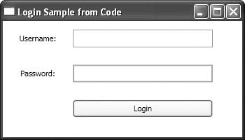
A “Hello World” application isn’t going to get you very far in understanding the WinFx object model and how to compose an application, so let’s look at a slightly more complex example. Say you are building a WinFx application that will use authentication and authorization to determine what a user is allowed to do based on a custom membership database and roles. In that case, you need to authenticate the user, so you need a login window. So let’s code a WinFx window that looks like the crude login dialog shown in Figure B.1.
1. Set up an empty WinFx project as described earlier in this appendix. Start with a WinFx application project and delete the MyApp.xaml and Window1.xaml files from the project.
2. Add a new class and name it LoginApp.
3. Add using statements for System.Windows and System.Windows.Controls to the top of the file.
4. Add Application as the base class for LoginApp, and add a static Main method that creates an instance of the application and calls the Run method on that instance:
using System;
using System.Windows;
using System.Windows.Controls;
namespace LoginSampleCode
{
class LoginApp : Application
{
[System.STAThread()]
static void Main()
{
LoginApp app = new LoginApp();
app.Run();
}
}
}
5. Add an override for the base class OnStartingUp method, which is where you will do all of your window construction. Listing B.1 shows the entire implementation.
LISTING B.1: OnStartingUp Method
protected override void OnStartingUp(StartingUpCancelEventArgs e)
{
Window win = new Window();
win.Width = 350;
win.Height = 200;
win.Text = "Login Sample from Code";
// Create the controls
Grid grid = new Grid();
TextBlock userNameLabel = new TextBlock();
userNameLabel.TextContent = "Username:";
userNameLabel.VerticalAlignment = VerticalAlignment.Center;
userNameLabel.HorizontalAlignment = HorizontalAlignment.Center;
TextBlock passwordLabel = new TextBlock();
passwordLabel.TextContent = "Password:";
passwordLabel.VerticalAlignment = VerticalAlignment.Center;
passwordLabel.HorizontalAlignment =
HorizontalAlignment.Center;TextBox userNameInput = new TextBox();
userNameInput.Height = 25;
PasswordBox pwdInput = new PasswordBox();
pwdInput.Height = 25;
Button loginButton = new Button();
loginButton.Height = 25;
loginButton.Content = "Login";
// Set up the grid layout
grid.ColumnDefinitions.Add(new ColumnDefinition());
grid.ColumnDefinitions.Add(new ColumnDefinition());
grid.RowDefinitions.Add(new RowDefinition());
grid.RowDefinitions.Add(new RowDefinition());
grid.RowDefinitions.Add(new RowDefinition());
grid.ColumnDefinitions[0].Width = new GridLength(100);
grid.ColumnDefinitions[1].Width = new GridLength(200);
grid.RowDefinitions[0].Height = new GridLength(50);
grid.RowDefinitions[1].Height = new GridLength(50);
grid.RowDefinitions[2].Height = new GridLength(50);
// Add the controls to the grid
AddControlToGrid(grid, userNameLabel, 0, 0);
AddControlToGrid(grid, passwordLabel, 1, 0);
AddControlToGrid(grid, userNameInput, 0, 1);
AddControlToGrid(grid, pwdInput, 1, 1);
AddControlToGrid(grid, loginButton, 2, 1);
// Set the grid as content for the window and show it
win.Content = grid;
win.Show();
}
private void AddControlToGrid(Grid grid, FrameworkElement ctl, int rowPos, int colPos)
{
Grid.SetColumn(ctl,colPos);
Grid.SetRow(ctl,rowPos);
grid.Children.Add(ctl);
}
The code first creates the main Window object and sets its Width, Height, and Text properties. There is nothing mystical going on here; the code is similar to what the Windows Forms designer writes in the designer code file for each form that you create.
Next it creates the following controls: a Grid, two TextBlocks, one TextBox, one PasswordBox, and a Button. Each instance is created with a default constructor, and then certain properties are set on it. For the TextBlocks, the TextContent property is set to the prompt string that the TextBlock is there for—this is acting like a Label control in Windows Forms. The HorizontalAlignment and VerticalAlignment properties are also set to Center to make things align nicely in the form. For the TextBox, PasswordBox, and Button, their Height property is set; for the Button, the Content property is set to a string, resulting in that string being displayed on the surface of the button as you are used to in setting the Text property of a Button control in Windows Forms.
The Grid control is a container control, and it lets you easily lay out controls in a rectangular grid on the rendering surface of some other element by setting the grid as the content of that element. The next block of code in Listing B.1 creates the column and row definitions for the grid and sets their Width and Height properties to get the layout you desire.
The next block of code calls a helper method at the bottom of the listing to add each control to a specific position within the grid. Unfortunately, with the current programming model in WinFx, it takes three lines of code for each control to perform the simple action of placing the control in a cell in the grid:
Grid.SetColumn(someControl, 0);
Grid.SetRow(someControl, 0);
gridInstance.Children.Add(someControl);
The AddControlToGrid helper method encapsulates these steps, which makes the calling code a little more compact. But basically that method sets the column and row for each control, and then adds it to the grid. Note that the way a control position is set within a grid is by using static methods on the Grid class itself, rather than methods or properties on an instance of a grid.
After adding each control to the grid in its respective cell, the grid is set as the content element on the window, and the window is shown. The net result is a window that looks like Figure B.1.
This example gives you a little better idea of how controls get layered into the content of each other to form a visual tree of controls. At this point, the programmatic approach probably seems a little cumbersome to you. I mean, come on, all that code just to lay out a simple login form? The thing to keep in mind is that there isn’t significantly less code to achieve the same thing in Windows Forms, but almost no one writes Windows Forms from scratch by hand; they let the designer write most or all of that code. Well, the same will be true for WinFx by the time it ships. There isn’t a designer to work with at this point, and understanding the code will help you out once the designer starts writing it and you find things not working quite the way you want.
So now you have seen a couple of simple programmatic WinFx applications, but there wasn’t really any data stuff going on in them. WinFx has a rich model for setting up data-bound controls as well. It works a little different from how Windows Forms works, with the intent of being more flexible and requiring less code.
WinFx elements support the concept of a data-binding context that is flowed down to child elements automatically: from the application, down to window objects, and down to child controls. So if you have a source of data that needs to be bound to multiple controls, potentially even in separate windows, you can establish a data context that lets you initialize and set the data source in one place, and it will automatically cascade down the element tree to any child elements that don’t explicitly set their own context.
If you have read the chapters in this book carefully, this should be sounding a little familiar. The binding approach in WinFx is somewhat similar to BindingSource objects in Windows Forms. They set up a one-stop-shopping object for a source of data to which multiple controls can be bound. There are some distinct differences, though, both in the way that you declare and initialize a binding in WinFx, and in the way that they flow to other elements. In Windows Forms, you have to explicitly set DataSource properties on controls to point to a BindingSource, or add a Binding object to the DataBindings collection on a control to make the association between a specific BindingSource and a control. You then also specify the data member path within that data source to which you want to bind. In the case of WinFx bindings, you only need to specify the path within the data context that you want, and a control will automatically pick up the data context (the data source) that is set on its parent element tree.
For example, consider a Window in which you have a grid containing a set of text boxes that are intended to be bound to the fields of a row of customer data. You could set the data context of the Window to be the collection of customers, and you could then specify the bindings at the control level to identify the path to each field (such as CompanyName, ContactName, etc.). Because the text boxes are designed to display a single value at a time, the values from the current record within the data source set at the Window level would be displayed.
You could then set a new data context at the grid level to a different collection of customers from the one that is currently set at the window level. As long as the shape of the objects in the collection set at the grid level was the same as the objects in the collection at the Window level (same field or property names), the text boxes in the grid would automatically switch to using the binding specified at the grid level. This happens because it is the closest parent that has specified its own data context.
If you set out to implement an application that bound customer data to rows of text boxes in a grid as just discussed, it might look something like Figure B.2.
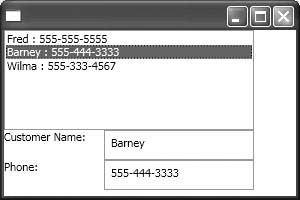
Listing B.2 shows the application class for this example. The Main method again creates an instance of your derived application class and then sets it running. The OnStartingUp override gets called as the application is starting up, letting you create the main window and populate it with controls. In this sample, I am using a StackPanel as the top-level container control within the window to stack the controls in a vertical column, as you can see in Figure B.1. One of the child controls in the StackPanel is a Grid that contains the TextBlocks and TextBoxes that display the bound fields of the rows. Most of the code is basic WinFx control creation and layout, and is similar to the code in Listing B.1. The lines of code related to data binding are in bold.
LISTING B.2: Data-Bound Application
class MyApp : Application
{
[STAThread]
static void Main()
{
MyApp app = new MyApp();
app.Run();
}
protected override void OnStartingUp(StartingUpCancelEventArgs e)
{
Window win = new Window();
win.Width = 300;
win.Height = 200;
StackPanel stack = new StackPanel();
stack.VerticalAlignment = VerticalAlignment.Top;
stack.HorizontalAlignment = HorizontalAlignment.Left;
ListBox custList = new ListBox();
custList.Height = 100;
custList.IsSynchronizedWithCurrentItem = true;
custList.SetBinding(ListBox.ItemsSourceProperty, new Binding());
Grid grid = new Grid();
grid.ColumnDefinitions.Add(new ColumnDefinition());
grid.ColumnDefinitions.Add(new ColumnDefinition());
grid.RowDefinitions.Add(new RowDefinition());
grid.RowDefinitions.Add(new RowDefinition());
grid.ColumnDefinitions[0].Width = new GridLength(100);
grid.ColumnDefinitions[1].Width = new GridLength(150);
grid.RowDefinitions[0].Height = new GridLength(30);
grid.RowDefinitions[1].Height = new GridLength(30);
TextBlock custNameLabel = new TextBlock();
custNameLabel.TextContent = "Customer Name:";
TextBlock custPhoneLabel = new TextBlock();
custPhoneLabel.TextContent = "Phone:";
TextBox custNameInput = new TextBox();
custNameInput.SetBinding(TextBox.TextProperty, "Name");
TextBox custPhoneInput = new TextBox();
custPhoneInput.SetBinding(TextBox.TextProperty, "Phone");
AddControlToGrid(grid, custNameLabel, 0, 0);
AddControlToGrid(grid, custNameInput, 0, 1);
AddControlToGrid(grid, custPhoneLabel, 1, 0);
AddControlToGrid(grid, custPhoneInput, 1, 1);
stack.Children.Add(custList);
stack.Children.Add(grid);
win.Content = stack;
win.Loaded += WindowLoaded;
win.Show();
}
private void AddControlToGrid(Grid grid, FrameworkElement ctl,
int rowPos, int colPos)
{
Grid.SetColumn(ctl, colPos);
Grid.SetRow(ctl, rowPos);
grid.Children.Add(ctl);
}
private void WindowLoaded(object sender, EventArgs e)
{
Window win = (Window)sender;
CustomersCollection custs = new CustomersCollection();
win.DataContext = custs;
}
}
The calls to the SetBinding method on the list box and the text boxes are what sets up the path within whatever the data context is for those controls. In the case of the list box, the property that sets up the binding is the ItemsSource property, and it is bound to a default instance of the Binding class. The SetBinding method takes a DependencyProperty argument, which provides type information about the property on a bound type to which the binding applies and a path within the data context. The path will be used at runtime to try to resolve the binding dynamically based on the current data context and the path information provided by the Binding instance. When you create a default instance of a Binding object, it sets the path to the root of the data context. Alternatively, as in the case of the TextBoxes, the path to a subobject or collection can be provided. For the TextBoxes, the name of the property within the objects in the collection is identified and used to populate the corresponding Text property on the TextBox.
The data used in this example is a custom collection of Customer objects, which is created in the WindowLoaded event handler and set as the data context for the Window through the DataContext property. The CustomersCollection class default constructor populates the collection with three test objects, which is what is seen at runtime. After the data context is set, the data bindings of all child controls are refreshed and their paths within that data context sought out.
The CustomersCollection class in Listing B.2 is derived from the ObservableCollection<T> class, which provides implementation for the interface INotifyCollectionChanged. This interface is necessary to have synchronization between multiple controls bound to the collection, and it is similar in function to the ListChanged event on the IBindingList interface. Because this interface type is new to WinFx, current .NET Framework collection classes and data sets don’t support full data-binding capabilities against WinFx controls. (By the time WinFx releases, though, I would expect the built-in data collection classes of the .NET Framework to support WinFx data binding.)
You can use any collection of data for data binding that at least supports the IEnumerable interface, which lets the data-binding code in WinFx to iterate over the collection of objects to present values from them using Bind objects. You can also use individual objects if the data context will only be used for binding against single-valued controls. You set the data source through the DataContext property on any element, which can be done at the Application, Window, or any child-control level. Again, when data binding occurs, any bound controls use the data context of the closest parent that has a data context set to perform its data binding. The DataContext property is declared on the FrameworkElement class and is of type System.Object, which lets you set it to anything.
For more robust data-binding features, such as the ability to edit the data in the objects that are bound, detect changes to a collection when it is changed by another control or programmatic code, or the ability to sort and filter the data collection, you will need to have objects and a data collection that support a variety of interfaces, similar to those discussed in Chapter 7. Those interfaces are likely to change quite a bit by the time WinFx releases, so I won’t go into any detail on them here. The most capable collection to place your objects in today is the ObservableCollection<T> class that is part of the System.Windows.Data namespace. Hopefully by the time WinFx ships, DataViews and other generic collection classes will support the necessary interfaces to allow rich data binding in WinFx.
Most WinFx user interfaces will probably be programmed using XAML. I started this appendix with the objects and programmatic code to make it clear that the objects you deal with in WinFx are just a different set of controls and classes from a new set of namespaces that supplement the existing .NET Framework. However, in addition to the objects that support the new WinFx user interface capabilities, there is also a new language to specify your user interface code with. XAML brings the declarative markup capabilities that Web developers have had for years to Windows UI programmers using XML markup, which is often easier and more concise for specifying the layout and properties of UI elements. Ideally, no one should ever have to edit XAML or any other form of XML directly. Tools should overlay the XML and let you manipulate designer objects in a more intuitive way, and the tools should generate the appropriate XML as a result of those interactions. Hopefully by the time WinFx ships, that will be the case in Visual Studio as well.
For now, you have to code the XAML by hand using the text editor. You do at least get some support in Visual Studio 2005 with the schema-bound IntelliSense of the XML editor, in that it will prompt you with the allowable elements and attributes based on where you are in an XAML element tree. But you are still just cranking out XML by hand, which leaves a lot to be desired.
As an example, I will recreate the same functionality shown earlier in the DataBinding101 example and Figure B.2—a window with a list box of customers and two text boxes that are bound to the same collection to display the customer name and phone number of the current item in the collection—but I will implement it using a mix of XAML and programmatic code.
XAML is good for declaratively specifying the elements that the application is composed of, along with setting any of their properties that can be statically defined. Some things will still require programmatic code, which can either be placed as script blocks in the XAML file itself, or you can write a separate partial class file containing a partial class definition that is pointed to by the Class attribute on the top-level element within the corresponding XAML file. The latter model is very similar to code-behind in ASP.NET and is the preferred model in Visual Studio.
To declare an application class using XAML, you can use the following code:
<Application x:Class="DataBinding101.MyApp"
xmlns="http://schemas.microsoft.com/winfx/avalon/2005"
xmlns:x="http://schemas.microsoft.com/winfx/xaml/2005"
StartingUp="AppStartingUp"
>
<Application.Resources>
</Application.Resources>
</Application>
Having an XAML file with an Application element in it will result in the creation of an instance of the application class at runtime. In this case, the Application element specifies that its class name is DataBinding101.MyApp, which will be created as a partial class. The namespaces define the schemas used in the XAML markup, and the StartingUp attribute lets you hook up an event handler for the StartingUp event by specifying the name of the method within your application class that will handle the event. The Application.Resources element is a container for application-scoped resources that you can declare as part of your file. Things such as static data and configuration settings, styles, and other elements can be declared in that section and will be accessible to any child elements of the application.
The code-behind for the application goes in a file named MyApp.xaml.cs, although the file could be named anything, and contains a partial class declaration with the programmatic code that goes along with the application class defined in the XAML:
public partial class MyApp : Application
{
void AppStartingUp(object sender, StartingUpCancelEventArgs e)
{
Window1 mainWindow = new Window1();
mainWindow.Show();
}
}
The handler method for the StartingUp event has to comply with the signature of the event’s delegate, which in this case is the StartingUpCancelEventHandler type. The handler simply creates an instance of the Window1 class, which will be discussed soon, and calls the Show method on that window to present it.
The Window1 class is declared using a combination of XAML and code as well. Here’s Window1.xaml:
<Window x:Class="DataBinding101.Window1"
xmlns="http://schemas.microsoft.com/winfx/avalon/2005"
xmlns:x="http://schemas.microsoft.com/winfx/xaml/2005"
xmlns:def="Definition"
Text="DataBinding101"
Loaded="WindowLoaded"
Width="300"
Height="200"
>
<StackPanel HorizontalAlignment="Left" VerticalAlignment="Top">
<ListBox ID="custList" ItemsSource="{Binding}"
IsSynchronizedWithCurrentItem="true" Width="150"
Height="50" Grid.Column="0" Grid.Row="0"/>
<Grid Grid.Column="0" Grid.Row="1">
<ColumnDefinition Width="100" />
<ColumnDefinition Width="150" />
<RowDefinition Height="30" />
<RowDefinition Height="30" />
<TextBlock Grid.Column="0" Grid.Row="0">
Customer Name:</TextBlock>
<TextBlock Grid.Column="0" Grid.Row="1">Phone:</TextBlock>
<TextBox Grid.Column="1" Grid.Row="0" Text="{Binding Path=Name}"
Height="25"/>
<TextBox Grid.Column="1" Grid.Row="1" Text="{Binding Path=Phone}"
Height="25"/>
</Grid>
</StackPanel>
</Window>
Like the application class XAML, the window class XAML declares a root Window element and identifies the class name with the Class attribute. It hooks up the Loaded event to a method named WindowLoaded, sets the title bar text through the Text attribute, and sets the Width and Height properties to drive the size of the window.
The window’s controls are then created by declaring them as child elements under the Window element. In this case, the outermost element is a StackPanel, which contains the list box and a grid containing the labels and text boxes for the customer name and phone. You can see that to set properties on the instances of the controls that will be created, you simply add attributes to their XAML elements. To set up the grid layout, ColumnDefinition and RowDefinition elements are specified as child elements of the grid, and then the controls are placed in the desired column or row by making them a child element and adding the Grid.Column and Grid.Row attributes to the control’s element tag.
Note also the binding statements for the list box and two text boxes. The list box simply sets its ItemsSource property to {Binding}. This is a special syntax in XAML that effectively creates a default instance of a Binding object, setting the current data context as the bound source. The text boxes set their Text property to a similar Binding statement, except one that sets the Path property on the resulting Binding object to the desired member name within the objects in the data context.
The code-behind for the window is in the file Window1.xaml.cs, and contains a default constructor that calls the InitializeComponent method, and an event handler named WindowLoaded for the Loaded event. Unlike Windows Forms, there is no designer code file that contains InitializeComponent. Instead, that method and the rest of the code corresponding to the XAML file markup is generated on the fly as part of the compilation process. InitializeComponent still needs to be called, because it is where all the code to set the properties specified in the XAML file resides after compilation. The implementation of the Window1 class is shown below:
public partial class Window1 : Window
{
public Window1() : base()
{
InitializeComponent();
}
private void WindowLoaded(object sender, EventArgs e)
{
CustomersCollection custs = new CustomersCollection();
DataContext = custs;
}
}
The WindowLoaded event handler creates an instance of the Customers Collection class, whose default constructor populates the collection with some test data. The method then sets the DataContext property on the window to that collection, which initiates the data-binding process for any elements with Binding objects associated with their properties.
That’s all there is to it. The combination of XAML and code-behind shown in this section is functionally equivalent to the programmatic code shown in the WinFx Data Binding 101 section. You will probably find that the resulting XAML for any given set of controls is generally more compact and concise than the corresponding programmatic code, but it does require you to look at XML instead of clean, imperative code.
You might expect to be able to bind the collection of Customer objects to a grid or table control and get a tabular rendering of that data the way you can today with the DataGridView or DataGrid controls. Unfortunately, a rich, tabular, data-bound control has not been added to the WinFx control suite yet, so you have to do a fair amount of work to generate a UI that contains a data-bound grid of controls that simulates a DataGridView-like experience.
One approach would be to programmatically loop through the collection of data and dynamically add child controls to a grid control. That can get a little messy, tedious, and error prone. A more elegant but slightly less intuitive way is to use item templates in WinFx. You can use item templates to define a template for the content of other controls, and that content can be arbitrarily complex and contain other elements. For example, to create a grid of text boxes on the fly in response to data binding, you can set up the XAML in Listing B.3. Instead of a Window object, this example defines a Page as part of a NavigationApplication. In a NavigationApplication, a NavigationWindow gets created automatically, and the Page specified as the StartupUri in the NavigationApplication element is loaded into that window as the starting page. This gives you a navigation experience like a browser, but in a rich Windows application.
LISTING B.3: Dynamic Grid with Templates
<Page x:Class="CustomersViewerXAML.Page1"
xmlns="http://schemas.microsoft.com/winfx/avalon/2005"
xmlns:x="http://schemas.microsoft.com/winfx/xaml/2005"
Loaded="PageLoaded"
>
<Page.Resources>
</Page.Resources>
<Grid HorizontalAlignment="Left" VerticalAlignment="Top">
<ColumnDefinition Width="400" />
<RowDefinition Height="50"/>
<RowDefinition />
<Grid Grid.Row="0">
<ColumnDefinition Width="100*" />
<ColumnDefinition Width="100*" />
<ColumnDefinition Width="100*" />
<TextBlock Grid.Column="0">Company</TextBlock>
<TextBlock Grid.Column="1">Contact</TextBlock>
<TextBlock Grid.Column="2">Phone</TextBlock>
</Grid>
<ItemsControl Grid.Row="1" Margin="20,0,20,20"
ItemsSource="{Binding}">
<ItemsControl.ItemTemplate>
<DataTemplate>
<Grid>
<ColumnDefinition Width="100*" />
<ColumnDefinition Width="100*" />
<ColumnDefinition Width="100*" />
<TextBox Text="{Binding Path=CompanyName}"
Grid.Column="0" />
<TextBox Text="{Binding Path=ContactName}"
Grid.Column="1" />
<TextBox Text="{Binding Path=Phone}" Grid.Column="2" />
</Grid>
</DataTemplate>
</ItemsControl.ItemTemplate>
</ItemsControl>
</Grid>
</Page>
In Listing B.3, the ItemTemplate is defined under the ItemsControl. The ItemsControl is bound to the default data context, which gets set in the code-behind on page load as described shortly. What happens is that for each item in the bound collection, an instance of the contents of the DataTemplate gets injected into the ItemsControl. So this creates an instance of a Grid, with its content controls each bound to the appropriate part of the current item, rendered for each row in the data source.
The data context in this sample is set to a data set of customers through the PageLoaded event handler:
private void PageLoaded(object sender, EventArgs e)
{
SqlConnection conn = new SqlConnection(
"server=localhost;database=Northwind;trusted_connection=true");
SqlDataAdapter adapter = new SqlDataAdapter(
"SELECT * FROM Customers", conn);
DataSet ds = new DataSet();
adapter.Fill(ds, "Customers");
DataContext = ds.Tables["Customers"].DefaultView;
}
Templates in XAML allow you to specify the shape of the content that is rendered for individual items in a control collection. The controls can be rendered based on data items in a collection as was done here. This gives you a lot of flexibility for dynamically constructing a form based on bound data.
Styles let you declaratively determine what the content of a given WinFx element will contain. Styles can also be used to dynamically alter the content of an element at runtime. Using styles, you can set look-and-feel properties such as background colors, fonts, and the like. But you can also dynamically inject child elements into the content of another element using a style. A style basically sets up a template that can be applied to a control or to its content.
Styles cascade down the element tree in a similar fashion to data contexts. This is a wonderful thing, because it means you no longer have to repetitively apply the same property to a collection of controls to get them all behaving or looking the same. You can simply apply a style to that control at an element level above where the multiple controls live, and they will all pick up that style automatically. You can also explicitly set a style to a named style instance if the style defines a Key attribute.
Take the case of a TextBlock control. Say that you have a set of three TextBlock controls, and you want them all to have a background color of light blue and a font of Comic Sans 14. Rather than having to set the Font and Background properties on each of the TextBlock controls as you would in Windows Forms, you can instead simply define a style at the window or grid level that contains style settings for TextBlocks, and all of the child TextBlock elements below the level where that style was defined will automatically pick up whatever property settings and content that style defines. You can also define a style for a TextBlock or other control that has a Key attribute, and then use that style to explicitly set the style for one or more controls without having to set all of the associated properties one by one.
The following is some XAML that does this for a window with three TextBlocks in a grid. It uses the cascading style for TextBlocks from the window level for two of the controls and then explicitly sets the style of another TextBlock to a different style based on its key.
<Window x:Class="SimpleSyles.Window1"
xmlns="http://schemas.microsoft.com/winfx/avalon/2005"
xmlns:x="http://schemas.microsoft.com/winfx/xaml/2005"
Text="SimpleStyles"
>
<Window.Resources>
<Style TargetType="{x:Type TextBlock}">
<Setter Property="FontFamily" Value="Comic Sans MS"/>
<Setter Property="FontSize" Value="14" />
<Setter Property="Background" Value="LightBlue" />
</Style>
<Style x:Key="ExplicitStyle">
<Setter Property="Control.FontFamily"
Value="Times New Roman" />
<Setter Property="Control.FontSize" Value="24" />
</Style>
</Window.Resources>
<Grid>
<ColumnDefinition />
<RowDefinition />
<RowDefinition />
<RowDefinition />
<TextBlock Grid.Column="0" Grid.Row="0">Label1</TextBlock>
<TextBlock Grid.Column="0" Grid.Row="1"
Style="{StaticResource ExplicitStyle}">Label2</TextBlock>
<TextBlock Grid.Column="0" Grid.Row="2">Label3</TextBlock>
</Grid>
</Window>
The first Style defined in the Window.Resources element says that any child elements of type TextBlock that don’t explicitly set their style to something else should inherit the style settings of a light blue background and Comic Sans MS size 14 font. The second Style element defines a different style that applies to any controls, but that needs to be set explicitly using its key. The first and third TextBlocks in the grid don’t explicitly set a style, so they are automatically styled based on the default style for TextBlocks at that scope, which translates to the first style declared at the window level. The second TextBlock explicitly sets its style to the ExplicitStyle key, and therefore gets set with Times New Roman size 24 font with the default white background.
This appendix has given you a quick and dirty introduction to WinFx UI programming and data binding in WinFx. There is a lot more to be said, and many more books on the topic to follow. The intent here was to just give you some quick exposure so that you could get a sense of how data binding works in WinFx, and how it is similar and different from data binding in Windows Forms.