Chapter 10. Google Analytics
In order to create a flourishing Web site, you need to get inside the minds of your visitors. First, you need to know what they’re doing. Are they staying for hours browsing your ample catalogue of Elvis memorabilia, or are they surfing away after a few seconds? Are they browsing each and every page in your scandalous life story or heading straight to a particularly juicy document? Are they returning regularly to check for new developments, or have they forgotten all about you?
Once you know what visitors are doing, you need to discover why. Ordinary Web sites fail for a variety of reasons. For example, a gargantuan Java applet could be choking the underpowered browsers of your visitors. Or maybe your Web site’s navigation menu makes it too hard to find the pages visitors want. Only after you’ve finished this Sherlockian exercise of deduction can you build a more popular Web site or craft a more successful ad campaign.
In the past, Webmasters had a hard time getting this sort of information. You were struck with essentially two choices: using limited hit counters and the underpowered reporting features provided by most Web hosting companies, or digging up some serious cash for a more sophisticated software tool that analyzes Web server logs.
But now Google has sailed to the rescue. In 2005, Google purchased Urchin, one of the premium Web tracking companies, and transformed it into Google Analytics. A few months later, they abolished its hefty $500/month price tag and made it free for everyone. In this chapter, you’ll learn how to use the high-powered Google Analytics service to track your visitors and summarize their habits in detailed reports.
Note
Technically, Google Analytics users that don’t have an AdWords account (Section 9.2) are limited to analyzing sites that receive no more than five million page views per month. If your Web site exceeds this threshold, congratulations! Why not celebrate by spending $5 to open a new AdWords account, which nets you a lifetime of unlimited page views?
How Google Analytics Works
Google Analytics is refreshingly simple. Unlike other log-analysis tools, Google Analytics doesn’t ask you to provide server logs or other low-level information. Instead, Google Analytics tracks all the information you need on its own. It stores this information indefinitely and lets you analyze it anytime with a range of snazzy Web reports.
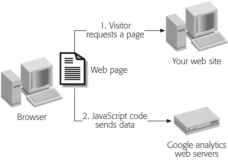
In order to use Google Analytics, you need to add a small snippet of JavaScript code to every Web page in your Web site (unless you have specific pages that you don’t want to track). The code tracks each visitor using a cookie (Section 2.1).
Once you’ve got the JavaScript code in place, everything works seamlessly. When a visitor heads to a page in your site, their browser sends a record of the request to Google’s army of monster Web servers, which store it for later analysis. The visitor doesn’t see the Google Analytics stuff. Figure 10-1 shows you how it works.
Using this system, Google Analytics is able to get two kinds of information:
Information about your visitors’ browsers. Whenever a browser requests a page, it supplies a basic set of information. This information includes the type of browser, the features it supports, and the IP address of the computer it’s connecting through. (An IP address is a numeric code that identifies a computer on a network.) These details don’t include the information you really want—for example, there’s no way to find out personal details like names and addresses. However, Google can use the browser information to infer some additional details. For example, using the IP address, it can make an educated guess about a visitor’s geographic location.
Visitor tracking. Thanks to its cookie-based tracking system, Google Analytics can determine more interesting information about a visitor’s surfing patterns. Ordinarily, if a surfer requests two separate Web pages from the same site, there’s no way to establish whether those requests came from the same person. However, with the cookie in place, Google can uniquely identify each visitor. As a result, when visitors click links and move from page to page, Google can determine their navigation path, the amount of time they spend on each page, and whether they return later.
Google Analytics wouldn’t be nearly as useful if it were up to you to make sense of all this information. But as you’ll see, Google not only tracks these details, it also provides reports that help you figure out what the data really means. You generate the reports through a handy Web interface, and you can also print your reports or download the data for use in another program.
Setting Up Google Analytics
To get set up with Google Analytics, you have to take three steps. First, you create an account. Next, you add the tracking code to every page in your site. Finally, you wait—and within 24 hours, Google will have enough information to provide detailed reports.
Note
At the time of this writing, Google Analytics is experiencing growing pains due to high demand. As a result, the sign-in process may be restricted from time to time. If you can’t create a Google Analytics account, check back later, or add yourself to the waiting list.
Signing Up
Signing up for Google Analytics is easy:
Head over to www.google.com/analytics and click the sign-up link.
The sign-up process takes you through a few short steps. Here’s the information you need to supply:
The email address and password you want to use.
Note
Google Analytics is one of many services that are accessible through a single Google Account. That means that you can use Google Analytics with the same account you use for services like Gmail and Google Groups. (Google AdSense and Google AdWords require dedicated accounts, because they need additional information like financial details.)
The Web site you want to track. A Google Analytics account can track up to 50 Web sites, but for now start with just one.
Whether or not your Web site uses frames.
The types of reports you want to see. Use the default settings, which include all the Google Analytics reports. The box “How Reports Are Organized” (Section 10.3.1.1) has more about the report categories in Google Analytics.
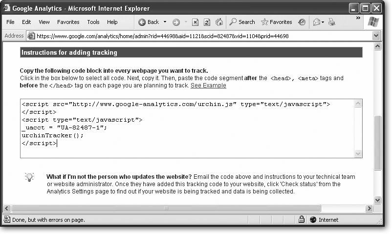
When you finish the sign-in process, Google gives you a box with the JavaScript code you need to start tracking visits (see Figure 10-2). The next section tells you how to add it to your pages.
Setting Up Your Site for Tracking
Once you’ve created your Google Analytics account, you’re ready to add the JavaScript code to every Web page you want to track.
Tip
For best results, copy the tracking code to every Web page in your site. The only exception is in a frames-based site. If you have a frames-based site, don’t copy the tracking code to the pages used for navigation bars, headers, and other noncontent regions.
The tracking code looks like this:
	<script src="http://www.google-analytics.com/urchin.js" type="text/
	javascript">
	</script>
	<script type="text/javascript">
	_uacct = "UA-02487-1";
	urchinTracker();
	</script>
The first two lines define a link to the file www.google-analytics.com/urchin.js. This file is packed full of customized tracking code.
Tip
Curious JavaScript gurus can request this file in their browsers, save a local copy, and take a closer look.
The rest of the code defines a script that runs automatically when the page is processed. This script contains exactly two lines. The first line sets the tracking identifier (_uacct), which identifies your Web site. The second line calls the urchinTracker( ) JavaScript function (one of the ingredients in the urchin.js file) to create the cookie and send the tracking information to Google’s Web servers.
Note
If your Web pages include their own custom JavaScript functions, they could conflict with Google Analytics—but it’s extremely unlikely. Aside from the urchinTracker( ) function, all the other function names in the urchin.js file start with _u or __u. So unless you’re in the habit of using cryptic function names like __utmVisitorCode( ), you won’t have a problem.
When adding the script code to a Web page, you place it inside the <head> section at the beginning of your page, after any <meta> tags. Here’s an example that shows where it fits in a typical Web page:
	<html>

	<head>
	  <meta http-equiv="Content-Language" content="en-us">
	  <meta http-equiv="Content-Type" content="text/html; charset=windows-1252">
	  <title>Welcome</title>
	  <!-- Put the analytics code here. -->
	</head>

	<body>

	  <!-- The page content goes here. -->
	</body>

	</html>
Once you’ve changed all the pages, make sure to upload them to your Web server. Only then can Google Analytics start tracking visits.
Tip
You can also use Google Analytics with many blog sites, as long as you’re able to edit the actual HTML. For example, a blogging tool like Blogger (www.blogger.com) lets you edit the template that’s used for blog entries. Add the Google Analytics code to this template, and you’ll have the same Web tracking a full-blown Web site enjoys.
Google provides the tracking code at the end of the sign-in process. Your block of script code will look identical to the example in Section 10.2.2, aside from the _uacct value, which is unique for every Web site that’s registered with Google Analytics.
If you misplace the ever-important tracking code, you can get it back. Just follow these steps:
Head to www.google.com/analytics and log in. You’ll start off at the Analytics Settings page.
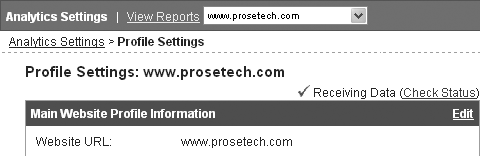
Next to your Web site profile, click Edit. This takes you to the Profile Settings page.
Click the Check Status link (shown here). This loads the Tracking Status page.
Scroll to the bottom of the page to find a text box with the tracking code you need.
A Snapshot of Your Web Traffic
Now that you’re a registered Google Analytics user, you can log in to read reports and check the status of the whole operation. If you haven’t already done so, now’s the time to head to www.google.com/analytics.
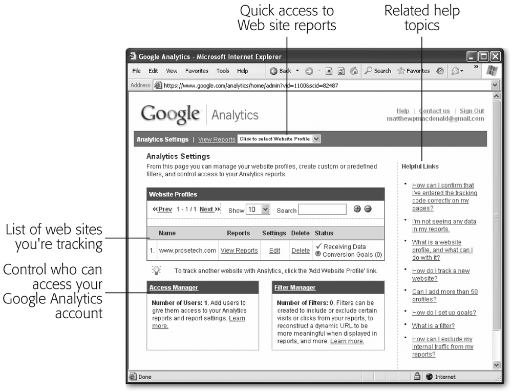
When you first log in, you’ll see the Analytics Settings page shown in Figure 10-3. Using this page, you can add new Web sites that you want to track and configure the existing ones. You can also get a little guidance from a list of help topics that appears on the right.
To determine whether your Web site’s tracking code is working, check the Status column in the Website Profiles list. Here’s how to interpret different statuses you might see:
Receiving Data indicates that all’s well. Your visitors are surfing under the watchful eye of Google Analytics.
Figure 10-3. This sample account has one configured Web site (in the Website Profiles section). You can use the View Reports link to start reviewing reports, the Edit link to change the information you supplied for your Web site, and the Delete link to remove the profile altogether. You’ll explore other details, like Conversion Goals (Section 10.5.1), the Access Manager (see the box in Section 10.4.1), and the Filter Manager (Section 10.4.3), later in this chapter.Waiting For Data indicates the JavaScript code is running on your Web pages, but the information isn’t available for reporting yet. Usually, you’ll see this for the first 6 to 12 hours after you set up a new Web site.
Unknown indicates that Google isn’t collecting any information. This could be because you need to wait for visitors to hit your site, or it could suggest you haven’t inserted the correct JavaScript tracking code. To double check the code, follow the steps in the “Help! I’ve Misplaced the Tracking Code” box in Section 10.3.
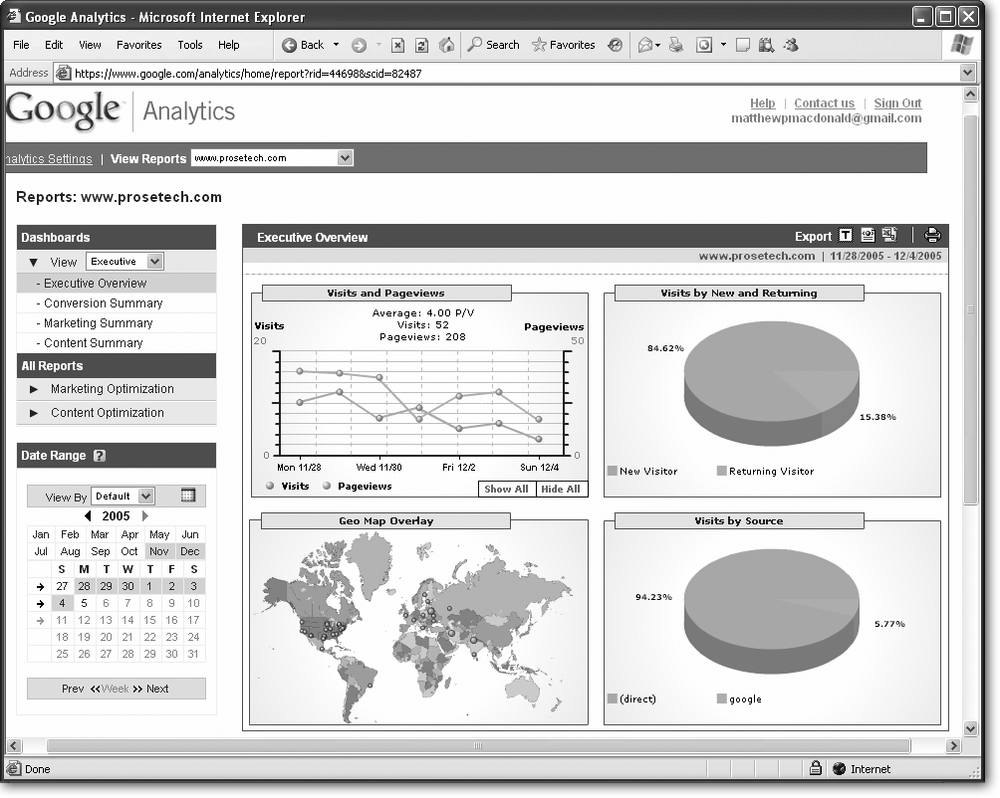
The Executive Overview
By now, you’re probably itching to get your hands on a Google Analytics report and see what’s going down in your corner of the Web. The best way to start out with the Google Analytics reports is to try the executive dashboard. It shows four snapshots that summarize what’s taken place at your Web site over the last week.
Note
Dashboards are Google Analytics pages that show one or more reports. Typically, dashboards focus on summary information, while reports offer views of more specific data. Overall, Google Analytics offers many more reports than dashboards.
Here’s how to get to the executive dashboard:
If you aren’t signed in yet, surf to www.google.com/analytics and sign in.
The Analytics Settings page appears, with a list of all your Web site profiles.
Click the View Reports link next to the Web site you want to track.
The reporting page appears. Unless you’ve changed the standard settings, you’ll always start out at the executive dashboard (Figure 10-4).
If you have changed the default settings, you can get to the executive dashboard using the menu on the left. Under the Dashboard heading, in the View list box, choose Executive. This shows all the executive reports. Now click the Executive Overview link.
Note
All Google’s reports use Macromedia Flash, a popular browser plug-in that supports interactive and animated content. Most people have Flash installed, but if you don’t, you can download what you need at www.macromedia.com/go/getflashplayer.
The information that appears in the executive dashboard can be a little overwhelming. To give you a better sense of what’s going on, the following sections break it down one chart at a time.
Note
Mac fans who use Apple’s Safari browser have reported problems viewing Google Analytics reports. If you suffer from the same headaches, Google recommends adjusting the text size (from the browser’s menu) after the reports have loaded. If this doesn’t solve the problem, you’ll need to use a Mozilla-based browser like Netscape or Firefox (Section 6.2.2), which are the only Mac browsers Google officially supports (at least for now).
Visits and Pageviews
The Visits and Pageviews chart (top left of the Executive Overview) shows the day-by-day popularity of your Web site over the last week. The yellow line shows the rise or fall of pageviews—a raw record of the number of pages your site has served out. The blue line compares the number of visits—a count of how many different people surfed through your site.
In other words, if an eager shopper visits your Banana Painting e-commerce store, checks out several enticing products, and completes a purchase, Google Analytics records close to a dozen pageviews, but only a single visit. The number of pageviews is always more than the number of visits—after all, each visit includes at least one pageview.
Like many of the charts in Google Analytics, the Visits and Pageviews chart is packed with information (see Figure 10-5). You can study the daily trend lines, or refer to the summary at the top of the chart for the total number of visits and pageviews over the week.
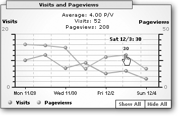
Tip
The summary at the top of the chart includes the P/V average, which is the average number of pageviews made in one visit.
Be aware that the pageview and visit lines use different scales. In the example in Figure 10-5, visits are scaled from 0 to 20 using the axis on the left, while pageviews are tracked from 0 to 50 on the axis on the right. Google adjusts the scale so the lines for visits and pageviews are as close as possible, which lets you see when trends change.
Here are some of the details you can study in the Visits and Pageviews chart:
Check the overall uptrend or downtrend of pageviews. This indicates whether your Web site is becoming more or less popular. But remember, daily trends aren’t as significant as weekly or monthly ones. See Section 10.3.2 for information about how to adjust the date range for a chart.
Check for day-of-the-week patterns. For example, visitors might spend more time at your Celebrity Gossip site on the weekend.
Check the correlation between visits and pageviews. Usually, these two factors are related. As visits increase, pageviews should increase proportionately. If these trends don’t line up, there could be a more interesting shift taking place in your site. For example, if visits remain the same while pageviews trend up, that means the average visitor is surfing through more pages. Of course, be aware that there’s still a healthy gap between discovering a relationship and interpreting it. For example, visitors might be surfing through more pages because you’ve expanded your Web site with new and gripping information, or because you’ve introduced a whizzy new navigation system that’s forcing your visitors to hunt around for the content they want.
Geo Map Overlay
The Geo Map Overlay chart (at the bottom left of the executive overview) gives a fascinating look at where your visitors are located on the globe. Google adds a small circle next to every location where a visitor resides, using slightly larger circles for areas that funneled a particularly large amount of traffic your way. In order to take a look at the city-by-city details, you need to hover your mouse over individual data points, as shown in Figure 10-6. You can also right-click and choose to zoom in for a closer look.
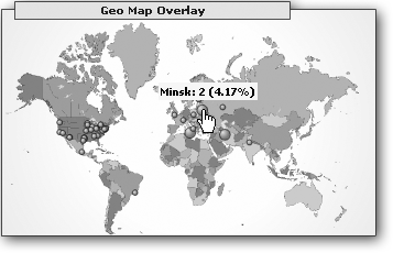
There’s no way to use the Geo Map Overlay to pick out other differences between visitors from different geographic locations. For example, you can’t use this chart to determine whether the visitors in Minsk favor certain pages or are more likely to make return visits when compared to the surfers in Tehran. However, Google Analytics does provide other, more specific reports that can ferret out these details, as you’ll see in Section 10.6.
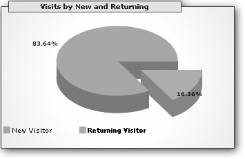
Visits by New and Returning
The Visits by New and Returning chart (top-right corner of the Executive Overview) compares the number of visitors who arrived for the first time with those who returned for a repeat visit. This information tells you whether your site is winning wide popularity or languishing in the surf-and-forget dustbin of history. Figure 10-7 shows a close-up.
Note
Remember, Google identifies return visitors based on the presence of a cookie on their computer. However, there are some types of repeat visitors that Google won’t correctly identify. For example, if a repeat visitor uses a different computer, a different browser, or logs in to their computer with a different user name, they’ll appear to be a new visitor. For these reasons, the number of repeat visitors may be slightly underreported.
Visits by Source
The Visits by Source chart (bottom-right corner of the Executive Overview) identifies how visitors are getting to your Web site. In Web marketing jargon, this list shows you the top referrers—other Web sites that link to yours and send visitors your way.
Google creates a separate pie slice for each domain. (A domain is the first part of the Web site address, as in www.amazon.com.) For example, if there are several pages on the Web site www.partyfavors.com that all lead to your site, Google will create a single slice that represents the cumulative traffic from all the links. There are also three pie slices with special meanings:
google indicates a visitor who comes to your site through a Google search or ad.
(direct) indicates a visitor that types your URL directly into their browser or uses a bookmark to make a return visit.
(other) indicates a contribution that’s too small to show. For example, a typical Visits by Source chart will show your top five referrers and group all the others into a single (other) pie slice.
Figure 10-8 shows a closer look.
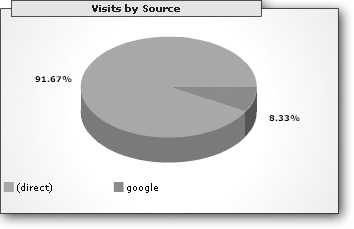
All in all, the Visits by Source chart is great tool for quickly identifying your most successful Web partnerships and judging the success of your search engine optimization. For example, if you’re in the habit of posting blog comments, newsgroup messages, or articles on other Web sites, you can gauge the success of your strategy: Do visitors who read your content follow the trail to your own Web site?
Changing the Date Range
Ordinarily, all the charts and reports in Google Analytics are based on the past week’s data. But if you’ve collected data for a longer period of time, you might want to broaden your perspective. Or, if you’re really curious about a sudden spike in traffic or an unexpected decline, you might want to home in on a certain day.
The secret to changing the date range is the calendar at the bottom left of the report page. Here’s what you can do:
To see a single day’s data, click that day. If the day isn’t in the current year, use the arrow links at the top of the calendar to move to another year.
To see an entire week, click the arrow next to the week.
To see an entire month, click the month heading at the top of the calendar.
To see an entire year, click the year heading (above the month headings).
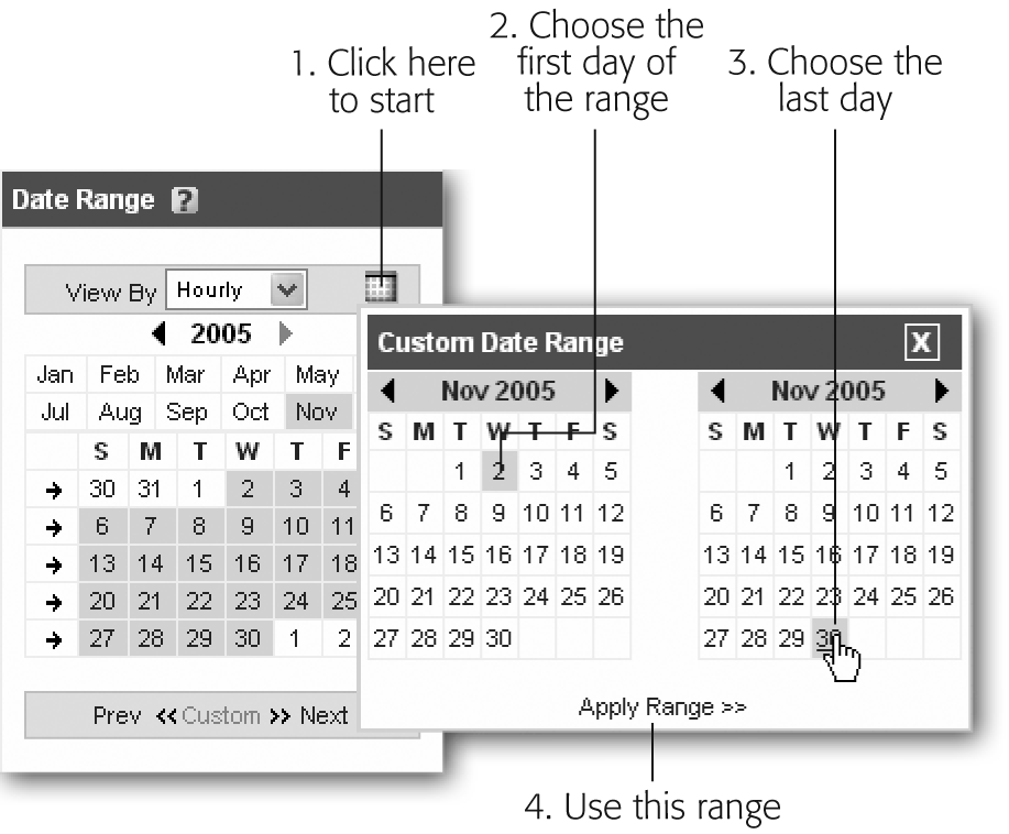
To choose a custom date range, click the calendar icon next to the View By list and follow the instructions in Figure 10-9.
Once you make your selection, there’s a short delay while Google updates all of the charts to include only the data you’ve chosen.
Exporting the Data
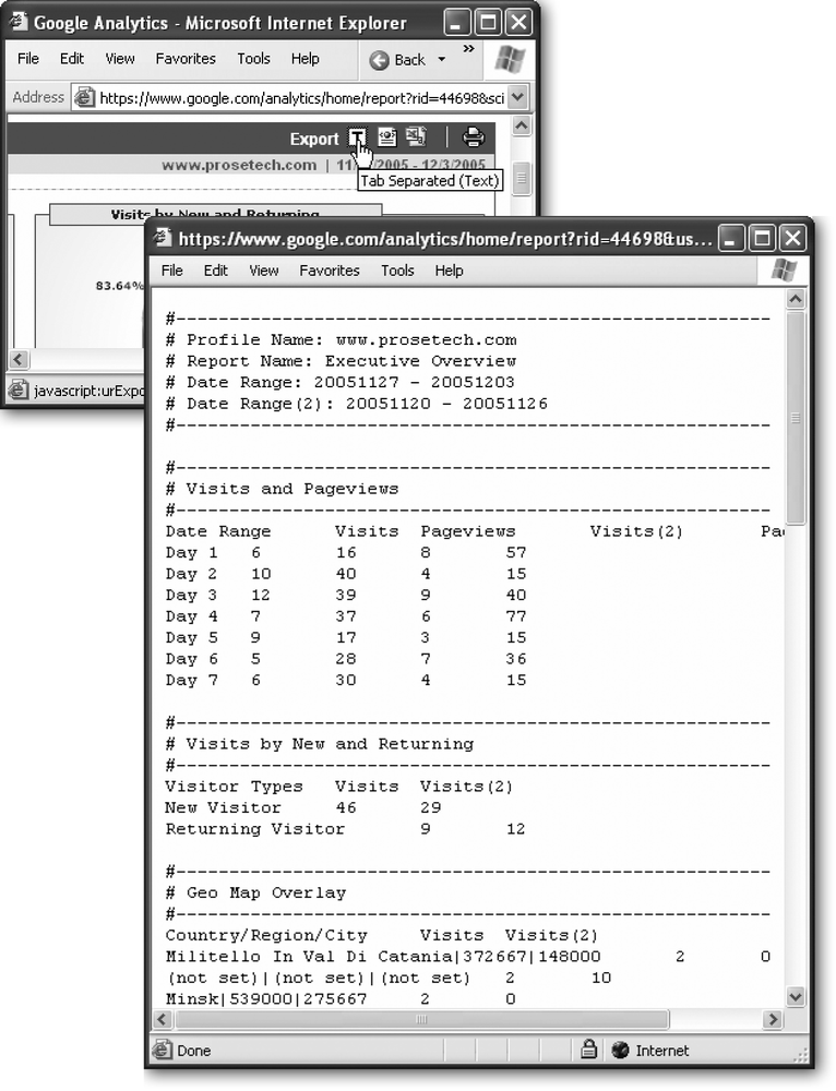
Google Analytics has enough tools for many long nights of caffeine-fueled Web analysis. However, you aren’t locked into the Google Analytics interface. If you’ve thought of another way you’d like to present your data, or if you just need to import those record-breaking numbers into a PowerPoint presentation, you’ll be happy to hear that Google makes it easy. All you need to do is look for the export and printing icons at the top right of the report or dashboard box (Figure 10-10). A single click can get your data in a plain text, XML, or an Excel file.
Printing a Report
As with any Web page, you can send the current Google Analytics dashboard to the printer with the Print command in your Web browser. However, before you do, look for the Standard/Print View icon (which looks like a printer) at the top right of the report or dashboard box. When you click this button, Google clears the menu bar and header information out of the way, so that the page shows only your report data. You can then use the browser’s Print command to create a more attractive printout.
When you’re finished, click the Standard/Print View icon again to get back to the normal view.
Assessing Your Site
So far, you’ve seen only one of the dashboards in Google Analytics—the Executive Overview. The Executive Overview shows your Web site’s vital signs, but not much more. If you want to answer demanding questions about your Web site and discover its strengths, weaknesses, and quirks, you’ll need to dig into the mountains of statistics with more focused reports.
There’s no way that this chapter can walk you through every one of the dozens of Google Analytics reports. (And even if it could, you’d have trouble keeping awake for the entire tour.) However, before you’ve finished this chapter, you’ll see many of the most useful reports—and you’ll learn your way around the surprisingly powerful charting tools.
Your Most (and Least) Popular Pages
As every Webmaster knows, all pages aren’t created equal. Some might command tremendous interest while others languish ignored. However, it’s not enough to simply determine which pages your visitors view the most. That’s because visitors often browse a site once they reach it. For example, the page of Member Photos on your International Nudist site might be attracting large volumes of visitors who then stick around to check out your personalized coffee cups, clothing, and memorabilia. A good reporting tool shows you where visitors enter your site, so you know what pages are the important attention-getters that lure traffic.
Fortunately, Google Analytics excels at figuring out exactly these sorts of details. To see a summary that profiles the Web page activity of your entire site, head to Dashboards section of the menu and then click the Content Summary link. (The Content Summary link is visible only if you’ve selected Executive or Webmaster in the View box at the top of the menu.)
Content Summary brings together three top-five lists (see Figure 10-11). They include:
Top 5 Entrances. These are the pages that visitors surf to first. Typically, your default page (like index.htm) tops the list, because that comes up when surfers head straight to the site without requesting a specific page. However, the rest of the list indicates other popular entry points. For example, a page that’s linked to on another site or a page that’s often returned by a search engine can creep up the list.
Top 5 Exits. These are pages that mark the end of a visit. Be on the watch for pages that really shouldn’t make this list. For example, if you find visitors are deserting in droves when they get to the checkout page of your e-commerce shop, maybe there’s an unexpected obstacle in place (like a surprise shipping charge).
Top 5 Contents. This is a no-nonsense list of the most popular pages on your site. Use it to determine what content is commanding the most interest once visitors arrive at your site.
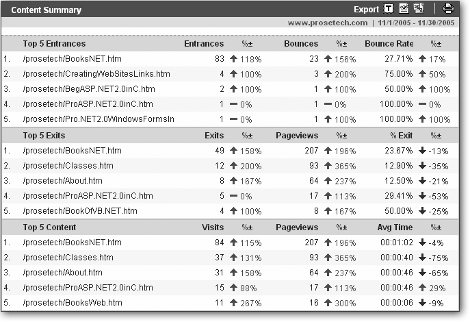
As you can see in Figure 10-11, the Content Summary has highlights about a site. The Top 5 Entrances table points out that for this sample site, most visitors arrive through the BooksNET.htm page (which is the default page for the Web site). Seventeen percent leave without viewing anything more, while those who continue are most likely to request the Classes.htm page (which comes in a solid second in the Top 5 Content list). Both BooksNET.htm and Classes.htm are common exit points. But the most interesting statistic may be the percentage change values in the Top 5 Content table, which show that Classes.htm and BooksWeb.htm have 300 percent increases in traffic when compared to the previous period.
The Top 5 Content table also includes an Average Time column that details how long a surfer looks at a page before surfing on. This can help you determine whether a popular page is truly successful. For example, a page that tops the list for pageviews but has an extremely short time value is attracting visitors, but not keeping them. Maybe the content is overly long, complicated, poorly formatted, or just doesn’t deliver what it promises.
The Top 5 Exits table includes the total exit count (the number of times this page marked the end of a visit) and an exit percentage (the percentage chance that once this page is requested, the visitor won’t continue any farther). These numbers can point out potential problems. For example, an exit rate of 50 percent indicates that half of the people who reach this page don’t stick around, which is a very ominous sign.
Finally, the Top 5 Entrances table includes the number of bounces. A bounce occurs when a visitor views only one page—in other words, they surf into your site through a specific page and then depart without browsing any further. Bounces are keenly important to Web masters, because they indicate lost potential visitors. If you can identify why a particular page has a large bounce rate, and keep a visitor interested enough to check out a few more pages, you’ll increase the popularity of your site.
As you learned in Section 10.3.2, you aren’t limited to looking at statistics one week at a time. You can also set a custom date range. Of course, this makes the percentage change values much less useful—or does it?
It turns out that Google Analytics has an almost hidden feature that lets you compare any two date ranges of your choice. To choose the first date range, configure the calendar in the bottom-right corner, as described earlier (Section 10.3.2). To choose the second date range (the one used for the purpose of comparison), click the double calendar icon in the Date Range bar (shown here). Another calendar appears underneath the first one. You use this calendar to set the second date range.
Keep in mind that you should compare date ranges of a similar length. Obviously, if you compare a week’s worth of traffic to a single day, the week will have much higher pageview numbers.
More Content Performance Reports
The Content Summary is a great place to start, but there are more statistics in store in the expansive All Reports section of the menu (which you can find underneath the Dashboards section). Click Content Optimization, and then click the Content Performance subgroup. The reports you’ll see include:
Top Content. Similar to the Top 5 Contents table, but it includes all the pages that visitors accessed, not just the best five. This report also presents the information in a bar chart or pie chart and lets you use more analysis tools, like cross-segmenting (Section 10.5).
Content Drilldown. Similar to Top Content, but this report assigns a dollar value to pages based on the likelihood that a visitor will continue to complete a goal after viewing this page. Goals are explained in Section 10.5.1.
Content by Titles. Similar to the Top 5 Contents page, but this report identifies each page by its title (the information in the <title> tag in the actual HTML) rather than the page’s URL. This means that if you have more than one page with the same title, their combined information appears as one entry in this table.
Page Query Terms. Show the most commonly used query terms for any page.
Note
Query terms are used to transmit information from page to page in a Web application. They’re the dynamic portion of the URL. For example, in the URL http://www.mysite.com/quote.htm?prodID=321 the query term is prodID=321.
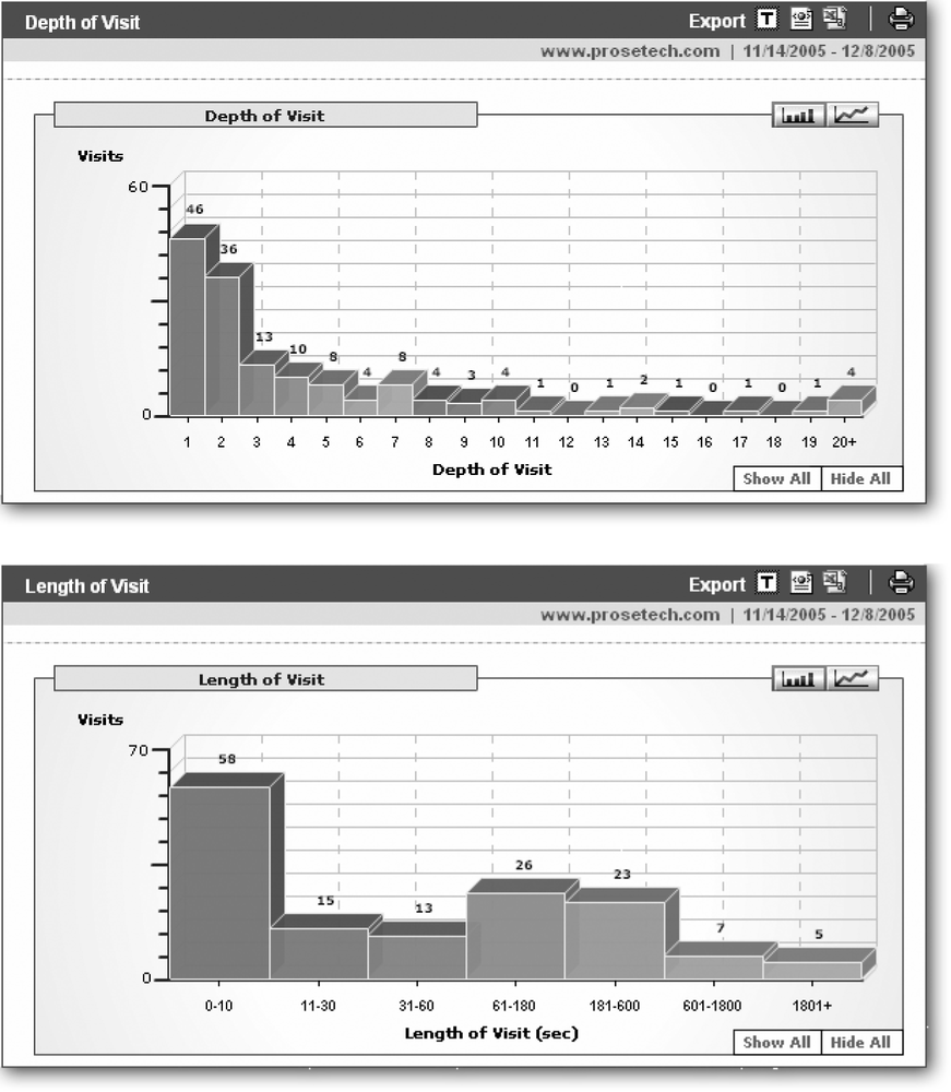
Depth of Visit. Shows the number of pages that visitors view in a typical visit (see Figure 10-12).
Length of Visit. Shows the amount of time that visitors spend in a typical visit (see Figure 10-12).
You’ll also find more reports of interest in the Navigational Analysis subgroup of the menu, which is just underneath the Content Optimization section. Look for the Entrance Bounce Rates and Top Exit Points reports. These are very similar to the Top 5 Entrances and Top 5 Exits tables you saw in the Content Summary, but they’re expanded to feature all the entrance and exit pages (not just the top five items).
Fine-Tuning a Chart
The slick charting features in Google Analytics conceal quite a few features. You can pull out pieces of a pie (Section 10.3.1.4), and show or hide individual data points (Section 10.4.4). However, there are several additional ways that you can interact with a chart to filter out information or focus on just the numbers that interest you.
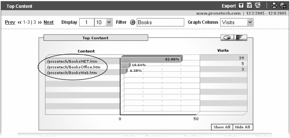
Before going any further, orient yourself with Figure 10-13, which shows the chart for the indispensable Top Content report. The Top Content report gives a detailed ranking of every page on your site based on the number of visits it receives. To get to the Top Content Report, under the All Reports section of the menu, click to expand the Content Optimization group, then click Content Performance, and finally click Top Content.
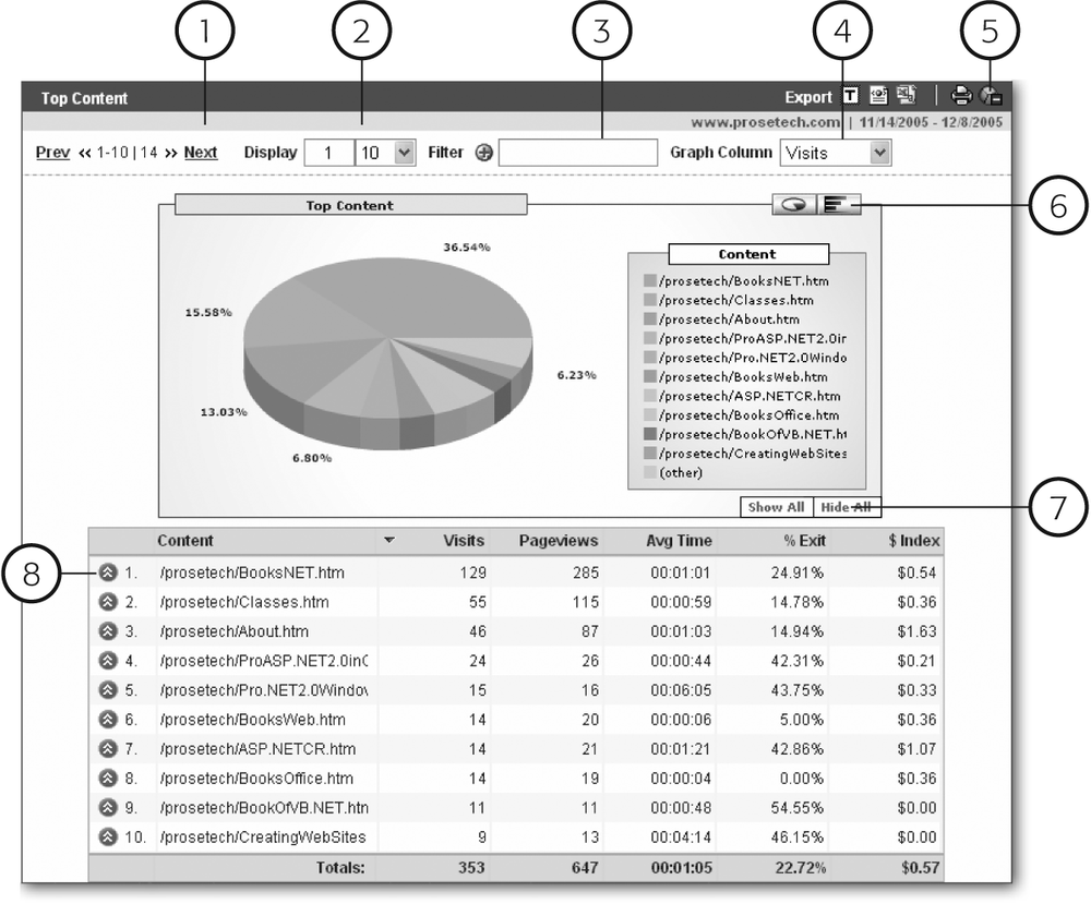
Here’s a guide that walks you through the different parts of the report (the numbers in the list correspond to the numbers in Figure 10-13):
Prev/Next links. You can’t always cram everything into sight at once. In this example, there are 14 pages to consider, but only 10 are shown at a time. To see the next segment of data, click the Next button. (In this example, the chart would display the pages ranked 11th through 14th.)
Display Count. You can use the Display boxes to choose exactly what segment of information you want to see. The first box is the number of the first segment that you want shown. (It’s initially 1, which represents the first item in the results.) For example, if you want to disregard the top two pages, set this to 3.
The second box is the number of items that are shown at once. (It’s initially 10.) You have only a few preset options, which include 10, 25, 50, 100, and 500. However, this selection affects only the data table under the chart, not the chart itself. (Google Analytics just can’t cram more than 10 slices into a pie chart or 10 bars into a bar chart.)
Filter Expression. You can use a filter expression to show or hide specific items. This gets a little tricky, because technically filters use regular expressions, a ridiculously powerful and complex pattern-matching language. But you can use the Filter box to match simple snippets of text, as shown in Figure 10-14.
Figure 10-14. By adding a filter of “Books”, you can limit this chart to the three pages that contain that word, including BooksNET.htm, BooksOffice.html, and BooksWeb.htm. This is an inclusive filter; it chooses the pages that Google should include in the report. You can also create an exclusive filter that hides certain pages. Just click the plus (+) symbol next to the Filter box, so that it changes into a minus (–) sign.Graph Column. The chart displays information from a single column from the table below. In the Top Contents report, for example, the chart shows the number of unique visits. However, you can choose to chart any of the other columns in the table, including pageviews and the average time spend viewing the page. Just select the column name from the Graph Column box.
Export and Printing. These icons let you export the data in the report table, as described in Section 10.3.2.
Chart Type. Depending on the type of report, you may have the option of displaying the data as a pie chart, line chart, or bar chart. Just click the appropriate icon to have Google generate the matching chart.
Show or Hide Data Points. You can use these buttons to quickly show or hide the specific data values next to every slice (in a pie chart), bar (in a bar chart), or point (in a line chart). This trick is a great way to see all the numbers in your chart at a glance.
Drill Down. Ready to get more information about a specific segment of your chart? You can click the red double arrow to launch a more detailed analysis. The following section explains how this feature works.
Drill-Down Analysis
Sometimes, you might want to get more info about a value in your chart. For example, once you know the top performing page, you might want to see how its performance has changed over the reporting period. Or maybe you want to get a breakdown of how its popularity varies for visitors in different geographic locations or using different browsers. You can answer these sorts of questions with the drill-down feature.
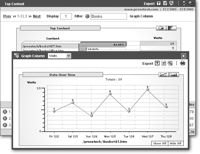
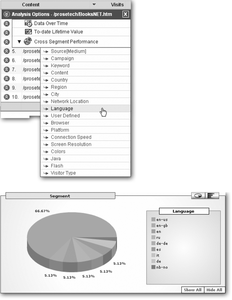
To start, just click the red double arrow next to the data you want to explore. A pop-up menu appears with three options: Data Over Time, To-date Lifetime Value, and Cross Segment Performance:
Data Over Time shows the fluctuations in a data item over your reporting period. For example, in the Top Contents report, you could use this feature to track down pages that are changing in popularity (see Figure 10-15).
To-date Lifetime Value is an option Google uses with goal tracking (discussed in Section 10.5.1). It shows whether the visitors who surfed to this page also completed one of your goals. If you’ve assigned a dollar value to your goal, this table uses that number to calculate an average value for every visitor in this category.
Cross Segment Performance allows you to take the category you’ve selected and split it into several subcategories, which are technically known as segments (see Figure 10-16). For example, you could take a popular page from the Top Contents chart and take a look at how its popularity varies based on other factors (like the visitor’s home city). This approach is great for ferreting out hidden relationships in the data. For example, it could show you that your Origami Magic page is particularly popular with surfers from Switzerland. However, there are so many different ways that you can cross-segment the same information that you could easily spend a long jail term cross-segmenting your data.
Goal Tracking
Some pages in your Web site have a special significance because visitors don’t reach them unless they complete a specific process. For example, after visitors make a purchase from your store, they see an order confirmation page. After making a donation to your charity, they’re sent to a thank-you page. After signing up for your Elvis Lives! newsletter, they see a welcome page.
These pages are particularly important, because they indicate that a transaction has taken place. For example, if you’re creating an e-commerce site, you’re keenly interested in how many users place orders. Google Analytics includes a goal tracking feature that lets you distinguish these pages and measure your success.
Note
Of course, any e-commerce site worth its salt has other ways of tracking information like the number of orders placed. For example, you could count the number of order records in your database. But by tracking this information with Google Analytics, you open your site to a great many more analysis options. For example, you could combine the order information with other statistics that Google Analytics collects to answer more questions, like how many pages does a purchaser browse through before performing an order, where do they enter your site, and how long do they spend reading each page?
To perform goal tracking, you define a Web page URL as a goal. When a visitor reaches a goal page, it’s called a conversion. In marketing speak, a conversion is the shining moment when an anonymous visitor is transformed into a customer.
Google keeps track of how many people reach your goal pages. Every Web site can have up to four goals—if you want more, you’ll need to create additional profiles for your Web site (see the box in Section 10.4.1).
Creating a Goal
Here’s how you define a goal:
Navigate to the Analytics Settings page.
This is the first page you see when you log in. If you’re currently viewing a report, click the Analytics Settings link in the top-right corner of the page.
Click the Edit link in the Settings column next to the Web site you want to use.
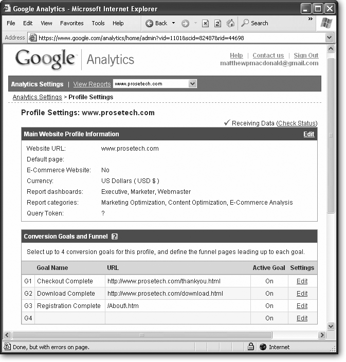
The Profile Settings page appears for your Web site. Scroll down to the “Conversion Goals and Funnel” section. You’ll see four goal slots that you can use (see Figure 10-17).
Click Edit next to the goal slot you want to use.
A Goal Settings page appears where you can configure the goal.
It doesn’t matter which goal slot you use. However, it makes sense to place your first goal in the first slot, your second goal in the second slot, and so on.
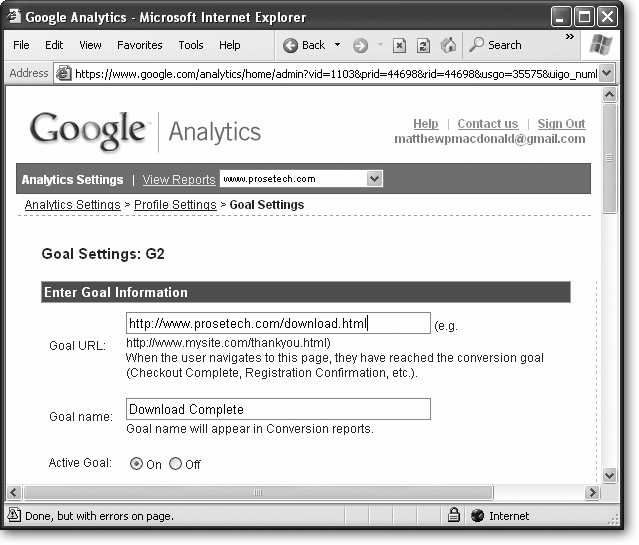
Enter a URL for the goal (see Figure 10-18).
When supplying a URL, you have two options. Your first option is to supply the whole URL, starting with http://. For example, a URL in this form is http://www.mysite.com/ThankYou.htm.
Your second option is to supply part of the URL (usually the page name). In this case, Google matches any URL that contains that text. However, life isn’t quite as easy as it should be. When you match a portion of a URL, Google actually interprets your text as a full-fledged regular expression. (For die-hard programmers with hours of extra time, that means you can use extra pattern-matching features.) Unfortunately, there are certain characters that have a special meaning in the regular-expression world (namely: * + -? ( ) . [ ] | ^ $ ). If you use any of these characters in your URL, you need to precede it with a backward slash (). For example, instead of specifying the page /About.html, you must use /About.html, because the period is considered a special character. This URL matches any request for a page named About.html, anywhere on your site. If you leave off the initial slash and specify About.html you might also match pages that end with About.html, as in WhatAbout.html, Roundabout.html, and HowzAbout.html.
Figure 10-18. The URL is the most important piece of information for a goal. In a very real sense, the URL is the goal. You can use any page, but typically you’ll use a page to which you want to drive traffic.Enter a goal name.
You can use any name you want. Registration Complete, Checkout, or Signup are good choices. The goal name is used to identify the goal in your reports.
If you don’t want to use the goal right away, set the Active Goal setting to Off.
You can also change the Active Goal setting of an existing goal to temporarily turn it off and to switch it back on.
If desired, add funnel pages.
A funnel consists of one or more pages that lead up to the goal. For example, if a visitor must travel through http://www.mysite.com/SignUp.htm to get to http://www.mysite.com/ThankYou.htm, the page http://www.mysite.com/SignUp.htm is a funnel. Because a transaction like signing up or making an order can require several steps and take place over multiple pages, you can define a list of pages for your funnel, in order from first to last.
The value of a funnel is that some reports (like the Defined Funnel Navigation report) let you see how many visitors reach your funnel but don’t continue through it to the goal. In turn, that can help you identify and remove last-minute obstacles that are preventing people from reaching your goal.
If desired, set the “Case sensitive” checkbox.
When you select the “Case sensitive” checkbox, Google matches the URL only if the capitalization that’s used by the page making the request matches the capitalization you used in step 4. Usually, you won’t want this option, because it’s unnecessarily strict and could cause you to miss conversions.
Choose the Match type.
If you entered a full URL in step 4, choose Head Match or Exact Match. An Exact Match succeeds only if the URL the visitor requests matches the goal URL exactly. On the other hand, a Head Match allows Web side code to tack on some extra information at the end of the URL, in the form of query arguments (see Section 10.4.2). That means a URL like http://www.mysite.com/TheGoalPage.htm?language=en matches the goal URL http://www.mysite.com/TheGoalPage.htm. In general, this difference matters only if you use server-side code in your Web pages that inserts query arguments into a URL. For basic Web sites, there is no difference between Head Match and Exact Match.
If you entered a partial URL in step 4, choose Regular Expression Match. This matches part off the URL using regular-expression pattern-matching magic (Section 10.5.1).
If desired, assign a monetary goal value.
The goal value is used to assign dollar values to various report statistics. Although it’s impossible to give an exact value, here are some guidelines:
If you’re selling a product, enter the average value of a transaction.
If the value is based on other actions (such as whether or not the visitor clicks an ad), multiply the probability of the action by its value. For example, if 10 percent of visitors click an ad after reaching your goal page, and the ad click is worth $2.00, your goal value is $2*0.1=0.20.
Click Save Changes.
You can’t create reports with goal information just yet. Instead, you’ll need to wait 24 hours until Google Analytics has collected the next round of information, complete with conversion statistics.
Reporting with Goals
There are several reports that let you see goal information:
From the Dashboards section of the menu, you can select Conversion Summary (if the View is Executive or Marketer). This option shows the percentage of visits that result in a conversion.
From the All Reports section of the menu, you can select Content Optimization and then Goals & Funnel Process. This option gives you the choice of several goal-tracking reports, including ones that show the number of conversions (Goal Tracking), the percentage of conversions per visit (Goal Conversion), and the number of visitors who start the process toward a goal but stop before they reach the final URL (Defined Funnel Navigation and Defined Funnel Abandonment).
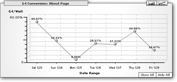
All goal reports show multiple charts, one for each goal you’ve defined. Figure 10-19 shows one of the charts from a sample Goal Conversion report.
Understanding Your Visitors
A large part of success in any Web site is getting inside the minds of your visitors. Why did they come? Why did they leave? What were they thinking when they spent 48 minutes reading your Hawaiian T-Shirt picture page?
In this section, you’ll learn about the reports that help you ferret out important details about your visitors.
Where They Live and Who They Are
In the Marketing Optimization section of the menu, there are two subgroups that are useful for tracking visitors: Visitor Segment Performance and Unique Visitor Tracking.
Visitor Segment Performance provides a wealth of information about what Web site visitors are coming from, where they live, and what service provider they’re using. All of these reports include the same information: the number of visits, the pages per visit, and the conversion rate for your goals. The reports include:
New vs. Returning. Compares new and return visitors.
Referring Source. Compares visitors based on how they arrived at the Web site (directly by typing in the URL, through a search engine, or from a link in a specific site).
Geo Location. Compares visitors based on the countries they live in. You can also cross-segment the table (Section 10.5) to compare regions or cities inside a specific country.
Geo Map Overlay. Gives you a geographic map like the one shown on the Executive Overview (Section 10.3.1). However, this chart adds filtering capability, and if you click a visitor location in the map, a pop-up window appears with the number of visits, the pages per visit, and the conversion rate for your goals.
Language. Compares visitors based on their language. Remember, the language is set in the browser—there’s no guarantee that’s the preferred language of the visitor.
Domains. Compares visitors based on domain name, the short computer name that’s linked to their IP address (like verizon.net). Remember, the domain name is determined by the computer that connects the surfer to the Internet. Surfers inside a large company may be able to connect to the Internet directly. Other people need to travel through an ISP (Internet Service Provider). The domain name is determined by that ISP.
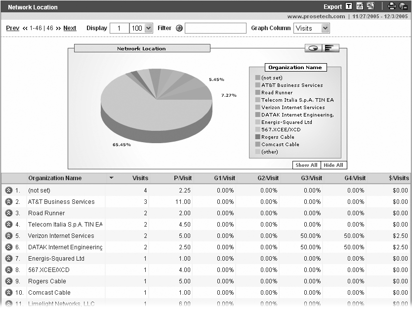
Network Location. Similar to the Domain report, except this report shows the company name of the computer that connects the Web surfer to the Internet, which is based on the company or ISP. Figure 10-20 shows an example.
Note
The Domains and Network Location reports aren’t terribly interesting for ordinary people, because they show only information about the ISP. However, these charts are useful if you want to find out if your Web site is popular with any large institutions, like specific schools or companies.
New and Returning Visitors
The Unique Visitor Tracking section contains reports that make use of Google’s cookie-tracking system. By checking for the existence of the tracking cookie, Google can tell when a new visitor hits your site. (In the marketing world, the number of visits is more important the total number of page requests. That’s because each visitor is a real, distinct person—and therefore a potential customer.)
There are a dizzying number of ways to explore this visitor information. Here are the reports Google provides:
Daily Visitors. This report includes two charts. The first shows the number of visitors day by day, and the second shows the number of new visitors over the same time period.
Visits & Pageview Tracking. This report includes three charts. They show the number of visits, the number of pageviews, and the average number of pageviews per visit over the reporting period.
Goal Conversion Tracking. Shows conversion rates over time.
Absolute Unique Visitors. Compares new and returning visitors with a simple pie chart.
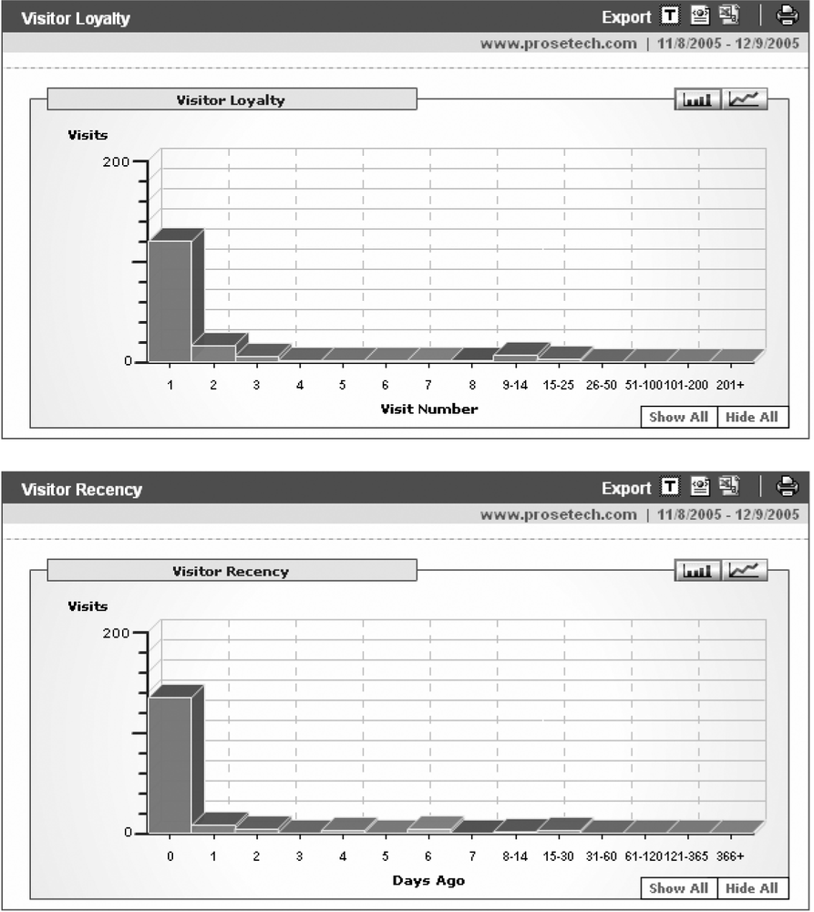
Visitor Loyalty. Shows the number of repeat visits (Figure 10-21).
Visitor Recency. Shows the amount of time in between visits for repeat visitors (Figure 10-21).
Browser Capabilities
So far, this chapter has focused squarely on content-oriented questions. But there’s a whole other set of considerations when crafting a Web site—browser support. Even the most winning content fails if you rely on browser gimmicks and plug-ins that only display correctly on specific browsers. As a rule of thumb, if in doubt, keep it simple.
Of course, top-notch Web sites need to distinguish themselves somehow. Skilled Webmasters have ways to introduce new frills that enhance the experience for certain browsers without preventing older browers from using the page. An example is Amazon, which recently introduced a few snazzy pop-up menus. Browsers that lack the required level of JavaScript and DHTML support don’t get the pop-up menus but still let visitors click through to the pages they want the long way.
In other words, the best design advice for any site is to make sure it’s usable by everyone—and then consider adding features that benefit newer browsers. But before you start working, you need to be sure that the features you’re adding will benefit a large-enough portion of visitors. (Otherwise, why bother?) That means you need to determine which browsers are accessing your site and what features they support.
Google Analytics has a set of reports dedicated to summarizing the browser support of visitors. To see these reports, in the All Reports section of the menu, click the Content Optimization group. Then click Web Design Parameters.
The reports you can use include:
Browser Versions. Separates browsers based on brand, such as Internet Explorer, Firefox, Opera, and Netscape.
Platform Versions. Compares different operating systems, like Windows and Mac.
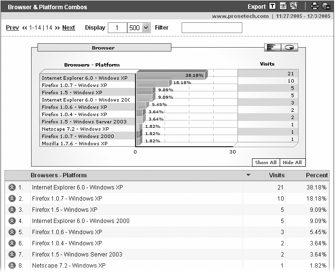
Browser & Platform Combos. Splits the traffic into detailed groups based on browser brand, browser version number, and exact operating system. For example, one group might be Internet Explorer 6.0 - Windows XP. Figure 10-22 shows an example.
Screen Resolutions. Separates visitors based on screen resolution. For example, a screen resolution of 1024 x 768 pixels provides more space than a screen resolution of 800 x 600. (A pixel is the smallest dot a computer screen shows.) If your visitors have large screens, they can tolerate wider pages.
Screen Colors. Separates visitors based on color support. However, most Web surfers have high-enough color support these days that you rarely need to worry about this information, and it almost never makes sense to design pages with limited color sets.
Languages. Splits visitors according to the language information that’s configured by their browser. For example, “ru” represents the Russian language.
Java Enabled. Divides visitors into two groups: those that have Java enabled and those that don’t. Java can be used to embed standalone applets in Web pages.
Flash Version. Divides visitors into groups based on the version of Macromedia Flash that they support. Flash is often used to show dynamic content, like animation, movies, and annoying advertisements.
Connection Speed. Separates visitors based on the speed of their Internet connection. The faster the connection, the more likely a visitor is to tolerate large, graphics-intensive pages, download big files, and sample rich content like movies.