7. Page Layouts
Page layout with HTML and CSS begins with establishing a layout grid or set of columns to flow content into, but what you do with individual content types or items once you get them into a column is just as important.
Luckily, the techniques used for both page layouts and content layouts are the same. Whether you’re working with elements of the content that fall inside each column, content in the page header or footer, or reusable widgets, content elements must be laid out in their own grid using the same techniques that make up the larger page layout.
This chapter introduces the common techniques and building blocks used for laying out HTML content in your pages.
Building Blocks of CSS Layouts
In Chapter 5, through the discussion of the box model and floats, you were introduced to some of the building blocks used to create layouts with CSS. They weren’t labeled as such, so what follows is a refresher and a more complete list of building blocks at the core of working with CSS.
Creating Content Blocks
Chapter 6 introduced the position property and containing blocks.
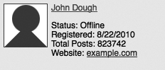
When styling repeatable content items such as those found in product listings or reusable user profile badges, it is often useful to manage these items as discrete content blocks (or widgets), using position:relative to create a distinct, self-referential space in which to work with the individual components of the content item. This widget or block of markup can be placed anywhere in a page and maintain its appearance. Figure 7.1 demonstrates this effect by creating a user badge in which the user’s photo is positioned in relation to the containing block.
Figure 7.1. Establishing new containing blocks for individual content items and positioning the profile icon.
Floating into Margins
Juggling the gutters created by element margins and using the float property is at the core of most CSS-based layouts. Although absolute positioning of columns or content items (as was done with the profile photo in the previous example) may seem like the most direct way of placing content side by side, removing content from the document flow or creating new containing blocks can have unwanted side effects.
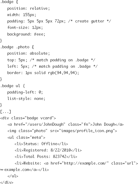
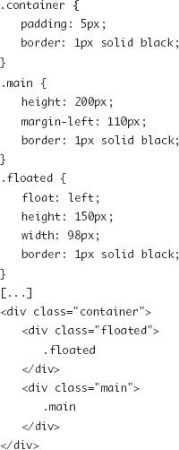
Instead, floated elements can be moved into gutters created by wide margins on column elements or other content. This layout technique is the basis for the following code, which created Figure 7.2.
Figure 7.2. A small content block is positioning in the gutter of a larger element using floats.
This is an extremely common technique when creating multicolumn page layouts, as you’ll see in the next section.
Creative Use of Backgrounds
Background images can be more than just repeated background patterns, textures, or fancy border substitutes (Chapter 8). Background images can also be used to create visual structures or separation that doesn’t follow the structure defined in the markup.
Faux Columns
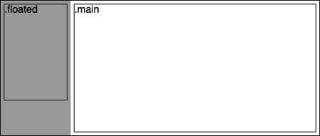
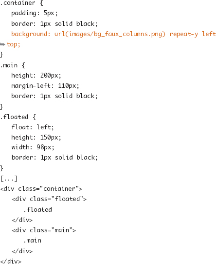
In the previous float example, you’ll notice that the height of the left element is shorter than the right. If you were to place a background color or image on this element, it wouldn’t extend past this element to cover the entire left gutter or column. A background image on the containing element will continue through the whole space, so use that opportunity to apply a background image to provide the appearance of full-height columns. The left column in Figure 7.3 is an example of this faux column technique.
Figure 7.3. Background image on the container element providing the appearance of a column that extends past the content.
Background images don’t have to be used for clean rectangular columns either. Any parent element right up to the document body is a great hook for applying diagonals, ribbons, waves, or some other graphical appearance that flows between the “physical” boundaries blocks or columns of a page.
Layering Background Images
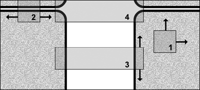
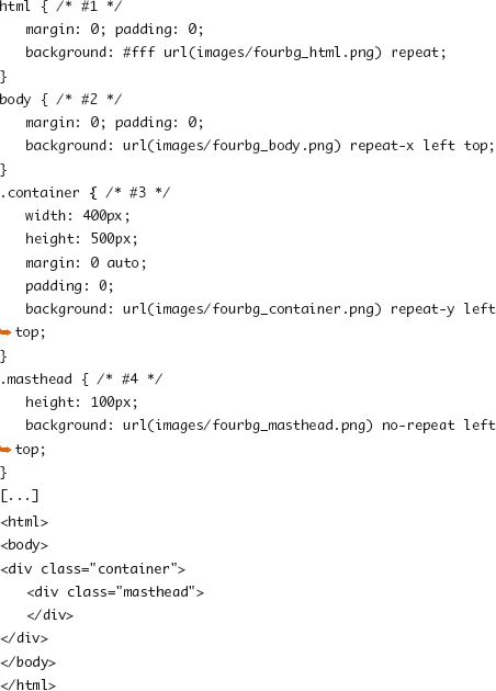
It is often the case that background images don’t cleanly tile or they tile for most of any given direction but then break or shift when interacting with a content element. Imagine implementing a design that has some background elements that repeat horizontally, different ones that repeat vertically, some that don’t repeat at all, and one more that repeats in both directions. An inefficient solution would be to make one 10,000 by 10,000 pixel graphic and hope a browser never gets bigger than that.
A more flexible and efficient solution is to deconstruct the background into smaller pieces and then find the element that is best suited to which to apply each background image. The example in Figure 7.4 (on the next page) uses the html, body, and two other elements to overlay four separate graphical pieces.
Figure 7.4. A composite of four separate background images working in coordination.
Note
CSS3 includes support for multiple background images on a single element, which provides quite a few more options for layering images. See Chapter 14.
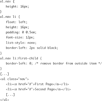
Inline and Floated List Items
All types of content in a document can be described in lists. Quite often, as is the case for many navigation bars, tabs, and image thumbnails, these structural lists aren’t presented as a bulleted list but in a horizontal format. The following code shows a basic example of text-based navigational elements with vertical separators (Figure 7.5).
Figure 7.5. A set of navigation-based list items floated into a horizontal format.
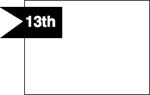
Using Positioning to Escape Containers
Though the goal of the relatively positioned content blocks described earlier was to create a self-contained area from which to work from, it can be useful to position the parts of those blocks to break out of the four sides of that container. Negative margins were discussed in Chapter 5, but here negative values for positioning are also useful, as demonstrated in the following example (Figure 7.6).
Figure 7.6. Negatively positioned element breaking its container.
Overlays, Tooltips, and Drop-Down Menus
Tooltips, drop-down menus, and overlays can be coded in a similar fashion as the example shown earlier in Figure 7.6. The difference with these types of elements is that they typically start as hidden and then through interaction change presentation.
Chapter 14 of The JavaScript Pocket Guide by Lenny Burdette (Peachpit, 2010) covers drop-down navigation in depth and includes the following code, which changes the state of the positioned submenu list.

Hiding Elements: display vs. visibility
Two ways hiding content can be accomplished are via the two properties display:none and visibility:hidden. In the case of the visibility property, the content continues to occupy the space in the document flow that it would normally. For the display property, since the element is no longer a block, inline, or other type, it is removed from the document flow as if it didn’t exist. Unless holding that space open for laying out other elements or maintaining its properties such as height and width is important for other feature of the page (like in some JavaScript interactions), display is typically used.
Multicolumn CSS Layouts
You can use all the tools described in the “Building Blocks of CSS Layouts” section of this chapter for creating the main layout grid for handling the header, footer, and content areas of the page.
The most common approach, because of its flexibility with regard to content lengths, source order, and markup structure, is to use some variation of the “float into margins” technique.
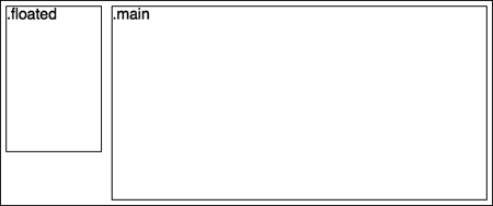
A Two-Column Layout
If you were to make the .main and .floated blocks earlier in the chapter (Figure 7.3) wide enough, then you have a two-column layout. That isn’t all there is to do, however, because that example has two important points of failure:
• If the sidebar column is taller than the main content area, it will escape the bottom bounds of the container and force the wrapping of the following content such as the footer.
• The code provided requires the floated element to appear before the main content area in the source HTML document, which may be undesirable.
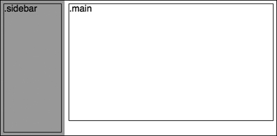
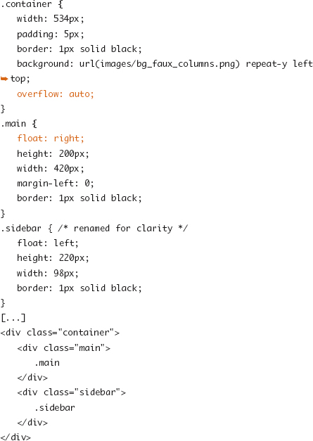
Both problems can be solved with minor changes, as the following example demonstrates (Figure 7.7).
Figure 7.7. The results of changes to the earlier two-column layout.
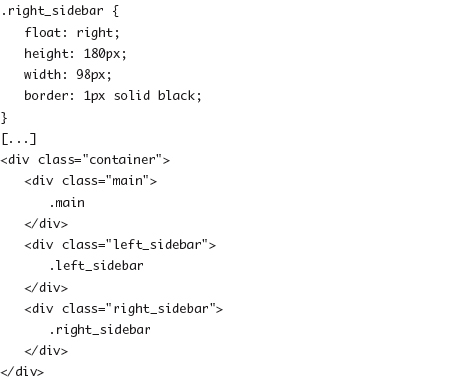
Two Columns with Right Sidebar
You’ve now seen examples of a two-column layout where the first or second column appears on the left. Creating a sidebar on the right just means putting these pieces together and getting the widths and spacing settled. Don’t forget to swap the background image as well! The following code shows changes from the code used in the Figure 7.7 example to place the .sidebar element on the right:

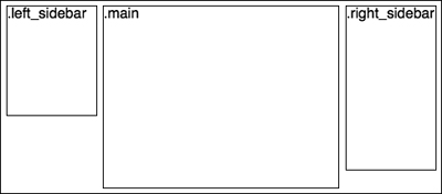
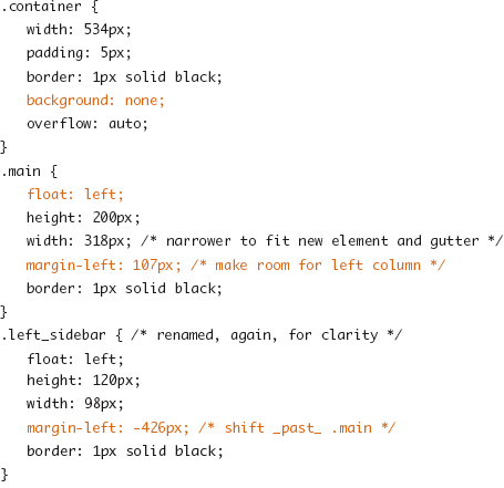
A Three-Column Layout
You can easily extend the previous two-column layout to incorporate a margin wide enough to float two of the three columns into. However, the size of the main column or the source order may dictate that a different arrangement is needed. Here is some trickery with floating and negative margins to get small left and right columns and allow the main content area to be first in the document (Figure 7.8).
Figure 7.8. A three-column, fixed-width layout.
Tip
A variation of this arrangement and in-depth description can be found in the A List Apart article “Multi-column Layouts Climb Out of the Box” (http://www.alistapart.com/articles/multicolumnlayouts/) by Alan Pearce.
Fixed-Sized, Flexible, and Mixed Columns
The previous layout examples were made with fixed-width columns in a fixed-width container and as a result are called fixed-width layouts.
Flexible columns based on percentages are called liquid layouts because they flow to fit the dimensions of the browser. Liquid two-column layouts can be just as easily made as their fixed counterparts. Moving to three columns can be a bit trickier, especially when source order considerations dictate the negative margin “jumping” column. This is because percentage margins are calculated relative to the width of the element the margin is applied to, not the containing block’s width, so unless the ratios of sizes of each column are simple, it may not be easy to define what “a margin equal to the width of that other element” is.
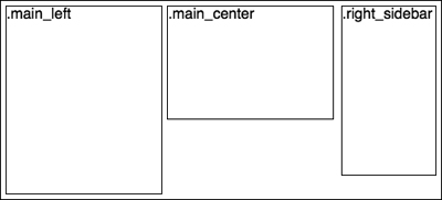
Mixed-column-based layouts don’t have a fancy name, but they consist of both fixed-dimension columns and percentage or autowidth columns. Sometimes these or other complex arrangements are accomplished by nesting sets of containers and columns. Figure 7.9 and the following code illustrate a fixed-width right column and two additional columns that grow to match the container width.
Figure 7.9. A mixed column layout with two flexible content columns and one fixed-width sidebar.

You may be looking at that previous example and thinking that the math doesn’t add up, and you’d be right—it doesn’t. When mixing percentage measurements, you have to fudge the numbers just a little. A 50 percent width plus another 50 percent width plus 4 pixels worth of borders plus a 5-pixel margin is clearly greater than the 100 percent width that the container has to spare. It is a better bet that 96 percent of that space will leave 9 pixels to spare, which, in this case, will be true so long as the container’s content width is at least 225 pixels (9 pixels / (100 percent − 96 percent) * 100). If the content width is larger than 225 pixels, that 4 percent width will be larger than 9 pixels, but in many situations, those few extra pixels are a fair trade-off for having a mixed layout.
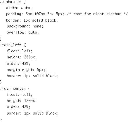
Designing with Constraints
Flexible columns are often the best solution for a Web where every visitor has a different screen size and browser size, but that doesn’t take into account that the content often has a role to play as well. Content columns that are too small may not fit images or video content, and when they get too wide, the content may be difficult to read. Secondary columns too may have constraints or optimal sizes. Mixed columns can be the best solution.
You can use the min-width and max-width properties to cap the size of otherwise liquid columns or column wrappers. In the following code, the container used in the previous examples is allowed to grow to between 600 pixels and 1000 pixels and then is centered on the page if it goes beyond the maximum width.

Chapter 12 covers media queries, which let you match browser or device dimensions (or other properties) with different CSS code. This can be yet another method of introducing a flexible, adaptive layout with constraints.