
13. Resets and Frameworks
In the previous chapters, the focus was on understanding the building blocks and elements that make up the language of Cascading Style Sheets. In Chapter 7, we used those elements to create some commonly used layout and grid structures.
But often, the task of building a web site does not start with rebuilding all elements from scratch; instead, it often starts with reusing elements by drawing from a library of code you’ve previously written or open source code for libraries or elements that you can use.
CSS Resets
In the Chapter 2 discussion of browser- and user-created style sheets, you saw how the default styling for common elements such as paragraphs, links, and forms can be different from each other. Building a site on this inconstant foundation can make cross-browser consistency a more difficult task than it already is.
A CSS reset creates a common baseline to work from and zeros out some or all aspects of browser default styling. For example, it is common for browsers to have padding set on the <body> element so that plain HTML content has a little room to breathe. However, it may be easier to style a site if you are instead starting exactly the top-left corner. Font sizes, padding, margin, table properties, and form elements are all typical candidates for being “reset.”
Using Resets
It is common to include a reset file so it is the first CSS code that the browser encounters. This is done by inserting its contents into the beginning of the main style sheet for the web site, by referencing it directly using a <link> element before your global style sheet, or by using an @import statement at the beginning of the main style sheet file, similar to the following:
@import url(reset.css);
There isn’t much to a reset, but a few solid examples have evolved over the years. They’re written to normalize inconsistencies between the default setting of various browser or trimming down default rules when they’re too overbearing (as in the case of form elements). Whichever one you use, look it over before you use it on a project to make sure it isn’t doing anything you don’t want (such as setting colors or font sizes).
Eric Meyer’s Reset
Eric Meyer’s Reset (http://meyerweb.com/eric/tools/css/reset/index.html) is widely used and can be found at the core of many larger projects including some of the frameworks discussed later in this chapter.
YUI Library CSS Reset
The YUI Library CSS Reset (http://developer.yahoo.com/yui/3/cssreset/) is similar but handles a few properties differently, including applying foreground and background colors. It is available to link to directly from Yahoo!’s servers, which can help with download speed and caching.
HTML5 Reset
The HTML5 Reset from Richard Clark (http://html5doctor.com/html-5-reset-stylesheet/) builds on the Eric Meyer’s Reset and makes some modifications to sync with new or deprecated elements in the HTML5 specification.
Why Not Reset?
There are two strong arguments against resetting.
Resets can be a blunt instrument. A rule such as * { margin: 0; padding: 0; } may have undesirable effects on form elements. On the flip side, explicitly picking a list of elements may mean some elements (old deprecated elements such as <center> or new HTML elements such as <article>) slip through the cracks.
Not resetting in the first place means not having to re-create common styles like those for emphasis, list indentation, and bullets that were already set by the browser. Also, edge cases or little-used HTML elements (<dl>, <cite>, <legend>) and markup patterns (<ul> in a <blockquote>) must be tested to make sure that content added to the site later is properly styled.
The type of content appearing on the site will weigh heavily on the appropriateness of a reset. A text-heavy site such as a blog may want to leave more of the browser styling intact, while an application or e-commerce site that relies on smaller content elements may want to be more controlled. Ultimately, the choice to zero out styles at the beginning of a project’s code is one of taste and how you prefer to work rather than one of purely technical merit.
Cross-Browser CSS via JavaScript
You can use a CSS reset to create an even starting point for styling individual page elements. But they don’t create that same level ground for browsers’ support for newer selectors and CSS properties. A drop-in JavaScript bridge library may be a convenient way to bridge the gaps in CSS support so that older browsers function like more recent browsers.
When the included library loads, it will typically test the browser’s support against a list of CSS features. If a feature is supported, the script will do nothing. However, for those unsupported features, it will comb the style sheet code for their use and then attempt to replicate the behavior of the unsupported CSS through scripting.
You can use JavaScript to check for all CSS 2.1 or CSS3 features missing in a browser, and other libraries are written to target specific gaps in support.
Common Bridge Libraries
There are many JavaScript bridge libraries available to use on your projects, each approaching the task of extending support for the CSS code you’ve written in different ways.
IE7.js
The goal of IE7.js (http://code.google.com/p/ie7-js/) is to make Internet Explorer 5.5 and 6 behave like and support the features of Internet Explorer 7. This includes fixing some HTML and CSS bugs as well as adding support for alpha-transparent PNG images. This may seem like a baby step, but if IE7 is among your target browser matrix and your code is already stable there, you may not need to do more than this to get IE6 in line.
IE8.js and IE9.js scripts are also part of the project, by Dean Edwards, providing similar version bridging support (to match IE8 and IE9, respectively).
Selectivzr
Keith Clark’s ie-css3.js (http://selectivizr.com/) is an example of a project that aims to add missing selector support (::first-child, ::nth-child(), [attr], and so on) to Internet Explorer 6 through 8. It remains lightweight by leveraging other JavaScript libraries already included in the document, such as jQuery or MooTools, that have selector tools.
eCSStender
Aaron Gustafson’s eCSStender (http://ecsstender.org/) provides a flexible framework for all browsers for fixing browser bugs or lack of support as well as helping navigate the tangle of vendor extension usage in more modern browsers. Extensions are available that add support for CSS3 features such as transitions, transforms, and rgba()/hsla() colors in older browsers.
Modernizr
Unlike the previous libraries mentioned, Modernizr (http://www.modernizr.com/) does not itself add support for any missing feature or browser bug. Instead, it provides feature detection, the results of which can be referenced from your CSS or JavaScript code. Classes such as .multiplebgs or .no-multiplebgs are added to the <html> element of your document, allowing you to define an alternate set of styles.
More Targeted Solutions
Another class of scripts does not attempt to fix a group of CSS features or fix a specific browser’s problems, instead targeting a very specific CSS feature.
The rounded corners discussion in Chapter 8 mentioned using JavaScript to create DOM elements to apply rounded corner effects for browsers that do not support the border-radius property. CurvyCorners (http://www.curvycorners.net/) is one library that does this for you and is an example of a library that is used to target one specific gap in browser support rather than going after a larger class of problems.
Why Not Use JavaScript?
These JavaScript libraries can be useful to bring a browser in line with the A-grade browsers you’re targeting with your CSS code, but they can be overkill. By design, many of these libraries attempt to fix most or all problems with a browser, whereas your project may have only one or two unsupported features or browser bugs that need to be fixed. Why load a script to add support for the :not() selector or border-radius property if it doesn’t appear in your code?
When there are just a few features that would have to be fixed in this manner, it may be more efficient to find alternate ways to code the effects through CSS and HTML rather than turn to scripting. There may be other selectors you can use, for example. In browsers with lower usage, it may be OK just to leave things unsupported.
Likewise, if you are tasked with building a site where you know you have older browsers in that A- or B-grade classification (Chapter 2), you probably will want to avoid some of the unsupported selectors or cutting-edge CSS3 features while building the site. This will ensure that your targets are met and your site displays properly, even without JavaScript enabled, in the largest segment of your user base.
These bridge libraries are best when you have a few noncore elements of the design you’d like to see supported in a wider space or when you’re looking to help out the lower-grade browsers that you’d still like to deliver the full experience to.
CSS Frameworks
With so many millions of sites being designed each year, it is a good assumption that any new project that comes along will have a layout grid or other layout properties that may have already been built for another site. Perhaps there are details or contexts of content items that will be unique, but patterns will emerge from the layout grid or other areas that can be transferred from one project to another.
Open source frameworks allow developers to share these patterns and conventions, start with a tested baseline of code, and spend time on the specifics instead of retyping code.
These frameworks include not only a style sheet but also HTML markup patterns and examples for accomplishing common tasks such as a layout grid.
Tip
If you’re using a popular content management system (CMS), there may be a theme or template that combines a CSS framework with the basic markup and application features already included. The Sandbox theme for WordPress is a good example of this generic baseline with which to work from.
Common CSS Frameworks
Far from a comprehensive listing, here are a few frameworks that have become popular because of the quality of their code and their flexibility.
Blueprint
Blueprint (http://www.blueprintcss.org/) provides a broad starting point for starting to build a site including a reset, layout grid tools, and baseline typographic and form styling. There are also plug-ins or examples for common content elements such as tabs, buttons, and iconography.
960
The 960 grid system (http://960.gs/) takes a 960-pixel area and allows you to specify a 12- or 16-column grid with 20-pixel gutters between them. This split, and the code that is generated and provided for you to place content in the grid, allows you to quickly put a page layout together. The sizing and spacing rules offer a very controlled grid to design a site from without being too restrictive.
Object Oriented CSS (OOCSS)
As much code philosophy as framework, Object Oriented CSS (http://wiki.github.com/stubbornella/oocss/ or http://oocss.org), spearheaded by Nicole Sullivan, focuses on content elements first. It breaks down the content into pieces and modules and uses their similarities to define a common language of content labels applied as class names. This is particularly useful for large sites because it takes full advantage of the cascading aspects of CSS to help maintain consistency across the many different content types typical of larger web sites.
YUI Library
The Reset file I mentioned earlier is just a small part of the YUI Library. The larger project is comprised of a baseline set of CSS files, baseline JavaScript files, and components for common web application interface components such as cookie access, drag-and-dropped elements, date pickers, and sliders. Similar interface widget libraries are available from jQuery UI, script.aculo.us, and MochaUI. They all provide a collection of widgets to choose from and rules for embedding and skinning those content elements, but they do not offer the more general reset and framework aspects that YUI does.
Why Not Use a Framework?
Like any other tool, frameworks are developed with certain priorities based on the specific problems developers are attempting to solve. As they evolve, they may become more generic, but each framework maintains these priorities that are sometimes not the same as your needs on any given project.
For instance, the YUI tools tend to be a bit more web application focused, and OOCSS works best when the site is complex enough to have the depth of content types to manage. Attempting to go against the grain will cause you to write more code than what you’d save and will cause you more headaches than starting from scratch.
Beyond Frameworks
Frameworks provide a starting point to begin developing a web site, but they don’t change how you write and edit CSS code. All the rules of inheritance, specificity, source order, and syntax discussed in this book continue to apply for any site-specific code you add on top of a chosen framework.
There is an emerging class of tools for authoring and generating CSS code that makes small modifications to the language and allows helpers such as variables and selector nesting to be used. These changes remove some of the repetition and document searching that typically come with building and maintaining styles for a larger site.
CSS Preprocessors
To turn the written code back into code in a syntax, browsers understand a conversion layer (preprocessor) is added as a compilation step via tools on your local development machine or via server-side scripts.
Less
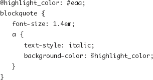
Less (http://lesscss.org/) is a Ruby gem that adds the ability to include the CSS rules from one selector into another (a mixin), selector nesting, simple mathematical formulas, and variables that stand in for values so that colors, sizes, and other values need to be typed only once. The following is an example of both a variable definition and a nested rule as written using Less:
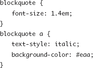
The previous code gets compiled into the following final code that gets sent to the visitors’ browsers:
Sass
Sass (http://sass-lang.com/) is also a Ruby gem and offers variable, mixin, math, and nesting features similar to Less. It has two different syntaxes to choose from, one similar to CSS (and Less) and an alternate syntax that breaks from the brackets and colons of CSS into a tab-based style some may find more readable or manageable.