8. Backgrounds and Borders
Through the color and images of backgrounds and borders, a site’s owner or creator can transform bland pages of text into designs that convey a mood, aesthetic, and branding. That is asking a lot of just two seemingly simple properties, but as you’ll see throughout this chapter, they’re very flexible and powerful properties.
Backgrounds
Backgrounds are an integral part of styling an HTML document. Solid colors, patterns, tiles, gradients, unconventional borders, and nonrectangular shapes can all be achieved by applying the various background properties to the right element.
background-color
The background-color property is applied throughout the content area of the element and is drawn behind any background-image that is set.
• <color>: The color of the background
• transparent: No color fill for the background (default)
background-image
The background-image property is used to specify a background image for an element.
• <uri>:The path to the image file in the format url(path) or quoted with single or double quotes such as url("path") and url('path').
• none: No background image is used (default).
The <uri>, when a relative path, is calculated based on the location of the document containing the given style rule and not the source HTML document (unless they are one and the same). This way, you don’t have to worry about paths working the same from the HTML documents index.html and /blog/2010/07/27/post-title. It also makes it easier to move the assets together onto a new server or content delivery network.
Note
In most situations, it is suggested you set a background color even if it will be covered by a background image. A slow or bad connection can sometimes mean an image doesn’t load or content can become too large for the area covered by a nontiling image. Choose a background color that is sampled from the image or pattern used to maintain the desired readability and visual contrast between the content and the background.
background-repeat
The tiling of background images is set with the background-repeat property. The following keywords are the most commonly used values:
• repeat: The image tiles in both directions (default).
• repeat-x: The image tiles in the horizontal direction.
• repeat-y: The image tiles in the vertical direction.
• no-repeat: The image does not repeat.
background-attachment
The background-attachment property defines how a background position is determined.
• scroll: The background is fixed with respect to the specific element and scrolls along with it in the document. (This is the default.)
• fixed: The background is fixed with respect to the viewport and does not scroll with the element; it appears only when that element is “over” its position in the viewport.
background-position
The background-position property specifies the position of the background image (or the positioning of the first background-image tile when repeating) given as a set of two values: horizontal and then vertical.
• <length>: A fixed length for the offset from the upper-left corner.
• <percentage>: A percentage offset relative to the difference between the size of the container’s content area and the size of the image; width is relative to (width of container area minus the width of background-image), resulting in a value of 50% being centered and 100% touching the right edge.
• top: Equivalent of 0% for the vertical position.
• right: Equivalent of 100% for the horizontal position.
• bottom: Equivalent of 100% for the vertical position.
• left: Equivalent of 0% for the horizontal position.
• center: Equivalent to 50% for either position.
A background-position of 0% 0% is the default (the equivalent of left top).
Note
When defining the background-position property, it is best to use the same unit type (<length>, <percentage>, <keyword>) for both the horizontal and vertical values. Mixing unit types may yield unpredictable results.
The CSS3 specification adds the ability to use pairs of values where the first of the pairing describes the edge measured and the second the offset length or percentage from that edge. At the time of this writing, however, no major browsers support the offset syntax.
background-position: right 50px bottom 10px; /* positioned
50px from right edge and 10px from bottom edge */
background (Shorthand)
The background shorthand property allows for assigning the individual background properties (background-color, background-image, background-repeat, background-attachment, background-position) in the same place.

Note
Like other shorthand properties, when individual properties are left out of the shorthand background property, they are set to their initial values. Therefore, background: rgba(45,45,45,0.5) as in the first example in the previous code would remove any previously defined background images. Use background-color to set color while leaving other properties alone.
Multiple Background Images
CSS3 defines a way to apply multiple background images to a single element. Supported by Firefox 3.6+, IE 9 Preview, Safari, and WebKit mobile, it may not be ready for use on many projects but may be useful in some situations such as targeting Apple devices. Multiple background images are assigned with comma-separated values for the background-image property (with the earliest image appearing closest to the user). After doing so, the other background image–related properties take matching comma-separated values or a single value applying to all images.
background-image: url(top.png), url(bottom.png), url(middle.png);
background-repeat: no-repeat, no-repeat, repeat-y;
background-position: center top, center bottom, center center;
The previous code would set up nonrepeating top and bottom images with a tiled image the height of the element beneath them.
Strategies for Background Images
Background images are the most powerful tools in the web designer’s toolbox because they can be used in so many different ways. There is no officially sanctioned correct way to use backgrounds, but with experience, you’ll notice a few patterns that emerge and common elements to which you can hook backgrounds.
Backgrounds Bigger Than an Element
If you remember the days of using HTML tables for page layouts, you certainly have sliced up your fair share of images into pieces that fit a specific cell only to reassemble them later.
There is very little reason to slice an image for use in CSS. If it appears as a cohesive graphical element in the source Photoshop document, then it can most likely remain so in the HTML build if you find the right element to which to attach it. A typical HTML document structure has a body, a wrapper for the header, center columns or footer, various sections or articles, and then finally the text. Find the element in that hierarchy that is best suited to which to attach the background image.
Stretching the size of an element with excess padding just to make space for an image is common practice when working with columns or link icons. Overlapping elements with negative margins (Chapter 5) can be a great way to get that background image attached to the header element to bleed into the content of the page.
Custom Bullets and Iconography
Applying a custom bullet to list items can be done via the list-style-image property (Chapter 10), but positioning is not as flexible as with background-image. By turning off list bullets entirely and extending the content area of the list item via padding-left, you can make room to shove a new image into (Figure 8.1):
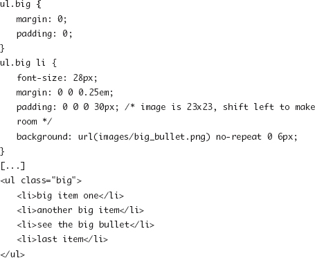
Figure 8.1. Icons placed in gutter created by padding.

The same method is applied for iconography like PDF icons next to links that match the selector a.pdf or a[href~=.pdf] or warning signs before any p.note.
Connecting Backgrounds
Elements such as section headers or tabbed boxes may have fancy borders that “open up” into the content below like the tab on a folder. Because the position of the tab on that folder varies, the opening in the top of the content area needs to change. Here again you can use visual tricks to make the elements backgrounds overlap. The following sample (shown in Figure 8.2) uses borders, background colors, and relative positioning to shift the header into the content that follows and create the appearance of a nonrectangular border:
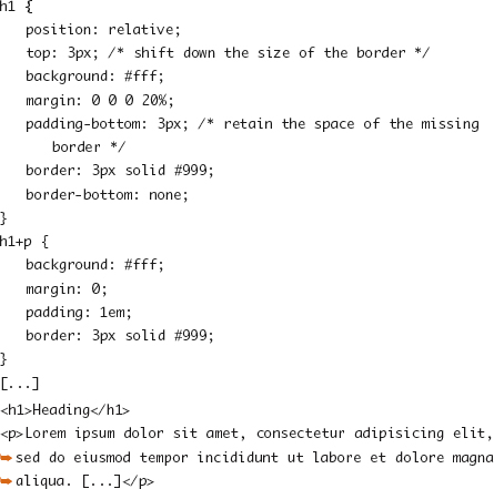
Figure 8.2. Relative positioning on the heading element, which causes it to appear over the border of the following paragraph.
Smart Tiling
Whenever using background images with elements that can become quite long on one end or another, such as the height of a content column or the width and height of the body element, there are two options for covering the full length of that block: You can pick a design that can tile, or you can make the image ridiculously big.
The ribbon pictured in the first part of Figure 8.3 (on the next page) cannot be tiled horizontally as the background image on the <body> element without repeating the dip at some point. Make the image 4000 pixels wide and continue the flat horizontal lines, and you may be confident no one will see the dip again; however, the file size and overhead once the image is loaded will be large.
Figure 8.3. Repeating pattern with a break, separated into two parts.
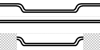
Splitting the image into two pieces, one that tiles and one that sits above and covers up the tiling portion, can solve the problem:
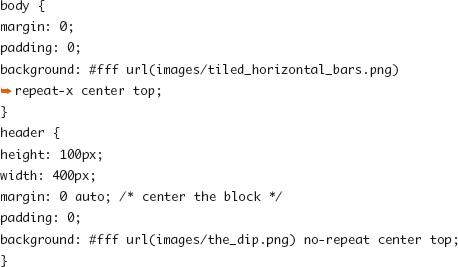
When working with the background of the document, you have an added challenge that you don’t want to extend the content areas unnecessarily and create scrollbars on the viewport. Don’t forget that in addition to the <body> element, <html> can also be styled and used as another layer before you have a need for wrapper elements or other artificial hooks.
Background Image Sprites
The performance impact of having many requests for many different image files used as backgrounds and icons around a web site can be quite large. This can be exaggerated if you have button or icons that have multiple states or you are working with mobile devices where server requests can chew up both bandwidth and battery life. Creating a sprite (one image file that contains multiple graphical elements) and then using background positioning to shift the image so that only the desired section of the sprite is visible is a common way to trim down the overhead of these requests.
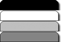
Take the four different tab “states” shown in Figure 8.4 placed in the same graphic file.
Figure 8.4. A typical sprite image.
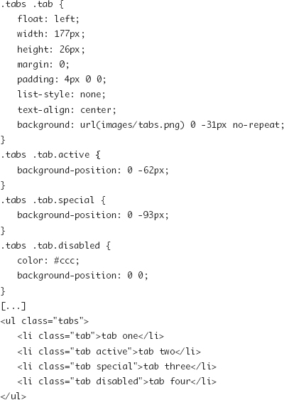
Each section of the image graphic file can be individually applied to a tab by repositioning the file until the desired part of the image is aligned (Figure 8.5 on the next page).
Figure 8.5. Applying a sprite-based background image.
Note
Placing every image used on a complex site into the same sprite file may create a management nightmare. Look to create sprites that represent similar types of images and balance complexity with request and performance overhead.
Border
In Chapter 5, border was introduced as the border on a block element that is drawn between the padding and the margin of an element. Borders are drawn in front of the element’s background, which has an impact on the display of border styles with gaps (dashed) and with background positioning.
border-color
The border-color property takes one to four <color> values signifying the colors for the border on each of a block’s four sides. Like with margin and padding, when one color is provided, it applies to all sides. With two, the first value applies to the top and bottom, and the second applies to the right and left. With three, the first applies to the first top; the second applies to the left and right; and the third applies to the bottom. With four values, it applies to each side clockwise from the top. border-color can be expanded to border-top-color, border-right-color, border-bottom-color, and border-left-color.
border-style
The design of the border is set via one to four keywords assigned to the border-style property.
• none: No border drawn
• dotted: A series of “round” dots; roundness varies by browser and border width
• solid: A solid line
• double: Two solid lines separated by a space
• groove: Looks like a groove has been carved by the border
• ridge: Gives the look of a ridge coming out of the canvas
• inset: Gives the appearance that the content was inset into the page
• outset: Gives the appearance that the content was raised from the page
For dotted, double, groove, ridge, inset, and outset, a small border-width value may alter the desired appearance—you cannot round a single pixel dot or find the room within two pixels to draw the two lines and a gap of a double border.
Like border-color, border-style can be expanded into four border-*-style properties.
border-width
The size of the border for each side. See Chapter 5.
border (Shorthand)
The border shorthand property accepts up to three values representing border-width, border-style, and border-color.
Additional shorthand properties are available for the individual sides of a block as border-top, border-right, border-bottom, and border-left.
border-radius
border-radius was introduced in CSS3 to allow for rounded corners by providing a radius for the roundness of each corner. Experimental support is included in recent versions of Firefox and Safari by way of vendor extensions and in Opera and the upcoming IE9 directly via the border-radius property. To further complicate things, Firefox has a slightly different order in addressing the individual corners of a block.
The shorthand property border-radius can be expanded (Figure 8.6 on the next page), as shown here:
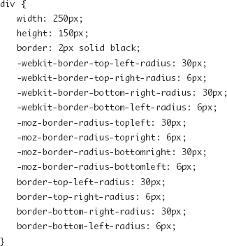
Figure 8.6. border-radius set independently on each corner.

Tip
Web-based tools such as http://borderradius.com/ provides an interactive tool for setting the border dimensions and generating rules for the various vendor extensions.
A rounded corner with border-radius does not require a border of any dimension. Without a border, the background of the element will still be rounded and cropped. When mixing border styles (Figure 8.7) and sizes, browsers will do a best guess to smooth the transitions.
Figure 8.7. Example of mixed border styles.

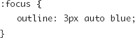
Outline
Outlines are a special visual property that behave similarly to borders but take up no space in the layout. Outlines are used most often to show focus on a link, active form field, or other element. They can also be useful as a debugging tool—they will highlight an item without shifting its position.
Outline properties are similar to border properties, with the exception that they do not have separate definitions for each of the four sides.
outline-color
The color of the outline.
outline-style
Uses the same style keywords as border does, with the addition of the keyword auto, which is mapped to a device default outline style (or solid).
outline-width
The width of the outline.
outline (Shorthand)
The outline shorthand property accepts up to three values representing outline-width, outline-style, and outline-color:
Faking Rounded Corners
The border-radius property has growing support with every new browser update, but sometimes design or branding elements are not optional, and you have to find other ways to create the appearance of rounded corners. Clever use of background images can be a way of re-creating the rounded corner look.
This section is not just about re-creating the effects of the border-radius property, but it also demonstrates the use of many of the background properties that are used earlier in the chapter.
Using a Background Image
With all these great new CSS3 properties being supported, it is easy to over-think and over-engineer solutions to design problems. Particularly when the design requires background images to already be used (so there’s no additional bandwidth or maintenance hit), then it may just make sense to create the rounded corner right in the graphic already being used, as in Figure 8.8.
Figure 8.8. One background used to simulate rounded corners.
One Fixed Edge
If a block has one side that is a fixed length but one that expands or contracts based on the space in the layout or the amount of content in it, then rounding all four corners of that box can be faked with just two separate background images, as shown in Figure 8.9 (on the next page). Usually you can leverage the markup already in the document to attach these two backgrounds to, but sometimes it may require adding a second wrapper element or empty element at the beginning or end to offer the “hook.”
Figure 8.9. Two backgrounds used to simulate rounded corners.
This method is quite easy to implement and maintain, and the pattern of having one fixed dimension occurs often in columns, sidebars, and rounded buttons. There are two drawbacks: First the longer (bottom) image can be required to be quite large if it needs cover an unknown amount of content, and second the bottom image can bleed through the outside of the corners of the top element if the outside of the corners is transparent.
Note
Why not use multiple background images on one element to do this? The same older browsers that don’t support border-radius do not support multiple background images.
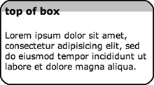
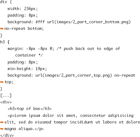
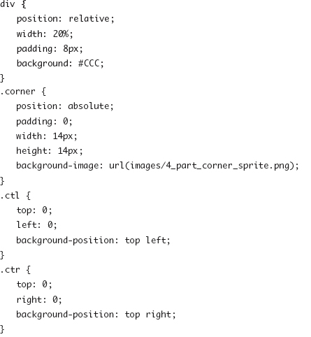
Four Corners
In Chapter 6, while learning about absolute positioning, you saw an example (refer to Figure 6.1) that took four small boxes and placed them into each corner of their parent element. You can use this pattern to create hooks to attach background images to, representing each of the four corners. Though this method has more overhead than previous methods and requires some added markup, the results are more flexible than other solutions. Figure 8.10 combines the four positioned corners with a background image sprite.
Figure 8.10. Four backgrounds used to simulate rounded corners.
Tip
Using JavaScript to add these four corner elements into the HTML DOM on the fly is a useful way to keep presentational elements out of your markup and keep your code lean, especially if you are rounding multiple different blocks on a page.
Drawing Pixels
Taking the positioning of empty elements to an extreme, you can create 1×1 boxes and meticulously re-create the pixels that draw the corners of a containing block. This can allow for visual tricks such as anti-aliasing and changing border radius without having to re-create background image files, but it also makes for lots of code and markup overhead.
Like with the earlier four corners solution, you can use JavaScript to create, plot, and position these extra elements, giving them proper background-color. An example of this method is implemented in the Curvy Corners JavaScript library (http://www.curvycorners.net/), which uses the border-radius property in the CSS document to draw in the rounded corner when loaded in a browser that doesn’t already support border-radius.
Border and Background Enhancements
Beyond multiple background images and rounded corners, CSS3 has a few other tricks in store that will quickly find their way into web developers’ toolboxes. Creating color gradients for background without the use of images and creating borders with images are both covered in Chapter 14.