
2. Web Browsers
Web browsers and their openness to consume what the world serves up are why we are able to design such rich sites that are easy to update and alter. Browsers are the yin to the web server’s yang. But as a content creator, the plethora of browsers can be a drag.
In this chapter, you will see some of the ways web browsers impact your CSS code, learn how to embrace the different platforms and devices that may view the pages you build, and see some frequent browser-related quirks and common ways to deal with them.
Where Do Styles Come From?
Before any document-specific styles are applied to your pages, browsers apply certain styles based on a combination of browser defaults, application preferences, and advanced user customization.
Browser Style Sheets
Every browser ships with a default or base style sheet. From browser to browser, these settings are common—headings are larger than the base font size, links are underlined, lists have bullets, and some space appears between individual paragraphs.
Browser vendors pick the styling based on a mix of accepted practices and what will work best on their specific operating system and device. These base style sheets act as the foundation for displaying all web pages.
Often, as in the case of lists and bullets, you may choose to not write your own CSS and just go with the defaults. Or, you may want to alter just one or two of these properties and let the rest be, such as changing the margin and padding for list items but leaving the bullet style for list items alone.
If you are the curious type, you can find all eight files that make up the default style sheet for Firefox 3 via the internal URL resource://gre/res/. Internet Explorer’s base style sheet isn’t as accessible, but Jon Neil has tried to reverse engineer it, placing the results at http://www.iecss.com/. One look at either, and you’re sure to be overwhelmed.
You can simply ignore many of these settings, but some such as margins or padding make creating consistent presentations difficult. In Chapter 13, I’ll cover using a “reset” to zero out some of these base style rules to provide an even starting point to code against.
User Settings
In addition to a browser’s baseline list of styles that it applies to HTML elements, most browsers allow users to customize a few style properties to make reading and interacting with web sites easier (Figure 2.1).
Figure 2.1. Preferences dialog box in Opera 10.54 for OS X.
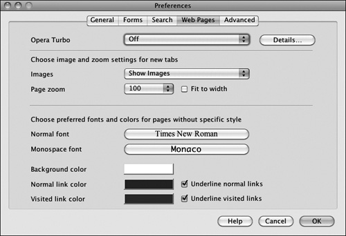
Through a browser’s preferences, users can often set whether their browser supports images, the base font size and font family it uses, and the behavior of certain features such as links.
User Style Sheets
Being able to control font sizes and colors is only the beginning. Many browsers offer the ability to go beyond the preference dialog boxes and allow a CSS file to be loaded and applied after the base browser style sheets and before the styles dictated by the Web. This user style sheet can contain any and all of the same rules that you might use to design a web page.
Tools such as the Stylish Firefox extension (http://userstyles.org/) provide users who don’t know CSS with sample style sheets and an easy way to load them for all sites they visit or to customize specific sites they frequent.
Rendering Modes
The teams building web browsers have the unenviable position of needing to support the way things have historically worked in their browsers while at the same time fixing bugs and supporting new work by the W3C. It may seem like web developers should abandon old and buggy behavior in favor of progress, but the reality is that hundreds of thousands of web sites may have been built, tested, and published with old behaviors in mind.
As a compromise, browser vendors have come up with a way they can be backward compatible while adhering to emerging web standards at the same time. The solution is to support multiple rendering modes and provide a way to switch between those modes at the document level via the DOCTYPE declaration.
Standards Mode
Under Standards Mode, browser rendering engines behave according to the letter of the standards. The CSS specifications are written to be backward compatible, so pages built to today’s standards should not behave differently under some new specification 10 years from now.
In other words, yet-unwritten standards will not change how color works or how font-family designations are written even if they add features such as font embedding or new color keywords. In extreme cases—such as with the box model updates—a new property is created to designate new behaviors should be followed, but the default behaviors should match the old specifications.
Note
Throughout this book I’ll be discussing various properties and how they behave according to the W3C and thus in Standards Mode.
Almost Standards Mode
Almost Standards Mode was developed as a compromise between the stricter Standards Mode rendering and the implications of <img> being an inline element. Under Standards Mode, images had a space underneath them just as text does—the space for text is reserved for the descender of characters such as g and q. This caused images sliced up and then recombined inside a table-based layout to suddenly not match up as they were intended. Almost Standards Mode is identical to Standards Mode with the sole exception that it closes up the space underneath images.
Quirks Mode
Quirks Mode is a legacy rendering mode in some browsers that allows the browser to behave like a previous version of that browser. Quirks Mode, by definition, works differently in various web browsers and does not fully follow any CSS specification. It is useful mainly for letting old sites live on without the need for maintenance and for allowing code built to work only in a specific browser to continue working.
Tip
Building new sites under Quirks Mode is difficult because of the behavior differences between browsers and the different ways they diverge from the CSS2 and CSS3 specifications. Stick with Standards Mode if you’re building new sites, and forget that anything else exists.
Choosing Modes with a DOCTYPE Switch
At the time that browser vendors were implementing rendering modes, the Web was largely a mess of invalid tag-soup HTML4, browser-targeted code, and “best viewed in ...” graphics. Only a few developers were writing valid code, reading specifications, and using DOCTYPES like those designating XHTML. This provided an opportunity to use the DOCTYPE declaration (or lack thereof) to indicate the type of code being written and therefore to switch between modes.
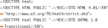
A missing or invalid DOCTYPE will put a browser into Quirks Mode, as will the following:
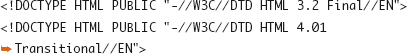
The following will put browsers into Standards Mode or Almost Standards Mode:
The Wikipedia article on Quirks Mode (http://en.wikipedia.org/wiki/Quirks_mode) contains a more complete chart of behaviors.
X-UA-Compatible
Having just two modes is not enough for some, particularly those building closed or internal applications using web technologies. Microsoft has shown concern that changes or fixes to the browser will break already tested and deployed code in ways that DOCTYPE switching alone could not satisfy. The X-UA-Compatible header, when set via an HTTP header or <meta> tag, was introduced as a way to lock IE8 and beyond into behaving like a specific older version of the browser. The following example tells the browser that it should behave like IE8 in Standards Mode:
The next example tells the browser to emulate IE7 and use the DOCTYPE derived mode:
More background and examples of values for X-UA-Compatible are available from Microsoft (http://msdn.microsoft.com/en-us/library/cc288325(VS.85).aspx).
Specific Mode Differences
If you want to know more (and aren’t content to just ignore that Quirks Mode exists at all), Jukka Korpela has a very detailed list of differences between Quirks Mode and Standards Mode in various browsers (http://www.cs.tut.fi/~jkorpela/quirks-mode.html). Peter-Paul Koch charted many of the differences in an easy-to-read table (http://www.quirksmode.org/css/quirksmode.html).
Targeting Browsers
In a perfect world, there would be no need to send or hide specific styles to specific browsers or find ways to accomplish something without CSS that there are clearly defined properties for. In the real world, you can get away with being almost perfect. Under Standards Mode rendering, sending different style rules to different browsers is not the norm, but some projects will require a small tweak here or there to pull a stray browser back into line.
Here I show three common ways to approach browser targeting and why they work. The first two are useful if you need to make minor changes, and the last is useful if you are making more regular changes, particularly if you have to develop for older versions of Internet Explorer.
Targeting with Selectors
The rules that browsers use to parse CSS selectors dictate that unknown syntaxes for selectors should cause the entire rule to be ignored. You can use that, combined with recent selectors that were not implemented in older browsers, to carefully craft rules for browsers. This can be one of the cleanest ways to target different features toward different editions of browsers or to offer fallback options for older browsers. You could write the following two CSS declarations:
html body { background-color: red; }
html>body { background-color: blue; }
Browsers that support the child selector will display a red background on the page, and those that do will display in blue.
Targeting with Syntax Hacks
Some browsers don’t quite follow the same parsing rules and handle what would be considered an error or invalid syntax in a unique manner. Over time, web developers have stumbled upon (or gone on quests to find) these differences and used them as “hacks” in some form of browser targeting.
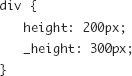
In the following example, most browsers will ignore the unknown property _height, but IE will instead ignore the _ character and consider it as a “height,” giving you a way to send a different value to IE if needed.
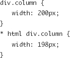
If you want to target IE6 and older, you might use the * html hack, which to most browsers will not apply to any elements because there is no element above the root <html> tag, but IE got that wrong until version 7.
You can find a compendium of CSS hacks and their dangers on swik.net (http://swik.net/CSS/CSS+Hacks).
The danger in using hacks of any nature is that it is impossible to control how future browsers behave in the same circumstance. Will a future Safari version parse your hack the same way but no longer need the changed value you’re feeding it? You’re leveraging incomplete support for specifications (or more directly, software bugs), and therefore you’re at the mercy of what fixes developers make over time.
Microsoft Conditional Comments
If you find you need to give a good deal of specialized code to Internet Explorer or that you don’t want to mix and maintain selectors or syntax hacks, you can use conditional comments (http://en.wikipedia.org/wiki/Conditional_comment). Using standard HTML comments (because non-IE browsers will ignore anything inside of them) and a few extra characters that tell IE to pay attention, you can feed IE or some specific version of IE a link to a style sheet with extra rules.
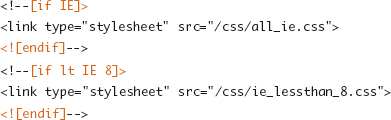
The downside to adding style rules in this manner is that you create two or three places where code for the same item resides, making it easy to forget to maintain each set of rules. A comment in the main CSS file designating where there is additional code can be a useful way to keep track of things:

The upside to conditional comments is that you have much greater control and confidence over what versions of IE will see your code than hacks can provide.
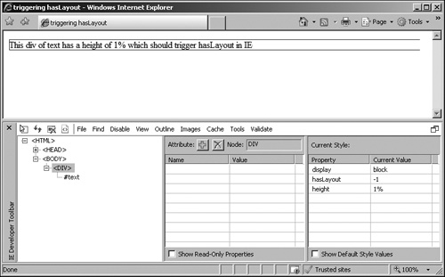
IE and hasLayout
In versions 6 and 7, Internet Explorer has an internal method of distinguishing when an element in the page needs some special layout features such as positioning or sizing. Based on the application of certain styles, such as height or positioning, Internet Explorer places an element into a bucket that gets extra layout handling or one that doesn’t. This internal flag is labeled hasLayout. The hasLayout flag was not meant to be exposed to those of us building web sites, but the internal architecture that relies on this flag is also the source of a few common CSS bugs. Figure 2.2 shows the indicator present on a <div> element in the IE Developer Toolbar.
Figure 2.2. An element with hasLayout revealed via the Developer Toolbar in IE7.
Unfortunately, the distinction between an element that goes into the bucket that gets the extra internal presentation logic and one that doesn’t leads to one of the most commonly attributed problem in Internet Explorer 6 and 7, called the Peekaboo bug.
The Peekaboo bug is so named because a block of content on a page may disappear (or flash in and out) while scrolling a page if the block does not have the hasLayout flag triggered. You can’t set the hasLayout flag directly, but you can “force” it into the proper state by setting one of a number of CSS properties for the element, including the following:

You can find an excellent discussion of hasLayout in “On having layout” (http://www.satzansatz.de/cssd/onhavinglayout.html), and Microsoft offers its own documentation on the property (http://msdn.microsoft.com/en-us/library/bb250481(VS.85).aspx).
Note
IE8 still has the hasLayout property internally, though its effects on layout behavior are mostly resolved.
Browser Grading
In the previous sections, I outlined a few methods commonly used to work with web browsers, both old and new, to make sure they’re handling your CSS properly and to target them when they don’t.
But creating all these different versions of code for different browsers, testing them thoroughly, documenting them, and maintaining them over time can be time-consuming and frustrating.
By creating a tiered support matrix of browsers, you can save time in development and help communicate the technical requirements clearly to your client, other developers on the project, the QA team testing and approving your work, and those maintaining the site and handling customer feedback.
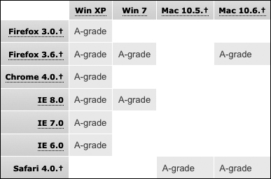
The specific breakdown of which browsers are most important and which browsers fit under other categories is a business decision that has to be made on a case-by-case basis. Yahoo!’s “Graded Browser Support” document (http://developer.yahoo.com/yui/articles/gbs/index.html) offers a well-reasoned explanation of YUI’s grading methodology and results (Figure 2.3) and is a common example I turn to when on a new project or when educating others about the benefits of grading.
Figure 2.3. YUI A-grade browser matrix.
This specific categorization works for the YUI developers but may not for you. Therefore, the following is a rough outline of the designations I have found to work for large commercial projects.
A-Grade Browsers
A-grade browsers represent the target platforms when deciding how to implement a site and what CSS tools and other technologies you can comfortably use. Browsers such as Firefox 3, Safari 4, and IE7 find their way into this classification based on their capabilities or the size of their user base.
B-Grade Browsers
B-grade browsers may be older versions of common browsers or current versions of browsers on uncommon operating systems or devices. These browsers may, but are not expected to, be able to display some CSS2 or CSS3 features or JavaScript tricks. However, the pages you build should still be tested in these browsers to make sure they are fully functional, they are accessible, your branding message comes across, and they don’t appear to look “broken.”
F-Grade Browsers
For the purposes of development, testing, and ongoing support, it may be useful to explicitly state which browsers or configurations will not be supported. Visitors with older browsers such as Netscape 6, Internet Explorer 5, or older mobile devices are F-grade browsers that will just get what they get and have to make due.
X-Grade Browsers
X-grade browsers are assumed to fall into the A-grade category but because of a small share of your user base or similarities to browsers already listed as A-grade, they aren’t on your radar or testing matrix. Older point releases, Linux versions, or alternate UI browsers such as Camino or Flock that use the same rendering engines as A-grade browsers fit in this category.
A+-Grade Browsers
It is increasingly useful to have an extra category called A+-grade browsers defined to allow for some extra flair above and beyond the A-grade category. New CSS3 features such as rounded corners, animations, or transitions can be used to enhance the experience for some visitors while not being central to the site’s design.
CSS Support via JavaScript
When you want to use the latest and greatest coding techniques on your web site and when your business needs or your user base dictates that you need an A- or B-grade level of support for a browser that otherwise isn’t up to the task, it is common to use drop-in JavaScript libraries to bridge support or implement alternative methods of achieving a similar visual effect. This is a great way to ensure support for rounded corners via border-radius (Chapter 8) or make sure all of your selectors are understood.
I discuss specific examples of this type of script in Chapter 13.