7. Use the Right Tool for the Job
You’re frustrated. You’ve just returned to your desk after spending 90 minutes at a meeting where you learned a single fact that easily could have been communicated in an e-mail. Now, as you try to catch up on your e-mail, you open a long message that leaves you with more questions than answers. You go online to watch a video that lasts eight painful minutes and doesn’t tell you anything you didn’t already know. A colleague asks for feedback on a poster, designed to be displayed outside the cafeteria. It contains so much information that it can only be read by someone standing six inches away.
We call this syndrome “Bad Use of Communication Tools.” Too often communication falls short because people use the wrong tool for the job. Perhaps they send an e-mail when a conversation is needed, or call a meeting just to provide background information. This is the equivalent of picking up a hammer when you need to drill a hole.
A second mistake is to choose the right communication tool but misuse it. Examples of this problem include an e-mail as lengthy as an employee handbook or a meeting that’s all presentation and no discussion. This is like using a hammer to drive a nail, but hitting the nail so hard that it cracks the plaster.
This chapter helps you do it right by showing you how to choose the appropriate communication tool. It also gives you tips on making that tool work for you and your employee audience.
Review the Tools in Your Tool Kit
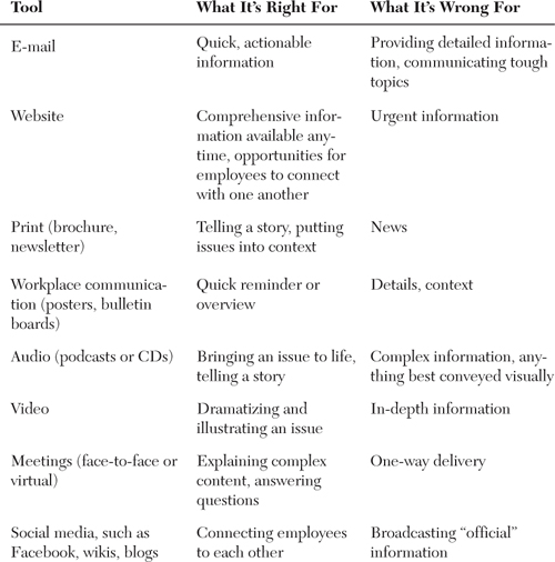
Let’s start by understanding the pros and cons of each tool:

By knowing what each tool does best, you can begin deciding how to use each one for the communication you have planned.
But before you jump in, we remind you of two important steps:
1. Consider employees’ communication needs and preferences (see Chapters 1, “Know Your Employees,” and 2, “Treat Your Employees Like Customers”). For example, if your sales force consists mostly of Millennials, those employees will probably prefer electronic communication over print (or even face-to-face). And they’ll expect to find information easily and get their questions answered quickly.
2. Revisit your objectives (see Chapter 3, “Plan and Manage Communication”) to make sure you focus on what you need employees to know, believe, and do. By doing so, you’ll make sure your choice of vehicles will accomplish your objectives.
Deciding on the Best Tool
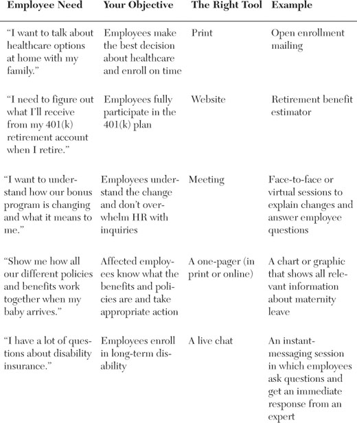
Here are examples of how an HR manager might match employee needs, objectives, and the appropriate communication vehicle:

Using Each Tool Effectively
Now that you know how to choose your tools, we show you how to enhance the way you use some of the most common vehicles: e-mail, print publications, and posters and bulletin boards. We also include tips on the newest form of communication: social media. (We cover face-to-face communication in Chapter 8, “Make Meetings Meaningful—and Support Managers.”)
E-mail: Love It, Hate It, Need It
Ah, e-mail. We love e-mail’s ease of use, speed, and responsiveness. But we hate the feeling of being besieged by a never-ending onslaught of incoming messages.
How Many E-mails?
According to The Radicati Group, a technology marketing research firm, here’s why you feel overloaded:
• 90 trillion: The number of e-mails sent in 2009
• 247 billion: The average number of e-mails sent each day
• 1.4 billion: The number of e-mail users worldwide
• 81%: The percentage of e-mails that were spam
Because employees receive so much e-mail, they’ve become skilled at deciding in seconds whether to press the Delete key or open a message and keep reading. How can you make sure your e-mails don’t get thrown in the trash? Here are a few tips:
• Use e-mail only when information is timely and action is required.
• Clearly outline action steps.
• Write strong, direct subject lines that summarize what you’re conveying.
• Use the inverted pyramid (see Chapter 4, “Frame Your Message”) to organize the body of your message.
• Rely on bullet points, numbers, and other devices (see Chapter 5, “Write Simply and Clearly”) to chunk your message into easily digestible bits.
• Limit your message to a single screen.
Graphic E-mails Get Attention
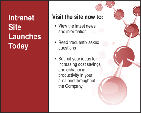
What’s better than even the best text e-mail? If you have time and resources, consider creating a “graphic e-mail.” This designed e-mail (programmed using HTML, the same code used to create websites) looks like an ad when the recipient opens it. You’re probably familiar with graphic e-mails, because you receive them from online retailers such as Lands’ End, Victoria’s Secret, and The Gap to advertise special offers such as free shipping.
Graphic e-mails (which some people call “e-cards” because they’re like electronic postcards) allow you to communicate a simple idea (see Figure 7-1). That way, employees don’t have to read a text message; they can quickly scan the “ad.” E-cards can be used to communicate the following:
• Dates and deadlines, such as the beginning and end of open enrollment, or the deadline for submitting a Flexible Spending Account claim
• Events, such as upcoming sessions about healthcare plans or retirement programs
• One compelling message, to reinforce or link to more comprehensive information on an intranet site

(Still) Powerful Print
About a decade ago, print was nearly extinct as an internal communication channel. Companies had invested so much in their intranets that they cut budgets for other forms of communication. The environmental movement was on the rise, and it seemed wrong to “kill all those trees.” (See the sidebar “The Truth About Killing Trees” in Chapter 3.) And, let’s face it, print took a lot of work to do well.
As a result, many organizations eliminated print. But then something strange happened. HR people began to notice that employees were calling more often, because they didn’t understand key programs as well. After one company stopped producing and mailing open enrollment packages, the HR director discovered that employees were covertly printing dozens of pages from the intranet site (which, by the way, cost the company a lot more money than if the material had been sent to a printer). Other clients realized that eliminating print was unfair to employees who had limited electronic access.
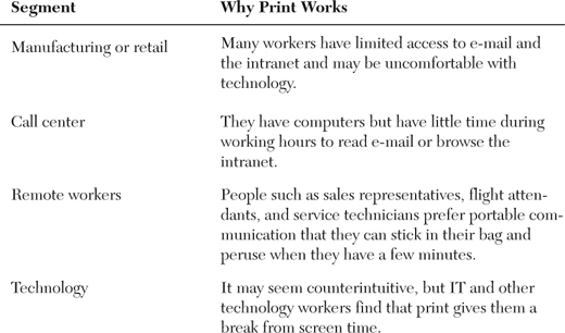
Consider print’s value to certain employee segments:

As a result, print has returned to its rightful place in the toolbox, especially for communicating complex information such as enrollment options. And that’s good news, because print has been proven to be more effective than electronic communication as a way to get people interested. (More good news: The cost of print has declined, and there are many “green” ways to print.)
Want an example of the power of print? A 2006 study of consumer behavior demonstrates that people are more engaged by print media such as newspapers and magazines than they are by electronic media such as TV, radio, and the Internet.
By “engagement,” the authors—academic researchers at Ball State University’s Center for Media Design—mean the amount of concentrated time that consumers spend on media. Known as the Middletown Media Studies,1 the research is based on more than 5,000 hours of direct observation of consumers using media.
The upshot is that people are much more likely to devote their full attention to print publications than they are to other media. So although consumers spend far more time on TV, radio, and the Internet, they’re likely to be multitasking. They might have two or more of these channels on at once, or might be using an electronic medium as “background noise” while involved in other activities. Can a study about external media be applied to internal communication? Absolutely, because employees use media in similar ways, no matter where the information comes from.
Three Ways to Tap the Power of Print
• Make print service-oriented. Print is an ideal medium for service journalism (described in Chapter 5). It can help employees understand key issues so that they can see where they fit and know how to make a contribution. Think “how to” and “news you can use.”
• Paint a picture. Follow best practices from magazines to make your information visual using photographs, charts, graphs, and other graphic elements. The most arresting visual of all? People’s faces.
• Give employees the choice of skimming or reading. Depending on their interest in the topic, some of your readers will just scan—looking quickly at the headline, subheads, photo captions, and sidebars—and others will devour every word. Make sure your content is chunked to appeal to both.
Waiting in the Cafeteria Line
Our next trip to the toolkit is for an often-neglected tool: workplace communication such as posters, bulletin board postings, and electronic signs and screens. Why would we care about these? Because even if your company has some virtual workers, most employees spend the majority of their time in the company’s office, manufacturing plant, store, warehouse, or other facility. That means they walk through an entrance, clock in (if they’re hourly workers), visit the restroom, and wait in line in the cafeteria. And while they do so, they could be getting valuable information by looking at posters, bulletin boards, or electronic signs or screens.
The best part about workplace communication is that, even if your budget is miniscule, you can create posters or bulletin boards. All you need is paper, some tacks or tape, and the know-how to get your message across.
High-Potential Posters
Poor posters. They have such potential, but they’re often created quickly, without much thought. The result is often mediocre: they lack a strong visual element, are full of words, try to convey too much content, and are not compelling. And employees, who always know good communication when they see it, respond appropriately. Here are some employee comments from a focus group study we conducted recently at a manufacturing facility:
• “I never look at posters. They just don’t seem relevant to me.”
• “Posters here are terrible. You have to stand there and read them. Who has time for that?”
• “I glance at the posters on the way to the cafeteria, but most of them seem like they’re just up so that someone can check something off their list—you know, ‘I put it on a poster, so I communicated it.’ But if no one pays attention, what’s the point?”
This is a missed opportunity, because posters are such a great way to convey concepts to people where they pause and/or congregate: In the break room. Waiting outside the credit union. Standing in the elevator.
Posters are especially valuable for employees who don’t have easy electronic access. But, as Hollywood film studios (think movie posters), advertisers (billboards), and retailers (visual displays) know, posters work for anyone. After all, we have to look at something, so it might as well be attractive, interesting, and persuasive.
For inspiration, look not within your own company, but at world-class posters. There’s a great website about posters throughout history at www.artlex.com/ArtLex/p/poster.html. For a “greatest hits” list of movie posters over the last several years, go to www.impawards.com.
Poster Tips
• Always use a strong visual.
• Severely limit the number of words. (Headlines should be fewer than seven words.)
• Test whether a poster works by putting it on a wall, approaching it from the side, and walking by it at a normal pace.
• Hang posters at eye level in a variety of high-traffic areas.
• Keep posters up long enough so that employees notice them, but not so long that they become wallpaper.
The Best Bulletin Boards
We love bulletin boards because all you need to be successful is some cork board, a box of pushpins, and the ability to channel your inner third-grade teacher.
Here are a few rules of thumb for making the most of bulletin boards:
• Create interest and engagement through colorful visuals. Employees need information that is quick and easy to digest and understand. Visuals such as progress charts, diagrams, photographs, and posters support the need to “get it fast.”
• Target high-traffic locations. While the size of your bulletin boards may vary depending on available space, what’s critical is where they’re located. Avoid positioning bulletin boards in narrow hallways, where the tendency is to walk past them without noticing. Instead, display bulletin boards in open areas where employees are more likely to stop and visit, such as the cafeteria or break room or near an elevator.
• Develop a consistent architecture. You need a blueprint to organize the information on your bulletin boards. Key content areas could include the following:
![]() A calendar of upcoming meetings and events (local or corporate-wide)
A calendar of upcoming meetings and events (local or corporate-wide)
![]() Job safety policies
Job safety policies
![]() Employee recognition
Employee recognition
![]() Career development opportunities
Career development opportunities
![]() Goals/strategies/performance results
Goals/strategies/performance results
• Designate individuals to maintain the bulletin board(s) in their area/location. This includes revising and/or replacing outdated information and collecting employee feedback if you have interactive features such as suggestion boxes.
Everybody into the Pool!
An employee communication tool that’s getting a lot of attention these days is social media. In case you’re not completely familiar with this new-ish communication channel, we bring you a definition from Brian Solis, one of the gurus of social media marketing:
Social media describes the online tools that people use to share content, profiles, opinions, insights, experiences, perspectives, and media itself, thus facilitating conversations and interaction online between groups of people. These tools include blogs, message boards, podcasts, microblogs, lifestreams, bookmarks, networks, communities, wikis, and vlogs.
A few prominent examples of social media applications are Wikipedia (reference); MySpace and Facebook (social networking); Twitter and Jaikue (presence apps); YouTube (video sharing); Second Life (virtual reality); Upcoming (Events); Digg and Reddit (news aggregation); Flickr and Zooomr (photo sharing); Blogtv, Justin.tv, and Ustream (livecasting); Stickham and YourTrumanShow (episodic online video); Izimi and Pownce (media sharing); del.icio.us (bookmarking); and World of Warcraft (online gaming).2
If you’re older than, say, 30, you may consider social media to be an activity mostly for the young. But social media is not just for kids. Although 18-to-29-year-olds are the largest users of social media, 43% of 30-somethings and 29% of 40-somethings use these tools—and the numbers keep increasing. For example, we’ve found that the business social network LinkedIn is more popular among people over 30, whereas there are more Facebook fans among Millennials (born between 1980 and 2000).
Despite the growing popularity of social media, many of us are unsure how to use this tool. After all, there are so many possibilities and quite a few risks. Here are a few suggestions for including social media in your communication program:
• Be clear about your objectives. We know—we keep referring to objectives. That’s because understanding what you’re trying to accomplish is such a great way to focus—and to make good decisions about the best ways to communicate. Resist the temptation to launch social media because the cool kids are doing so. First, figure out how social media helps you get to where you need to go.
• Don’t go it alone. Social media isn’t “owned” by anyone; it’s bigger than any one function. So the best way to tackle social media is often to form a team that includes HR, IT, Legal, and Corporate Communications. By doing so, you can address all the aspects: technology, external reputation (all those crazy bloggers), policies, and employee engagement.
• When you’re ready to start, don’t jump into the deep end; just dip your toe into the water. The nice thing about social media is that you can quietly experiment, see how it goes, and then ramp up or switch gears. Many tools are free or cheap, and commonly used IT platforms such as Microsoft SharePoint have social media options such as blogs and wikis built in.
• Give it a go with recruiting. As we explain in Chapter 10, “Recruiting,” many companies start by supplementing their traditional recruiting communication efforts with Facebook, LinkedIn, and Twitter. It’s a great way to get your feet wet while attracting potential employees who aren’t reading newspaper classified ads.
• Ask your employees what they use and what they need. In the very early days of social media, we had several clients who enthusiastically plunged into creating internal Facebook-like networks. But some of these efforts failed; employees just didn’t use them. What was the problem? As one employee told us, “I’m already on the real Facebook, where I connect with all my friends and colleagues. Why would I create a new profile and new connections when I don’t need to?” Make sure you understand employees’ preferences for how they would use internal social media channels.
• Help employees solve problems and get work done. Networking is fun, but your best employees are focused on doing their jobs. That’s why many organizations are exploring social media’s potential for making work easier. For example, a major pharmaceutical client has introduced Yammer, an internal microblog that works like Twitter. Employees form groups and then post comments or questions such as “Looking for data on how XX software can increase run time. Can anyone help?” or “Just ran a successful test using XX new methodology. Would be happy to share my results.” When employees are located in multiple locations and a variety of time zones, they appreciate that Yammer is a great way to collaborate with colleagues and get work done despite geographic or time differences. Isn’t that what it’s all about?
Summing Up: Put Every Tool to Work
When you’re communicating something especially important, you’ll want to include a variety of tools to help employees understand their options and make good choices.
When we helped a major pharmaceutical company communicate open enrollment in a year that included many changes, we recommended a communication program that included nearly every tool available: newsletters, fact sheet, postcards, posters, benefits fair, website enrollment, cafeteria tent cards, and plasma screen panels in major lobby locations. Here is how each tool contributed to the overall success of the open enrollment:
• Newsletters helped share complex subjects in short, easy-to-read segments, including charts, bullets, and lists.
• The fact sheet gave employees information in one concise page to encourage them to act. For example, one piece listed excuses employees might use to postpone enrolling (“I don’t need it,” “I can’t afford it”) and gave compelling reasons to act now.
• Postcards reminded employees that it was time to act. We used postcards for two different events. The first reminded employees to enroll, sharing website and phone information. The second focused on one aspect of enrollment: long-term disability.
• Posters were put up throughout facilities—outside cafeterias and lunchrooms, near elevators, at entrances, and on bulletin boards—to reinforce key messages.
• A benefits fair gave employees the chance to ask questions and get answers immediately.
• Website or phone enrollment offered employees a fast, simple, inexpensive way to enroll and to see immediately what their costs would be. Employees without web access could call a toll-free number to enroll.
• Cafeteria tent cards encouraged employees to “Enroll today.”
• Plasma screen panels provided information about where employees could attend a benefits fair and reminded them of the upcoming deadline for enrollment.
Checklist for Choosing the Right Tool for the Job
![]() Consider your audience and your message.
Consider your audience and your message.
![]() Think about all the tools at your disposal (along with the pros and cons of each), and then determine how each might help you communicate a specific message.
Think about all the tools at your disposal (along with the pros and cons of each), and then determine how each might help you communicate a specific message.
![]() Make sure you’re making the most out of each tool.
Make sure you’re making the most out of each tool.
