
Numbers play a key role in any business presentation. Revenues, units shipped, profits, and market share are the hits, runs, and errors of the business scorecard, and everyone in business understands their importance.
However, not everyone in business feels equally at home when it comes to numbers. There are the green-eyeshade types who immediately recognize key trends and who can quickly pick out the most important item in a column of figures. Then there are the rest of us, who need a little time and a lot of context to fully grasp the meaning of a profit-and-loss statement or balance sheet.
In any presentation, you want both the number-fluent and the number-challenged audience members to understand and agree with you. Skillfully designed numeric graphics can help achieve that. They translate digits and decimals into visual images that make abstract relationships concrete and much easier to recognize.
Unfortunately, many of the numeric graphics used in presentations serve to obscure rather than clarify the facts. All too often, the graphics are sheer Data Dumps, loaded with needless information, poorly organized, and visually cluttered. Such numeric slides take a long time to explain and even longer for the audience to understand. Often, the audience members decide that such slides aren’t worth the effort, and they give up. This is how many important presentations get derailed.
This needn’t happen with your presentations. The same basic principles you learned in Chapter 6, “Communicating Visually,” Presenter Focus, Less Is More, and Minimize Eye Sweeps, apply to numeric graphics. Let them be your guidelines to creating clear and effective images that will drive your story home and reinforce your key ideas.
Let’s begin with the Problem/Solution approach by looking at an all-too-typical numeric slide, the bar chart shown in Figure 8.1. You’ve probably encountered this type of graphic in many presentations. This example depicts six years of steady sales growth in the history of an up-and-coming company, information that should play an exciting role in telling the company’s story.
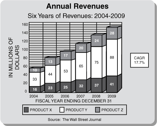
There’s plenty of information here. In fact, the problem is that there’s too much information for a presentation. If this chart were in a document, such as a business plan or annual report, the reader, as the audience to the absent writer, would need all this data to understand the chart and identify the figures. The reader would also have close-up access to the document. But in a presentation, the audience is forced to make multiple involuntary eye sweeps across the distant enlarged image to see all the data, while simultaneously their ears are listening to the presenter and their minds are processing all the data. All this ratcheting around and thinking is excessive sensory activity that disconnects the audience from the presenter. The slide becomes the focus of the presentation.
Sound familiar? These same underlying problems have a negative impact on the graphics, just as they do on the story, drastically reducing the potential to capture your audience.
Here’s how to communicate the same information successfully: First, notice how much print clutters the slide. The title and subtitle essentially repeat the same information. There are two labels, one at the left side of the slide (“IN MILLIONS OF DOLLARS”) that is standing on its end, and one sprawled along the bottom of the slide (“FISCAL YEAR ENDING DECEMBER 31”). Each label takes up a great deal of space while providing information that is either very simple or not very important. There are more than 30 numbers on the slide: nine along the left scale, 18 superimposed on the six bars, and the six dates along the bottom edge of the graph. The CAGR (Compound Annual Growth Rate) sticks out to the right like an outrigger. The source credit to The Wall Street Journal is in a font size so tiny it rings of the fine print in a shady contract. The six bars depicting revenues are each subdivided into three different colored sections. And all of this data is backed by grid lines that resemble bargain-basement, bamboo-slat Venetian blinds.
Clearly the person who designed this slide has never heard of Less Is More.
Notice how much work your eyes (and your mind) must do to absorb all this information. It’s not only a matter of wading through all the words and numbers to decipher which ones are important and which aren’t; it’s also a matter of attempting to draw connections among the disjointed parts of the graph. In short, this slide is a visual mess. How can we improve it?
We can start by simplifying and cleaning up the unnecessary verbiage. Since the title and subtitle are redundant, we can eliminate the subtitle. The graph itself clearly contains six bars, which are labeled by year, so it isn’t necessary for the subtitle to spell out the number of years covered.
Rather than devoting so much space to the labels “IN MILLIONS OF DOLLARS” and “FISCAL YEAR ENDING DECEMBER 31,” we can use simple abbreviations. Nor do we need to spell out full dates. In this context, if a bar is labeled “’04,” everyone in the audience will understand that it represents 2004 rather than 1004 or 3004. Give The Wall Street Journal its due by making the font size legible. Finally, does your audience really need to know the exact dollar figure for each product sold? Probably not; it depends on the point of the slide. If the purpose is to demonstrate total revenue growth, then the audience can see the relative amounts of each product by the colors. Remove the numbers in the bars.
This is a distinct improvement. We’ve substantially reduced the amount of work the audience must do to understand the graph. But there’s still more to be done. To identify the different colored parts of the bars, the audience members must shift their eyes up and down repeatedly to the legend at the bottom, like a bouncing yo-yo.
Only when the audience discovers the legend at the bottom of the slide, which matches the colors to Product X, Product Y, and Product Z, does the explanation become clear. You can feel the movement here on the page, where the distance is only several inches. Imagine the feeling when you traverse a space of several feet on a projection screen. Minimize Eye Sweeps.
Furthermore, anyone in the audience who wants to figure out the value of a particular bar must move his or her eyes back and forth, left and right, several times between the scale and the bar, like a fast and furious ping-pong match. A futile match, too, because, at a distance, the human eye can’t find the exact tick mark. Would any businessperson respond favorably to a proposal with inexact figures that could be viewed a few million dollars in either direction? Hardly.
We can make some simple adjustments to clear up these problems . . . again, by applying the Minimize Eye Sweeps rule.
Look at Figure 8.2.
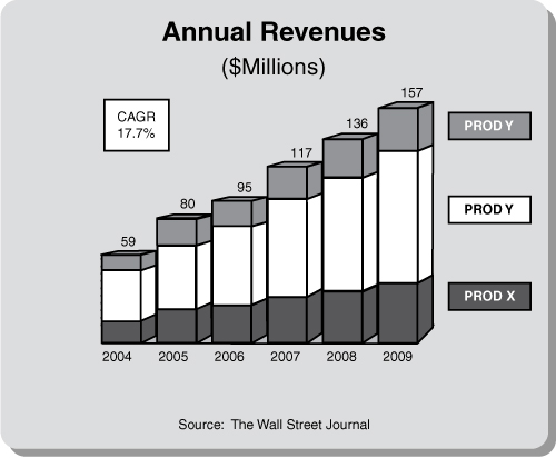
By removing the scale from the left and placing the revenue totals directly above the bars, we see the growth trend in one sweep of the eyes. By removing the legend at the bottom of the graph (along with the usual trifling little squares) and simply labeling the three different colored bar segments in matching colored text boxes along the right margin, the eyes identify products X, Y, and Z at the end of the eye sweep. Simpler still would be to eliminate the stacks and create separate charts for each product.
Notice the three-dimensional effect on the bars. Some people like this effect; others hate it. As with typography in the previous chapter, these are matters of individual taste, and the same Latin proverb applies: De gustibus non est disputandum. There’s no arguing taste.
The simplified version of the slide will have much more impact in your presentation. The important story it tells about your company’s impressive sales growth will hit home much more forcefully. Any numeric slide can be dramatically improved by eliminating unnecessary words, numbers, scales, and legends.
Figure 8.3 shows a typical pie chart (also called a circle chart). This kind of chart is useful for showing a total amount divided into subordinate parts; in this case, the chart shows how a company’s sales are divided geographically. At a glance, it’s easy to see the relative share of the whole that each part, or each wedge of pie, represents.
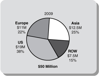
Unfortunately, the chart is needlessly cluttered and confusing to read. Stacking the name of the sales region, the sales figure, and the percentage (such as “Europe,” “$11M,” and “22%”) forces the viewer to pause and sort out what each element means.
Now look at the version shown in Figure 8.4.
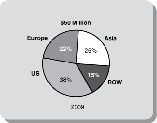
The geographic labels remain outside the pie, but the percentages are now inside the wedges. This arrangement is clearer because text usually takes up more space than numbers. If any wedge is too small to contain its number, use a callout; that is, place the number just outside the wedge, with a narrow line to indicate where it belongs.
Notice that by separating the labels from the numbers, both are much easier to read. Notice, too, that we have omitted the dollar figures shown in the first version of the graph. In a pie chart, the relative size of each wedge is the most important information.
Finally, note that we’ve shifted the date to the bottom of the pie. That’s where the timeline appears in most business charts.
Follow these general guidelines when you create a pie chart, and it will be easy for your audience to read and understand.
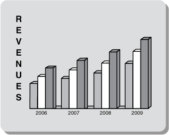
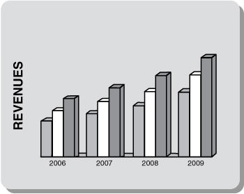
The label on the left side of Figure 8.5 is “stacked.” Type set this way is very hard to read. Think about it: The stacked label, containing eight letters, causes your eyes to make seven carriage returns. Ouch!
This problem is easy to solve, as shown in Figure 8.6.
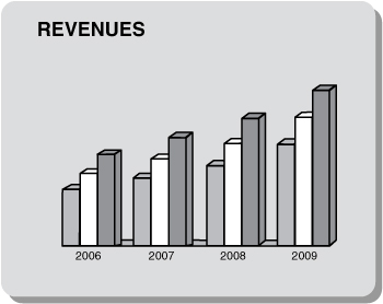
Use a horizontal label like the one shown in Figure 8.6, which makes the chart much clearer and easier to read.
A close cousin of the stacked vertical label is the vertical label on end, shown in Figure 8.7.
This practice is a carryover from documents. In a document, the reader can rotate the document to read the word “REVENUES.” In a projected presentation slide, however, the audience members are forced to rotate their heads. This often seems like an adult variation of Simon Says: “Left ears on left shoulders, place!”
The solution is the same as for the problem of the stacked label (please refer back to Figure 8.6 for the solution). Make the label legible by aligning it on the horizontal axis. Now you’re minimizing not only your audience’s eye sweeps, but their head movements as well.
Another example of conditioned eye movement is the way audiences perceive and react to information. Through long experience with graphs and charts, businesspeople are accustomed to responding favorably to what is known as the hockey stick, which expresses positive results that move up and to the right. A trend sloping in the downward direction implies negative results and is therefore a counterintuitive movement.
If you were creating a graph to compare your company’s results (sales, profits, product performance, or customers) against those of your competition, would you show it using bars like those in Figure 8.8?
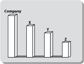
I hope not. The results are heading downhill. Instead, arrange the bars as shown in Figure 8.9, up and to the right. The hockey stick now expresses rising action. Furthermore, the bars end with your company name. By placing your company name at the final, climactic point, not only do you tacitly take a superior position, but your company name becomes the last word your audience will see and remember.

Unfortunately, many presenters, as well as many professional graphic artists, design their bar charts counter to these cultural implications. They are under the mistaken assumption that the most important figure should come first. While this reasoning seems logical, it is contradictory to the more powerful psychological forces. Figure 8.10 is a reproduction of an actual newspaper advertisement, doctored slightly to protect the guilty (we’ve used the fictitious bank name “Comet”).
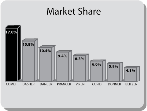
Comet wanted to brag about its leading market share over all its competitors in corporate debt underwriting. Although Comet was proud of its achievement, its advertising designers set up the bars with movement downward rather than upward, counterintuitive to positive results.
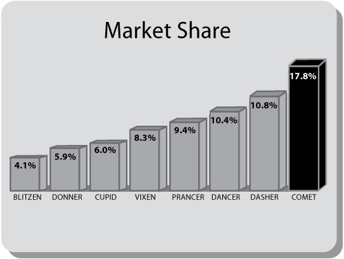
Figure 8.11 shows how Comet’s ad should have been depicted.
The stylistic points presented in this chapter may strike you as picky. “Oh, come on,” you might say. “The members of my audience aren’t graphic artists or designers. Will anyone really notice if I arrange the bars in the graph in reverse order or stack the letters in the vertical label?”
Maybe not . . . maybe not consciously. But our cultural conditioning to react to visual cues is very deep and powerful . . . so much so that, even when your audiences don’t consciously recognize such design flaws, they respond to them with a sense of unease, uncertainty, or dislike. They may not realize what’s bothering them; at most, they might think, “Those slides look a little odd” or “There’s something here that’s not quite right.”
Is this a serious problem? It can be. Remember, it is likely that that your efforts to persuade your audience will be competing against powerful opposing forces, ranging from your direct competitors to the subtler forces of indifference, apathy, and inattention. It’s easy for anyone to doubt your expertise, to question your motives, to be distracted, or simply to lose interest. You can’t afford to overlook any factor that might influence your audience, no matter how subtle it may appear.
Persuading your audience to respond to your call to action is almost always an uphill battle. Why make it harder, even 10 percent harder, by designing graphics that work against your message? Make your graphics work for you.