
41. How Audiences See
Follow the Action

The large, illuminated letter at the upper left of this ancient text has been an established practice in documents ever since medieval times. It marks the beginning of a new document or a new section in a document. The practice has continued on into modern publishing where an enlarged first letter marks the beginnings of chapters in books and the beginnings of articles in magazines and newspapers. Now it becomes a factor in how we view computer—and presentation—screens.
EyeTrackShop, an eponymous Swedish start-up company, does exactly what its name says: Track eye movements to, as their slogan puts it, “identify where people look, for how long and in what order.”1 The company’s technology uses webcams to follow and record how viewers’ eyes scan images and then applies that information to help advertisers create effective ads and web designers to create effective web pages. By understanding the dynamics of how viewers scan ads and web pages, you can create effective graphics for your presentations.
One of EyeTrackShop’s projects studied how users viewed the home pages of Facebook and Google+. The results, shown in Figure 41.1 and reported in the Wall Street Journal, found that in both cases, “Users’ eyes head straight for the big status column in the middle of the screen, then over to the list of categories on the left side, then hop across to alerts on the right.”2
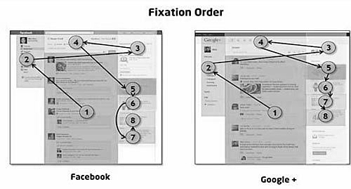
Figure 41.1. EyeTrackShop study of Facebook and Google+ Web pages
Those movements are driven by forces more powerful than the images on the Google and Facebook sites, two forces that drive the eyes of every human being:
• Nurture. In Western culture, because we have learned to read from left to right, our eyes start reading at the upper-left corner of documents.
• Nature. The optic nerves in all human eyes impel them to look at new images, and so, having started at the upper left, readers’ eyes naturally—and involuntarily—move to the right to see the remainder of the new image.
As a result, human eyes do essentially what the eyes of the subjects in the EyeTrackShop study did: After centering on the full image, they move to the upper left to start reading, and then sweep across to the right to continue reading. In that same manner, whenever you click to a new slide, your audience’s eyes start reading at the upper left of the projection screen and sweep across to the right.
If your slide is densely packed with images, numbers, and/or text, your audience’s eyes will not see the entire image on the first move to the right. They will have to come back to the left and then go back to the right again. The denser the slide, the more times your audience’s eyes will have to traverse the screen; the more traverses they make, the less they will hear of what you are saying.
Do you see where this is going? Back to the familiar Less is More principle, but now with this new added corollary: Reduce the number of moves your audience’s eyes must make to understand your slide.
In the previous chapter, you saw these principles applied to the two most common slides in presentations today: bullets and bars. Please look at those two illustrations again and feel how your eyes naturally take in each slide: They start at the left and swing to the right.
Do the same for all your presentations. Design effective slides by reducing the number of eye moves your audiences must make.
Minimize the processing their eyes—and their brains—must do. Let them spend their energy and time focused on you.