Chapter 1. Essential Techniques
The Basic Stuff Ya Gotta Know First
It’s a tradition in all my books to use song, TV show, or movie titles for the names of the book chapters. In this case, it’s a song title because I found a song that is actually named “Technique.” It’s a rap tune from a band named Def Shepard, which seems like a wink and nod to the big hair ’80s band Def Leppard (either that or it’s a shout-out to all those hearing-impaired sheep herders out there). Anyway, I have to say, that whole idea of taking part of an existing band’s name and just changing a letter or two is brilliant! Not only is it much easier than coming up with a new name from scratch, but when people hear the name, they think, “Hey, I think I’ve heard of them before” and—boom—you’ve got instant name recognition and that translates into more record sales (well, it would if they actually still sold records). For years now, I wanted to be a rapper (they always look like they’re having so much fun in those beer commercials), and I even had my rapper name all picked out: I was going to be “Plain White Rapper.” But, now I’m thinking I should do what Def Shepard did and use a derivative of an existing band name. So, how about if I named my band, Bed Zepplin? Or maybe AC/BC? I thought The Rolling Jones might be nice, or how ‘bout Elton Johnny, and I could do a song called “Goodbye Mellow Brick Toad”? Now, if you’re a teen, you might be so young that you’ve never heard of these bands, so if my East Coast hip-hop style was aimed at this highly sought-after teen demographic, then I would go with a name like Mr. Gaga or Justin Timberpond. Or, if I wanted to go the rap route, I could be 51 Cent or Dr. Drayage, M&Ms, or my favorite, Snoop Scotty Scott (oh yeah, Snoop Scotty in da hiz-zay!). Now, if you’re wondering, “What in the world does this have to do with Photoshop?” then you must have skipped over #4 in the “Seven Things You’ll Wish You Had Known Before Reading This Book” back in the book’s introduction. Peace out. Fo shizzle!
#1: Using Photoshop’s Toolbox
You’ll find all of Photoshop’s tools in the vertical Toolbox on the left side of the screen. Now, while there are quite a number of tools in the Toolbox (compared to Lightroom’s six tools), don’t sweat it because there are a whole bunch of them we never ever use. Plus, once you see how Photoshop handles working with tools, you’ll realize that it’s much easier than it appears at first glance. Here are the most important things to know about Photoshop’s Toolbox:
THE TOOLBOX:
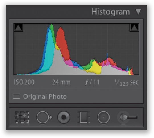
You’re probably already familiar with using tools since Lightroom has a horizontal toolbox in the Develop module, right below the Histogram (shown here, on the right). Of course, it only has six tools, whereas Photoshop has 71 (don’t worry, you don’t have to learn them all. As photographers, we actually only use a few of these tools). Photoshop’s Toolbox is vertical (seen here, on the left) and runs along the left edge of the screen (although, if you want it somewhere else, you can click-and-hold right on the little tab at the top of it, drag it right off the edge, and it becomes a floating Toolbox you can put wherever you want).
Photoshop’s Toolbox
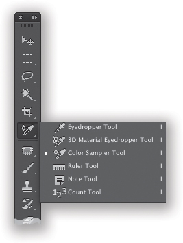
ACCESSING OTHER TOOLS:
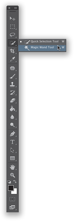
The tools you see when you look at Photoshop’s Toolbox are the ones that Adobe figured you’d use the most. But, if you see a little triangle in the bottom-right corner of a tool’s button, this means there are other tools nested (hidden) beneath that tool. Click-and-hold on one of those tools, and a little menu pops up displaying other tools (the “nested” tools). For example, if you click-and-hold on the Dodge tool, the Burn tool and Sponge tool (for desaturating) appear. In the example shown here, if you click-and-hold on the Quick Selection tool, its cousin, the Magic Wand tool, appears.
Lightroom’s Toolbox
KEYBOARD SHORTCUTS:
Most tools have a one-key keyboard shortcut assigned to them. Some are obvious, like you’d press L to get the Lasso tool or B to get the Brush tool, but then there are some that are not so obvious, like pressing V will get you the Move tool. This one-key shortcut thing is great, but the problem is there are 71 tools, but only 26 letters in the alphabet. So, nested tools have to share shortcuts. For example, pressing the letter I will get you the Eyedropper tool, but there are two other eyedropper tools, plus a few other tools, all nested under the Eyedropper tool, and they all share the same shortcut. To toggle through any nested tools, just add the Shift key. For example, each time you press Shift-I, it brings the next nested tool to the front as the active tool.
MOST TOOLS HAVE OPTIONS:
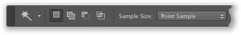
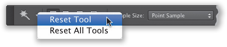
When you click on a tool, any features or controls for that tool appear up at the top of the screen in the Options Bar (shown here are some of the Magic Wand tool’s options). To return these options to their default settings, Right-click on the tool’s icon in the left side of the Options Bar and choose Reset Tool from the pop-up menu.
FOREGROUND & BACKGROUND COLORS:
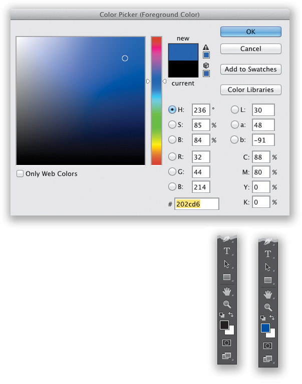
There are two large color swatches at the bottom of the Toolbox: the top one is your Foreground color and the bottom one is your Background color. If you’re painting with a brush, the Foreground color swatch will show you the color you’ll be painting with (in our example on the left, our current Foreground color is black). The Background color swatch shows the color the Eraser tool uses (here, it’s white). To change colors, click once on a swatch to bring up Photoshop’s Color Picker. Click in the gradient bar in the center to choose your color, then click in the large square on the left to choose how vibrant the color will be. To reset the color swatches to their defaults (black/white), press the letter D. To swap the Foreground/Background colors, press the letter X.
#2: Panels and Navigating
Unlike Lightroom, by default, Photoshop’s panels are all on the right side of the screen (there are no panels on the left side, just the Toolbox). But also, unlike Lightroom, most of Photoshop’s 26 panels are hidden from view (you can find them all by going under the Window menu). Again, like with the tools, there are only a few photographers actually use. Also, some of the shortcuts for viewing and making your way around your images will be very familiar to Lightroom users. (Note: I’m working in Application Frame here, so you can see the full Photoshop window. You can turn this off, though, by going under the Window menu.)
ZOOMING IN/OUT:
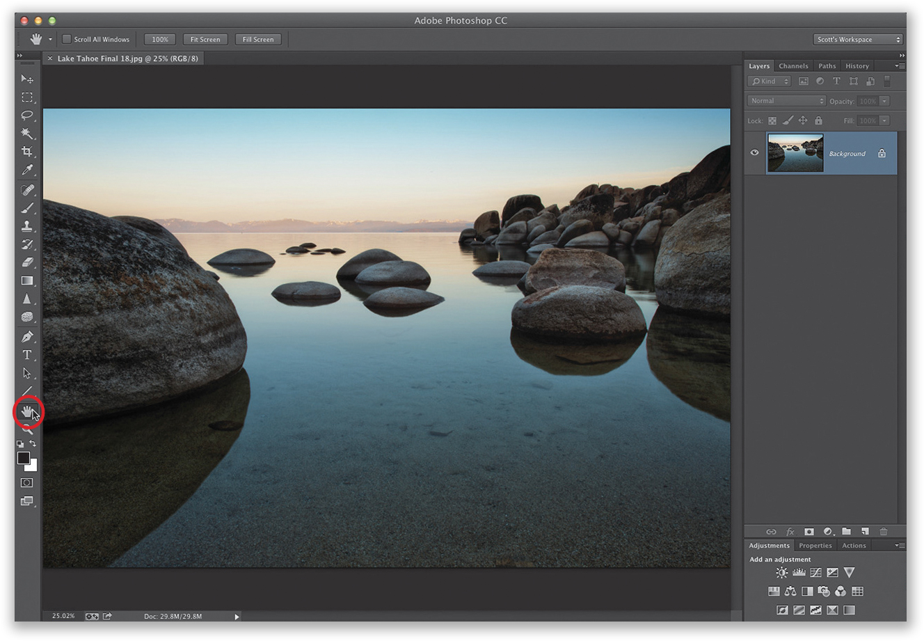
You zoom in/out in Photoshop using the same keyboard shortcuts that you use in Lightroom: Command-+ (plus sign; PC: Ctrl-+) to zoom in and Command-– (minus sign; PC: Ctrl-–) to zoom out. If you want to fit your image as large as it can fully be viewed within Photoshop, just double-click directly on the Hand tool in the Toolbox, as shown here (its icon is a hand). To jump right to a 100% (1:1) view, just double-click on the Zoom tool (its icon is a magnifying glass). If you want to zoom right in to a particular area, then get the Zoom tool (Z) and click-and-drag it in the area you want to zoom in tight on. Lastly, once you are zoomed in tight, you can use the scroll bars on the right and bottom of the image window to move around, but it’s easier to just press-and-hold the Spacebar on your keyboard, which temporarily switches you to the Hand tool, so you can click-and-drag around the image.
VIEW ANY PERCENTAGE YOU LIKE:
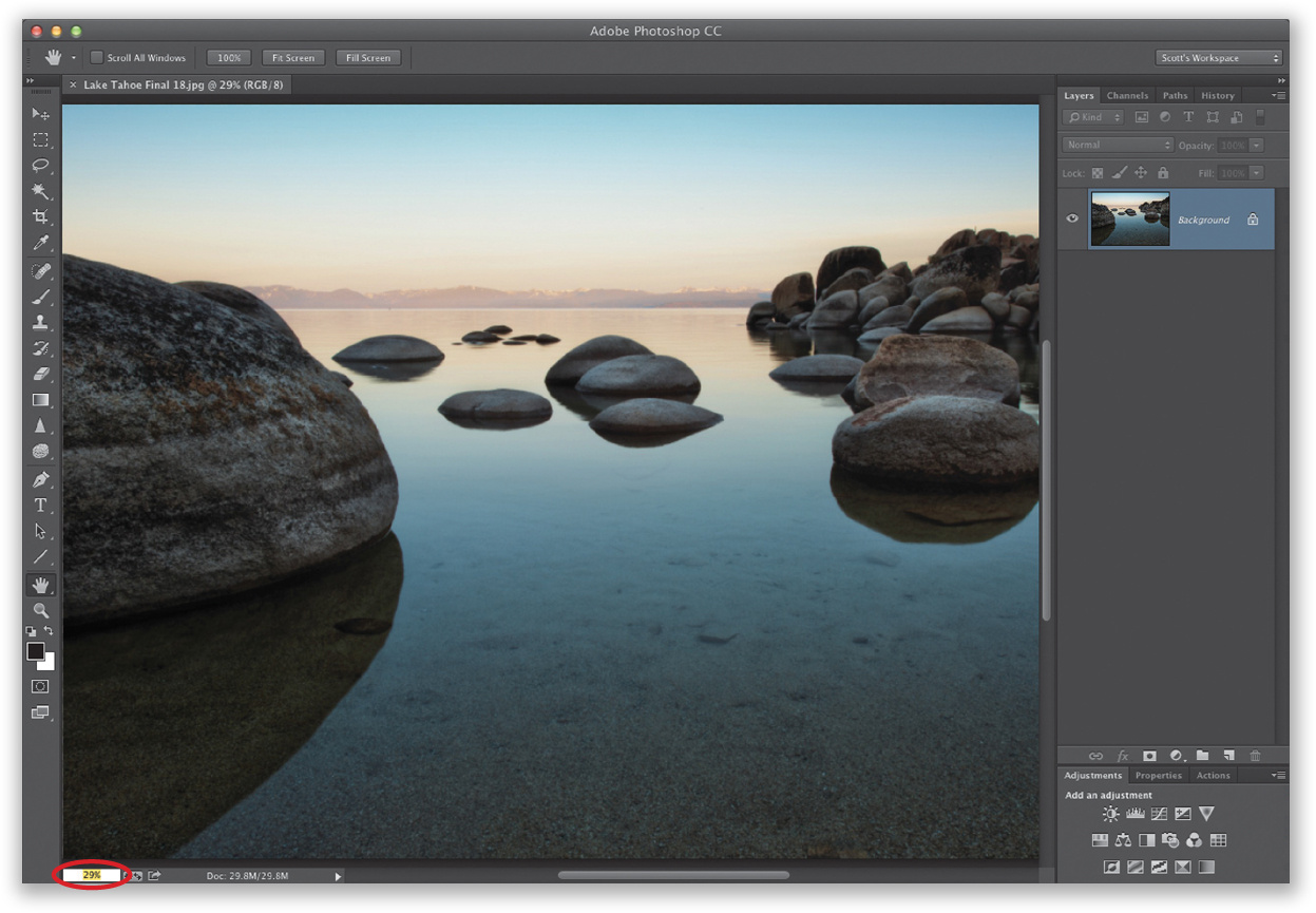
You can also type in any amount of zoom you’d like right in the zoom amount field in the bottom-left corner of the image window (shown circled here in red). For example, when I double-clicked on the Hand tool, so the image fit within my screen, it set the magnification at 25.02%. But, as you see in the previous image, that only fills the screen side-to-side. So, I clicked inside that zoom amount field, typed in 29% (as seen here), and now it fills the entire window (like Lightroom’s Fill command).
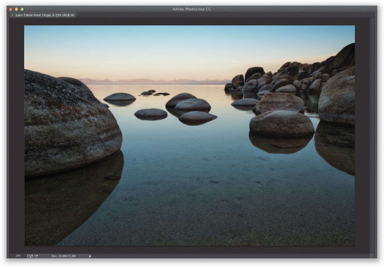
To hide all the panels from view (including the Toolbox on the left and Options Bar at the top), press the Tab key and you’ll get the view you see here—just your image, with no panels or Toolbox. If you only want the panels hidden, and to keep the Toolbox and Options Bar still visible, then press Shift-Tab instead.
PHOTOSHOP’S NAVIGATOR PANEL:
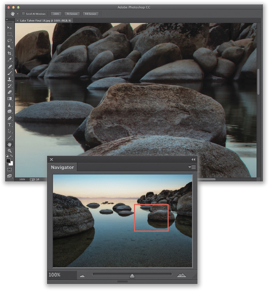
If you like Lightroom’s Navigator panel, there’s one here in Photoshop, too. Go under the Window menu and choose Navigator. Once the panel appears, use the slider beneath the image thumbnail to zoom in/out (dragging to the right zooms in tighter; to the left zooms out). Once you’ve zoomed in, you can click-and-drag the red rectangle to where you want the zoom focus to be (as seen here).
COLLAPSING PANELS:
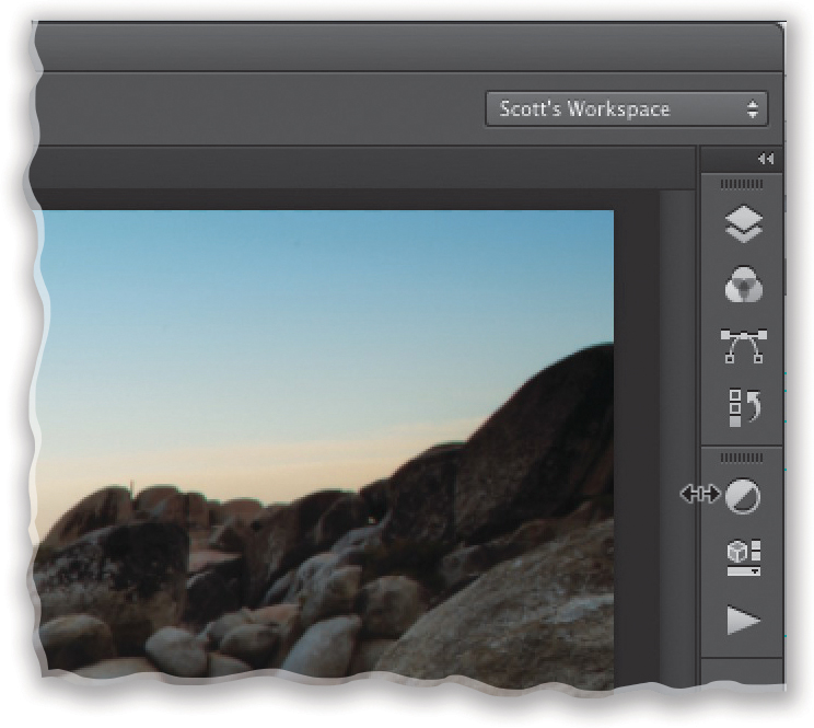
To give you more room to view your image, Photoshop gives you three ways to view your panels (shown here, from top to bottom): (1) full panel view gives you a full view of the panel(s); (2) click on the two tiny right-facing arrows at the top-right corner of a panel, and that panel(s) collapses down to just its name and icon; or (3) click-and-drag the divider bar between the image window and a panel over to the right, and it collapses the panel(s) to just its panel icon. To see any panel full size, just click on its icon. To see all nested panels again, click on the two tiny left-facing arrows at the top right of the top panel icon.
#3: Editing Just Part of Your Image
In Lightroom, all the sliders in the Develop module pretty much affect the entire image at once. So, if you wanted to affect just part of an image, you’d get the Adjustment Brush and paint over the area you wanted to affect. In Photoshop, you can also do that (well, to some extent), but if you want to edit just one part of your image, you use Photoshop’s Selection tools (there is a tool for every type of selection imaginable, which is one of the things that makes Photoshop so powerful). Here are the primary Selection tools you’ll use the most (even though we’ll cover others later in the book):
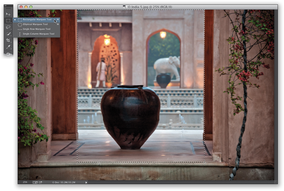
MAKING RECTANGULAR SELECTIONS:
If the area you want to select is either square or rectangular, there’s one tool that does both: the Rectangular Marquee tool (I think they call it “marquee” because the animation that shows where the boundary of your selection is looks like a Hollywood movie marquee twith chasing lights, but most folks call the boundary “the marching ants”). You just choose this tool (it’s the second tool from the top in the Toolbox, or press M) and select an area to work on by clicking-and-dragging a rectangle out over that area. Now, only that selected area will be affected by whatever you do to it (as seen here, where I drew a rectangular selection between the columns. And, now, if I were to lighten or darken the image, only the area inside that rectangle would be affected).
ADDING OR SUBTRACTING FROM YOUR SELECTED AREA:
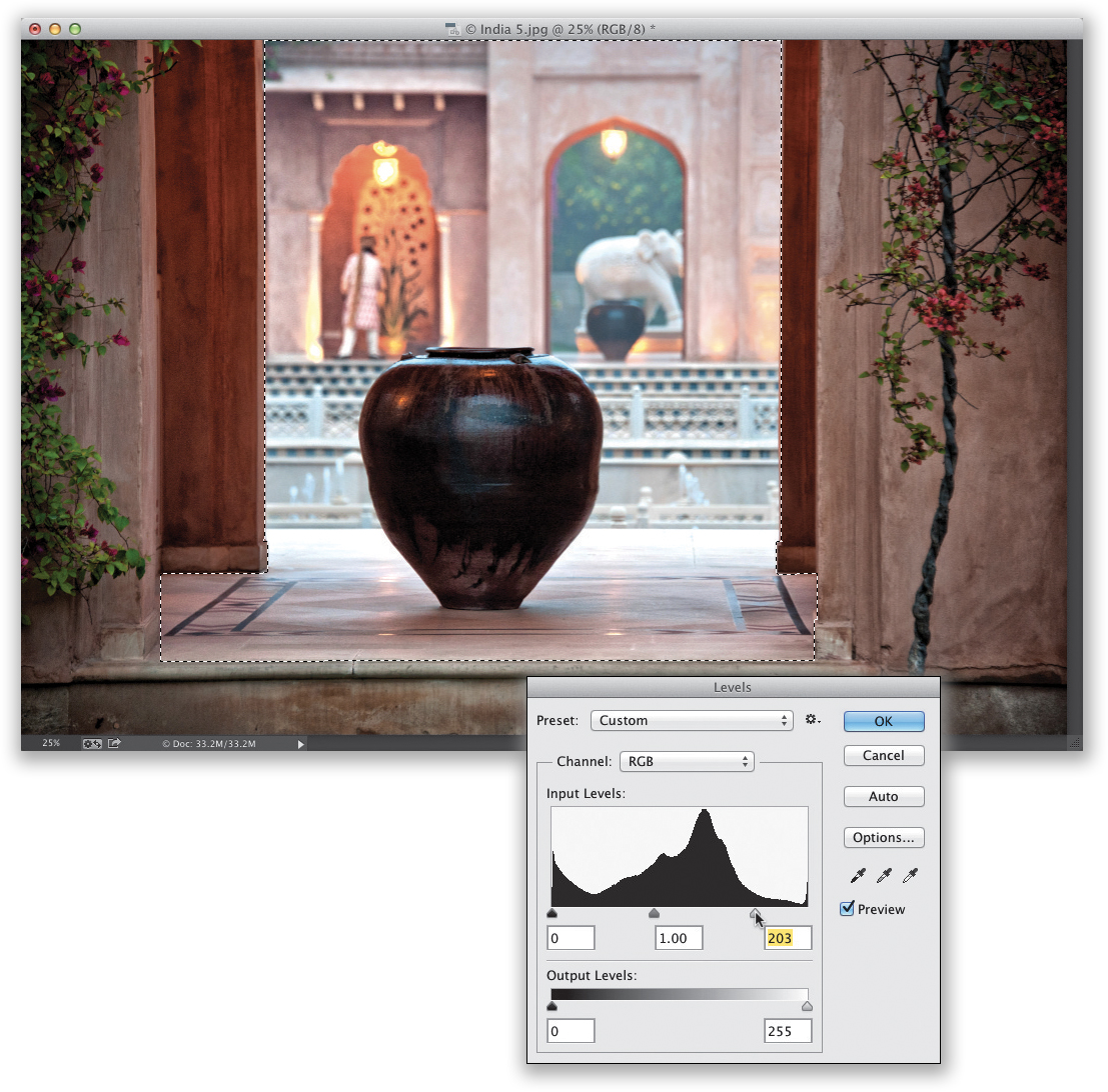
Once you have a selection in place, if you want to add more areas to it, just press-and-hold the Shift key and drag out more rectangles. That’s what I did here where I selected the areas under the left and right columns by dragging out smaller rectangles. If you want to subtract an area from your selection, press-and-hold the Option (PC: Alt) key instead and click-and-drag over that area (which is what I did on the sides and very bottom of the columns). (Note: You can use these keys to add/subtract from selections made with any Selection tool.) Now that all those areas are selected, I brightened them by going to Photoshop’s Levels command and dragging the Highlight slider to the left, as seen here (more on Levels later).
DESELECTING & SQUARE SELECTIONS:
If you want to remove your selection altogether (called “deselecting”), press Command-D (PC: Ctrl-D). If you want to make a square selection (rather than a rectangle), just press-and-hold the Shift key, then click-and-drag out your selection and it will be perfectly square (as seen here). Once again, any changes I make will now just affect that selected square area, as seen here, where I went to the Levels command again and brightened the highlights. (By the way, Levels is found under Photoshop’s Image menu, under Adjustments, and it lets you adjust the highlights [the white slider on the far right under the graph—drag to the left to brighten], the midtones [the gray slider in the middle—drag right to darken the midtones; left to brighten], and the shadows [the black slider on the left—drag to the right to make the shadows darker]. This is what we used before Camera Raw and Lightroom.)
STRAIGHT LINE SELECTIONS:
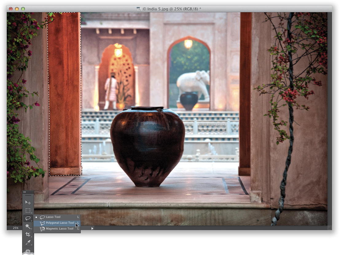
Not every object with straight lines is a rectangle or a square, but there’s a tool for that: the Polygonal Lasso tool (it’s nested beneath the Lasso tool; press Shift-L until you have it), which lets you draw a selection made up of straight lines (for example, if you wanted to select a stop sign or a yield sign, you’d use this tool). It kind of works like a connect-the-dots tool: You click it at the point where you want to start, move your cursor to the next corner and click, it draws a straight line between the two points, and then you continue on to the next point. When you get back to where you started, click on the first point again and it creates the selection (that’s how I selected the column on the left here. I started at the top-right corner and worked my way around, and then I brightened the highlights with Levels).
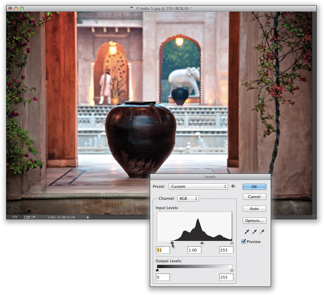
The Lasso tool (L; the third tool down in the Toolbox) lets you draw a freeform selection like I did here, where I selected the open archway in the background. You just click and start drawing, like you’re tracing around the edges with a pencil or pen. When you get back to near where you started, just release the mouse button and it connects back to where you started and it makes the selection. I also went to Levels here and darkened the shadows.
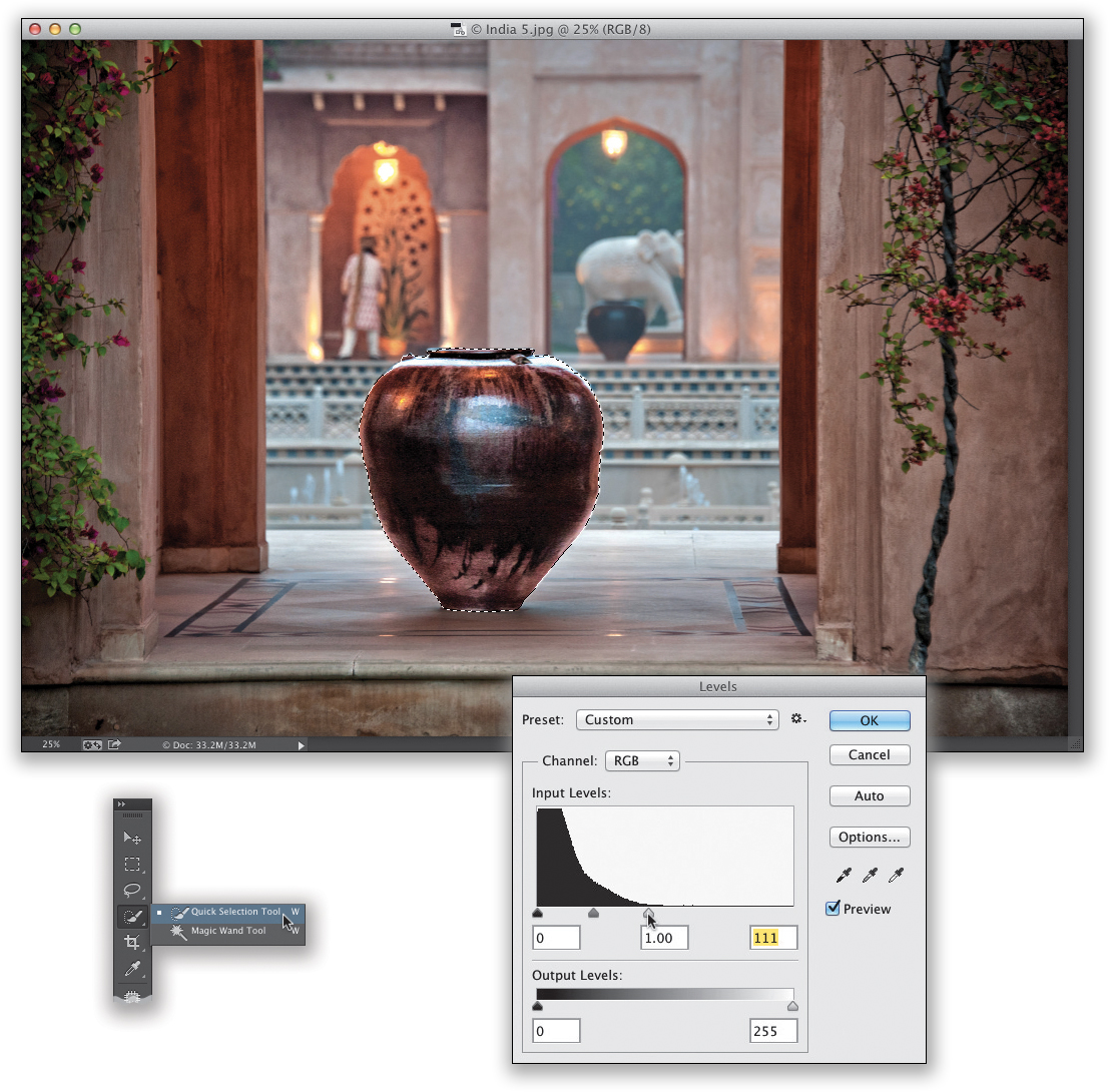
USING THE QUICK SELECTION TOOL:
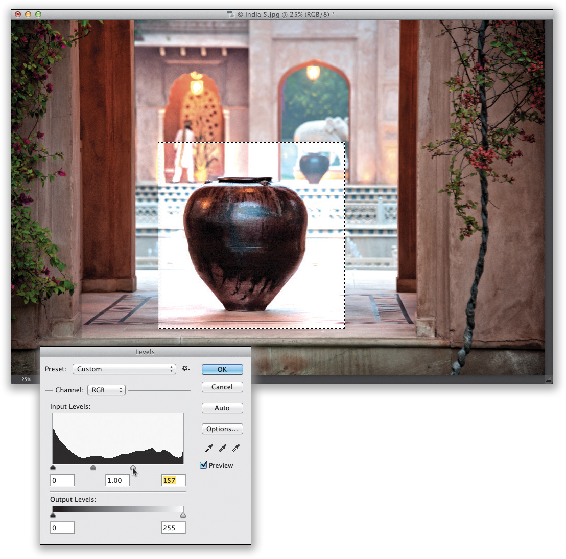
If you want to select an object, like this vase (or is it a pot?), you’d get the Quick Selection tool (W; it’s the fourth tool down in the Toolbox) and just paint over what you want to select (like I did here, where I painted over the vase), and it selects it by sensing where the edges are automatically (this is similar to the Adjustment Brush in Lightroom with Auto Mask turned on). (Remember: You can add and subtract from any of these selections that we’ve talked about—just press-and-hold the Shift key to add to your existing selection or press-and-hold the Option [PC: Alt] key to remove areas from your selection.) Here, I also went to Levels and increased the highlights.
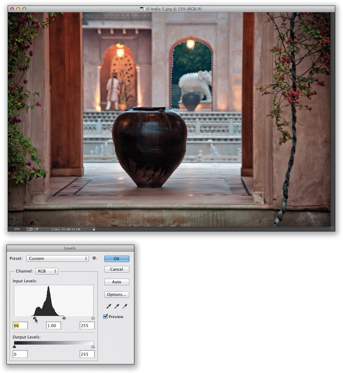
USING THE MAGIC WAND TOOL:
We use this tool much less today than we used to in the past (mostly thanks to the Quick Selection tool), but it’s still handy when you have a solid color or similar colors in an area you want to select. For example, if you had a solid yellow wall and you wanted to select it so you could change its color (using the Hue slider in Photoshop’s Hue/Saturation adjustment, found under the Image menu, under Adjustments), then the Magic Wand tool would be the tool that would usually select that entire wall in one click. In our example here, we want to select the green trees outside the arch in the background and use Levels to darken the shadows. So, take the Magic Wand tool (it’s nested beneath the Quick Selection tool; press Shift-W until you have it) and click it once on the trees. It gets most, but not all of them, so press-and-hold the Shift key (to add to your current selection) and click it again over any areas it missed on the first click. You might have to do this a few times. Also, the Tolerance amount (up in the Options Bar) determines how many colors out it selects. The higher the number, the more colors it includes, so if it selects way too much, just enter in a lower number (I lowered it to 20).
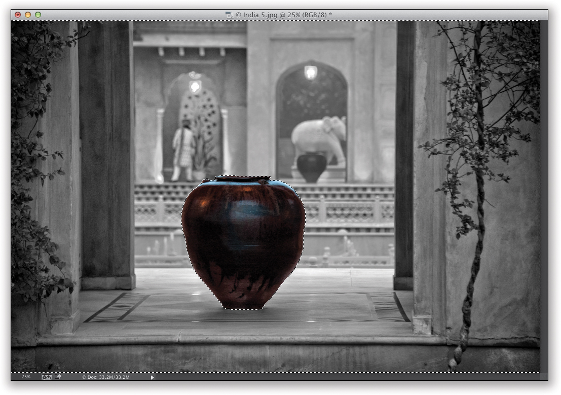
INVERSING A SELECTION:
A popular selection trick we use when making a tricky selection is to select something easy in an image (like the vase, here), and then go under the Select menu and choose Inverse. This inverses the selection, so everything but the original object we selected is now selected. So, for example, if we wanted everything in this photo to be black and white, except for the vase, we’d select the vase, choose Inverse, then go under the Image menu, under Adjustments, and choose Desaturate. I thought showing you this, here, might come in handy at some point.
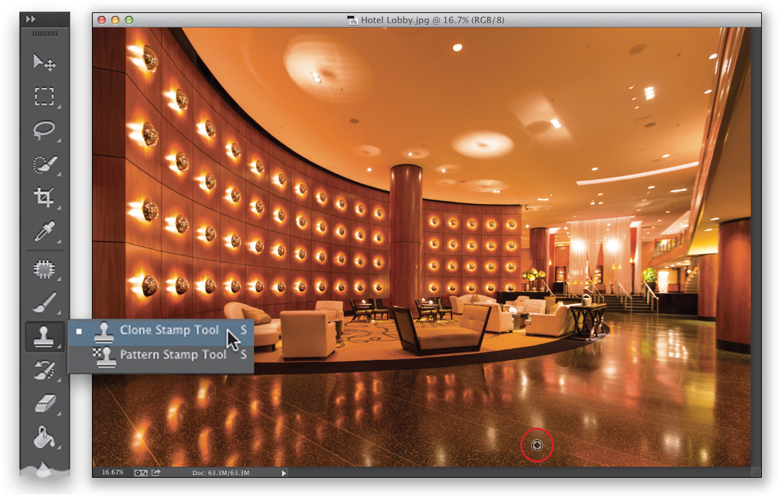
#4: Cloning and the Patch Tool
Lightroom’s Spot Removal tool does have a Clone option, but it’s...well...it ain’t great (and that’s being kind). However, Photoshop’s Clone Stamp tool is incredible—it fixes, covers up, and removes all sorts of things in a way Lightroom just can’t. For example, if you have a shot of a building with a broken window, you can paint a nearby window right over that broken one at a quality that no one would ever know it was fixed. But, that’s just the tip of the iceberg of what it can do. Plus, there’s also the Healing Brush (the more powerful cousin of the Clone Stamp tool [Spot Removal tool]), which we use for bigger repairs.
HOW TO CLONE:
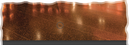
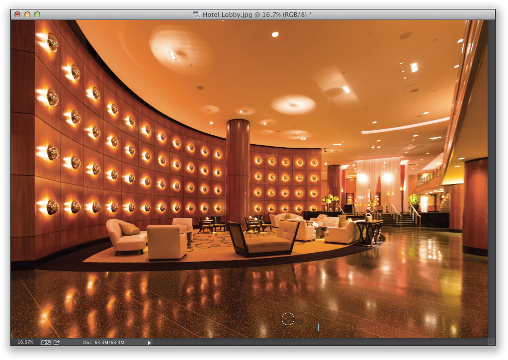
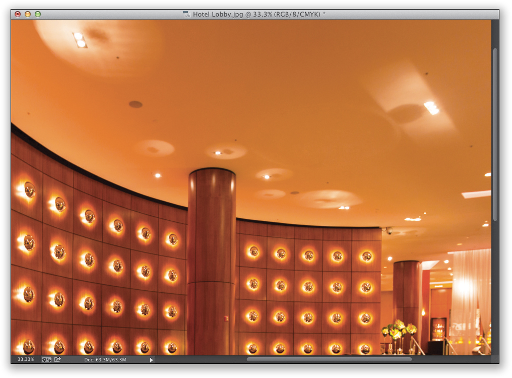
In this image, we want to remove some extra reflections from the lighting in this hotel lobby, both on the ceiling (big jobs) and on the floor (small, but really tricky jobs because there are dividing lines between the tiles, so you can’t just remove the reflections, you have to remove them and replace the lines). We’ll start on the floor. Get the Clone Stamp tool (S) from the Toolbox, then press-and-hold the Option (PC: Alt) key and your cursor changes into a target. Click this target cursor right along one of the lines on the floor near where you want to remove a reflection (as seen circled here). Now, move your cursor up over the reflection, and you’ll notice that you see a preview inside the round brush cursor itself of what you’re about to clone. You can see the original line where you clicked in the brush cursor in the zoomed in view here, so you can line it up perfectly along the line in the tile, but it doesn’t cover it all yet.
Now, just start painting and it clones the floor where you Option-clicked (PC: Alt-clicked) earlier right over that reflection. Since that area (called the “sampled” area) had that straight line, that line is cloned right over the reflection, and as you paint over it, and the area to the left of it, the reflection is gone, and the line is filled in right over it. Pretty amazing. So, that’s how the tool works: you sample a clean nearby area by Option-clicking on an area, you move your cursor over the area you want to repair, and just click to clone the good area right over it.
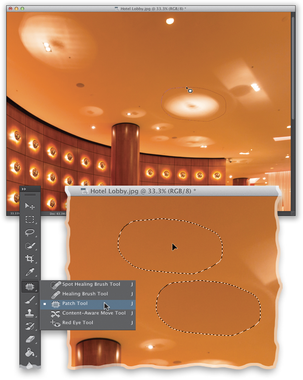
THE PATCH TOOL:
While we could remove all the reflections, one-by-one, using the Clone Stamp tool, it would take quite a while, and you’d have to be pretty meticulous in your cloning because some of these reflections are pretty large. When the object you want to remove is large, that’s when we reach for the Patch tool. It’s also kind of like Lightroom’s Spot Removal tool, if it was combined with Photoshop’s Lasso tool. Here’s how it works: Get the Patch tool from the Toolbox (it’s nested beneath the Spot Healing Brush tool; press Shift-J until you have it) and draw a freehand selection around the object you want to remove (in our example, one of those big reflections on the ceiling, as seen here), just like you’d do with the Lasso tool. Once you’re done, click inside the selection and drag it to a clean area of the ceiling (like you see here in the zoomed in view).
Once you drag your Patch tool selection to a clean spot (it shows you a preview within the selected area, just like the Clone Stamp tool shows you a preview inside its brush cursor), just let go of your mouse button and the selection snaps back to its original location and removes the reflection based on the texture, tone, and color from where you dragged the selection to (as seen here at the bottom, where the reflection is gone). Then, press Command-D (PC: Ctrl-D) to Deselect. If you need to do a little cleanup after using the Patch tool, just switch back to the Clone Stamp tool and use that to clean things up.
Tip: What to Do If It Smears
If the object you want to remove is near an edge in the image, chances are the Patch tool will leave a large smear when it patches the area. If that happens, press Command-Z (PC: Ctrl-Z) to Undo, then go up to the Options Bar and, from the Patch pop-up menu, choose Content-Aware, and try again. That will usually do the trick.
#5: Working with Layers
Layers are one of the main features we come over to Photoshop for because they do so much. A layer lets you add something on top of your image and position it wherever you’d like. For example, say you’d like to add a graphic or type to a wedding book page, or you’d like to blend two photos together for a fine art effect, you can do this with layers. Plus, we use layers for everything from portrait retouching (see Chapter 4) to special effects (see Chapter 6). Here are the basics on how layers work:
STEP ONE:
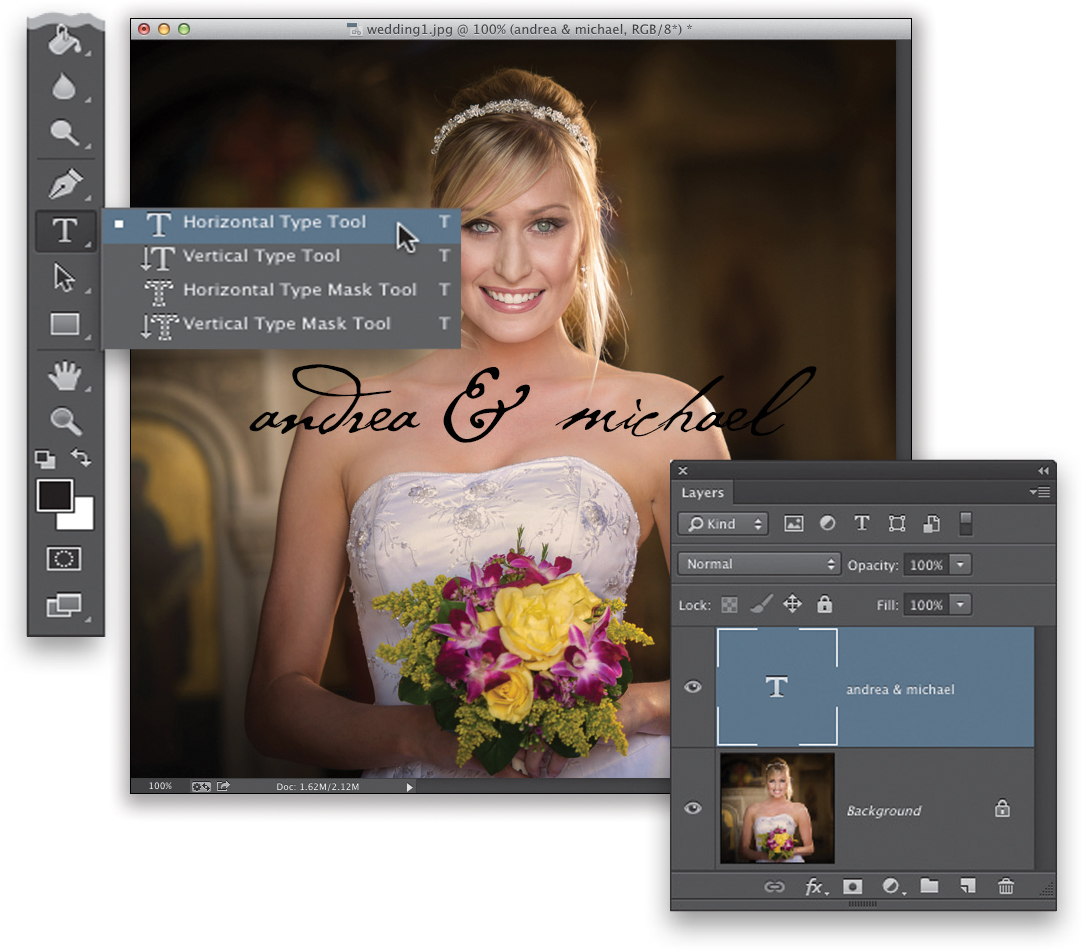
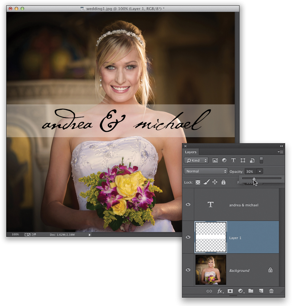
Open the image you want to edit in Photoshop and it will appear as the Background layer (meaning it’s just a regular flat ol’ image, just like in Lightroom). To add some text above your image, we’ll use the Horizontal Type tool (T). So, just click right on your image and start typing and it will type in whatever font and size you have selected in the Options Bar. If you want to change the font or size, highlight your type, then go up to the Options Bar and choose a new font from the font pop-up menu (I chose the font Cezanne Regular, but you can choose any font you like) and a large font size from the font size pop-up menu (I chose a size of 48 pt), then press Command-Return (PC: Ctrl-Enter) to set the type. You can reposition it anywhere you’d like using the Move tool (V; the topmost tool in the Toolbox).
STEP TWO:
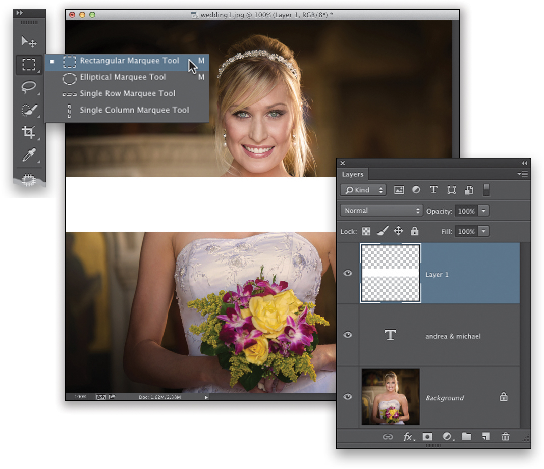
If you look at the type in Step One, some of the black type is kinda hard to read (especially the last couple letters of Michael’s name), so we’re going to put a white bar behind the type so it all stands out. To add a new blank layer above your type layer, click on the Create a New Layer icon at the bottom of the Layers panel (it’s the second icon from the right). Now, get the Rectangular Marquee tool (M) from the Toolbox and click-and-drag out a thin, wide rectangle from side to side (as seen here). Press the letter D, then X to set your Foreground color to white, and then press Option-Delete (PC: Alt-Backspace) to fill this selection with white (as seen here). Press Command-D (PC: Ctrl-D) to Deselect.
STEP THREE:
Unfortunately, this white bar now covers up our type when we actually want it behind our type. That’s because layers are added to the stack from the bottom up. Take a look at the Layers panel in the previous step. There, we have the Background layer (that’s on the bottom), and then on top of that we have a type layer. When it was only those two layers, you could see the type because it was stacked above the Background layer in the Layers panel. But once you added another layer on top, and filled it with white, it covered whatever was below it—the type layer and the photo of our bride. To get that white bar below our type layer, go to the Layers panel, and click-and-drag the white bar layer (Layer 1) down below the type layer (as seen here). The stacking order is now: the background image, then the white bar, and the type layer on top.
STEP FOUR:
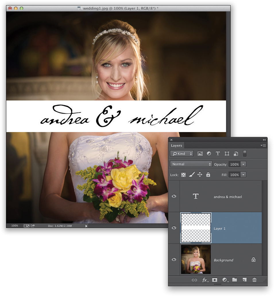
Now, if you look at the image in Step Three, you can see that the solid white bar covers up part of the image of the bride. That’s because it’s a solid object and solid objects cover up what’s below them in the Layers panel. However, layers all have an opacity setting, so if you want your object to be a little see-through, or a lot, you can lower the opacity amount for that layer. Make sure that layer is active (highlighted), then just go up to the Opacity field near the top right of the Layers panel (where it says 100%), click on the little down-facing arrow to its right, and the Opacity slider appears. Drag it down to around 30% (as shown here) and now you can see through to the bride on the Background layer.
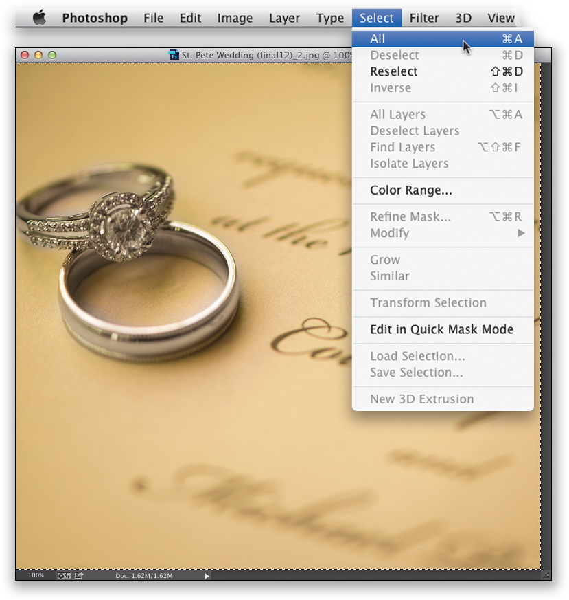
STEP FIVE:
Next, let’s add another image here and we’ll subtly blend them together. So, open another image in Photoshop (in this case, it’s a wedding invitation with wedding rings on top). We’ll need to select the entire image first, before we can copy it into memory, so go under the Select menu and choose All (or just press Command-A [PC: Ctrl-A]). Once you have a selection around the image, press Command-C (PC: Ctrl-C) to Copy the photo into Photoshop’s memory.
Tip: Deleting Layers
To delete a layer, click on the layer in the Layers panel and (a) drag it onto the Trash icon at the bottom of the panel, (b) click on the Trash icon (but then it’ll ask if you really want to delete the layer), or (c) hit the Delete (PC: Backspace) key on your keyboard.
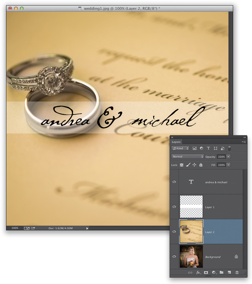
STEP SIX:
Switch back to our photo of the bride and press Command-V (PC: Ctrl-V) to Paste the image in memory right into your document. It will appear on top of whatever your last active layer was. (Note: You may have to resize your pasted image, but we’ll cover that in detail in #6.) In this case, the last layer we worked on was the white bar layer, so it appears in the stack of layers right above the white bar layer. However, we’re going to want it to appear right above our photo of the bride (so we can blend the two photos together and still have the white bar and type layers above them). So, go the Layers panel, and click-and-drag this layer down in the layer stack right above the Background layer (as seen here). To get this image to blend with the bride photo on the layer below it, I could just lower the opacity of this layer, but it doesn’t make for a very interesting blend. That’s where the layer blend modes come in.
There are a whole bunch of layer blend modes (you can find them in the pop-up menu near the top left of the Layers panel—they’re all seen here on the far right), and they determine how the current layer blends with the layer (or layers) below it. Some blend in a way that makes the combination of layers much brighter (like Screen mode) or much darker (like Multiply mode). So, which one is the “right” one for these two images? Who knows? That’s why we use a keyboard shortcut to try them all out, and then we just stop when we find one that looks good to us. The shortcut is Shift-+ (plus sign). Each time you press this, it changes to the next blend mode in the pop-up menu, so when you see one you like, stop. Yes, it’s that easy. Here, I stopped at Soft Light, then lowered the opacity of this layer to 80% because the effect seemed too strong.
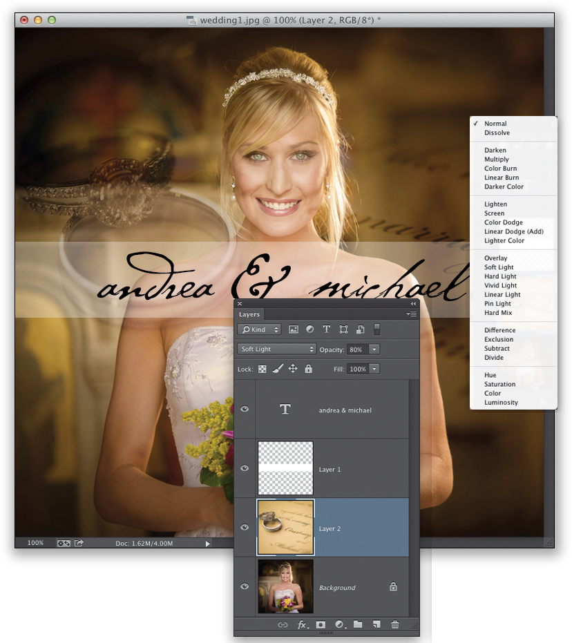
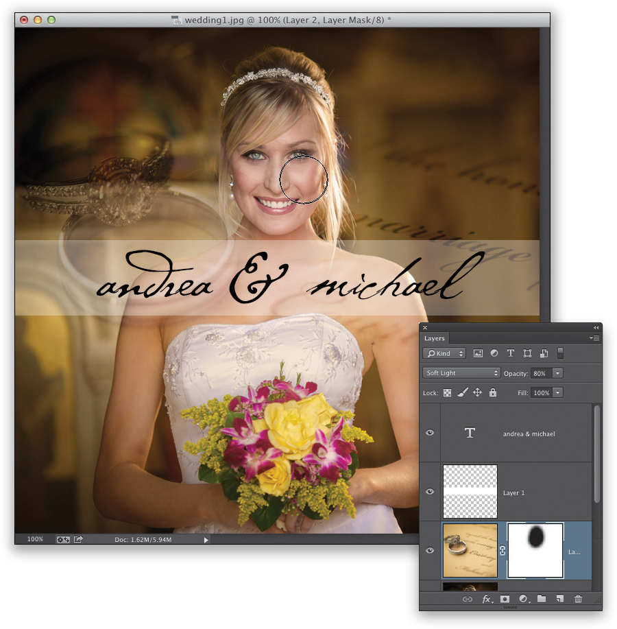
STEP EIGHT:
There’s still a little problem, here, though. The invitation layer is making her face seem too yellow. I’d rather have her face appear like it does in the Background layer, but luckily we can choose which parts of our layers are visible by using layer masks. To add one, click on the Add Layer Mask icon at the bottom of the Layers panel (it’s the third icon from the left), and it adds a white thumbnail mask to the right of your image thumbnail in the Layers panel. Since it’s white, you’ll paint in the opposite color—black. So, get the Brush tool (B) from the Toolbox, choose a large, soft-edged brush from the Brush Picker up in the Options Bar, and paint over her face (as shown here). It basically cuts a hole in the invitation layer, so you can see her original face on the layer below.
#6: Resizing, Rotating, and Transforming
Since you’ll be working with layers a lot, you’re going to want to know how to resize things, because if you add something to a photo, like maybe a custom watermark or a logo or another photo (like we just did in #5), you might need to resize it to fit on your photo. Photoshop’s feature for resizing is called “Free Transform,” and the name fits because besides resizing, it lets you rotate, skew, flip, distort, and all sorts of other cool stuff. We’ll cover a bunch of ‘em here. You’ll also want to know how to resize the entire image, so we’ll do that, as well (at the very end).
STEP ONE:
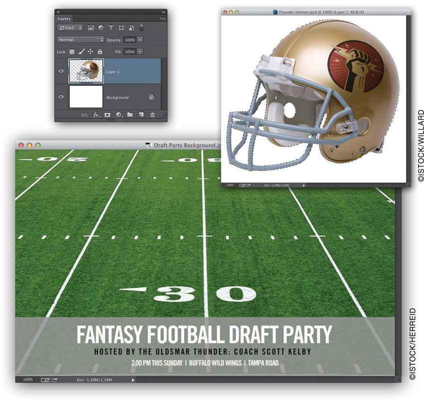
We’ll start by opening the background image (this is an image from iStock that started in Lightroom. I took it over to Photoshop to add the three lines of text [I used the font Trade Gothic LT Std.], then I added that gray bar behind the text, and then lowered the opacity so it was a little transparent. We just covered how to do all this in #5). Then, we’ll open another image—one of a football helmet on its own layer (with a transparent background). To get that helmet onto our football field background, press-and-hold the Command (PC: Ctrl) key, then go to the Layers panel and click directly on the thumbnail for the helmet layer. This puts a selection around everything on this layer (the helmet). Now, press Command-C (PC: Ctrl-C) to Copy that into memory.
STEP TWO:
Now, switch back to the football field background image and press Command-V (PC: Ctrl-V) to Paste the helmet you copied into this document. As you can see, it’s a little big (this is why we need to know how to resize stuff within Photoshop). By the way, there are other ways to copy objects like this helmet between documents. Here’s another way: Go back to the helmet image, then go under the Layer menu and choose Duplicate Layer. In the dialog that appears, from the Destination pop-up menu, choose the football field image.
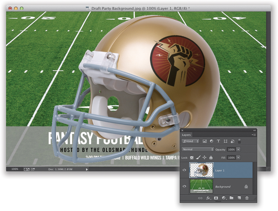
STEP THREE:
To scale our image down in size, we’ll use Free Transform. Its keyboard shortcut is Command-T (PC: Ctrl-T), so it’s easy to remember: T for Transform. When you press this, it puts a bounding box around whatever is on your active layer, with little handles in its four corners and at the center of all four sides. To resize something (like our helmet), all you have to do is press-and-hold the Shift key (this makes it resize proportionally, so your image looks the same, just smaller), then grab one of the corner handles (it doesn’t matter which one) and drag inward to scale it down, as shown here (or drag outward to make it larger). When you’re done resizing, press the Return (PC: Enter) key to lock in your transformation.
STEP FOUR:
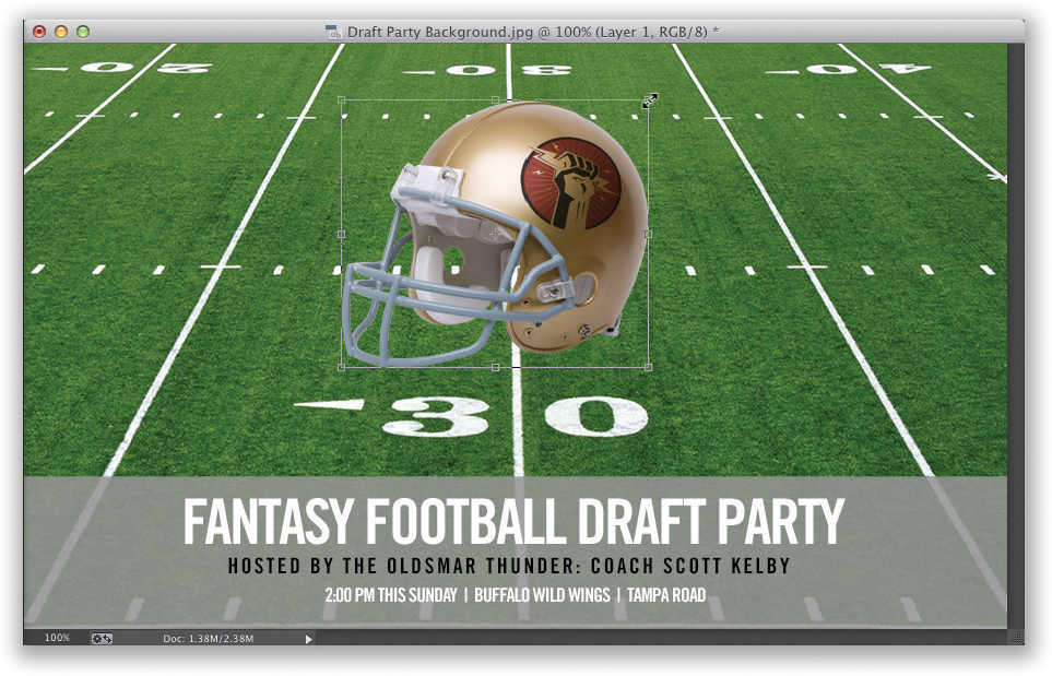
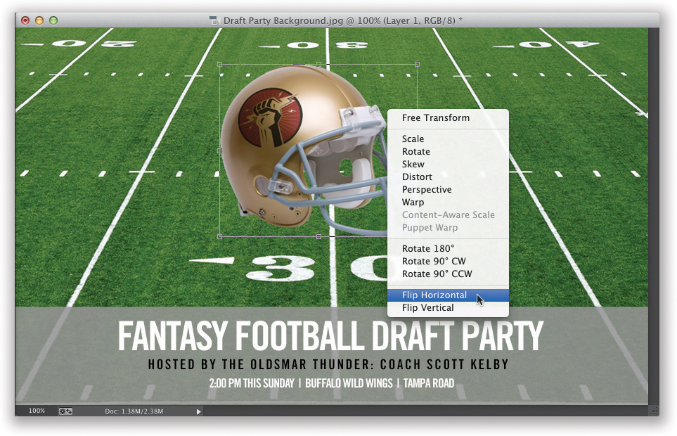
Let’s get the Free Transform bounding box again, but this time let’s Right-click anywhere inside of it. This brings up a pop-up menu of all the transformations you could apply—everything from Rotate to Skew, Perspective to Rotate 180°, and everything in between. When you choose one of these options, and then use the handles, it automatically transforms based on the selected option. Here, we want to have Free Transform flip the helmet horizontally (we can get away with this because there’s no text on the helmet. If there were text, it would read in reverse). So, Right-click within the bounding box, choose Flip Horizontal, and the helmet flips (as seen here).
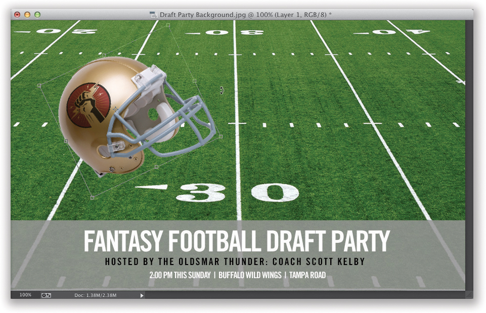
STEP FIVE:
Now, to rotate our flipped helmet, all you have to do is bring up Free Transform once again (if it’s not still active), then move your cursor outside the bounding box, and you’ll see that your cursor changes into a two-headed arrow. This lets you know you’re ready to rotate. So, rotate the object by clicking-and-dragging up/down. Here, I placed my cursor outside the right side of the bounding box and rotated up. Then, I moved the helmet over to the left side—just move your cursor inside the bounding box and it changes into the solid Move arrow, so you can just click-and-drag it to the left. Press Return (PC: Enter) to lock in your transformation.
STEP SIX:
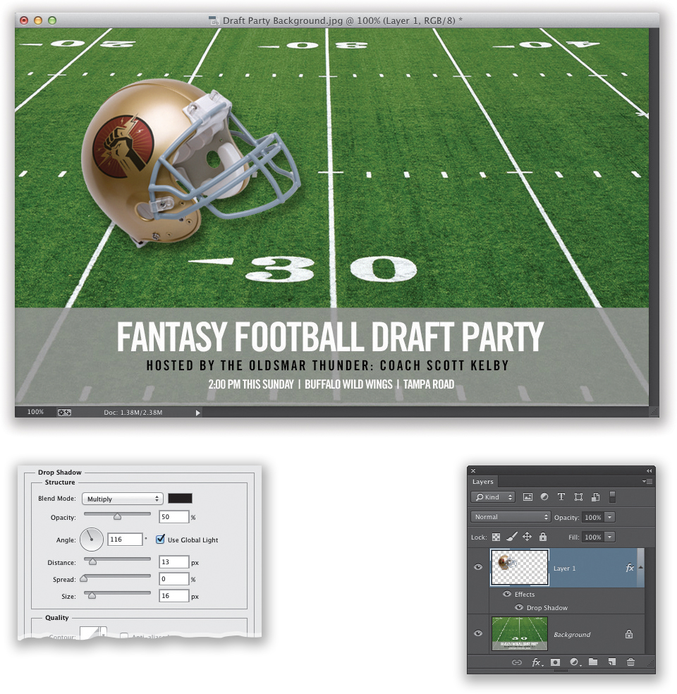
Okay, we’re going to stray away from resizing for just a moment, so we can introduce layer styles. You use these to add drop shadows, glows, and stuff like that to a layer. So, to add a drop shadow behind our helmet, click on the Add a Layer Style icon at the bottom of the Layers panel (it’s the second icon from the left) and choose Drop Shadow. This brings up the Layer Style dialog, which gives you access to all the layer styles (but, since we’re just focusing on the Drop Shadow options here, I’m only showing that part of the dialog). There are just two sliders we need to worry about: (1) Size controls how soft the shadow is (I usually crank this up a bit), and (2) Opacity controls how dark the shadow is (I would probably lower it to 50%). There are controls for Angle and Distance, but it’s easier to move your cursor outside the dialog, onto your image, and literally just click-and-drag the shadow where you want it. When you’re done, click OK to close this dialog.
STEP SEVEN:
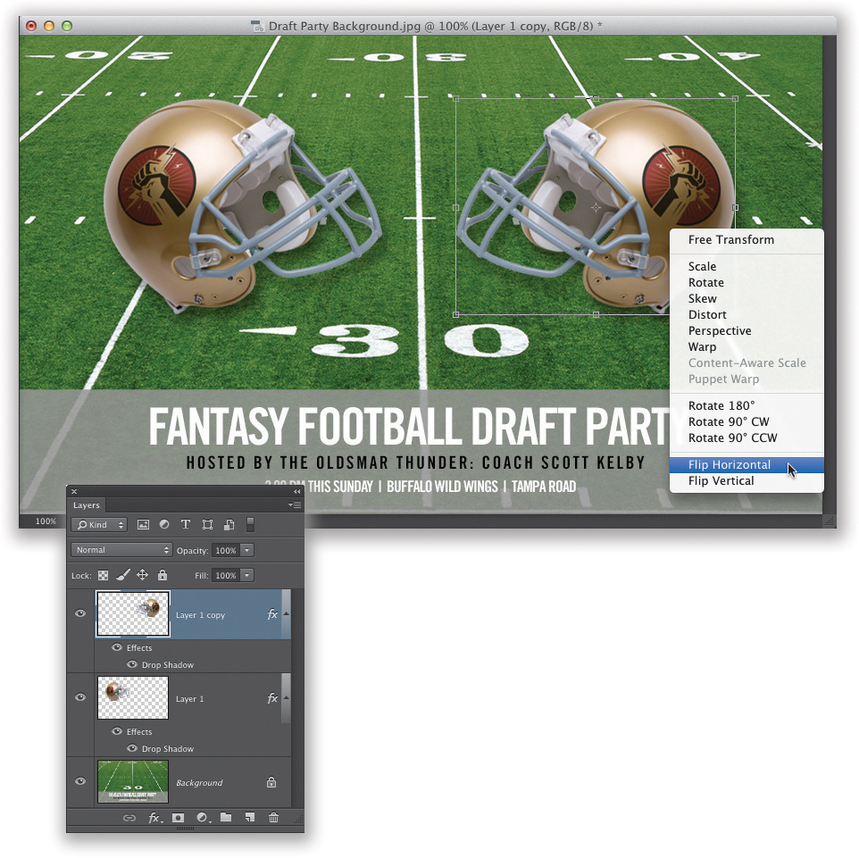
Next, let’s make a copy of our helmet layer. The quickest way to duplicate a layer is to use the keyboard shortcut Command-J (PC: Ctrl-J). This makes a duplicate of your active layer, so let’s go ahead and do that now. Bring up Free Transform (you know the shortcut), press-and-hold the Shift key (to keep the helmets aligned), and then click-and-drag the duplicate helmet over to the right. Now, Right-click inside the bounding box and choose Flip Horizontal, so the helmets are facing off with each other (as seen here). Press Return (PC: Enter) to lock in your transformation. There’s more to what Free Transform can do (and we’ll look at it a little more later in the book), but that’s what’s so cool about Photoshop in general—there’s always more you can do.
STEP EIGHT:
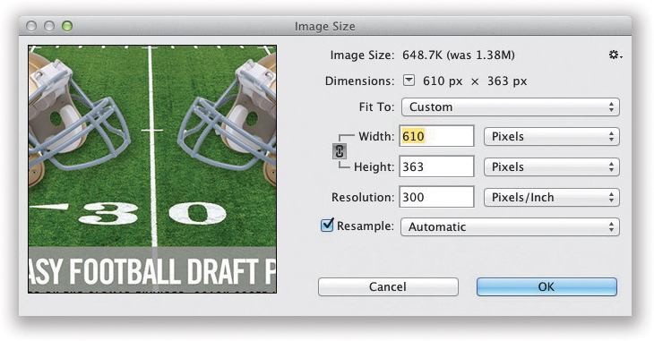
If you want to resize the entire image (not just a helmet), so it’s smaller in physical size (and file size), making it easier to email to the people you want to invite to your fantasy football draft party, just go under the Image menu (up top) and choose Image Size (or just press Command-Option-I [PC: Ctrl-Alt-I]). This brings up the Image Size dialog. There’s a preset pop-up menu of popular sizes near the top, but in our case, I just want to size it down from its original size of 1008 pixels wide (about 14") to just 610 pixels wide for emailing (that lowers my file size from 1.38MB to just 648KB, as seen at the very top of the dialog). When you’re done, click OK and it physically resizes the image (as long as you have the Resample checkbox turned on, so make sure it’s on). Also, Automatic resampling lets Photoshop use whichever mathematical algorithm it thinks will work best for resizing your image with the best results.
#7: Camera Raw as a Filter (& Adjustment Layers)
When Adobe created Lightroom, they took their Camera Raw plug-in from Photoshop and added it to Lightroom (it has the same sliders, in the same order, that do the exact same things), but in Lightroom they call it the Develop module. Luckily, if you have Photoshop CC, you don’t have to jump back to Lightroom to make any Develop module edits, because you can apply Camera Raw as a filter right within Photoshop. Also, while we’re here, we’ll cover adjustment layers, because they’re pretty darn handy.
STEP ONE:
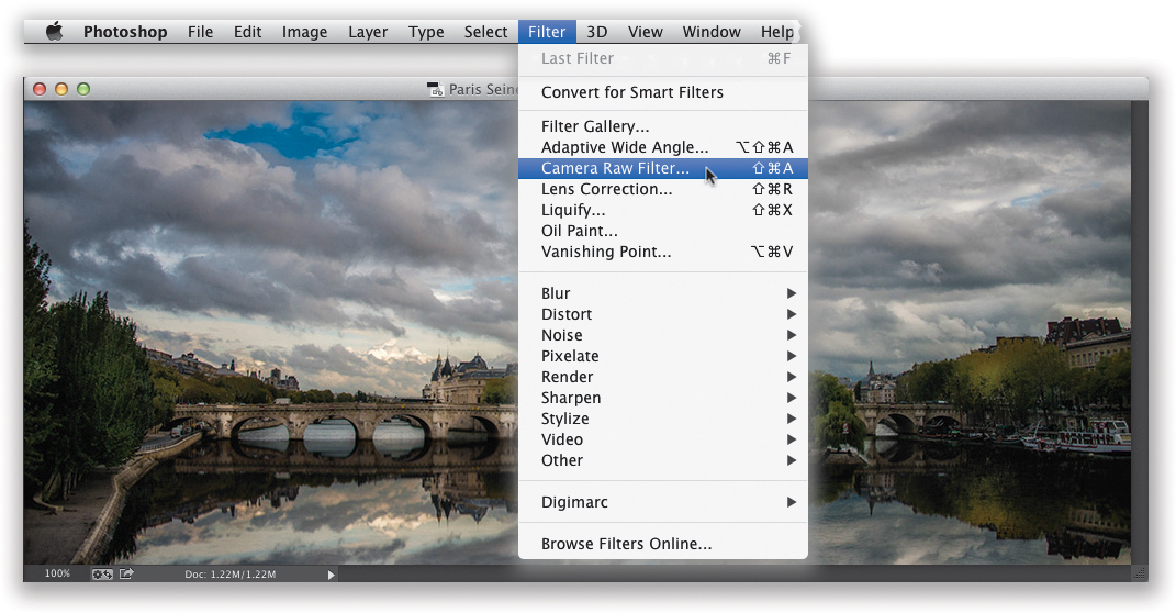
Open the image you want to edit in Photoshop. If you come to a point where you want to add a Develop module edit, but you’re not ready to head back to Lightroom quite yet, just go under the Filter menu and right near the top you’ll find Camera Raw Filter (as shown here). (Note: If you just looked for this, and you don’t see it on the menu, that’s because it’s only available in Photoshop CC [the Creative Cloud version of Photoshop]. If you don’t have CC, no worries, just skip over to Step Three.)
STEP TWO:
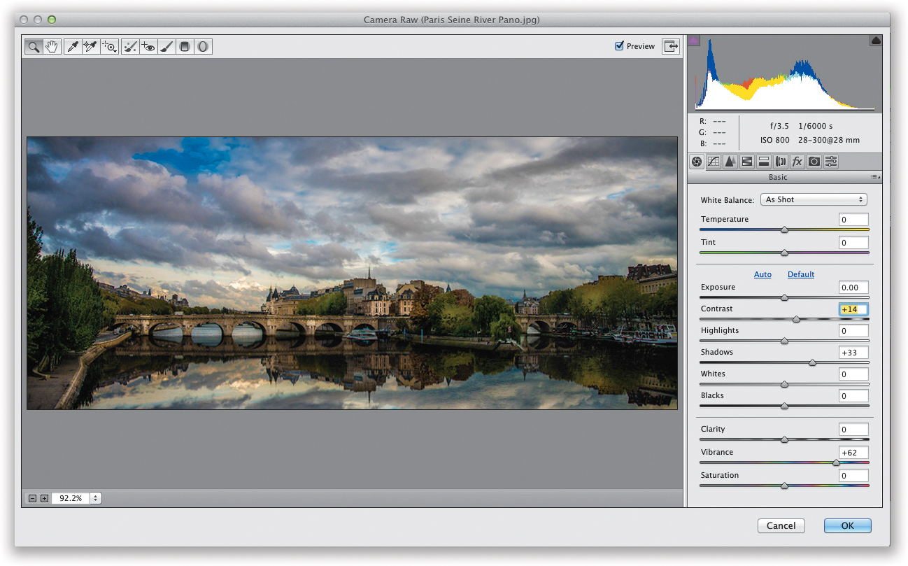
This brings up the Camera Raw window (it’s generally just called “ACR” for short), and if you look on the right side of the window, you’ll see all the same sliders, with the same names, that do the same thing as in Lightroom’s Develop module, so this should all be familiar to ya. The functionality is the same, but things appear a little differently: for example, the toolbar (that includes the White Balance eyedropper tool) is in the top left, and instead of scrolling down to get to the other panels, they’re in a row of horizontal icons near the top right—just hover your cursor over each icon to find what you’re looking for. Anyway, you make your Develop module-like edits here, then click OK, and you’re instantly back in regular Photoshop to pick up right where you left off. Easy enough.
STEP THREE:
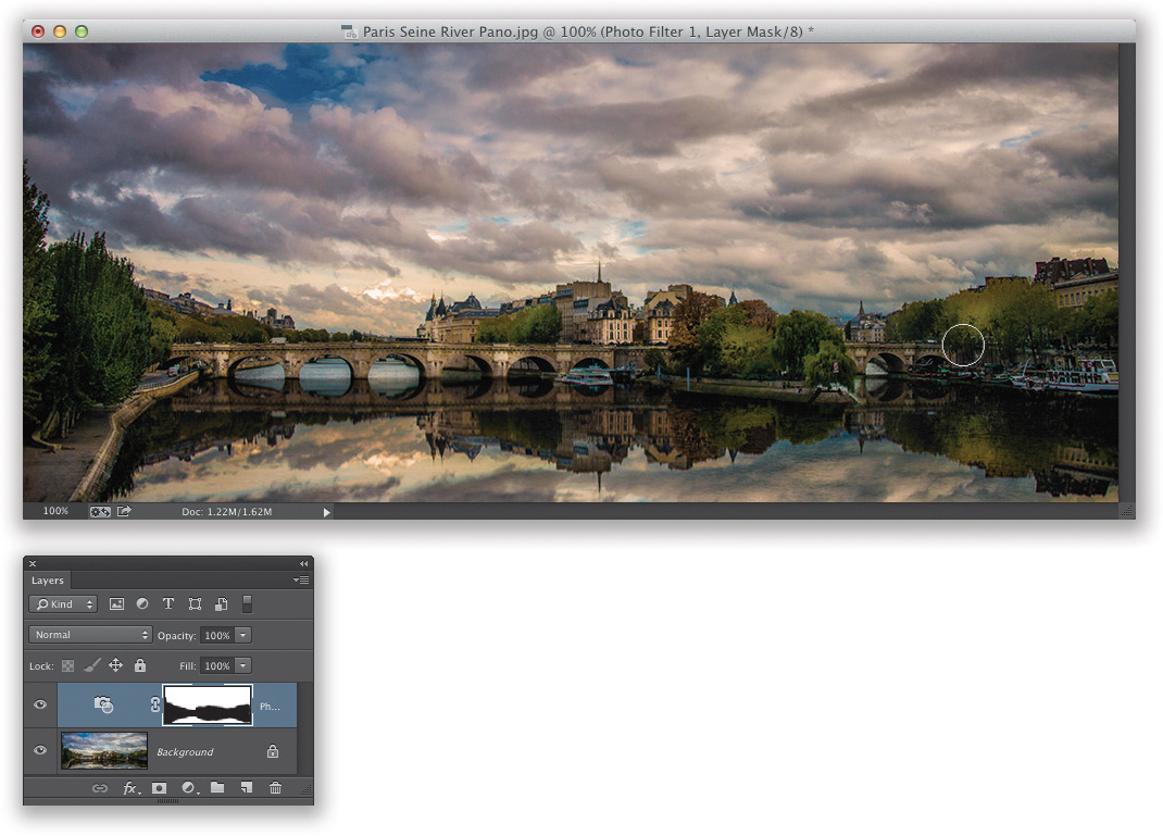
Lightroom has unlimited undos, so if you make a mistake, you can just press Command-Z (PC: Ctrl-Z) until it’s undone. Photoshop doesn’t have unlimited undos, though, so we use adjustment layers instead. These layers are adjustments (like making things brighter or darker using Levels, or changing color with Hue/Saturation). Let’s use one here, so you can see how they work: click on the Create New Adjustment Layer icon at the bottom of the Layers panel (it’s the fourth icon from the left and it looks like a half-filled circle), and choose Photo Filter (as shown here). You can also choose adjustment layers by clicking on the icons in the Adjustments panel (seen here in the lower right). When you choose an adjustment, its options appear in the Properties panel (also seen here). I wanted more orange in this image, so I increased the Density to 40% (as shown here).
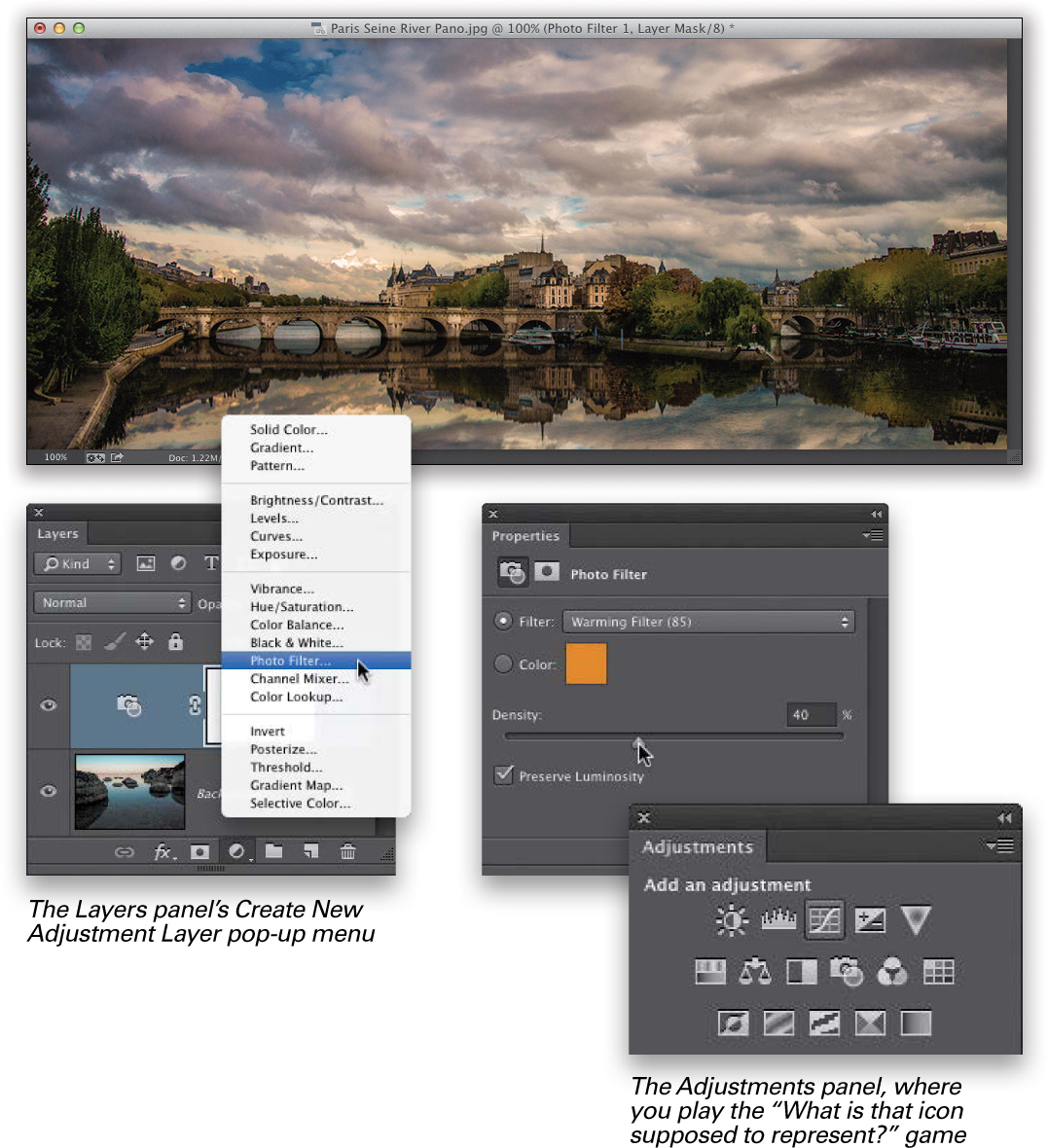
STEP FOUR:
Here’s what’s so awesome about an adjustment layer: (1) It adds the effect as a layer, so any layers below it get the effect added. (2) Since it’s a layer, you can go back and adjust the amount anytime (even if you save and close the file—when you come back, as long as you didn’t flatten the image, you can still change the effect). (3) It has a built-in layer mask, so if you wanted to remove the orange filter from just the buildings, bridge, and trees (but keep it in other areas), you’d just paint over those areas in black with the Brush tool (as shown here), and those areas are no longer affected. (4) If at some point you decide that you don’t want this effect added after all, you can delete it by dragging that layer onto the Trash icon at the bottom of the Layers panel. And, (5) it has layer blend modes just like regular layers. Overall, they’re incredibly handy (as you’ll see later in the book).