Chapter 6. Side Effects
Creating Special Effects in Photoshop
I had two really good choices for chapter names for this one: either the 2013 movie Side Effects (starring Rooney Mara and Channing Tatum) or 2009’s Personal Effects (starring Michelle Pfeiffer and Ashton Kutcher), but once I read the brief plot summary on IMDb (the Internet Movie Database), I knew it would have to be Side Effects. Here’s what it said, “A young woman’s world unravels when a drug prescribed by her psychiatrist has unexpected side effects.” That movie might just as well have been based on me, because that’s my story. When I read it, it sent chills down my spine because (a) I’m a young woman, (b) I live in this world, (c) it’s unraveling because... (d) my psychiatrist prescribed the drug trimethoxyphenethylamine, which had the unexpected side effect of me growing a full head of long blonde hair on the small of my back, to the extent that my colleagues refer to me as “Pony Boy” or “Pony Girl” or “Polly Grip.” It’s not funny. I have to trim that tail at least three times a week using a Black & Decker 12-inch, 18-volt Cordless Electric GrassHog String Trimmer/Edger to this very day. Now, there was another “effects” movie title I could have gone with, which was 2012’s Lake Effects (starring Jane Seymour and Scottie Thompson), and the fact that one of the stars was named “Scottie” was pretty compelling unto itself, but I couldn’t get past the “Lake” part. However, once I read the short plot summary on IMDb, I thought this sounded even more like my life story than Side Effects. Here’s what they wrote: “Sara and Lily grew up at Smith Mountain Lake. Sara became estranged from the family and without explanation moved to Los Angeles to study law.” This is really eerie because I grew up at Smith Mountain Lake. I became estranged from my family and without explanation I moved to L.A. to study law. It was there in Los Angeles that my psychiatrist prescribed the drug trimethoxyphenethylamine, and I bought my first Black & Decker Cordless GrassHog. Every word of this is true.
The High-Contrast Portrait Look
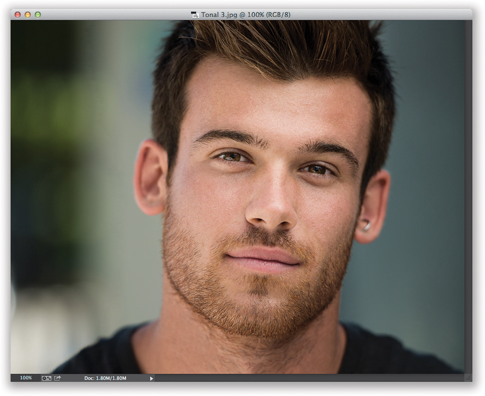
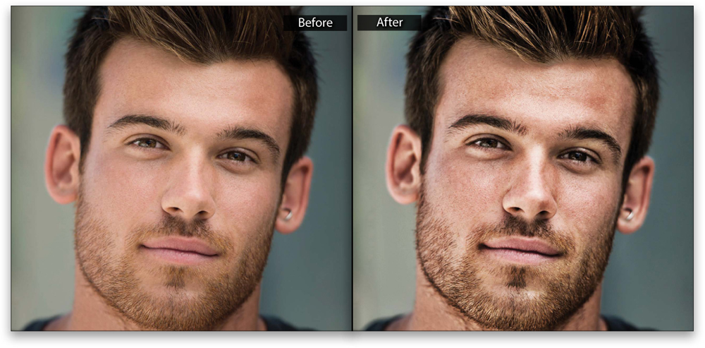
Lightroom’s Clarity slider increases midtone contrast, and does a pretty nice job of enhancing texture and giving your subjects a gritty look, but if you really want to take it to the next level, jump over to Photoshop and apply this high-contrast, mutli-layer tonal contrast effect. This is a simplified version of a technique I learned from German retoucher Calvin Hollywood, who shared his technique during a stint as my special guest blogger on my blog (http://scottkelby.com).
STEP ONE:
Open the image you want to apply a high-contrast look to in Photoshop. This effect seems to look best on shots that have a lot of contrasty lighting (I usually put two lights behind my subject, one on either side, to create a bright rim light on either side of their face, and then I fill in the shadows with a beauty dish), but it also looks good on this shot taken with natural light in the shade of a tree, so it’s worth trying even if you don’t have contrasty lighting.
STEP TWO:
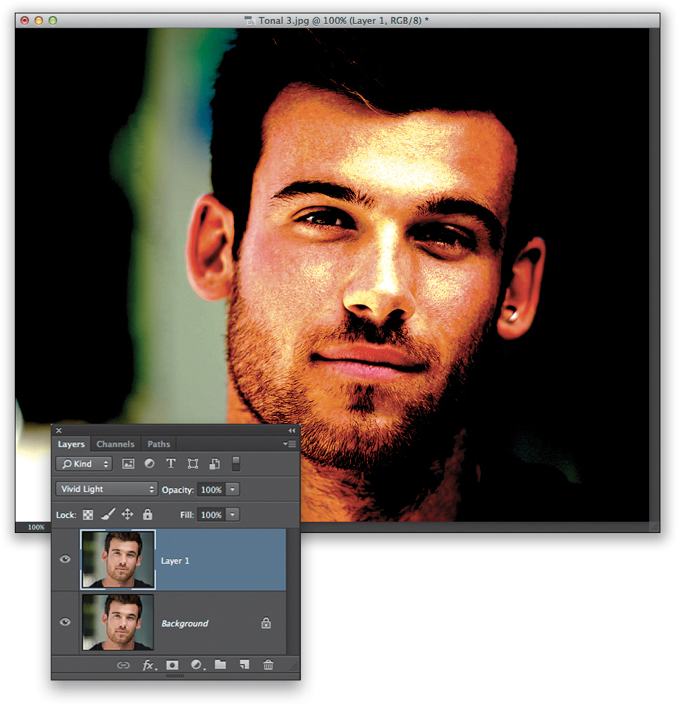
Make a copy of your Background layer by pressing Command-J (PC: Ctrl-J). Now, go to the Layers panel and change the blend mode of this duplicate layer from Normal to Vivid Light (in the pop-up menu near the top left of the panel). I know it doesn’t look pretty now, but it’ll get better in a few more moves.
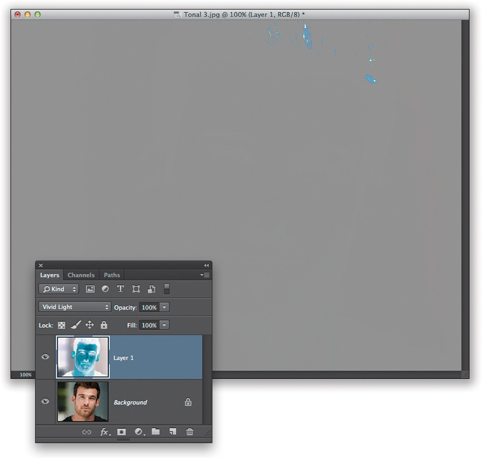
Now, press Command-I (PC: Ctrl-I) to Invert the layer. It should look pretty gray at this point (like the image you see here).
STEP FOUR:
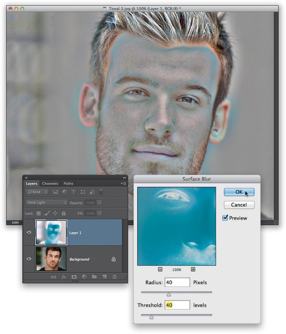
Next, go under the Filter menu, under Blur, and choose Surface Blur. When the dialog appears, enter 40 for the Radius and 40 for the Threshold, and click OK (it can take a while for this particular filter to do its thing, so be patient. If you’re running this on a 16-bit version of your photo, this wouldn’t be a bad time to grab a cup of coffee. Maybe a sandwich, too).
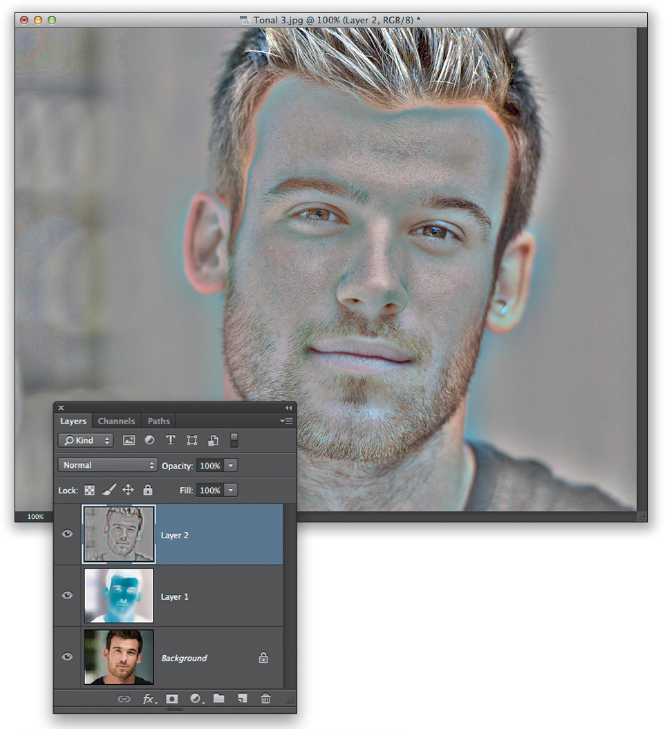
We need to change the layer’s blend mode one more time, but we can’t change this layer’s blend mode from Vivid Light or it will mess up the effect. So, instead, we’re going to create a new layer at the top of the layer stack that looks like a flattened version of the image. That way, we can change its blend mode to get the effect we need. This is called “creating a merged layer,” and you get this merged layer by pressing Command-Option-Shift-E (PC: Ctrl-Alt-Shift-E). If you look at the Layers panel now, you’ll see the Background layer (on the bottom, of course), then the Surface Blur layer, and then this new merged layer at the top of your layers stack in the Layers panel (as seen here).
STEP SIX:
Now that you have this new merged layer, you need to delete the middle layer (the one you ran the Surface Blur filter on), so click-and-drag it onto the Trash icon at the bottom of the Layers panel. We now have to deal with all the funky neon colors on this layer, and we do that by simply removing all the color. So, go under the Image menu, under Adjustments, and choose Desaturate to remove all the color (so now this layer is just gray).
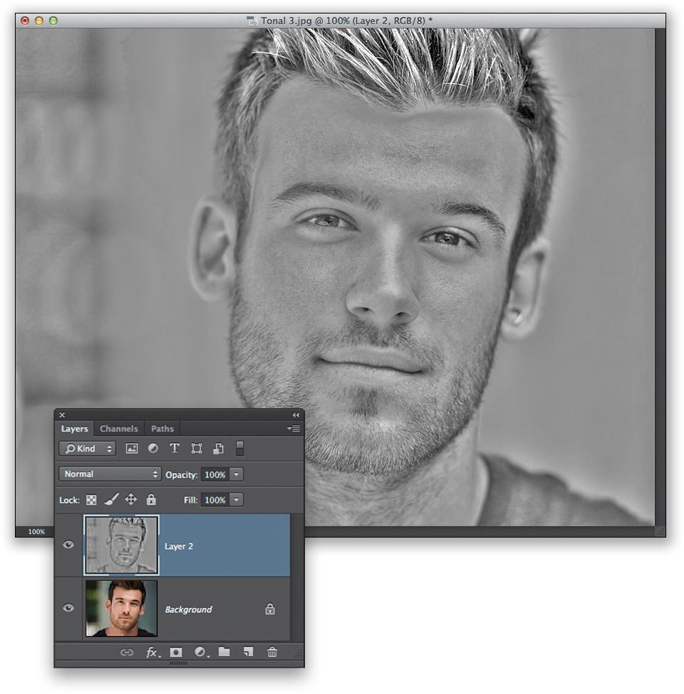
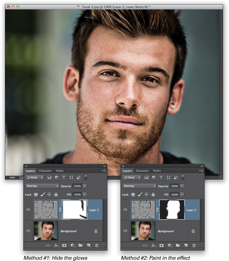
Okay, we’re almost done. Change the blend mode of your merged layer (the one named Layer 2) to Overlay, and now you can see the tonal contrast effect applied to your image. Unfortunately, we’re experiencing a side effect of applying it—the white glow you see around his hair and shoulder on the right. There are two ways to fix this: (1) Click on the Add Layer Mask icon at the bottom of the Layers panel (the third icon from the left) to add a layer mask. Get the Brush tool (B), choose a small, soft-edged brush from the Brush Picker up in the Options Bar, set black as your Foreground color and paint over the edge of his hair and shoulder, and it returns them to normal (you’re hiding the effect in that area by masking it away). Or, (2) Option-click (PC: Alt-click) on the Add Layer Mask icon. That hides your tonal effect layer behind a black mask. Switch your Foreground color to white and paint in the effect over your subject’s skin, but avoid the edge of his hair and shoulder. That’s it.
Turning a Photo into an Oil Painting in One Click
This is a really popular effect for photographers who do portraits of babies, brides, pets, and anything really cute and cuddly. Also, it can look wonderful on landscapes, travel shots, and well...you just have to try it out on whatever image you’d like to see as an oil painting because it’s so easy it’s worth trying it out.
STEP ONE:
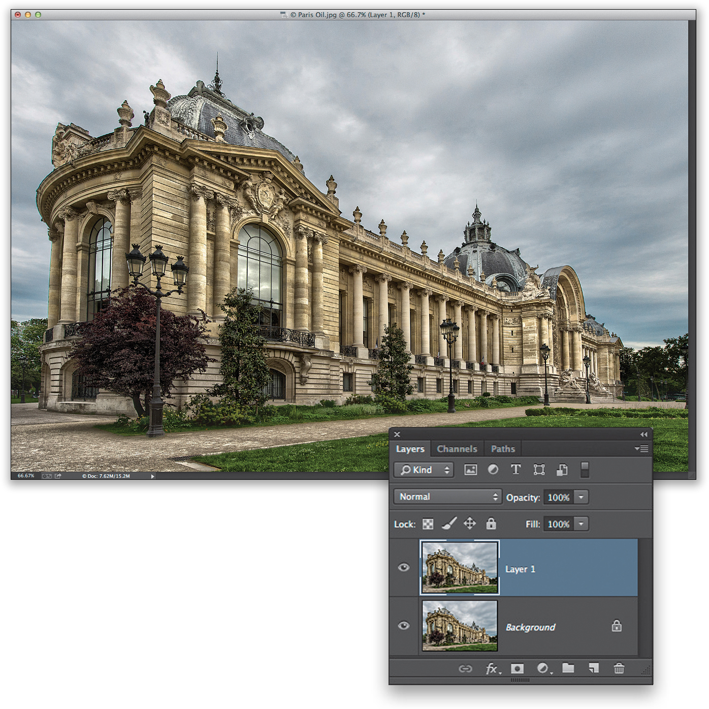
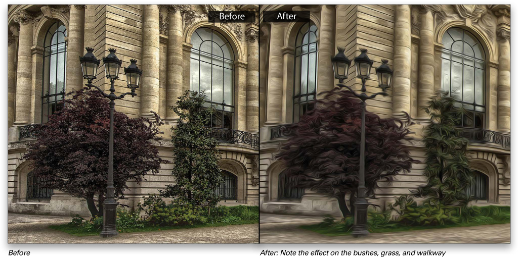
Open an image in Photoshop that you want to turn into an oil painting. Here’s a travel shot of the Petit Palais in Paris. I did a little HDR on this image (as if there was such a thing as a “little” HDR), but we’re going to turn it into an oil painting in one click. For reasons I can’t begin to understand, there is no Preview checkbox in the Oil Paint filter, so I usually start by duplicating the Background layer (press Command-J [PC: Ctrl-J]) so I can easily see a before/after by turning the top layer on/off (by clicking on the Eye icon to the left of the layer in the Layers panel).
STEP TWO:
Go to the Filter menu and choose Oil Paint. Now, when you choose this filter, it immediately applies its default settings, so once you choose it—BANG!—you’ve got an oil painting. To really see the paint effect, you’ll need to zoom in to 100%, and you can see it does a pretty amazing job of keeping detail while looking very painterly. Of course, at this point, you can just click OK and be done with it, but you actually have quite a bit of control over how your oil painting looks. Let’s start with the first slider: Stylization. Technically, this controls the style of the brush it paints with, and the farther you drag this slider to the right, the more intense the effect becomes because the brush strokes get longer and the effect looks smoother (at lower numbers, it paints with small, hard brush strokes). If you drag this slider all the way to the left, the oil paint look pretty much goes away and it just looks like you put a canvas texture over your image.

Increase the Brush Stylization to 9.0 for a smoother, more Van Gogh-esque look
The next slider down, Cleanliness, controls the detail (in fact, they could have named it the Detail slider and saved us a lot of grief). If you want the brush to paint your image with a cleaner, more detailed look (more realistic), keep this slider closer to the left, and for a softer, more painterly look (seen here), drag the slider to the right (I dragged it over to around 8.2).
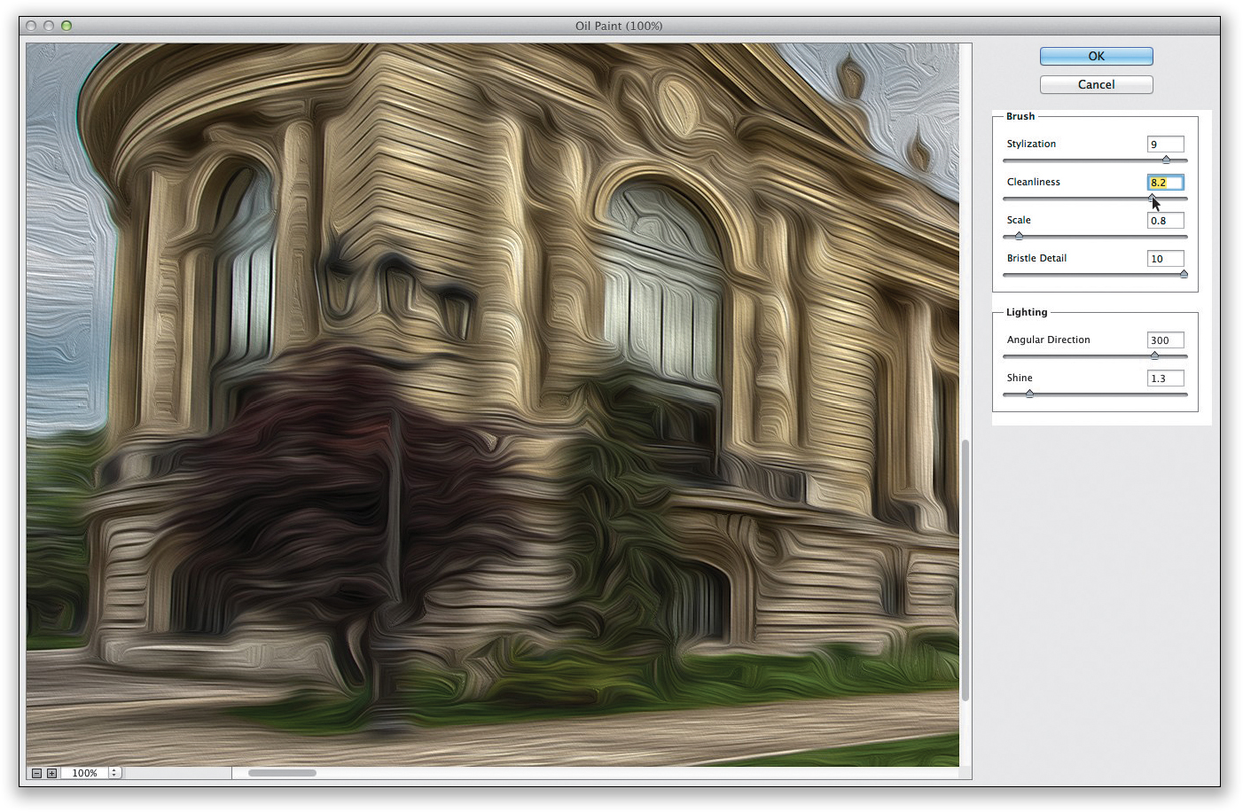
Cleanliness controls detail. Drag to the right to create a softer, more painterly look
STEP FOUR:
The Scale slider controls the size of your brush, so dragging it way over to the left paints your image with a very thin brush and dragging it all the way over to the right paints it with very thick strokes, and that definitely creates a different look.

Scale controls the thickness of the brush. Want bigger strokes? Drag to the right
Okay, a better name for the Bristle Detail slider would be the Sharpness slider. It makes the overall image look sharper or softer with how it affects the brush. Dragging it to the left takes away the detail of the brush bristles, so it’s very soft, smooth, and undefined. Dragging to the right gives it a harder, more detailed look that makes the image look sharper, as you really see the bristles in the stroke now.
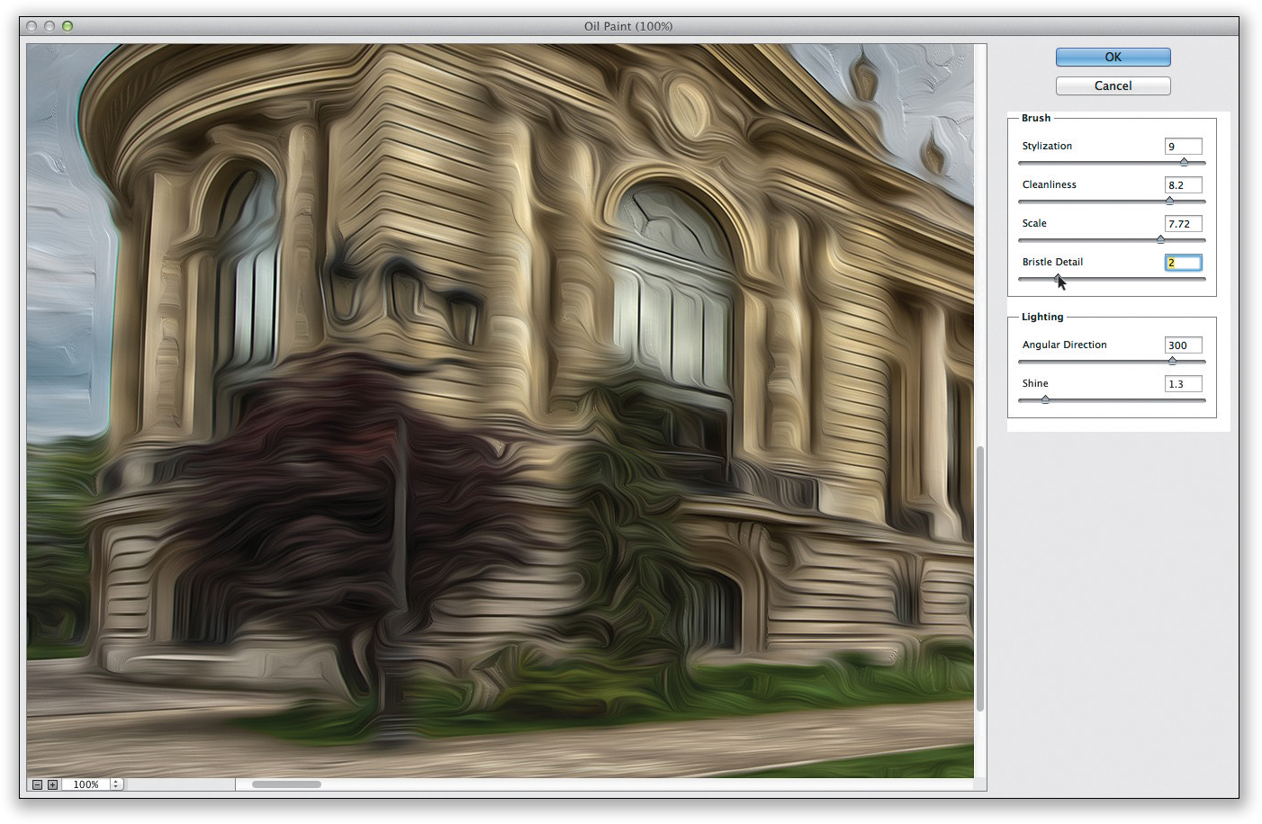
Bristle Detail controls the overall sharpness. Drag to the right for a sharper look
STEP SIX:
In the Lighting section below the brush controls, the Angular Direction controls the angle of the light hitting your painting, and the light changes as you drag from 0 to 360 degrees.
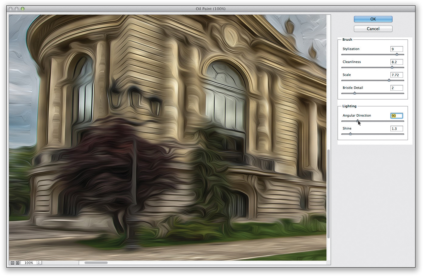
The Angular Direction lets you choose the direction of the light hitting the paint
Tip: Getting Good Results
I hate to be the guy that says, “Just drag the sliders around until it looks good to you.” But, I can tell you that I’ve used this filter enough to know that it looks so different depending on the subject, that if you just drag each slider back and forth a couple of times, you’ll find a sweet spot where it looks good for that particular photo, and you just stop there. It sounds like a cop-out, but honestly, that’s how I use it.
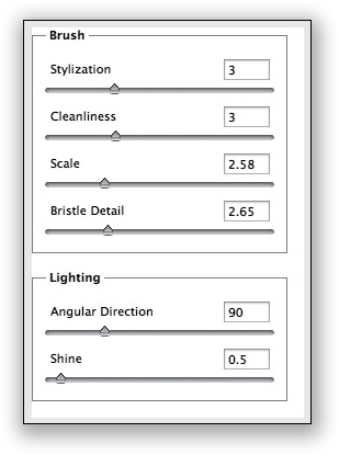
The last control in this dialog is the Shine amount, and it controls how the light reflects: dragging it to the left makes your image very flat-looking, and dragging over to the right (as shown here) adds contrast to the highlights and shadows and kind of makes the paint look thicker, almost like it’s embossed. Below are the settings for the final image (labeled After) that I came up with based on the technique I mentioned in the tip on the previous page.
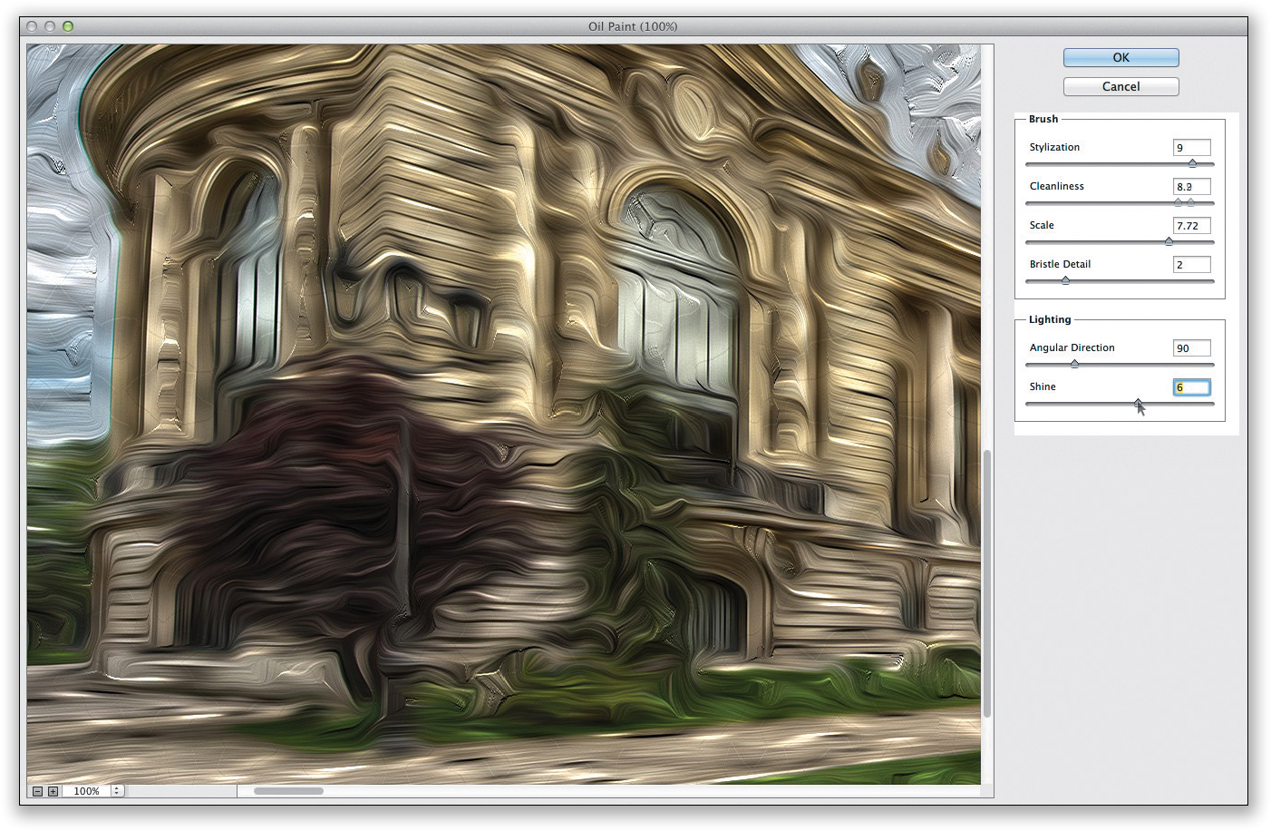
Dragging the Shine slider to the right gives an embossed look to the paint strokes
Tilt Shift Effect (The Architectural Model Look)
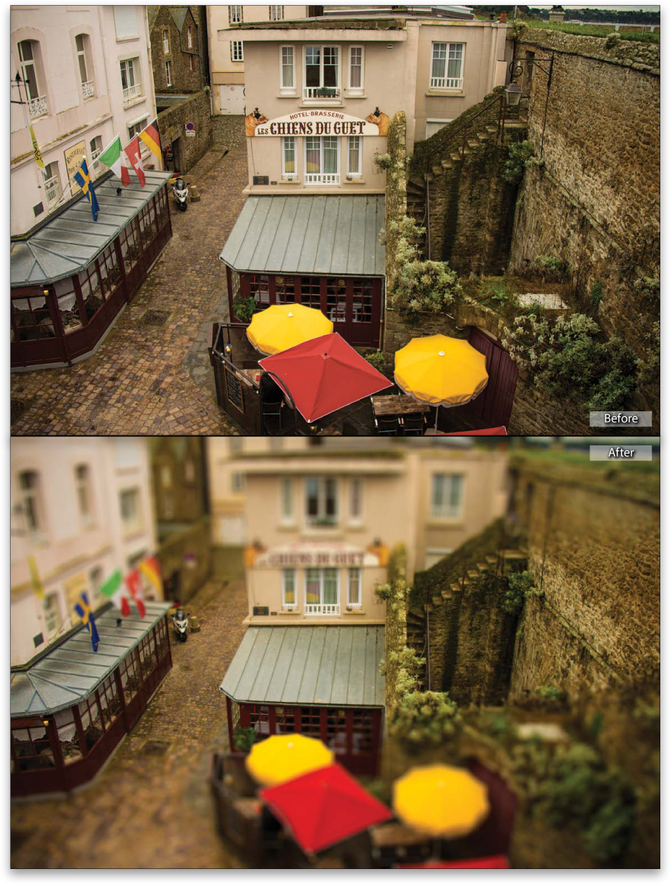
The tilt shift effect, where you miniaturize a scene and make it look like a small architectural model, has become huge in the past couple of years, with Flickr groups, and meetups, and the whole nine yards. The Photoshop part is easy as long as you have a photo where the view is from above, looking down onto the scene. That’s because that’s the angle you would actually view a real architectural model. If you’ve got a shot like that, the rest is easy.
STEP ONE:
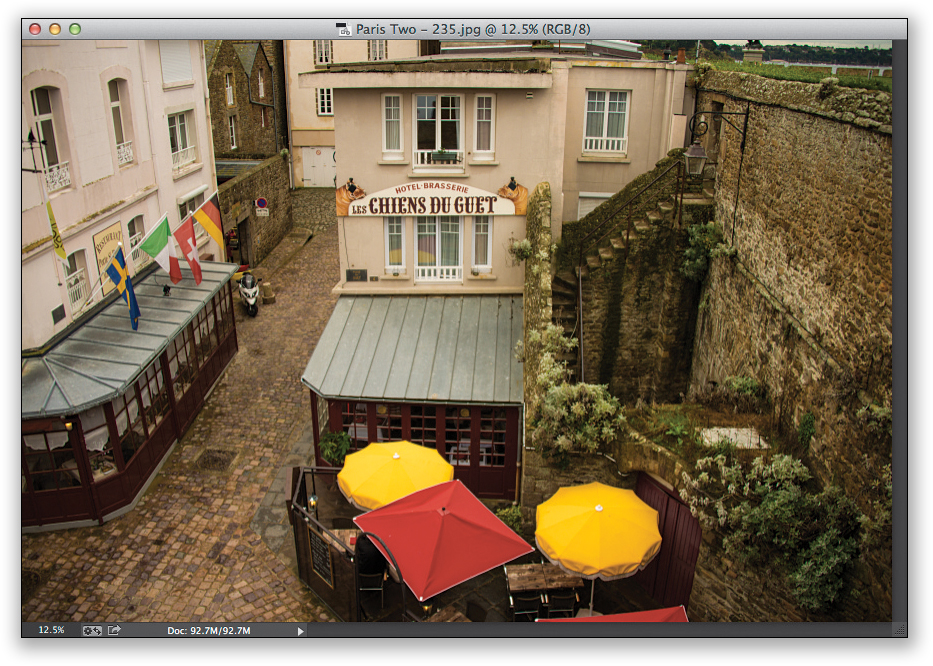
Open the image you want to apply the effect to in Photoshop (remember to read the intro above to make sure you use the right type of image, or this effect will look pretty lame. Of course, as always, you can download the image I’m using here from the book’s downloads page mentioned in the book’s introduction). Now, go under the Filter menu, under Blur, and choose Tilt-Shift.
STEP TWO:
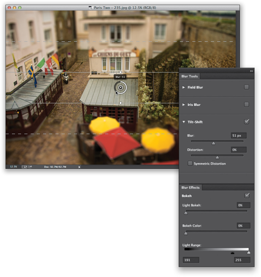
When you use this filter, you don’t get a regular filter dialog or window, instead you get an onscreen interface (Adobe introduced this in Photoshop CS6 as a more interactive way to edit your images) with a column of panels on the right side of the screen. Anyway, when you choose this filter, it places a round pin in the center of your image, and outside of that are two solid lines, and outside of those are two dotted lines. The area inside the solid lines is the area that will remain in focus (the focus area), and the area between each solid line and dotted line is a transition area, where it fades from sharp to blurry. The wider the distance between the solid and dotted lines, the longer it takes to go from sharp (inside the solid line) to totally blurry (outside the dotted line). You can change the distance between any of these lines by just clicking-and-dragging directly on them. Note: To remove a pin, just click on it and hit the Delete (PC: Backspace) key on your keyboard.
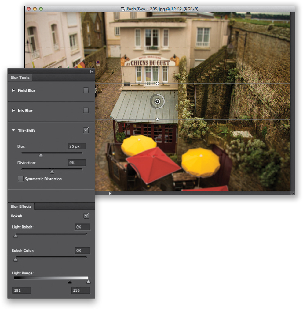
You control the amount of blur by clicking on that gray ring around the pin and dragging around the ring. As you drag, the ring turns white to show you how far you’ve gone, and the actual amount of blur appears in a little pop-up display at the top of the ring (as seen here). If you don’t like working with that tiny circle to choose your blur amount, there is a Tilt-Shift section in the Blur Tools panel on the right, and you’ll see a Blur slider over there you can use instead. In our example, I clicked-and-dragged the ring over to 51. While we’re here, look inside the two horizontal solid lines. See how that area is sharp and in focus? Okay, now look at the area outside those lines, until you reach the dotted lines, to see how it transitions to the blurry area.
STEP FOUR:
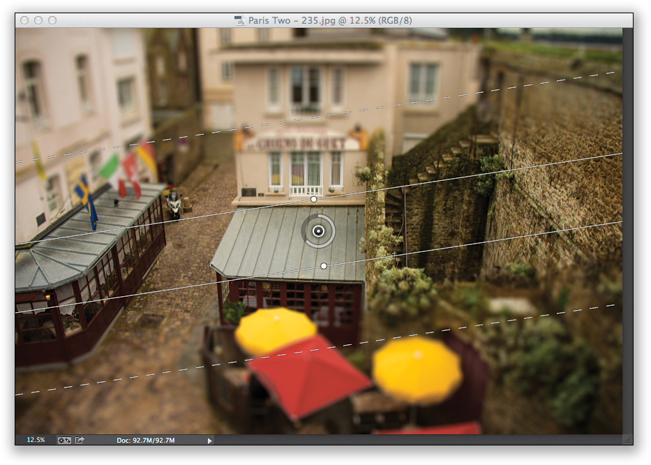
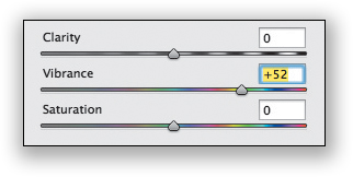
When I do these tilt shift effects, I pretty much use the same formula every time: (1) I drag the two solid lines closer to the center to make the focus area smaller, (2) I increase the blur quite a bit, (3) I rotate the entire blur a bit to the left, so it doesn’t look so intentional, by moving my cursor just outside the white dot in the center of a solid line. That changes your cursor into a double-headed arrow, and you can just click-and drag to rotate the whole effect. (4) When I’m done, I click the blue OK button in the Options Bar, and (5) lastly, I bump up the color to make the model look more colorful. You can do this when the image comes back to Lightroom by going to the Develop module and dragging the Vibrance slider quite a ways over to the right (I dragged to +52), or if you have Photoshop CC, go under the Filter menu and choose Camera Raw Filter and drag the Vibrance slider there (as seen here).
Creating Mirror-Like Reflections
Nothing kills a shot like choppy water. I include it in my “Seven Deadly Sins of Landscape Photography,” and it’s pretty deadly for travel shots. Here’s a quick technique that gives you an absolutely still water, glassy reflection, and you can end the technique right there—many people do—or you can take it one step further and bring a little more realism to the look. The choice is yours (and it does depend on the image. Sometimes the mirror look looks best).
STEP ONE:
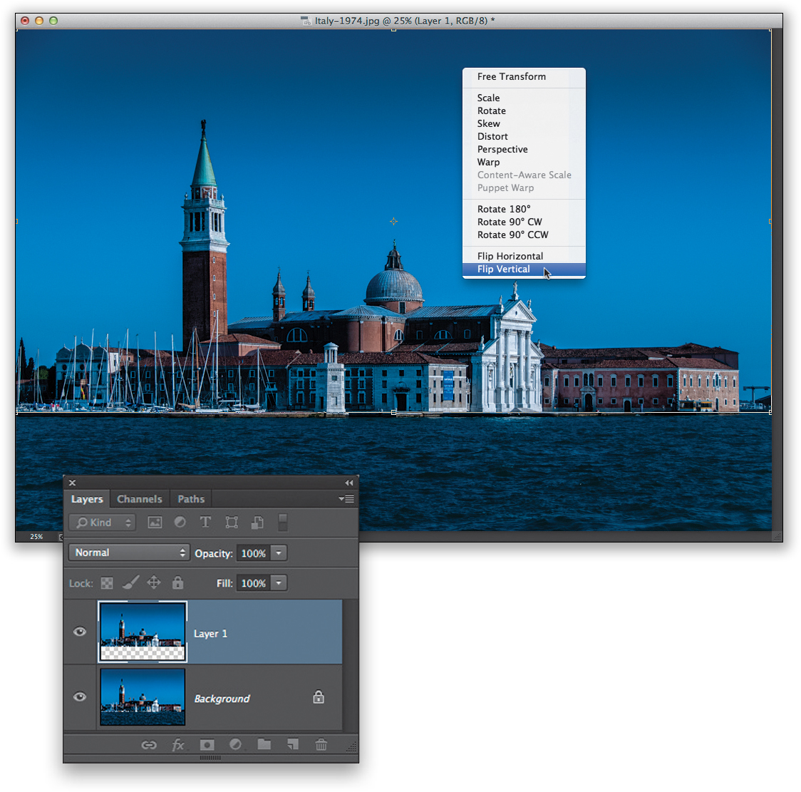
We’ll start by opening the image in Photoshop, so select it in Lightroom then press Command-E (PC: Ctrl-E) to take it over to Photoshop. In this case, we have a photo of San Giorgio Maggiore (just across the Grand Canal from Venice’s St. Mark’s Basilica), and the water is very choppy (it usually is—the Grand Canal is a very busy waterway, especially when huge cruise ships move through the canal headed out to sea). Get the Rectangular Marquee tool (M) and make a selection from the horizon line at the base of the buildings all the way up to the top of the sky (as shown here).

STEP TWO:
Now press Command-J (PC: Ctrl-J) to copy that selected buildings-and-sky area up onto its own separate layer. Once it’s there, it’s time to flip it upside down, so press Command-T (PC: Ctrl-T) to bring up Free Transform, then Right-click anywhere inside the Free Transform bounding box (which will appear around your buildings-and-sky layer). From the pop-up menu that appears, choose Flip Vertical (as seen here) to flip this layer upside down. Press Return (PC: Enter) to lock in your transformation.
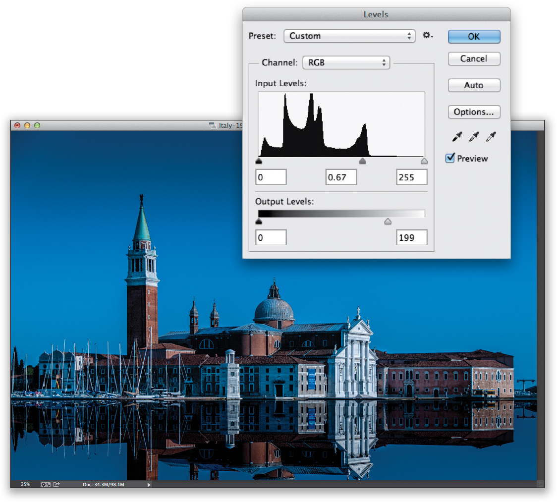
Now get the Move tool (V), press-and-hold the Shift key, and drag straight downward until the bottom of the flipped image touches the bottom of the buildings (as shown here). The reason we hold the Shift key as we drag is that it keeps the image lined up as you drag—it keeps it from sliding over to the right or the left—so it goes straight down, which is what we need to make everything perfectly match up. Now, you can end right here, and it would look good. However, I do take it another couple of moves further and whether you do (just for the sake of realism) is up to you. The first thing I do is darken the flipped reflection so it stands out from the original image, and I do this using Levels (press Command-L [PC: Ctrl-L]). When the Levels dialog appears, I drag the center Input Levels midtones slider to the right and the bottom-right Output Levels slider to the left to darken the overall flipped reflection (as seen here).
STEP FOUR:
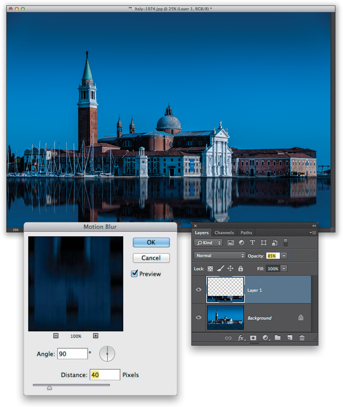
The last two moves (which are, again, totally optional) are to first apply a bit of vertical motion blur. That way, the water still reflects, but it’s not that absolute mirror reflection, and looks more like what a real reflection looks like in many cases (although it is possible to get a true mirror-like reflection in real life...just probably not along the Grand Canal). Go under the Filter menu, under Blur, and choose Motion Blur. When the dialog appears (shown here), set the Angle to 90° (straight up and down), and then drag the Distance slider over to the right until it looks good to you (in other words, it looks imperfect). My final step is to lower the layer’s Opacity for this reflection by about 15% (to 85%) to let just a tiny bit of the original water peek through, again to help it look more realistic. Here’s the final image.
Swapping Out for a Better Sky
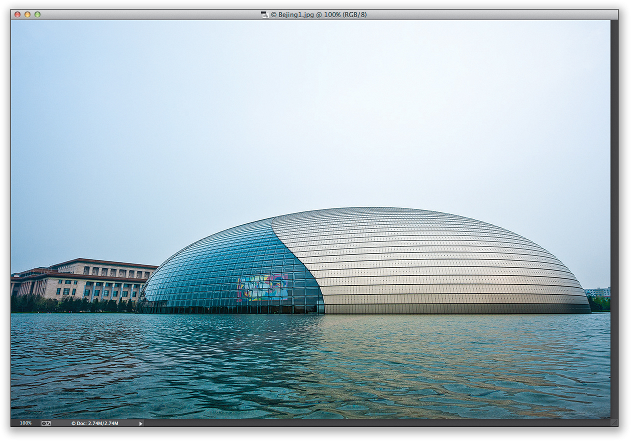
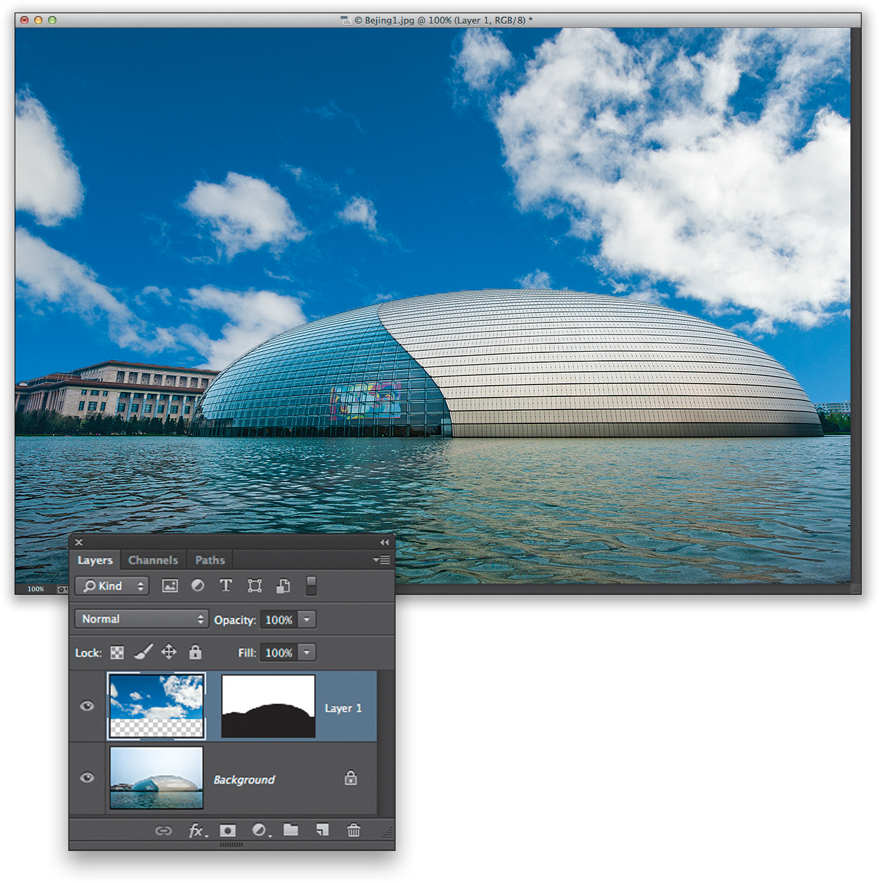
This is yet another form of compositing, but it’s kind of “reverse compositing” because, instead of selecting a person or an object and placing it on another background, we’re going to select the background (sky) and replace it with a better one. This is a handy thing to know because nothing kills a travel or landscape shot like a dull, gray, cloudless sky, like the sky was on the day I took this photo of the National Centre for the Performing Arts in Beijing.
STEP ONE:
We’ll start by opening the first image in Photoshop, so select it in Lightroom then press Command-E (PC: Ctrl-E) to take it over to Photoshop. This photo has it all—it was taken in boring light, with choppy water, under a dull, cloudless sky. I’m amazed I’m letting anyone see it at all, but it’s only because I have a feeling it’s about to look somewhat better. Since our goal is to fix the sky (by replacing it with a better sky), we need to put a selection around the current sky.
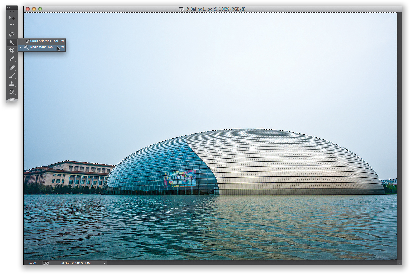
STEP TWO:
Since the sky is made up of very similar colors, either the Magic Wand tool (shown here) or the Quick Selection tool will select that sky in all of two seconds (I tested both and the Quick Selection is faster for this particular image), but choose whichever you feel more comfortable with. If you chose the Magic Wand tool (Shift-W), click it once anywhere in the sky, then press-and-hold the Shift key and click in any places it missed until the entire sky is selected (as seen here). If you chose the Quick Selection tool (W), paint a stroke from left to right across the sky and it’ll select it for you. Once it’s selected, let’s “dig in” to the edges a bit so there are no little white pixels showing up later. Go under the Select menu, under Modify, and choose Expand. When the dialog appears, enter 2 pixels (your selection will grow outward by 2 pixels), and click OK.
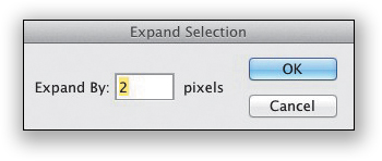
Now you’ll need to open an image that has some nice clouds in it. I chose an image taken up on a hill in Banff National Park in Canada. (Hey, there are direct flights from Canada to Beijing every single day, so I felt it was okay to use Canadian clouds. Okay, I’m stretching here, so don’t overthink this one.) Once you find a shot with good clouds, select as much of the sky as you can, using the Rectangular Marquee tool (M; as shown here, where I selected all of the sky from just above the trees on the left). Once you’ve got just the sky selected, you’ll need to copy that sky into memory by pressing Command-C (PC: Ctrl-C).
STEP FOUR:
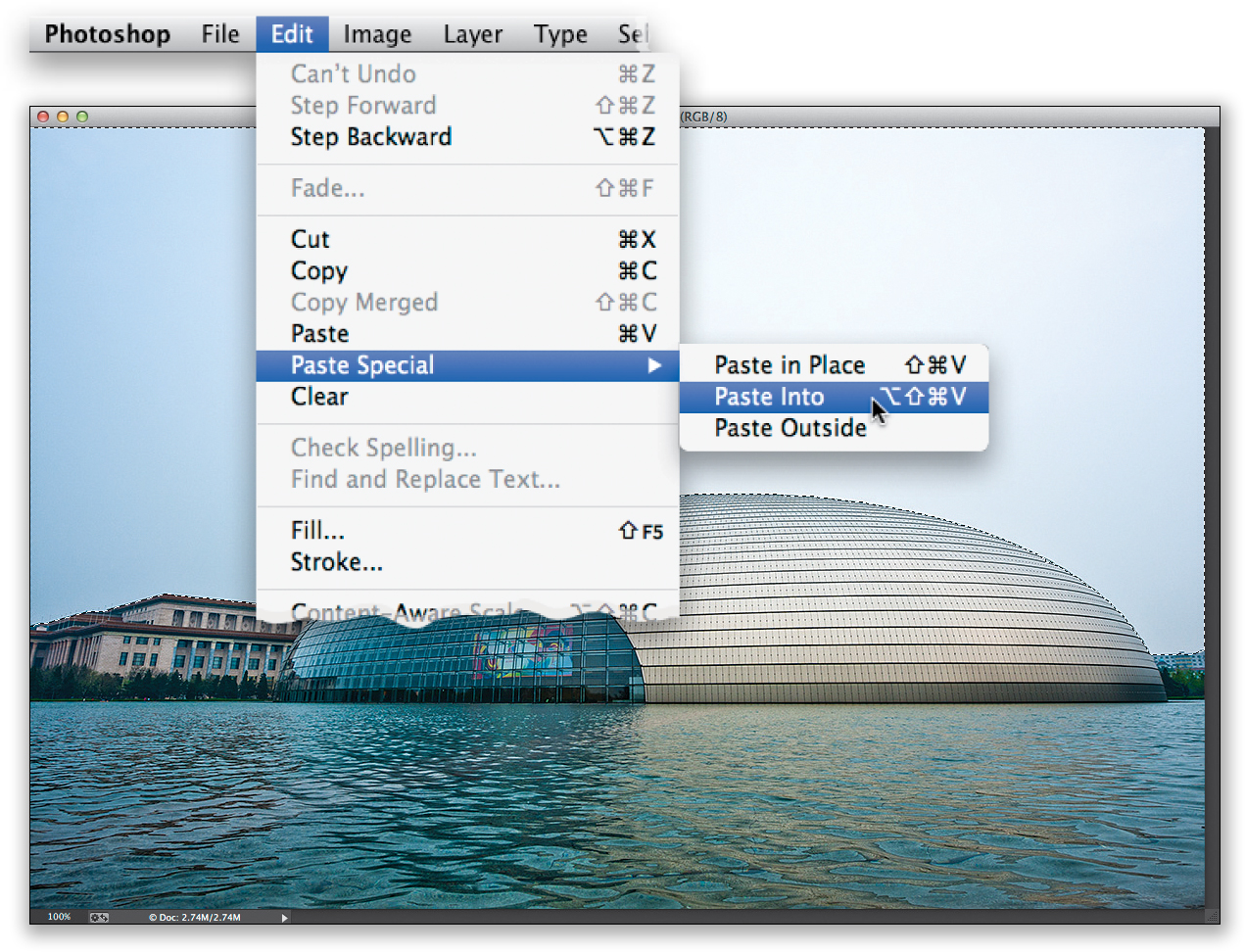
Next, switch back to your original image (the selection you made of the sky should still be in place). Then, go under the Edit menu, under Paste Special, and choose Paste Into (as shown here). This will paste the clouds you copied into memory into your image (as seen in the next step).
Here’s the sky image pasted into our selection. By the way, when you paste into a selection like this, it automatically deselects your selection and adds a layer mask to the pasted image (as seen here). That way, if you need to edit the edges (maybe you see some white or something that doesn’t look right along the edges where the sky meets the original photo), you can paint in white, with a very small brush, on that layer mask to help cover up any problems (but, our “digging in” of 2 pixels, like we did in Step Two, usually helps avoid that). You can also reposition the sky by using the Move tool (V) to click-and-drag right on the sky itself. If you need to resize the sky, press Command-T (PC: Ctrl-T) to bring up the Free Transform bounding box (see page 18). If you can’t see the Free Transform handles, just press Command-0 (zero; PC: Ctrl-0) and the document window automatically resizes, so you can reach all four handles. Just remember to press-and-hold the Shift key to keep things proportional as you scale up or down by dragging the corner handles.
STEP SIX:
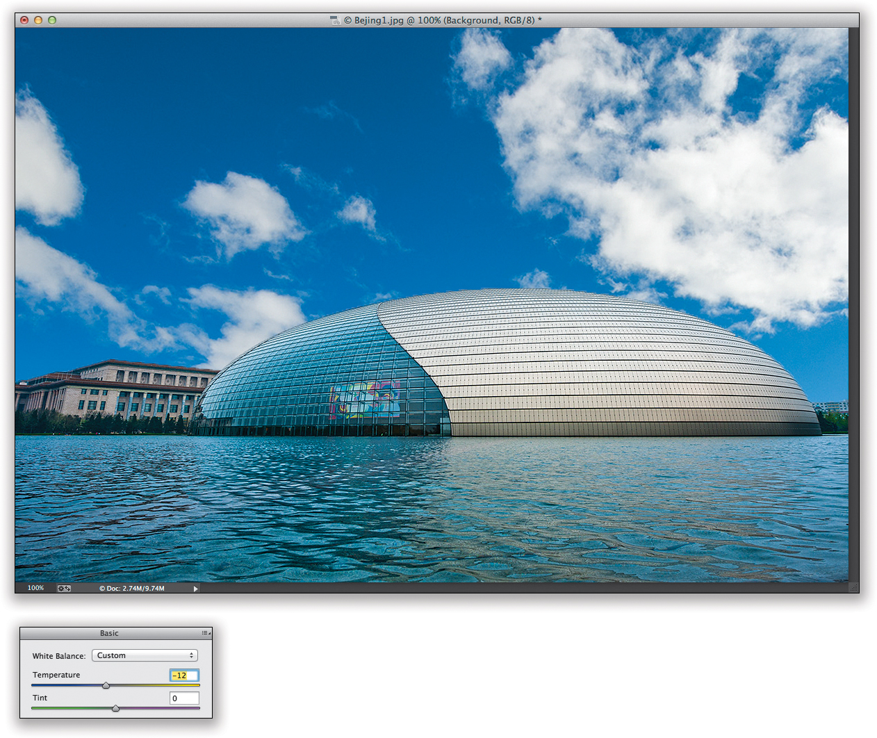
There is one more thing I would do to finish this one off: The water looks a little greenish to be under such a rich blue sky, so if you have Photoshop CC, click on the Background layer, put a rectangular selection around the water, and then go under the Filter menu and choose Camera Raw Filter. When the ACR window appears, drag the Temperature slider (near the top of the Basic panel) to the left a bit until the water becomes more blue (it will only affect the water since you made a selection before you chose the Camera Raw filter). If you don’t have Photoshop CC, then wait until you take the image back to Lightroom, and paint over the water with the Adjustment Brush, using the same bluish Temperature setting.
Wedding Book and Type Effects
There are as many wedding book Photoshop techniques as there are wedding books, so what I wanted to do here was show you a pretty typical one—one that you’d need to jump over to Photoshop to do because it adds effects (like a drop shadow and an inner glow) that we can’t achieve in Lightroom. We also get to unlock a very powerful, yet seldom shown, type technique that will definitely help you stand out from the crowd.
STEP ONE:
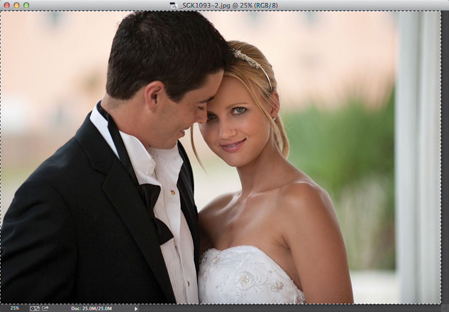
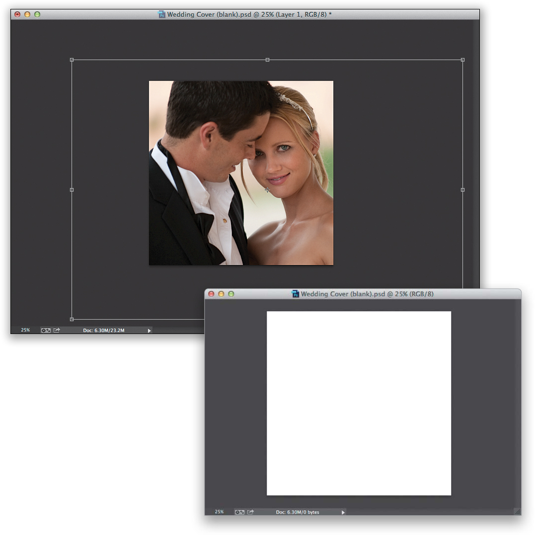
We’ll start by opening the image in Photoshop, so select it in Lightroom then press Command-E (PC: Ctrl-E). Once the image is open, go ahead and put a selection around the entire image by pressing Command-A (PC: Ctrl-A)—that’s the shortcut for Select All. Now, copy that image into memory by pressing Command-C (PC: Ctrl-C). Let’s switch to the blank wedding book cover. In this case, our wedding book is square, so create a new document that is square (as seen in the next step) by going under the File menu and choosing New. When the dialog appears, just type in the dimensions you want, type in the resolution (we’ll go with 300 ppi), and click OK.
STEP TWO:
Now, press Command-V (PC: Ctrl-V) to Paste the image we copied in Step One into this square document. We’re going to have to scale the image down because it’s much larger than the document we pasted it into, so press Command-T (PC: Ctrl-T) to bring up the Free Transform bounding box (see page 18). If you can’t reach the handles, press Command-0 (zero; PC: Ctrl-0) and the window will resize so you can reach them all. Press-and-hold the Shift key, grab a corner handle, and drag inward to scale the image down so it kinda looks like the cropping you see here, then press the Return (PC: Enter) key to lock in your transformation.
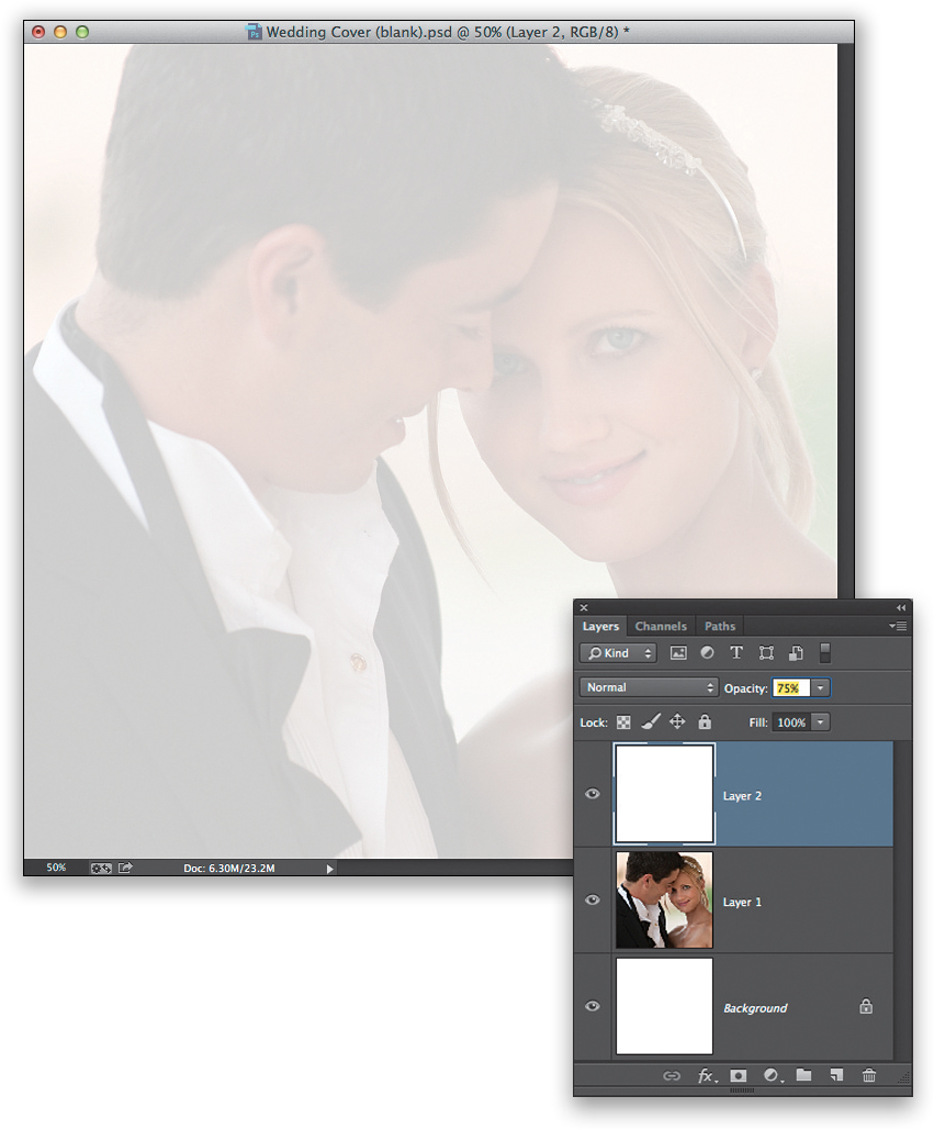
Go to the Layers panel and click on the Create a New Layer icon (it’s the second icon from the right) to create a new blank layer above your wedding couple layer. Press the letter D, then X, to set your Foreground color to white. (Pressing D sets your Foreground and Background colors to their defaults of black and white, respectively. The letter X then swaps them, so white is the Foreground color. It’s a handy little trick.) Now we want to fill this entire layer with white by pressing Option-Delete (PC: Alt-Backspace). Of course, this white layer completely covers up the bride and groom. But, what we want to create is a backscreened effect (very popular in wedding albums), so just lower the Opacity of this layer to around 75%, and now you can see through the white layer to the couple layer below it. This 75% number might be showing them a bit too much, but we can’t really tell until we add the type later on. So, for now, we’ll leave it at 75% and roll on.
STEP FOUR:
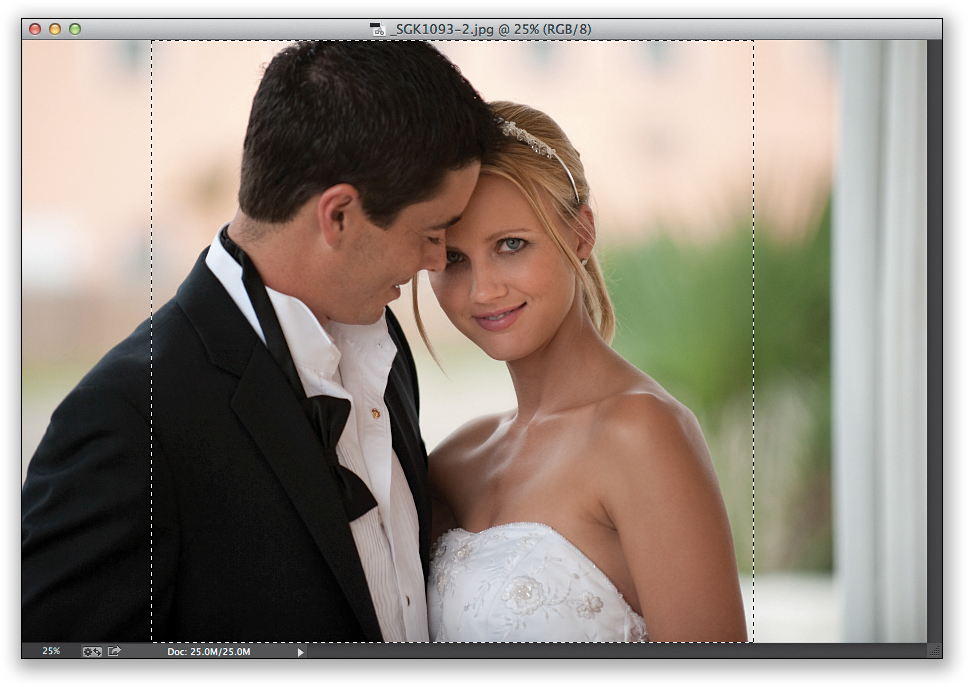
Next, switch back to your original image, and get the Rectangular Marquee tool (M), because we’re going to make a perfectly square selection nice and tight on the wedding couple. To make a square selection, press-and-hold the Shift key first, then click-and-drag out a selection and it’s constrained to a perfect square (as seen here). Now, press Command-C (PC: Ctrl-C) to copy that square selected area into memory.
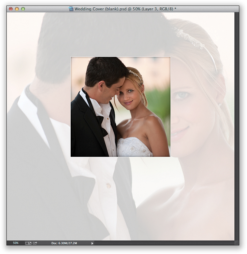
Switch back to your wedding book document and press Command-V (PC: Ctrl-V) to Paste that square selected version of the couple into your document. Of course, it will be too large, so you’ll have to do the whole Free Transform thing again (press Command-T [PC: Ctrl-T]) to scale the image down to the size you see here, and position it just above center in the document (you may want to click on the original couple layer and use the Move tool to nudge it over a little, as I did here). Don’t forget to press-and-hold the Shift key when you click-and-drag that corner handle inward to keep things proportional as you scale it or things will look really wonky. When you’re done resizing it, press Return [PC: Enter]) to lock in your resizing. Next, we’re going to add an effect to the inside of this photo (and to the outside) to give the impression that this smaller image is cut into the image behind it.
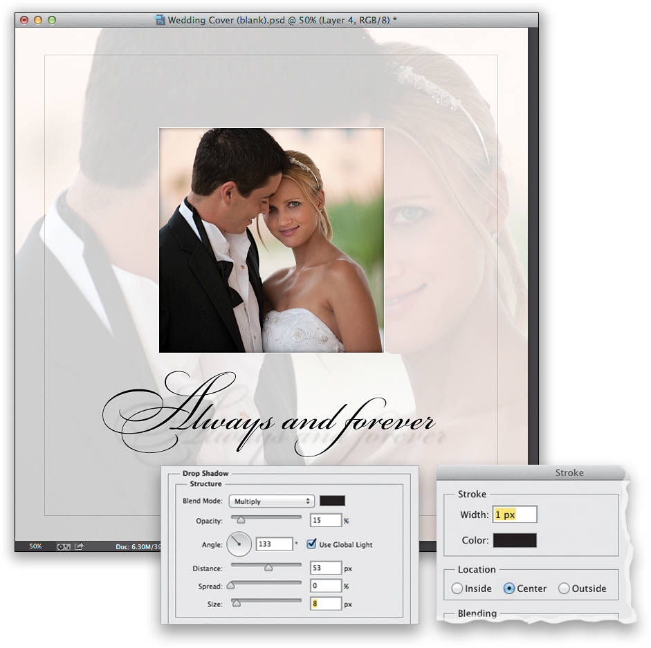
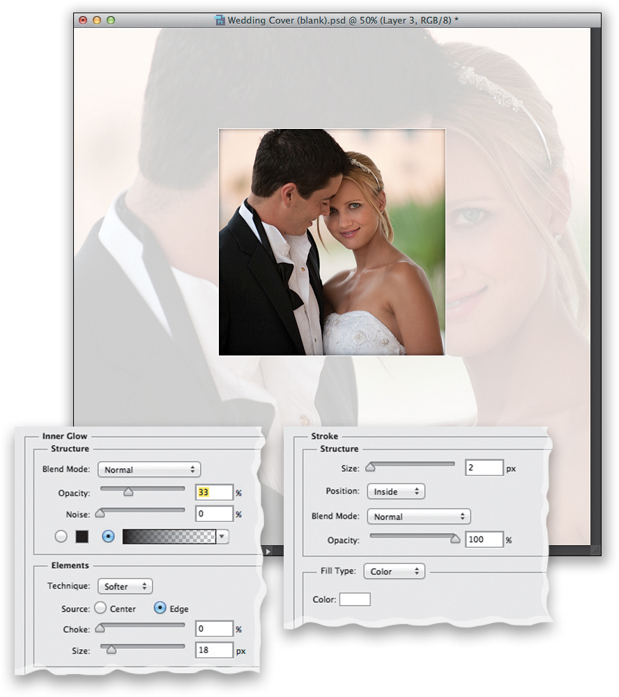
STEP SIX:
Click on the Add a Layer Style icon (the second icon from the left) at the bottom of the Layers panel and choose Inner Glow from the pop-up menu. This places a glow inside the edges of your image, but the default settings are very subtle, so we’ll have to tweak them quite a bit. First, change the Blend Mode (up top) from Screen to Normal, or you won’t be able to see your glow when we change the color. Then, click on the light yellow color swatch to bring up the Color Picker, choose black, and then click OK. The Size slider controls the amount of glow—we need to increase that to 18 to make the glow big enough to be seen with this image. And, finally, lower the Opacity down to 33%, so it doesn’t look so dark and obvious. While you’re still in that dialog, on the left side is a list of all the layer styles. Click on Stroke, and this adds a black stroke around your image. Click on the color swatch and change your stroke color to white, then from the Position pop-up menu, choose Inside (so the corners stay square, not rounded), and lastly, lower the stroke Size to just 2, then click OK.
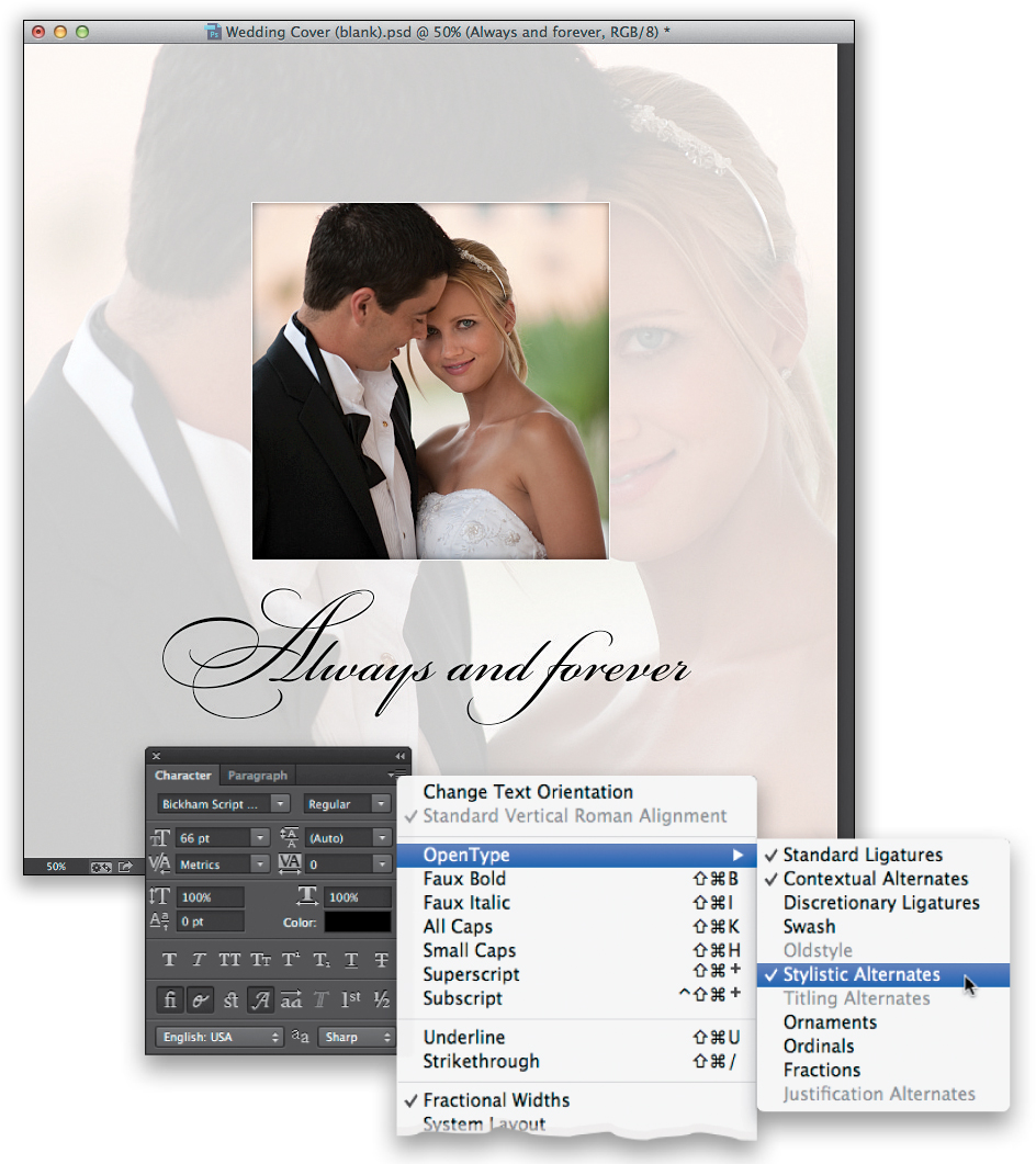
Get the Horizontal Type tool (T) from the Toolbox, and then type “Always and forever” using the font Bickham Script Pro (it should already be installed on your system—it’s an OpenType font from Adobe and that OpenType thing means it has special powers). Highlight the capital “A” in “Always,” then press Command-T (PC: Ctrl-T) to bring up the Character panel (this is where all the main type controls are). From the panel’s flyout menu (in the top-right corner of the panel), go to OpenType, and then choose Swash. This replaces your regular capital “A” with a beautiful stylized capital “A.” If you then go under that same menu again, and choose Stylistic Alternates, it gives you an even bigger, more beautiful “A” (as seen here). Although only capital letters have that Swash feature, you can get stylized lowercase letters by highlighting a letter and choosing just Stylistic Alternates (that’s what I did here to get that gorgeous “f” for the word “forever”). Use the Move tool (click on it in the Toolbox) to center the text better after you add the stylistic alternates.
STEP EIGHT:
Let’s finish things off by adding a drop shadow to our type, and a thin inner border to the page. Click on the Add a Layer Style icon again, but this time choose Drop Shadow. Move your cursor outside the dialog, click directly on your type in the image itself, and drag the drop shadow down and to the right, so it’s a little bit away from the type (as seen here). Now, in the dialog, lower the Opacity to just 15% for a nice subtle shadow. For the final touch, add a new blank layer, then get the Rectangular Marquee tool and make a large, square selection about 1/2" inside the edges of the image. Then, go under the Edit menu and choose Stroke. When the dialog appears, enter a Width of 1 px, for Location choose Center, and click OK to add a black stroke around your selection. Deselect by pressing Command-D (PC: Ctrl-D). The final step is to make the stroke look very thin by lowering the Opacity of this layer to just 40%. Voilà!