
Chapter 7. Design with Color
This is a wonderful time in the world of graphic design. Everyone has color printers on their desktops, and professional color printing has never in the history of this planet been so available and affordable. (Search the web for color printing services and compare prices.)
Color theory can get very complex, but in this chapter I’m just going to provide a brief explanation of the color wheel and how to use it. A color wheel is amazingly useful when you need to make a conscious decision about choosing colors for a project.
And I’ll briefly explain the difference between the color models CMYK and RGB and when to use each one.
As you can see in these simple examples, color not only has its own impact, but it impacts all objects around it.
The amazing color wheel
The color wheel begins with yellow, red, and blue. These are called the primary colors because they’re the only colors you cannot create. That is, if you have a box of watercolors, you know you can mix blue and yellow to make green, but there is no way to mix pure yellow, red, or blue from other colors.
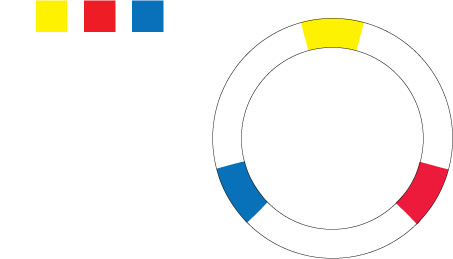
We’ll space these three primary colors evenly around the wheel.
Now, if you take your watercolor box and mix each of these colors with an equal amount of the one next to it, you’ll get the secondary colors. As you’re probably aware from working with crayons and watercolors as a kid, yellow and blue make green; blue and red make purple; red and yellow make orange.
So we’ll put those secondary colors between the primary colors.
To fill in the empty spots in the color wheel, you probably know what to do—mix equal parts of the colors on each side. These are called the tertiary (or third) colors. That is, yellow and orange make, well, yellow-orange. And blue and green make blue-green (which I’ll call aqua).
We’ll fill in each space with the tertiary colors to complete the color wheel. The fun is just beginning.
Color relationships
So now we have a color wheel with the basic twelve colors. With this color wheel, we can create combinations of colors that are pretty much guaranteed to work together. On the following pages, we’ll explore the various ways to do this.
(In the CMYK color model we’re using, as explained on page 110, the “color” black is actually the combination of all colors, and the “color” white is an absence of all colors. It is just the opposite when using RGB.)
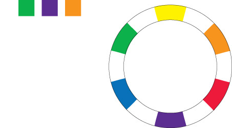
Complementary
Colors directly across from each other, exact opposites, are complements. Because they’re so opposite, they often work best when one is the main color and the other is an accent.
Now, you might think some of the color combinations on these pages are pretty weird. But that’s the great thing about knowing how to use the color wheel—you can gleefully use these weird combinations and know that you have permission to do so! They really do work well together.

typefaces
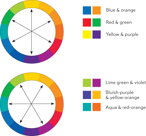
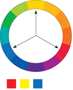
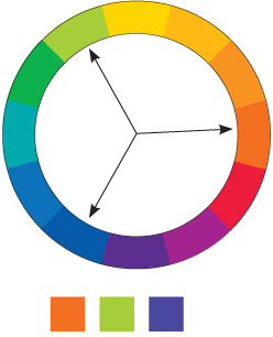
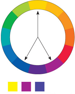
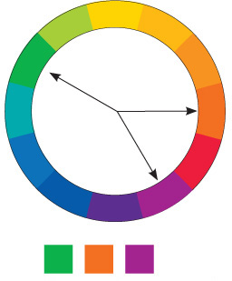
Triads
A set of three colors equidistant from each other always creates a triad of pleasing colors. Red, yellow, and blue is an extremely popular combination for children’s products. Because these are the primary colors, this combination is called the primary triad.
Experiment with the secondary triad of green, orange, and purple—not as common, but an exciting combination for that very reason.
All triads (except the primary triad of red, yellow, and blue) have underlying colors connecting them, which make them harmonize well.
Red, yellow, blue
Red-orange, lime-green, bluish-purple
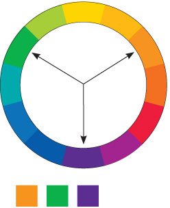
Orange, green, purple
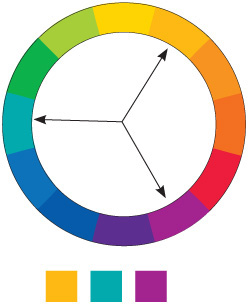
Yellow-orange, aqua, violet
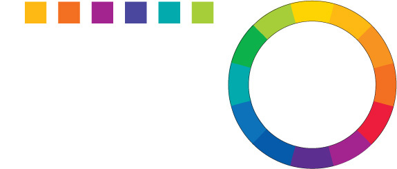
Split complement triads
Another form of a triad is the split complement. Choose a color from one side of the wheel, find its complement directly across the wheel, but use the colors on each side of the complement instead of the complement itself. This creates a combination that has a little more sophisticated edge to it. Below are just a couple of the various combinations.
Yellow, violet, bluish-purple
Green, red-orange, violet
typefaces
I also used tints—you can count four different colors in each of the above examples. See pages 102–105 for information about tints.
Analogous colors
An analogous combination is composed of those colors that are next to each other on the wheel. No matter which two or three you combine, they all share an undertone of the same color, creating a harmonious combination. Combine an analogous group of colors with their various tints and shades, as explained on the following page, and you’ve got lots to work with!
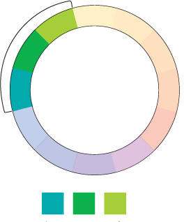
Aqua, green, lime-green
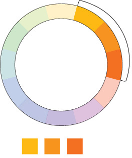
yellow-orange, orange, red-orange
typefaces
Shades and tints
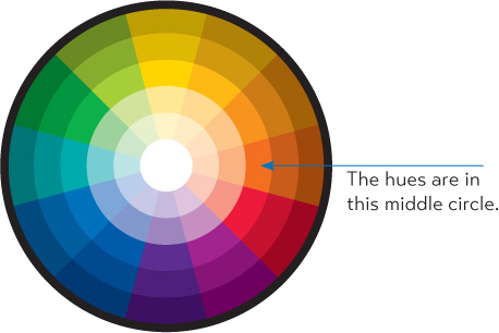
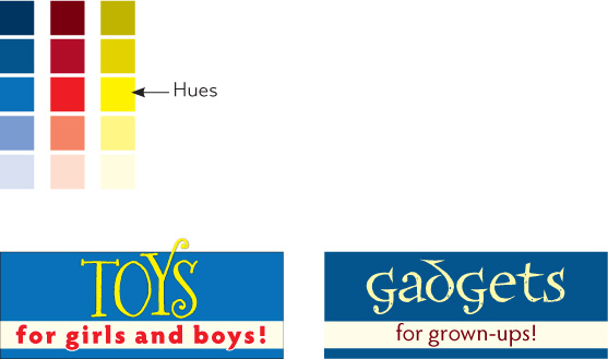
The basic color wheel that we’ve been working with so far involves only the “hue,” or the pure color. We can hugely expand the wheel and thus our options simply by adding black or white to the various hues.
The pure color is the hue.
Add black to a hue to create a shade.
Add white to a hue to create a tint.
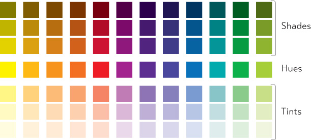
Below is what the colors look like in the wheel. What you see here are colored bands, but it’s really a continuous gradient with an infinite number of colors from white to black.
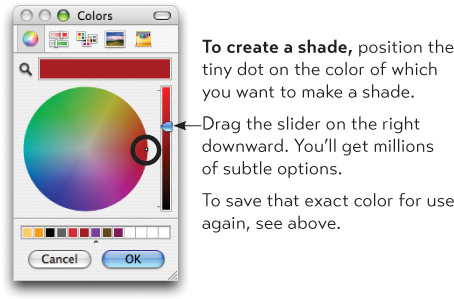
Make your own shades and tints
If your software program allows you to create your own colors, just add black to a color to create a shade. To make a tint, use the tint slider your application provides to lighten it. Check your software manual.
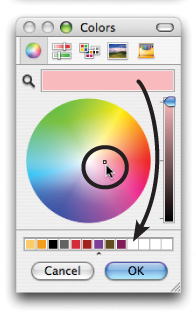
If your application provides a color palette something like this one, here’s how to make tints and shades.
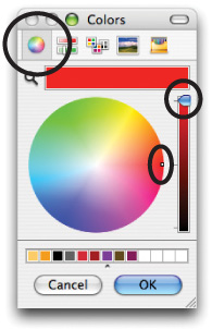
First, make sure to select the color wheel icon in the toolbar (circled).
Make sure the slider is at the top of the colored bar on the right.
The tiny dot inside the color wheel selects the color.
Hues are on the outer rim of this particular wheel.
To create a tint, drag the tiny dot toward the white center.
The color bar at the top displays the color you’ve selected.
To save that exact color for use again, press on that upper color bar and drag—it will create a tiny color box. Drop that color box into one of the empty slots at the bottom.
Monochromatic colors
A monochromatic combination is composed of one hue with any number of its corresponding tints and shades.
You’re actually very familiar with a monochromatic scheme—any black and white photograph is made of black (the “hue,” although black isn’t really a “color”) and many tints or varying shades of gray. You know how beautifully that can work. So have fun with a design project using a monochromatic combination.

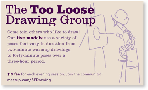
This is the purple hue with several of its shades and tints. You can actually reproduce the effect of a number of colors in a one-color print job; use shades and tints of black, then have it printed with the ink color of your choice.
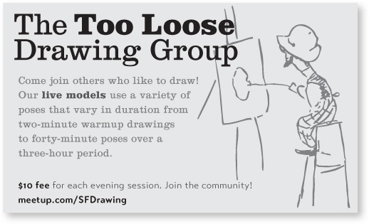
This postcard is set up using only tints of black.
typefaces
This is printed using tints and shades of one purple. It’s a great exercise to limit yourself to a monochrome palette.
Shades and tints in combination
Most fun of all, choose one of the four color relationships described on pages 98–101, but instead of using the hues, use various tints and shades of those colors. This expands your options tremendously, but you can still feel safe that the colors “work” together.
For instance, the combination of red and green is a perfect complement, but it’s almost impossible to get away from a Christmas effect. However, if you dip into the shades of these complementary colors, riches appear.
I mentioned that the combination of the primary colors of blue, red, and yellow is extremely popular for children’s products. So popular, in fact, that it’s difficult to get away from the kids’ look, unless you bring in some of the tints and shades—voilà! Rich and delicious combinations.
typefaces
Watch the tones
Are there any colors that don’t look great together? Not if you subscribe to the Wildflower Theory of Color—have you ever seen a field of wildflowers and said, “Omigosh, that’s a dreadful combination of colors in that field.” Probably not.
That field of wildflowers includes a variety of tones, or different values of colors, which naturally look good together. You will only run into problems when the tones are too similar.
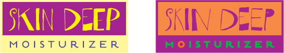
Tone refers to the particular quality of brightness, deepness, or hue of any color. As you can see in the first examples below, when the tones are similar, it gets a little muddy. The contrast is too weak. If you were to reproduce the examples below on a copy machine, the text would get lost.
If your design calls for hues with similar tones, try not to bump them up together, and don’t use the same amounts of each one.

The tones of these dark colors are much too close, as you can obviously tell.

The contrast is much better here; the contrast is a result of differences in tones. Where there might be some trouble (in the white ornament on the pale tint), I added a bit of a shadow to separate the two elements. On the opposite page where a dark red text was having a hard time on the black field, I lightened the values.
Warm colors vs. cool colors
Colors tend to be either on the warm side (which means they have some red or yellow in them) or on the cool side (which means they have some blue in them). You can “warm up” certain colors, such as grays or tans, by adding more reds or yellows to them. Conversely, you can cool down some colors by adding various blues to them.
The most practical thing to remember is that cool colors recede into the background, and warm colors come forward. It takes very little of a hot color to make an impact—reds and yellow jump right into your eyes. So if you’re combining hot colors with cool, generally use less of the hot color.
Cool colors recede, so you can use (sometimes you have to use) more of a cool color to make an impact or to contrast effectively.
Don’t try to make the colors appear to have equal weight! Take advantage of this visual phenomenon.
An excess of red can be overwhelming and rather annoying.
typeface
Can you feel the red still overpowering the blue? Consider what you want the reader to focus on first.
How to begin to choose?
Sometimes it can seem overwhelming to choose colors. Start with a logical approach. Is it a seasonal project you’re working on? Perhaps use analogous colors (page 101) that connote the seasons—hot reds and yellows for summer; cool blues for winter; shades of oranges and browns for autumn; bright greens for spring.
Are there official company colors to work with? Perhaps you can start there and use tints and shades (pages 102–105). Are you working with a logo that has specific colors? Perhaps use a split complement of its colors (page 100).
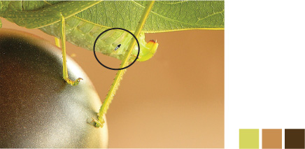
Does your project include a photograph or other image? Pick up a color in the photograph and choose a range of other colors based on that. You might want analogous colors to keep the project sedate and calm, or complementary colors to add some visual excitement.
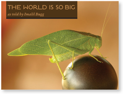
I picked up colors in the ball and the bug to use for the title and byline. For the rest of the project, I might use the colors analogous to the tan color of the background, with tints from the bug wings for accents.
typefaces
In some applications you’ll find an eyedropper tool with which you can pick up colors. Using InDesign, I used the eyedropper to grab colors from the bug and the ball. I could build my project with these colors.
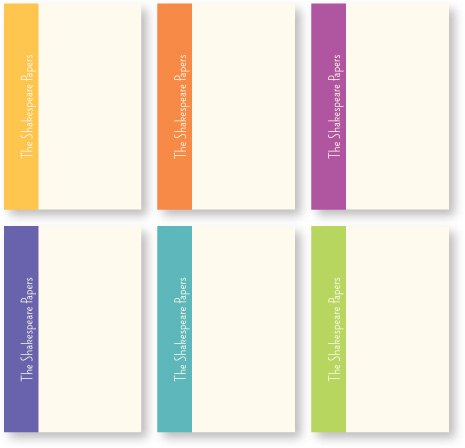
If you’re working on a project that recurs regularly, you might want to make yourself a color palette to which you’ll consistently refer for all projects.
For instance, I publish a twenty-page booklet every two months on some tidbit of the Shakespearean works. There are six main themes that recur every year, so after collecting them for a few years, the color-coding becomes an organizational tool. I chose 80-percent tints of the six tertiary colors (page 97) for the main color blocks on the covers; the color wraps around onto the back and the title is always reversed out.
typefaces
If you’re beginning a new project that’s composed of a number of different pieces, try choosing your color palette before you begin. It will make a lot of decisions easier for you along the way.
CMYK vs. RGB: print vs. screen
There are two important color models to be aware of. Here is the briefest of explanations on a very complex topic. If all you ever do is print to your little desktop color inkjet, you can get by without knowing anything about color models, so you can skip this for now. It will be here when you need it.
CMYK
CMYK stands for Cyan (which is a blue), Magenta (which is sort of red/pink), Yellow, and a Key color, which is usually blacK. With these four colors of ink, we can print many thousands of colors, which is why it’s called a “four-color process.” (Specialized print jobs can include extra colors of inks.)
The colors in CMYK are like our coloring crayons or paint boxes—blue and yellow make green, etc. This is the model we’ve been using throughout this chapter because this is a printed book.
CYMK is the color model you’ll use for projects that are going to be printed by a printing press onto something physical. Just about everything you ever see printed in a book, a magazine, a poster, on matchbox covers or cookie boxes has been printed with CMYK.
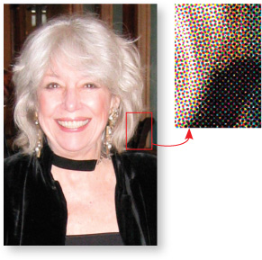
Take a look at a printed color image with a magnifying glass and you’ll be able to see the “rosettes” made up of the dots of the four colors.
RGB
RGB stands for Red, Green, and Blue. RGB is what you see on your computer monitor, television, iPhone, iPad, or any other electronic device.
In RGB, if you mix red and green you get—yellow. Really. Mix full-strength blue and red and you get hot pink. That’s because RGB is composed of beams of colored light that are not reflected off of any physical object—it is light that goes straight from the monitor into your eyes. If you mix all the RGB colors together you get white, and if you delete all the colors, you get black.
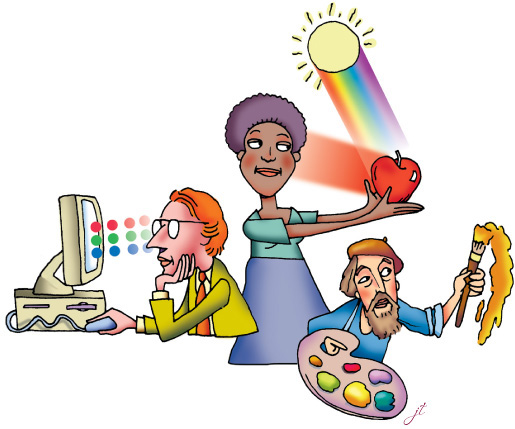
In the world, the spectrum of visible light hits objects. Objects absorb (or subtract) most of the spectrum—what they don’t absorb reflects back to our eyes as color.
On a monitor, however, the colors of light are not reflected—they go directly into our eyes.
Mixing colors in CMYK is like mixing paint on a palette.
Use CMYK for projects that are to be printed.
Use RGB for anything that will be viewed on a screen.
If you’re printing to an expensive digital color printer (instead of a four-color printing press), check with the press operator to see whether they want all colors in CMYK or RGB.
RGB makes smaller file sizes, and some techniques in Adobe Photoshop work only (or best and usually faster) in RGB. But switching back and forth from CMYK to RGB loses a little data each time, so it’s best to work on your images in RGB and change them to CMYK as the last thing you do.
Because RGB works through light that goes straight into our eyes, the images on the screen are gorgeous and backlit with an astonishing range of colors. Unfortunately, when you switch to CMYK and then print that with ink on paper, you lose some of that brilliance and range. That’s just what happens, so don’t be too disappointed.
Little Quiz #3: Color
A quick quiz to settle a few terms in your design mind. (Answers page 224.)
1. Colors that are next to each other on the color wheel are called ____________.
2. Colors across from each other are ____________.
3. Add white to a hue to create a ____________.
4. Add black to a hue to create a ____________.
5. You are going to send a job to press to be printed on paper. Should your images be CMYK or RGB? ____________
6. You are creating images for a web site. Should the images be CMYK or RGB? ____________