
Chapter 11. Categories of Type
There are many thousands of different typefaces available right now, and many more are being created every day. Most faces, though, can be dropped into one of the six categories mentioned below. Before you try to become conscious of the contrasts in type, you should become aware of the similarities between broad groups of type designs, because it is the similarities that cause the conflicts in type combinations. The purpose of this chapter is to make you more aware of the details of letterforms. In the following chapter I’ll launch into combining them—the key to combining typefaces is to understand their similarities and differences.
Of course, you will find many faces that don’t fit neatly into any category. We could make several hundred different categories for the varieties in type—don’t worry about it. The point is just to start looking at type more closely and clearly.
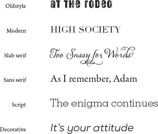
I focus on these six groups:
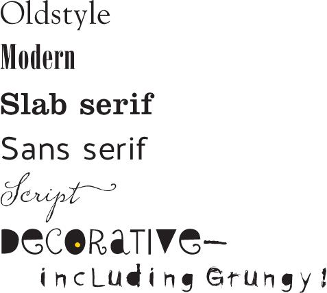
Oldstyle
The first typefaces were based on the handlettering of scribes and are called oldstyle. You can imagine a wedge-tipped pen held in the hand when you look carefully at their shapes. Oldstyles always have serifs (see below) and the serifs of lowercase letters are always at an angle (the angle of the pen) and have a curve where they meet the stem (called bracketing). Because of that pen, all the curved strokes in the letterforms have a transition from thick to thin, technically called the “thick/thin transition.” This contrast in the stroke is relatively moderate, meaning it goes from kind-of-thin to kind-of-thicker. If you draw a line through the thinnest parts of the curved strokes, the line is diagonal. This is called the stress—oldstyle type has a diagonal stress.
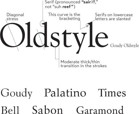
Do these faces all look pretty much the same to you? Don’t worry—they look the same to everyone who hasn’t studied typography. Their “invisibility” is exactly what makes oldstyles the best type group for extensive amounts of body copy. There are rarely any distinguishing characteristics that get in the way of reading; they don’t call attention to themselves. If you’re setting lots of type that you want people to actually read, choose an oldstyle.
Modern
Oldstyle faces replicate the humanist pen stokes. But as history marched on, the structure of type changed. Type has trends and succumbs to lifestyle and cultural changes, just like hairdos, clothes, architecture, or language. In the 1700s, smoother paper, more sophisticated printing techniques, and a general increase in mechanical devices led to type becoming more mechanical also. New typefaces no longer followed the pen in hand. Modern typefaces have serifs, but the serifs are now horizontal instead of slanted, and they are very thin. Like a steel bridge, the structure is severe, with a radical thick/thin transition, or contrast, in the strokes. There is no evidence of the slant of the pen; the stress is perfectly vertical. Moderns tend to have a cold, elegant look.

Modern typefaces have a striking appearance, especially when set very large. Because of their strong thick/thin transitions, most moderns are not good choices for extended amounts of body copy—the thin lines almost disappear, the thick lines are prominent, and the effect on the page is called “dazzling.”
Slab serif
Along with the industrial revolution came a new concept: advertising. At first, advertisers took modern typefaces and made the thicks thicker. You’ve seen posters with type like that—from a distance, all you see are vertical lines, like a fence. The obvious solution to this problem was to thicken the entire letterform. Slab serifs have little or no thick/thin transition.
This category of type is sometimes called Clarendon, because the typeface Clarendon (shown below) is the epitome of this style. They are also called Egyptian because they became popular during the Egyptomania craze in Western civilization; many typefaces in this category were given Egyptian names so they would sell (Memphis, Cairo, Scarab).

Many of the slab serifs that have a slight thick/thin contrast (such as Clarendon or New Century Schoolbook) are very high on the readability scale, meaning they easily can be used in extensive text. They present an overall darker page than oldstyles, though, because their strokes are thicker and relatively monoweight. Slab serifs are often used in children’s books because of their clean, straightforward look.
Sans serif
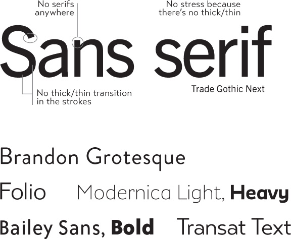
The word “sans” means “without” (in French), so sans serif typefaces are those without serifs on the ends of the strokes. The idea of removing the serifs was a rather late development in the evolution of type and didn’t become wildly successful until the early part of the twentieth century.
Sans serif typefaces are almost always “monoweight,” meaning there is virtually no visible thick/thin transition in the strokes; the letterforms are the same thickness all the way around.
Also see the following page for important information on another branch of the sans serif category.
If the only sans serifs you have in your font library are Helvetica/Arial and Verdana (which was designed specifically for the screen, not print), the best thing you could do for your design work is invest in a sans serif family that includes a strong, heavy, black face. Each of the families above has a wide variety of weights, from light to extra black. With that one investment, you will be amazed at how your options increase for creating eye-catching pages.
Most sans serifs are monoweight, as shown on the preceding page. A very few, however, have a slight thick/thin transition. Below is an example of Optima, a sans serif with a stress. Faces like Optima are very difficult to combine on a page with other type—they have similarities with serif faces in the thick/thin strokes, and they have similarities with sans serifs in the lack of serifs. Be very careful when working with a sans like this.

Optima is an exceptionally beautiful typeface, but you must be very careful about combining it with other faces. Notice its thick/thin strokes. It has the classic grace of an oldstyle (see page 176), but it’s a sans serif.

Here you see FunnyBone combined with Optima (the smaller text). FunnyBone’s spunky informality is a nice contrast with Optima’s classic grace, but I had to increase the contrasts to make them work together.
Script
The script category includes all those typefaces that appear to have been handlettered with a calligraphy pen or brush, or sometimes with a pencil or technical pen. This category could easily be broken down into scripts that connect, scripts that don’t connect, scripts that look like hand printing, scripts that emulate traditional calligraphic styles, and so on. But for our purposes we are going to lump them all into one pot.
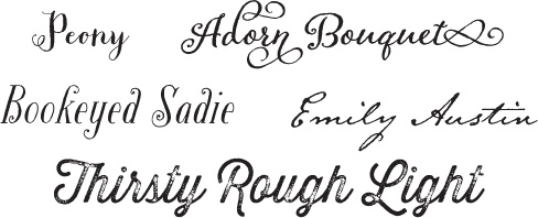
Scripts are like cheesecake—they should be used sparingly so nobody gets sick. The fancy ones, of course, should never be set as long blocks of text and never as all caps. But scripts can be particularly stunning when set very large—don’t be a wimp!
typefaces
Decorative
Decorative fonts are easy to identify—if the thought of reading an entire book in that font makes you wanna throw up a little, you can probably put it in the decorative pot. Decorative fonts are great—they’re fun, distinctive, easy to use, oftentimes cheaper, and there is a font for any whim you wish to express. Of course, simply because they are so distinctive, their use is limited.
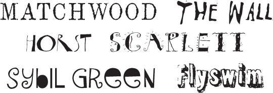
When using a decorative typeface, go beyond what you think of as its initial impression. For instance, if Sybil Green strikes you as informal, try using it in a more formal situation and see what happens. If you think Matchwood carries a Wild West flavor, try it in a corporate setting or a flower shop and see what happens. Depending on how you use them, decoratives can carry obvious emotions, or you can manipulate them into carrying connotations very different from your first impression. But that is a topic for another book.

typefaces
Wisdom sometimes benefits from the use of decorative fonts.
Be conscious
To use type effectively, you have to be conscious. By that I mean you must keep your eyes open, you must notice details, you must try to state the problem in words. Or when you see something that appeals to you strongly, put into words why it appeals to you.
Spend a few minutes and look through a magazine. Try to categorize the typefaces you see. Many of them won’t fit neatly into a single pot, but that’s okay—choose the category that seems the closest. The point is that you are looking more closely at letterforms, which is absolutely critical if you are going to combine them effectively.
Little Quiz #5: Categories of type
Draw lines to match the category with the typeface! (Answers on page 224.)
Little Quiz #6: Thick/thin transitions
Circle the letter that describes the thick/thin transitions of each face. (Answers are on page 224.)
A moderate thick/thin transitions
B radical thick/thin transitions
C no (or negligible) thick/thin transitions

Times New Roman Regular

American Typewriter Regular
Garamond Premier Pro Regular
Optima

Formata Regular

Walbaum Book
Little Quiz #7: Serifs
Circle the letter that describes the serifs in each face below. (Answers are on page 224.)
A thin, horizontal serifs
B thick, slabby [hint] horizontal serifs
C no serifs
D slanted serifs
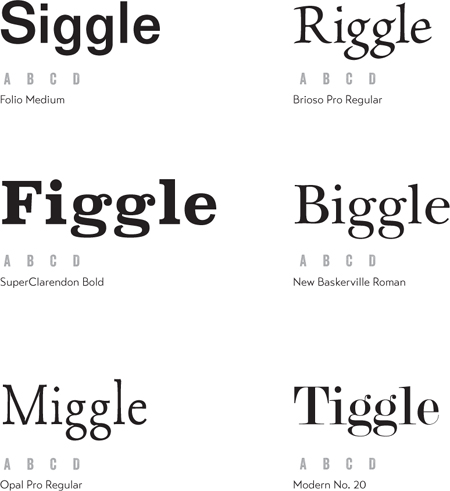
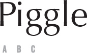
Notice the huge differences between all the “g” letters! It’s too much fun.
Summary
I can’t stress enough how important it is that you become conscious of these broad categories of type. As you work through the next chapter, it will become clearer why this is important.
A simple exercise to continually hone your visual skills is to collect samples of the categories. Cut them out of any printed material you can find. Do you see any patterns developing within a broad category? Go ahead and make subsets, such as oldstyle typefaces that have small x-heights and tall descenders. Or scripts that are really more like hand printing than cursive handwriting. Or extended faces and condensed faces (see below). It is this visual awareness of the letterforms that will give you the power to create interesting, provocative, and effective type combinations.

Notice (below) the x-height of Bernhard as compared to Eurostile—look at the x-height in relation to the ascenders. Bernhard has an unusually small x-height relative to its ascenders. Most sans serifs have large x-heights. Start noticing those kinds of details.
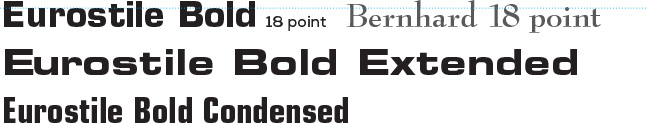
Extended typefaces look stretched out; condensed typefaces appear to be squished. Both are appropriate in certain circumstances.