Chapter 12. Type Contrasts
This chapter focuses on the topic of combining typefaces. The following pages describe the various ways type can be contrasted. Each page shows specific examples, and at the end of this section are examples using these principles of contrasting type on your pages. Type contrast is not only for the aesthetic appeal, but also to enhance the communication.
A reader should not have to try to figure out what is happening on the page—the focus, the organization of material, the purpose, the flow of information, all should be recognized instantly with a single glance. And along the way, it doesn’t hurt to make it beautiful!
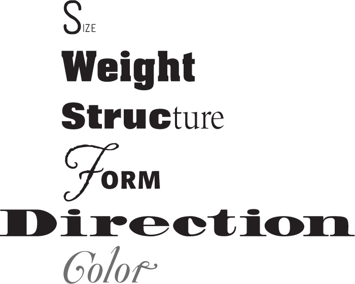
These are the contrasts I discuss:
typefaces
A contrast of size is fairly obvious: big type versus little type. To make a contrast of size work effectively, though, don’t be a wimp. You cannot contrast 12-point type with 14-point type; most of the time they will simply conflict. You cannot contrast 65-point type with 72-point type. If you’re going to contrast two typographic elements through their size, then do it. Make it obvious—don’t let people think it’s a mistake.

Decide on the typographic element that you want seen as a focus. Emphasize it with contrasts.

typefaces
Often certain typographic elements have to be visible, but aren’t really that important to the general reading public. Make them small. If someone cares what the volume number is, for instance, it can still be read. It’s okay not to set it in 12-point type!
A contrast of size does not always mean you must make the type large—it just means there should be a contrast. For instance, when you see a small line of type alone on a large newspaper page, you are compelled to read it, right? An important part of what compels you is the contrast of very small type on that large page.
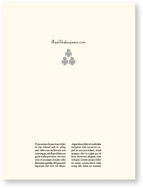
If you came across this full page in a magazine, would you read that small type in the middle? Contrast does that.

typefaces

Sometimes the contrast of big over little can be overwhelming; it can overpower the smaller type. Use that to your advantage. Who wants to notice the word “incorporated” anyway? Although it’s small, it’s certainly not invisible so it’s there for those who need it.
Over and over again I have recommended not to use all caps. You probably use all caps sometimes to make the type larger, yes? Ironically, when type is set in all caps, it takes up a lot more space than the lowercase, so you have to make the point size smaller. If you make the text lowercase, you can actually set it in a much larger point size, plus it’s more readable.

This title is in 20-point type. That’s the largest size I can use in this space with all caps.
typefaces

By making the title lowercase, I could enlarge it to 30-point type in the same space, which helps to emphasize the contrast of the fonts.
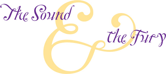
Use a contrast of size in unusual and provocative ways. Many of our typographic symbols, such as numbers, ampersands, or quotation marks, are very beautiful when set extremely large. Use them as decorative elements in a headline or a pull quote, or as repetitive elements throughout a publication.
typefaces
An unusual contrast of size can become a graphic element in itself—handy if you are limited in the images that are available for a project.

typefaces
If you use an item in an unusual size, see if you can repeat that concept elsewhere in the publication to create an attractive and useful repetition.
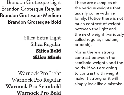
The weight of a typeface refers to the thickness of the strokes. Most type families are designed in a variety of weights: regular, bold, perhaps extra bold, semibold, or light. When combining weights, remember the rule: Don’t be a wimp. Don’t contrast the regular weight with a semibold—go for the stronger bold. If you are combining type from two different families, one face will usually be bolder than the other—so emphasize it.
Most of the typefaces that come standard with your personal computer are missing a very strong bold in the family. I heartily encourage you to invest in at least one very strong, black face. Look through online type catalogs to find one. A contrast of weight is one of the easiest and most effective ways to add visual interest to a page without redesigning a thing, but you will never be able to get that beautiful, strong contrast unless you have a typeface with big, solid strokes.
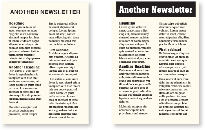
Remember these examples in the first part of the book? On the left, I used the fonts that come with the computer; the headlines are Helvetica (Arial) Bold, the body copy is Times Roman Regular.
On the right, the body copy is still Times Roman Regular, but I used a heavier (stronger weight) typeface for the headlines (Aachen Bold). With just that simple change—a heavier weight for contrast—the page is much more inviting to read. (The title is also heavier and is reversed out of a black box, adding contrast.)

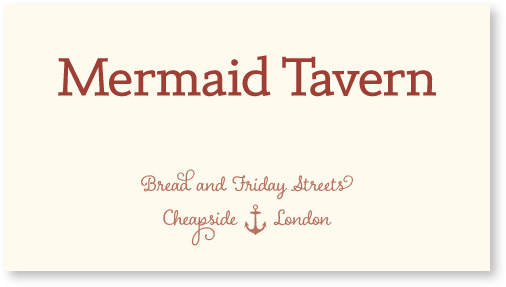
Remember this example from a couple pages back? By setting the company name in lowercase instead of all caps, I could not only make the type size larger, but I could make it heavier as well, thus adding more contrast and visual interest to the card. The heavier weight also gives the piece a stronger focus.
Not only does a contrast of weight make a page more attractive to your eyes, it is one of the most effective ways of organizing information. You do this already when you make your newsletter headlines and subheads bolder. So take that idea and push it a little harder. Take a look at the table of contents below; notice how you instantly understand the hierarchy of information when key heads or phrases are very bold. This technique is also useful in an index; it enables the reader to tell at a glance whether an index entry is a first-level or a second-level entry, thus eliminating the confusion that often arises when you’re trying to look up something alphabetically. Look at the index in this book (or in any of my books).

typefaces
By making the chapter headings bolder, the important information is available at a glance, and there is also a stronger attraction for the eye. Plus it sets up a repetition (one of the four main principles of design, remember?). I also added a tiny bit of space above each bold heading so the headings would be grouped more clearly with their subheadings (Principle of Proximity).
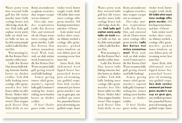
If you have a very gray page and no room to add images or to pull out quotes and set them as graphics, try setting key phrases in a strong bold. They will pull the reader into the page. (If you use a bold sans serif within serif body copy, you will probably have to make the bold sans serif a point size smaller to make it appear to be the same size as the serif body copy.)
typefaces
A completely gray page may discourage a casual reader from perusing the story. With the contrast of bold type, the reader can scan key points and is more likely to delve into the information.
Sometimes, of course, what a reader wants is a plain gray page. For instance, when you’re reading a novel, you don’t want any fancy type tricks to interrupt your eyes—you just want the type to be invisible. And some magazines and journals prefer the stuffy and formal look of a gray page because their audience feels it imparts a more serious impression. There is a place for everything. Just make sure the look you are creating is conscious.
The structure of a typeface refers to how it is built. Imagine that you were to build a typeface out of material you have in your garage. Some faces are built very monoweight, with almost no discernible weight shift in the strokes, as if you had built them out of tubing (like most sans serifs). Others are built with great emphasis on the thick/thin transitions, like picket fences (the moderns). And others are built in-between. If you want to combine two different type families, choose them from different structures.
Remember wading through all that stuff earlier in this section about the different categories of type? Well, this is where it comes in handy. Each of the categories is founded on similar structures. So you are well on your way to a type solution if you choose two or more faces from two or more categories.
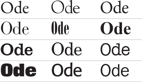
Little Quiz: Can you name each of the typeface categories represented here (one category per line)?
If not, re-read that section because this simple concept is very important.
Structure refers to how a letter is built, and as you can see in these examples, the structure within each category is quite distinctive.
Robin’s Rule: Do not put two typefaces from the same category on the same page. There’s no way you can get around their similarities. And besides, you have so many other choices—why make life difficult?
The guiding principle of typographic contrast is that you must pull two faces from two different categories of type.
That is, you can use two serifs as long as one is an oldstyle and the other is a modern or a slab serif. Even then you must be careful and you must emphasize the contrasts, as explained in the rest of this chapter.
Along the same line, avoid setting two oldstyles on the same page—they have too many similarities and are guaranteed to conflict no matter what you do. Avoid setting two moderns, or two slabs, for the same reason. Avoid using two scripts on the same page.

typefaces

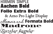
There are five different typefaces in this one little quote. They don’t look too bad together because of one thing: they each have a different structure; they are each from a different category of type.
Serif vs. sans serif is a contrast of structure
At first, different typefaces seem as indistinguishable as tigers in the zoo. So if you are new to the idea that one font looks different from another, an easy way to choose contrasting structures is to pick one serif font and one sans serif font. Serif fonts generally have a thick/thin contrast in their structures; sans serifs generally are monoweight. Combining serif with sans serif is a time-tested combination with an infinite variety of possibilities. But as you can see in the example below-left, the contrast of structure alone is not strong enough; you need to emphasize the difference by combining it with other contrasts, such as size or weight.
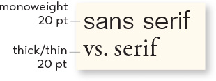
You can see that the contrast of structure alone is not enough to contrast type effectively.
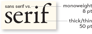
But when you add the element of size—voilà! Contrast!

As the example above shows, the combination of typefaces with two different structures is not enough. It’s still weak—the differences must be emphasized.
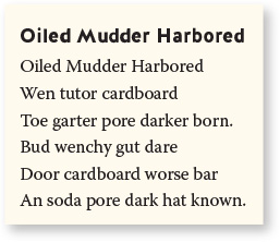
typefaces

See how much better this looks! Adding weight to the title highlights the difference in the structure of the two typefaces—and strengthens the contrast between the two.
Setting two sans serifs on one page is always difficult because there is only one structure—monoweight. If you are extraordinarily clever, you might be able to pull off setting two sans serifs if you use one of the rare ones with a thick/thin transition in its strokes, but I don’t recommend even trying it. Rather than try to combine two sans serifs, build contrast in other ways using different members of the same sans serif family. The sans serif families usually have nice collections of light weights to very heavy weights, and often include a compressed or extended version (see pages 204–207 about contrast of direction).
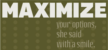
Here are two sans serifs together, a monoweight sans (Aptifer) with one of the few sans serifs that has a thick/thin transition (Octane), which gives it a different structure. I also maximized the contrasts with all caps, large size, and very bold.

And here are three different weights of one sans serif family, Avenir Next: Condensed Ultra Light, Heavy, and Regular Italic. This is why it’s good to own at least one sans serif family that has lots of different family members. Emphasize their contrasts!

Look—two serifs together! But notice each face has a different structure, one from the modern category (Bodoni) and one from the slab serif (Clarendon). I also added other contrasts—can you name them?
The form of a letter refers to its shape. Characters may have the same structure, but different “forms.” For instance, a capital letter “G” has the same structure as a lowercase letter “g” in the same family. But their actual forms, or shapes, are very different from each other. An easy way to think of a contrast of form is to think of caps versus lowercase.

The forms of each of these capital letters (Warnock Pro Light Display) are distinctly different from the forms, or shapes, of the lowercase letters. So caps versus lowercase is another way to contrast type.
This is something you’ve probably been doing already, but now, being more conscious of it, you can take greater advantage of its potential for contrast.
All caps vs. lowercase is a contrast of form
In addition to each individual capital letterform being different from its lowercase form, the form of the entire all-cap word is also different. This is what makes all caps so difficult to read, as mentioned in Chapter 9. We recognize words not only by their letters, but by their forms, the shapes of the entire words. All words that are set in capital letters have a similar rectangular form, as shown below, and we are forced to read the words letter by letter.
You’re probably tired of hearing me recommend not using all caps. I don’t mean never use all caps. All caps are not impossible to read, obviously. Just be conscious of their reduced legibility and readability. Sometimes you can argue that the design “look” of your piece justifies the use of all caps, and that’s okay! You must also accept, however, that the words are not as easy to read. If you can consciously state that the lower readability is worth the design look, then go ahead and use all caps.

Every word in all caps has the same form: rectangular.

Caps versus lowercase (contrast of form) usually needs strengthening with other contrasts. Size is the only other contrast added in this example.
Roman vs. italic is a contrast of form
Another clear contrast of form is roman versus italic. Roman, in any typeface, simply means that the type stands straight up and down, as opposed to italic or script, where the type is slanted and/or flowing. Setting a word or phrase in italic to gently emphasize it is a familiar concept that you already use regularly.

The first line is roman type; the second line is italic. They are both Brioso Pro; their structures are exactly the same, but their forms (shapes) are different.

Sans serif faces often (not always) have “oblique” versions, which look like the letters are just tilted. Most sans serif roman and oblique forms are not so very different from each other.
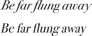
The “true-drawn” italic in this first line is not simply slanted roman, whereas the second line is fake italic. True-drawn italic letterforms have actually been redrawn into different shapes. Look carefully at the differences between the e, f, a, and y (both lines use the same font).

Which of these two sentences contains a word in fake italic?
Since all scripts and italics have a slanted and/or flowing form, it is important to avoid a combination of two different italic fonts, or two different scripts, or an italic with a script. Doing so will invariably create a conflict—there are too many similarities. Fortunately, it’s not difficult to find great fonts to combine with scripts or italics.
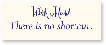
So what do you think about these two typefaces together? Is something wrong? Does it make you twitch? One of the problems with this combination is that both faces have the same form—they both have a cursive, flowing form. One of the fonts has to change. To what? (Think about it.)
Yes—one face has to change to some sort of roman. While we’re changing it, we might as well make the structure of the new typeface very different also, instead of one with a thick/thin contrast. And we can make it heavier as well.

typefaces

An obvious interpretation of type “direction” is type on a slant. Since this is so obvious, the only thing I want to say is don’t do it. Well, you might want to do it sometimes, but only do it if you can state in words why this type must be on a slant, why it enhances the aesthetics or communication of the piece. For instance, perhaps you can say, “This notice about the boat race really should go at an angle up to the right because that particular angle creates a positive, forward energy on the page.” Or, “The repetition of this angled type creates a staccato effect which emphasizes the energy of the Bartok composition we are announcing.” But please, never fill the corners with type on angles.
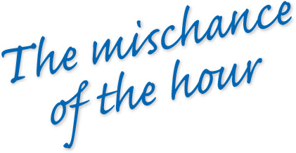
Type slanting upward to the right creates a positive energy. Type slanting downward creates a negative energy. Occasionally you can use these connotations to your advantage.
typefaces
Sometimes a strong re-direction of type creates a dramatic impact or a unique format—which is a good justification for its use.
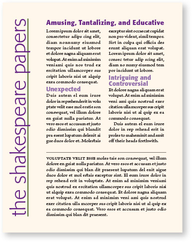
But there is another form of “direction.” Every element of type has a direction, even though it may run straight across the page. A line of type has a horizontal direction. A tall, thin column of type has a vertical direction. It is these more sophisticated directional movements of type that are fun and interesting to contrast. For instance, a double-page spread with a bold headline running across the two pages and the body copy in a series of tall, thin columns creates an interesting contrast of direction.


typefaces
If you have a layout that has the potential for a contrast of direction, emphasize it. Perhaps use an extended typeface in the horizontal direction, and a tall typeface in the vertical direction. Emphasize the vertical by adding extra linespace, if appropriate, and narrower columns than you perhaps originally planned.
You can involve other parts of your layout in the contrast of type direction, such as graphics or lines, to emphasize or contrast the direction.

typefaces
Long horizontals and tall, thin columns can be combined in an endless variety of elegant layouts. Alignment is a key factor here—strong visual alignments will emphasize and strengthen the contrasts of direction.
typefaces
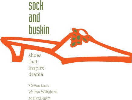
In this example, the direction of the text provides a counter-balance to a horizontal image.
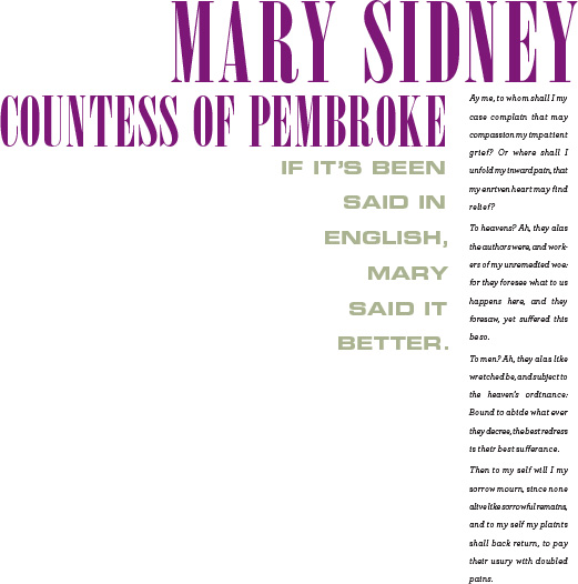
In the example below, there is a nice, strong contrast of direction. But what other contrasts have also been employed to strengthen the piece? There are three different typefaces in that arrangement—why do they work together?
Also notice the texture that is created from the structures of the various typefaces, their linespacing, their letterspacing, their weight, their size, their form. If the letters were all raised and you could run your fingers over them, each contrast of type would also give you a contrast of texture—you can “feel” this texture visually. This is a subtle, yet important, part of type. Various textures will occur automatically as you employ other contrasts, but it’s good to be conscious of texture and its effect.
typefaces
Spend a few minutes to put into words why these three typefaces work together.
If you choose a narrow modern in all caps for the headline, what would be a logical choice for the short quote?
If you had, instead, chosen a modern typeface for the short quote, what would then be a logical choice for the headline?
Color is another term, like direction, with obvious interpretations. When you’re talking about actual color, remember to keep in mind that warm colors (reds, oranges) come forward and command our attention. Our eyes are very attracted to warm colors, so it takes very little red to create a contrast. Cool colors (blues, greens), on the other hand, recede from our eyes. You can get away with larger areas of a cool color; in fact, you need more of a cool color to create an effective contrast.

Notice that even though the name “Scarlett” is much smaller, it competes with the larger word because of the warm color.

Now the larger name in the warm color overpowers the smaller name. You can avoid this or take advantage of it, but always be conscious of it.

Notice how the light blue “Scarlett” almost disappears.

typefaces
To use a cool color effectively, you generally need to use more of it.
But besides the natural idea of colorful color, typographers have always referred to black-and-white type on a page as having color. It’s easy to create contrast with colorful colors; it takes a more sophisticated eye to see and take advantage of the color contrasts in black-and-white.
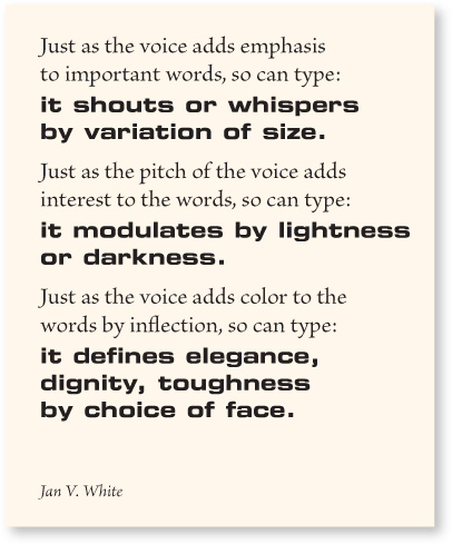
In the quote below, you can easily see different “colors” in the black and white text which is created by such variances as the weight of the letterforms, the structure, the form, the space inside the letters, the space between the letters, the space between the lines, the size of the type, or the size of the x-height. Even using one typeface, you can create different colors.
typefaces
Squint your eyes and look at this. Get used to considering the different values of blocks of text as having color and texture.
A light, airy typeface with lots of letterspacing and linespacing creates a very light color (and texture). A bold sans serif, tightly packed, creates a dark color (with a different texture). This is a particularly useful contrast to employ on those text-heavy pages where there are no graphics.
A gray, text-only page can be very dull to look at and uninviting to read. It can also create confusion: In the example below, are these two stories related to each other?

typefaces
This might be a typical page in a publication. The monotonous gray does not attract your eye; there’s no enticement to dive in and read.
As mentioned earlier, a gray, text-only page is sometimes the perfect solution, as when you do not want the typography to interrupt the reading experience. But for most forms of graphic design, we like to lure the reader into the page or at least make the page interesting to look at, even if in a subtle way.
If you add some color to your heads and subheads with a stronger weight, or perhaps set a quote, passage, or short story in an obviously different color, then it attracts the eyes and readers are more likely to stop on the page and actually read it. And that’s our point, right?
Besides making the page more inviting to read, this change in color also helps organize the information. In the example below, it is now clearer that there are two separate stories on the page.

typefaces
This is the same layout, but with added “color.” Also, look again at many of the other examples in this book and you’ll often see contrasting black typefaces that create variations in color.
Below, notice how you can change the color in one typeface, one size, with minor adjustments. As you can see, these minor adjustments can also affect how many words fit into a space. Being able to make these adjustments requires knowing how to adjust all the spacing attributes in your software: tracking, kerning, letterspacing, word spacing, linespacing, paragraph spacing, column spacing.
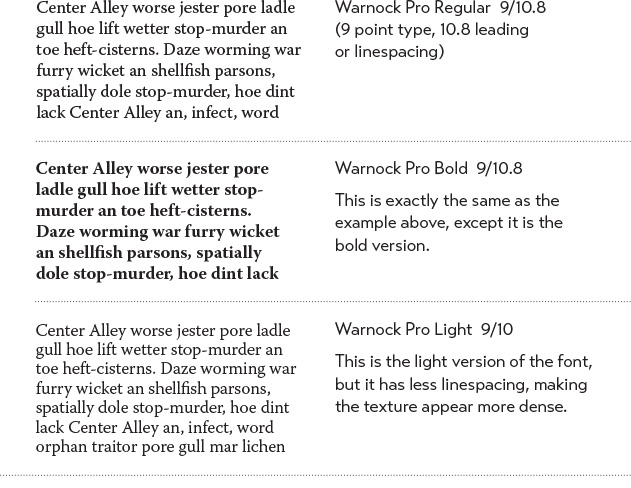
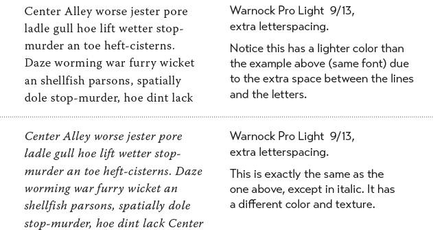
Below you see just plain examples of typeface color, without any of the extra little manipulations you can use to change the type’s natural color. To do: Set about twenty blocks of the same text, like you see below, and make minor adjustments to each one to see the differences in color. Be sure to label each block. Print up the pages because the real test is on paper, unless of course you are designing specifically for the screen.
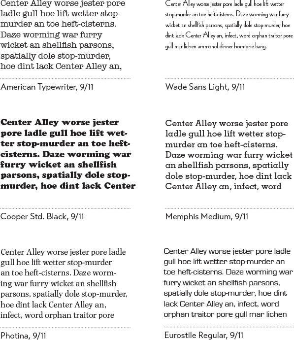
Most effective type layouts take advantage of more than one of the contrasting possibilities. For instance, if you are combining two serif faces, each with a different structure, emphasize their differences by contrasting their form also: If one element is in roman letters, all caps, set the other in italic, lowercase. Contrast their size, too, and weight; perhaps even their direction. Take a look at the examples in this section again—each one uses more than one principle of contrast.
For a wide variety of examples and ideas, take a look through any good magazine. Notice that every one of the interesting type layouts depends on the contrasts. Subheads or initial caps emphasize the contrast of size with the contrast of weight; often, there is also a contrast of structure (serif vs. sans serif) and form (caps vs. lowercase) as well.
Try to verbalize what you see. If you can put the dynamics of the relationship into words, you have power over it. When you look at a type combination that makes you twitch because you have an instinctive sense that the faces don’t work together, analyze it with words.
Before trying to find a better solution, you must find the problem. To find the problem, name the similarities—not the differences. What is it about the two faces that compete with each other? Are they both all caps? Are they both typefaces with a strong thick/thin contrast in their strokes? How effective is their contrast of weight? Size? Structure?
Or perhaps the focus conflicts—is the larger type a light weight and the smaller type a bold weight, making them fight with each other because each one is trying to be more important than the other?
Name the problem, then you can create the solution.
Summary
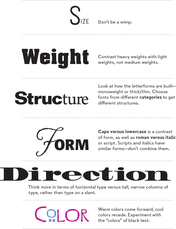
This is a list of the contrasts discussed. You might want to keep this list visible for when you need a quick bang-on-the-head reminder.
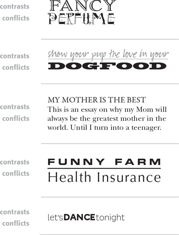
Little Quiz #8: Contrast or conflict
Look carefully at each of the following examples. Decide whether the type combinations contrast effectively or there is a conflict going on. State why the combination of faces works (look for the differences), or state why it doesn’t (look for the similarities). [Ignore the words themselves—don’t get wrapped up in whether the typeface is appropriate for its product, because that’s another topic altogether. Just look at the typefaces.] If this is your book, circle the correct answers. (Answers on page 224.)
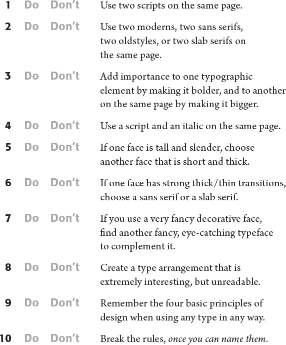
Little Quiz #9: Dos and don’ts
Rather than give you a list of dos and don’ts, I’m going to let you decide what should and should not be done. Circle the correct answers. (Answers on page 225.)
An exercise in combining contrasts
Here is a fun exercise that is easy to do and will help fine-tune your typographic skills. All you need is tracing paper, a pen or pencil (colorful plastic-tip markers are great for this), and a magazine or two.
Trace any word in the magazine that appeals to you. Now find another word in the magazine that creates an effective contrast with the one you just traced. In this exercise, the words are completely irrelevant—you are looking just at letterforms. Here is an example of a combination of three faces that I traced out of a news magazine:
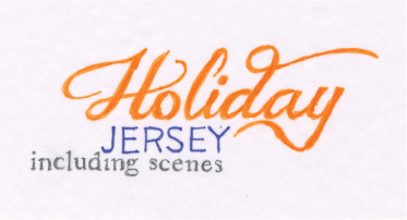
The first word I traced was “Holiday.” Once I did that, I didn’t even have to look at any more scripts or italics. “JERSEY” has a very different form from “holiday,” including being all caps. Then I needed something small and lowercase and from a different category than sans serif or script as a third face.
Trace the first word, and then make a conscious, verbal decision as to what you need to combine with that word. For instance, if the first word or phrase is some form of sans serif, you know that whatever you choose next won’t be another sans serif, right? What do you need? Put your choices into conscious thoughts.
Try a few combinations of several words, then try some other projects, such as a report cover, a short story on one page with an interesting title, a newsletter masthead, a magazine cover or story spread, an announcement, and anything else that may be pertinent to you. Try some colored pens, also. Remember, the words don’t have to make any sense at all.
The advantage of tracing from magazines is that you have an abundance of different typefaces that you probably don’t have on your computer. Is this going to make you lust after more typefaces? Yes.

