Chapter 13. Does it Make Sense?
Is all this making sense to you? Once you see it, it seems so simple, doesn’t it? It won’t take long before you won’t even have to think about the ways to contrast type—you will just automatically reach for the right typeface. That is, if you have the right typeface in your computer. Fonts (typefaces) are so inexpensive right now, and you really only need a few families with which to make all sorts of dynamic combinations—choose one family from each category, making sure the sans serif family you choose contains a heavy black as well as a very light weight.
And then go to it. And have fun!
typefaces

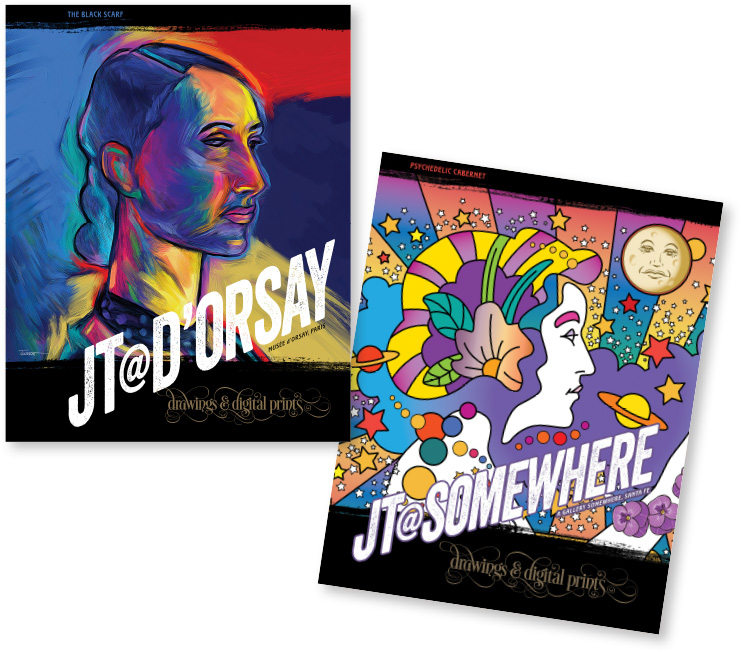
These are two more in John’s playful series of posters. (The other two are on page 113.) The Principle of Repetition is particularly important in series.
Start with the focal point. Decide what it is you want readers to see first. Unless you have chosen to create a very concordant design, create your focal point with strong contrasts.
Group your information into logical groups; decide on the relationships between these groups. Display those relationships with the closeness or lack of closeness (proximity) of the groups.
As you arrange the type and graphics on the page, create and maintain strong alignments. If you see a strong edge, such as a photograph or vertical line, strengthen it with the alignments of other text or objects.
Create a repetition, or find items that can have a repetitive connection. Use a bold typeface or a rule or a dingbat or a spatial arrangement. Take a look at what is already repeated naturally, and see if it would be appropriate to add more strength to it.
Unless you have chosen to create a concordant design, make sure you have strong contrasts that will attract a reader’s eye. Remember—contrast is contrast. If everything on the page is big and bold and flashy, then there is no contrast. Whether it is contrasting by being bigger and bolder or by being smaller and lighter, the point is that it is different and so your eye is attracted to it.
An exercise
Open a newspaper, magazine, catalog, web page, theater program, old phone book, whatever. Find any advertisement that you know is not well-designed (especially with your newly heightened visual awareness). You won’t have any trouble finding several, I’m sure.
Take a piece of tracing paper and trace the outline of the ad (no fair making it bigger). Now, moving that piece of tracing paper around, trace other parts of the ad, but put them where they belong, giving them strong alignments, putting elements into closer proximity where appropriate, making sure the focal point is really a focal point. Change the capital letters into lowercase, make some items bolder, some smaller, some bigger, get rid of obviously useless junk.
Tip: The neater you do this, the more impressive the result. If you just scratch it on, your finished piece won’t look any better than the original.
Even though we all do our work digitally, if your piece is going to be in print, show the client the printed version. All too often I see work in print that I know looked good on the screen but then paper and ink got in the way. Print it up.
(And here’s a trick I taught my graphic design students—whenever you have a client who insists on his own dorky design and doesn’t want to think seriously about your more sophisticated work, make your rendering of his design a little messy. Spill some coffee on it, let the edges get raggedy, smear the pencil around, don’t line things up, etc. For the designs that you know are much better, do them brilliantly clean and neat, print them onto excellent paper, mount them onto illustration board, cover them with a protective flap, etc. Most of the time the client will think—lo and behold—your work really does look better than his original concept, and since he is a VIP* (which you are no longer), he won’t be able to pinpoint why his doesn’t look so good anymore. His impression is that yours looks better. And don’t you dare tell anybody I told you this.)
*VIP: visually illiterate person
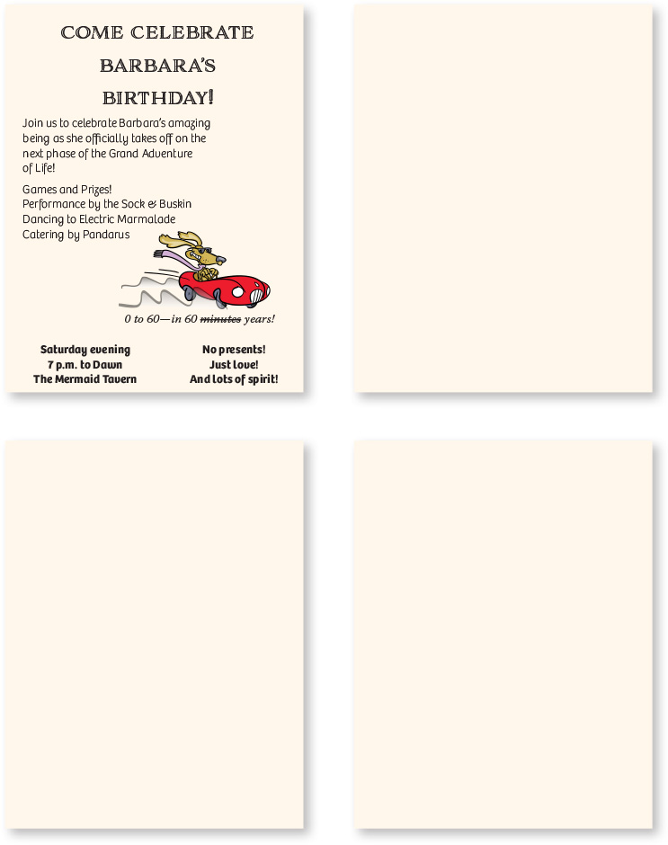
Okay—redesign this!
Here’s a little flyer invite that could use some help. A few simple changes will make a world of difference. Its biggest problem is the lack of a strong alignment, plus there are several different elements competing for the focal point. Use tracing paper to rearrange elements, or sketch a few versions right onto this page.