
Appendix A. Google Play Assets
Google Play is the primary method for distributing Android apps, and it has the largest world-wide reach of any Android app store. Although there is no lengthy review process, you should have all of your assets ready for the store before you launch the app, even if you’re doing a “soft” launch (i.e., a launch with no explicit publicity). Having the right assets ensures that you reach the maximum number of users by showing them what is great about your app and by enabling it to be featured by Google Play.
Application Description
Although this book is focused on design and the impact of design on the user experience, not emphasizing the importance of a good app description would be a major failing. The app description not only lets you tell the users what your app is about and why they must download it now, but also gives you the opportunity to set their expectations.
Use concise, clear language that explains what your app is and what need it fulfills. Many users will only read the first portion of your description, so make sure you get the most important pieces across right away. If there are any problems with the app, be upfront about them. For instance, if the app is a prototype that demonstrates functionality but drains battery quickly, say so. If the app is intended for a specific audience, make that clear upfront (e.g., “This demo for Android app developers does X, Y, and Z”). If you created a weather app that only supports forecasts for one country, be explicit about that right away (and, in this specific case, consider limiting it geographically to those in that country). Setting expectations not only allows users to filter themselves (e.g., “Oh, it doesn’t work in my country, so I won’t try it”), it makes them far less likely to leave negative feedback. By not setting the expectations right away, you run the risk of negative reviews from users who had their own expectations (e.g., “Why doesn’t this stupid app provide weather forecasts in my country?”). A few negative reviews can influence many future would-be users to avoid your app.
Do not make your app description sound “market-y.” In other words, this is not the place to brag excessively about your app or talk about how it was downloaded a million times in the first week. Focus on what the user gets out of it. What makes it different from the competition? Is it faster, better presented, or easier to use?
If your app fulfills a new need or an uncommon one, you have to explain what that need is. For instance, you might make an app for pilots to track their flight details, automatically populating time and distance based on the device sensors. You can declare the audience immediately (e.g., “This app allows pilots to...”). Because pilots know the importance of keeping maintenance and flight records, you can instead emphasize what your app does to make that record keeping easier and what records it actually keeps. If your app is a new take on an existing and common app type (e.g., a new Twitter client), you have to put the emphasis on what makes your app special. You can assume that people looking at your app know what Twitter is and what they want to do with your app, so your description needs to state what makes your app different from the other Twitter apps out there.
Do not use automatic translation for your application description. It may be tempting to use Google Translate or a similar service to automatically translate your description into other languages, but you should avoid doing so. In most cases, doing so will get the gist of your app’s meaning across, but it will often be riddled with minor errors or awkward phrasing that will not convey a sense of professionalism. You don’t want a user’s first experience to be with a grammatically flawed description; otherwise, it could be the last.
The Change Log
Whenever you update the app, update the change log. No exceptions. Many people are afraid to put anything there for fear that they risk sounding like the app was flawed; however, no app is perfect. How did the update make it better? Did you fix a crash bug? Did you fix some silly typos? Is there new content for users? This is your chance to show existing users that they are not forgotten, and it’s your chance to show potential users that the app is constantly improving. Existing users want to know whether the change is worth downloading now, later, or ever. When you don’t update the change log or you put something generic, such as “fixes,” you’re telling the users that the update isn’t important.
Be specific. “Fixed rare crash on launch for Nexus 4 users” is good, but “Fixed bugs” is not. Be concise. “Added support for Hungarian” is good, but “Updated the whole app to support users who have their device set to Hungarian” is excessive. This is not the place to fully explain new features; instead, you can briefly introduce them (“Added swiping for faster navigation”) and then explain them on first launch of the app, if needed. It can be helpful to look back through your commit messages in your version control software such as Git to recall what has changed.
Application Icon
The application icon for Google Play must be 512×512. Only PNG images are supported, so you should upload a 32-bit PNG that matches your default launcher icon. Whenever possible, it’s ideal to create assets such as your application icon as vector graphics so that they can be scaled (and sharpened or otherwise adjusted) to match a variety of sizes.
The application icon is one of the most important parts of your app. It is often the first graphic a user sees related to your app, and it’s the one users search for when launching your app. It needs to convey what your app is about in a simple but recognizable way. This means that it needs to follow all the standard conventions.
A good icon . . .
 Uses the majority of the space available to it. This means the touch target is obvious and you don’t have an overly thin icon. Icons that are too thin don’t look touchable and they can often be lost against certain backgrounds.
Has a notable shape. Android does not force all app icons into the same shape, so this is one of the best ways to make your icon stand out. Is it an analog clock? Perhaps you should consider a round icon. Is it for tracking stars in the sky? Maybe you could try a star or constellation shape. Look at the variety of shapes in the default apps. There aren’t just circles and rounded rectangles but mail-shaped icons and icons that look like headphones.
Sticks to a simple color scheme. Look at the apps that come on an Android device and you should notice a very common pattern among the default icons. Most of them stick to a simple but distinct color scheme. Gmail is red and white. Play Music is orange and yellow. Calendar is blue and white. Where shapes are similar, colors are different. The color of your icon should reflect the colors of your app, when possible. This helps the user associate your icon with your app.
Applies the core themes of Material Design. The same clean concepts, simple shadows, bold colors, and geometry apply to icons. The top of the icon can be slightly lighter and the bottom slightly darker. You want to have a soft shadow, just like a paper element from Material Design, but you can also add a 45 degree shadow for any raised elements, a score across the icon for depth, or other visual embellishments.
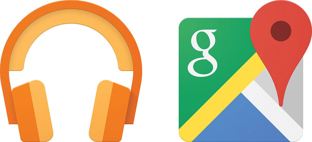
Take a look at both the Google Maps icon and the Google Music icon in Figure A.1. Notice the bright, playful colors and the shapes. Both of these types of apps typically have very simple icons. The Google Maps icon uses a location pin to break away from a simple rounded square that another mapping app might use for its icon. Music applications are another example where people typically do something simple such as a rounded rectangle with a music note or CD on it. Google used the unique shape of headphones to ensure the icon stands out and chose a vibrant orange color to make it more distinct. Consider how bland the icon would have been with a standard black headband instead of orange.
Creating an Icon the Easy Way
Learning how to design an icon effectively is deceptively hard. Despite that it’s relatively small, a lot of thought should go into a good icon. In most cases, developers either don’t have time to learn all the details or simply don’t want to. If that describes you, consider using the Android Asset Studio to create the launcher icon (https://romannurik.github.io/AndroidAssetStudio/icons-launcher.html). You can supply an image, use some clipart, or even just type some text to create the icon. You’ll specify colors, shapes, and visual effects and all the work is done for you. Figure A.2 shows a few simple icons for the woodworking app, created using Android Asset Studio, that just use “WW” as the content.
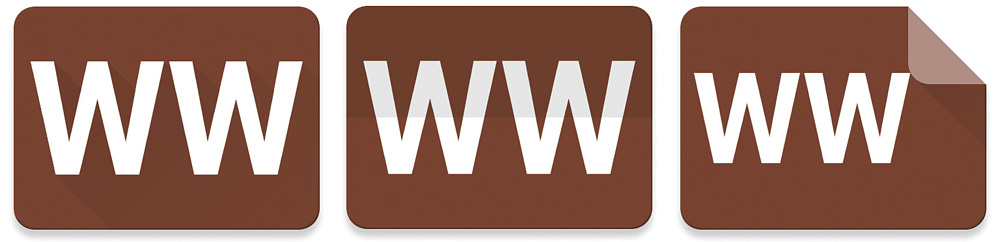
Figure A.2 Icons created with Android Asset Studio demonstrating long shadow (left), score (center), and dog-ear (right) effects
Creating an Icon Manually
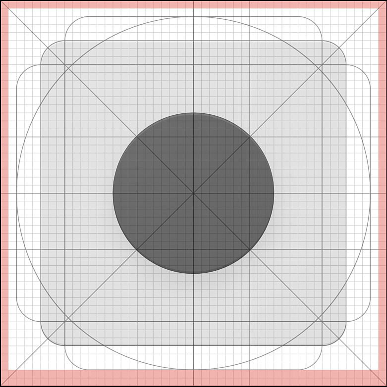
Although Android Asset Studio is amazing, there are times when you want to create an icon yourself. The Material Design guidelines for icons (https://www.google.com/design/spec/style/icons.html#icons-product-icons) are quite detailed; you should definitely read through them in detail before starting on an icon. Once you’re ready to begin, you should grab the “Product Icons sticker sheet” (https://www.google.com/design/spec/resources/sticker-sheets-icons.html), which provides templates for Adobe Illustrator that simplifies the process. Figure A.3 shows the template.
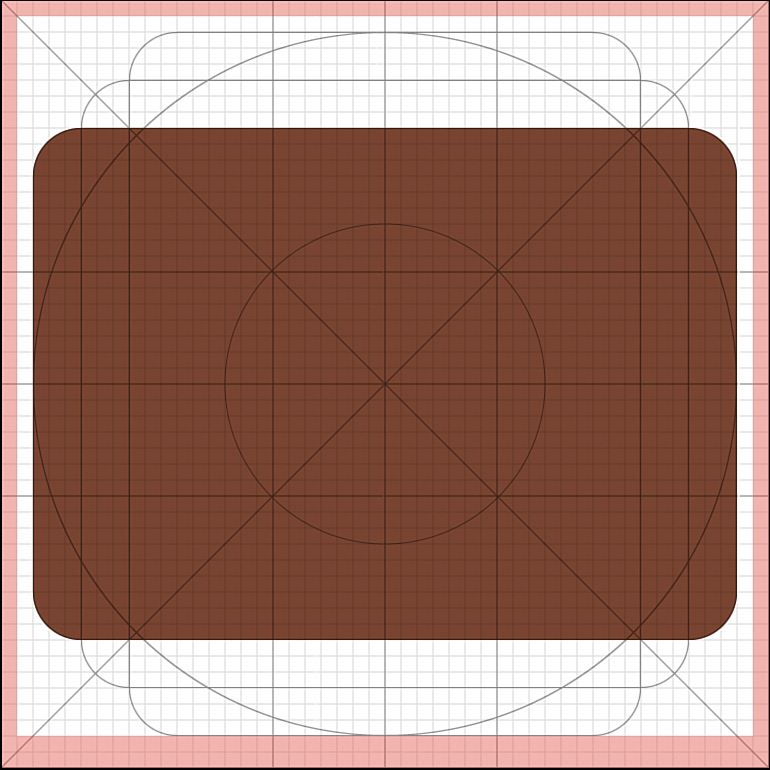
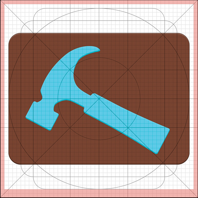
After opening the template, you’ll see several layers that will help guide the creation of a new icon. You should choose a background shape that will work well with the content of the icon. For instance, the woodworking tools app might use a hammer as the central part of the icon. Although a literal hammer isn’t one of the emphasized tools in the app, it is a simple shape that evokes the sense of “construction” and “tools,” both of which go well with the app. Placing that hammer at an angle is more interesting than simply having it vertical or horizontal, so using the wider rounded rectangle might be a good idea. The color can often be the app’s primary color. Figure A.4 shows the background created with the template.
A subtle but important addition to the background is the lighting and shading. The top of the icon has a tinted edge (1dp, 20% opacity, pure white) and the bottom has a shaded edge (1dp, 20% opacity, pure black), creating a hint of shape to the background instead of making it too flat. If you’re using a shape for the background other than what was included in the template, you’ll need to make these edges yourself.
An easy way to create the shaded edge is to select the background shape, copy it, and paste it twice. Click the front duplicate and move it up one unit (tap the up arrow). With the front duplicate still selected, hold Shift and click the duplicate behind it (it is sticking out one unit at the bottom) to select both shapes. Open the Pathfinder window and click the “Minus Front” option. This basically cuts the front shape out of the other shape, leaving just that slim offset. Make that edge black and set the opacity to 20% then make sure it is positioned in front of the very bottom of the background.
Creating the top tinted edge is the same process, but the duplicate is moved down one unit and the edge is set to white and 20% opacity. Make sure it’s in front of the very top of the background. Figure A.5 shows the updated icon, though the edges are extremely subtle, so they may be difficult to see.
With the background ready, it’s time to create the content of the icon. This is the part that is most difficult to provide directions for because it depends entirely on what makes sense on your icon. In some cases, a letter or two can work well. In other cases, you want some kind of shape or logo. Try to keep it relatively simple (remember, the icon will usually be displayed at about the size of the user’s thumb). If necessary, you can find a real photo of the type of object you’d like, bringing it into Illustrator and drawing over it with the pen tool. Once you’ve created the shape, you can delete the photo and tweak your shape until it looks right.
Ensure that the content of the icon has sufficient contrast with the background. Sometimes you can use your accent color, but other times you may need to change it. If the content is meant to appear floating or needs more character, you can use the same tinted/shaded edge trick that was used on the background. Figure A.6 shows the icon so far.
If you want to create a long shadow for the content of the icon, create two new copies of it and drag one of them off the bottom-right edge of the background while holding shift (which constrains the movement to 45 degrees). Make both copies black with the opacity set to 0% on the bottom-right one. Open the Object menu, pick Blend, and open Blend Options. The dropdown should have Specified Distance selected and the unit should be 1. Select both copies and blend them (Object, Blend, Blend).
At this point, the shadow will be very harsh and it will extend beyond the background. To lighten the shadow, select the blended object and open the Transparency window. Set the blend mode to Multiply and the opacity to 25%. Now the shadow won’t be as harsh, but it still extends too far, so select the icon background and make a copy of it in front of the long shadow (make sure it lines up with the original background). Select both the shadow and the copied background and then open the Object menu, select Clipping Mask, and choose Make. This will clip your shadow to the background. Figure A.7 shows what this looks like.

Now the icon needs the “finish,” which is simply a radial gradient centered on the top left of the canvas. The gradient goes from white with 10% opacity to 0% opacity. There is also a layer in the template that provides an example. Note that the effect is very subtle (it will look like the icon is just a little lighter).
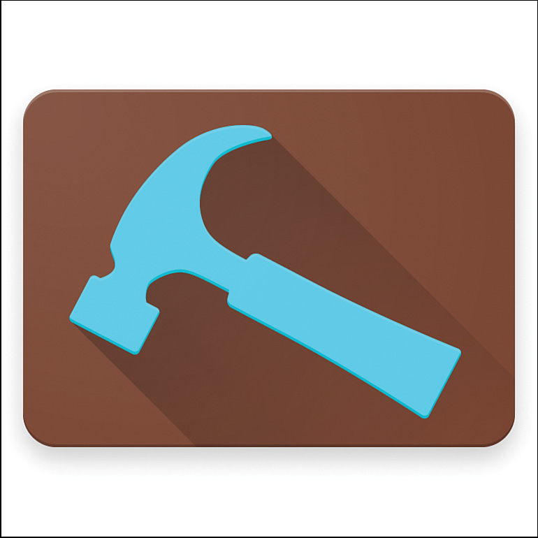
The final thing to do is add a drop shadow to the icon background. Select the background shape and open the Effect menu, click Stylize, and select Drop Shadow. The mode should be Normal, opacity 20%, X offset 0, Y offset 4, and blur 4. Figure A.8 shows the final icon.
Screenshots
Screenshots can be a wide range of sizes now from the original 320×480 resolution on up to 2160×3840. They should be 24-bit PNGs to keep the graphics crisp, but JPEGs are also acceptable. As new resolutions become more common on Android devices, support for new screenshot sizes is added, so be sure to double-check what sizes you can upload in the developer console when you are submitting your app (https://play.google.com/apps/publish).
A lot of users will look at the screenshots before they’ve even begun to read your app description. Screenshots provide the first glimpse into what your app is really like, so they’re absolutely vital to include. Google Play requires two screenshots, but you should provide more. Ideally, you should provide one screenshot for each primary section of the app. For instance, an email app could show a screenshot of the inbox, a full email, replying to an email, and any other core functionality, such as searching.
Screenshots are an excellent way to show off support for alternate form factors. If you support tablets, include a few tablet screenshots. This is often one of the first places users look to see if their tablet is supported, and seeing only phone screenshots will be perceived as an indication that tablets are not supported. Some users will even back out of an app’s details in Google Play without reading the description or downloading the app to give it a try because they’re using a tablet and the screenshots don’t indicate support for tablets.
Do not use Google Play screenshots for promotional material. Some people make the mistake of using them to advertise for other apps, but they are meant to be specific to the app they are for and shouldn’t have added text on them that doesn’t reflect the user experience. Do not show screenshots of unimportant screens just to have more screenshots available. For instance, it does not make sense to include a screenshot of the settings screen for most apps (an exception being for apps that are intended for power users or focused on customizability). Settings screens generally have a lot to look at and interpret and don’t reflect the primary user experience of the app.
Exclude distracting pieces from the screenshots; you should remove any status bar notifications from each screenshot. Android 6.0 supports this through the developer options, but you can also use the Clean Status Bar app, which will allow you to replace the status bar with a clean one on the device itself, so you can just grab the screenshots without extra work (https://play.google.com/store/apps/details?id=com.emmaguy.cleanstatusbar). Some people like to include the frame of a real device around the screenshot, but you shouldn’t do that. Doing so decreases the size of the actual screenshot (which is what the users care about) and it also means your screenshots will look dated faster since devices change so frequently. Be sure to review each screenshot. It’s easy to make the mistake of taking a screenshot of an app that includes user-generated content that might not be appropriate. If your screenshots are taken on a device that’s customized (e.g., one that has a custom style for the status bar), modify them to look like what the user will see to keep the focus on your app and not the trim.
Feature Graphic
The feature graphic must be 1024×500 (although it will be resized for use in a variety of places). Ideally, it should be a PNG, but a JPEG with minimal compression works well, too. In either case, it must be a 24-bit image (no alpha channel).
Your feature graphic is an important part of marketing your app and is currently included at the top of your app’s page in the Google Play app. It’s also often scaled down to be used in the Google Play app and on the website at a variety of sizes. Many designers are very tempted to put a lot of detail into this image because it is fairly large, but it should be clean and clear so that it can scale effectively. Think of it like a book cover; the goal is to entice viewers with strong visuals that emphasize the characteristics of your app.
Consider incorporating your logo or other visual representing your app into the design of your feature graphic. It is a good idea to include the name of your app in a very large font because this graphic can be used to represent your app on its own. If you scale this image down to one-tenth the normal size and you cannot read the app name, your text is not big enough. Another common piece of this image is a tagline of some sort. This is a brief bit of text that gives the user some sense of what your app does, preferably in a memorable way. The tagline is especially helpful for apps that have a name that doesn’t necessarily explain what they are. If your app is called “Image Cleaner” and it is an app that takes images and automatically processes them in ways to improve their appearance, your tagline might be something like “Automatically makes your images beautiful” or “Bad images in; good images out.” Sometimes simplicity can be powerful, but you have to be careful to make sure you are telling enough. For instance, your tagline might be “Your images. Beautiful.” That in itself might not be clear enough, but your graphic might depict a blurry image turning into a sharp one or something similar to convey the rest of the meaning. Whatever the tagline is, it needs to reflect the voice of your app (is your app playful, sophisticated, or snarky?) and give some feel for its purpose.
You should not include small text in this image. It’s far too tempting to include some bullet points or even a brief intro into what your app is, but these small bits of text just become blurry, unprofessional lines once the graphic is scaled down. You should also avoid including screenshots in the feature graphic for the same reason. Once the image is scaled down, the screenshots are not useful and can detract from the message (besides, there’s already a spot specifically for screenshots). Further, people are often tempted to put their screenshots into device mockups to make them look like the devices are really running the app. That can look really nice at large size, but again it’s terrible at a smaller size and, perhaps worse, it becomes outdated extremely fast. Android devices change very rapidly, adjusting constantly to consumer demand, new technologies, and growing trends.
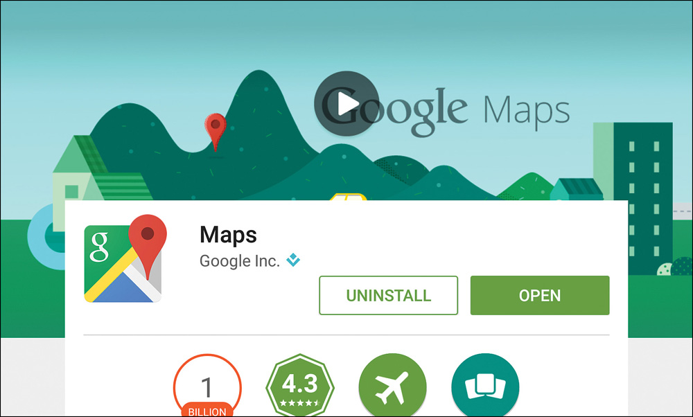
You should also avoid having anything too important in the bottom third of the feature graphic, because it can be covered by content, or at the very top, which can be covered by the app bar. Figure A.9 shows the top of the Google Maps page in Google Play in portrait orientation, with the app bar removed. Figure A.10 shows the same page in landscape orientation. Notice that the bottom third is mostly covered in landscape orientation. Also note that the app name is large and with sufficient contrast to be clear at different sizes and that a play button is added because the app has a video.

Tip
Although you might hope that just making an amazing app is enough to get it noticed by the world, the reality is that preparing proper Google Play assets makes a significant difference. The obvious required pieces, such as the screenshots and description, are extremely important, but now you also know how important the feature graphic is. If you’re still looking for some help understanding what good assets look like, consider visiting Google Play (https://play.google.com/store/apps) and viewing some of the featured apps.
Promotional Graphic
The promotional graphic has to be 180×120. It should be a PNG to avoid JPEG artifacts at such a small size, but you can upload a JPEG image. There is no support for an alpha channel, so it should be a 24-bit image.
This graphic is probably the least important asset. It originally served a purpose similar to the feature graphic in the Android Market (before the rebranding to Google Play) for phones. Apps that were being promoted in the Android Market would have the promotional graphic shown at the top and in a few other places. Neither the current Google Play app for devices nor the Google Play website show the promotional graphic anywhere, so it wouldn’t be surprising if this asset went away completely.
All of this does not mean that the promotional graphic has no value; it just means it has less value than some of the other assets. If you do not have the time (or want to spend the time) creating a promotional graphic, a good option is to use a resized version of your feature graphic. If you have done the feature graphic well, scaling it to the size of the promotional graphic should give you something reasonable. You may choose to remove some text or to sharpen other text to ensure it is readable, but the purpose of the two images is very similar.
Video (YouTube)
Adding a video for your application is a great way to demonstrate the app in action. You can give the user a quick view of what the app looks like and how usable it is. Video has the advantage of being able to better demonstrate the app in use and take advantage of audio, but it is a supplement (not replacement) for screenshots. Screenshots must be to-the-point, faithful depictions of the actual app experience. The video, however, is open to a full range of options. It can be as simple as a user demonstrating the app with a voiceover explaining each screen, or it can be as involved as a comedic movie short meant to entertain and delight the user.
The type of movie should be reflective of the type of app and its personality. Is your app cool, to the point, and entirely utilitarian, or is your app bright, playful, and exciting? The former would lend itself to a video that demonstrates the key features of the app, and the latter is more open to entertainment. Regardless of the type of app, be sure to keep your video short (30 seconds to 3 minutes).
Paper Camera (https://play.google.com/store/apps/details?id=com.dama.papercamera) is an app that allows you to take photos and videos using various effects that make the media look like pastels, sketches, and so on. Their demo video is beautiful in its ability to accurately portray the app in the real world with a simplicity that makes it understandable and accessible to all levels of users. The app itself is also a great example of how to use a fully UI that is still intuitive. You can see the video on YouTube at https://www.youtube.com/watch?v=_Aw6jEVnE2o.
Promoting Your App
Once you have your app listed in Google Play with the assets specified in this appendix, you might consider promoting your app elsewhere. For instance, you might write to various blogs and ask them to cover your app. Be sure to include the Google Play link and a brief blurb about what the app is right away (you do want to include more details, but you are emailing people who are dealing with a significant volume of emails that are just like yours, so you have to get to the point in the first paragraph). Do not include any attachments in the email; instead, provide a link to download promotional photos, videos, and so on. Unlike for the screenshots for Google Play, you can use device mockups for the screenshots in this case (take a look at the official Device Art Generator, which allows you to just drag and drop images to put them in a device: http://developer.android.com/distribute/promote/device-art.html). Provide a point of contact for any questions. Never send the email multiple times; otherwise, your app quickly goes from being a potentially interesting new app to one that has to be spammed to be noticed. Finally, be willing to accept that your app won’t be covered by everyone you email and that most of these people won’t have the time to respond to you.
Amazon Appstore
The Amazon Appstore is an alternative to Google Play and reaches a fair number of users. The process for submitting an app is detailed on the website (https://developer.amazon.com/public/support/submitting-your-app/tech-docs/submitting-your-app), but it’s worth calling out a few differences in the assets used when submitting to the Amazon Appstore. The application icon needs to be available in two sizes, 512×512 (just like you need for Google Play) and 114×114. You also have to submit at least three screenshots and a variety of sizes are acceptable (800×480, 1024×600, 1280×720, 1280×800, 1920×1200, and 2560×1600). The Amazon Appstore allows you to upload an optional “promotional image” that is very similar in purpose to the promotional graphic used for Google Play. Amazon requires a 1024×500 image, so you may be able to use the version you create for Google Play with a bit of cropping.
The Amazon Appstore listing can support up to five videos. They must be 720px to 1080px wide (both 4:3 and 16:9 ratios are supported). They should be 1200kbps or higher and will generally look best using the H.264 codec.