
4. Transforming the Message
LIKE CSS TRANSITIONS, CSS Transforms were also initially developed by the WebKit team, then folded back into two separate specs at the W3C for 2D and 3D, and ultimately combined into one Working Draft (http://bkaprt.com/css3-2/10/)
We’re going to focus primarily on 2D transforms in this book, as they’re the most practical to use right now. An entire book could be filled with information on 3D transforms alone, and they’re wonderfully magical. But 2D transforms have the most traction with regard to browser support, including Safari 3.2+, Chrome 3.2+, Firefox 4.0+, Opera 10.5+, and IE 9+ (just like transitions).
So just what are CSS Transforms? The W3C (http://bkaprt.com/css3-2/10/) describes them as:
CSS Transforms allows elements styled with CSS to be transformed in two-dimensional or three-dimensional space.
Well, that was helpful. The best way to understand transforms is to see them in action.
So let’s first walk through a simple example applying various 2D transforms on a small photo gallery. We’ll then use those same techniques in practice on the moon example site later in the chapter.
The Scale Transform
Consider a horizontal list of three subtly framed photos from a recent trip to Martha’s Vineyard, a small island off the coast of Massachusetts (FIG 4.1). This is a rather typical design pattern: a grid of linked images.

FIG 4.1: A grid of three hyperlinked photos.
We’re going to rely once again on our trusty unordered list to mark these up:
<ul class="gallery">
  <li><a href="#"><img src="photo-1.jpg" /></a></li>
  <li><a href="#"><img src="photo-2.jpg" /></a></li>
  <li><a href="#"><img src="photo-3.jpg" /></a></li>
</ul>
With no style yet applied, FIGURE 4.2 shows how this list would appear by default. Notice how the images are quite a bit larger than we’d like them to be in the final design. This is intentional, as we’ll be using CSS to scale them down.

FIG 4.2: The list of large photos, before CSS is applied.
Adding style
Let’s add some CSS to make this vertical list of photos a horizontal grid, with a one-pixel border around each image. (Also note the page background is a light gray #eee.)
ul.gallery li {
  float: left;
  margin: 0 10px;
  padding: 10px;
  border: 1px solid #ddd;
  list-style: none;
  }

ul.gallery li a img {
  float: left;
  width: 200px;
  }
Here we’ve floated the list items, turned list-style bullets off, and wrapped each li in a one-pixel gray border. We’ve also floated the images themselves and sized them down to 200 pixels wide.
Those two compact declarations will get us where we want to go in terms of a default design (refer back to FIG 4.1).
Applying the scale transform on hover
Now it’s time for transforms. Let’s add a scale transform to make the photo larger when hovered. Remember that the original images in the markup are larger than the 200-pixel width we’re specifying in the stylesheet. That means we can safely scale up the photo while maintaining its quality.
Scale transforms are supported in Safari, Chrome, Firefox, and Opera—each requiring a vendor prefix—as well as IE, which doesn’t require a prefix. Let’s add a stack that satisfies those browsers as well as any future ones.
ul.gallery li a:hover img {
  -webkit-transform: scale(1.5);
  -moz-transform: scale(1.5);
  -o-transform: scale(1.5);
  transform: scale(1.5);
  }
When the hyperlinks are hovered, we’re saying, “scale the images to 1.5 times their initial size” (which was 200px wide). Setting scale(2) would make the photo twice as large, scale(0.5) would make it half as large, etc.
FIGURE 4.3 shows the result, viewed here in Safari. Notice how the transform doesn’t disturb the rest of the elements in the document, and zooms the photo out from the center, without affecting the layout around it.

FIG 4.3: The middle photo being hovered and scaled with a CSS transform.
You can also optionally set a transform-origin that will dictate where the scaling will expand from: top, bottom, center, or a percentage (see http://bkaprt.com/css3-2/11/).
For example, to have the photo scale out from the bottom left of its container instead of the center, you’d write this:
ul.gallery li a:hover img {
  -webkit-transform-origin: bottom left;
  -moz-transform-origin: bottom left;
  -o-transform-origin: bottom left;
  transform-origin: bottom left;
  -webkit-transform: scale(1.5);
  -moz-transform: scale(1.5);
  -o-transform: scale(1.5);
  transform: scale(1.5);
  }
An appropriate drop shadow
We could go a step further with this example and add a drop shadow to the photo when hovered. This would be an appropriate use of the CSS3 box-shadow property, as we’re making the enlarged photo appear as if it’s pulling up off the page.
Now, the drop shadow is a delicate beast, an often-overused crutch by the trigger-happy designer. It’s easy to get carried away and overdo it. But in this case, we’re attempting to add dimension to the photo enlargement, so it should work out quite well.
The syntax for box-shadow is identical to the text-shadow property we used back in Chapter 3. However, unlike text-shadow, box-shadow requires vendor prefixes in order to work in older versions of Safari, Chrome, and Firefox. (Opera 10+ and IE9+ support the non-prefixed box-shadow.) Let’s fold those rules in.

FIG 4.4: The hovered photo, now scaled with box-shadow applied.
ul.gallery li a:hover img {
  -webkit-transform: scale(1.5);
  -moz-transform: scale(1.5);
  -o-transform: scale(1.5);
  transform: scale(1.5);
  -webkit-box-shadow: 4px 4px 10px rgba(0, 0, 0, 0.5);
  -moz-box-shadow: 4px 4px 10px rgba(0, 0, 0, 0.5);
  box-shadow: 4px 4px 10px rgba(0, 0, 0, 0.5);
  }
We’ve added a CSS3 stack for the box-shadow property for the older versions of WebKit and Mozilla browsers, ending with the non-prefixed version as we have with other examples.
In terms of the syntax, here we’re applying a shadow on the hovered image that is 4px from the top, 4px from the left, has a 10px blur, and is black at 50% opacity (ensuring it’ll blend in to whatever background or element sits behind it).
FIGURE 4.4 shows the shadow now appearing in conjunction with the scale transform when a photo is hovered over. This combination gives the effect of having the enlarged photo pop out from the page.
Smoothing out the zoom with a transition
Lastly, adding a transition to the linked photos will smooth out the scaling, giving the :hover treatment an animated zoom-in-and-out—an effect previously only possible with Flash or JavaScript, but now possible in many browsers with just the few lines of CSS3.
Here’s the transition stack added to the complete CSS for our little photo gallery:
ul.gallery li {
  float: left;
  margin: 0 10px;
  padding: 10px;
  border: 1px solid #ddd;
  list-style: none;
  }
ul.gallery li a img {
  float: left;
  width: 200px;
  -webkit-transition:
    -webkit-transform 0.2s ease-in-out;
  -moz-transition:
    -moz-transform 0.2s ease-in-out;
  transition: transform 0.2s ease-in-out;
  }
ul.gallery li a:hover img {
  -webkit-transform: scale(1.5);
  -moz-transform: scale(1.5);
  -o-transform: scale(1.5);
  transform: scale(1.5);
  -webkit-box-shadow: 4px 4px 10px rgba(0, 0, 0, 0.5);
  -moz-box-shadow: 4px 4px 10px rgba(0, 0, 0, 0.5);
  box-shadow: 4px 4px 10px rgba(0, 0, 0, 0.5);
  }
Notice this time, the property we’re transitioning is the scale transform, hence the appropriate vendor prefixes are in place for both the transition and transform properties.
Transforming the Experience
With everything in place, the result is quite impressive for the minimal amount of CSS that’s required to make it happen. We’re putting most of the burden of the effect back on the browsers that support it, rather than injecting Flash or JavaScript to make it happen.
Again, the place where we chose to fully embrace CSS3 in this particular example is in the experience layer: when the photo is hovered, we’re offering an enhanced view. It’s not critical for browsers that don’t support those properties.
Users of Internet Explorer, for example, will just see a gallery of clickable thumbnails, and that’s perfectly OK. If the hover treatment were critical, then we’d need to rethink our use of CSS3 to achieve the visual experience.
Rotate, Skew, And Translate
In addition to scale, there are three other transforms available for rotating, skewing, and translating elements. (Translate moves elements via x/y coordinates.) Let’s add each to the photo gallery example to quickly see how they operate.
Adding rotation
If we wanted to rotate the photo when hovered, while still scaling it up, we can add the following rotate transform to the :hover rule:
ul.gallery li a:hover img {
  -webkit-transform: scale(1.5) rotate(-10deg);
  -moz-transform: scale(1.5) rotate(-10deg);
  -o-transform: scale(1.5) rotate(-10deg);
  transform: scale(1.5) rotate(-10deg);
  -webkit-box-shadow: 4px 4px 10px rgba(0, 0, 0, 0.5);
  -moz-box-shadow: 4px 4px 10px rgba(0, 0, 0, 0.5);
  box-shadow: 4px 4px 10px rgba(0, 0, 0, 0.5);
  }
We’re still scaling up the photo on hover, but we’re also tipping the photo 10 degrees to the left using rotate (FIG 4.5). A negative value from -1deg to -360deg rotates the element counter-clockwise, while a positive value from 1deg to 360deg rotates it clockwise.

FIG 4.5: A hovered photo, now scaled and rotated to the left using the rotate transform.
Alternatively, we could add varying rotate transforms to the list items, so that the photo (and frame) appear to be tossed on the table, randomly. Then we can rotate and scale on :hover as well (FIG 4.6).

FIG 4.6: Using rotate to make the photos appear scattered on the page.
I’m stressing in this little book that the most appropriate place to add CSS3 is on the experience layer—but that doesn’t mean you can’t use these techniques on the default view of a design, provided again that they’re not critical and degrade well.
For example, should the browser not support rotate transforms, and the photos appear perfectly straight, that would be fine. Nothing would appear broken.
No rotate? Don’t Panic
Panic Software’s blog has a nice example of using rotate in the primary design of a page (http://www.panic.com/blog), where they use very subtle rotation via CSS3 to tip the entries to the left as if they’re sheets of paper left on a desk (FIG 4.7). It’s not crucial to the design, and if the entries are straight without rotation (FIG 4.8), it’s perfectly OK.
FIG 4.7: Panic Software’s blog design uses subtle rotation via CSS3 to add realism.
FIG 4.8: Without rotation, the blog still looks great. Nothing appears missing or broken.
Rotating the sun
Another nice example of an appropriate use of CSS transforms is the site for Outside (http://outsideapp.com), a wonderful weather app for the iPhone (FIG 4.9).

FIG 4.9: The Outside iPhone app uses rotation on the sun graphic.
At the top of the page is a sun graphic (FIG 4.10) that rotates 360° via the use of the rotate transform. (In this case, JavaScript is used to animate the rotation in non-WebKit browsers, but we’ll be discussing pure CSS-based animations later in Chapter 6). This subtle experience enhancement is simple and appropriate, as it mimics the same animated sunshine that appears in the iPhone app itself. The sun doesn’t rotate in browsers that don’t support CSS transforms, and that’s perfectly fine. Nothing appears broken or missing in a non-animated version of the site.

FIG 4.10: Outside app’s sun graphic comes to life after positioning and rotating with CSS.
Transforms coupled with transitions in CSS can help support the overall message in the designs we create for the web, and that’s a wonderfully enabling tool for us web designers.
The skew transform
The skew transform takes x and y coordinates and skews an element. If we were to skew the photos in our gallery on hover, for example, we’d use the following CSS (skewing negative five degrees on the x coordinate, and 30 degrees on the y coordinate) (FIG 4.11):
ul.gallery li a:hover img {
  -webkit-transform: scale(1.5) skew(-5deg, 30deg);
  -moz-transform: scale(1.5) skew(-5deg, 30deg);
  -o-transform: scale(1.5) skew(-5deg, 30deg);
  transform: scale(1.5) skew(-5deg, 30deg);
  }

FIG 4.11: Using the skew transform to distort the photo.
Like rotate, skew accepts positive and negative degree values. You can also use just one value for both x and y like so (FIG 4.12):
ul.gallery li a:hover img {
  -webkit-transform: scale(1.5) skew(30deg);
  -moz-transform: scale(1.5) skew(30deg);
  -o-transform: scale(1.5) skew(30deg);
  transform: scale(1.5) skew(30deg);
  }
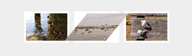
FIG 4.12: Skewing the photo 30 degrees on both the x and y axis.
Now I realize that what we just did to the photo is far from visually compelling, and admittedly, I don’t use skew all that often; however, I’m convinced there are interesting uses for it.
For example, skew could be used on blocks of text to create three-dimensional visuals—all with semantic markup and CSS3 (FIG. 4.13 and 4.14).

FIG 4.13: A demo by Paul Hayes using skew and transitions to create multiple 3D cubes from simple chunks of hypertext (http://www.paulrhayes.com/experiments/cube/multiCubes.html).

FIG 4.14: The Web Trend Map uses skew to place avatars on an isometric grid, creating unique data visualizations from otherwise flat elements (http://webtrendmap.com).
The translate transform
Lastly, the translate transform allows you to move an element from its normal position on screen, using x and y coordinates.
For example, if we wanted to move an image in the photo gallery from its initial position upon hover, we could do that with translate. And with our transition in place, that movement will be smoothly animated.
Here’s the syntax for moving the image 20 pixels to the right and 40 pixels from the top of its original location (FIG 4.15):
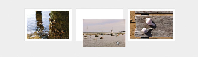
FIG 4.15: Using the translate transform to move the photo on :hover.
ul.gallery li a:hover img {
  -webkit-transform: scale(1.5) translate(20px, 40px);
  -moz-transform: scale(1.5) translate(20px, 40px);
  -o-transform: scale(1.5) translate(20px, 40px);
  transform: scale(1.5) translate(20px, 40px);
  }
If we wanted to move the image to the left and/or top, we’d use negative values, e.g., translate(-20px, -40px).
Like the aforementioned transforms, translate doesn’t disturb the other elements in the document, moving it explicitly to wherever you tell it to go. That means you don’t have to be concerned with margins, padding, clearing floats, or absolute positioning. Give an element translate coordinates and it’ll move it there.
Different Transforms to Help Support the Story
The photo gallery example demonstrated how scale, rotate, skew, and translate can work together with transitions to create richer experiences. The key to using these transforms well is to find appropriate situations in which they’ll assist in telling the story of what’s on screen.
Again, it’s easy to get carried away with transforms, because, well, they’re fun and simple to implement. But searching for the appropriate places in the experience layer to enable them will make for a better end product.
Transforming the Moon
Let’s return to the moon example site, where I’ve used various transforms and transitions to help liven up the experience on the slideshow gallery (FIG 4.16).

FIG 4.16: The slideshow carousel area of Things We Left on the Moon.
When hovering each of the items left on the moon, the image reacts in a different way, depending on the nature of the item being featured, be it a doughnut, a lawnmower, a cat, etc.
Adding an appropriate transform/transition to each of the items is not only fun and easy to implement, it’s also harmless for browsers that don’t yet support the bits of CSS3 that make the interaction possible.
Let’s go through each item one by one to see how scale, rotate, positioning, and opacity can be combined with transitions to complete the experience.
Supporting the message
If we think about each of the linked items, and specifically about their meaning, we can then apply a transform and/or transition that supports the story of the object at hand.
How would a big doughnut or reclining chair react to interaction? We can choose to apply the appropriate CSS3 here to help enrich the experience (FIG 4.17).

FIG 4.17: The things we’ll be transforming.
The markup
To mark up this faux carousel of wacky things, the semantics are quite simple: just an ordered list of linked images, with a heading underneath to describe what each item is.
<ol id="things">
  <li id="things-1">
    <a href="#"><img src="img/doughnut.png" /></a>
    <h2>1 big doughnut</h2>
  </li>
  <li id="things-2">
    <a href="#"><img src="img/mower.png" /></a>
    <h2>1 lawnmower</h2>
  </li>
  <li id="things-3">
    <a href="#"><img src="img/cat.png" /></a>
    <h2>1 astro cat</h2>
  </li>
  <li id="things-4">
    <a href="#"><img src="img/recliner.png" /></a>
    <h2>1 recliner</h2>
  </li>
  <li id="things-5">
    <a href="#"><img src="img/gnome.png" /></a>
    <h2>1 magic gnome</h2>
  </li>
</ol>
Notice we’ve added an id of #things to the list itself, and then an id for each list item as well, so that we can add unique interactions to the :hover state of each item.
Base styles for each item
Next we’ll add the base CSS for each list item that contains the linked images. The following styles float the items to make them horizontal, set relative positioning for the context in which we will later absolutely position each image, and finally, add a rounded, semi-transparent background frame.
ol#things li {
  position: relative;
  float: left;
  margin: 0 15px 0 0;
  padding: 10px;
  background: #444; /* backup for non-RGBA */
  background: rgba(255, 255, 255, 0.1);
  list-style: none;
  -webkit-border-radius: 4px;
  -moz-border-radius: 4px;
  -o-border-radius: 4px;
  border-radius: 4px;
  }
We’ll now set the moon background image that appears behind each item, as well as giving each link a specific width and height (FIG 4.18).
ol#things li a {
  float: left;
  width: 137px;
  height: 91px;
  background: url(../img/moon-137.jpg) »
    no-repeat top left;
  }

FIG 4.18: The list items, now with the moon background image.
Catch-all declaration
Our next step is to create a catch-all declaration that will absolutely position each image within the list item’s frame and therefore on top of the moon background image.
We’ll be positioning each item slightly differently depending on the object, as well as using varying transforms, but we can declare position: absolute; here for all images so we don’t have to duplicate that rule for each item. We’ll also add a transition stack using the all value. That way, any transform or change we wish to make on each thing will be transitioned and smoothed out, regardless of which CSS properties we decide to change.
ol#things li a img {
  position: absolute;
  -webkit-transition: all 0.2s ease-in;
  -moz-transition: all 0.2s ease-in;
  -o-transition: all 0.2s ease-in;
  transition: all 0.2s ease-in;
  }
Now we’re ready to add exact positioning and width for each image, taking advantage of those ids we added to each list item.
ol#things li#things-1 a img {
  width: 60px;
  top: 23px;
  left: 26px;
  }

ol#things li#things-2 a img {
  width: 50px;
  top: 20px;
  left: 50px;
  }

ol#things li#things-3 a img {
  width: 80px;
  top: 19px;
  left: 30px;
  }

ol#things li#things-4 a img {
  width: 70px;
  top: 25px;
  left: 45px;
  }

ol#things li#things-5 a img {
  width: 80px;
  top: 20px;
  left: 34px;
  }
I’ve created these images on the large side, so that if we wish to scale them up, we can do so without stretching the image beyond its native dimensions.
Now we’ll add a unique :hover treatment to each item, knowing that the catch-all transition will smooth out and animate whatever we fold in.
Scaling the big doughnut
The big doughnut gets bigger on hover, so we’ll use the scale transform here to scale up the image. Remember that the original image in the markup is quite a bit bigger than what we sized down to in the stylesheet. This was intentional, so we could scale it up like this.
ol#things li#things-1 a:hover img {
  -webkit-transform: scale(1.25);
  -moz-transform: scale(1.25);
  -o-transform: scale(1.25);
  transform: scale(1.25);
  }
These rules will scale the doughnut up by 25% on hover. FIGURE 4.19 shows the normal and hover states, with the doughnut getting a little bigger when moused over.

FIG 4.19: The big doughnut gets bigger on :hover using scale.
Perspective with scale and position
For the lawnmower left on the moon, we’ll do two things:
1. Scale it larger with a transform.
2. Move it down and to the right.
These two changes plus the transition make the mower appear like it’s coming at you. (Look out!) It’s very subtle, but simple and effective.
We’ll adjust the default position five pixels lower and 10 pixels to the right. And we’ll also add a transform stack to scale the mower 20% larger than the default.
ol#things li#things-2 a:hover img {
  top: 25px;
  left: 60px;
  -webkit-transform: scale(1.2);
  -moz-transform: scale(1.2);
  -o-transform: scale(1.2);
  transform: scale(1.2);
  }
FIGURE 4.20 shows the default and hovered state, and the illusion of a mower coming at you is complete.

FIG 4.20: The lawnmower uses position and scale to create a pseudo three-dimensional effect.
The elusive astro cat
We can add CSS transitions on a whole host of properties (not just CSS3 ones); simply smoothing out a position change can make the astro cat appear as though it’s avoiding the mouse.
By adjusting the left position of the image on hover, the catch-all transition will smooth that movement out, making the astro cat appear like it’s sliding back and forth.
Here we’ll move the cat 15 pixels to the right by upping the left value from 30px to 45px (FIG 4.21):
ol#things li#things-3 a:hover img {
  left: 45px;
  }

FIG 4.21: The cat slides back and forth, as cats often do.
Pretty simple. And it’s really the CSS transition that’s doing the magic here (which is difficult to illustrate on a sheet of pressed wood pulp).
Tipping back the recliner
A good recliner tips back, and we can mimic that real-world reaction with the aforementioned rotate transform.
Let’s add the transform stack to rotate the recliner slightly, to the left. We’ll use the vendor-prefixed rules for WebKit, Mozilla, and Opera-based browsers, as well as ending with the actual transform property for future implementations.
ol#things li#things-4 a:hover img {
  -webkit-transform: rotate(-15deg);
  -moz-transform: rotate(-15deg);
  -o-transform: rotate(-15deg);
  transform: rotate(-15deg);
  }
We used a negative value to tip the image to the left (counterclockwise), and once again the transition will smooth out that subtle rotation, completing the illusion of our comfy, plushy chair on the moon (FIG 4.22).

FIG 4.22: The recliner tips back to the left using a negative value on the rotate transform.
The disappearing gnome
For the final item, we’ll take a lounging gnome and make him partially disappear. Somehow, that seems like a perfectly natural thing for a gnome to do.
We’ll use the opacity property to simply and quickly create a hover style for the image, dimming it down considerably. Because of the transition already in place for all property changes on the image, the opacity swap will animate in browsers that support transitions, creating a smooth disappearance for our little friend.
The declaration is simply:
ol#things li#things-5 a:hover img {
  opacity: 0.4;
  }
FIGURE 4.23 shows how the gnome fades out to 40% opacity on :hover.

FIG 4.23: The gnome almost disappears by reducing opacity on :hover.
Harmless degradation
Like the photo gallery example we discussed earlier in the chapter, the sprinkling of CSS3 we’re adding here is harmless for browsers that don’t yet support it.
In the end, the important thing here is that each of these items is a clickable link. What happens beyond that is an enriched experience for those that are capable of receiving it.
One More Time Now: Be Smart, Be Subtle
By taking a little time to think about the meaning behind the content we’re dealing with, we can choose to apply some of the CSS3 properties that work today along with transitions and transforms.
These experience enhancements can be the mark of a true web craftsperson: attention to details that not everyone will notice, care and feeding for non-critical visual events, and elevating the message a step beyond the norm. For browsers that support this stuff now, and those that will in the future, the small amount of code and thought is well worth it.
Try and be subtle when it comes to CSS transforms. It’s easy to get carried away, but when used appropriately, they can make all the difference in the way the reader experiences the message you’re delivering.
More “wow,” please
Speaking of getting carried away, the next time your client or boss says, “this design needs more ‘wow’” or “it’s missing some pizzazz!” just add the following declaration to your stylesheet (and make sure they’re using Safari, Chrome, Firefox, or Opera, of course):
*:hover {
  -webkit-transform: rotate(180deg);
  -moz-transform: rotate(180deg);
  -o-transform: rotate(180deg);
  transform: rotate(180deg);
  }
This little bit of CSS3 says, “hover over anything on the page, and rotate it 180 degrees.” Try it. It’s a sure-fire way to make a big impression (FIG 4.24).

FIG 4.24: An attempt to convey on paper the chaos that results from the “rotate everything on hover” trick.
Actually, the sad thing is that there are some clients and bosses that might love this.
“This is great! Ship it!”
Sigh.