

This first section of the book is mainly concerned with developing your skills of observation – and how to select the interesting and unusual from what you see around you. It is concerned with picture-composing devices such as: framing up your shot in the camera viewfinder or LCD monitor; choice of viewpoint and moment to shoot; and picking appropriate lighting. It also discusses how to recognize pattern, line, color and tone in the subject you intend to photograph, and how to use such features to good effect. These are visual rather than technical aspects of photography and most stem from drawing and painting. They apply no matter what camera you own – cheap or expensive, digital or film, auto-everything or covered in dials and controls.
All the world’s cameras, sensors, desktop printers, scanners, films, enlargers and other photographic paraphernalia are no more than tools for making pictures. They may be very sophisticated technically, but they cannot see or think for themselves. Of course, it’s quite enjoyable playing around with the machinery and testing it out, but this is like polishing up your bicycle and only ever riding it around the block to see how well it goes. Bicycles enable you to get out and explore the world; cameras challenge you to make successful pictures out of what you see around you, in perceptive and interesting ways.
Anyone who starts photography seriously quickly discovers how it develops their ability to see. In other words, not just taking familiar scenes for granted but noticing with much greater intensity all the visual elements – shapes, textures, colors and human situations – they contain. This is an exciting and rewarding activity in itself. The second challenge is how to put that mindless machine (the camera) in the right place at the right time, to make a really effective photographic image out of any of these subjects. Seeing and organizing your picture making is just as important as technical ‘know-how’ and it comes with practice.
To begin with, it is helpful to consider the ways seeing differs from photographing. You don’t necessarily have to regard differences as a barrier. The point is that by understanding how the scene in front of you will appear on a final print you will start to ‘pre-visualize’ your results. This makes it much easier to work through your camera.
Pictures have edges
Our eyes look out on the world without being conscious of any ‘frame’ hemming in what we see. Stop a moment and check – your nose, eyebrows, glasses (if you wear them) do form a sort of frame, but this is so out of focus and vague that you are not really aware of any definite ‘edge’ to your vision. However, immediately you look through a camera viewfinder the world is cut down into a small rectangle with sharply defined edges and corners. Instead of freely scanning your surroundings, you have to compose their essence within this artificial boundary.
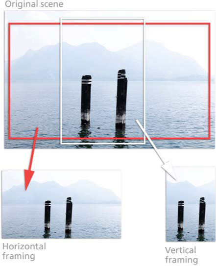
Figure 1.1 The same scene can be framed in a variety of ways, producing photographs that emphasize different parts of the picture. Try turning your camera from the horizontal to the vertical to produce a different point of view.
The hard edges and their height-to-width proportions have a strong effect on a photograph. Look how the same scene in Figure 1.1 is changed by using a different shooting format. Long, low pictures tend to emphasize the flow of horizontal lines and space left to right. Turning the camera to form an upright picture of the same scene tends to make more of its depth and distance, as the scale between foreground and furthest detail is greater and more interactive.
Framing up pictures is a powerful way to include or exclude – for example, deciding whether the horizon in a landscape should appear high or low, or how much of an expanse of color to leave in or crop out. The edge of the frame can crop into the outline of something and effectively present it as a new shape too. Remember, though, that nothing you leave outside the viewfinder can be added later!
The camera does not select
When we look at something we have an extraordinary ability to concentrate on the main item of interest, despite cluttered surroundings. Our natural ‘homing device’ includes turning the head, focusing the eyes and generally disregarding any part of the scene considered unimportant. Talking to a friend outside their house, you hardly register details of the building behind, but the camera has no brain to tell it what is important and unimportant. It cannot discriminate and usually records too much – the unwanted detail along with the wanted. This becomes all too apparent when you study the resulting photograph. Drainpipes and brickwork in the background may appear just as strongly as your friend’s face … and how did that dustbin appear in the foreground?
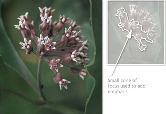
Figure 1.2 Because the camera is not as selective as the human eye, photographers use a range of techniques to add emphasis to their pictures and to direct the attention of the viewer. Here a small zone of focus (commonly called depth of field) is used to emphasize the flowers and de-emphasize the surrounding leaves.
You therefore have to help the camera along, perhaps by changing your viewpoint or filling up the frame (if your camera will focus close enough). Perhaps you should wait for a change in lighting to pick out your main item from the rest by making it the brightest or the most contrasting color in the picture. Or you might control your zone of sharpness (a device called depth of field or DOF, discussed further on page 66) in order to limit clear detail to one chosen spot, as is the case in Figure 1.2. Other forms of emphasis are discussed on page 9.
You have to train your eyes to search the scene for distractions. When looking through the viewfinder, check the background, midground and foreground detail. Above all, always make a quick scan of everything in the viewfinder before pressing the button.
Sensors and films cannot cope with the same contrast as the eye
Our eyes are so sophisticated that we can make out details both in the dark shadows and brightly lit parts of a scene (provided they are not right next to each other). This is an ability that is beyond the capabilities of a photograph. Photography generally makes darkest areas record darker and lightest areas lighter than they appeared to the eye, so that the whole image becomes more contrasty. It is important to remember that your eyes will always see the contrast of a scene differently to how the camera will record it. With practice this will mean that you can anticipate the differences and therefore be able to predict more accurately how your pictures will turn out (see Figure 1.3).

Figure 1.3 The high contrast contained in this backlit scene is too great for the camera to record clear detail in both the highlight and shadow areas. Instead, the result is a silhouette.
The camera has one ‘eye’
Unlike humans, the cameras we use do not have binocular vision. Their pictures are not three-dimensional. They do not photograph from two points of view. So when we want to show depth in a scene we are photographing we have to imply it through devices such as the use of converging lines (see Figure 1.4), changes in scale or changes in tones aided by lighting. To help you see more like the camera does, close one eye to forecast the camera’s two-dimensional way of imaging.
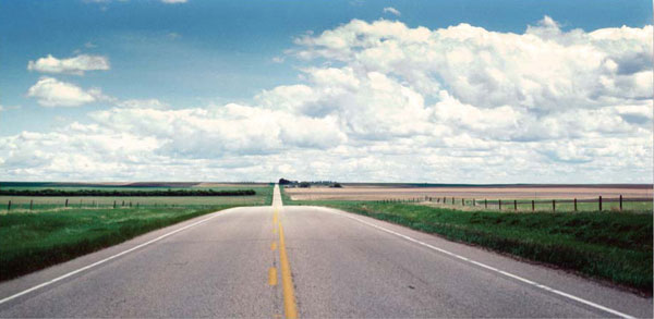
Figure 1.4 Because the camera only provides a ‘single-eye’ view of the world, photographers have to rely on devices like converging lines to portray distance and depth in their pictures.
Most photographs capture just one moment in time
When things are active in front of the camera your choice of when to take the picture often ‘sets’ someone’s momentary expression or the brief juxtaposition of one person to another or their surroundings. Capturing the peak of the action often produces photographs that are frozen moments of time (see Figure 1.5). There is often a decisive moment for pressing the button that best sums up a situation or simply gives a good design. You need to be alert and able to make quick decisions if you are going for this type of picture. Once again, the camera cannot think for you.
Figure 1.5 The camera has the ability to capture a moment in time and then preserve it frozen for ever.
Color translated into monochrome
When you are shooting or printing out results in black and white (‘monochrome’), the multicolored world becomes simplified into different shades or tones of gray. A scarlet racing car against green bushes may reproduce as two grays that very nearly match. Try not to shoot monochrome pictures that rely a great deal on contrast of colors unless this will also reproduce as contrasty tones. Look at colors as ‘darks’ and ‘lights’. Remember too that an unimportant part of your subject visually much too strong and assertive (such as an orange door in a street scene) can probably be ignored because it will merge with its surroundings in black and white (see Figure 1.6).
Occasionally, when shooting in black and white you might want to adjust the way colors translate into monochrome. This can be done with the aid of a colored filter over the camera lens (page 242). More recently digital photographers tend to capture in color and then convert the photo to grays using editing software such as Photoshop or Photoshop Elements. With this approach, ‘shoot color and then convert to gray’, they always maintain the possibilities of both color and black and white outcomes. Another advantage is that software-based conversion provides the opportunity to alter how specific colors are mapped to gray which in turn allows the photographer to translate color contrast to monochrome contrast during the conversion process.

Figure 1.6 Contrasting colors can become similar shades of gray when they are recorded in monochrome. If you are shooting black and white, you will need to train yourself to see your subject in terms of light and dark rather than color. Alternatively you can add separation between similar gray tones using the software conversion options in Photoshop and Photoshop Elements.
2 Using the viewfinder – framing up
Experienced photographers often make a rough ‘frame’ shape with their hands to exclude surroundings when first looking and deciding how a scene will photograph (see Figure 2.1). Similarly, you can carry a slide mount, or a cardboard cut-out, to look through and practice ways of framing up your subject. When you come to buying a camera, it is most important to choose one which has a viewfinding system you find clear and ‘comfortable’ to use, especially if you wear glasses. After all, the viewfinder is a kind of magic drawing pad on which the world moves about as you point the camera – including or cropping out something here; causing an item to appear in front of, or alongside, another item there. Digital cameras have the added advantage of often allowing you to frame your pictures on the camera’s inbuilt LCD screen as well as through the viewfinder.
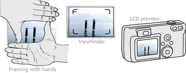
Figure 2.1 You can practice framing a scene in several ways – using your hands, the viewfinder in the camera or the LCD screen on the back of your digital camera.
Precise and accurate viewfinder work is needed to position strong shapes close to the camera, as in Figure 2.2, to symmetrically fill up the frame. Or alternatively you might frame up your main subject off center, perhaps to relate it to another element or just to add a sense of space. With practice you will start to notice how moving the camera viewpoint a few feet left or right, or raising or lowering it, can make a big difference to the way near and distant elements in, say, a landscape appear to relate to one another. This is even more critical when you are shooting close-ups, where tiny alterations of a few centimeters often make huge changes to the picture.
Figure 2.2 Accurate framing is essential when you are filling the frame with subjects close to the camera.
The way you frame up something which is on the move across your picture also has interesting effects. You can make it seem to be entering or leaving a scene by positioning it facing either close towards or away from one side of your picture. A camera with a large, easy-to-use viewfinder will encourage you to creatively explore all these aspects of viewpoint and framing before every shot, instead of just crudely acting as an aiming device ‘to get it all in’.
Using foregrounds and backgrounds
Foreground and background details cause problems when you are a beginner, for in the heat of the moment they are easily overlooked – especially when you are concentrating on an animated subject. And yet far from being distracting, what lies in front of or behind your main subject can often be used to make a positive contribution to your picture.
Sometimes, for example, you are forced to shoot from somewhere so distant that even with the lens zoomed to its longest setting your key element occupies only a tiny area in the frame. It then pays to seek out a viewpoint where other, much closer, items will fill in the foreground and help to create a ‘frame within a frame’. They may even make the small size of the main element an asset that adds a sense of depth and distance. With landscape subject matter you can often use nearby foliage, rock or other appropriate elements to frame a distant subject.
Even simply photographing from a low viewpoint so that the background shows only sky and very distant detail (Figure 2.3) often eliminates unwanted assertive material in the foreground. Equally, by picking a high viewpoint you can fill up your background with grass or similar plain ground – or you may find an angle from which the background is seen shrouded in shadow. On the other hand, always try to make use of background details when these will add interesting information to a shot. This is also a way of making some visual comment through comparisons between like objects, perhaps parodying one element against another – for example, people passing by giant figures on a billboard. Statues and monuments also offer good opportunities.
Figure 2.3 Tilting the camera upwards and filling the frame with an interesting sky can remove the problem of unwanted details in the foreground. Image courtesy of www.ablestock.com.
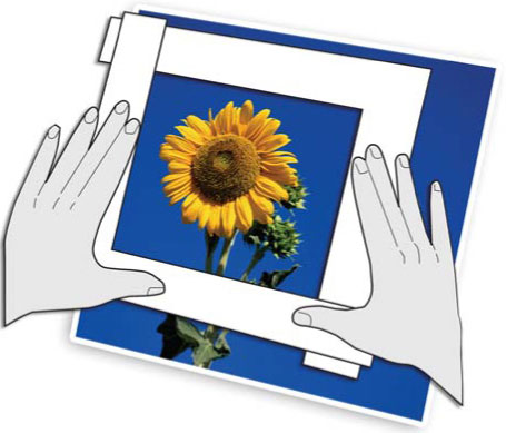
Figure 2.4 Don’t think that the shape of your pictures is restricted to the format of the film that you are using. At the print stage you can crop out unwanted details or even change the format of the picture.
When framing, always try to fill up the picture area, but don’t let your camera’s fixed height-to-width picture proportions restrict you (2:3 ratio is standard for 35 mm film cameras). Some subjects will look better framed up in square format; others need a more extreme oblong shape. You may be able to get around this by again using a ‘frames within frames’ arrangement. You can also trim the picture after it has been taken. You can preview how a crop will look by hiding unwanted details or changing the picture’s shape by using L-shaped cards for prints, or the Crop tool for digital files (see Figures 2.4 and 2.5). Once you have seen how crop would look using L-shapes, trim print or mount behind a card ‘window mount’ Some digital cameras provide the ability to select several different formats for your photographs. This is true also for APS cameras, allowing you to choose between three format ratios before each shot. The setting you make alters frame lines in the viewfinder and also informs the processing lab to print your picture the required shape.
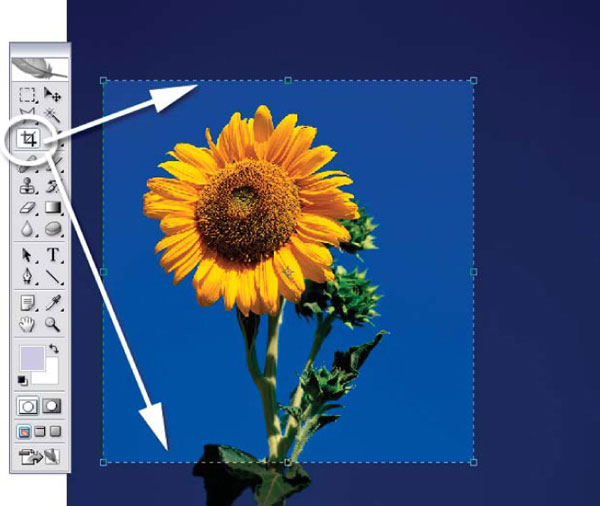
Figure 2.5 For digital shooters the task of cropping their pictures is even easier, with most image editing software containing specific Crop tools that can be used to interactively trim your images.
3 Creating a point of emphasis
Most photographs are strengthened and simplified by having one main subject or ‘center of interest’. In a picture of a crowd, for example, this might be one figure waving a flag; a landscape might center on a cottage or a group of trees. Having first decided your main element, you can help to bring it into prominence and at the same time improve the structure of your shot by calling on a range of long-established visual devices used in picture composition.
In some situations you will be able to create emphasis through making the chosen item stand out relative to its surroundings because it appears to break the horizon, or perhaps is placed where lines within your picture converge. You can also give it prominence through its contrasting color or tone, or by the way the subject is shown within some eye-catching shape either in front or behind it. To achieve these results, it is once again important to learn to seek out the right camera viewpoint and compose your pictures in the viewfinder with thought and care.
Using lines
Lines are formed in a picture wherever lengthy, distinct boundaries occur between tones or colors. A line need not be the actual outline of an object but it could be a whole chain of shapes – clouds, roads and hedges, shadows, movement, blur – which together form a strong linear element through a picture. Clear-cut lines steeply radiating from, or converging to, a particular spot (as in Figure 3.1, for instance) achieve the most dramatic lead-in effects. At the same time, their shape (curved, straight) and general pattern (short and jagged, long and parallel) can strongly influence the mood of your shot too.

Figure 3.1 Radiating lines draw the viewer’s attention towards a single focal point in the picture.
You can best control the appearance of lines in your picture by where you position the camera – high, low, near, far, square-on or oblique to them. As you try each of these different viewpoints, observe carefully in the viewfinder how objects overlap or appear to join up with others in front or behind them to create useful shapes and lines. Then change focal length (zoom in or out, page 80) if necessary to frame up exactly the area you need.
Positioning within the picture format
Most beginners position the main subject they want to emphasize centrally in the picture. This may work well for a strictly symmetrical composition with a child’s face centered in the middle of whirling concentric circles, but it easily becomes repetitive and boring. There is, however, a viewer-researched classical guide to placing the principal element called the ‘golden mean’, which artists have favored in composition over the centuries. The concept is that the strongest, most ‘pleasing’ position for points of interest is at one of the intersection lines dividing vertical and horizontal zones in an 8:5 ratio. A simple interpretation of this idea is often called the ‘rule of thirds’. Figure 3.2 shows the four so-called ‘strong’ positions this gives within a 35 mm camera’s picture format ratio. Many cameras have a viewfinder that displays these grid points to help aid with composing your pictures.
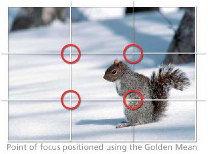
Figure 3.2 You can add a sense of balance to an off-center composition by using the rule of thirds as a guide. Simply place the points of interest from your picture at the intersection of the grid lines.
The golden mean is an interesting guide in photography but, as with other forms of picture making, it is something that should never be slavishly adopted. Lines and tones elsewhere in pictures all contribute to photographs with unified balance and strong structure. Pictures with their main element placed very off-center against plain surroundings tend to look unstable, but they can be lively and have a spacious, open-air feel. Off-centering can work very well where another secondary element (typically on the opposite side of the frame) relates to it and gives your picture balance (see Figure 3.3).
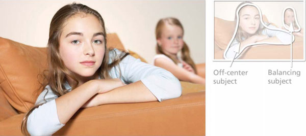
Figure 3.3 Balance an off-center subject by positioning another object in the opposite part of the frame.
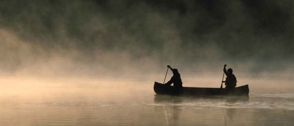
Figure 3.4 By backlighting your main subjects, it is easy to create silhouette effects. In this type of image the shape of the subjects is paramount, as texture and color are kept to a minimum.
Contrasting with surroundings
Making your main element the lightest or darkest tone, or the only item of a particular color included in the picture, will pick it out strongly. This is also a good way to emphasize an interesting shape and help set mood. For maximum emphasis pick a camera position that shows your chosen item against, or surrounded by, the most contrasting background. Bear in mind that the eye is most attracted to where strong darks and lights are adjacent, so make sure the emphasis really is where you want it to be. Often, you can use the fact that the background has much less, or more, lighting than your main subject and then expose correctly for what is the important part (make sure your camera’s exposure settings are not over-influenced by the darker or brighter areas around it).
Remembering how photographs step up the appearance of contrast in a scene, preview roughly how it will record by half-closing your eyes and looking through your eyelashes. Shadows now look much darker and contain less detail. In a really high-contrast situation – like Figure 3.4 – you can expect a silhouette effect when exposure is correct for most of the surrounding scene. Having dark figures against the lightest part of the environment gives their shapes great emphasis.
The same device, known as tonal interchange, is used in the statue picture (Figure 3.5). Here, however, lighting is soft and even, and plays a minor role. Tonal differences between objects in the picture (the statue being the only white item amongst almost uniformly dark foliage) create their own tonal interchange. Contrast of tone is an especially important emphasizing device when you are shooting something in black and white.
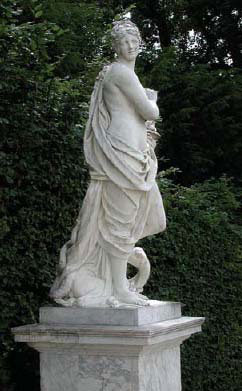
Figure 3.5 Tonal interchange: using existing contrast of tone.
Tonal interchange is a device worth remembering when you are taking a portrait, where you have some control over arrangement of the lighting. Showing the lightest side of a face against the darkest part of the background and vice versa, as in Figure 3.6, picks out the shape of the head. Often, this lighting is achievable by just part closing a curtain or having someone shade the background with a card from one side.
Figure 3.6 Tonal interchange: manipulating light sources to create contrast of tone.
Don’t forget the value of seeking out a handy frame within a frame as the means of isolating your main subject by color or tone from otherwise confusing surroundings. Windows and doors are particularly useful – a figure photographed outside a building can be isolated by picking a viewpoint from where they appear framed in front of the dark shape of an open entrance behind them (preferably some way back, and out of focus). Similarly, a closed door may give a patch of colored background. Take care, however – this local surround should never contain color or patterning in such a strong manner that it overwhelms or camouflages your main subject.
Choice of moment
Of course, if you are photographing someone you know, or a largely ‘still life’ subject or landscape, you often have sufficient time to pick some means of emphasis, such as the use of line, or tone, or positioning in the frame. But in a fast-changing, active situation, often the best you can do is choose the most promising viewpoint and wait for the right moment. Sometimes this will mean first framing up a background shape or foreground lead-in, and then waiting patiently for someone to enter the picture space. On the other hand, your picture may be full of people surrounding some relatively static element. Having framed up the scene, the moment to shoot is dependent on the the various subjects in the picture. You will need to wait until the expressions and positions of your subjects are just right before releasing the shutter.
Always be on the lookout for fleeting comparisons which support and draw attention to one element – your main subject. Perhaps you can do this by showing two different ‘compartments’ in your picture. For example, comparing people framed in adjacent windows of a crowded bus or row of telephone booths. A mirror on the wall or some other reflective surface is another useful way of bringing two quite separate components together into your picture.
Most photographs (especially when you begin) are taken under ‘existing light’ conditions. This term means natural or artificial lighting as it exists for your subject at the time, rather than flash or lamps in the studio, which are used to provide a fully controlled lighting set-up (see the appendix pages at the rear of the book). It’s easy to regard the lighting by which you see the world around you simply as illumination – something taken for granted. But as well as giving the eye the basic ability to see, it can be responsible for communicating strong emotional, subjective responses too. In fact, the effect of lighting on a subject is often the reason for taking a picture as much as the subject itself.
We have all experienced the way the appearance of something is transformed under different weather conditions or at different times of the day, due to changes in the direction, color, quality (e.g. overcast or direct sunlight) and contrast-producing effect of the light. You may not be able to exert control over these existing light conditions, but excellent pictures often result from you recognizing the right time and best camera position, choices which greatly influence the whole mood of a picture.
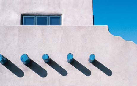
Figure 4.1 The strong, contrasty light from the sun creates sharp-edged shadows in your pictures. The shadows’ dark tone and graphic shape mean that they play an important part in the balance and design of the photograph.
Quality and direction
The quality of the light falling on your subjects is often defined with terms such as ‘hard’ or ‘soft’. Hardest natural light comes direct from the sun in a clear sky; objects then cast well-defined, hard-edged shadow shapes and these may contribute strong lines and patterns to a picture, as well as stark, dramatic contrast. Figure 4.1 is an example where well-defined shadow shapes on a sunny day become a key part of the picture.
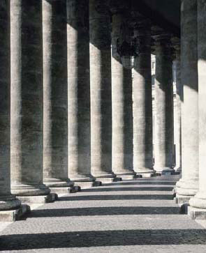
Figure 4.2 Side lighting creates pictures with strong, well-defined shapes and striking texture. Here the shadow area of one column is contrasted against the highlight area of the next, producing a pattern of alternating shades.
In Figure 4.2, sunlight from one side, 90˚ to the subject, gives a strongly three-dimensional effect. Lit parts are well defined, forming a strong pattern especially where picked out against an area of solid dark shadow areas. In addition to defining shape well, side lighting also creates strong texture. However, you must be careful when photographing very contrasty pictures like this. It is important to expose accurately because even a slight error either ‘burns out’ the lightest detail or turns wanted shadow detail impenetrably dark. Beware too of shadows being cast by one subject onto another, as this may give confusing results.
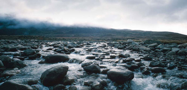
Figure 4.3 The hazy lighting produced by the low cloud has provided a soft and even, but still directional, light to the whole of this scene. Highlights and shadows are clearly present on the rocks in the foreground, but they are not as strong and distinct as they would be if the same location was photographed in midday sun.
Softest quality light comes from a totally overcast sky. Shadows are ill-defined or more often non-existent, so that lines and shapes in your picture are created by the forms of the subject itself. Pictures that are full of varied shapes and colors are best shot in soft, even lighting to reveal maximum overall information without complications of shadow. Even on a clear, sunlit day you can still find soft lighting by positioning your subject totally in shadow – for instance, in the shade of a large building, where it only receives light scattered from sky alone. Results in color may show a blue cast, however, unless carefully corrected via the editing software or when printing.
In Figure 4.3 you will notice how hazy sunlight gives an intermediate, semi-diffused lighting effect to the scene. Shadows are discernible but have ill-defined, well-graduated edges and there is less contrast than given by sunlight direct. Intermediate lighting conditions like this are excellent for many photographic subjects, and are especially ‘kind’ to portraits.
Time of day
Throughout the day, the sun moves its position around the sky; the color of its light reaching us also changes at dawn and dusk. Combined with the effects of weather and other atmospheric conditions like haze or smoke, you have a tremendously wide range of lighting opportunities. If possible, forward plan to ensure that you are in the right place at a time when a fixed subject such as a landscape receives lighting that brings out the features and creates the mood you want to show.
Photography at dusk is often very rewarding because, as the daylight fades, the scene’s appearance changes minute by minute. It is good to shoot landscape pictures during the brief period when there is enough daylight in the sky to still just make out the horizon, yet most of the buildings have switched on their lighting – not difficult to judge by eye. A firmly mounted camera with automatic exposure measurement can adjust settings as daylight dims (see Figure 4.4).
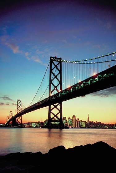
Figure 4.4 Often, the difference between taking an okay picture and one that really suits the subject is the time of day that the photograph is captured. City night scenes are often taken just on dusk when the landscape is lit by both the city lights and the remaining daylight.
Mixed lighting
Pictures lit with, or containing, a mixture of light sources – daylight, domestic lamps, fluorescent tubes, street lighting, etc. – will not photograph all the same color. Most color films are designed to be accurate in daylight. Many digital cameras have an auto white balance setting that automatically adjusts the capture to suit the light source. Alternatively, some models allow the user to change the setting to suit specific light sources such as daylight, domestic lamps and fluorescent tubes. When your digital camera is set to the daylight white balance setting, it will create pictures with similar color to those captured on daylight balanced film.
Looking at a distant scene with mixed lighting you notice and accept differences of color, even though they are exaggerated when photographed. But it would be a mistake to shoot a portrait lit by the pink light of dusk, or by the floodlighting on the foreground terrace. Skin rendered pink by one and yellow by the other looks odd in isolation, and is probably beyond the ability of your processing lab to normalize in printing. Keep to using a lighting source that your film or camera ‘white balance’ setting is suited for.
Problems can also occur when photographing people, food, flowers and similar ‘color-sensitive’ subjects in surroundings with strongly tinted daylight. The greenery of sunlit grass and foliage in an enclosed garden or woods may do this, or it may be a nearby strongly colored wall or vehicle – particularly with subject close-ups. Oddly enough, wrong color becomes much more acceptable if your picture actually shows the environment which was its cause.
Most photographs are ‘subject orientated’, meaning that who, or what, is featured in the shot is of the greatest interest. Others are more ‘structure orientated’ – enjoyed not necessarily so much for the subject as for the way the picture has been seen and constructed. In practice, both aspects should be present if you want a unified picture rather than a random snap.
The pattern and shapes used in photographs are like notes and phrases used to structure music. But in visual image form they are linked with texture too – each one of the three often contributing to the others. Pattern, for example, may be formed by the position of multiple three-dimensional shapes, like the house fronts in Figure 5.1. Or it might be no more than marks of differing tones on an otherwise smooth, flat surface. Then again, pattern can be revealed on an even-toned textured surface through the effect of light – as with the weatherboard on an old barn. Pattern, texture and shape should be sought out and used as basic elements of composition, provided they support and strengthen rather than confuse your picture.
Pattern
Be wary of filling up your picture with pattern alone – the result is usually monotonous like wallpaper, and without any core or center of interest. You can help matters by breaking the pattern in some way, perhaps having one or two elements a different shape or color. Another way to create variety in a regular pattern is to photograph it from a steeply oblique viewpoint, in order to get a difference in size.
Shadows frequently form interesting patterns, especially when the surface receiving the shadow is undulating rather than flat. You can see this, for instance, when the shadow of a window frame falls on pleated white curtaining.
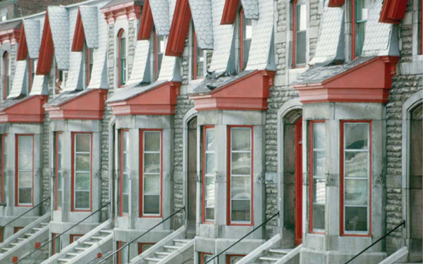
Figure 5.1 The design of this photograph of repeating house fronts is based on the structure of the image rather than its content. It is the pattern of regular shapes, repeating colors and textures that forms the core of the picture’s interest.
Revealing the texture in the surface or surfaces of your subject helps to make a two-dimensional photograph look three-dimensional. Texture also adds character to what might otherwise be just flat-looking slabs of tone and color, helping to give your subject form and substance. A multitude of different and interesting textures exist all around us. Rough wood (Figure 5.3) or stone comes immediately to mind, but look also at the texture of ploughed earth, plants, ageing people’s faces, even the (ephemeral) texture of wind-blown water. Or even in rugged landscapes, distant hills and mountains, as these represent texture on a giant scale.

Figure 5.2 The abstract mixture of shadow and shape keeps the audience interested in this photograph. Here the shadow has become more than just a by-product of the lighting – it is an integral part of the photograph’s design.
There are two essentials for emphasizing texture. One is appropriate lighting, the other is the ability to resolve fine detail (e.g. accuracy of focusing, no camera shake, or a light recording material without a pattern of its own). Where the subject’s textured surface is all on one plane, direct sunlight from one side will separate out the raised and hollowed parts. The more the angled light just grazes the surface, the greater the exaggeration of texture.

Figure 5.3 The angled lighting skimming across the old oak barrels not only visually describes the form of the barrels, but also shows off the wood’s texture.
Such extreme lighting also tends to leave empty black shadows – if these are large and unacceptable, pick a time when white cloud is present in other parts of the sky, and so able to add some soft ‘fill-in’ light. When your subject contains several textured surfaces shown at different angles, the use of harsh lighting from one direction may suit one surface but lights others flat-on or puts them totally in shadow. More diffused, hazy sunlight (but still steeply directed from above or one side) will then give the best results. What you can learn from sunlight can also be applied on a smaller scale, working with a lamp or camera flash, in the studio.
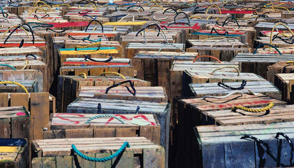
Figure 5.4 The repeated design of the crates in this photograph has produced an informal pattern of texture, shape and color.
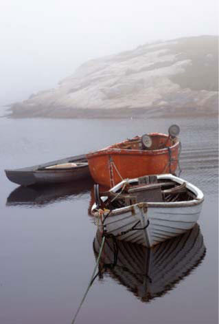
Figure 5.5 Though not identical, there are enough similarities between the boats in this group to provide a visual echo of each other’s design.
Shape
A strong shape is a bold attraction to the eye, something that you can use to structure your whole picture. It might consist of one object, or several items seen together in a way that forms a combined shape. Shape is also a good means of relating two otherwise dissimilar elements in your picture, one shape echoing another, perhaps in a humorous way. Bear in mind too that shapes are often made stronger when repeated into a pattern – like the informal rows of crates in Figure 5.4 or (very differently) the irregular pattern of similarly shaped boats in Figure 5.5.
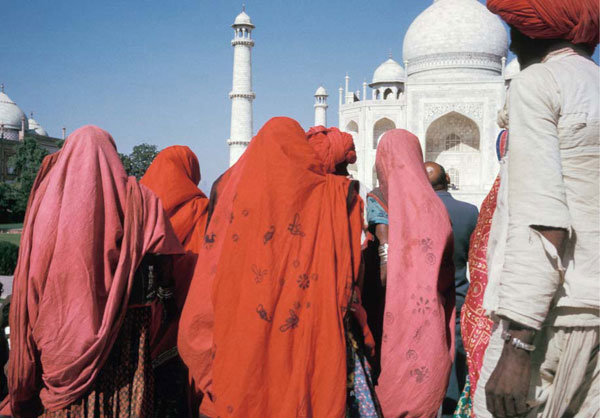
Figure 5.6 Though not identical, the shapes and colors of the clothed women in front of the Taj Mahal form an irregular pattern that adds interest to the picture’s foreground.
The best way to emphasize shape is by careful choice of viewpoint and the use of contrast. Check through the viewfinder that you are in the exact position to see the best shape. Small camera shifts can make big changes in edge junctures, especially when several things at different distances need to align and combine. If this position then leaves your subject too big or small in the frame, remain where you are, but zoom the lens until it fits your picture.
Shape will also gain strength and emphasis through contrast with its surroundings – difference in tone or color of background and lighting. A good example of this is the contrast of shape and color of the group of women in front of the Taj Mahal in Figure 5.6. Their repeating shapes add an extra dimension to the picture by providing a patterning effect. Sometimes you will find it possible to fill up a shape with pattern.
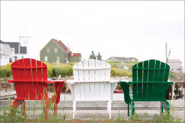
Figure 6.1 The patterns of the three chairs are made more dynamic by their contrasting colors and their positioning against the relatively muted tones of the background.
Like shape and pattern, it may be the color in a scene that first attracts your eye and becomes a dominant feature in your picture. (Just switch your TV or computer screen between color and black and white settings to prove how much color contributes to an image.) Color can help create harmony or discord. It may pick out and emphasize one important element against all others, or link things together as in Figure 6.1, by repeating the shape of the chairs and then contrasting them with different colors. A more varied pair of colors will interact and gain contrast from one another, especially if they are strong hues, well separated and ‘complementary’ in the spectrum. The resulting effect may then shout for attention and be lively and exciting or perhaps just garish.
It is interesting to notice, in pictures that combine contrasting colors, that the reds often seem to advance or ‘come forward’ while greens and blues ‘stand back’. Even black or white is influential. Areas of black surrounding small areas of color can make them seem luminous and bright, as in Figure 6.2, whereas colors against white make the hues look darker.
Once again, the key to practical success is selection – mainly through tightly controlled framing and viewpoint. You should rigorously exclude from your picture any elements that confuse or work against its color scheme. Where possible, select lighting conditions that help to present colors in the way you need. For example, have you noticed how a car that looked brilliant red in hard sunlight appears a diluted color in overcast weather conditions as it reflects light from the white sky in its polished surface? Similarly, atmospheric haze or mist in a landscape scatters and mixes white light with the colored light reaching you from distant objects, so that they appear less rich and saturated. Then, if dull overcast conditions change to direct sunlight (especially immediately after rain), clear visibility enriches and transforms all the colors present in your photographs.
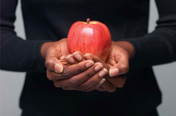
Figure 6.2 The red apple, when contrasted against the black background, seems to be more vibrant, almost glowing, than if the fruit was photographed with a brighter backdrop.
Color of the light
The actual color of the light that falls on your subject at different times of the day and from different light sources – domestic lamps or candles, for instance – can make big differences to the emotional effect of your picture. The comfortable mood of a cottage interior may be intensified by a warm color cast from domestic lights and firelight. Bare tree branches in winter can appear cold and bleak in light from a clear blue sky, or be transformed in the orangey light of sunset.
It is important to realize that subject color is never completely constant and need not always be strictly accurate. This is especially true when atmosphere and mood are your main priorities. Contrast the cold blue of the ice scene in Figure 6.3 with the warm desert rocks in Figure 6.4. An empty ruined building can seem more mysterious in a photograph with a dominant color scheme of blues and gray–greens, especially when the overall tone of the picture is dark (low key) too. A ‘cold’ color filter over the lens may help to achieve this effect or alternatively digital photographers can simulate the effect by intentionally adding a cast to their photos using Photoshop or Photoshop Elements.

Figure 6.3 The blue tones of this picture add to the cold feeling for this icy scene. Don’t be too quick to dismiss the emotive power of color to help communicate through your pictures.
Other macabre results – inhuman-looking portraits, for example – are possible using offbeat but easily found light sources such as sodium street lighting, at night. You can judge by eye when lighting of this kind makes familiar colors such as red look just dark gray, and skin seem an unholy greenish yellow. The distortion is even stronger when your digital camera is set to ‘daylight’ white balance or you are using regular daylight-type color film.
Finally, don’t overlook the value of blurred and ‘stretched out’ semi-abstract shapes and streaks of color for making pictures depicting action and movement in dynamic ways. At night, fairgrounds or just roads with busy traffic lanes will provide you with fruitful subject matter.
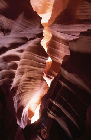
Figure 6.4 The rich red and ochre tones of these rocks seem to emit the very heat of the desert that surrounds them.
PROJECTS
Developing a personal approach
This first part has been concerned with ‘seeing’ – with not taking simple everyday objects for granted but observing them as mixtures of shapes and forms, with various color and pattern characteristics and set against a background. Over-familiarization as to what things are actually for (or who people are) easily blunts your visual sense. Looking and photographing in a completely unfamiliar environment like a strange town or country is often more productive because newly seen things trigger perception strongly. The more you begin to see objects as potential picture subjects, the less your photography will be limited to cliché-like postcard-type views or the conventional family group.
At the same time, the various structures of picture making itself allow plenty of scope for a personal approach. For convenience, ways of composing pictures have been discussed here under framing, lighting, color, etc., but in practice almost all photographs (including most of the ones reproduced here) use a mixture of devices. One may be more effectively used for a particular set of circumstances than another, but rarely to the exclusion of all others. You have to decide your priorities and seize opportunities on the spot.
A good way to develop awareness of picture possibilities is to set yourself projects. These can be applied to subjects which interest you – family, locations, sport, etc. The example projects that follow are similar to assignments and tests in photography course programmes. You will probably be able to find subjects in your locality for most of them, even though they differ somewhat from the suggestions made. Don’t slavishly copy pictures in this and other books. Approach each project as a chance to make your own discoveries – sometimes these come from producing unexpected images (including mistakes!) that are worth following up later.
‘Developing your eye’ in this way will also provide a powerful incentive for learning technical aspects of photography in order to get what you want into final picture form. The way cameras work and how their controls can contribute to results are the themes of the next sections of the text.
1 Select five letters of the alphabet and then go and photograph objects or parts of objects in your local environment that look like your chosen letters. Make sure that the shapes of your objects suggest the letter shapes and where possible use contrast (in color, texture, lighting or tone) to make the letter shape obvious in your picture.
2 Often, photojournalists are required to submit two versions of the same picture – one vertical and one horizontal. This gives the paper or magazine more choice when laying out the story. Select a landscape, still-life or portrait as your subject and practice making two versions (horizontal and vertical) of each photograph you take.
3 Most cameras record their pictures in a rectangular format, but for this project I want you to imagine that your camera shoots in a square format (rectangle minus the edges). Compose five different pictures using the square format and then check the success of your results by cropping the resultant pictures as squares in your image editing program (or use cardboard ‘window’ mounts to frame your print).
4 The majority of cameras are used at eye level, so most photographs show the world from this height. Take six pictures of familiar subjects using your camera only below waist height or above normal head height.
5 Making appropriate use of color, lighting, composition and expression, take two portraits of the same person. One should show your subject as gentle and friendly, the other as sinister and frightening. Keep clothing and setting the same in each picture.
6 Make a series of three pictures of one of the following subjects: wheels, doorsteps or trees. One photograph should emphasize shape, another pattern, and the third color.
7 Shoot three transiently textured surfaces. Suggestions: rippled water; clouds; billowing fabric; smoke. Remember choice of moment here, as well as lighting.
8 Find yourself a static subject in a landscape – an interesting building, a statue, even a telephone box or tree – and see in how many ways you can vary your viewpoint and still make it the center of interest. Utilize line, tone and color.
9 Take four pictures which each include a cast shadow. Use your own shadow, or one cast by a variety of objects shown or unshown.
10 Using your camera as a notebook, analyze shapes found in your local architecture. Do not show buildings as they appear to the casual eye, but select areas that are strong in design.
11 Produce three interesting pictures of people in surroundings that can be made to provide strong lead-in lines, e.g. road and roof lines, steps, corridors, areas of sunshine and shadow. Make sure your subject is well placed to achieve maximum emphasis.
12 Machinery often has a regularity of form. Produce a set of four differing images that make this point, either through four separate mechanical subjects or using only one of them but photographed in a variety of ways.
13 Throughout this section of the book we have concentrated on looking at how controlling the elements of art and design (color, texture, pattern, line, contrast) produces strong photographs. Make a series of five photographs which feature each of these elements in turn.
14 Using landscape or urban architecture as your subject create two photos of the same environment, one using symmetrical balance and the other using asymmetrical or off-center balance.