
2
Design styles
■No two snowflakes are exactly alike and the same can be said for artists and designers. A good drawing program will allow this individuality to be expressed without limitation.
THE FLASH DRAWING ENGINE IS AS COMPLICATED OR as simple as you make it. Drawing in Flash is like building with Legos. Each individual tool is simple to use but capable of creating complicated designs when necessary. Even with so many drawing programs at my disposal, Flash is almost always my go-to tool because of its ease of use. This chapter will show you the fundamentals of designing in Flash with a few cool drawing techniques along the way.
Drawing with basic shapes
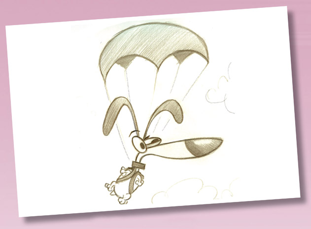
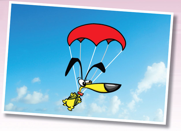
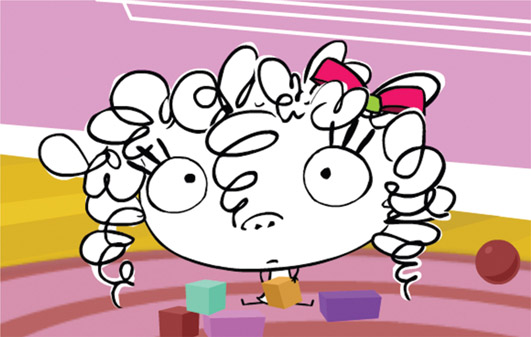
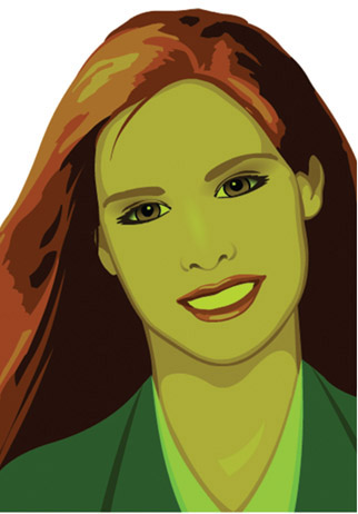
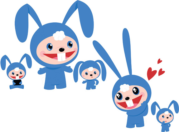
DOG CHARACTER: COPYRIGHT MUDBUBBLE LLC
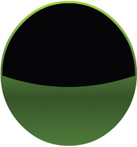
IF YOU PLAYED WITH LEGO BUILDING blocks as a kid, you may find this drawing style familiar (or at least intuitive). You’ll use several basic shapes and then connect them together. This technique requires breaking down each body part of the character into basic building blocks using the Rectangle and Oval tools. It’s a fast and efficient way to simplify the character into manageable sections while achieving a very professional cartoon style.
Here, we will use shapes to cut into other shapes. This technique is very useful for cutting holes out of objects as well as altering the edges of shapes. Of course these techniques can be applied to background elements as well.
The key here is using simple shapes to build complex images suitable for Flash style animation, which we will get to in later chapters.
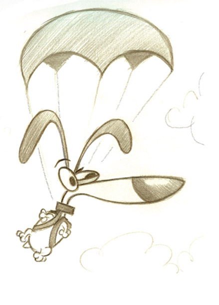
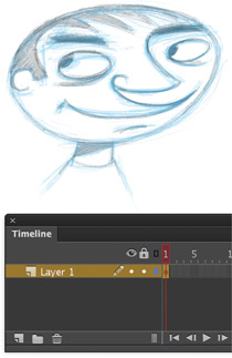
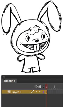
1 Here is my original pencil sketch that I have scanned and saved as a JPG file. I prefer to start with pencil on paper because I simply like the feel of this medium and the results are always a little more, shall we say, artistic.
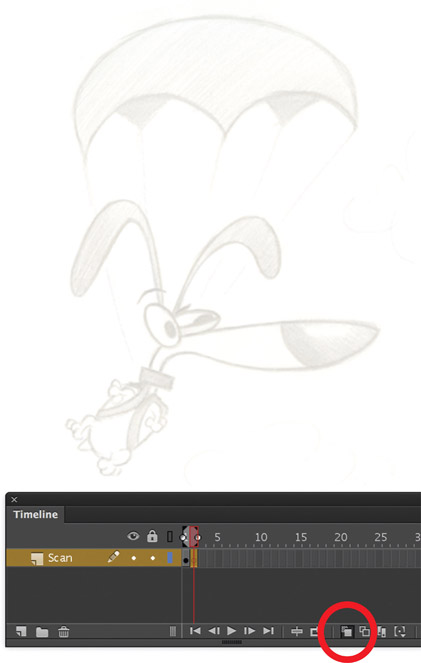
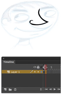
2 After importing the scanned image, insert a blank keyframe on frame 2 and turn on the Onionskin tool. Onionskinning allows you to trace the image in a new frame while using the original image as a reference.
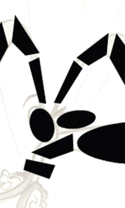
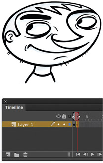
3 Using the Oval ![]() and Rectangle
and Rectangle ![]() tools allows you to quickly achieve the basic forms of the character. The Selection tool is great for pushing and pulling these basic fills into custom shapes based on the sketch.
tools allows you to quickly achieve the basic forms of the character. The Selection tool is great for pushing and pulling these basic fills into custom shapes based on the sketch.
4 Turn on the Snap option (magnet icon), and drag corners to each other so they snap together. This process is not unlike those Lego building blocks you played with when you were a kid.
5 Next, click and drag the sides of your shapes to push and pull them into curves. This process is fun as your character really starts to take shape.
6 To achieve the black outline, select the shape, copy it using ![]()
![]() and paste it in place using
and paste it in place using ![]() . While it’s still selected, select a different color from the Mixer panel and scale it about 80% smaller.
. While it’s still selected, select a different color from the Mixer panel and scale it about 80% smaller.
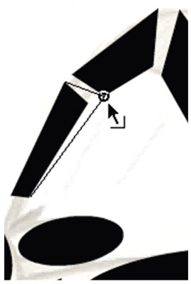
7 The original shape is still present underneath your new shape. The trick is to position the new shape off-center from the original to achieve an outline with a varied weight.

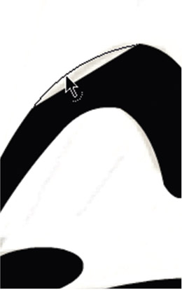
8 The parachute uses a slightly different technique I like to call “cutting in”. Let’s start with the Oval tool for the parachute’s basic shape.

9 You can cut into this shape using different colored shapes such as this blue oval. Position it over the area you want to cut into, deselect it, then select it and hit the Delete key ![]() .
.
10 Once your shape is the way you want it, you can use the Ink Bottle tool ![]() to quickly add an outline to it.
to quickly add an outline to it.
Hot Tip
As you complete individual sections of your character, cut and paste them into new layers and lock them. Putting them on separate layers will prevent them from being inadvertently edited. Better yet, convert them to symbols while you’re at it.
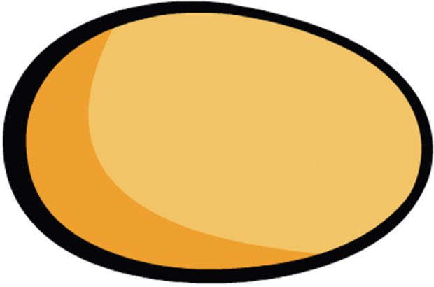
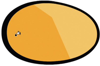
Geometric and organic shapes

VECTOR ILLUSTRATION: CHRIS GEORGENES
DESIGNING WITH BASIC SHAPES is not limited to characters. For most Flash projects, I start with primitive shapes for all objects, including props and backgrounds. At their most basic level, my designs start with simple ovals or rectangles, and from there I build upon these shapes to create relatively complex images. What I love about working with vectors is the ability to push and pull them into anything I want as if they were made of clay.
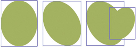
1 To suggest a fully mature tree with a plumage of leaves, you don’t actually have to draw each individual leaf. Since the design style is targeted at young children, it’s valid to keep the level of detail to a minimum. Select the Oval ![]() tool and your desired fill color and create an oval shape. Next rotate it or skew to position it at an angle. Copy and paste it and scale it to add more “leaves”. Rotate and position the new oval as shown above. There’s no wrong decision at this stage as it is entirely up to you as to how much variation you want your tree to have.
tool and your desired fill color and create an oval shape. Next rotate it or skew to position it at an angle. Copy and paste it and scale it to add more “leaves”. Rotate and position the new oval as shown above. There’s no wrong decision at this stage as it is entirely up to you as to how much variation you want your tree to have.
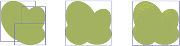
2 Repeat the previous step by copying and pasting the same oval to suggest a larger plumage of leaves. Scale, skew and rotate the shape and position it off-center from the original oval. The objective here is to to create a non-symmetrical organic shape to suggest the imperfections that are found in nature. Remember, nothing in nature is perfectly horizontal, vertical, round or square, which is why there’s no wrong way to position these. As you can see I used a total of 4 ovals to complete my plumage of leaves. I could have used more or less, but I felt this was just the right amount. Feel free to experiment with the number of shapes and variations for your tree. At this stage I couldn’t help but add a little bit of texture to suggest some volume using the Brush ![]() tool and a subtle yellow color.
tool and a subtle yellow color.
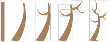
3 The trunk of the tree is designed in a similar fashion. Create a basic rectangle using the Rectangle ![]() tool and use the Selection tool
tool and use the Selection tool ![]() to push and pull the sides and corners to give the trunk a slight curve and taper. Each branch is a duplicate of the tree trunk shape. Hold down
to push and pull the sides and corners to give the trunk a slight curve and taper. Each branch is a duplicate of the tree trunk shape. Hold down ![]() and then click and drag the trunk to create as many duplicates of it as you want. Scale, skew, rotate and position each duplicate shape so that they resemble tree branches.
and then click and drag the trunk to create as many duplicates of it as you want. Scale, skew, rotate and position each duplicate shape so that they resemble tree branches.
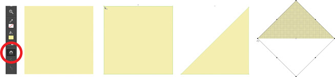
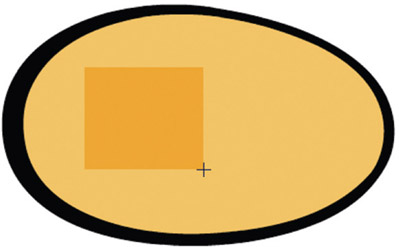
4 The birdhouse is also built using simple shapes. The key here is to turn on the Snap to Objects feature represented by the magnet icon in the toolbar when you select the Rectangle ![]() tool. Create a perfect square by dragging with the Rectangle tool while holding down the
tool. Create a perfect square by dragging with the Rectangle tool while holding down the ![]() key. Using the Subselection
key. Using the Subselection ![]() tool, select one of the corner points and press the
tool, select one of the corner points and press the ![]() key. The square is now a triangle. Rotate the triangle using the Free Transform
key. The square is now a triangle. Rotate the triangle using the Free Transform ![]() tool. Hold down the
tool. Hold down the ![]() key to constrain the rotation to 45 degree increments. Rotate the triangle until the bottom side is flat and the top side is pointed.
key to constrain the rotation to 45 degree increments. Rotate the triangle until the bottom side is flat and the top side is pointed.
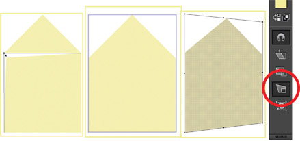
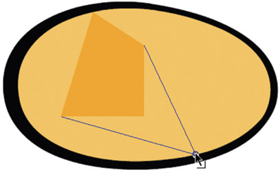
5 With Snap to Objects on, drag a corner point to another corner point until they snap together. Snapping to an object makes it easy to merge different shapes together accurately. To complete the front side of the birdhouse, create another square and drag the top 2 corner points to the bottom 2 corner points of the triangle with the Selection ![]() tool until they snap together. Skew the shape with the Distort tool (subselection of the Free Transform
tool until they snap together. Skew the shape with the Distort tool (subselection of the Free Transform ![]() tool) to suggest perspective.
tool) to suggest perspective.
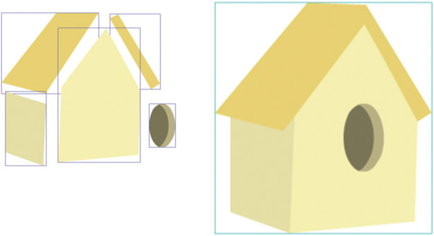
6 The remaining additional shapes for the birdhouse are also (you guessed it) simple rectangles and ovals. Keeping the Snap option turned on, drag corner points to each other to join shapes and as Object Drawings you can also overlap shapes to complete the image.
Hot Tip

As you can see each shape has a bounding box around it because Object Drawing mode ![]() was turned on at the time the objects were drawn. Object Drawing Mode allows you to overlap objects without merging them together.
was turned on at the time the objects were drawn. Object Drawing Mode allows you to overlap objects without merging them together.
The Brush tool

ANDREA CHARACTER: COPYRIGHT MUDBUBBLE LLC
THE BRUSH TOOL IS PROBABLY ![]() the most versatile of all the drawing tools, especially when combined
the most versatile of all the drawing tools, especially when combined ![]() with a pressure-sensitive tablet. Drawing with the Brush tool is essentially drawing with shapes. It’s the tool that feels the most natural due to the support of pressure sensitivity and tilt features.
with a pressure-sensitive tablet. Drawing with the Brush tool is essentially drawing with shapes. It’s the tool that feels the most natural due to the support of pressure sensitivity and tilt features.
Wacom makes a series of popular tablets that work great with Flash. They can work in conjunction with your existing mouse or replace your mouse completely. Many digital designers use a tablet with any number of graphics editors including Adobe Photoshop and Adobe Illustrator.
Deciding to use the Brush tool is really a matter of style and preference. For this character, I wanted to achieve a loose, hand-drawn feel, so the Brush was a perfect choice.
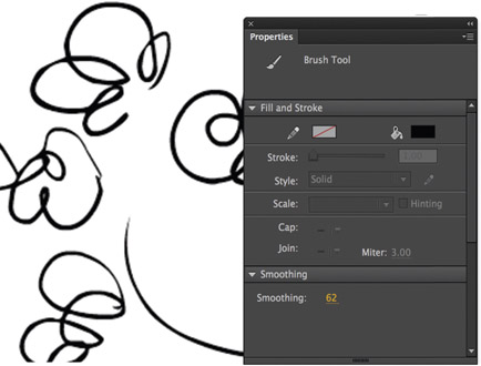
1 The first adjustment you will want to make when using the Brush tool ![]() will be the amount of smoothing you want applied. This option appears as a hot text slider in the Properties panel when the Brush tool is selected. The right amount of smoothing to use depends on personal preference. The higher the number, the smoother the line (and vice versa). For this character, we’ll choose a low amount of smoothing to maintain an organic quality to the line work.
will be the amount of smoothing you want applied. This option appears as a hot text slider in the Properties panel when the Brush tool is selected. The right amount of smoothing to use depends on personal preference. The higher the number, the smoother the line (and vice versa). For this character, we’ll choose a low amount of smoothing to maintain an organic quality to the line work.
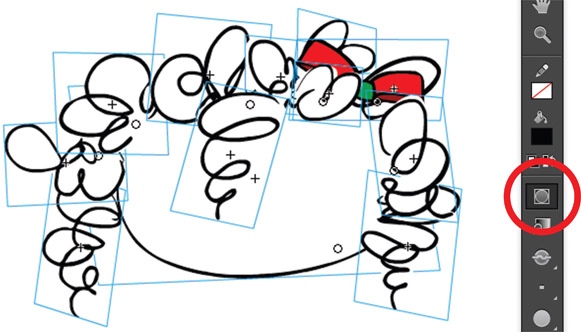
2 Always design your characters with the intended purpose in mind: animation. Form follows function, and the animation style can often dictate how a character is designed. If you’re a perfectionist like me, you’ll want the hair to look as much like individual curls as possible. To do this, avoid designing the hair as one large flat object. Instead, draw individual sections of curls to keep them as separate objects, so they can be moved independently of each other. Turn on Object Drawing mode ![]() (subselection of the Brush tool). Object Drawing mode allows you to draw shapes as separate objects. These objects can be drawn over each other without them being merged together. You can select each Object Drawing with the Selection tool
(subselection of the Brush tool). Object Drawing mode allows you to draw shapes as separate objects. These objects can be drawn over each other without them being merged together. You can select each Object Drawing with the Selection tool ![]() and then convert each one to a symbol.
and then convert each one to a symbol.
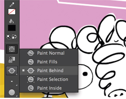
3 To remain consistent with the loose drawing style, you may want to add a fill color that bleeds outside of the outlines a little. There are several ways to achieve this effect by painting on a new layer below the outline art or setting the brush to “Paint Behind” and painting on the same layer.
4 The final result represents the loose hand-drawn style we were after. The line quality feels natural and reflects the imperfections the human hand is capable of. We are not trying to achieve a slick design style here but rather to convey a looser line quality representative of hand-drawn artwork. This style lends itself well to a child character as the integrity of the line is similar to how a real child would draw.
Hot Tip

Experiment with different stage magnifications when drawing. I prefer to draw on a larger scale and with the stage magnified about 400%. The result is typically a smoother line quality.

IN ITS DEFAULT MODE, THE BRUSH TOOL along with a graphics tablet that supports pressure sensitivity – is great for drawing shapes with a varied width. The success of the Brush tool may be due to its simplicity, but that doesn’t mean you can’t achieve sophisticated results when using it. The Brush tool provides several options that affect how the paint is applied, and with a little ingenuity you can dictate how the Brush works based on your needs and workflow. This example shows my use of the Paint Selection setting for the Brush, allowing it to paint within the confines of a selected fill color only.
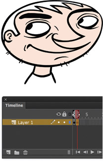
1 The character sketch was created using ProCreate, a powerful drawing app for the Apple iPad. I used a drawing stylus instead of my finger because of its accuracy.
2 After importing the scanned image, I inserted a blank keyframe on frame 2 and turned on the Onionskin tool. I began tracing the image in a new frame while using the original image as a reference.
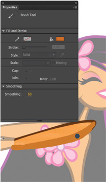
3 I traced the character using the Brush ![]() tool. Typically I have the Brush tool smoothness setting at a value between 60 and 75, which is a setting found in the Properties panel.
tool. Typically I have the Brush tool smoothness setting at a value between 60 and 75, which is a setting found in the Properties panel.
4 With the character outline complete, it’s time to mix a color for his skin tone and fill the head using the Paint Bucket ![]() tool.
tool.
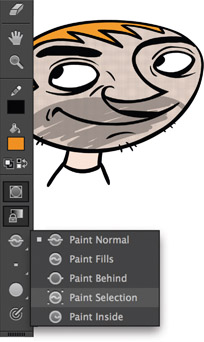
5 Select the fill color using the Selection ![]() tool. To add some shading to the character, mix a darker value of the skin tone and then select the Paint Selection option from the Brush tool subselection menu.
tool. To add some shading to the character, mix a darker value of the skin tone and then select the Paint Selection option from the Brush tool subselection menu.

6 Paint anywhere inside the selected fill color without destroying any other part of the drawing. The shapes made with this Brush tool setting will be limited to the selected area only.

7 The Paint Selection setting is perfect for adding lines to suggest strands of hair. I also used this same technique for adding the shadows around the character’s eyes.

8 The Smoothing value was set to 72 for this drawing, meaning Flash smoothed the shapes created with the Brush tool just enough to remove most of my natural imperfections of drawing by hand. For a more natural-looking drawing, adjust the Smoothness to a lower numerical value.
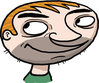
9 Here’s a version of the same character drawn with a Smoothing value of 0. The difference in line quality is subtle, but if you look closely it’s quite noticeable how imperfect the overall image is. With no smoothing applied, the drawing can take on a completely different look and feel.
Hot Tip

You can apply smoothing after a shape has been drawn with the Brush tool. Select the shape with the Selection tool and click the Smooth tool in the Tools panel. Alternately you can click the Straighten tool to straighten the edges of the selected shape.
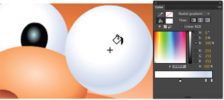
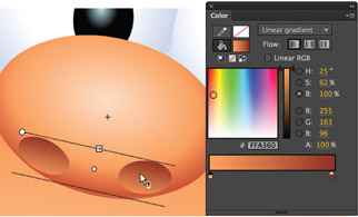
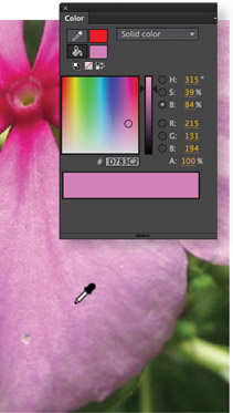
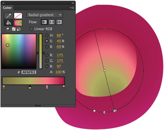
Mixing colors
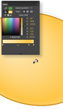
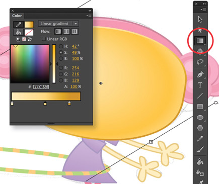
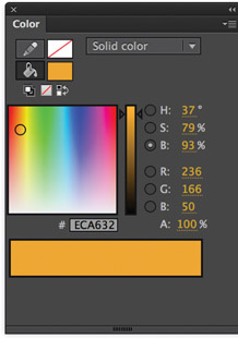
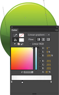
AS OF FLASH CS6, the Color panel got a slight facelift. Instead of choosing between HSB or RGB, we now have both displayed simultaneously and all color values are accurately controlled using hot text sliders.
VECTOR ILLUSTRATION: CHRIS GEORGENES FOR BIG PINK
Mixing colors in Flash since then has never been easier or more accurate. The creative folks over at Big Pink asked me to create an animation for children between 2 and 5 years of age. Because of the target audience, I wanted the animation to have a soft yet inviting color palette.
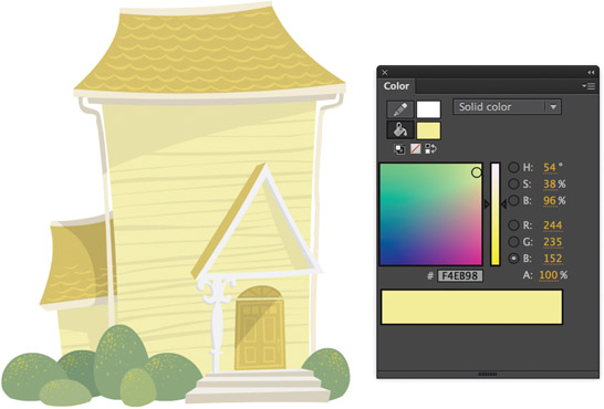
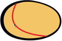
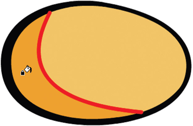
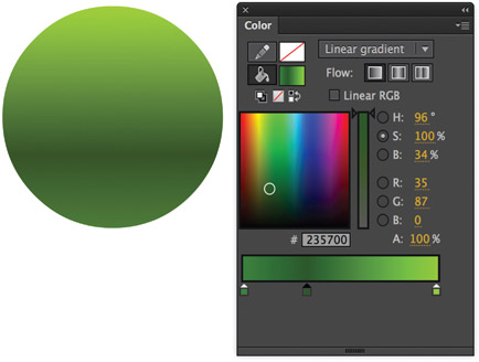
1 My typical workflow when mixing colors is to click and drag within the gradient window in order to select the approximate color I’m after. Once I have this color selected I like to use the hot text sliders to fine-tune my color selection. Hue and saturation can play an important role in the design process, and for this particular background image I wanted to keep the colors muted to avoid overpowering the characters that were added later on. As you can see here, the main color of the house has a very low level of saturation but enough brightness to maintain a good level of clarity.
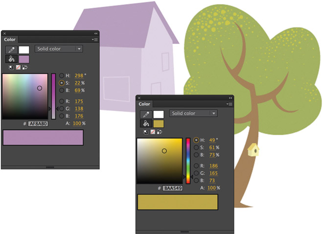
2 Once again the colors of this house are easily muted by lowering the saturation and keeping their brightness relatively high. The green for the tree is slightly more saturated compared to the other colors but overall still muted.
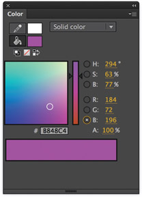
3 Once I had the overall pink color selected, mixing the darker shade of pink required a simple brightness adjustment. The large color swatch at the bottom of the Color panel will split to reveal the current color being mixed on top of the original color. This split provides a visual reference for how the new color will contrast against the original color.

Hot Tip

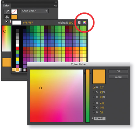
You can use the Flash Color panel to pick any color from anywhere on your screen -even outside of Flash! Just click on the fill color swatch to activate the color picker and then click on the area of your screen that contains the color you desire.
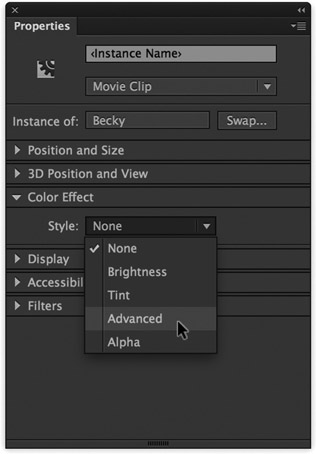
Advanced color effect

VECTOR ILLUSTRATION: CHRIS GEORGENES
THE ADVANCED COLOR EFFECT separately adjusts the alpha, red, green and blue values of the instance of a symbol. It can be used in a variety of ways to suggest the tone of your graphic design or the mood of an entire animated scene. Let’s take a look at how to adjust the color values of a symbol using the RGB hot text sliders. In the Color Effect section of the Properties panel, change the style mode to Advanced.
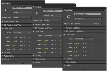
1 Select the symbol containing your artwork. Using the hot text sliders, change the value for red to 100% and both green and blue values to 0%. An overall hue of red will be applied to the symbol. Increasing the amount of green while decreasing red and blue will result in an overall greenish hue. Increasing the amount of blue while decreasing red and green will follow suit with an overall bluish hue.
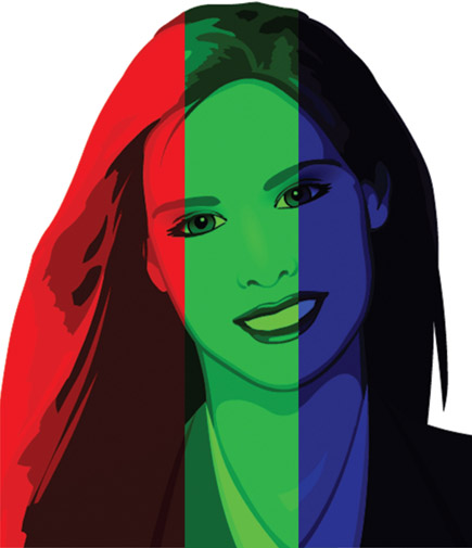
2 Red, green or blue will not always satisfy your color needs. By varying the amount of red, green and blue you can come up with almost unlimited variations of color tones. Here I have an almost equal mix of red and green but no blue at all.
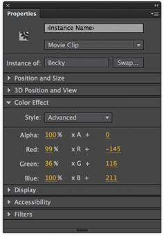
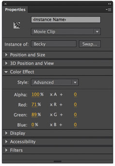
3 If the red, green and blue percentages aren’t enough, you can produce more values by adjusting the values in the right column. These values will get added to the percentage values in the left column. For example, if the current red value is 100, setting the left slider to 50% and the right slider to 100% produces a new red value of 150 ([100 × .5] + 100 = 150).

Hot Tip

The advanced color values can also be animated over time using Classic and Motion tweens. Check out the animated example on page 50.
Animated color effect
VECTOR ILLUSTRATION: CHRIS GEORGENES FOR BIG PINK
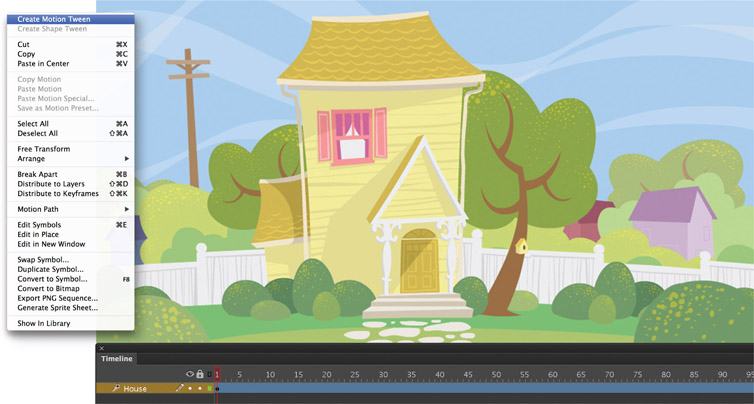
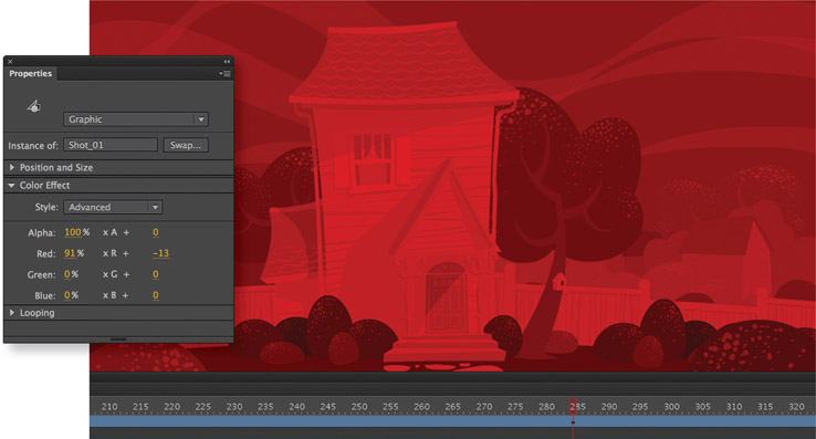
1 As animators we occasionally need to find ways to visually suggest the passing of time. One of the easiest ways to do this is to change the overall hue of an entire scene or background. As we know, this process naturally takes several hours, but through animation we can speed up time to convey the effect. In its initial shot, this quaint suburban home is designed to represent daytime, probably early afternoon given the angle of the shadow across the front door. The entire background has been converted to a symbol and a Motion tween has been created by right clicking over the symbol and selecting Create Motion Tween. Insert frames in the tween span by pressing on a frame further down the Timeline and pressing the F5 key. With the tween span extended, the hue of the entire scene can now be changed via the Color Effect section of the Properties panel.
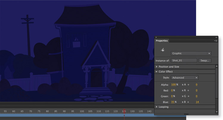
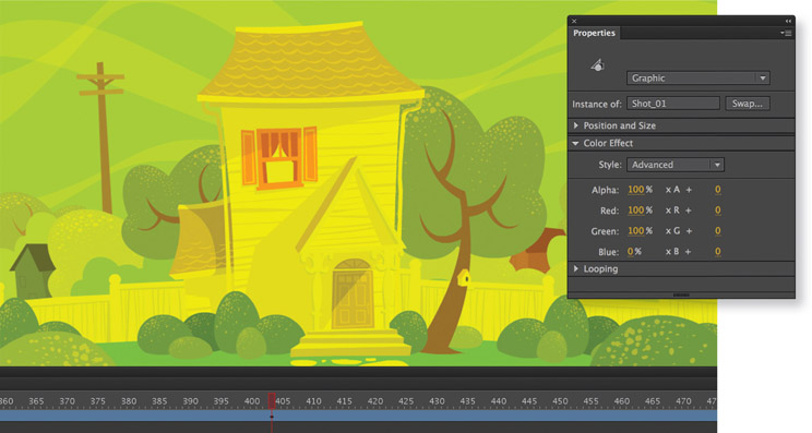
2 Make sure the frame indicator is at or near the end of the tween span. With the Properties panel open and Color Effect section expanded, select the symbol containing the background image. Using the hot text sliders, adjust the hue of the symbol instance. Here I have removed the red and green values by entering a numerical value of “0” for both and increased the amount of blue to suggest a cooler range of colors across the entire image. These settings imply a lack of sunlight and create a convincing night time mood. Position the frame indicator back at frame 1 and press the ![]() key to playback the animation. The Motion Tween span will interpolate the difference in color values between the keyframes, resulting in a dramatic time lapse animation similar to the transition from day into night. You are not limited to just day and night as this technique can be used to imply a change of mood for dramatic effect.
key to playback the animation. The Motion Tween span will interpolate the difference in color values between the keyframes, resulting in a dramatic time lapse animation similar to the transition from day into night. You are not limited to just day and night as this technique can be used to imply a change of mood for dramatic effect.
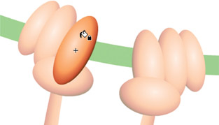
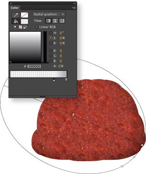
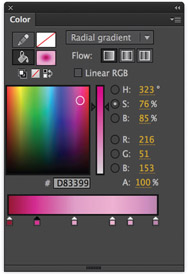
Using gradients
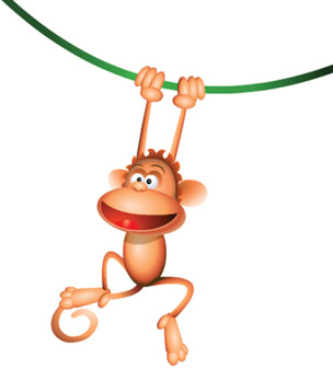
MONKEY CHARACTER: MUDBUBBLE LLC
GRADIENTS CAN BE VERY effective when you want to break away from the flatness of solid color fills. They can be used to add a sense of depth and dimensionality to your characters, backgrounds and graphics in general.
Gradients can also work against you due to their ease of use, resulting in generic and often lackluster images. When in the right hands, however, both linear and radial gradients can contribute to a very effective and sometimes realistic design.
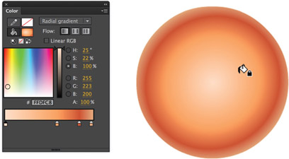
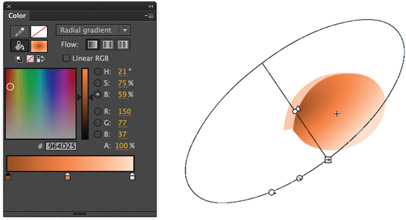
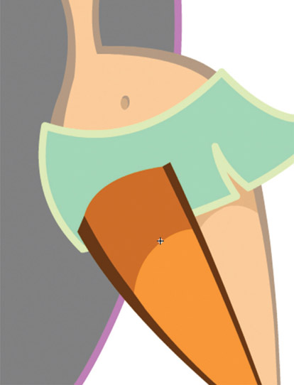
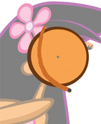
1 A simple radial gradient is used to fill most of the shapes that make up the monkey. The trick here is providing the illusion of a 3D object in a 2D environment. Four colors are used for this gradient. The critical color for this illusion is the fourth color (far right). It represents a light source coming from behind the sphere, suggesting the sphere is truly round.
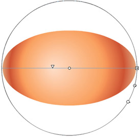
2 Edit the gradient to conform to the shape using the Gradient Transform tool ![]() . Use the handles to rotate, scale and skew the gradient, so it is slightly larger than the shape. Select the center control point, drag the entire gradient and position it slightly off-center from the shape.
. Use the handles to rotate, scale and skew the gradient, so it is slightly larger than the shape. Select the center control point, drag the entire gradient and position it slightly off-center from the shape.
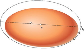
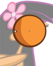
3 Click and drag the focal point tool so that the highlight is positioned between the center of the shape and its edge. This position suggests that the light source is at more of an angle. Notice the fourth color of our gradient is showing along the bottom and right edge which implies light wrapping around the sphere from behind.
4 To make the ear look concave, mix another radial gradient going from darkest in the center to a lighter value on the outer edge. Fill the shape with this gradient and position it off-center so that only half of the gradient is shown. Since darker colors will recede and lighter colors will appear closer to us, this otherwise flat shape now gives us the impression it is concave.
5 The hair is a shape filled with another radial gradient. Most of this shape will be hidden behind other graphics, so you only need to concern yourself with how the outer edge looks when the character is fully assembled.
6 The hands are really just a few strategically positioned spheres with the same radial gradient as the face and body and are used to suggest hands.
7 For those classic cartoon “ping-pong” eyeballs, mix a radial gradient the same way using white and gray colors. Color theory teaches us that to show light, you must show dark. Apply this technique to the eyes by placing them in front of a darker shape. The contrast will help make the eyeballs pop, thereby adding depth.
8 The nose is a combination of spheres filled with radial and linear gradients. To create the nostrils, use a linear gradient and edit it so that the darker color is above the lighter color. By themselves, the spheres are just shapes. But placed against the radial sphere, they become holes.

9 Good designs are consistent in technique. When each element is comprised of the same graphical style, the overall result is typically consistent and fluid. Don’t deviate from your plan; choose a technique and stick with it.
Hot Tip

Gradients, in my opinion, look more realistic when the change in color values is subtle. Gradients that have strong contrasting colors have a tendency to look unrealistic.
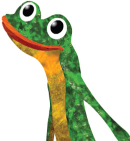
Adding texture
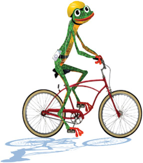
ED THE FROG: COPYRIGHT LEAPFROG INNOVATIONS - VECTOR ILLUSTRATION: CHRIS GEORGENES
BITMAPS DON’T ALWAYS HAVE TO BE imported as static elements in your projects. Instead, they can be an effective source of adding texture to your designs. Since any image could be a potential texture, the possibilities are endless. For this frog character, I wanted a slightly more sophisticated look while still maintaining a cartoon feel. Instead of using solid color fills and some spot color shading, the use of imported bitmap textures added that extra sense of depth and richness.
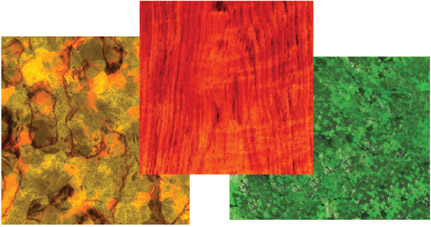
1 The first task is to design your textures. A digital camera is a very handy device for this purpose. Take a walk around your neighborhood and you’ll quickly find an unlimited supply of interesting textures that can be used for your designs. Use Photoshop to adjust the color, add filters and crop your images. Remember to keep the image small enough for web output.
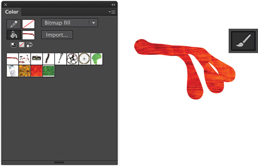
2 Using the Brush tool, draw your shapes using the bitmap as the fill color.
3 You can use the Bucket tool to fill your shapes with the different bitmaps you imported, broke apart and picked with the eyedropper.
4 Most likely the bitmap fill will need to be scaled, rotated or re-positioned. Select the Gradient Transform tool ![]() , and edit your fill using the various handles around the bounding box.
, and edit your fill using the various handles around the bounding box.
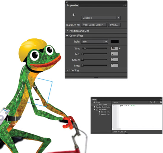
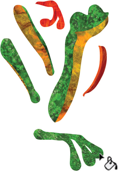
5 The final step is to convert all parts to symbols and add a slight amount of dark tint to the instances behind the character. This helps separate similar bitmap textures from each other and adds a touch of depth.
Hot Tip

As an option, set the quality of your movie to “BEST” by adding one line of code to frame 1 of the main Timeline. Your bitmaps will look their best but will demand more from your processor during playback.
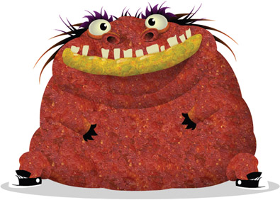
BITMAPS DON’T ALWAYS have to look flat. Introducing “Grotto,” a character made almost entirely of bitmap fills and some carefully placed Flash gradients, which provide the illusion of form, volume and, most of all, texture.
Here we’ll look at how to give otherwise flat bitmap textures a bit more depth using some basic gradients and alpha.
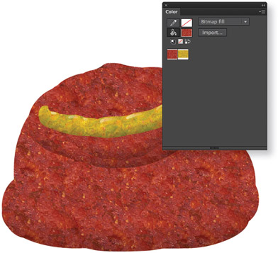
1 The first step is to create your texture in Adobe Photoshop, import it into Flash, break it apart and then select it with the Eyedropper tool ![]() . I created the shape for Grotto’s body with the paint brush and the bitmap swatch as my fill “color”. Select the body shape and convert it to a Graphic symbol.
. I created the shape for Grotto’s body with the paint brush and the bitmap swatch as my fill “color”. Select the body shape and convert it to a Graphic symbol.
2 Edit the symbol by adding another layer above the shape layer. Copy ![]() and paste in place
and paste in place ![]() the body shape into this new layer. Fill it with a radial gradient with two colors; black with about 30% alpha and black with 0% alpha.
the body shape into this new layer. Fill it with a radial gradient with two colors; black with about 30% alpha and black with 0% alpha.
3 The mouth/lip symbol was made the same way by layering a radial gradient over the bitmap fill shape. Use the Fill Transform tool to position the gradient so it forms a shadow along the bottom half of the shape.
4 Sometimes the devil is in the detail, which is evident here with the additon of some subtle highlights to the lip. On a new layer use the Brush tool to paint some shapes and then fill them with a linear gradient containing 30% white to 0% white. Use the Fill Transform tool ![]() to edit the gradient as necessary.
to edit the gradient as necessary.
5 The nostril is another example of layering various gradients over the original shape containing the bitmap fill. Here I used a linear gradient for the inner nostril shape and a radial gradient to provide some shading for a more realistic effect.
6 When all these subtle details are combined, they can add up to a very sophisticated image. The shapes that make up Grotto are simple yet convincing, simply by layering some basic gradients over our textures.
Hot Tip

You may also want to adjust the properties of the imported bitmap (double-click the bitmap icon in the document library and select “Apply Smoothing.”) This will apply anti-aliasing to your image and make it appear smoother.
The Pen tool
VECTOR ILLUSTRATION: CHRIS GEORGENES
SO FAR IN THIS CHAPTER WE have looked at several ways of achieving different styles of drawing, from the basics of snapping simple shapes together forming bigger, more complex shapes to using bitmaps as textural fills. Most of the time the design process demands a combination of tools and techniques to get the job done. For this character design I went from a rough pencil sketch to a fully rendered vector drawing using the Pen tool and basic shapes. The Pen tool, in combination with the Selection tool, offers infinite flexibility when it comes to manipulating strokes and shapes.
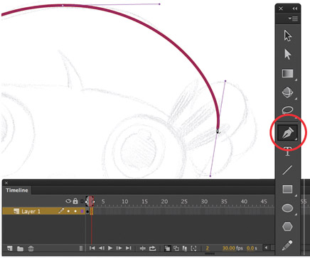
1 Start with a scanned sketch or draw directly into Flash. Create a blank keyframe on frame 2 and turn on the Onionskin feature. Using the sketch as reference, trace the hair using the Pen tool by clicking and dragging each point as you go. This technique will automatically create curves with Bezier handles, allowing you to manipulate the stroke each time a point is made.
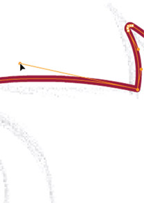
2 Using the Subselection tool ![]() , modify the contours of the hair by clicking an anchor point and adjusting its Bezier handles. Once this shape is complete, temporarily cut and paste it to a new layer and lock it to avoid editing it unintentionally.
, modify the contours of the hair by clicking an anchor point and adjusting its Bezier handles. Once this shape is complete, temporarily cut and paste it to a new layer and lock it to avoid editing it unintentionally.

3 To add an anchor point, hover the Pen ![]() tool over the path until you see the “+” symbol appear and click. Remove an anchor point by hovering over and clicking it.
tool over the path until you see the “+” symbol appear and click. Remove an anchor point by hovering over and clicking it.
4 Once you have closed the path, fill it with a color. Here I have mixed a radial gradient to provide a sense of volume to the shape.
5 A linear gradient can be applied to a path without having to convert it to a shape like in older versions. For this gradient I chose to mix 3 colors: a light, mid and dark tone. With this gradient selected in the stroke color swatch in the Color panel, click on the path using the Ink Bottle ![]() tool to apply it. Edit the gradient using the Gradient Transform tool
tool to apply it. Edit the gradient using the Gradient Transform tool ![]() .
.
6 The Pen tool is clearly a useful tool for drawing paths, but in some situations the Oval and Rectangle tools are a better and faster alternative. The Selection tool ![]() can be used for basic editing of paths made with the shape tools.
can be used for basic editing of paths made with the shape tools.

7 The final result is a combination of shapes and paths created with the Pen, Oval and Rectangle tools. Editing of these paths and shapes was the result of using the Selection, Subselection and Pen tools.
Hot Tip

Go to Edit > Preferences > Drawing and make sure the “Show Pen Preview” option is checked. This option will allow you to see a preview of what your lines will look like as you are drawing with the Pen tool. Hold down the Shift key to snap your lines to 90 and 45 degree angles as you draw. To designate a control point as the end of your line, hold down the Ctrl/Command key while clicking.
Trace Bitmap

PHOTOGRAPHIC IMAGES CAN BE used to add a measure of realism to any Flash project. They can be imported and used in their original state, or they can be simpified for a unique, stylized look. The obvious approach to vectorizing photographs is to import the image into Flash and use the drawing tools to trace it by hand. But that can be very time-consuming depending on the complexity of the image. The trick here is to average down the amount of colors your image contains, and Adobe Photoshop makes this an almost effortless task.
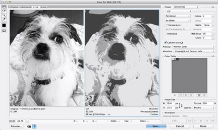
1 Start with a good quality image that has enough color contrast. Open it in Adobe Photoshop and save it as a PSD file. Now may be a good time to adjust the contrast, saturation, colors or whatever else you prefer to edit. Save for Web using ![]() and select GIF as the file format. Select Grayscale from the Color Reduction drop-down menu and limit the number of colors to two or three depending on the image and amount of colors your prefer to keep. Click Save and name your new GIF image.
and select GIF as the file format. Select Grayscale from the Color Reduction drop-down menu and limit the number of colors to two or three depending on the image and amount of colors your prefer to keep. Click Save and name your new GIF image.
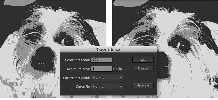
2 Import the optimized GIF into Flash ![]() . Make sure it is selected and go to Modify > Bitmap > Trace Bitmap. In the Trace Bitmap dialog panel, you can adjust individual settings that will ultimately dictate the level of complexity your image will have when converted to vectors. The proper setting will vary depending on your image and personal preference.
. Make sure it is selected and go to Modify > Bitmap > Trace Bitmap. In the Trace Bitmap dialog panel, you can adjust individual settings that will ultimately dictate the level of complexity your image will have when converted to vectors. The proper setting will vary depending on your image and personal preference.
3 Once the trace is complete, your image will be all vector and fully scalable. The resulting image of this dog is now only 88k, but we can get it even smaller by using Flash’s built-in Optimize engine.
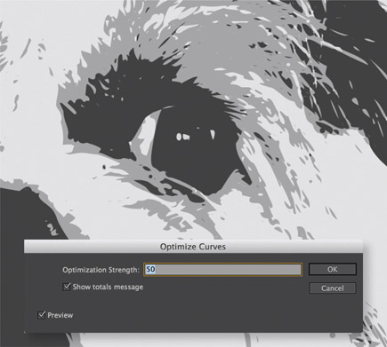
4 Select the entire image and go to Modify > Shape > Optimize to open the Optimize Curves panel. With Preview selected use the slider to adjust the amount of smoothing desired and click OK.
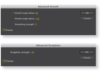
5 Flash CC offers Advanced Smooth and Straighten panels that provide more control over how your vector image is optimized. Both of these panels can be found by going to the Modify > Shape menu.
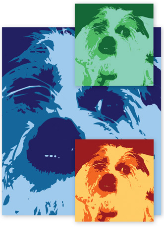
6 The end result is an image that is very lightweight for the Web, weighing in at only six kilobytes. It is also easy to change its color scheme using the Paint Bucket tool ![]() and the Color Mixer.
and the Color Mixer.
Hot Tip

When optimizing curves using the Flash optimizing feature, set the stage magnification to 100% or lower. Total optimization may vary depending on the magnification of the stage. Optimization tends to have a greater effect with smaller objects and less of an effect with larger ones. You will have to conduct your own experimentation for the preferred ratio between optimization and image quality.
Image Trace (Illustrator)

ILLUSTRATION BY HUSSAM NASSOUR
ADOBE ILLUSTRATOR AND ADOBE Flash are 2 of the best vector drawing applications available. In terms of drawing tools, Illustrator has a much more sophisticated toolset than Flash, and for this reason it’s worth taking a look at a feature introduced in Illustrator CS6: Image Trace.
Image Trace was the replacement for the Live Trace tool and for good reason: Image Trace is much more powerful and does a much better job at tracing your bitmap images.
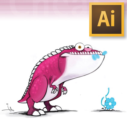
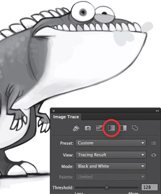
The dinosaur character I’m using for this example was created by my friend Hussam Nassour of Dubai, India. Hussam is a wonderfully talented character designer and CG artist. The dinosaur sketch is a perfect example for vectorizing using the Image Trace feature. Visit sketchwings.com to see more of Hussam’s work.
1 The original sketch was drawn by Hussam in Adobe Photoshop using subtle variations in color and shading. It will be interesting to see how well the Trace Image engine converts these subtle nuances in color from pixels to vectors. Place the bitmap into an Illustrator document by choosing File > Place…
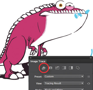
2 Open the Image Trace panel by choosing Window > Image Trace. Select the bitmap and click the Auto Color icon to begin the Trace Image conversion. The Auto Color preset will convert the image to vectors while averaging the colors to a limited number of values.
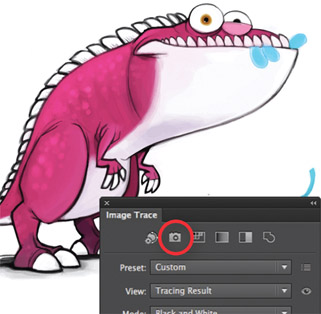
3 The High Color option does a remarkable job of converting the image to vector paths while maintaining the same integrity of the original. The converted paths look almost identical to the original bitmap.
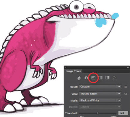
4 Low Color will trace the image with fewer colors than the High Color option. Low Color is useful if you want fewer colors and a more stylized look to your image.
5 Grayscale converts the image to vectors while converting the colors to gray tones.
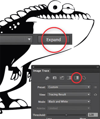
6 Black and White converts the image to black and white vector fill colors only. To edit the paths in Illustrator CS6+, click the Expand button located in the main tool bar.
Hot Tip

The Image Trace feature provides several templates to choose, but you can also create and save your own Image Trace presets! Once the image has been converted to vectors, you can save the file and import it directly to Flash where it can be animated.
Shading 1: line trick

BOY CHARACTER: COPYRIGHT MUDBUBBLE LLC
CEL SHADING IS COMMONLY referred to as “toon shading.” This style of shading is popular with comic book style artwork and classic Disney films. I have discovered four different ways to achieve cel-style shading in Flash for you to consider. This particular example demonstrates a stroke drawn across an existing fill color. The stroke can be edited without disrupting the shape below it. Once the stroke has been defined and a shadow color added, the stroke can easily be removed, leaving behind the shadow and original fill color.
1 Start with a basic shape that contains a fill and outline. This technique will work just as well with shapes that have no outlines.

2 Select the Line tool ![]() and make sure the Snap to Objects tool is also selected in the toolbox.
and make sure the Snap to Objects tool is also selected in the toolbox.
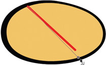
3 Draw a diagonal line inside the fill of your shape. Use the Selection tool ![]() to drag each end point of the line so they snap to the edge of the fill.
to drag each end point of the line so they snap to the edge of the fill.
4 Use the Selection tool to bend the line so that its arc reflects the shape of the oval.
5 With the fill color selected, mix a slightly darker color using the Color panel mixer.
6 An alternative way to mix colors in Flash is to click the color wheel button in the upper right corner. This button will open the color palette mixer that is native to your operating system. Mix your new color and click “OK”.
7 Use the Bucket tool ![]() to fill the shape you created with the Line tool.
to fill the shape you created with the Line tool.
8 Select the line and delete it. Easy right? If it still isn’t perfect, you can continue to use the Selection tool to edit the edge of the new fill you created.
Hot Tip

Cel-style shading can be difficult to achieve. You have to imagine that your two-dimensional shapes have a third dimension and they are affected by light and shadow. Choose a light source and keep it consistent throughout your design when adding shading.
Shading 2: shape it

BOY CHARACTER: COPYRIGHT MUDBUBBLE LLC
HERE’S ANOTHER variation on cel-style shading in Flash. This technique involves the Rectangle tool and allows for more complex shading. This approach may be preferable if your shapes require more complex shadows.
1 Using the Rectangle tool ![]() , draw a box inside your shape that contains a darker fill color (no outline).
, draw a box inside your shape that contains a darker fill color (no outline).
2 Use the Selection tool ![]() to pull the corners until they snap to the edges of the shape (make sure the Snap feature is turned on).
to pull the corners until they snap to the edges of the shape (make sure the Snap feature is turned on).
3 Fill the gap area created after snapping the corners to the edge of the shape.
4Use the Selection tool to bend the edge of the darker fill color so that its arc reflects the shape of the oval. Having used the Rectangle tool, you have an extra corner to play around with. The extra control can be useful for creating more complex shading such as with the ear shape.

5 Let’s take this technique one step further by adding more shading for a more realistic effect. Repeat the above procedure using an even darker color inside the shaded area.
6 Use the Selection tool to pull the corners until they snap to the edges of the shaded shape.

7 Fill the gap area created after snapping the corners to the edge of the shape.
8 Use the Selection tool to bend the edge of the darker fill color so that its arc reflects the contour of the shape.

9 You can repeat this procedure as many times as you like. The more color values you add, the more realistic the image will be.
Hot Tip

If you would like a cool and easy way to create various hues based on your original color, give Adobe’s Kuler tool a try (kuler.adobe. com). You can mix shades of color very easily and then save and download them as ASE (Adobe Swatch Exchange file). Open the downloaded ASE file(s) in Illustrator and then save your new swatch panel as an AI file and import it into Flash. An easier way would be to manually copy the HEX value from the Kuler site and paste into the Flash Color Mixer panel.
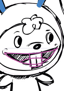
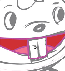
Shading 3: paint selected
HULA GIRL: COPYRIGHT MUDBUBBLE LLC
WE’RE ALL DIFFERENT AND we tend to find different ways of using the same tools. Certain techniques become familiar to our workflow, and we become comfortable in our individual habits. Here is yet another technique for creating cel-style shading that you may prefer over the previous versions. It lends itself well to the designer who likes a more hand-drawn feel to their work.

1 Start with a shape.
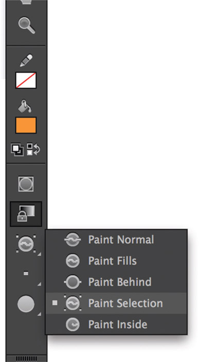
2 Select the Brush tool ![]() and then from the brush mode subselection menu, select Paint Selection. This subselection will restrict any paint to selected fills only.
and then from the brush mode subselection menu, select Paint Selection. This subselection will restrict any paint to selected fills only.
3 Use the Selection tool ![]() to select the fill color you’ll be adding the shade color to. Now use the Brush tool and adjust the amount of smoothing desired for the shape you’ll paint. Next, paint inside the selected fill.
to select the fill color you’ll be adding the shade color to. Now use the Brush tool and adjust the amount of smoothing desired for the shape you’ll paint. Next, paint inside the selected fill.

4 Don’t worry about being sloppy. Once you release the brush, the painted fill will exist only inside the selected area you intended.
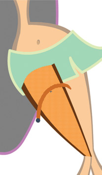
5 Sometimes the area may be too large to paint entirely by hand. In this situation, just draw the contour of the edge for the shaded area.
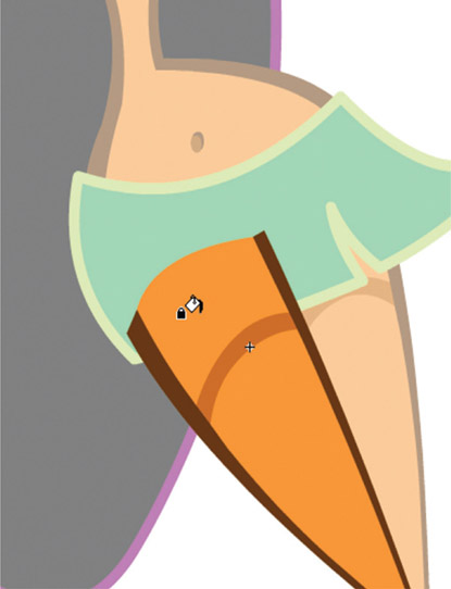
6 Next, simply fill the space created with the new fill you just painted.
7 Voila! Now you’ve got a convincing cell-style shading for the leg.
8 The face shading can be drawn the same way. Remember the direction your light source is coming and paint a crescent fill.
9 Fill the space created by the new fill and you are done.

10 Cel shading can add that extra dimension to your designs, giving them depth and realism.
Hot Tip

Consistency is important when it comes to your light source. It helps to limit yourself to one light source if possible and create your shading based on the angle where the light is coming.
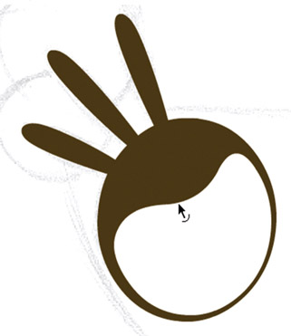
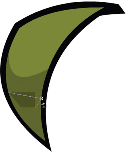
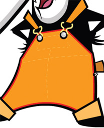
Shading 4: outlines

BADGER CHARACTER: MUDBUBBLE LLC
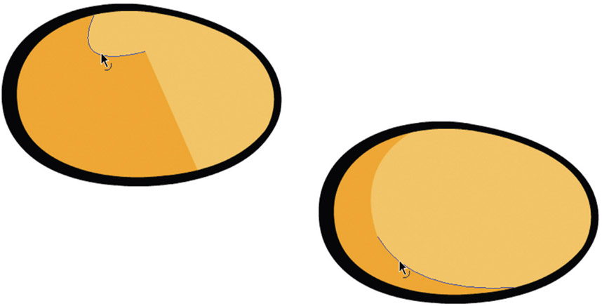
THIS VARIATION ON CEL-STYLE shading works well for both simple and very complex shapes. If you have line work that is very loose in a hand-drawn style, this technique may be the one for you. You’ll use the Ink Bottle to create a line around your fill. Then you can reposition this line off-center and fill the space created with a darker shade of color.
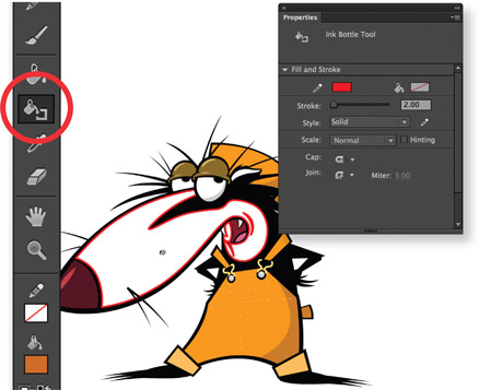
1 Start with the Ink Bottle tool ![]() and a stroke color that doesn’t exist anywhere in your design. Set the stroke height to around 3 or 4 point. Click anywhere within the fill to outline it with a stroke in the color you chose. Don’t worry about how it looks because you will eventually delete this line entirely after you are done.
and a stroke color that doesn’t exist anywhere in your design. Set the stroke height to around 3 or 4 point. Click anywhere within the fill to outline it with a stroke in the color you chose. Don’t worry about how it looks because you will eventually delete this line entirely after you are done.

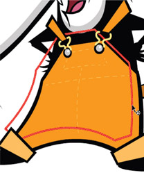
2 Select the line by double-clicking on it with the Selection tool ![]() . Next, use the arrow keys to nudge it away from the original shape in the direction of your light source. Fill this area created between the stroke and the original edge of your shape with your shade color.
. Next, use the arrow keys to nudge it away from the original shape in the direction of your light source. Fill this area created between the stroke and the original edge of your shape with your shade color.

3 Delete the entire stroke by pressing the ![]() key. If your stroke has been deselected, select it by double-clicking on it with the Selection tool. Double-clicking the stroke will select the entire stroke while single-clicking on it will select a segment of it if it contains multiple points.
key. If your stroke has been deselected, select it by double-clicking on it with the Selection tool. Double-clicking the stroke will select the entire stroke while single-clicking on it will select a segment of it if it contains multiple points.
4 For this character’s outfit, I applied a stroke outline to the overalls as well.
5 The stroke is selected and repositioned based on the same light source as in the previous example.
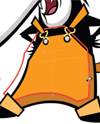
6 A darker shade of color is mixed and filled to create the illusion of form and realism.

7 With the stroke still selected, delete it. In some cases, the resulting shape created may need some tweaking.
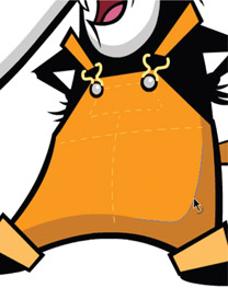
8 Use the Selection ![]() tool to further refine your shading based on your needs and design sense.
tool to further refine your shading based on your needs and design sense.
Hot Tip

Set your stroke height large enough to make working with the stroke easier. A larger value will allow you to select it more easily. Choosing a bright color that is high in contrast from your original design will make it easier for you visually.
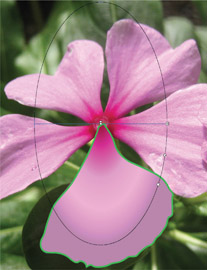
Realism with gradients

ILLUSTRATION: CHRIS GEORGENES
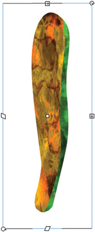
FLASH IS MUCH MORE THAN A tool for designing cartoon characters. Its full array of vector drawing tools is suitable for many styles of illustration. Here we’ll go step by step creating a realistic flower illustration. Flowers are always appealing to draw and at the same time challenging due to the subtle variations of color they often contain.
The main tools used in this example are the Pen tool and Gradients. Flash has adopted the core functionality of Illustrator’s Pen tool including identical shortcut keys and hot key modifiers – not to mention identical pen cursors as well. Integration is bliss.
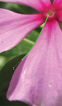
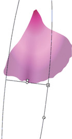
1 The first step is to outline the basic shape of the flower’s petal with a stroke color that is high in contrast to the original image. Be as precise as you want, but I recommend using the original image as a guide, simplifying where needed along the way.
2 The Pen tool ![]() is perfect for this task simply because it is quick and easy to manually trace the contour of the petal by clicking and dragging along the contour of the image.
is perfect for this task simply because it is quick and easy to manually trace the contour of the petal by clicking and dragging along the contour of the image.
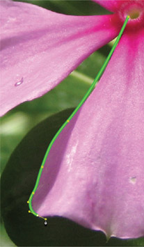
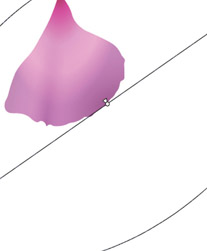
3 To close the path, position the Pen tool over the first anchor point. A small circle appears next to the Pen tool pointer when positioned correctly. Click or drag to close the path.
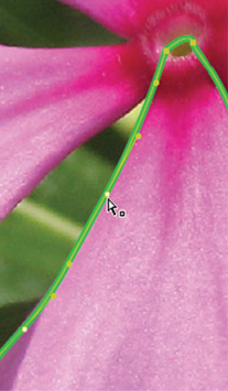
4 Use the Subselection tool ![]() to refine your path if you desire. To adjust the shape of the curve on either side of an anchor point, drag the anchor point, or drag the tangent handle. You can also move an anchor point by dragging it with the Subselection tool.
to refine your path if you desire. To adjust the shape of the curve on either side of an anchor point, drag the anchor point, or drag the tangent handle. You can also move an anchor point by dragging it with the Subselection tool.
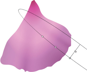
5 Next we need to mix some radial gradients. Flash’s color picker can grab colors from anywhere on your screen if you click on any of the color swatches found in the Color Mixer, Properties panel or the toolbox and drag to the area containing your desired color.
6 The initial gradient will provide the overall hue and tonal range of the flower petal. Flash lets you apply up to 15 color transitions to a gradient.
7 Fill your shape with your radial gradient and then use the Gradient Transform tool ![]() to edit its size, position and rotation. You can delete the stroke at this stage as it is no longer needed.
to edit its size, position and rotation. You can delete the stroke at this stage as it is no longer needed.
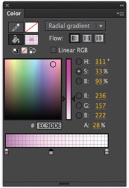
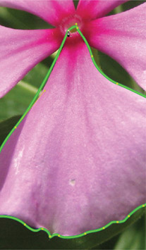
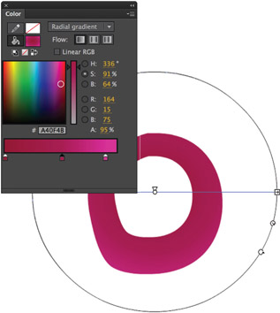
8 Copy ![]() and Paste in Place
and Paste in Place ![]() this shape to a new layer as you will be layering several gradients on top of each other to create a realistic effect. The following gradients contain varied amounts of alpha to create subtle transitions in color.
this shape to a new layer as you will be layering several gradients on top of each other to create a realistic effect. The following gradients contain varied amounts of alpha to create subtle transitions in color.
9 Fill the duplicated shape with your new gradient and use the Gradient Transform tool ![]() to create the suggestion of subtle undulations within the shape. Repeat the process of copying and pasting in place this shape to new layers for each new gradient.
to create the suggestion of subtle undulations within the shape. Repeat the process of copying and pasting in place this shape to new layers for each new gradient.
10 You can manipulate each new gradient using the Gradient Transform tool ![]() to create soft shadows and highlights. In almost all cases you will only use partial gradients to create subtle transitions of light and shadow.
to create soft shadows and highlights. In almost all cases you will only use partial gradients to create subtle transitions of light and shadow.
Hot Tip

To constrain the curve to multiples of 45º, hold down the Shift key while dragging. To drag tangent handles individually, Alt-drag (Windows) or Option-drag (Macintosh).
11 It’s always convincing to position soft shadows where the edge of the shape contains an imperfection. The combination of gradient colors and irregular contours makes for a very convincing imperfection.

12 This end result is achieved by using several variations of layered radial gradients, producing beautiful and convincing variations of color.

13 Repeat the same procedure for each petal of the flower image. To keep your main timeline layers to a minimum, convert each layer to a group or an object drawing and convert each petal to a symbol.
14 The center of the flower, technically named the stigma, was created with a doughnut-shaped fill containing a radial gradient.
15 To achieve the effect of depth in the center of the stigma, drag the little white arrow in the radial gradient’s center to move the focal point towards the edge.

16 Here’s what the flower image looks like once all the petals and stigma have been illustrated. But you don’t have to stop here. Let’s have some fun with Flash’s filters. Convert the entire flower to a Movie Clip symbol.

17 From the Filters panel, add a Drop Shadow. Set the blur, alpha and distance to your desired amount. You may want to also add a Blur filter to soften the overall image of the flower.

18 Duplicate the instance of the flower movie clip. Scale and rotate them to create an appealing floral arrangement. It’s almost hard to imagine this style of illustration can be made entirely in Flash, right?
Hot Tip

The technique of mixing gradients with transparency and layering them so that they overlap each other can produce effects that go beyond radial and linear gradients. You can actually use this technique to create gradients with abstract shapes and curves that go beyond what the default gradients were designed to look like. It takes a measure of trial and error to achieve the look you want, but in the end the final results may be worth the extra effort.
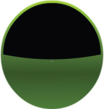
UI Design

YOU MIGHT BE WONDERING why I’m featuring a Flash design that looks like it was created with Adobe Photoshop or Fireworks or perhaps Illustrator. I chose this graphic because the download available icon used throughout this book was created entirely with Flash. I love using Flash to create graphics and buttons for user interfaces because it forces me to be simple. I also like how the Flash drawing engine allows me to quickly and easily manipulate vector shapes.
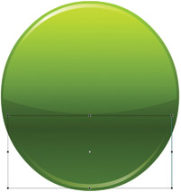
1 The first step is to create a circle using the Oval tool ![]() with a fill color only. The stroke color swatch is puposely empty to avoid having a stroke added to the shape. The fill color is a linear gradient using a variation of 3 green colors. The mid-tone is the darkest color while the color swatch on the left is of a slightly lighter value and the swatch on the far right is the brightest. This shading simulates a light source coming from above. Select the shape and convert it to a Movie Clip symbol by pressing the F8 key.
with a fill color only. The stroke color swatch is puposely empty to avoid having a stroke added to the shape. The fill color is a linear gradient using a variation of 3 green colors. The mid-tone is the darkest color while the color swatch on the left is of a slightly lighter value and the swatch on the far right is the brightest. This shading simulates a light source coming from above. Select the shape and convert it to a Movie Clip symbol by pressing the F8 key.
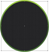
2 Copy and Paste in Place the original circle to a new layer. For illustration purposes I have filled it with a solid black color. Scale it so that it’s slightly smaller than the original. I recommend locking the original layer.
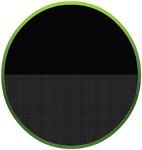
3 Using the Selection tool ![]() , start outside the shape and click and drag across the bottom half of the circle in order to select only the bottom half of the circle. Press the
, start outside the shape and click and drag across the bottom half of the circle in order to select only the bottom half of the circle. Press the ![]() key to remove it.
key to remove it.
4 With the top half of the circle remaining, deselect it by clicking anywhere outside of it using the Selection tool. Now click and drag the lower edge down to create a slight curve.
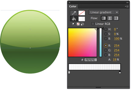
5 Since black doesn’t necessarily convey a highlight very well, we need to mix a new color. In fact, another linear gradient will work well here. Using only 2 color swatches, use white for both but adjust the Alpha transparency of the left swatch to around 69% and the right swatch to 19%. Fill the shape with this gradient and adjust it by using the Gradient Transform tool. The end result should have the more opaque color at the top and the less opaque color at the bottom.
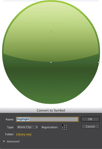
6 Select the highlight shape and press F8 to convert it to a symbol. Make sure the symbol type is Movie Clip. If it isn’t, select Movie Clip from the drop-down menu. The Movie Clip type is important because it allows us to add a Blend Mode to it.
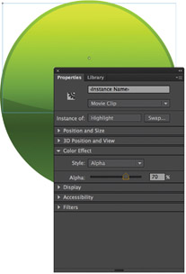
7 Select the Movie Clip and from the Blending drop-down menu in the Display section of the Properties panel select Overlay. Overlay combines Multiply and Screen blend modes resulting in light colors becoming lighter and dark colors becoming darker.

8 If the highlight is too bright, adjust its opacity using the Alpha slider in the Color Effect section of the Properties panel.
Hot Tip

Creating the illusion of a shiny plastic button relies on subtle variations of color in your gradients. Achieving that glassy look can take practice to achieve. If you are having trouble getting the effect to look right, it might be that your colors have too much contrast between them. Being subtle will prove to be more effective in the end.
9 A convincing shiny effect relies on the illusion of reflection. Adding a highlight along the top edge of the icon begins with using a copy of the larger highlight we just finished creating. Copy and Paste in Place the same shape to a new layer and break it apart. I have filled it with black for this example.
10 Select this shape, copy it and then Paste in Place again. With the shape still selected, choose a different color from the color panel (here I chose blue) and then nudge it few pixels downward using the arrow keys. The original black shape will be revealed underneath still intact. Click anywhere on the stage outside of the blue shape to deselect it.
11 With the Selection tool still selected, click the blue shape and press the Delete key. Deleting it will remove the blue shape as well as the original black section that was underneath it leaving behind the sliver of black as seen above. The remaining shape will be our edge highlight.
12 Mix a Linear gradient with 3 color swatches with white as the color for each. Select the swatch on the far right and adjust the color opacity to 0%. Repeat the same procedure for the far left color swatch. Select the middle swatch and lower its opacity to around 87%.
13 Copy and paste this highlight and then rotate it or flip it vertically. Position it at the bottom of the circle to create the illusion of light reflecting from below.
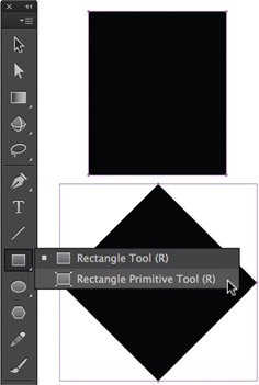
14 To create the arrow use the Rectangle Primitive Tool ![]() and draw 2 rectangles. Rotate one of them 45 degrees by holding down the
and draw 2 rectangles. Rotate one of them 45 degrees by holding down the ![]() key to rotate it in 45 degree increments.
key to rotate it in 45 degree increments.
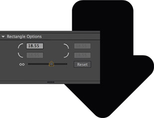
15 With both Rectangle Primitives selected, adjust the roundness of each corner using the Rectangle Options slider in the Properties panel. Break apart both rectangles and edit them to create the shape of an arrow.

16 I changed the fill color of the arrow to white and using the Ink Bottle tool ![]() I selected black as the outline color and clicked inside the fill color to apply the outline.
I selected black as the outline color and clicked inside the fill color to apply the outline.

17 Double-click the stroke outline using the Selection tool ![]() to select it. Using the arrow keys nudge the outline down and to the right about 10 pixels.
to select it. Using the arrow keys nudge the outline down and to the right about 10 pixels.

18 Using the Bucket Fill tool ![]() and gray as the fill color, click in the area of the arrow in between the stroke and the edge of the shape as shown above. With the stroke still selected press the
and gray as the fill color, click in the area of the arrow in between the stroke and the edge of the shape as shown above. With the stroke still selected press the ![]() key to remove it.
key to remove it.
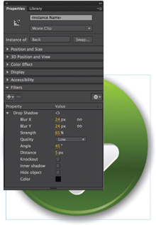
19 Select the Movie Clip symbol that was created in step 1. Apply a Drop Shadow filter from the Filters category of the Properties panel. Adjust the amount of blur, distance and strength.

20 The advantages of using Flash for creating graphics are that they are resolution independent and can be animated.
Character design

DESIGN IS ONE THING, TECHNIQUE IS another. Everyone has their own way of working in Flash, and there are many ways to go about designing in Flash. For this character I chose a technique that a friend and talented illustrator showed me. It involves using the Pencil tool with Object Drawing mode and the Union feature to combine multiple Object Drawings into a single object. I love her technique so much I’ve started to incorporate it more into my daily workflow. Thanks to Katie Osowiecki-Zolnik for this cool Flash drawing technique. Check out her work at http://katieo.kuiki.net.
1 The first step is to sketch the character using your tool of choice. Here I have chosen to remain entirely in Flash by using the Brush tool. My sketch is kept loose as I only need to get the basic form drawn.
2 Select the Pencil tool and turn on Object Drawing mode. Create a new layer in the timeline and choose a bright stroke color that is high in contrast from the original sketch color.
3 Using the sketch as my guide, I traced the image using the Pencil tool. It’s ok to use as many different strokes as needed. In the next step we will combine the individual Object Drawing strokes into a single object.
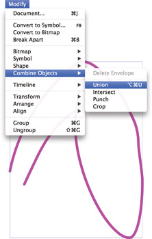
4 Select all Object Drawings and then go to Modify > Combine Objects > Union to combine them into a single Object Drawing.
5 With drawing contained within a single Object Drawing, it’s easy to edit the strokes to clean up the image. Select and delete any unneeded segments and use the Selection tool ![]() to edit the curves if need be. Here I’ve also applied a fill color.
to edit the curves if need be. Here I’ve also applied a fill color.
6 The mouth and teeth were drawn with the same technique of tracing in Object Drawing mode, combining each object using Union, and then editing the object as a whole.
7 Here I’ve added fill colors to the mouth, tongue and teeth. Once the shape and fill are finished I double-click the strokes to select them all and then press the Delete key to remove them.
8 Here’s the completed head, face and ears. Each shape is an Object Drawing consisting of shapes with solid fills. Only in certain cases did I use subtle gradients such as the highlights of the eyes and nose.
9 With the character designed in a neutral pose, I duplicated it a few times and edited the objects to create addition poses. In some cases new body parts were drawn to reflect the nature of the pose or gesture.
Hot Tip

The Union feature does not have a keyboard shortcut assigned to it by default. If you find yourself needing to combine Object Drawings often, then I recommend assigning a shortcut to the Union feature by editing your keyboard shortcuts. Once a shortcut has been assigned, you can take it a step further and assign the shortcut to an Express Key if you are using a Wacom drawing tablet.
Object Drawing

IN THE PREVIOUS EXAMPLE, I SHOWED YOU a technique learned from fellow illustrator and animator Katie Osowiecki-Zolnik. Katie is not only extremely talented but probably the fastest illustrator I know. She chooses Flash exclusively due to the simplicity of its drawing tools. Impressed with her style, I asked Katie if she would show us her technique of drawing in Object Drawing mode and using the Union feature to combine objects. This example deconstructs a small detail of her mermaid image and shows how Katie uses Flash to quickly sketch, trace and polish her illustrations. Check out more of her work at http://katieo.kuiki.net.

1 The sketch is loosely drawn using the Brush ![]() tool. Nothing fancy going on here. Just a quick and dirty drawing to get things started.
tool. Nothing fancy going on here. Just a quick and dirty drawing to get things started.

2 On a new layer, use the Pencil ![]() tool to trace over the original sketch. Make sure Object Drawing mode is turned on.
tool to trace over the original sketch. Make sure Object Drawing mode is turned on.

3 Complete the drawing of a single leaf. Select all the Object Drawings and then go to Modify > Combine Objects > Union to combine them into a single Object Drawing.

4 Fill the object with your color of choice using the Color panel.

5 Delete the stroke by selecting it and pressing the ![]() key.
key.

6 Draw a new stroke that dissects the leaf down the middle and bend it slightly. Use the Union feature to combine both objects.

7 Mix a darker value of the fill color and fill one of the halves of the shape defined by the new stroke. ![]() the stroke.
the stroke.

8 repeat steps 2–7 except this time mix different color values to separate this leaf from the first one.

9 Duplicate the object by using ![]() or
or ![]() + drag.
+ drag.

10 Flip the duplicated leaf horizontally by going to Modify > Transform > Flip Horizontal.

11 Send the duplicated object to the back by holding down ![]() + the down arrow.
+ the down arrow.

12 Scale and skew the object to create some variation.

13 Continue to duplicate, flip, scale and skew existing objects to create additional leaves.

14 Arrange the individual leaf objects using ![]() + the up and down arrows.
+ the up and down arrows.

15 Hide or remove the layer containing the original sketch when you are done.
Hot Tip

Keep a look out for holes that may get left behind by errant strokes. Often it is easy to spot small gaps in fill colors by zooming in to your image. If you spot a gap, select the color and fill it using the Bucket tool.
Being subtle
ANYONE WHO HAS EVER HEARD ME SPEAK PUBLICLY ABOUT FLASH AND what led me to this industry may recognize the term “moment of clarity.” As an artist, there have been several of these moments and the most memorable transpired long before Flash was around.
It was spring of 1989 and after four fulfilling years at the Hartford Art School, I was finally about to receive my BFA degree. My drawing style during this time could best be described as hyper-realistic. I was illustrating images that looked like actual photographs. Sometimes the illustrations would fool even a well-trained eye into thinking they were real, at least at first glance. Objects caught in motion as if snapped by some high speed camera shutter, foreshortened as if they were literally flying out from the page and about to hit you square between the eyes. I can only imagine this style represented my excitement as a young artist having this ability to push the limits of light and dark onto a two-dimensional surface and only the best professors looking over my shoulder. I spent so many hours trying to master this drawing style that I would often have to use my left hand to pry the fingers of my right hand off of the pencil.
Most of my work was large in scale, 18” × 24” and even as large as 30” × 40”. A large majority of it was lithographs and etchings that took weeks and often months to create. One afternoon I had a leftover piece of copper plate that I was about to discard. It was small, about 3” × 7”, and tiny compared to what I was used to. For no particular reason I drew a rough study of a figure of a fellow student across the room from me. I had caught her in a moment of what can best be described as daydreaming. I spent no more than ten minutes scratching her likeness on to the copper plate before throwing it in the acid bath to be etched. I rolled some ink into it and printed about six copies. It was a simple drawing, loose in line style and very much the opposite of the hyper-realistic style I was known for, and for this reason I didn’t think it was a very impressive piece. I contemplated tossing the print and the copper plate in the trash and going back to my much larger and more realistic pieces. But something told me to hang on to it, at least for a little while. So I slid it between the pages of a book in my backpack.
Like all graduating seniors, we were celebrated with our own showing in the school’s gallery. While setting up my show, I carefully chose my biggest and most realistic drawings and prints. While hanging the last piece, the small etching of the girl slipped out onto the floor. I reluctantly decided to include it in my show next to the light switch in the darkest corner of the room.
The night of the show was a success. A few days later, my illustration professor Dennis Nolan, who had been unable to attend, asked to see my work before it was taken down. He was one of the professors I most admired and to this day I adore his skill and dedication as an illustrator. He quietly perused each lithograph, etching, watercolor and pen and ink illustration. When he finished, he turned to me and asked, “Want to know what is your best piece?” Confident he was going to point to the largest and most realistic piece, I was shocked when he turned and pointed to the small etching next to the light switch. My heart sunk and for a moment I felt as though I might be insane.
He explained to me that its simplicity and essential quality provoked an emotion within him and compared it to Rembrandt or Da Vinci. He told me it was a milestone not only in my career, but in any artist’s career, to draw like that. It was subtle, and that subtlety made more of an impact than any of the other pieces I had done in my four years as a student. The world of art changed for me that day and, in some ways, the way I looked at life changed as well. It took four years and that very moment for my eyes to be opened as an artist. It taught me more than I ever thought I would be able to know and it’s a lesson I carry with me to this very day. Being subtle is powerful.