
PROJECT: DEVELOPING YOUR FIRST MOBILE WEBSITE
In the previous article you were introduced to the new SECTION, ARTICLE, NAVIGATION, ASIDE, HEADER, and FOOTER elements in HTML5 that allow you to apply a more easily read structure to your website design. In this project you will be building an entire website that uses the new HTML5 blocking elements to illustrate how you can structure your code more effectively.
The website will consist of four pages:
• Home page
• Product page
• News page
• Contact us
Each of these pages demonstrates how you can use HTML5 in your website design. By the time you have completed this project you will able to apply blocking to your new design.
What You Will Need
To get started with this project you will need to download the files from www.visualizetheweb.com. The files for this project are contained in a ZIP file that you can extract on your desktop.
The project files include the following:
• CSS (Cascading Style Sheets)
• HTML
In many ways, this will be the easiest project for you to create. You are not using frameworks, just standard HTML5.
Setting Up Your Project
Each of the pages in the site will highlight specific elements used in HTML5. To make things easy for you let’s set up one page that you can reuse as a template for the other pages in the project website. It is easier to manage your website when the HTML code is consistent on each page. Finding and replacing sections becomes a matter of cut and paste. For this project, the default home page contains all the elements and structure you will need for the entire site. The home page, as shown in Figure P1.1, will be used as the template.
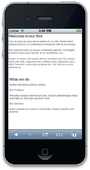
Figure P1.1 HTML5 and CSS3 are used to construct the document.
Before you start coding your HTML let’s take some time to explore how the default home page is structured. You will want to use a tool that allows you to easily draw blocks on the page to visually show where you will place the content.
There are four basic sections to each web page. HTML5 allows you to block out the following sections:
• Header
• Section
• Navigation
• Footer
The basic structure for the page looks like this in HTML5:
<!DOCTYPE html> <head>
<meta content=“en-us” http-equiv=“Content-Language” />
<meta content=“text/html; charset=utf-8” http-equiv=“Content-Type” />
<link href=“style.css” rel=“stylesheet” type=“text/css” /> <title>Company Home Page</title>
</head>
<body>
<header > </header>
<navigation> </navigation>
<section> </section>
<footer> </footer>
</body>
</html>
The default page opens with the HTML5 DOCTYPE that declares that the page supports HTML5. The rest of the HTML code within the HEAD element has not changed in HTML5. It is not until you start creating the content in the main page that you will see the new HTML5 elements.
The new blocking elements in HTML5 describe accurately where the content goes. In HTML4 and XHTML you can only achieve this same type of layout using DIV elements that are difficult to manage. It is easier to understand what each section is attempting to achieve when you name the elements HEADER, FOOTER, SECTION, and NAVIGATION.
Now that you have your basic page structure, you can start filling in each section with content.
Customizing the HEADER Element
The HEADER element in the project example contains only one key part: a search engine. To add a Google Search engine insert the following code:
<header id=“header” class=“headerStyle” >
<form method=“get” action=“http://www.google.com/search”>
<input type=“text” name=“q” size=“15” maxlength=“255” value=“” placeholder=“Search” />
<input type=“submit” value=“GO” />
<input type=“hidden” name=“sitesearch” value= “www.focalpress.com” />
</form>
</header>
The HEADER element has two additional attributes: ID and Class. The ID is a value that, if you insert JavaScript into the page, you can use to identify the HEADER element on the page. The Class attribute “headerStyle” links to a style defined in the CSS file. The headerStyle describes the placement and visual presentation of the HEADER element on the screen.
Inside the HEADER element is the FORM element. The FORM element takes any content entered in the INPUT element and sends it to Google.
The first INPUT element is using a new HTML5 Form attribute. The Placeholder attribute allows you to add ghosted text into the input form that disappears when you start typing your own content.
A final hidden INPUT element forces the search engine results to search only www.focalpress.com.
Customizing the Main SECTION Element
The center area of the web page is reserved for the main content. The HTML for this section can be described as easily as this:
<section> </section>
Typically you will find that the main section of any web page will contain more content. The template page is set up with two areas for additional content within the SECTION element.
<section>
<div id=“section_articleOneIdentifier” style=“position: absolute; left: 355px; top: 105px; width: 1px; height: 60px; z-index: 3”>
<hr class=“style2” style=“height: 60px; width: 1px” /></div>
<article id=“article_one” style=“position: absolute; left: 420px; top: 100px; width: 315px; height: 195px; z-index: 2”>
<h1>Header 1</h1>
<p>Add Content here</p></article>
<div id=“section_articleTwoIdentifier” style=“position: absolute; left: 355px; top: 355px; width: 1px; height: 60px; z-index: 3”>
<hr class=“style2” style=“height: 60px; width: 1px” /></div>
<article id=“article_two” style=“position: absolute; left: 420px; top: 350px; width: 315px; height: 195px; z-index: 2”>
<h1>Header 2</h1>
<p>Add Content here</p> </article>
<hr class=“HRstyle” style=“position: absolute; left: 420px; top: 320px; width: 315px; height: 2px; z-index: 3” />
</section>
Two ARTICLE elements are placed within the SECTION element. The ID for both ARTICLE elements is unique to allow you to easily identify which element is which. Instead of linking to an external CSS class a Style attribute is used for both ARTICLE elements. The Style attribute is using CSS but it is localized to that single element and is not shared with other elements.
Each ARTICLE element also contains an H1 element and P elements. The H1 element is a header used to lead in each article title. The P element is a paragraph element for content. Placeholder text is added to H1 and P tags so you can see where the content is when you view the page in an HTML5-compliant web browser.
The final HR (horizontal rule) element is a visual separator between the two ARTICLE elements.
Customizing the FOOTER Element
The final element to modify is the FOOTER element. The following code describes the FOOTER element:
<footer id=“footer” class=“footerStyle”>
<hr class=“HRstyle” />
<p class=“Copyright”>Copyright © 2011 Focal Press</p>
</footer>
Typically, the FOOTER element does not contain much information. An HR element is used to visually separate the FOOTER element from the content on the page. Below the HR element is a P element that contains copyright information. Again, CSS is used to style and position the elements on the screen.
At this point you can take your HTML and save it. Name your file template.html.
The layout is constructed with HTML content, with the visual elements controlled with CSS. The final project will show all the content in the correct placement on the screen.
Creating the Home Page for the Website
In many ways, the home page for your website is the easiest to create. You have already done all the heavy lifting creating the template for the website. For the home page, all you have to do is switch out the content you entered as placeholder text with the text you want to have displayed on your home page.
Open the template.html file and save the file as default.html. This will be your new home page file.
Each of the ARTICLE elements in the main SECTION element will be modified to reflect new content. Using a unique ID for each ARTICLE makes it easier to work with each section. Find the ARTICLE with the ID article_one and replace the HTML code with the following:
<article id=“article_one” style=“position: absolute; left: 420px; top: 100px; width: 315px; height: 195px; z-index: 2”>
<p id=“section_articleTwoIdentifier” style=“position: absolute; left: 355px; top: 105px; width: 1px; height: 60px; z-index: 3”>
<hr class=“style2” style=“height: 60px; width: 1px” /></p>
<h1>Welcome to our Site</h1>
<strong>Cras ut justo eu arcu</strong> varius viverra in a enim. Nulla varius pharetra luctus. Ut scelerisque consequat velit at accumsan. <br /><br />
<strong>Sed euismod eros</strong> ut massa commodo egestas. Ut fringilla tincidunt ligula quis blandit. In et vestibulum orci. <br /><br />
<strong>Donec et metus sed</strong> purus ultrices interdum vel non purus. Nulla nisi velit, vulputate nec sodales vitae, dignissim quis odio. Praesent malesuada pulvinar leo, vel ultricies metus eleifend at.</article>
This code keeps the content within the ARTICLE element. A search engine, such as Google.com or Bing.com, can now accurately identify this content as informational and pertinent to the page. Identifying pertinent information is the goal of a search engine and will help in allowing this page to appear higher in the results page for Google or Bing.
The second ARTICLE element contains the following HTML code:
<article id=“article_two” style=“position: absolute; left: 420px; top: 350px; width: 315px; height: 195px; z-index: 2”>
<p id=“section_articleOneIdentifier” style=“position: absolute; left: 355px; top: 355px; width: 1px; height: 60px; z-index: 3”>
<hr class=“style2” style=“height: 60px; width: 1px” /></p>
<h1>What we do</h1>
<p>Nullam tincidunt pulvinar ornare. </p>
<p><strong>Our Products</strong></p>
<p>Phasellus dictum elementum erat, rutrum pellentesque tellus imperdiet ac. Sed quis porttitor eros.</p>
<p><strong>Our Services</strong></p>
<p>Etiam gravida dui a purus sollicitudin tempus blandit sem pulvinar.</p>
</article>
The second ARTICLE uses different HTML to format the text. The new HTML elements do not restrict you from using additional elements within them, giving you maximum creative freedom to code a page the way you want it coded.
This is it. Save the page and view it through your favorite HTML5-compliant web browser.
Adding a News Page That Uses the TIME and ASIDE Elements
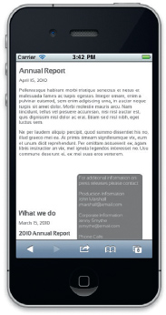
Figure P1.2 The ASIDE HTML5 element is fully supported in most smart phones.
The next page to create is the news page. The news page uses two elements that help provide additional information about both content and structure content on the screen. Figure P1.2 shows you what the page looks like.
Let’s start by adding the sidebar shown on the screen. Open the template.html file and save it at news.html.
The sidebar is created using the ASIDE element. As with other blocking elements, the goal of the ASIDE is to help you structure your content. In this example, you go one step further and format the position and presentation of the aside using CSS.
The following HTML code creates the ASIDE:
<aside id=“aside” style=“position: absolute; left: 740px; top: 200px; width: 150px; height: 190px; z-index: 6; background-color: #808080; color: #FFFFFF;-moz-border-radius: 10px;-webkit-border-radius: 10px;padding: 5px;”>
</aside>
The Style attribute defines the position, background color, and border radius so you can see ASIDE on the page. Place the ASIDE element within the SECTION element. The following HTML can be added within the ASIDE element tags. This is the content for the ASIDE:
For additional information on press releases please contact:<br /><br />
Production Information<br />
John Marshall<br />
<a href=“mailto:[email protected]”>[email protected]</a><br /><br />
Corporate Information<br />
Jenny Smythe<br />
<a href=“mailto:[email protected]”>[email protected]</a><br /><br />
Phone Calls:<br />
(920) 555-1212<br />
Both ARTICLE elements contain information that is newsworthy. A date for each news article specifies the publication date. Using the TIME element you can highlight the time content for each article on the page.
Following is the title and date for the first article:
<h1>The news is hot!</h1>
<p><time>April 1, 2010</time></p>
In this instance, the TIME element captures the information between the two tags and identifies it as a date. The second news headline uses the Datetime attribute to be more specific with the date:
<h1>What we do</h1>
<p><time datetime=“2010-03-15T10:32:17”>March 15, 2010</time></p>
Here the text between the TIME elements states March 15, 2010. The Datetime attribute allows additional information to be added. In this case, the Datetime attribute adds a time stamp to the date, explaining that the article was published as 10:32 AM and 17 seconds.
Creating a Contact Us Page That Uses the New Form Input Attributes
Earlier in this chapter you built a search engine form that sends requests to Google. The Contact Us form (Figure P1.3) builds on the fundamentals introduced with the Google Search form and introduces you to more complex ways in which you can display data.
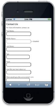
Figure P1.3 Forms work correctly on any modern mobile device.
The form automatically places the focus of the cursor into the First Name field (this field is required). The Middle Name field has been disabled, preventing a user from entering data into it. The Age field is a numeric scroll that allows you to choose an age from 18 to 100. The Email field has a visual cue to tell you that you must enter a valid e-mail address. The How Did You Hear about Us? field is a drop-down that allows you to choose from several options. The When Would You Like Us to Contact You? field is a selectable date tool. The final field, How Many of Our Products Do You Own?, is a slider, allowing you to choose from 0 to 10.
The new attributes for the INPUT element enable you to accomplish complex design without having to develop complex scripting solutions or leverage nonstandard technologies such as Adobe Flash or Microsoft Silverlight.
What has not changed in HTML5 forms is the way you send data using CGI or Server Side technologies such as PHP, ASPNET, ColdFusion, or JSP. You can use any CGI solution to transmit data captured in a web form. HTML5 only gives you more options to capture the data—once you have the data, it is still data.
To create the Contact Us form you will need to take a copy of the template.html file and save it as contactus.html. Open the contactus.html file in your favorite text editor. The form will be added to the main SECTION block of the page.
The first elements to add are the opening and closing FORM elements.
<h1>Contact Us</h1>
<p>For more information, contact us:</p>
<form method=“POST” action=“http://fp1.formmail.com/cgi-bin/fm192”>
</form>
In this code you have a title and brief sentence introducing the form. The FORM element uses the POST method to submit the contents of the form. In this example I am using the free FormMail service to submit the contents of the form. You can use this for your forms, too. The action=http://fp1.formmail.com/cgi-bin/fm192 submits the data from the form to a free CGI Perl script.
INPUT form elements are placed in-between the opening and closing FORM element. The following three INPUT elements are hidden. The role of these elements is to pass data to the CGI Perl script, letting it know that the form is valid and where to send the results when someone has completed the form.
<input type=“hidden” name=“_pid” value=“119137”>
<input type=“hidden” name=“_fid” value=“FNNZXGED”>
<input type=“hidden” name=“recipient” value=“[email protected]”>
Here you can swap the recipient e-mail with your own.
The visual elements of the form use the LABEL and INPUT elements to present themselves on the page. The LABEL element identifies the text as a label and is typically used with forms. As with the TIME, MARK, and METER elements, the LABEL element is a new blocking HTML5 feature. Each form INPUT element has a preceding LABEL describing the element. The LABEL element does not have any additional attributes. The following is the LABEL for the first field in the form:
<label>First Name: </label><br />
A BR element is used to force a single line break after the LABEL element.
The following HTML code allows you to force the cursor to start in this field by adding the Autofocus attribute. The Required attribute also prevents the form from being submitted until a value has been entered into the First Name field.
<label>First Name: </label><br /><input name= “FirstName” type=“text” autofocus required> <br /><br />
The Middle Name INPUT field has been visually disabled. You can use the disable feature to lock and unlock fields dynamically using JavaScript.
<label>Middle Name: </label><br /><input name=“MiddleName” type=“text” disabled>
The Last Name field is also a required field using the Required attribute.
<label>Last Name: </label><br /><input name=“LastName” type=“text” maxlength=“25” required> <br /><br />
The Age field is a numeric stepper tool that allows you to scroll through a specific range of numbers. In this case, you can choose a number from 18 to 100.
The visual effect of the numeric stepper is created through setting the attribute settings of type, min, and max. Here is the HTML code for the Age field:
<label>Age: </label><br /><input name=“age” type=“number” min=“18” max=“100”><br /><br />
The Type attribute identifies the INPUT element as a numeric stepper. Placing a min and max value forces the element to be restricted between those two numbers.
The Email field uses the INPUT type attribute Email to force the visual e-mail icon to appear at the beginning of the field.
The code to add these Email and Required visual cues is:
<label>Email: </label><br /><input name=“email” type=“email” required><br /><br />
As you can see, all you need to do is identify the INPUT as a type=email and insert the Required attribute.
The most complex INPUT element allows you to choose from three items in a drop-down. The drop-down is accomplished by creating a datalist and linking it to an INPUT element. The following creates the list. The key attribute is the ID in the first line. The ID in the datalist can be linked to other elements on the page.
<datalist id=“mylist”>
<option label=“google” value=“http://google.com”>
<option label=“yahoo” value=“http://yahoo.com”>
<option label=“Bing” value=“http://bing.com”>
</datalist>
An INPUT element can now be linked to the datalist using the following code:
<label>How did you hear about us?: </label><br /><input name=“HowDidYouHear” type=“uri” list=“mylist”><br /><br />
The INPUT element uses the List attribute to link the ID of the datalist. The datalist values are now injected into the INPUT element.
Frequently you will see a tool used on web pages that enables you to select a date. With HTML5 you can add a date picker simply by identifying the INPUT element as the type “date.” The following code is all you need to add:
<label>When would you like us to contact you?: </label><br /> <input name=“ContactDate” type=“date”><br /><br />
Changing the Type attribute to “date” adds a sophisticated date picker.
Before selecting the Submit button, you can answer the last question in the form by sliding a scrub head to choose a number from 0 to 10. The value you select appears as a number to the right of the slider.
Using the slider and displaying the value you select uses both a new Type attribute in the INPUT field and the new OUTPUT field. The slider uses the new Range type attribute. As with the Number type attribute, the Range attribute also supports minimum (min) and maximum (max) values. You can also force the slider to start at a specific number using the Value attribute. The following code defines the INPUT as a Range with the min set at 0, the max set at 10, and the Value set at 5, positioning the slider in the center.
<label>How many of our products do you own?: </label><br /> <input id=“slider” name=“sliderValue” type=“range” min=“1” max=“10” value=“5”> </input>
You will also see in this code that the ID of the INPUT element is “sliderValue.” The OUTPUT element can link to the ID and post the value onto the web page. The following code shows you how to do this.
<output name=“NumberOfProducts” value=“5” onforminput= “value=sliderValue.value” >5</output><br /><br />
The final element to add to the FORM is the BUTTON element. Here is the code:
<button type=submit>Submit</button>
As you can see, nothing special is applied to the BUTTON element. Sorry, just plain old-fashioned HTML here, folks.
Summary
The project covered in this chapter illustrates how you can successfully use the HTML5 blocking elements to more effectively manage your HTML code within your mobile projects. Without having to resort to complex and confusing HTML TABLES or DIV elements, the new HEADER, SECTION, ARTICLE, ASIDE, NAVIGATION, and FOOTER elements logically places content on the screen.
The new form attributes allow you to add a slew of new visual tools to capture data. The new INPUT types are both sophisticated and simple to insert. You no longer need to work with complex Ajax libraries to add a date picker. All you need to do is modify an INPUT type.
The role of these new elements is to enable you to more easily control the content as it is presented in HTML. How that data is presented is controlled using CSS.