
DEVELOPING WEBSITES WITH jQUERY MOBILE
One of the most popular frameworks used to build out complex web pages is jQuery, an Open Source solution managed by community volunteers. This article is going to take a deep dive in jQuery for mobile development. You will use the specialized jQuery Mobile framework and jQuery itself to add complexity and riches to your pages.
Progressive Enhancement
You probably have one in your pocket, or you may be talking to it, or you may be playing games on it—it’s a smart phone. The category of smart phone seems to be quite broad—is it an Android phone, Apple iOS device, WebOS, or something else?
It is a royal pain in the neck to develop websites optimized for a mobile device when there are literally so many different types out there. To give you a taste, here is a list of just some mobile devices:
• Apple iPhone/iPod Touch
• Google Android
• RIM BlackBerry/PlayBook OS
• Nokia Symbian (retired, but still with over 1 billion users worldwide)
• HP/Palm WebOS
• Microsoft Windows Phone Series
This list covers just the names of the operating systems and does not even start to break down the different browser versions.
The challenge you have with such a vast number of different systems is fragmented support for standards. For instance, Apple’s latest iPhone has amazing support for HTML5, whereas Symbian and the Microsoft Windows Phone Series have little to none. To battle this, jQuery employs a philosophy called progressive enhancement. Figure 2.1 is an image showing jQuery running on four different mobile operating systems.
At its roots, progressive enhancement means this: If you have the latest web browser then you will get all the bells and whistles; if you have an older browser then the page will still render and you will still have access to the content.
The goal is to allow you as a developer and designer to add complex features such as 3D page transitions found in iOS, but still have the page load and function on devices that are several years old.
The bottom line is that progressive enhancement is a model that allows your content to work at any level of browser (desktop, mobile, tablet, or TV).

Figure 2.1 Each of these devices run jQuery Mobile—all are different operating systems and web browsers.
When you work in jQuery you tend to forget some of the obvious questions such as: What is jQuery? The focus of this section is to explain what jQuery is and, when your boss asks, why it’s important to your work.
jQuery was released in January 2006 by John Resig as an Open Source JavaScript library to make it easier to add complex interactivity to your web applications using JavaScript, but with the promise of working across all popular web browsers. This is no mean feat, since jQuery has to support many different variations of browsers (IE6–9, Firefox 1–4, Safari, Chrome, Opera, to name just a handful). Figure 2.2 shows jQuery’s website.
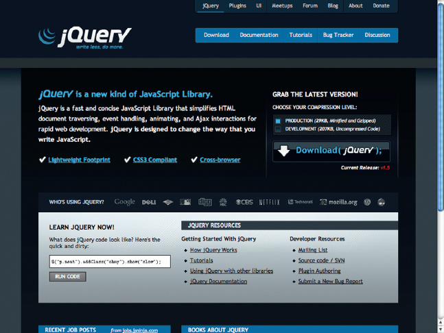
Figure 2.2 You can download jQuery at www.jquery.com.
For the most part, jQuery has stuck true to its roots and has garnered a huge following of developers. It is estimated that more than 3000 of the top 10,000 popular sites use jQuery, making it the most popular JavaScript library being used. Part of the reason jQuery is so popular is due to how easy it is to add to your web pages. You can be up and running in jQuery by adding one single line of code in your web page:
<script type=“text/javascript” src=“ http://ajax.googleapis.com/ajax/libs/jquery/1.5/jquery.min.js”> </script>
This path points directly to the Google-hosted version of jQuery. Figure 2.3 shows jQuery located inside of the HTML of a web page.
Amazingly, this whole JavaScript library is only 24 Kb when you use the compressed “min” version. So, what do you get for this? Let me point you to the jQuery API for the details (http://api.jquery.com/), but I will give you a summary here (see also Figure 2.4):
• Ajax call tools (for real asynchronous control of your XML)
• CSS control through the DOM
• Data control
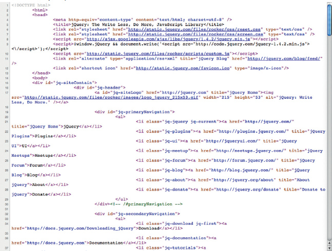
Figure 2.3 You need only one line to reference jQuery.
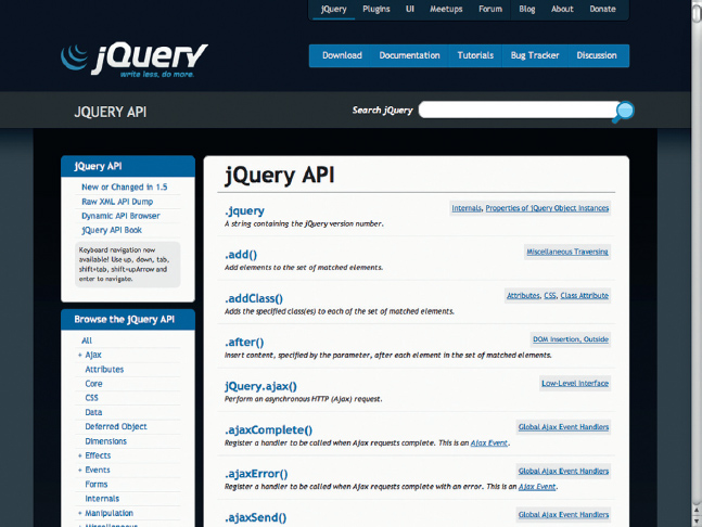
Figure 2.4 The jQuery Api.
• Visual effects
• Consistent event actions
• DOM manipulation
• Properties
• Selectors
• Utilities
In other words, you get a lot in a very small package.
John Resig has a great tutorial called “How jQuery Works” (http://docs.jquery.com/How_jQuery_Works) that you can read on the jQuery website.
Here is an example of writing your own JavaScript with the jQuery library. I am using John’s example here (thanks, John, if you are reading):
$(document).ready(function(){
$(“a”).click(function(event){
alert(“jQuery ROCKS!”);
});
});
So, what’s going on here? The first declaration is the $ sign. What the heck is up with the $ sign? Well, the $ sign is a keyword function that references the main jQuery Object in the JS library. So, instead of writing out jQuery (“a”).click(function(event)) you can use the $. Believe you me, this will save your tired digits a lot of time from tapping on the keyboard.
The first parenthesis is (document).ready, which is an event in jQuery that checks that all of the web page and images have downloaded before the code executes.
The second line adds a function to any “A”, ANCHOR element you may have on your web page. When the ANCHOR is selected an alert pops up (see line 3).
To test this out, add the following HTML to the body of your code:
<a href=“http://www.focalpress.com”>Click me</a>
Test the effect in any web browser and the alert will work the same.
You might be thinking, “you told me that jQuery would reduce the amount of JavaScript that I am writing, but you have me writing code! What gives?” You are writing code, but jQuery allows you to write much less code.
There is also another way to get jQuery to do more for you: it’s called plug-ins.
A plug-in references the main jQuery library in a second JS file to give you additional functionality such as adding form validation, a chart tool, or a sortable table. A current list of plug-ins is available at http://plugins.jquery.com/, as shown in Figure 2.5. Currently, there are over 1000 plug-ins for jQuery.
You will see that there are two groups of plug-ins: core plug-ins and community plug-ins. The core plug-ins are extensions to jQuery that are considered part of the core project. The most popular core plug-in is jQuery UI, a user interface plug-in that includes several cool tools such as tabs, accordion, and drag-n-drop; Microsoft has recently contributed Templates, Data Link, and Globalization as additional core plug-ins.
Finally, jQuery gives you an easy way to structure your code. It is clean, organized, and optimized. In fact, it fits in perfectly with any MVC project you are developing (MVC stands for Model View Controller, a pattern for keeping the domain logic and user interface elements separated) with ASP.NET, PHP, or the many languages that support MVC.
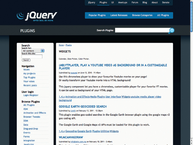
Figure 2.5 The jQuery plug-ins library.
Going beyond the Core of jQuery
At one time, when you said jQuery it was clear you were referring to the core JavaScript library. Today? Not so much. As the web and access to the web is changing, so is jQuery. Today there several pieces that makes the jQuery toolset. They are:
• jQuery Core (www.jquery.com)
• jQuery UI (www.jqueryui.com)
• jQuery Mobile (www.jquerymobile.com)
• jQuery Plug-ins (plugins.jquery.com)
At the center of your jQuery world is the core library, a 26 Kb minified Gzip slice of goodness. The core library has matured dramatically over the last five or so years to meet the jQuery Groups’ goals of “write less, do more” mantra. Meeting this goal requires a dedicated core team with a focus on quality.
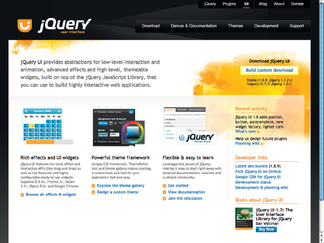
Figure 2.6 The jQuery UI website.
All the other parts of jQuery can be considered plug-ins, building out from the core library. With that said, some plug-ins are so huge that they do deserve their own section. A great example of a set of plug-ins that is now part of the top-tier is jQuery UI, as shown in Figure 2.6. The jQuery user interface library allows you to easily add to your site controls such as sliders, accordions, and datapickers. In addition, jQuery UI enables you to apply a consistent set of styles to your site using ThemeRoller, a web-based CSS style engine.
The last two years have seen an explosion of mobile tools. To meet this demand comes the newest part of the jQuery family: jQuery Mobile, as shown in Figure 2.7. The goal of jQuery Mobile is to make it easier to build consistent mobile websites for a growing group of devices. This is not an easy goal when you consider how different iPhones, iPads, BlackBerry PlayBooks, and Android phones can all present the web. Expect jQuery Mobile to iterate and grow dramatically over the next year.
The final piece that makes up the jQuery framework is the extensible plug-in architecture built into jQuery that allows for hundreds of developers to extend the Core UI with specialized plug-ins. There are some plug-ins, such as Microsoft’s Templates plug-in, that are becoming top-tier plug-ins along with jQuery UI and jQuery Mobile libraries. Other plug-ins have a narrow focus to meet a specific need such as the following:
Figure 2.7 The jQuery mobile site.
• jQTouch: The mother of mobile environments. You have to check out this open source solution for any mobile website you need to develop (www.jqtouch.com/), as shown in Figure 2.8.
• Hi-res images for retina displays: Apple made a big splash about the “retina display” for the iPhone 4 supporting a massive 300+ ppi resolution images, but other phones running Android have been doing this for a while. This means you will want to switch out the dusty low-res images we use for computers (c’mon, people, who wants to see a 96 ppi image, it’s like watching regular TV after you have had HD!) for hi-res alternatives. Check out Troy Mcilvena’s jQuery Retina Display plug-in (http://troymcilvena.com/post/998277515/jquery-retina). All your images will swap out low-res with hi-res. Sweet!
• jQuery iPhone plug-in: This project has not been updated for a while, but it might give you some extras (http://plugins.jquery.com/project/iphone).
• jQuery itself is going mobile: The new goal for jQuery is to run on all sorts of devices, not just desktops. Check out http://jquerymobile.com/ for more details.

Figure 2.8 jQTouch website.
There are other plug-ins you can use, but these are a collection I have used that I have really liked. Some I have used a lot (such as jQTouch) and some are brand new.
Developing Websites Using jQuery Mobile
Developing mobile websites is no longer a wish list item for the web design team: it’s a reality. The adoption of mobile devices is growing at a rapid pace. Within the next two years you may well see more people coming to your website on a phone or tablet instead of using a traditional computer.
Over the last 18 months a small collection of frameworks that specifically target mobile devices have sprung up, the most recent being jQuery Mobile. You can find out more information on jQuery Mobile at its website: http://jquerymobile.com/.
There are two paths you can take in developing a mobile framework: create a standalone framework that targets mobile browsers or build on top of an existing framework. The folks over at jQuery decided to do both. The current release of jQuery Mobile extends the Core jQuery framework with some specific mobile features and augments the core with a second library, jQuery Mobile. In essence, jQuery Mobile is a super plug-in for jQuery Core (much in the same way that jQuery UI and Templates are big plug-ins for jQuery Core).
In this section you are going to learn how you can implement jQuery Mobile into your websites.
The goal of jQuery Mobile is to allow the framework to run on as many mobile devices as possible. In the United States the primary focus is on iOS and Android smart phones. However, outside of the United States, other carriers, such as Nokia, are dominant. To this end, jQuery Mobile will work on a broad set of devices. At the launch of jQuery Mobile, in September 2010, John Resig, the author of jQuery, revealed a chart that listed the most popular mobile operating systems (http://jquerymobile.com/gbs/), as shown in Figure 2.9.
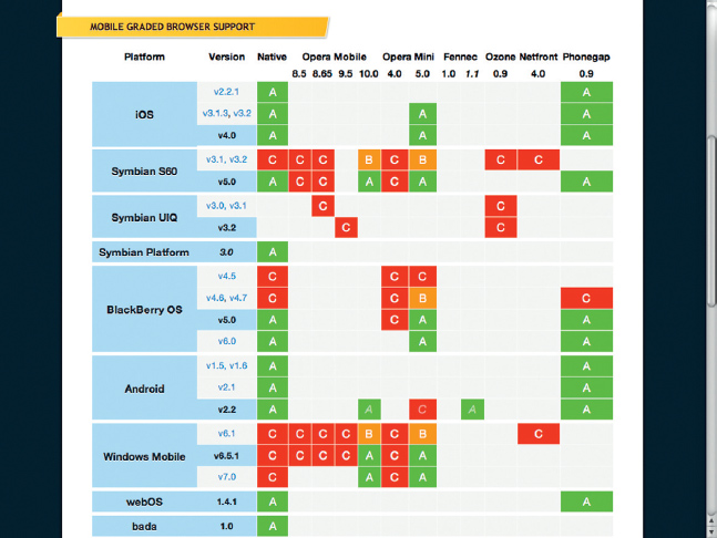
Figure 2.9 Grade for mobile browsers.
For each system he assigned an A, B, or C, the letters determining if the importance of supporting the OS was high (A), medium (B), or low (C). The following are determined to be of high importance (A) for support within jQuery Mobile:
• iOS (for iPhones, iPod Touch, and iPads)
• Symbian S60
• Symbian Platform
• BlackBerry OS 5 and 6
• Android
• WebOS
• bada
• MeeGo
Devices at the bottom of the scale include the following:
• Windows Mobile
• Maemo
As an indication of how rapidly the mobile world is changing, this whole matrix will likely now be redrawn due to one radical change: Nokia is killing the Symbian platform and replacing it with Windows Mobile Phone 7. In one move, Windows Mobile Phone 7 has gone from being irrelevant to immediately relevant. In addition, Nokia is also dropping MeeGo, and bada remains relevant only to Samsung phones (Note: Samsung is moving aggressively to adopt Android globally, replacing its own aging bada operating system). The new A-list should now read:
• iOS
• BlackBerry 6
• Android
• WebOS
• Windows Mobile
At the time of this writing, the latest version of jQuery Mobile is the third Alpha release. By the time you are reading this, however, jQuery Mobile will have certainly hit 1.0.
If you want to get ahead of the game and see what is coming to the future of jQuery Mobile, check out the Experiments section of the source code in GitHub. The location is https://github.com/jquery/jquery-mobile. You will see some very interesting technologies that include support for tablets as well as smart phones. It is clear that the goal for jQuery Mobile is to include new devices and screens as they reach the market.
Getting Started with jQuery Mobile
The first step in starting to use jQuery Mobile is to set up a web page. Inside of the HEAD element you will want to reference the jQuery Mobile CSS and JS files:
<link rel=“stylesheet” href=“ http://code.jquery.com/mobile/1.0a3/jquery.mobile-1.0a3.min.css” />
<script src=“ http://code.jquery.com/jquery-1.5.min.js”> </script>
<script src=“ http://code.jquery.com/mobile/1.0a3/jquery.mobile-1.0a3.min.js”> </script>
As you can see from the script source files, jQuery Mobile is extending the core jQuery library. For you resource watchers out there, the current minified file size for jQuery Mobile is 12 Kb.
The source references in the JavaScript above point to the live CDN (Content Delivery Network) versions hosted on the jQuery servers. The CSS link also contains all the graphic files you need.
If you want to download and host the files locally you will need to go to the following web address, also shown in Figure 2.10: http://code.jquery.com/mobile/1.0a3/jquery.mobile-1.0a3.zip.
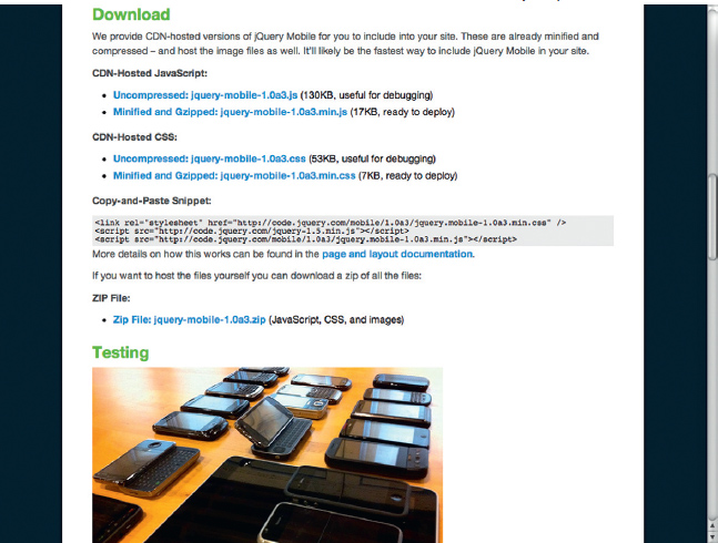
Figure 2.10 Where to get jQuery Mobile.
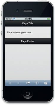
Figure 2.11 The basic boilerplate demo of jQuery Mobile running on an iPhone.
Download and expand the ZIP file. Within the file you will find compressed and uncompressed versions of the CSS and JavaScript files along with a subfolder containing 10 images used by the CSS document.
There are three basic areas of content on your web page that you will need to use when building your first jQuery Mobile site. The following is a boilerplate template jQuery provides, shown on an iPhone in Figure 2.11:
<!DOCTYPE html>
<html>
<head>
<title>Page Title</title>
<link rel=“stylesheet” href=“ http://code.jquery.com/mobile/1.0a3/jquery.mobile-1.0a3.min.css” />
<script src=“ http://code.jquery.com/jquery-1.5.min.js”> </script>
<script src=“ http://code.jquery.com/mobile/1.0a3/jquery.mobile-1.0a3.min.js”> </script>
</head>
<body>
<div data-role=“page”>
<div data-role=“header”>
<h1>Page Title</h1>
</div><!-- /header -->
<div data-role=“content”>
<p>Page content goes here.</p>
</div><!-- /content -->
<div data-role=“footer”>
<h4>Page Footer</h4>
</div><!-- /header -->
</div><!-- /page -->
</body>
</html>
There are a couple of things worth pointing out in this template. The first is the use of the DIV element. With HTML5 so prevalent in mobile devices why not use the newer HEADER, ARTICLE, SECTION, or FOOTER elements? The reason is progressive enhancement. Older smart phones do not understand the new HTML5 elements. Indeed, the new Windows Phone 7 mobile browser does not support HTML5. The DIV tag is, however, universally supported.
You can save the web page and test it in your web browser. The code is HTML and will work on your desktop. I recommend using Chrome to run your local testing when you want to validate that the HTML/JS works correctly. For real quality testing you will need to run your mobile web pages on different mobile devices.
Creating Pages in Your Mobile Site Using Links
A difference between normal web pages and mobile web pages is the amount of content you can place on the screen. Yes, you can load The New York Times website onto your iPhone, but you need to pinch and zoom to read the content. A better solution is to reduce the clutter of the page down to the content you want to present.
A traditional website would have you create many different web pages with a small amount of content on each one. But, we are using jQuery here, so we can tackle the problem of micro-content more efficiently.
In the previous section you saw how you can create a boilerplate page for jQuery Mobile. Let’s take this a step further and create “pages” of content. A page can be structured as a DIV block in jQuery Mobile. Remove the content inside of the BODY elements using the previous boilerplate template (page 14). You are going to add a menu that links to four different pages. The first page is a menu page with links:
<!-- Start of first page -->
<div data-role=“page” id=“menu”>
<div data-role=“header”>
<h1>Menu</h1>
</div><!-- /header -->
<div data-role=“content”>
<p>What vehicles do you like?</p>
<p><a href=“#one”>Cars</a></p>
<p><a href=“#two”>Trains</a></p>
<p><a href=“#three”>Planes</a></p>
</div><!-- /content -->
<div data-role=“footer”>
<h4>Page Footer</h4>
</div><!-- /header -->
</div><!-- /page -->
The important part of this block of HTML is the first DIV. Within the element are an ID and data-role properties:
data-role=“page” id=“menu”
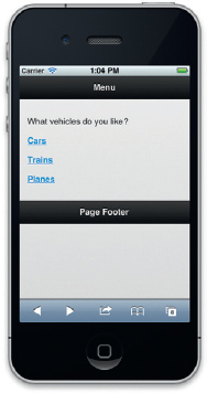
Figure 2.12 A simple jQuery Mobile web app.
The data-role defines the content within the DIV element as a “page.” This instructs jQuery Mobile to build a web page around the DIV elements. The ID allows you to link up to sections using HREF links.
The menu page is the first page and will then be presented first in the browser. You can add three additional “pages,” each with a different ID: Cars, Planes, Trains (see Figure 2.12).
<div data-role=“page” id=“one”>
<div data-role=“header”>
</div><!-- /header -->
<div data-role=“content”>
<p>Content about cars</p>
</div><!-- /content -->
<div data-role=“footer”>
<h4>Cars</h4>
</div><!-- /header -->
</div><!-- /page -->
Here is the start of the third page:
<div data-role=“page” id=“two”>
<div data-role=“header”>
<h1>Trains</h1>
</div><!-- /header -->
<div data-role=“content”>
<p>Content about trains</p>
</div><!-- /content -->
<div data-role=“footer”>
<h4>Trains</h4>
</div><!-- /header -->
</div><!-- /page -->
Here is the start of the fourth page:
<div data-role=“page” id=“three”>
<div data-role=“header”>
<h1>Planes</h1>
</div><!-- /header -->
<div data-role=“content”>
<p>Content about planes</p>
</div><!-- /content -->
<div data-role=“footer”>
<h4>Planes</h4>
</div><!-- /header -->
</div><!-- /page -->
Test the page on your Android or iOS device. When you load the web page you will see three things:
• The menu loads as its own page (you can try to scroll up and down but you will not see anything else).
• When you select a link, the page will transition with an animation sequence as it moves to the new section.
• When you move away from the menu page a back button automatically appears in the top header DIV section.
Each of these DIV elements will load inside the web browser and look like separate web pages. The movement between screens is fluid.
The recommendation of creating multiple pages of content on one screen allows you to eliminate the page load times that cause many mobile devices to appear slow. You can, however, link to external web pages. There is one caveat to this. Links in jQuery Mobile are treated as Ajax calls. To link outside the current page you are on will require that you clear the use of the # symbol by Ajax. This is done easily enough with the following example:
<a href=“ http://www.focalpress.com” rel=“external”>FocalPress.com</a>
You need to include the rel=“external” attribute and value. This allows you to link to a web page outside the local page links you have been using up to this point. But, jQuery Mobile goes one extra step. Instead of just treating an external link as a link outside your site, jQuery Mobile will apply the page transition animation. This gives you a unique one-up over other popular mobile frameworks. Instead of having all of your website content in one page, you can split up the content over several pages, allowing you to build larger solutions.
Working with Components
Of course, links and pages are just one part of mobile web design. A second challenge many mobile web developers face is the explosion of apps. Unlike web pages, apps for Android, iOS, and other systems are built with complex technologies such as Objective-C, Java, and C#. These technologies allow developers to easily add menu tools, unique lists, and other controls and components not found natively in HTML. Do you think this stops your development with jQuery Mobile? I would like to see it try.
jQuery Mobile is currently shipping with a selection of components. The following components are included in the current Alpha:
• Pages
• Dialogs
• Toolbars
• Buttons
• Content formatting
• Form elements
• List views
Adding and changing a component is not too hard. If you know a little HTML, then you are good to go. Let’s look at the page component as an example.
By default, the web page slides back and forth. There are, however, six current page transitions supported. They are:
• Slide
• Slideup
• Slidedown
• Pop
• Fade
• Flip
Adding a custom page transition is a simple modification of an ANCHOR element. For instance, to add 3D flip transition you would add the following data-transition property with a value of “flip”.
<a href=“ http://focalpress.com” datatransition=“flip”>focalpress.com</a>
The page transition will work with pages using a # or file link.
Adding Headers and Footers to the Page
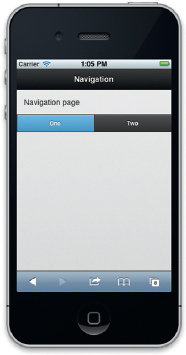
Figure 2.13 jQuery Mobile navigation buttons.
The previous boilerplate example (page 14) demonstrated how to easily add toolbars such as headers and footers into your page. Toolbars are often the hardest to control when creating content for different screens. The challenge comes in placing content that dynamically scales to different screen sizes. For example, a header toolbar can contain both the header and a button (such as back button). Using jQuery Mobile, the header toolbar will allow you to add a title that stays in the center with a button always staying to the left or right side of the page no matter how large the screen.
The following creates a header toolbar with two buttons on either side of the title.
<div data-role=“header” data-position=“inline”>
<a href=“cancel.html” data-icon=“delete”>Cancel</a>
<h1>Edit Contact</h1>
<a href=“save.html” data-icon=“check”>Save</a>
</div>
The position of the buttons is defined by the order of the content. The result is a Mobile web page with a centralized title and buttons on the left- and right-hand sides that look and work consistently across devices.
Headers and footers can also be customized into navigation tools. Interactive buttons can be added to a footer that will take you to sections of the screen. This is accomplished with a “navbar” data role. Following is the code for a navbar:
<div data-role=“navbar”>
<ul>
<li><a href=“#nav1” class=“ui-btn-active”>One</a></li>
<li><a href=“#nav2”>Two</a></li>
</ul>
</div>><!--/navbar-->
Again, as you can see with most of the jQuery Mobile code, the navbar is constructed of a simple HTML list wrapped in a DIV tag. Properties such as the ui-btn-active can be set to identify a button that should be selected, as shown in Figure 2.13.
When you select a button and go to a second screen within the same page, jQuery Mobile is smart enough to automatically add a back button to the header.
A back button is good for one interaction, but what happens when you need to offer two or more buttons to a user? In this instance, you need to use a Navbar to add navigation buttons.
For instance, the following HTML adds three screens in one HTML page. You have the main screen and two sample screens you can link to from the navbar. Add the code and see how the navigation automatically adds back buttons. The following code sets up the page:
<div data-role=“page”>
<div data-role=“header”>
<h1>Navigation</h1>
</div><!-- /header -->
<div data-role=“content”>
Navigation page
</div><!-- /content -->
<div data-role=“footer”>
The navbar is placed within the footer. In this example you are adding a navbar with two buttons that reference content within this page:
<div data-role=“navbar”>
<ul>
<li><a href=“#nav1” class=“ui-btn-active”>One</a></li>
<li><a href=“#nav2”>Two</a></li>
</ul>
</div><!-- /navbar -->
</div><!-- /footer -->
</div><!-- /page -->
The following is the page the left hand button references in the navbar:
<div data-role=“page” id=“nav1”>
<div data-role=“header”>
<h1>Nav Screen 1</h1>
</div><!-- /header -->
<div data-role=“content”>
Screen for Navigation One </div><!-- /content -->
<div data-role=“footer”>
<h4>Additional Footer information</h4>
</div><!-- /header -->
</div><!-- /page -->
The following is the page the right-hand button references in the navbar:
<div data-role=“page” id=“nav2”>
<div data-role=“header”>
<h1>Nav Screen 2</h1>
</div><!-- /header -->
<div data-role=“content”>
Screen for Navigation Two
</div><!-- /content -->
<div data-role=“footer”>
<h4>Additional Footer information</h4>
</div><!-- /header -->
</div><!-- /page -->
Remember to add the SCRIPT and CSS references for jQuery Mobile. Test and run the code on your device.
Making Footers and Headers Persistent
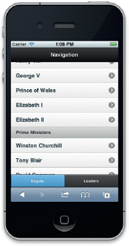
Figure 2.14 The header and footer bars are fixed on the screen.
A common user interface design technique is to keep the header and footer at the top and bottom of the screen. You can use jQuery Mobile to accomplish this by simply adding dataposition=“fixed” to the header or footer. This will force the header to be flush with the top and the footer to be flush with the bottom. Here is an example (illustrated in Figure 2.14):
<div data-role=“page”>
<div data-role=“header” data-position=“fixed”>
<h1>Navigation</h1>
</div><!-- /header -->
<div data-role=“content”>
Here is a list view to add additional data to the screen:
<ul data-role=“listview” data-dividertheme=“d” style=“margin-top: 0;”>
<li data-role=“list-divider”>Royal Family</li>
<li><a href=“#nav1”>Henry VIII</a></li>
<li><a href=“#nav1”>George V</a></li>
<li><a href=“#nav1”>Prince of Wales</a></li>
<li><a href=“#nav1”>Elizabeth I</a></li>
<li><a href=“#nav1”>Elizabeth II</a></li>
<li data-role=“list-divider”>Prime Ministers</li>
<li><a href=“#nav2”>Winston Churchill</a></li>
<li><a href=“#nav2”>Tony Blair</a></li>
<li><a href=“#nav2”>David Cameron</a></li>
</ul> </div><!-- /content -->
Following is a footer section. Notice that the “fixed” attribute has been added. You will observe that as you select the screen to scroll, the fixed footer will fade out, giving you more space to flick your finger.
<div data-role=“footer” data-position=“fixed”>
<div data-role=“navbar”>
<ul>
<li><a href=“#nav1” class=“ui-btn-active”>Royals</a></li>
<li><a href=“#nav2”>Leaders</a></li>
</ul>
</div><!--/footer -->
</div><!--/page -->
<div data-role=“page” id=“nav1” data-position=“fixed”>
<div data-role=“header”>
<h1>Royal Family</h1>
</div><!--/header -->
<div data-role=“content”>
<p>Members and relatives of the British Royal Family historically represented the monarch in various places throughout the British Empire, sometimes for extended periods as viceroys, or for specific ceremonies or events. Today, they often perform ceremonial and social duties throughout the United Kingdom and abroad on behalf of the UK, but, aside from the monarch, have no constitutional role in the affairs of government. This is the same for the other realms of the Commonwealth though the family there acts on behalf of, is funded by, and represents the sovereign of that particular state, and not the United Kingdom.</P>
</div><!-- /content -->
A footer does not need to be used with just lists. Here the footer is fixed on standard HTML:
<div data-role=“footer” data-position=“fixed”>
<h4>Royal Family</h4>
</div><!--/header -->
</div><!--/page -->
Notice that we also have a fixed header in this sample. Unlike the footer, which disappears, the header stays with the content as you scroll.
<div data-role=“page” id=“nav2” data-position=“fixed”>
<div data-role=“header”>
<h1>Prime Ministers</h1>
</div><!--/header -->
<div data-role=“content”>
The Prime Minister of the United Kingdom of Great Britain and Northern Ireland is the Head of Her Majesty’s Government in the United Kingdom. The Prime Minister and Cabinet (consisting of all the most senior ministers, who are government department heads) are collectively accountable for their policies and actions to the Sovereign, to Parliament, to their political party and ultimately to the electorate. The current Prime Minister, David Cameron, was appointed on 11 May 2010.</div><!--/content -->
<div data-role=“footer” data-position=“fixed”>
<h4>Prime Minister</h4>
</div><!--/header -->
</div><!--/page -->
Now, without using custom Objective-C you can add fixed headers and footers to your pages.
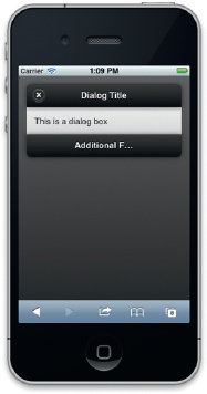
Figure 2.15 The jQuery Mobile dialog box.
The Page component also allows you to add custom CSS pop-up dialog boxes using the data-rel property. For instance, the following will load a web page into a pop-up dialog box:
<a href=“dialog.html” data-rel=“dialog”>Open dialog</a>
Using this method allows you to load any custom message into your dialog box, as shown in Figure 2.15. You do need two sections to a dialog when posting a dialog in the same page. The first section displays a link to the dialog, as shown here:
<div data-role=“page”>
<div data-role=“header”>
<h1>Dialog Box</h1>
</div><!-- /header -->
<div data-role=“content”>
<a href=“#dialogPopUp” data-rel=“dialog” data-role=“button”>Open dialog</a>
</div><!-- /content -->
<div data-role=“footer”>
<h4>Page Footer</h4>
</div><!-- /header -->
</div><!-- /page -->
You can see in the HREF for the Open Dialog button that there is a link to a local section. The following is a markup that will appear in the dialog box:
<div data-role=“page” id=“dialogPopUp”>
<div data-role=“header”>
<h1>Dialog Title</h1>
</div><!-- /header -->
<div data-role=“content”>
This is a dialog box
</div><!-- /content -->
<div data-role=“footer”>
<h4>Additional Footer information</h4>
</div><!-- /header -->
</div><!-- /page -->
The inclusion of the footer is optional, but you must include the header. Without the header, the automatic inclusion of a close button will not appear.
Working with Lists
There is a lot of data on the web. Lists are effective tools you can use to manage large amounts of data. We have already used lists in a couple of the earlier examples, but now let’s get down and dirty with them.
At their core, lists are just, well… lists. One of the oldest HTML elements is the LIST element (you can see it in web pages that go back to the early 1990s). Here is a simple list using standard HTML, illustrated in Figure 2.16:
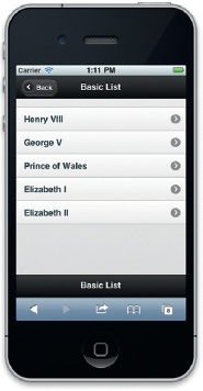
Figure 2.16 A basic list.
<ul>
<li><a href=“#nav1”>Henry VIII</a></li>
<li><a href=“#nav1”>George V</a></li>
<li><a href=“#nav1”>Prince of Wales</a></li>
<li><a href=“#nav1”>Elizabeth I</a></li>
<li><a href=“#nav1”>Elizabeth II</a></li>
</ul>
In jQuery Mobile you can convert this simple list into a gorgeous, APP-like list by adding one set of attributes to the open UL tag. The data-role attribute will tell jQuery Mobile to redraw the list to look like and perform as if it were a native app, as follows:
<ul data-role=“listview” style=“margin-top: 0;”>
<li><a href=“#nav1”>Henry VIII</a></li>
<li><a href=“#nav1”>George V</a></li>
<li><a href=“#nav1”>Prince of Wales</a></li>
<li><a href=“#nav1”>Elizabeth I</a></li>
<li><a href=“#nav1”>Elizabeth II</a></li>
</ul>
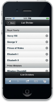
Figure 2.17 List with dividers.
That’s it, just 20 characters and you have a formatted list. This is code you can tweet!
Outside of the basic list, jQuery gives you the option to extend the core list. For instance, the following will add dividers to the lists:
<ul data-role=“listview” data-dividertheme=“d” style=“margin-top: 0;”>
<li data-role=“list-divider”>Royal Family</li>
<li><a href=“#home”>Henry VIII</a></li>
<li><a href=“#home”>George V</a></li>
<li><a href=“#home”>Prince of Wales</a></li>
<li><a href=“#home”>Elizabeth I</a></li>
<li><a href=“#home”>Elizabeth II</a></li>
<li data-role=“list-divider”>Prime Ministers</li>
<li><a href=“#home”>Winston Churchill</a></li>
<li><a href=“#home”>Tony Blair</a></li>
<li><a href=“#home”>David Cameron</a></li>
</ul>
Dividers are added by including the attribute data-dividertheme=“d” in the opening UL tag and including a special list item where you want your divider to appear (<li data-role=“listdivider”>Royal Family</li>), as illustrated in Figure 2.17.
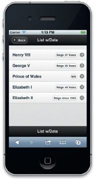
Figure 2.18 List with data in right-hand side bubbles.
Data bubbles can also be added to each list item, as shown in Figure 2.18. In the following example the reign of each member of the British Royal Family is added to a bubble immediately to the right of each item.
<ul data-role=“listview” style=“margin-top: 0;”>
<li><a href=“#nav1”>Henry VIII <span class=“ui-li-count”>Reign 37 Years</span></a></li>
<li><a href=“#nav1”>George V <span class=“ui-li-count”>Reign 25 Years</span></a></li>
<li><a href=“#nav1”>Prince of Wales <span class=“ui-li-count”>N/A</span></a></li>
<li><a href=“#nav1”>Elizabeth I <span class=“ui-li-count”>Reign 44 Years</span></a></li>
<li><a href=“#nav1”>Elizabeth II<span class=“ui-li-count”>Reign since 1952</span></a></li>
</ul>
The fourth type of list is a complex list where you can add links, images, and text within an LI element; for example:
<ul data-role=“listview” style=“margin-top: 0;”>
<li>
<h3><a href=“index.html”>Henry VIII</a></h3>
<p>Reign 37 Years</p>
<a href=“#home”>Details</a>
</li>
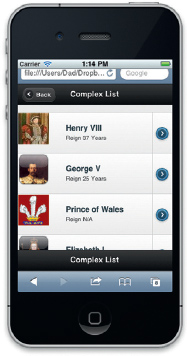
Figure 2.19 List with images.
In this example you can see that HTML code is placed between each LI element. The first piece is an image. To keep your layout consistent, make sure you use the same size image. Each of the following LI items have an image that is 64×64 pixels in PNG format, as shown in Figure 2.19.
The second item is a title with an HREF link. Following the title is a section where you can add a paragraph text.
The final element is an HREF link with the word “details”. When you preview this page you will not see the word “details” because it will be replaced with a custom arrow icon.
<li>
<img src=“http://www.iwise.com/authorIcons/15/King_George%20V_64×64.png” />
<h3><a href=“index.html”>George V</a></h3>
<p>Reign 25 Years</p>
<a href=“#home”>Details</a>
</li>
<li>
<h3><a href=“index.html”>Prince of Wales</a></h3>
<a href=“#home”>Details</a>
</li>
<li>
<img src=“http://www.iwise.com/authorIcons/13846/Elizabeth%20I%20of%20England_64×64.png” />
<h3><a href=“index.html”>Elizabeth I</a></h3>
<p>Reign 44 Years</p>
<a href=“#home”>Details</a>
</li>
<li>
<img src=“http://www.iwise.com/authorIcons/9098/Elizabeth%20II_64×64.png” />
<h3><a href=“index.html”>Elizabeth II</a></h3>
<p>Reign Since 1952</p>
<a href=“#home”>Details</a>
</li>
</ul>
This is a complex looking list, but not really too complex to write. The result is that you give your audience a list with a lot of data.
Adding Custom Icons to Buttons, Lists, and Navigation
There are many different types of data-icons you can add. They include:
• Left arrow: data-icon=“arrow-l”
• Right arrow: data-icon=“arrow-r”
• Up arrow: data-icon=“arrow-u”
• Down arrow: data-icon=“arrow-d”
• Delete: data-icon=“delete”
• Plus: data-icon=“plus”
• Minus: data-icon=“minus”
• Check: data-icon=“check”
• Gear: data-icon=“gear”
• Refresh: data-icon=“refresh”
• Forward: data-icon=“forward”
• Back: data-icon=“back”
• Grid: data-icon=“grid”
• Star: data-icon=“star”
• Alert: data-icon=“alert”
• Info: data-icon=“info”
• Home: data-icon=“home”
• Search: data-icon=“search”
The following navigation bar shows how you can add custom buttons using the data-icon reference:
<div data-role=“footer”>
<div data-role=“navbar”>
<ul>
<li><a href=“#” data-icon=“grid” data-iconpos=“top”> Summary</a></li>
<li><a href=“#” data-icon=“star” class=“ui-btn-active” data-iconpos=“top”>Favs</a></li>
<li><a href=“#” data-icon=“gear” data-iconpos=“top”>Setup</a></li>
</ul>
</div><!--/navbar -->
</div><!--/footer -->
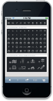
Figure 2.20 You can add custom icons such as those found at glyphish.com.
In addition, you can create your own icons and have those inserted. A very popular set of icons can be found at http://glyphish.com/, as shown in Figure 2.20. There are two parts to adding custom icons. The first is creating the graphics and then adding the CSS as shown here:
<style type=“text/css”>
.nav-glyphish-example .ui-btn .ui-btn-inner { padding-top: 40px !important; }
.nav-glyphish-example .ui-btn .ui-icon { width: 30px!important; height: 30px!important; margin-left: -15px !important; box-shadow: none!important; -moz-box-shadow: none!important; -webkit-box-shadow: none!important; -webkit-border-radius: none !important; border-radius: none !important; }
#chat .ui-icon { background: url(glyphish-icons/09-chat2.png) 50% 50% no-repeat; background-size: 24px 22px; }
#email .ui-icon { background: url(glyphish-icons/18-envelope.png) 50% 50% no-repeat; background-size: 24px 16px; }
#login .ui-icon { background: url(glyphish-icons/30-key.png) 50% 50% no-repeat; background-size: 12px 26px; }
#beer .ui-icon { background: url(glyphish-icons/88-beermug.png) 50% 50% no-repeat; background-size: 22px 27px; }
#coffee .ui-icon { background: url(glyphish-icons/100-coffee.png) 50% 50% no-repeat; background-size: 20px 24px; }
#skull .ui-icon { background: url(glyphish-icons/21-skull.png) 50% 50% no-repeat; background-size: 22px 24px; }
</style>
The second section is adding the custom icons to list items. In the following you will see each LI has an ID, which matches the CSS class with the data-icon set to custom.
<div data-role=“footer” class=“nav-glyphish-example”>
<div data-role=“navbar” class=“nav-glyphish-example” data-grid=“d”>
<ul>
<li><a href=“#” id=“chat” data-icon=“custom”>Chat</a></li>
<li><a href=“#” id=“email” data-icon=“custom”>Email </a></li>
<li><a href=“#” id=“skull” data-icon=“custom”>Danger </a></li>
<li><a href=“#” id=“beer” data-icon=“custom”>Beer</a></li>
<li><a href=“#” id=“coffee” data-icon=“custom”>Coffee</a></li>
</ul>
</div>
</div>
The same model for applying custom icons can be used for buttons, headers, footers, and navigation menus.
Gesture-Driven Events
As you will have noticed, the components are sensitive to gestures: taps, swipes, and hold events. There are five gestures currently supported:
• Tap: Quick tap on the screen
• Taphold: Hold your finger down
• Swipe: Swipe in any direction more than 30 px
• Swipeleft: Swipe left more than 30 px
• Swiperight: Swipe right more than 30 px
Gestures are supported only in browsers such as Mobile Safari and Android. Older browsers ignore the gesture and treat taps as if they were mouse clicks.
There are some gestures clearly not supported at this time such as multitouch gestures (two-finger tap, etc.) and pinch-tozoom style gestures. It is likely you will see this in future releases or as plug-ins to jQuery Mobile.
Extending jQuery Mobile with Plug-ins and Custom JavaScript
In many respects, jQuery Mobile is a super-sized plug-in for the core jQuery framework. When you start thinking of jQuery Mobile in these terms, you realize that most jQuery plug-ins should work within your mobile device. The following sections describe several essential plug-ins. There are, however, hundreds of jQuery plug-ins you can use that we do not cover. For more information on jQuery plug-ins, check out http://plugins.jquery.com.
Form Validation for jQuery Mobile
There is a good chance that, as a Mobile web developer, you will need to write a form or two. Heck, you will probably have to write hundreds. Wouldn’t it be nice if you could control the content that is entered into the form?
jQuery plug-ins to the rescue! The Validate plug-in allows you to do all the heavy work for form control such as:
• Requiring a field to be filled
• Checking that the e-mail is correctly written
• Checking that the credit card number is entered correctly
• Checking if the minimum number of characters were entered
• Checking whether too many characters were entered
• Checking whether the value entered needed to match another value on the screen
You can write all of this out using JavaScript or use a server side-script to test for this, but I am guessing you will not be able to find anything that is as easy to use as the Validate plug-in for jQuery. So, enough jabbering from me, let’s get into the code.
Setting Up Your Page for Form Validation
The first step you need to take for standard form validation is to link the jQuery and Validate plug-in files to your web page. Add the following code in your web page HEAD element:
<script src=“http://code.jquery.com/jquery-latest.js”></script>
<script type=“text/javascript” src=“http://dev.jquery.com/view/trunk/plugins/validate/jquery.validate.js”></script>
Now you only need a web form to validate against. A normal web form looks something like this:
<form id=“yourForm” method=“get” action=“”>
<fieldset>
<p>
<label>Name</label>
<input id=“name” size=“25”/>
</p>
<p>
<label“>E-Mail</label>
<input id=“email” size=“25” />
</p>
<p>
<label”>Your comment</label>
<textarea id=“comment” cols=“22”></textarea>
</p>
<p>
<input class=“submit” type=“submit” value=“Submit”/>
</p>
</fieldset>
</form>
What you would like to do is make sure that all the fields are required. The first step is to create a link between jQuery and the form in the HTML. If you look, you will see that the form has an ID of “yourForm”. You can reference this ID using JavaScript. Add the following script in the HEAD element of your page after the links to jQuery and the Validate plug-in:
<script>
$(document).ready(function(){
$(“# yourForm ”).validate();
});
</script>
Notice on line 3 how you link to the form ID we created? That’s all the JavaScript you need to write.
The Validate plug-in ships with a large number of built-in common validation rules. You add them to the Class attribute in a field. For instance, the following will make the INPUT element be required:
<input id=“name” size=“25” class=“required”/>
You can test to see if the new validation works. Save your web page and open it in a web browser. Select the Submit button. You will see the warning, “This field is required,” in red text to the right of the name field. Click inside of the name field and start typing. As soon as you enter in any content the warning message goes away.
What if you want the field to be required and formatted to a specific type of content, such as an e-mail address? You can do that by adding in two or more class references. The following example makes the e-mail field both required and formatted to an e-mail regular expression:
<input id=“email” size=“25” class=“required email”/>
Right out of the box, you can see that adding validation rules is very simple.
Customizing Your Error Message
What if you want something different? For instance, you want the message to change for different errors. To do this, you will need to download and use a local copy of the Validate plug-in. Now is the time to modify the code. Warning: JavaScript is now in session, folks.
There are two parts to modifying a validation rule:
• Name
• Method
The validation name is the ID you will use in the HTML Class attribute in your web page. The validation method is the rule that tests if the content meets certain criteria (such as valid e-mail format, credit card, or date).
Open your local copy of the Validate plug-in and find the section that starts with “message.” You will see all the different default validation types you can use defined as a name followed by the error message if the validation rule is not met. The section will look like this:
messages: {
required: “This field is required.”,
remote: “Please fix this field.”,
email: “Please enter a valid email address.”,
url: “Please enter a valid URL.”,
date: “Please enter a valid date.”,
dateISO: “Please enter a valid date (ISO).”,
dateDE: “Bitte geben Sie ein gültiges Datum ein.”,
number: “Please enter a valid number.”,
numberDE: “Bitte geben Sie eine Nummer ein.”,
digits: “Please enter only digits”,
creditcard: “Please enter a valid credit card number.”,
equalTo: “Please enter the same value again.”,
accept: “Please enter a value with a valid extension.”,
maxlength: $.format(“Please enter no more than {0} characters.”),
minlength: $.format(“Please enter at least {0} characters.”),
rangelength: $.format(“Please enter a value between {0} and {1} characters long.”),
range: $.format(“Please enter a value between {0} and {1}.”),
max: $.format(“Please enter a value less than or equal to {0}.”),
min: $.format(“Please enter a value greater than or equal to {0}.”)
}
There is a corresponding method for each name listed. Here is an example of the “required” method:
required: function(value, element, param) {
if ( !this.depend(param, element) )
return “dependency-mismatch”;
switch(element.nodeName.toLowerCase() ) {
case ‘select’:
var options = $(“option:selected”, element);
return options.length > 0 && (element.type == “select-multiple” || ($.browser.msie && !(options[0].attributes[‘value’]. specified) ? options[0].text : options[0].value).length > 0);
case ‘input’:
if ( this.checkable(element) )
return this.getLength(value, element) > 0;
return $.trim(value).length > 0;
}
}
This is where the code is located. Now, let’s talk about creating a custom rule.
Creating a Custom Message
So, what do you do if you want to create your own custom message? The easiest way to get started is to create an alternative copy of the “required” field.
1. You are going to create a new rule that is called customMessage. Add the following (the modified code is in bold):
messages: {
required: “This field is required.”,
customMessage: “This is a custom message!”,
remote: “Please fix this field.”,
email: “Please enter a valid email address.”,
2. Locate the classRuleSettings section and add a reference to your new rule.
classRuleSettings: {
required: {required: true},
customMessage: { customMessage: true},
email: {email: true},
url: {url: true},
date: {date: true},
dateISO: {dateISO: true},
dateDE: {dateDE: true},
number: {number: true},
numberDE: {numberDE: true},
digits: {digits: true},
creditcard: {creditcard: true}
}
3. Create a method for your new rule. Here we are just copying the function of the default required method, but with a reference to our customMessage name:
customMessage: function(value, element, param) {
if (!this.depend(param, element) )
return “dependency-mismatch”;
switch( element.nodeName.toLowerCase() ) {
case ‘select’:
var options = $(“option:selected”, element);
return options.length > 0 && (element.type == “select-multiple” || ($.browser.msie && !(options[0].attributes[‘value’].specified) ? options[0]. text : options[0].value).length > 0);
if (this.checkable(element) )
return this.getLength(value, element) > 0;
default:
return $.trim(value).length > 0;
}
}
4. Save the modified Validate JS file.
5. Go to your HTML form and add the Class attribute custom-Message. Test your file in your web browser. You should see a custom message.
This section covered only the basics of the Validate plug-in. You can do a lot more, such as add rules. Check it out and let me know what kind of custom rules you create.
Template, Data Link, and Globalization Plug-ins for jQuery
When you think Open Source, the name that does not leap to mind is Microsoft, but it should. Over the last few years Microsoft has changed its approach to Open Source projects. This is clearly demonstrated with its commitment to jQuery.
Back in May 2010, Microsoft stated that it would bring three new features to jQuery: Templates, Data Link, and Globalization. On October 4, 2010, Microsoft delivered on its promise. You can find the news release over at the jQuery blog, http://blog.jquery.com/2010/10/04/new-official-jquery-plugins-provide-templating-data-linking-and-globalization/, as shown in Figure 2.21.
Each of these three plug-ins is very broad in scope. Here is a brief summary of each, followed by links to more detailed tutorials:
• Templates: As the name suggests, Templates enables you to template your data in a logical structure.
• Data Link: This plug-in allows more effective data synchronization capabilities.
• Globalization: This plug-in allows you to add globalization in over 350 cultures.
Here are some great tutorials from the Microsoft folks which explain how each of these plug-ins work:
• jQuery Templates and Data-Link: http://weblogs.asp.net/scottgu/archive/2010/05/07/jquery-templates-and-data-linking-and-microsoft-contributing-to-jquery.aspx
• Introducing jQuery Templates: www.borismoore.com/2010/09/introducing-jquery-templates-1-first.html
• jQueryTemplatesinthewild: www.jamessenior.com/2010/09/30/jquery-templating-in-the-wild/
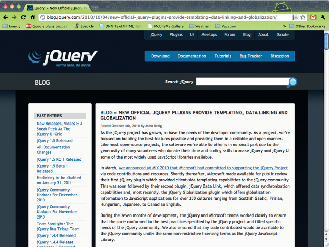
Figure 2.21 jQuery’s official blog.
What is very interesting about Microsoft’s contribution is that the new plug-ins must adhere to the same licensing as jQuery itself. Is this a PR scheme from Microsoft or a genuine contribution to a great Open Source project? I am not sure I care; I am just delighted to see new and awesome tools available for the jQuery community. Keep up the good work, Microsoft.
jQuery + Google Analytics = Very Useful Plug-in
Tracking activity on your website is essential. When you track user activity you can validate the success of your content or a campaign. This is exactly the same for mobile web development. Google is a leader in website analytics. With Google Analytics (Figure 2.22) you can track where on your site your customer is going, how long they are there, and which browser they are using. Google has even given mobile developers an additional bounty in that you can separate mobile traffic from desktop computer traffic.

Figure 2.22 Google Analytics website.
A group called Aktagon Ltd. has created a Google Analytics plug-in that is essential if you want to track activity on your website. You can see a brief demo here: http://aktagon.com/projects/jquery/google-analytics.html. The code is available at this site: http://github.com/christianhellsten/jquery-google-analytics.
You will need some Google Analytics experience to use the code. The role of Google Analytics is to allow you to track users as they move through your website. This is very similar to any of the dozens of website statistic tools on the market. The types of tracking you can complete include:
• Activity on a page
• Links selected
• Event actions (such as submitting a form with a button)
The problem with Google Analytics is that it gets to be annoying as you add more complex tracking activities. This is where the AKTAGON plug-in really shines. The uncompressed JS file can be copied from this page: http://github.com/christianhellsten/jquery-google-analytics/blob/master/jquery.google-analytics.js.
Now let’s step through what you need to do to add this to your site.
1. Create a new web page and add the usual links to jQuery:
<script type=“text/javascript” src=“ jquery.min.js”> </script>
2. Link to the Google Analytics plug-in:
<script src=“jquery.google-analytics.js” type=“text/javascript”></script>
3. You are almost ready to get the basic functionality working. All you now need to do is add a reference to your unique Google Analytics code in the HEAD element on your page:
<script type=“text/javascript”>
$.trackPage(‘UA-XXXXXXX-1’, {onload:true})
</script>
The value in the parentheses is where you add your UA ID. The curly brackets are really interesting. Here you can add additional values. The following are supported:
• onload (Boolean): If false, the Google Analytics code is loaded when this method is called instead of on window.onload. The default is true.
• status_code: The HTTP status code of the current server response. If this is set to something other than 200 then the page is tracked as an error page. For more details refer to www.google.com/support/analytics/bin/answer.py?hl=en&answer=86927.
• callback: Function to be executed after the Google Analytics code is loaded and initialized.
At this point you are done. The whole script should look like this:
<html>
<head>
<title>jQuery Google Analytics Plug-in Examples</title>
<script type=“text/javascript” src=“jquery.min.js”>
</script> <script src=“jquery.google-analytics.js” type=“text/javascript”></script>
<script type=“text/javascript”>
$.trackPage(UA-xxxxx-1, {status_code: 404})
</script>
</head>
<body>
Enter content for your page
</body>
</html>
That’s it. If you have worked with Google’s own JavaScript code, then you already know this is much cleaner.
Of course there is more you can do. One of the things you can do with Google Analytics is create categories to track different types of data. For instance, you may want to call content you have on the eCommerce or mainContent pages to help sort through all the data more easily. Well, the good folks over at AKTAGON have added the ability to categorize your content easily.
Under the $.trackPage script add the following line to include a new category:
$(‘.eCommerce a’).track({
category : ‘eCommerceTraffic’
});
This code will pass any link selected within a section using the eCommerce class back to Google Analytics with the category eCommerceTraffic associated with it. This allows for more comprehensive tracking in your Google Analytics code. An example of the HTML with the correct class name is:
<div class=“ eCommerce ”>
<p>lorem ipsum – blah – blah – blah</p>
<a href=“http://www.focalpress.com”>This link will have a category associated with it when you click on it</a>
</div>
Something I learned as I dug through the Google Analytics plug-in is that you can send information back to Google on links as you move your mouse over but do not select. This is very cool because you can see if people are even thinking of selecting a link on a page, or if they simply do not even see it. This is how you do it with the plug-in:
$(document).ready(function(){
$(‘a#hover’).track({event_name: ‘mouseover’})
});
<a href=“www.google.com” id=“hover”>Hover over me</a>
All in all, this is a very cool plug-in that makes it much easier to access complex functionality in Google Analytics.
Extending jQuery Mobile with Custom Themes
The layout and presentation of elements in jQuery Mobile on the screen is accomplished using Cascading Style Sheets (CSS). To this end you can go in and rewrite the CSS styles that are in the default setup.
You may want to wait until the jQuery UI ThemeRoller is integrated into jQuery Mobile, which is preferable, as shown in Figure 2.23.
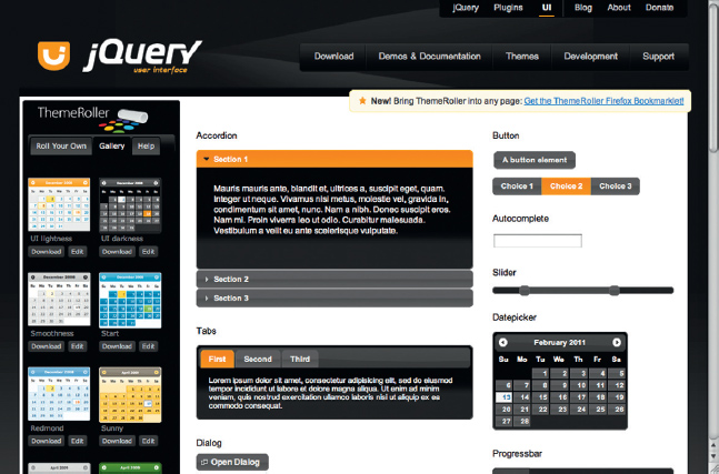
Figure 2.23 jQuery’s UI themeroller.
The jQuery UI team extended the functionality of its visual design elements to allow you to easily change the color schemes of widgets to match your corporate brand. This same model is also coming to jQuery Mobile. Fingers crossed, by the time you read this the jQuery Mobile team will have added ThemeRoller integration.
Converting Your jQuery Website into an App Using PhoneGap
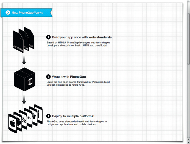
You have spent all this time building a great website using jQuery Mobile. What about real apps? You can choose to learn Objective-C, Java, and C#, or you can leverage your knowledge of jQuery and use it as the foundation for your mobile apps.
A clever tool that is gaining a growing user community is PhoneGap. Essentially, PhoneGap is an Open Source project that allows you to use HTML, CSS, and JavaScript to build real-world native apps for iOS (Tablet and handheld), Android, BlackBerry, Symbian, and Palm. Yes, you heard me, real apps, not just web pages (see Figure 2.24).
Figure 2.24 How phoneGap works.
The way PhoneGap works is that it sits as a project inside your development environment. For instance, for iOS development, PhoneGap is a special project type in Xcode. When you load the project type you are able to build your entire iOS project using HTML. Extensions in PhoneGap allow you to tap into core features within the device that are outside of HTML. For instance, you may want to use the microphone to record a message. HTML does not allow you to do that today, but extensions in PhoneGap do allow you to do this.
PhoneGap recommends jQuery Mobile as the first choice in supported mobile frameworks. Check it out over at www.phonegap.com. I use PhoneGap a lot for the simple reason that I can take a website developed with jQuery Mobile and port it to all the popular smart phones without needing to learn a lot of different languages. We will be getting into PhoneGap support later, but I thought it worthwhile letting you know now.
Keeping Up to Date on the Latest News and Getting Involved
Twitter is a great way to get news instantly. I particularly like getting updates as text messages to my phone.
There are some great jQuery accounts you should be subscribing to:
• @jquery: The official word from the source
• @smashingmag: They have some great jQuery articles
• @jqtouch: One of the best jQuery plug-ins for mobile frameworks
• @usejquery: Nice tidbits
• @jquerypodcast: Know when your favorite podcast is updated
• @jquerybot: Lots of great information
• @matthewadavid: Well, it’s my tweet and I’m gonna think it’s great!
Let me know if I have missed any from this list—send me a tweet!
If you are also finding that you are using jQuery Mobile frequently, why not get involved with the open source program? If developers did not write jQuery code, users did not test it, and designers did not implement jQuery then the product simply would not exist. As a group, we have made jQuery the success story it is today.
Here are some things you can do:
• The first step is to simply start using jQuery—add the jQuery library to a web page, an app, or something, but just get your hands dirty with the code.
• Find a bug? Report it! The jQuery team has a great site dedicated to bug tracking: http://docs.jquery.com/How_to_Report_Bugs.
• Want to chat about jQuery with like-minded people? Jump on the IRC or forums: http://forum.jquery.com/developingjquery-core.
• Extend jQuery with your own plug-ins and contribute the plug-ins back to the community: http://plugins.jquery.com/.
• Feeling really brave? Then fix some of the bugs in the core library—this section has a whole piece on how to download the latest code: http://docs.jquery.com/Getting_Involved.
There you are, some simple ways to get involved with the jQuery community.
Beyond Alpha
A lot of work has clearly gone into the current Alpha release of jQuery Mobile. With that said, it is clearly still an alpha. Sometimes the code does not execute correctly and the spinning “loading” symbol can get annoying. With that said, I have high hopes for jQuery Mobile. Both jQuery and jQuery UI are solid and dependable frameworks.
Future enhancements you can expect to see coming to jQuery Mobile include:
• Support for the jQuery UI ThemeRoller, allowing you to create your own custom styles
• Support for tablet layouts such as Apple’s iPad popovers and side menus
Additional features I would like to see include enhanced gesture support and access to HTML5 APIs in iOS and Android such as geolocation.
If you have been waiting to jump into the mobile web design world then your wait is over. Though not fully baked, jQuery Mobile gives you a framework that would otherwise make mobile web development very difficult.