
CREATING WEBSITES FOR iPAD AND ANDROID HONEYCOMB TABLETS
Got iPad? It is hard to imagine a time when there was not an iPad tablet. The low cost for purchasing the device, the ease of use, and the massive number of apps have altered our collective perception of what a tablet is.
Let’s be clear: the tablet computer is not new. Microsoft developed the technology in 2000. Unfortunately, the Microsoft tablet was heavy, slow, and expensive.
In 2010 Apple released the iPad—a sleek, fast, and cost-effective product that is one of the most desired pieces of technology ever released. The world can’t get enough of them.
Apple continues to dominate the tablet market with the release of iPad 2, shown in Figure 6.1. The desire for a tablet has not gone unnoticed. RIM has released the PlayBook, Google now has Honeycomb, a version of Android designed from the ground up for tablets, and HP is bringing its WebOS to a tablet near you. Sales of laptop computers are now dropping as customers choose tablets. A new communication tool has been released.
In this section we look into what you need to consider when developing for tablets. They are not simply big iPhones.
What Makes a Tablet a Unique User Experience?
Apple’s release of the iPad in January 2010 involved an unusual presentation technique. A comfy chair sat in the center of the stage. Steve Jobs came on stage and sat down, looking like he was going to watch the Sunday football game. Instead he pulled out the iPad and changed the world.
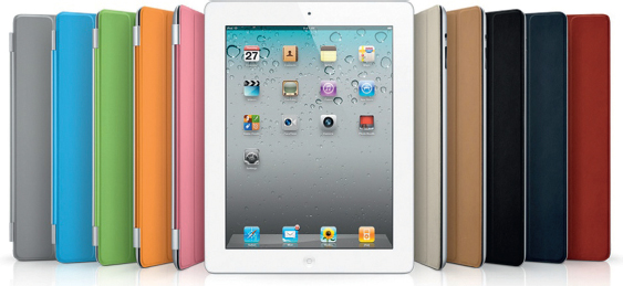
Figure 6.1 The iPad 2.
The first reaction to the iPad was that it was an oversized iPhone. Who wants one of those?
But the iPad is not an oversized smart phone. Nor are any of the tablets on the market. A tablet in the current form factor is truly a new and unique technology experience. This is true of the Xoom, PlayBook, and all the competing tablets.
Smart phones are designed for instant content. You take out your Android phone, check the weather, your mail, and the news and put the phone away. Next time you are grocery shopping, watch as people casually check information on their phones as they are standing in line to pay.
The tablet, on the other hand, has an experience more akin to a book or magazine. You engage with a tablet. Your tablet is always on. Apps always use the whole screen, allowing you to focus just on the app and not be distracted by other content.
When Steve Jobs came on stage and sat in a comfy chair he was making a direct statement: your iPad allows you to fully engage with it.
The indirect statement Apple has made since is this: The days of the traditional computer are very much numbered.
There are an ever-increasing number of tablet computers entering the market. Today, and likely for the next couple of years, Apple’s iPad will dominate. The growth of the tablet market has only just begun. You will soon see tablet sales in the hundreds of millions per year.
Now is the time to start assessing how you can make your website work on a tablet.
Elements of the Tablet Experience: Sidebars, Pop-overs, and Touch Interfaces
Today, Apple is driving the elements of the tablet user experience for a simple reason: the vast majority of tablets sold are iPads. For this reason, you are seeing Apple’s UX teams drive the new user experience.
The first new feature is sidebars. A sidebar appears when a tablet is held in landscape mode as an area on the left-hand side of the screen. When the tablet is moved into a vertical position, the sidebar disappears and is replaced with a button that will open and close the sidebar.
The next feature is called a pop-over. Essentially, a pop-over is similar to a dialog window found on a desktop computer, as shown in Figure 6.2.
Some features, though new, extend the touch screen technique developed for the iPhone. You have pinch-to-zoom, tap, double-tap, and multitouch gestures. Your customers will want to leverage these features as you build websites optimized for tablets.
The bottom line reality is that rapid adoption of tablets is blindsiding many people. For this reason, web technologies that support tablet interfaces are sketchy at best. Arguably, the most mature technology is Sencha’s Touch framework.
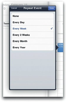
Figure 6.2 A pop-over on the iPad 2.
Using Sencha Touch for Tablet Creation
In earlier articles, you were introduced to Sencha Touch, a framework optimized for mobile devices. The initial list of devices includes iPhones, Androids, and BlackBerrys. Also on the list is support for the iPad.
The current support for iPad is somewhat limited. You have a sidebar that appears when the web page is viewed in landscape mode and disappears when resized to portrait.
The functionality to accomplish the sidebar using HTML is demonstrated in the default Kitchen Sink app that comes with Sencha Touch. You will need to download the Sencha Touch framework to view the Kitchen Sink sample.
The default file that controls the use of a tablet interface is labeled index.js and can be found in the SRC folder for the Kitchen Sink solution. Setting up the interface to work with the iPad takes more work than for the default iPhone. The challenge you have is detecting when the iPad is moved from vertical to horizontal, and whether the device viewing the page is an iPhone or an Android phone.
The first step is to create a new function that allows you to design for all user interfaces. In the following instance, the function is named UniversalUI.
Ext.ux.UniversalUI = Ext.extend(Ext.Panel, {
The following properties set the display to full screen with default presentation text:
fullscreen: true,
layout: ‘card’,
items: [{
cls: ‘launchscreen’,
html: ‘<div><img src=“resources/img/sencha.png” width=“210” height=“291” /><h1>Welcome to Sencha Touch</h1> <p>This is a comprehensive collection of our examples in an <br /> easy-to-navigate format. Each sample has a “view source” button which dynamically displays its associated code.<br /><br /><span>Sencha Touch (‘ + Ext.version +’) </span></p></div>’
}],
The following sets the left navigation menu to show if the screen is shown in landscape mode:
backText: ‘Back’,
useTitleAsBackText: true,
initComponent : function() {
this.navigationButton = new Ext.Button({
hidden: Ext.is.Phone || Ext.Viewport.
orientation == ‘landscape’,
text: ‘Navigation’,
handler: this.onNavButtonTap,
scope: this
});
this.backButton = new Ext.Button({
text: this.backText,
ui: ‘back’,
handler: this.onUiBack,
hidden: true,
scope: this
});
var btns = [this.navigationButton];
if (Ext.is.Phone) {
btns.unshift(this.backButton);
}
this.navigationBar = new Ext.Toolbar({
ui: ‘dark’,
dock: ‘top’,
title: this.title,
items: btns.concat(this.buttons || [])
});
The following functions are triggered by the iPad moving into portrait mode:
this.navigationPanel = new Ext.NestedList({
store: sink.StructureStore,
useToolbar: Ext.is.Phone ? false : true,
updateTitleText: false,
dock: ‘left’,
hidden: !Ext.is.Phone &&
Ext.Viewport.orientation == ‘portrait’,
toolbar: Ext.is.Phone ? this.navigationBar : null,
listeners: {
itemtap: this.onNavPanelItemTap,
scope: this
}
});
this.navigationPanel.on(‘back’, this.onNavBack,
this);
If the device is an iPhone or Android phone, the code will hide the left-hand navigation when the page is viewed in landscape mode. The width of the phone triggers if the sidebar is hidden when viewed in landscape mode:
if (!Ext.is.Phone) {
this.navigationPanel.setWidth(250);
}
this.dockedItems = this.dockedItems || [];
this.dockedItems.unshift(this.navigationBar);
if (!Ext.is.Phone && Ext.Viewport.orientation ==
‘landscape’) {
this.dockedItems.unshift(this.navigationPanel);
}
else if (Ext.is.Phone) {
this.items = this.items || [];
this.items.unshift(this.navigationPanel);
}
this.addEvents(‘navigate’);
Ext.ux.UniversalUI.superclass.initComponent.call(this);
},
The final result is that you can display new iPad-like features using Sencha Touch. The result, however, is clunky and requires a lot of JavaScript knowledge. There is no doubt in my mind that Sencha will improve tablet support over time but it is not quite there yet.
Using jQuery Mobile to Build Websites Optimized for Tablets
The most popular framework for quickly building smart phone websites is jQuery Mobile. At this time, jQuery Mobile does not support the iPad.
With that said, it does not mean you cannot create custom themes that give you iPad-like experiences. jQuery Mobile leverages CSS for visual presentation. All the position, border, padding, and other visual effect rules are controlled with the following CSS file you reference in the head of your page:
jquery.mobile-1.0a4.1.css
The CSS document can be opened in a text editor. There are two main sections to the CSS file:
• Defining the swatches to add colors, gradients, and text effects
• Defining the position of objects, rounded corners, and space
With a few keystrokes you can modify any of these elements to look and feel like elements found on an iPad. To this end, the jQuery Mobile team is looking at adding support for tablets in late 2011.
Building for the Future: CSS Regions
It is clear that support for tablets in web pages is limited at the moment. Fundamentally this is due not to widgets and features missing in frameworks, but to features in HTML that allow you to easily adapt your layout to different screens. A driving force at Adobe is multiscreen support; that is, you build one website that is optimized for desktop, laptop, iPhone, tablet, and interactive TV.
To address this problem, Adobe is proposing a new CSS property known as CSS Regions. Details surrounding CSS Regions can be found at http://labs.adobe.com/technologies/cssregions/.
The goal for CSS Regions is to allow you to develop one design that elegantly resizes, depending on the screen resolution, as shown in Figure 6.3.
The following example takes a simple approach of having some text wrap itself on three columns. There are two main elements to this example: CSS and HTML. No JavaScript was used in this demo (or hurt in any way).
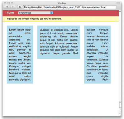
Figure 6.3 A very early prototype of CSS Regions.
Start by declaring a standard HTML5 document:
<!DOCTYPE HTML>
<html>
<head>
<title>CSS Regions - Simple Template Demo</title>
The CSS style begins with standard page presentation:
<style type=“text/css”>
body,
html{
height:100%;
width:100%;
overflow:hidden;
}
body{
margin:0;
font-family: Helvetica, Arial, sans-serif;
color:#222;
font-size:15px;
line-height:20px;
}
The source class is used to identify the block of HTML in the BODY element that will dynamically wrap content. To do this, a source class creates a –webkit-flow and names it main-thread.
#source{
-webkit-flow: “main-thread”;
text-align:justify;
}
A CSS style named region inherits the main-thread as its source content.
.region{
content:from(main-thread);
margin:0 25px 0 0;
background:#C5DFF0;
padding:15px;
}
Three classes specify where on the screen the content will flow. You will see from the following settings that the size of each region is dynamically created depending on the size of the screen. This is demonstrating how content can flow from region to region.
#region1{
width:20%;
height:50%;
float:left;
}
#region2{
width:35%;
height:170px;
float:left;
}
#region3{
width:20%;
height:50%;
margin-right:0;
}
#workspace{
position:relative;
padding:25px;
}
</style>
</head>
<body>
The following DIV element is the content that will be wrapped from one region to another. Here the content is just text, but you can add any type of HTML.
<div id=“source”>
<p>Lorem ipsum dolor sit amet, consectetur adipiscing elit. Fusce eros felis, eleifend at sagittis non, pulvinar at ante. Maecenas cursus feugiat massa, sed ultrices mauris mattis vel. Quisque volutpat hendrerit tristique. Quisque a dolor sit amet metus convallis dignissim. Quisque id volutpat orci. Lorem ipsum dolor sit amet, consectetur adipiscing elit. Donec dictum augue id nisl mollis non sagittis enim feugiat. Aliquam consectetur vehicula nibh et euismod. Fusce posuere nisi eget enim auctor ut dignissim neque gravida. Sed suscipit vehicula enim tempus tempus. Aenean at felis id nibh lobortis auctor. Proin sodales rutrum sollicitudin. Ut pharetra imperdiet sapien quis venenatis. Quisque varius neque sem. Curabitur pharetra condimentum ligula, quis imperdiet quam fringilla gravida. Proin fringilla luctus leo ultricies molestie.</p>
</div>
The following DIV element contains the three region areas where content will share the source content.
<div id=“workspace”>
<div id=“region1” class=“region”></div>
<div id=“region2” class=“region”></div>
<div id=“region3” class=“region”></div>
</div>
</body>
</html>
When you view this page in a web browser that supports CSS Regions you will see that the content overflows into different regions depending on the size of the screen.
The specification is still very early in its development and will likely mature and change through 2011.
Summary
It is crystal clear that support for tablets is essential in your website design. What is less clear is the approach you take to support tablets. Frameworks, such as Sencha Touch and jQuery Mobile, are maturing to add support for tablets. In addition, Adobe is proposing core technology additions to CSS to add support for multiscreen devices.
The bottom line is that although these technologies are forward thinking, the future is rushing toward us. Forward-thinking solutions need to be implemented today for you to use. How we consume information on the web has changed forever: smart phones, tablets, interactive televisions, intelligent in-car systems, and so much more are driving this change. And your site needs to work on all of them.