9. Building and Using Controls
The UIControl class provides the basis for many iPhone interactive elements, including buttons, text fields, sliders, and switches. These onscreen objects have more in common than their ancestor class. Controls all use similar layout and target-action approaches. This chapter introduces controls and their use. You discover how to build and customize controls in a variety of ways. From the prosaic to the obscure, this chapter introduces a range of control recipes you can reuse in your programs.
The UIControl Class
On the iPhone, controls refer to a library of prebuilt onscreen objects designed for user interaction. Controls include buttons and text fields, sliders and switches, along with other Apple-supplied objects. A control’s role is to transform user interactions into callbacks. Users touch and manipulate controls and in doing so communicate with your application.
The UIControl class lies at the root of the control class tree. All controls define a visual interface and implement ways to dispatch messages when users interact with that interface. Controls send those messages using target-action. When you define a new onscreen control, you tell it who receives messages, what messages to send, and when to send those messages.
Kinds of Controls
The members of the UIControl family include buttons, segmented controls, switches, sliders, page controls, and text fields. Each of these controls can be found in Interface Builder’s Object Library (Tools > Library > Objects) in the Inputs & Values section, as shown in Figure 9-1. Control objects correspond to Inputs. The label, progress indicator, and activity indicator represent the Values.
Figure 9-1 Interface Builder groups controls together in the Inputs & Values section of the Object Library.

Control Events
Controls respond primarily to three kinds of events: those based on touch, those based on value, and those based on edits. Table 9-1 lists the full range of event types available to controls.
Table 9-1 UIControl Event Types
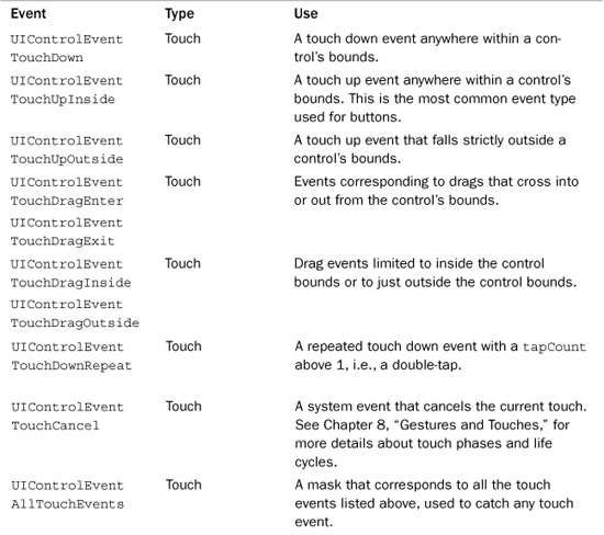
For the most part, Event types break down along the following lines. Buttons use touch events; the single UIControlEventTouchUpInside event accounts for nearly all button interaction. Value events (i.e., UIControlEventValueChanged) correspond to user-initiated adjustments to segmented controls, switches, sliders, and page controls. When users switch, slide, or tap those objects, the control value changes. UITextField objects trigger editing events. Users cause these events by tapping into (or out from) the text field, or by changing the text field contents.
As with all iPhone GUI elements, you can lay out controls in Interface Builder or build them directly in Xcode. This chapter discusses IB approaches but focuses more intently on code-based solutions. IB layout, once mastered, remains pretty much the same regardless of the item involved. You place an object into the interface, customize it with inspectors, and connect it to other IB objects.
Buttons
UIButton instances provide simple onscreen buttons. Users can tap them to trigger a callback via target-action programming. You specify how the button looks, what art it uses, and what text it displays.
The iPhone offers two ways to build buttons. You can use a precooked button type or build a custom button from scratch. The current iPhone SDK offers the following precooked types. As you can see, the buttons available are not general purpose. They were added to the SDK primarily for Apple’s convenience, not yours. Nonetheless, you can use these in your programs as needed. Figure 9-2 shows each button.
Figure 9-2 The iPhone SDK offers five precooked button types, which you can access in Interface Builder or build directly into your applications. From left to right, these are the Detail Disclosure button, the Info Light and Info Dark buttons, the Contact Add button, and the Rounded Rectangle.
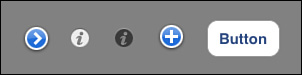
• Detail Disclosure—This is the same round, blue circle with the chevron you see when you add a detail disclosure accessory to table cells. Detail disclosures are used in tables to lead to a screen that shows details about the currently selected cell.
• Info Light and Info Dark—These two buttons offer a small circled i like you see on a Macintosh’s Dashboard widget and are meant to provide access to an information or settings screen. These are used in the Weather and Stocks application to flip the view from one side to the other.
• Contact Add—This round, blue circle has a white + in its center and can be seen in the Mail application for adding new recipients to a mail message.
• Rounded Rectangle—This button provides a simple onscreen rounded rectangle that surrounds the button text. In its default state it is not an especially attractive button (that is, it’s not very “Apple” looking), but it is simple to program and use in your applications.
To use a precooked button in code, allocate it, set its frame, and add a target. Don’t worry about adding custom art or creating the overall look of the button. The SDK takes care of all that. For example, here’s how to build a simple rounded rectangle button. Note that buttonWithType: returns an autoreleased object.
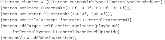
To build one of the other standard button types, omit the title line. Rounded rectangles is the only precooked button type that uses a title.
Most buttons use the “touch up inside” trigger, where the user touch ends inside the button’s bounds. iPhone UI standards allow users to cancel button presses by pulling their fingers off a button before releasing the finger from the screen. The UIControlEventTouchUpInside event choice mirrors that standard.
When using a precooked button, you must conform to Apple’s Human Interface Guidelines on how those buttons can be used. Adding a detail disclosure, for example, to lead to an information page can get your application rejected from the App Store. It might seem a proper extrapolation of the button’s role, but if it does not meet the exact wording of how Apple expects the button to be used, it may not pass review. To avoid potential issues, you may want to use rounded rectangle and custom buttons wherever possible.
Adding Buttons in Interface Builder
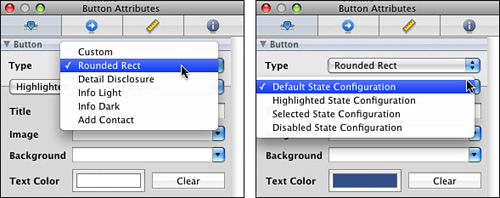
Buttons appear in the Interface Builder library as Rounded Rect Button objects. To use them, drag them into your interface. You can then change them to another button type via the Attribute Inspector (Command-1). A button-type pop-up appears at the top of the inspector, as shown in Figure 9-3. Use this pop-up menu to select the button type.
Figure 9-3 Choose your button type from the Type pop-up in the attributes inspector (left). Changes in the Button section apply to the current configuration (right).
If your button uses text (such as the word “Button” in Figure 9-2), you can enter that text in the Title field. The Image and Background pull-downs let you choose a primary and background image for the button.
Each button provides four configuration settings, which can be seen in Figure 9-3 (right). The four button states are default (the button in its normal state), highlighted (when a user is currently touching the button), selected (an “on” version of the button for buttons that support toggled states), and disabled (when the button is unavailable for user interaction).
Changes in the Button Attributes > Button > Configuration section (i.e., the darkened rectangle below the configuration pop-up) apply to the currently selected configuration. You might, for example, use a different button text color for a button in its default state versus its disabled state.
To preview each state, locate the three check boxes in Button Attributes > Control > Content. The Highlighted, Selected, and Enabled options let you set the button state. After previewing, and before you compile, make sure you returned the button to the actual state it needs to be in when you first run the application.
Art
Apart from the precooked button types (disclosure, info, and add contact), you’ll likely want to create buttons using custom art. Figure 9-4 shows a variety of buttons built around the Rounded Rect and Custom button classes.
Figure 9-4 These examples show a variety of custom art options for both Rounded Rect Buttons and Custom Buttons.
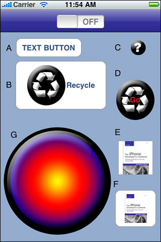
Figure 9-4 shows that when working with Rounded Rect buttons, you are not limited to just text (Button A). You can add an image along with text (Button B), use an image instead of text (Button F), or even replace the background rounded rectangle style with custom art (Button E), although this latter case does not make a lot of sense in the day-to-day design process.
Custom buttons have no built-in look. You can make buttons with any size you like (Buttons C and G) and add text (Button D) using the attributes inspector. What Figure 9-4 does not show is that these three buttons also represent other custom design decisions.
Button D uses the same art from Button B. Being a custom button, its text is centered and not displayed on a rounded backsplash. Beyond that, there’s no big difference between the B layout and the D layout. The button relies on the default highlighting provided by Interface Builder and the UIButton class.
Button C represents a button created for highlighting on touch. Its relatively small size allows it to work with Button Attributes > Button > Shows Touch On Highlight. When touched, the button reveals a glowing halo. This halo is approximately 55-by-55 pixels in size. Buttons larger than about 40-by-40 pixels cannot effectively use this visual pop.
What can’t be seen in this static screenshot is that Button G was built to display an alternate image when pushed. Setting a second image in Button Attributes > Button > Highlighted State Configuration lets a button change its look on touch. For Button G, that image shows the same button but pushed into an indented position.
Connecting Buttons to Actions
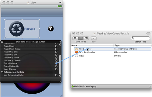
When you Control-drag (right-drag) from a button to an IB object like the File’s Owner view controller, IB presents a pop-up menu of actions to choose from. These actions are polled from the target object’s available IBActions. Connecting to an action creates a target-action pair for the button’s touch up inside event.
Alternatively, as Figure 9-5 shows, you can Control-click (right-click) the button, scroll down to Touch Up Inside, and drag from the unfilled dot to the target you want to connect to. The same pop-up menu appears with its list of available actions. Select the one you want to use to finish defining the target-action callback.
Figure 9-5 Control-clicking (right-clicking) a UIControl in Interface Builder reveals a table of events that you can connect to a target. Available actions appear in a pop-up menu after dragging out the connection.
Buttons That Are Not Buttons
In Interface Builder, you also encounter buttons that look like views and act like views but are not, in fact, views. Bar button items (UIBarButtonItem) store the properties of toolbar and navigation bar buttons but are not buttons themselves. See Chapter 5, “Working with View Controllers,” for more information about using bar button items.
Building Custom Buttons in Xcode
When using the UIButtonTypeCustom style, you supply all button art. The number of images depends on how you want the button to work. For a simple pushbutton, you might add a single background image and vary the label color to highlight when the button is pushed. For a toggle-style button, you might use four images: for the “off” state in a normal presentation, the “off” state when highlighted (that is, pressed), and two more for the “on” state. You choose and design the interaction details.
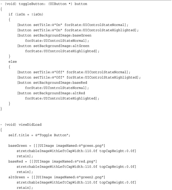
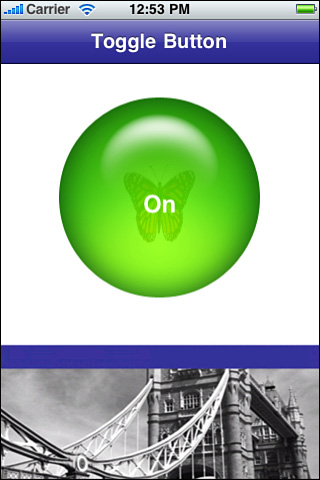
Recipe 9-1 builds a button that toggles on and off, demonstrating the detail that goes into building custom buttons. When tapped, the button switches its art from green (on) to red (off), or from red to green. This allows your (noncolorblind) users to instantly identify a current state. The displayed text reinforces the state setting. Figure 9-6 (left) shows the button created by this recipe.
Recipe 9-1 Building a UIButton That Toggles On and Off
Get This Recipe’s Code
To get the code used for this recipe, go to http://github.com/erica/iphone-3.0-cookbook-, or if you’ve downloaded the disk image containing all of the sample code from the book, go to the folder for Chapter 9 and open the project for this recipe.
Figure 9-6 Use UIImage stretching to resize art for arbitrary button widths. Set the left cap width to specify where the stretching can take place.
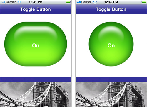
The UIImage stretchable image calls in this recipe play an important role in button creation. Stretchable images enable you to create buttons of arbitrary width, turning circular art into lozenge-shaped buttons. You specify the caps at either end (that is, the art that should not be stretched). In this case, the cap is 110 pixels wide. If you were to change the button width from the 300 pixels used in this recipe to 220, the button loses the middle stretch, as shown in Figure 9-6 (right).
Note
The UIView contentStretch property provides view-specific stretching. The rectangle stored in the property defines the portion of the view that can be stretched. The rectangle values are normalized between 0.0 and 1.0, so to make only the middle portion of a view stretchable, you might set that rectangle to (0.25, 0.25, 0.5, 0.5). Using a contentStretch property lets a view maintain the kind of crisp borders seen in Figure 9-6.
Multiline Button Text
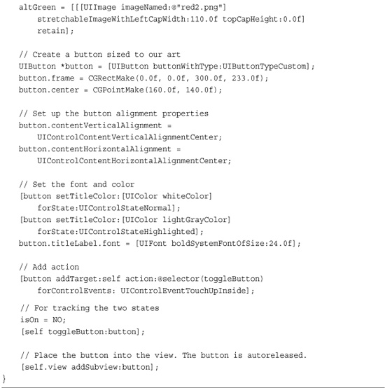
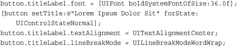
New to the 3.0 SDK, UIButtons now offer access to their title label via the titleLabel property. By exposing this property, the SDK allows you to modify the title attributes directly, including its font and line break mode. Here, the font is set to a very large value (basically ensuring that the text needs to wrap to display correctly) and used with word wrap and centered alignment.
Be aware that the default label stretches from one end of your button to the other. This means that text may extend farther out than you might otherwise want, possibly beyond the edges of your button art. To fix this problem, you can force carriage returns in word wrap mode by embedding new line literals (i.e.,
) into the text. This allows you to control how much text appears on each line of the button title.
Adding Animated Elements to Buttons
When working with buttons, you can creatively layer art in front of or behind them. Use the standard UIView hierarchy to do this, making sure to disable user interaction for any view that might otherwise obscure your button (setUserInteractionEnabled:NO). Figure 9-7 shows what happens when you combine semitranslucent button art with an animated UIImageView behind it. The image view contents “leak” through to the viewer, enabling you to add live animation elements to the button.
Figure 9-7 Combine semitranslucent button art with animated UIImageViews to build eye-catching UI elements. In this concept, the butterfly flaps “within” the button.
Recipe: Animating Button Responses
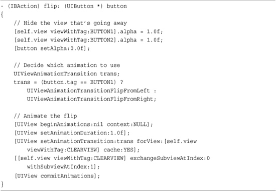
There’s more to UIControl instances than frames and target-action. All controls inherit from the UIView class. This means you can use UIView animation blocks when working with controls just as you would with standard views. Recipe 9-2 builds a toggle switch that flips around using UIViewAnimationTransitionFlipFromLeft to spin the button while changing states.
Recipe 9-2 Adding UIView Animation Blocks to Controls
Get This Recipe’s Code
To get the code used for this recipe, go to http://github.com/erica/iphone-3.0-cookbook-, or if you’ve downloaded the disk image containing all of the sample code from the book, go to the folder for Chapter 9 and open the project for this recipe.
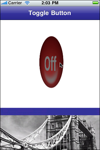
Unlike Recipe 9-1, this code doesn’t switch art. Instead, it switches buttons. There are two: an on button and an off button, both of which rest on a clear UIView backdrop. Giving the two buttons a see-through parent enables you to apply the flip to just those buttons without involving the rest of the user interface. Skip the clear background, and you end up spinning the entire window—not a good UI choice.
As this recipe uses the same semitranslucent art as the previous recipes, it’s important that only one button appears onscreen at any time. To make this happen, the current button hides (sets its alpha value to 0.0) while in the animation block. The button with the opposite state takes its place. Figure 9-8 shows the flipping button in midflip.
Figure 9-8 Use UIView animation blocks to flip between control states. Here, a button twirls around to move between Off and On.
Recipe: Working with Switches
The UISwitch object offers a simple ON/OFF toggle that lets users choose a Boolean value. The switch object contains a single (settable) value property, called on. This returns either YES or NO, depending on current state of the control. You can programmatically update a switch’s value by changing the property value directly or calling setOn:animated:, which offers a way to animate the change.
Interface Builder offers relatively few options for working with switches. You can enable it and set its initial value, but beyond that there’s not much to customize. Switches produce a value-changed event when a user adjusts them. Recipe 9-3 uses that behavior to trigger an IBAction callback. When the switch updates, it enables or disables an associated button.
Recipe 9-3 Using a Switch State to Enable/Disable a Guarded Button
Get This Recipe’s Code
To get the code used for this recipe, go to http://github.com/erica/iphone-3.0-cookbook-, or if you’ve downloaded the disk image containing all of the sample code from the book, go to the folder for Chapter 9 and open the project for this recipe.
As with all IB work, make sure you’ve defined your outlets and actions in the Library > Classes pane before you make your connections. The switch should trigger on Value Changed and send the doSwitch: action to the File’s Owner, that is, the main view controller. The controller then sets the enabled property for the button. Unfortunately, you cannot connect the switch directly to the button inside IB to tie the switch value to the button’s enabled property. If you are a longtime IB user, you will recall that there was a time when such connections were allowed.
This recipe builds on the modal animations introduced in Chapter 6, “Assembling Views and Animations,” and the control animation shown in Recipe 9-2. When the switch activates, it calls one or more animation requests that transform the button into its active or inactive state.
Note
Do not name UISwitch instances as switch. Recall that switch is a reserved C word; it is used for conditional statements. This simple oversight has tripped up many iPhone developers.
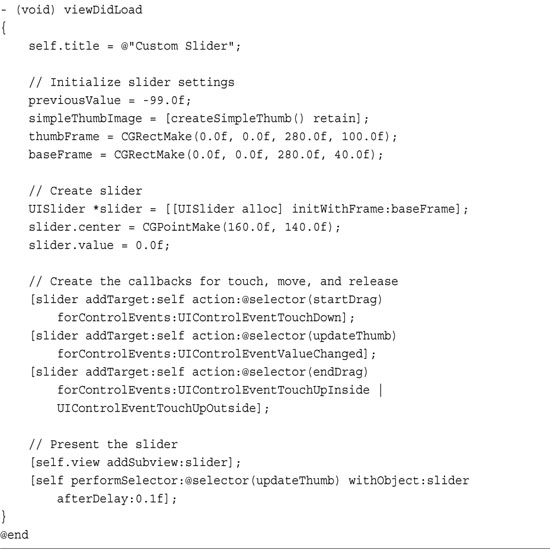
Recipe: Adding Custom Slider Thumbs
UISlider instances provide a control allowing users to choose a value by sliding a knob (called its “thumb”) between its left and right extent. You’ll have seen UISliders in the iPod/Music application, where the class is used to control volume.
Slider values default to 0.0 for the minimum and 1.0 for the maximum, although you can easily customize this in the Interface Builder attributes inspector or by setting the minimumValue and maximumValue properties. If you want to stylize the ends of the control, you can add in a related pair of images (minimumValueImage and maximumValueImage) that reinforce those settings. For example, you might show a snowman on one end and a steaming cup of tea on the other for a slider that controls temperature settings.
The slider’s continuous property controls whether a slider continually sends value updates as a user drags the thumb. When set to NO (the default is YES), the slider only sends an action event when the user releases the thumb.
Customizing UISlider
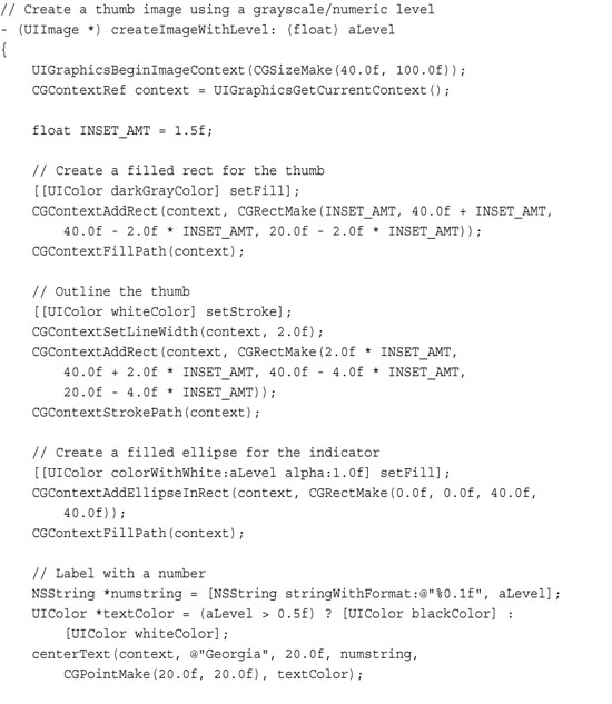
In addition to setting minimum and maximum images, the UISlider class lets you directly update its thumb component. You can set a thumb to whatever image you like by calling setThumbImage:forState:. Recipe 9-4 takes advantage of this option to dynamically build thumb images on the fly, as shown in Figure 9-9. The indicator bubble appears above the user’s finger as part of the custom-built thumb. This bubble provides instant feedback both textually (the number inside the bubble) and graphically (the shade of the bubble reflects the slider value, moving from black to white as the user drags).
Recipe 9-4 Building Dynamic Slider Thumbs

Get This Recipe’s Code
To get the code used for this recipe, go to http://github.com/erica/iphone-3.0-cookbook-, or if you’ve downloaded the disk image containing all of the sample code from the book, go to the folder for Chapter 9 and open the project for this recipe.
Figure 9-9 Core Graphics/Quartz calls enable this slider’s thumb image to dim or brighten based on the current slider value. The text inside the thumb bubbles mirrors that value.

This kind of dynamically built feedback could be based on any kind of data. You might grab values from onboard sensors or make calls out to the Internet just as easily as you use the user’s finger movement with a slider. No matter what live update scheme you use, dynamic updates are certainly graphics intensive—but it’s not as expensive as you might fear. The Core Graphics calls are fast, and the memory requirements for the thumb-sized images are minimal.
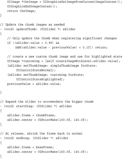
This particular recipe assigns two thumb images to the slider. The bubble appears only when the slider is in use, for its UIControlStateHighlighted. In its normal state, namely UIControlStateNormal, only the smaller rectangular thumb appears. Users can tap on the thumb to review the current setting. The context-specific feedback bubble mimics the letter highlights on the standard iPhone keyboard.
To accommodate these changes in art, the slider updates its frame at the start and end of each gesture. On being touched (UIControlEventTouchDown), the frame expands by sixty pixels in height to the thumbFrame. This extra space provides enough room to show the expanded thumb during interaction.
When the finger is removed from the screen (UIControlEventTouchUpInside or UIControlEventTouchUpOutside), the slider returns to its previous dimensions, the baseFrame. This restores space to other onscreen objects, ensuring that the slider will not activate unless a user directly touches it.
Adding Efficiency
This recipe stores a previous value for the slider to minimize the overall computational burden on the iPhone. It updates the thumb with a new custom image when the slider has changed by at least 0.1, or 10% in value. You can omit this check, if you want, and run the recipe with full live updating. When tested, this provided reasonably fast updates, even on a first generation iPod touch unit. It also avoids any issues at the ends of the slider, namely when the thumb gets caught at 0.9 and won’t update properly to 1.0. In this recipe, a hard-coded workaround for values above 0.98 handles that particular situation by forcing updates.
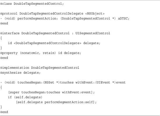
Recipe: Creating a Twice-Tappable Segmented Control
The UISegmentedControl class presents a multiple button interface, where users can choose one choice out of a group. The control provides two styles of use. In its normal radio-button style mode, a button once selected remains selected. Users can tap on other buttons, but they cannot generate a new event by re-tapping their existing choice. The alternative momentary style lets users tap on each button as many times as desired but stores no state about a currently selected item. It provides no highlights to indicate the most recent selection.
Recipe 9-5 builds a hybrid approach. It allows users to see their currently selected option and to reselect that choice if needed. This is not the way segmented controls normally work. There are times, though, that you want to generate a new result on reselection (as in momentary mode) while visually showing the most recent selection (as in radio button mode).
Recipe 9-5 Creating a Segmented Control Subclass That Responds to a Second Tap
Get This Recipe’s Code
To get the code used for this recipe, go to http://github.com/erica/iphone-3.0-cookbook-, or if you’ve downloaded the disk image containing all of the sample code from the book, go to the folder for Chapter 9 and open the project for this recipe.
Unfortunately, “obvious” solutions to create this desired behavior don’t work. You cannot add target-action pairs that detect UIControlEventTouchUpInside. UIControlEventValueChanged is the only control event generated by UISegmentedControl instances. (You can easily test this yourself by adding a target-action pair for touch events.)
Here is where subclassing comes in to play. It’s relatively simple to create a new class based on UISegmentedControl that does respond to that second tap. Recipe 9-5 defines that class. Its code works by detecting when a touch has occurred, operating independently of the segmented control’s internal touch handlers that are subclassed from UIControl.
Segment switches remain unaffected; they’ll continue to update and switch back and forth as users tap them. Unlike the parent class, here touches on an already-touched segment continue to do something. In this case, they request that the object’s delegate produce the performSegmentAction method.
Don’t add target-action pairs to your segmented controllers the way you’d normally do. Since all touch down events are detected, target-actions for value-changed events would add a second callback and trigger twice whenever you switched segments. Instead, implement the delegate callback and let object delegation handle the updates.
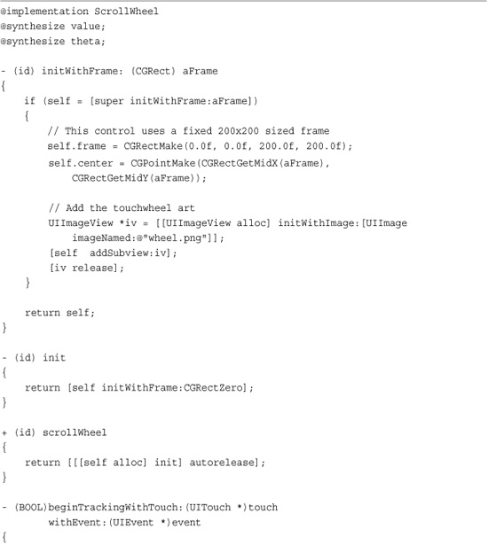
Recipe: Subclassing UIControl
Apple provides several prebuilt controls that you can use directly in your applications. But you don’t have to limit yourself to Apple-supplied items. Recipe 9-6 demonstrates how to subclass UIControl and build new controls. This example creates a touch wheel, like the ones used on older model iPods.
Recipe 9-6 Building a Touch Wheel Control

Get This Recipe’s Code
To get the code used for this recipe, go to http://github.com/erica/iphone-3.0-cookbook-, or if you’ve downloaded the disk image containing all of the sample code from the book, go to the folder for Chapter 9 and open the project for this recipe.
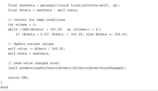
Touch wheels provide an infinitely scrollable input. Users can rotate their finger clockwise or counterclockwise, and the object’s value increases or decreases accordingly. Each complete turn around the wheel, that is, a traversal of 360 degrees, corresponds to a value change of 1.0. Clockwise changes are positive; counterclockwise changes are negative. The value accumulates on each touch, although it can be reset; simply assign the control’s value property back to 0.0. This property is not a standard part of UIControl instances even though many controls use values.
This recipe computes user changes by casting out vectors from the control’s center. The code adds differences in the angle as the finger moves, updating the current value accordingly. For example, three spins around the touch wheel adds or subtracts 3 to the current value, depending on the direction of movement.
Tracking Touches
UIControl instances use an embedded method set to work with touches. These methods allow the control to track touches throughout their interaction with the control object:
• beginTrackingWithTouch:withEvent:—Gets called when a touch enters a control’s bounds.
• continueTrackingWithTouch:withEvent:—Follows the touch with repeated calls as the touch remains within the control bounds.
• endTrackingWithTouch:withEvent:—Handles the last touch for the event.
• cancelTrackingWithEvent:—Manages a touch cancellation.
Add your custom control logic by implementing any or all of these methods in a UIControl subclass. Recipe 9-6 uses the begin and continue versions to locate the user touch and track it until the touch is lifted or otherwise leaves the control.
Dispatching Events
Controls use target-action pairs to communicate changes triggered by events. When you build a new control, you must decide what kind of events your object will generate and add code to trigger those events.
Add a dispatch message to your custom control by calling sendActionsForControlEvents:. This method lets you send an event, in this case UIControlEventValueChanged to the specified target. Controls transmit these updates by messaging the UIApplication singleton. As Apple notes, the application acts as the centralized dispatch point for all messages.
Note
The basic wheel defined in Recipe 9-6 tracks touch rotation but does little else. The original iPod scroll wheel offered five click points: in the center circle and at the four cardinal points of the wheel. Adding click support and the associated button-like event support (for UIControlEventTouchUpInside) are left as an exercise for the reader.
Recipe: Dismissing a UITextField Keyboard
The most commonly asked question about the UITextField control is, “How do I dismiss the keyboard?” There’s no built-in way to automatically detect this. When users finish editing the contents of a UITextField, the keyboard should go away.
Fortunately, it takes little work to respond to the end of edits. By watching for the Return key, you can resign first-responder status. This moves the keyboard out of sight, as Recipe 9-7 shows. Here are a few key points about doing this:
• Optionally, set the Return key type to UIReturnKeyDone. You can do this in Interface Builder’s Attribute Inspector or by assignment to the text field’s returnKeyType property. Using a “Done”-style Return key tells the user how to finish editing. Figure 9-10 shows a keyboard using the Done key style.
Figure 9-10 Setting the name of the Return key to Done (left) tells your user how to finish editing the field. Specify this directly in code or use Interface Builder’s text field attributes inspector (right) to customize the way the text field looks and acts.
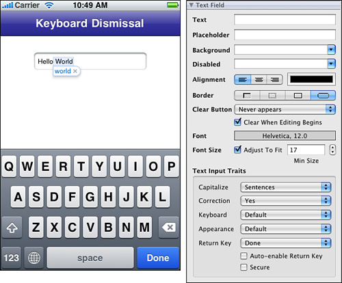
• Be the delegate. You must set the text field’s delegate property to your view controller in code. Interface Builder does not provide a way to make that assignment graphically. Make sure your view controller implements the UITextFieldDelegate protocol.
• Implement textFieldShouldReturn:. This method catches all Return key presses—no matter how they are named. Use the method to resign first responder. This hides the keyboard until the user touches another text field or text view.
Recipe 9-7 Using the Done Key to Dismiss a Text Field Keyboard

Get This Recipe’s Code
To get the code used for this recipe, go to http://github.com/erica/iphone-3.0-cookbook-, or if you’ve downloaded the disk image containing all of the sample code from the book, go to the folder for Chapter 9 and open the project for this recipe.
Note
You can also use textFieldShouldReturn: to perform an action when the Return key is pressed as well as dismissing the keyboard.
Your code needs to handle each of these points to create a smooth interaction process for your UITextField instances.
Text Trait Properties
Text fields implement the UITextInputTraits protocol. This protocol provides seven properties that you can set to define the way the field handles text input. Those traits are as follows:
• autocapitalizationType—Defines the text autocapitalization style. Available styles use sentence capitalization (UITextAutocapitalizationTypeSentences), word capitalization (UITextAutocapitalizationTypeWords), all caps (UITextAutocapitalizationTypeAllCharacters), and no capitalization (UITextAutocapitalizationTypeNone). Avoid capitalizing when working with account name entry. Use word capitalization for proper names and street address entry.
• autocorrectionType—Specifies whether the text is subject to the iPhone’s autocorrect feature like the bubble shown in Figure 9-10. When enabled (set to UITextAutocorrectionTypeYes), the iPhone suggests replacement words to the user.
• enablesReturnKeyAutomatically—Helps control whether the Return key is disabled when there’s no text in an entry field or view. If you set this property to YES, the Return key becomes enabled after the user types in at least one character.
• keyboardAppearance—Provides two keyboard presentation styles: the default style and a style meant to be used with an alert panel.
• keyboardType—Lets you choose the keyboard that first appears when a user interacts with a field or text view. The available keyboard types are UIKeyboardTypeDefault, UIKeyboardTypeASCIICapable, UIKeyboardTypeNumbersAndPunctuation, UIKeyboardTypeURL, UIKeyboardTypeNumberPad, UIKeyboardTypePhonePad, UIKeyboardTypeNamePhonePad, and UIKeyboardTypeEmailAddress. Each keyboard has its advantages and disadvantages in terms of the mix of characters it presents. The Email keyboard, for example, is meant to help enter addresses and includes the @ symbol, along with text.
• returnKeyType—Specifies the text shown on the keyboard’s Return key. You can choose from the default (“Return”), Go, Google, Join, Next, Route, Search, Send, Yahoo, Done, and Emergency Call.
• secureTextEntry—Toggles a text hiding feature meant to provide more secure text entry. When enabled, you can see the last character typed, but all other characters are shown as a series of dots. Switch this feature for password text fields.
Other Text Field Properties
In addition to the standard text traits, text fields offer several other properties that control how the field is presented. The placeholder text is shown in light gray when the text field is empty, providing a user prompt. Use the placeholder to provide usage hints like “User Name” or “E-mail address.”
Text fields allow you to control the type of borderStyle displayed around the text area. You can choose from a simple line, a bezel, and a rounded rectangle presentation. These are best seen in Interface Builder, where the attributes inspector lets you toggle between each style.
The text field clear button appears as an X in the right side of the entry area. Set the clearButtonMode to specify if and when this button appears: always, never, when editing, or unless editing is ongoing.
Recipe: Dismissing UITextView Keyboards
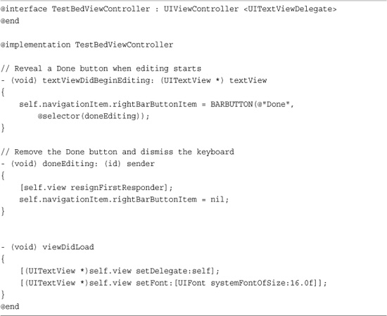
When dismissing keyboards, UITextView instances require a slightly different approach than UITextField ones. Users should be able to tap Return in the text view, adding carriage returns without dismissing the keyboard. Instead, add a Done button to the general interface when the text view becomes active, as shown in Figure 9-11. Use this key to resign first-responder status when the user finishes his or her edits.
Figure 9-11 Add a Done key to the navigation bar when users start interacting with a text view. This offers users an obvious way to finish editing and dismiss the keyboard.
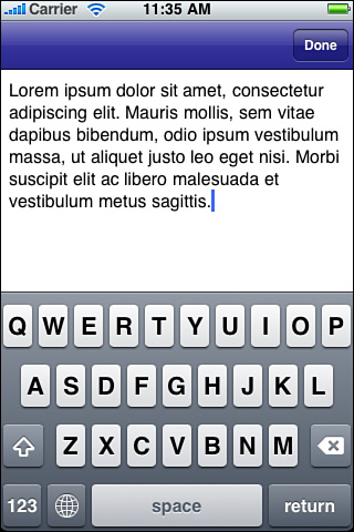
To sense text view activity, your view controller must implement the UITextViewDelegate protocol, and it must be set as the text view’s delegate. The textViewDidBeginEditing: delegate method triggers whenever a user taps the view. Detecting this enables you to either add or enable the Done button. Users can then tap on Done after they’ve finished editing. The Done button offers an obvious way to finish editing and dismiss the keyboard.
Recipe 9-8 demonstrates how to add the navigation item button in the delegate method call and how to remove it when the user is done editing. Reveal the Done button when the view becomes active. Hide it when resigning the view’s first-responder status.
Recipe 9-8 Adding a Done Button to Active UITextView Sessions
Get This Recipe’s Code
To get the code used for this recipe, go to http://github.com/erica/iphone-3.0-cookbook-, or if you’ve downloaded the disk image containing all of the sample code from the book, go to the folder for Chapter 9 and open the project for this recipe.
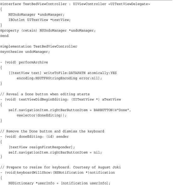
Recipe: Building a Better Text Editor
Recipe 9-8 showed how to catch user interactions within a text view. Recipe 9-9 expands upon this notion to add a number of critical features that make a better text editor. These features are easy to implement in your own programs.
Recipe 9-9 Adding Undo Support, Persistence, and Autoresizing to Text Views
Get This Recipe’s Code
To get the code used for this recipe, go to http://github.com/erica/iphone-3.0-cookbook-, or if you’ve downloaded the disk image containing all of the sample code from the book, go to the folder for Chapter 9 and open the project for this recipe.
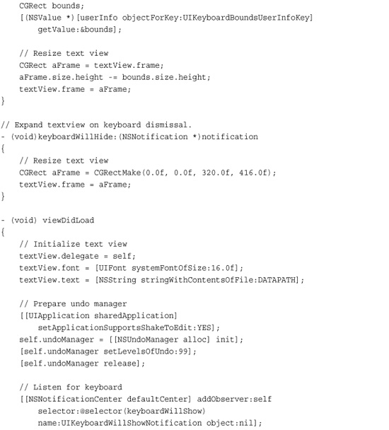
First, the view controller adds undo support. Users can shake the iPhone to load the undo/redo editor that was first introduced in Chapter 8. UITextView objects ship in an undo-ready state. They provide built-in support that works hand-in-hand with select, cut, copy, and paste. The undo manager understands these actions, so possible user messages might include “Undo Paste,” “Redo Cut,” and so forth. All the view controller needs to do is instantiate an undo manager; it leaves the rest of the work to the built-in objects.
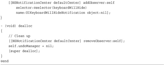
Second, the view uses persistence. It archives its contents to file in the performArchive method. The application delegate calls this method right before the application is due to quit.
On launch, any data in that file is read in to initialize the text view instance.
Finally, the text view automatically updates its size when the keyboard appears. This ensures that the keyboard does not hide any part of the text. That’s especially important when you want to edit the end of a long text entry. By shrinking the text view so it appears fully above the keyboard, users can access every part of the text.
To make this happen, Recipe 9-9 listens for two standard notifications that are sent when the keyboard is about to show or hide. The code adds observers that can respond to the keyboard state and adjust the text view height to match the keyboard presentation.
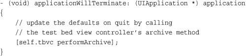
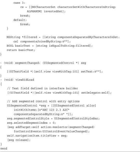
Recipe: Text Entry Filtering
At times you want to ensure that a user enters only a certain subset of characters. For example, you might want to create a numeric-only text field that does not handle letters. Although you can use predicates to test the final entry against a regular expression (the NSPredicate class’s MATCH operator supports regex values), for filtered data it’s easier to check each new character as it’s typed against a legal set.
A UITextField delegate can catch those characters as they are typed and decide whether to add the character to the active text field. The optional textField:shouldChangeCharactersInRange:replacementString: delegate method returns either YES, allowing the newly typed character(s) or NO, disallowing it or them. In practice, this works on a character-by-character basis being called after each user keyboard tap. However, with 3.0’s new pasteboard support, the replacement string could theoretically be longer when text is pasted to a text field.
Recipe 9-10 works by looking for any disallowed characters within the new string. When it finds them, it rejects the entry leaving the text field unedited. So a paste of mixed allowed and disallowed text would be rejected entirely.
Recipe 9-10 Filtering User Text Entry
Get This Recipe’s Code
To get the code used for this recipe, go to http://github.com/erica/iphone-3.0-cookbook-, or if you’ve downloaded the disk image containing all of the sample code from the book, go to the folder for Chapter 9 and open the project for this recipe.
This recipe considers four scenarios: alphabetic text entry only, numeric, numeric with an allowed decimal point, and a mix of alphanumeric characters. You can adapt this example to any set of legal characters you want.
The third entry type, numbers with a decimal point, uses a little trick to ensure that only one decimal point gets typed. Once it finds a period character in the associated text field, it switches the characters it accepts from a set with the period to a set without it. Yes, you can sneak your way around this using paste, although it’s unlikely that users will resort to doing so.
Recipe: Adding a Page Indicator Control
The UIPageControl class provides a line of dots that indicates which item of a multipage view is currently displayed. The dots at the bottom of the SpringBoard home page present an example of this kind of control in action. Sadly, the UIPageControl class is a disappointment in action. The UIPageControl class is awkward to handle, hard to tap, and will generally annoy your users. So when using it, make sure you add alternative navigation options so that the page control acts more as an indicator and less as a control.
Figure 9-12 shows a page control with three pages. Taps to the left or right of the bright-colored current page indicator trigger UIControlEventValueChanged events, launching whatever method you set as the control’s action. You can query the control for its new value by calling currentPage and set the available page count by adjusting the numberOfPages property. SpringBoard limits the number of dots representing pages to nine, but your application can use a higher number, particularly in landscape mode.
Figure 9-12 The UIPageControl class offers an interactive indicator for multipage presentations. Taps to the left or right of the active dot enable users to select new pages. At least they do in theory. The page control is hard to tap, requires excessive user precision, and offers poor response performance.
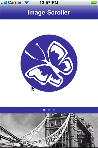
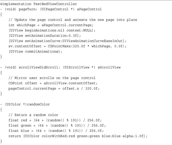
Recipe 9-11 uses a UIScrollView instance to display three pages of images. Users can scroll through the pictures using swipes, and the page indicator updates to reflect the current page shown. Similarly, users can tap on the page control and the scroller animates the selected page into place. This two-way relationship is built by adding a target-action callback to the page control and a delegate callback to the scroller. Each callback updates the other object, providing a tight coupling between the two.
Recipe 9-11 Using the UIPageControl Indicator
Get This Recipe’s Code
To get the code used for this recipe, go to http://github.com/erica/iphone-3.0-cookbook-, or if you’ve downloaded the disk image containing all of the sample code from the book, go to the folder for Chapter 9 and open the project for this recipe.
Recipe: Creating a Customizable Paged Scroller
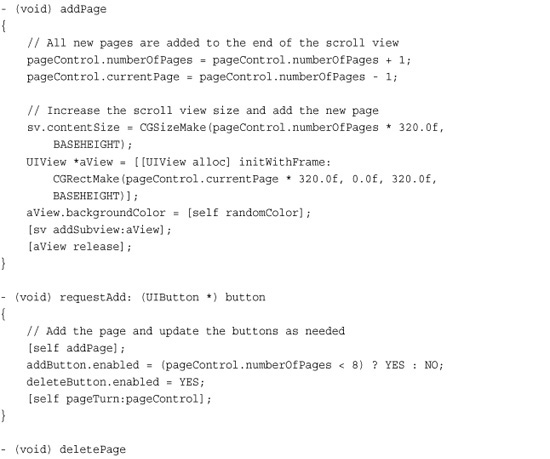
Recipe 9-11 introduced a basic paged scroller but didn’t add any dynamic interaction to the equation. That sample started and ended with three pages. In real life, page controls are far more useful when you can add and delete pages on the fly. Recipe 9-12 does exactly that. It adds buttons that build and remove views for the UIScrollView.
Recipe 9-12 Adding and Deleting Pages On the Fly

Get This Recipe’s Code
To get the code used for this recipe, go to http://github.com/erica/iphone-3.0-cookbook-, or if you’ve downloaded the disk image containing all of the sample code from the book, go to the folder for Chapter 9 and open the project for this recipe.
This approach uses not two but four separate controls to produce the add-and-remove interface of Figure 9-13. The four buttons include an add button built using the standard Contacts Add button style, a delete button that mimics that style, a confirm button that looks like an “X,” which is built to fit over the delete button, and a full-screen, completely clear cancel button.
Figure 9-13 The + and - buttons let users add and remove paged views from the scroller. Deletion requires an extra step as a confirm button animates into place.
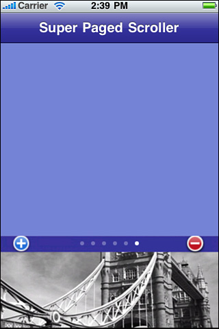
The buttons work like this. So long as there are fewer than eight buttons, the user can tap Add to create a new view in the UIScrollView. On add, the number of pages for the page control updates, and the new view scrolls into place. There’s also a check for the current page count; when that page count hits the maximum, the code disables the add button. The eight-page limit is arbitrary. You can adjust the code for a larger or smaller number.
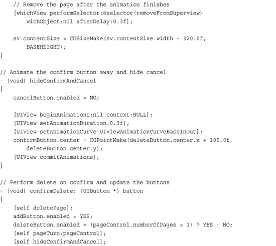
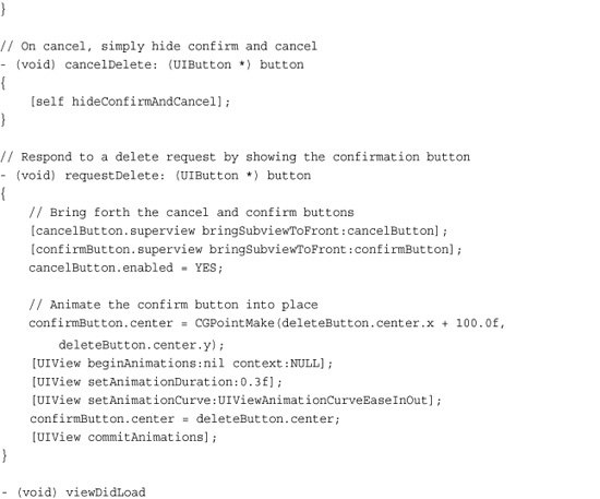
Upon tapping Delete, a confirm button animates into place and the invisible cancel button is enabled, covering the rest of the screen. If the user taps Confirm, the page deletes. A tap anywhere else causes the action to cancel, hiding the confirm button without performing a page deletion.
This confirm/cancel approach mirrors Apple’s delete-with-caution policy that’s seen in table edits and in other user interfaces. It takes two taps to delete a page and the user can cancel out without penalty. This prevents accidental page deletion and provides a safe exit route should the user decide not to continue.
Building a Toolbar
You can build toolbars in Interface Builder and in Xcode, but when push comes to shove, it’s often a lot easier in Xcode. That’s because the IB user interface for adding and customizing a toolbar’s bar button items is pretty dreadful. You need to keep switching between palettes and inspectors, and things quickly get messy.
After dragging a toolbar into an IB view, you must add and then customize each bar button item. Drag in one bar button item for each element you plan to add. Toolbar elements include both view items like buttons and spacers that lie between those buttons, as shown in Figure 9-14 (left).
Figure 9-14 Adding bar button items in Interface Builder can be a complex process.
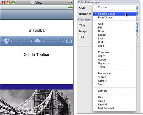
Once added, the bar button item attributes inspector (Command-1) shown in Figure 9-14 (right) lets you choose which kind of item each bar button represents. Use the Custom style to create custom text- and image-based items. Otherwise, pick from the list of system-defined icons. These include icons for playing media, accessing the camera, editing a list, and more.
When using a system item, make sure your application uses that item in a manner that complies with Apple’s Human Interface Guidelines. App Store reviewers take a dim view of “creative” icon interpretations.
On a similar note, avoid creating your own buttons that look like any Apple products or trademarks. Apps have been rejected for using icons that look like the iPhone and Apple’s logo.
Building Toolbars in Xcode
It’s easy to define and lay out toolbars in Xcode provided that you’ve supplied yourself with a few handy macro definitions. The following macros return proper bar button items for the four available styles of items.
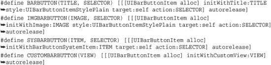
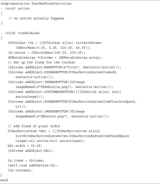
Those styles are text items, image items, system items, and custom view items. Each of these macros provides an autoreleased UIBarButtonItem that can be placed into a UIToolbar. Recipe 9-13 demonstrates these macros in action, showing how to add each style including spacers. You can even add a custom view to your toolbars, as Recipe 9-13 does. It inserts a UISwitch instance as one of the bar button items, as shown in Figure 9-15.
Recipe 9-13 Creating Toolbars in Xcode
Get This Recipe’s Code
To get the code used for this recipe, go to http://github.com/erica/iphone-3.0-cookbook-, or if you’ve downloaded the disk image containing all of the sample code from the book, go to the folder for Chapter 9 and open the project for this recipe.
Figure 9-15 Custom toolbar items can include views like this switch.
The fixed space bar button item represents the only instance where you need to move beyond these handy macros. You must set the item’s width property to define how much space the item occupies.
Toolbar Tips
When working with toolbars, here are a few tricks of the trade that might come in handy:
• Fixed spaces can have widths—Of all UIBarButtonItems, only UIBarButtonSystemItemFixedSpace items can be assigned a width. So create the spacer item, set its width, and only then add it to your items array.
• Use a single flexible space for left or right alignment—Adding a single UIBarButtonSystemItemFlexibleSpace at the start of an items list right-aligns all the remaining items. Adding one to the end, left-aligns. Use two, one at the start and one at the end, to create center alignments.
• Take missing items into account—When hiding bar button items due to context, don’t just use flexible spacing to get rid of the item. Instead, replace the item with a fixed-width space that matches the item’s original size. That preserves the layout and leaves all the other icons in the same position both before and after the item disappears.
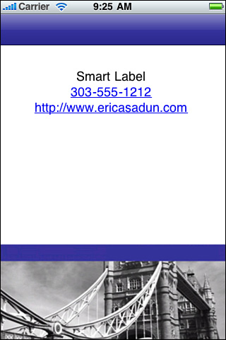
One More Thing: Smart Labels
Unfortunately, the built-in UILabel class isn’t very smart when it comes to providing clickable elements like phone numbers and Web addresses. That’s where the UITextView class can step in. Text views offer a new 3.0 property called dataDetectorTypes, which specifies which data types get converted to clickable URLs. The available types are phone numbers (UIDataDetectorTypePhoneNumber) and links (UIDataDetectorTypesLink). To enable all types, choose the all flag (UIDataDetectorTypeAll) as used here.
You also find individual check boxes for links and phone numbers in the Interface Builder text view attributes inspector.
When replacing UILabel instances with UITextView instances make sure to disable scrolling. Set the view’s editable property to NO, either in code or in Interface Builder. Use carriage return constants (
) to provide line breaks and carefully consider your text alignment choices. Figure 9-16 shows a UITextView stepping in and acting like a label while offering automatic URL creation.
Figure 9-16 This “label” is actually a text view with its data detectors enabled.
When working with embedded URLs be aware that links take users to the requested resource without any further confirmation. In contrast, telephone numbers require user confirmation before dialing.
Note
Ever need to work with fonts outside those supplied with Cocoa Touch? A an open source iPhone project called FontLabel (http://github.com/zynga/FontLabel), developed by iPhone guru Kevin Ballard, uses the Core Graphics CGFont class to bypass the iPhone’s UIFont limitations. FontLabel is in active development at the time this book was written, with regular updates.
Summary
This chapter introduced many ways to interact with and get the most from the controls in your applications. Before you move on to the next chapter, here are a few thoughts for you to ponder:
• Just because an item belongs to the UIControl class doesn’t mean you can’t treat it like a UIView. Give it subviews, resize it, animate it, move it around the screen, or tag it for later.
• Core Graphics and Quartz 2D let you build visual elements as needed. Combine the comfort of the SDK classes with a little real-time wow to add punch to your presentation.
• If the iPhone SDK hasn’t delivered the control you need, consider adapting an existing control or building a new control from scratch.
• Apple provides top-notch examples of user interface excellence. Consider mimicking their examples when creating new interaction styles like the confirm button used in this chapter to safeguard a delete action.
• Interface Builder doesn’t always provide the best solution for creating interfaces. With toolbars, you may save time in Xcode rather than customizing each element by hand in IB.