5. Working with View Controllers
UIViewControllers handle view management for many iPhone applications. In the previous chapter you saw how to build view controller-based applications using Xcode and Interface Builder. Now it’s time to dive into more advanced view controller-based classes and learn how to apply them to real-world situations. In this chapter you discover how to build simple menus, create view navigation trees, design tab bar-based applications, and more. This chapter offers hands-on recipes for working with a variety of controller classes.
Developing with Navigation Controllers
The UINavigationController class provides all the high-calorie goodness of a UINavigationBar-based interface with minimal navigation-specific programming. Navigation controllers let users move smoothly between views (or, more accurately, view controllers) using built-in animation. They provide history control for free without any programming effort. Navigation controllers automatically handle Back button functionality. The titles of each parent view controller appear as Back buttons, letting users “pop the stack,” so to speak, without any further programming effort.
And if that weren’t enough, the navigation controller also offers a simple menu bar. You can add buttons—or even more complicated controls—into the bar to build actions into your application. Between these three features of navigation, history, and menus, navigation controllers build a lot of wow into a simple-to-program package.
The following recipes introduce these core navigation controller features, from building menus to building a history stack. In these examples, you see how to use the UINavigationController class to create a variety of novel and useful interfaces.
Setting Up a Navigation Controller
Whether you plan to use a navigation controller to simplify moving between views—its intended use—or use it as a convenient menu button holder you should understand how the navigation controller works. At their simplest level, navigation controllers manage view controller stacks.
Every navigation controller owns a root view controller. This controller forms the base of the stack. You can programmatically push other controllers onto the stack. This extends the navigation breadcrumb trail and automatically builds a Back button each time a new view controller gets pushed.
Tap one of these Back buttons to pop controllers off the stack. Users can pop back until reaching the root. Then you can go no further. The root is the root, and you cannot pop beyond that root.
This stack-based design lingers even when you plan to use just one view controller. You might want to leverage the UINavigationController’s built-in navigation bar to build a two-button menu, for example. This would disregard any navigational advantage of the stack. You still need to set that one controller as the root via initWithRootViewController:.
You can use Interface Builder and Xcode templates to build navigation-based interfaces, as introduced in Chapter 4, “Designing Interfaces,” or you can create those same interfaces by hand. The easiest way to do so is by building your navigation controller in the applicationDidFinishLaunching: method that gets called at the start of your application run. Here, you set up the window, create the navigation controller, and assign its root.

This is one of the few places you don’t really have to worry about memory management and leaky calls. An application delegate’s dealloc method is never called at application termination, so while you can assign the window and the navigation controller to instance variables and use those variables in a deallocation method, it doesn’t really matter if you’d rather not do so.
Pushing and Popping View Controllers
Add new items onto the navigation stack by pushing a new controller with pushViewController: animated:. Send this call to the navigation controller that owns a UIViewController. This is normally called on self.navigationController. When pushed, the new controller slides onscreen from the right (assuming you set animated to YES). A left-pointing Back button appears, leading you one step back on the stack. The Back button uses the title of the previous view controller.
There are many reasons you’d push a new view. Typically, these involve navigating to subviews like detail views or drilling down a file structure. You can push controllers onto the navigation controller stack after your user taps a button, a table item, or a disclosure accessory.
Perform push requests and navigation bar customization (like setting up a bar’s right-hand button) inside UIViewController subclasses. As a rule, there’s no reason or need to ever subclass UINavigationController. And, for the most part, you need never access the navigation controller directly. The two exceptions to this rule include managing the navigation bar’s buttons and when you change the bar’s look.
You might change a bar style or its tint color by accessing the navigationBar property directly.
self.navigationController.navigationBar.barStyle =
UIBarStyleBlackTranslucent;
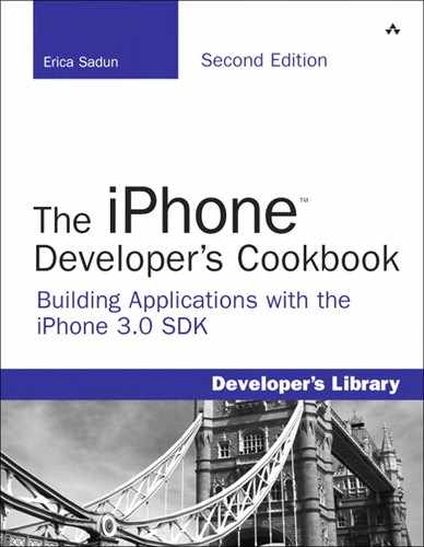
To add a new button you modify your navigationItem, which provides an abstract class that describes the content shown on the navigation bar. To remove a button, assign the item to nil.
The Navigation Item Class
The objects that populate the navigation bar are put into place using the UINavigationItem class, which is an abstract class that stores information about those objects. Navigation item properties include the left and right bar button items, the title shown on the bar, the view used to show the title, and any Back button used to navigate back from the current view.
This class basically enables you to attach buttons, text, and other UI objects into three key locations: the left, the center, and the right of the navigation bar. Typically, this works out to be a regular button on the right, some text (usually the UIViewController’s title) in the middle, and a Back-styled button on the left. But you’re not limited to that layout. You can add custom controls to any of these three locations You can build navigation bars with search fields, segment controls, toolbars, pictures, and more.
You’ve already seen how to add custom bar button items to the left and right of a navigation item. Adding a custom view to the title is just as simple. Instead of adding a control, assign a view. This code adds a custom UILabel, but this could be a UIImageView, a UISwitch, or anything else.
self.navigationItem.titleView = [[[UILabel alloc]
initWithFrame:CGRectMake(0.0f,0.0f, 120.0f, 36.0f)] autorelease];
The simplest way to customize the actual title is to use the title property of the child view controller rather than the navigation item.
self.title = @"Hello";
When you want the title to automatically reflect the name of the running application, here is a little trick you can use. This returns the short display name defined in the bundle’s Info.plist file.
Modal Presentation
With normal navigation controllers, you push your way along views, stopping occasionally to pop back to previous views. That approach assumes that you’re drilling your way up and down a set of data that matches the tree-based view structure you’re using. Modal presentation offers another way to show a view controller. After sending the presentModalViewController: animated: message, a new view controller slides up into the screen and takes control until it’s dismissed with dismissModalViewControllerAnimated:. This enables you to add special-purpose dialogs into your applications that go beyond alert views.
Typically, modal controllers are used to pick data such as contacts from the Address Book or photos from the Library, but you can use modal controllers in any setting where it makes sense to perform a task that lies outside the normal scope of the active view controller.
You can present a modal dialog in any of three ways, controlled by the modalTransitionStyle property of the presented view controller. The standard, UIModalTransitionStyleCoverVertical, slides the modal view up and over the current view controller. When dismissed it slides back down. UIModalTransitionStyleFlipHorizontal performs a back-to-front flip from right-to-left. It looks as if you’re revealing the back side of the currently presented view. When dismissed, it flips back left-to-right. The final style is UIModalTransitionStyleCrossDissolve. It fades the new view in over the previous one. On dismissal, it fades back to the original view.
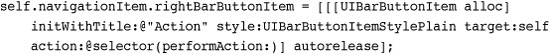
Utility Function
Some of the recipes in this book use this showAlert() macro/function combination. This function acts as a visual version of NSLog(), and it displays a message and information about where the call originated. This function can be called using the same parameters as NSLog, complete with format string and arguments. For space considerations, this alert code is not listed in individual recipes. Invoking the alert code is shown in Figure 5-1, which follows later in this chapter.
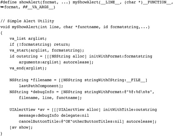
Figure 5-1 Create a basic two-button menu for iPhone applications by adding custom buttons to a UINavigationController-based interface.

Recipe: Building a Simple Two-Item Menu
Although many applications demand serious user interfaces, sometimes you don’t need complexity. A simple one- or two-button menu can accomplish a lot. Use these steps to create a hand-built interface for simple utilities:
1. Create a UIViewController subclass that you use to populate your primary interaction space.
2. Allocate a navigation controller and assign an instance of your custom view controller to its root view.
3. In the custom view controller, create one or two buttons and add them to the view’s navigation item.
4. Build the callback routines that get triggered when a user taps a button.
Recipe 5-1 demonstrates these steps. It creates a simple view controller called TestBedViewController and assigns it as the root view for a UINavigationController. In the loadView method, two buttons populate the left and right custom slots for the view’s navigation item. When tapped, these show an alert, indicating which button was pressed. This recipe is not feature rich, but it provides an easy-to-build two-item menu. Figure 5-1 shows the interface in action.
Recipe 5-1 Creating a Two-Item Menu Using a Navigation Controller
Get This Recipe’s Code
To get the code used for this recipe, go to http://github.com/erica/iphone-3.0-cookbook-, or if you’ve downloaded the disk image containing all of the sample code from the book, go to the folder for Chapter 5 and open the project for this recipe.
This code uses a handy bar button creation macro. When passed a title and a selector, this macro returns a properly initialized autoreleased bar button item ready to be assigned to a navigation item.
If you’re looking for more complexity than two items can offer, consider having the buttons trigger UIActionSheet menus. Action sheets, which are discussed in Chapter 10, “Alerting Users,” let users select actions from a short list of options (usually between two and five options, although longer scrolling sheets are possible) and can be seen in use in the Photos and Mail applications for sharing and filing data.
Note
You can add images instead of text to the UIBarButtonItem instances used in your navigation bar. Use initWithImage: style: target: action: instead of the text-based initializer.
Recipe: Adding a Segmented Control
The preceding recipe showed how to use the two available button slots in your navigation bar to build mini menus. Recipe 5-2 expands on that idea by introducing a six-item UISegmentedControl and adding it to a navigation bar’s custom title view, as shown in Figure 5-2. When tapped, each item updates the main view with its number.
Recipe 5-2 Adding a Segmented Control to the Navigation Bar

Get This Recipe’s Code
To get the code used for this recipe, go to http://github.com/erica/iphone-3.0-cookbook-, or if you’ve downloaded the disk image containing all of the sample code from the book, go to the folder for Chapter 5 and open the project for this recipe.
Figure 5-2 Adding a segmented control to the custom title view allows you to build a multi-item menu. Notice that no items remain highlighted even after an action takes place. (In this case, the One button was pressed.)
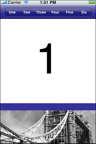
The key thing to pay attention to in this recipe is the momentary attribute assigned to the segmented control. This transforms the interface from a radio button style into an actual menu of options, where items can be selected independently and more than once. So after tapping item three, for example, you can tap it again. That’s an important behavior for menu interaction.
Unlike Recipe 5-1, all items in the segmented control trigger the same action (in this case, segmentAction:). Determine which action to take by querying the control for its selectedSegmentIndex and use that value to create the needed behavior. This recipe updates a central text label. You might want to choose different options based on the segment picked.
Note
If you want to test this code with the momentary property disabled, set the selectedSegmentIndex property to match the initial data displayed. In this case, segment 0 corresponds to the displayed number 1.
Segmented controls use styles to specify how they should display. The sample here, shown in Figure 5-2, uses a bar style. It is designed for use with bars, as it is in this example. The other two styles (UISegmentedControlStyleBordered and UISegmentedControlStylePlain) offer larger, more metallic-looking presentations. Of these three styles, only UISegmentedControlStyleBar can respond to the tintColor changes used in this recipe.
Recipe: Navigating Between View Controllers
In addition to providing menus, navigation controllers do the job they are designed to do: managing hierarchy as you navigate between views. Recipe 5-3 introduces the navigation controller as an actual navigation controller, pushing views on the stack.
Recipe 5-3 Drilling Through Views with UINavigationController
Get This Recipe’s Code
To get the code used for this recipe, go to http://github.com/erica/iphone-3.0-cookbook-, or if you’ve downloaded the disk image containing all of the sample code from the book, go to the folder for Chapter 5 and open the project for this recipe.
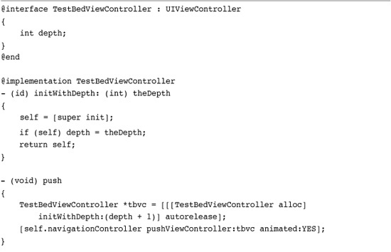
These views consist of the same number-display stand-ins you’ve seen in earlier recipes. An instance variable stores the current depth number, which is used to show the current level and decide whether to display a further push option. The maximum depth here is 6. In real use, you’d use more meaningful view controllers or contents. This sample demonstrates things at their simplest level.
The navigation controller automatically creates the Level 2 Back button shown in Figure 5-3 (left) as an effect of pushing the new Level 3 controller onto the stack. The rightmost button (Push 4) triggers navigation to the next controller by calling pushViewController: animated:. When pushed, the next Back button reads Level 3, as shown in Figure 5-3 (right).
Figure 5-3 The navigation controller automatically creates properly labeled Back buttons. After selecting the Push 4 button in the left interface, the navigation controller pushes the Level 4 view controller and creates the Level 3 Back button in the right interface.
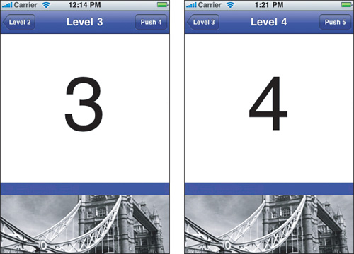
Back buttons pop the controller stack for you. You do not need to program any popping behavior yourself. Note that Back buttons are automatically created for pushed view controllers but not for the root controller itself, as it is not applicable.
Recipe: Using Creative Popping Options
Although you usually want to pop to the previous view controller upon hitting the Back button, be aware that there are times you want to pop the entire stack instead. For example, you might have just given an interactive quiz, or a museum visitor might have finished his walking tour. For these cases, it makes little sense to move back up a long complex tree a screen at a time. Instead, use popToRootViewControllerAnimated:. This empties the stack, popping all view controllers except the root, updating the display accordingly.
To pop back to a specific controller other than the root, use popToViewController: animated:. This pops the stack until the top view matches the view controller specified. To pop back just one item, as if the user had tapped the back button, use popViewControllerAnimated:.
Loading a View Controller Array
You can create and assign an array of UIViewController objects to a UINavigationController’s viewControllers property. The array represents the current controller stack. The top (that is, active) view controller occupies the last position (n -1) in the array; the root object lives at index 0.
There are various reasons you might want to set the array property. Controller arrays help restore previous states after quitting and then returning to an application. You might store a state list to user defaults and then re-create the same array on launch, returning your user to the same place in the controller hierarchy that he or she left from.
Arrays are also handy when jumping within a conceptual tree. For example, you might be navigating directories and then need to jump through a symbolic link to somewhere else. By setting the entire array, you avoid the detail work of popping and then pushing the stack.
Pushing Momentary Views
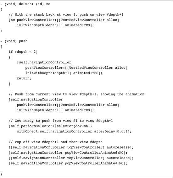
Every now and then, I run into developers who want to be able to push UIViewControllers that do not remain in the navigation controller stack. For example, you might start at view 1, push on view 2, and then push on view 3 while letting the Back button from view 3 link back to the first view.
This situation comes up more often than you might imagine. The most common reason is that you’re introducing the action that will take place in the third view with the second. Typically, the second screen contains instructions, general “read me” content, or a visual splash. These are meant to display once and then be gone from the user experience and yet, you want the navigation controller experience to remain as standard as possible. To make this work, the Back button needs to ignore the second, temporary view.
Recipe 5-4 demonstrates how to do this. When the second view is ready to transition to the third, the navigation controller goes ahead and performs the push. This creates the proper animation for the viewer, from view two to view three. Then, without animation, the code pops the last two views, leaving the stack at view one. To finish, the code performs a delayed animated push, adding view three behind view one, creating the proper “back” button.
Recipe 5-4 Pushing Momentary Views
Get This Recipe’s Code
To get the code used for this recipe, go to http://github.com/erica/iphone-3.0-cookbook-, or if you’ve downloaded the disk image containing all of the sample code from the book, go to the folder for Chapter 5 and open the project for this recipe.
Although the main view animation properly shows a push from view two to view three, be aware that the navigation bar animation shows a push from root to Level 3. This should not be enough to get your application booted from the App Store for violating human interaction guidelines but you might want to use smart interface design to minimize visual discontinuities.
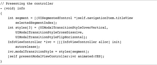
Recipe: Presenting a Custom Modal Information View
Modal view controllers slide onscreen without being part of your standard view controller stack. Modal views are useful for picking data or presenting information, tasks that might not match well to your normal hierarchy. Any view controller or navigation controller can present a modal controller:
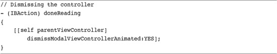
The controller that is presented can be either a view controller or navigation controller. Either way, it helps to provide a Done button to allow the user to dismiss the controller. Figure 5-4 shows a modal presentation built around a UIViewController instance. The navigation bar at the top of the view was added via a UINavigationBar instance, making this view especially easy to construct in Interface Builder.
Figure 5-4 This modal view is built using UIViewController with a UINavigationBar.

Normally, a navigation controller-based view requires two .xib files and extra work, as shown in the Chapter 4 walk-throughs that built a navigation-based interface. Using the bar directly avoided the hassle and provided an elegant solution that mimics the normal look of a UINavigationController presentation.
Recipe 5-5 shows the two key pieces for this presentation. The presentation is done in the main view controller, with the presentation style set by a segmented control. The InfoViewController, that is, the class that was presented, handles dismissal. Its Done button was connected via IB to the doneReading method. This method asks the view controller’s parent to dismiss the modally presented view controller.
Recipe 5-5 Presenting and Dismissing a Modal Controller
And...
Get This Recipe’s Code
To get the code used for this recipe, go to http://github.com/erica/iphone-3.0-cookbook-, or if you’ve downloaded the disk image containing all of the sample code from the book, go to the folder for Chapter 5 and open the project for this recipe.
Recipe: Tab Bars
The UITabBarController class allows users to move between multiple view controllers and to customize the bar at the bottom of the screen. This is best seen in the YouTube and iPod applications. Both offer one-tap access to different views, and both offer a More button leading to user selection and editing of the bottom bar.
With tab bars, you don’t push views the way you do with navigation bars. Instead, you assemble a collection of controllers (they can individually be UIViewControllers, UINavigationControllers, or any other kind of view controllers) and add them into a tab bar by setting the bar’s viewControllers property. It really is that simple. Cocoa Touch does all the rest of the work for you. Set allowsCustomizing to YES to enable user reordering of the bar.
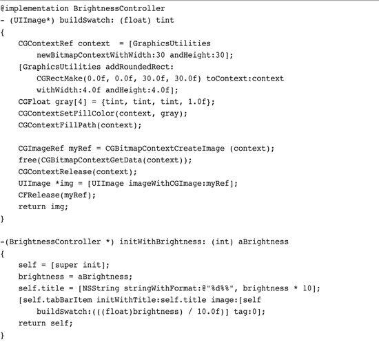
Recipe 5-6 creates 11 simple view controllers of the BrightnessController class. This class uses a UIView embedded into mainview.xib and sets its background to a specified gray level, in this case from 0% to 100% in steps of 10%. Figure 5-5 (left) shows the interface in its default mode, with the first four items and a More button displayed.
Recipe 5-6 Creating a Tab View Controller
Get This Recipe’s Code
To get the code used for this recipe, go to http://github.com/erica/iphone-3.0-cookbook-, or if you’ve downloaded the disk image containing all of the sample code from the book, go to the folder for Chapter 5 and open the project for this recipe.
Figure 5-5 Tab bar controllers allow users to pick view controllers from a bar at the bottom of the screen (left side of the figure) and to customize the bar from a list of available view controllers (right side of the figure).
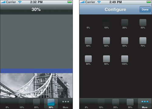
Reorder these tabs by selecting the More option and then tapping Edit. This opens the Configure panel shown in Figure 5-5 (right). These 11 view controllers are the options a user can navigate through and select from.
Notice that this recipe adds those 11 controllers twice. The first time assigns them to the list of view controllers available to the user:
tbarController.viewControllers = controllers;
The second time specifies that the user can select from the entire list when interactively customizing the bottom tab bar:
tbarController.customizableViewControllers = controllers;
The second line is optional, the first mandatory. After setting up the view controllers, you can add all or some to the customizable list. If you don’t, you still can see the extra view controllers using the More button, but users won’t be able to include them in the main tab bar on demand.
Tab art appears inverted in color on the More screen. According to Apple, this is the expected and proper behavior. They have no plans to change this. It does provide an interesting view contrast when your 100% white swatch appears as pure black on that screen.
Note that this recipe uses a convenience class called GraphicsUtilities, which I created for this book. This and other goodies are looked at in detail in later chapters.
Recipe: Remembering Tab State
On the iPhone, persistence is golden. When starting or resuming your application from termination or interruption, always return users to a state that closely matches where they left off. This lets your users pick up with whatever tasks they were involved with and provides a user interface that matches the previous session. Recipe 5-7 introduces an example of doing exactly that.
Recipe 5-7 Storing Tab State to User Defaults

Get This Recipe’s Code
To get the code used for this recipe, go to http://github.com/erica/iphone-3.0-cookbook-, or if you’ve downloaded the disk image containing all of the sample code from the book, go to the folder for Chapter 5 and open the project for this recipe.
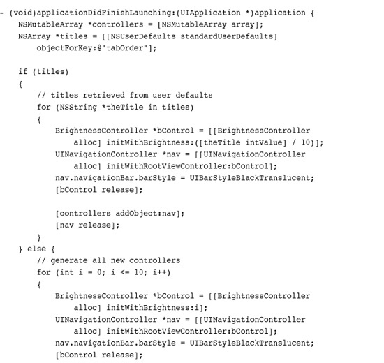
This recipe stores both the current tab order and the currently selected tab, and does so whenever those items are updated. When a user launches the application, the code searches for previous settings and applies them when they are found.
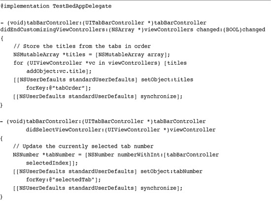
The approach used here depends on two delegate methods. The first, tabBarController: didEndCustomizingViewControllers: provides the current array of view controllers after the user has customized them with the More > Edit screen. This code snags their titles (10%, 20%, and so on) and uses that information to relate a name to each view controller.
The second delegate method is tabBarController: didSelectViewController:. The tab bar controller sends this method each time a user selects a new tab. By capturing the selectedIndex, this code stores the controller number relative to the current array.
Setting these values depends on using the iPhone’s built-in user defaults system, NSUserDefaults. This preferences system works very much as a large mutable dictionary. You can set values for keys using setObject: forKey:
and retrieve them with objectForKey:.
Always make sure to synchronize your settings as shown in this code to ensure that the defaults dictionary matches your changes. If you do not synchronize, the defaults will not get set until the program terminates. If you do synchronize, your changes are updated immediately. Any other parts of your application that rely on checking these settings will then be guaranteed to access the latest values.
When the application launches, it checks for previous settings for the last selected tab order and selected tab. If it finds them, it uses these to set up the tabs and select a tab to make active. Since the titles contain the information about what brightness value to show, this code converts the stored title from text to a number and divides that number by ten to send to the initialization function.
Most applications aren’t based on such a simple numeric system. Should you use titles to store your tab bar order, make sure you name your view controllers meaningfully and in a way that lets you match a view controller with the tab ordering.
Note
You could also store an array of the view tags as NSNumbers or, better yet, use the NSKeyedArchiver class that is introduced in Chapter 8, “Gestures and Touches.” Keyed archiving lets you rebuild views using state information that you store on termination.
One More Thing: Interface Builder and Tab Bar Controllers
Xcode offers an easy to customize Tab Bar Application template that gets you started building tab-bar-based GUIs in Interface Builder. The tab bar controller’s attribute inspector lets you add new tabs, as shown in Figure 5-6. Click the + button. The class column lets you select what kind of view controller you’re working with, namely View Controller, Table View Controller, Navigation Controller, or Image Picker Controller.
Figure 5-6 Interface Builder provides tools for laying out tab bar controllers but offers few advantages for building what is essentially a logical and not a visual class.
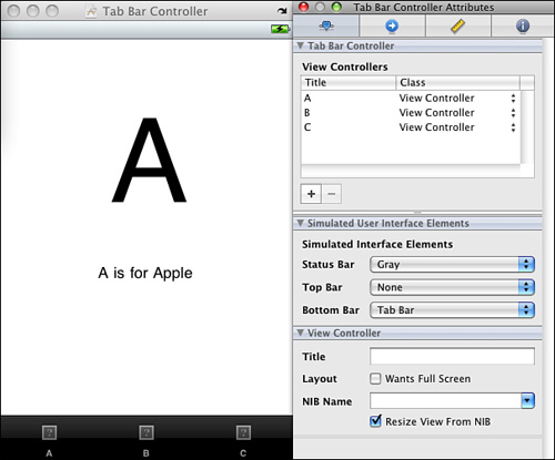
You’ll likely want to create a new view controller class for each tab. Create your class (and its associated .xib file) in Xcode and then choose the .xib from within Interface Builder. Tap any of the black tabs in the MainWindow .xib, and tap the gray View presentation. Select the .xib from the attributes inspector (Command-1). The first tab comes prepopulated with a view (as shown in Figure 5-6), but all the other tabs require a .xib to be assigned to them.
To add art to the tabs in IB, drag 20×20 png images from the Library > Media pane onto each tab button. The Media pane lists the images you have added to your Xcode project. Design your images using a transparent background and a white foreground.
While Interface Builder offers a friendly way to lay out individual views, you may find yourself forgoing it for tab bars and navigation bars. These classes provide what can be argued is more of a logical construct than a visual presentation. After all, you cannot drag the tab bar or the navigation bar around the screen and any customizations can easily be done in code.
Further, once you start taking advantage of the delegate callbacks that are leveraged directly from code, the IB overhead may no longer be worth the trouble. IB works best with view design. Its support for navigation controllers and tab bar controllers is relatively weak.
Summary
This chapter showed the UIViewController, UINavigationController, and UITabBarController classes in action. You learned how to use them to handle view presentation and user navigation. With these classes, you discovered how to expand virtual interaction space and create multipage interfaces as demanded by applications. Before moving on to the next chapter, here are a few points to consider about view controllers:
• Use navigation trees to build hierarchical interfaces. They work well for looking at file structures or building a settings tree. When you think “disclosure view” or “preferences,” consider pushing a new controller onto a navigation stack.
• Don’t be afraid to use conventional UI elements in unconventional ways so long as you respect the overall Apple human interface guidelines. Parts of this chapter covered innovative uses for the UINavigationController that didn’t involve any navigation. The tools are there for the using.
• Be persistent. Let your users return to the same GUI state that they last left from. NSUserDefaults provides a built-in system for storing information between application runs. Use these defaults to re-create the prior interface state.
• Interface Builder works best for visual layout. Many developers use it for designing views but give it a pass when building navigation controllers and tab bar controllers.