
Web page optimization streamlines your content to maximize display speed. Fast display speed is the key to success with your website. It increases profits, decreases costs, and improves customer satisfaction (not to mention search engine rankings, accessibility, and maintainability).
Streamlining transforms your pages to display navigable content faster, and to defer or delay off-site content. In this chapter, you’ll learn how to reduce HTTP requests, convert to semantic markup to more easily style with Cascading Style Sheets (CSS), optimize graphics and multimedia, and defer or delay the loading of off-site content.
To maximize web page display speed, you can employ the following 10 techniques:
Minimize HTTP requests.
Resize and optimize images.
Optimize multimedia.
Convert JavaScript behavior to CSS.
Use server-side sniffing.
Optimize JavaScript for execution speed and file size.
Convert table layout to CSS layout.
Replace inline style with CSS rules.
Minimize initial display time.
Load JavaScript wisely.
Using the best practices in this chapter, you’ll transform your HTML and multimedia to give your site more hurtle and less turtle. First, let’s explore some common web page problems and trends that confront web performance engineers.
The size and complexity of the markup that you use in your web pages determine, for the most part, their initial display speed. Pages that are large and complex, especially those with nested tables and mispositioned CSS and JavaScript files, delay the time it takes for useful content to display. Sleek and streamlined pages feel faster because of quicker feedback through progressive display. The idea is to streamline your markup using standards-based techniques and let your code get out of the way of your content.
As Steve Souders describes in his book High Performance Web Sites (O’Reilly), 80% of web page response time is in the content. Most of this time is spent dealing with the objects that make up a web page. As the number of objects per page increases beyond four, object overhead dominates total web page delay.
As you learned in the introduction to Part II, most popular web pages go well past this threshold, averaging more than 50 objects per page and more than 300 KB in total file size. Improperly coded, Ajax-enhanced pages can slow down interactivity, even after the page has loaded.
Clearly, there is room for improvement in the performance of the average website.
With the advent of Ajax, DHTML, and Web 2.0 mashups, some web pages have turned from simple HTML documents into full-blown interactive applications. With this increased complexity comes a cost: larger web pages. The number of external objects has grown accordingly as web pages have become more complex. Each additional object adds one more HTTP request and more uncertain delay.
Each object adds latency to your load time, increasing it an average of 0.25 seconds per object on dial-up and 40 ms on cable. [102] Overseas users suffer the most from object overage because long-distance connections require more hops and present more opportunities for data loss.
Tables are a poor substitute for CSS layout. Despite the widespread adoption of CSS, 62.6% of web pages still use tables for layout. [103] The average table depth has decreased by half since 2006, from nearly 3 to about 1.5. [104] Complex nested tables can cause rendering delays with browsers because tangled tables must be parsed and rendered before your content displays.
Some database-driven sites create table-based content modules that are assembled on the fly into table-based templates. All of these nested tables will bog down browsers and overwhelm your content-to-code ratio. This reduces the potential search engine rankings of your web pages.
You can reduce the depth of nested tables by styling, labeling, and positioning content areas with CSS and using simpler skeleton tables for layout. You can then target content within labeled container cells with compound selectors such as:
td#main p{}Or, you can use CSS entirely to position, style, and target content like this:
div#main ul{}See “Step 7: Convert Table Layout to CSS Layout,” later in this chapter, for some tips on creating and debugging CSS layouts, and Chapter 7 for tips on CSS drop-down menu creation. Teaching all the intricacies of CSS layout is beyond the scope of this book; we encourage you to refer to some of the excellent books on the subject, including CSS Mastery by Andy Budd (friends of ED), and CSS Web Site Design by Eric Meyer (Peachpit Press).
The average web page has more than 54% of its page weight in graphics. [105] In fact, more than 60% of the pixels above the fold are used by graphics on the average web page. [106]
Unfortunately, many of the graphics on the Web are fat and unoptimized. As digital camera resolution has increased, the file size of digital originals has ballooned, and some online graphics exceed 1 MB. Trying to view such bloated graphics on a dial-up connection is like trying to get a camel to pass through the eye of a needle.
Most popular media and blog sites use image-heavy advertising to generate revenue, at a cost of about one-sixth more objects and one-third more latency. [107] A survey of the top 1,300 Alexa sites (http://www.alexa.com) found that 56% of these web pages contained ads or some form of “extraneous content.” [108] Blocking ads reduced the number of objects and bytes by 25% to 30%, resulting in a proportional reduction in latency.
We’ve analyzed web pages with 300 KB to 500 KB of banner ads. Without ad size policies in place, the total impact of advertising can become even more significant. If you use graphical ads, set file size criteria for the banner ads of your advertisers, criteria that are appropriate to banner dimensions.
The growth in the number and size of advertisements has caused significant delays for users. However, displaying ads also incurs the overhead of remote network hosting (in most cases) and additional logic to deliver ads to the screen (usually done with JavaScript). Remote JavaScript is the most inefficient ad delivery method, yet it is in widespread use because of its convenience. In “Step 1: Minimize HTTP Requests,” we’ll show how server-side includes can deliver ads to save HTTP requests. In “Step 10: Load JavaScript Wisely,” you’ll learn how to make JavaScript load asynchronously.
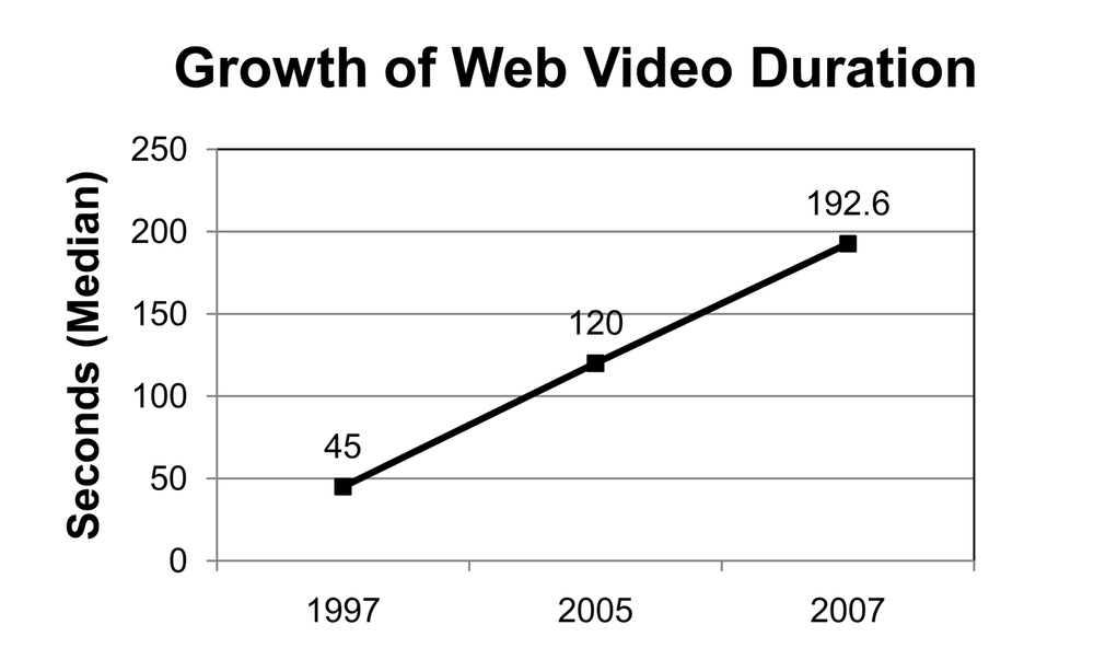
The popularity of Flash and the likes of YouTube, Yahoo! Video, and MySpace have increased the use of multimedia on the Web. As broadband penetration has increased, videos have grown in size, bit rate, and duration (see Figure 6-1).
In 1997, 90% of online videos were less than 45 seconds in length (see Figure 6-1). [109] In 2005, the median video was about 120 seconds long. [110] By 2007, the median video was 192.6 seconds in duration. [111] The median bit rate of web videos grew from 200 Kbps in 2005 to 328 Kbps on YouTube in 2007. So, by late 2007, the median video weighed in at more than 63 MB in file size.
The majority of multimedia traffic comes from files that are larger than 1 MB, but most requests come from files smaller than 1 MB. More than 87% of all streaming media is abandoned by users in the first 10 seconds, however, wasting up to 20% of server bandwidth. [112] Although only 3% of server responses are for videos, they account for 98.6% of the bytes transferred. [113] So, although videos account for a small percentage of requests, they make up the majority of the traffic on the Web.
Overall, for videos longer than 30 seconds, about 13% of home and 40% of business users experience quality degradation with their streaming media, caused by rebuffering, stream switching, and video cancellation. For sessions longer than 300 seconds, the results are even worse. In “Step 3: Optimize Multimedia,” you will learn how to combat the growth of multimedia with specialized tools and techniques.
To optimize your web page speed, start by stripping out all inline style. Pare down your markup to pure HTML structure. Next, look at your page to see whether any elements can be created by more efficient means. You can often morph HTML structural elements with CSS to replicate table-based elements more efficiently.
After your code has been stripped of style and refactored, convert that embedded style into rule-based CSS. To enable progressive display, position CSS files in the head and JavaScript files at the end of your body code. Minimize the number of HTTP requests by combining files, and by converting graphical text to CSS text. Use CSS spacing, CSS sprites, image maps, and background colors to save requests. Optimize any remaining images and multimedia to the lowest acceptable quality and frame rates. Enable caching for persistent objects and distribute them over different servers to minimize latency. Finally, use HTTP compression to shave an average of 75% off XHTML, CSS, and JavaScript file sizes. You’ll learn how to configure your server for caching and HTTP compression in Chapter 9.
The foundation of these techniques is a switch to web standards (XHTML 1.0 and CSS2 or 3). By converting old-style nonsemantic markup into semantic markup, you can more easily target noncontiguous elements with descendant selectors.
Artificial XHTML structure can crop up in web pages created manually and with some WYSIWYG programs. This “fake structure” uses the font tag or CSS to artificially simulate structural markup, such as <h1>, <dl>, or <ul>. [114] One problem with fake structure is that it cannot be easily targeted with type or descendant selectors that are designed to point to structural elements.
In addition, proper structural markup conveys helpful information to whoever is maintaining the site with headings, paragraphs, and list items. Semantic markup can save countless hours of work in site redesigns. Search engines look for structural markup to see what information is most important. Accessibility and cross-platform access through mobile devices is enhanced when you use structural markup. Screen readers key off structural waypoints and users tab through a page based on semantically meaningful markup. For all these reasons, you should avoid fake structure like the plague.
So, for example, this (adapted from a real web page):
<p style="color:red"><strong>Fake descriptive term</strong><br>    <font size="2" color="black">Description of first term here, no structure to target!</font><br> <strong>Fake descriptive term 2</strong><br>    <font size="2" color="black">Description of second term here, no structure to target</font></p>...
becomes this, by abstracting the inline styles to a matching structural element:
<style type="text/css">
<!--
dl dt{font-weight:bold;color:red;}
dl dd{font-size:0.9em;color:#000;}
--></style></head><body>
<dl>
    <dt>Descriptive term 1</dt>
    <dd>Description 1 here, no problem targeting</dd>
    <dt>Descriptive term 2</dt>
    <dd>Description 2 here, styled by a single CSS rule </dd>
</dl>
Notice how clean the structural HTML code is when compared to the unstructured example.
The last code sample is easier to target with CSS using simple descendant selectors (dl dt and dl dd). The first nonsemantic sample forces the use of embedded styles. For more information about web standards, see http://www.webstandards.org and http://www.w3.org.
If you plan your web page to use container divs from the start—#masthead, #content, #navigation, and #footer can be your major container divs—you can avoid the need to embed classes within structural elements. You can then target enclosed content with descendant selectors. For example, the following navigation menu can be targeted through the surrounding nav element:
<style type="text/css">
<!--
#nav ul, #nav ul li {list-style:none;}
#nav ul li {font-weight:bold;}
--></style>
Here’s the HTML markup:
<div id="nav">
    <ul>
        <li>Burma</li>
        <li>Shave</li>
    </ul>
</div>
Now you can declare these styles for all of your navigation, content, and other areas without the need to embed classes within HTML elements. The idea is to strip your HTML down to its structure, group the content within labeled divs, and target this structure with CSS selectors, descendant or otherwise.
If all browsers were as well behaved as Opera, Firefox, and Safari, you could use “grouping” elements such as body and html to avoid embedding classes within container divs. Instead, we recommend using labeled container divs such as #nav, #content, and #footer. Use CSS IDs for these main container divs that are used only once per page and then use CSS classes for most everything else. Keep in mind that CSS IDs have stronger specificity than CSS classes.
Now that you’ve learned how to overcome common web page problems, and the fundamentals behind those techniques, let’s explore the top 10 steps you can use to speed optimize your web pages.
Each unique object in a web page requires a round trip to the server, that is, an HTTP request and a reply. Each object introduces indeterminate delays. As you learned in the introduction to Part II, when the number of objects is greater than four, object overhead dominates page download times.
By minimizing the number of objects in your web pages, you can minimize the number of HTTP requests that are required to render your page and thus reduce object overhead. By requiring fewer HTTP requests, you’ll speed up load times and make them more consistent.
The key to minimizing HTTP requests is to combine files and convert graphics-based techniques to CSS. You can convert graphical text to CSS text; combine external images, scripts, and CSS files; and eliminate frames and JavaScript includes. Convert spacer cells into CSS margins, and replace JavaScript behavior with CSS :hover techniques. Combine multiple decorative images into one CSS sprite.
Graphical text is often used for headers or menu items to achieve a certain look. As yet, search engines can’t read text embedded in graphics. Rasterized text also introduces unnecessary HTTP requests. You can instead use CSS to style headers, or use an image replacement scheme (see the “Image Replacement Schemes” sidebar, previously). By converting to CSS text, you lose some control but gain in speed, potential search engine rankings, and accessibility.
So this:
<div align="center">
<img src="graphictext.gif" width="115" height="24" alt="graphic text example">
</div>

becomes this:
<style type="text/css">
<!--
h1 {font:bold 18px palatino,times,serif;color:#03c;text-align:center;}
-->
</style></head><body>
<h1>CSS Text</h1>
Use text overlays. One variation on this theme is to separate graphical text from background images. To achieve high-quality text in a JPEG you need to increase the quality of the entire image so that it is higher than it needs to be, or use regional compression. In some cases, it may be more efficient to remove the text from the JPEG and overlay the text as either CSS text or, as a last resort, a transparent GIF or PNG with the text embedded in the image. With a graphical text overlay you trade an additional HTTP request for a smaller background image. A CSS text overlay avoids this trade-off.
A common practice is to use spacer cells with a single-pixel GIF that is stretched to enforce the spacing distance. Here is an example from Nasa.gov:
<!-- Empty spacer row -->
<table><tr>
<td colspan="2" width="223"><img border="0" alt="" height="10" width="223" src="/
images/common/spacer.gif"></td>
</tr>
Even rocket scientists can use some help with their HTML. A better way would be to use CSS to add spacing between cells:
<style type="text/css"><!--
.vmargin {margin-top:10px;} --></style></head><body>
<table><tr>
<td colspan="2" width="223" class="vmargin">Content goes here</td>
</tr>
Even better is to use relative “em” spacing to allow for changes in font size made by the user and div elements:
<style type="text/css"><!--
.vmargin {margin-top:1em;} --></style></head><body>
<div class="vmargin">Content goes here</div>You can reduce the number of HTTP requests that your pages require by combining adjacent images into one composite image and mapping any links using an image map. Instead of multiple HTTP requests, this technique requires only one (see Figure 6-2). So, this:
<div align="center"> <h4 align="center">Two Images = Two HTTP Requests</h4> <p><img src="1.gif" alt="first image"> <img src="2.gif" alt="second image"></p> </div>
becomes this, by combining the images into one composite image and using a client-side usemap:
<div align="center">
<h4 align="center">One Combined Image = One HTTP Request</h4>
<map name="map1">
<area href="#1" alt="1" title="1" shape="rect" coords="0,0,100,100">
<area href="#2" alt="2" title="2" shape="rect" coords="100,0,210,100"></map>
<img src="combined.gif" width="210" height="100" alt="combined image client-side
imagemap" usemap="#map1" border="0">
</div>

This HTML creates a client-side image map with two target areas that correspond to the “1” and “2” squares in the composite image. For the rect(angle) shape, coordinates are measured from the top-left corner of the image to the bottom right, so 0,0,100,100 defines an area starting in the upper-left corner (0,0), down to X = 100 pixels to the right, and Y = 100 pixels down (100,100).
We’ll explore the use of CSS sprites to consolidate decorative images in Chapter 7.
Many developers create separate stylesheets and import them into their pages as needed. There are two problems with this approach: (1) it requires additional HTTP requests, and (2) you can encounter the same-domain connection limit. Combining files in the head of your HTML documents can avoid these problems. Browsers must load and parse external CSS files referenced within the head of your HTML before they parse the body content. By minimizing the HTTP request load, you can maximize the initial display speed of your content. So, this:
<link rel="stylesheet" type="text/css" href="/css/fonts.css" />
<link rel="stylesheet" type="text/css" href="/css/nav.css" />
<script src="/js/functions.js" type="text/javascript"></script>
<script src="/js/validation.js" type="text/javascript"></script>
becomes this, by combining the CSS files into one file and the JavaScript files into one file:
<link rel="stylesheet" type="text/css" href="/css/combined.css" />
<script src="/js/combined.js" type="text/javascript"></script>
Suture CSS or JavaScript files. A similar approach to saving HTTP requests is to automatically combine external CSS or JavaScript files by suturing them together on the server. You can combine stylesheets or JavaScript files on demand to create one master file. Done properly, these combined files can also be cached.
Here is how this digital surgery would work for CSS. You need to tell the server two things: first, to parse CSS files for PHP commands, and second, to send the correct MIME type. Add the following lines to your httpd.conf file for Apache:
AddHandler application/x-httpd-php .css
header('Content-type: text/css'),
Next, you can merge your CSS files together with PHP inside the CSS file, like this:
<?php
  include("layout.css");
  include("navigation.css");
  include("advanced.css");
?>
To deliver files based on browser environment variables (e.g., to simulate an @import to filter out older browsers), you could use software such as phpsniff, available at http://sourceforge.net/projects/phpsniff/.
Cache dynamic files. As specified earlier, the dynamic CSS file will not cache properly. If you add the following headers to the top of your PHP file after the content type, they will cache for three hours (adjust 10,800 seconds as necessary):
header('Cache-control: must-revalidate'),
header('Expires: ' . gmdate('D, d M Y H:i:s', time() + 10800) . ' GMT'),
Put CSS at the top, JavaScript at the bottom. Steve Souders found that moving stylesheets to the top in your head element makes pages load faster by allowing them to load progressively. With scripts, the opposite is true. If possible, move external JavaScript files to the bottom of your pages, or delay or defer the loading of JavaScript files in the head. Progressive rendering is blocked for all content that is placed after scripts in your HTML.
We’ll explore CSS optimization in more detail in Chapter 7. In Chapter 8, we’ll touch on JavaScript optimization. Chapter 9 shows how to delay the loading of scripts, even when they are referenced in the head of your HTML documents.
More than 52% of web pages use frames, the vast majority of which are iframes used to display advertising. [115] Frames, iframes, and JavaScript includes can be especially harmful to web performance because they introduce extra HTTP requests and can include entire web pages within other web pages.
For advertising, you can eliminate the extra HTTP requests required by the preceding methods by using a server-side include-based ad delivery system such as 24/7 Real Media’s Open AdStream (http://www.247realmedia.com). Here is some sample code from Internet.com that can be added to a web page to include a banner ad:
<!--#include virtual="/banners/adstream_sx.ads/_PAGE_@750x100-1"-->
This technique uses server-side includes (SSIs) to include the banner ad directly into the page, saving an HTTP request. The inserted code looks like this:
<div id="topvisibility"><table ALIGN="CENTER">
<tr>
<td align="center">
<A HREF="http://itmanagement.earthweb.com/RealMedia/ads/click_lx.cgi/intm/it/www.
datamation.com/datbus/article/3739896i/1286136569/468x60-1/OasDefault/SSO_BluRay_
GEMS_1d/bluray2_750x100.jpg/34376565343564363437666663326530" target="_top"><IMG
SRC="http://itmanagement.earthweb.com/RealMedia/ads/Creatives/OasDefault/SSO_BluRay_
GEMS_1d/bluray2_750x100.jpg"  ALT=""  BORDER="0"></A><img src="http://itmanagement.
earthweb.com/RealMedia/ads/adstream_lx.cgi/intm/it/www.datamation.com/datbus/article/
3739896i/1286136569/468x60-1/OasDefault/SSO_BluRay_GEMS_1d/bluray2_750x100.jpg/
34376565343564363437666663326530?_RM_EMPTY_" Width="1" Height="1" Border="0"></td>
</tr>
</table>
</div>
The resultant ad displays as shown in Figure 6-3, saving an HTTP request.

The editors at Internet.com noticed an increase in speed after switching from JavaScript-based ad serving to SSI-based ad serving. Again, the idea is to shunt work to the server in exchange for less work for the browser.
More megapixels! That is what digital camera manufacturers are hawking these days. As a consequence of this pixel pushing, photographs destined for the Web have become larger in size and higher in resolution. We see sites with full-size unoptimized or partially optimized JPEGs resized into small thumbnails with height and width dimensions. These files can be more than 1 MB in size and yet occupy only 100 x 100 pixels in screen real estate. One megabyte is around a hundred times larger than these files need to be.
A better way is to crop and resize your images to the final dimensions that you want them to assume on your page. Then optimize them in a good-quality graphics program such as Photoshop or Fireworks. You can achieve higher compression ratios using specialized graphics tools from companies such as BoxTop Software (http://www.boxtopsoft.com), VIMAS Technologies (http://www.vimas.com), xat (http://www.xat.com), and Pegasus Imaging (http://www.pegasusimaging.com). The idea is to reduce the image to the lowest acceptable quality and resolution for the Web (72 dpi).
Tip
JPEG Wizard from Pegasus Imaging is one of the few graphics optimization programs that can recompress JPEGs without the generation loss introduced in a decompress-compress cycle. It does this by working within the JPEG Discrete Cosine Transform space to avoid the decompress step.
You can often switch formats to save even more bytes. For example, you can often substitute PNG-8s used with or without dithering for JPEGs or GIFs at smaller file sizes. Figure 6-4 shows the effect that file format and quality have on file size.
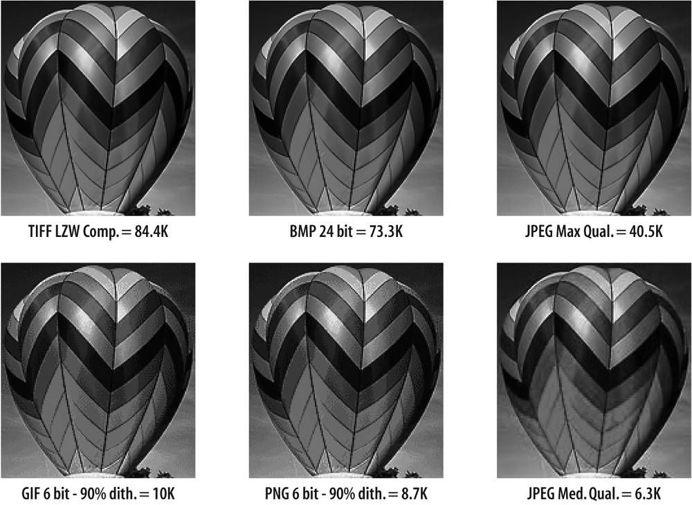
TIFFs, BMPs, and maximum-quality JPEGs are unsuitable for the Web (see the first row of Figure 6-4, all greater than 40 KB saved from original in Photoshop). Switching to a different format can make a significant difference in file size. The PNG in Figure 6-4 is 13% smaller than the GIF at equivalent settings. Although this smooth-toned balloon is an extreme example, for most flat-color images PNGs are 10% to 30% smaller than GIFs due to PNG’s superior compression algorithm.
Here is a summary of the techniques you can use to fully optimize your images, available from http://www.websiteoptimization.com/speed/tweak/graphic-optimization/:
Plan ahead to maximize file size savings (e.g., simplify background images).
Contextually crop to show only the most relevant parts of the image.
Resize images to the exact pixel dimensions that you want for each web location.
Combine images to save HTTP requests, and optionally create a
usemapor CSS sprite.Blur backgrounds for JPEGs. Experiment with “surface blur” settings to see which ones give a clean yet simplified appearance.
Use CSS borders or backgrounds instead of embedding borders in images. Don’t leave blank background borders of one color to achieve layout goals. Instead, use a tightly cropped image combined with a coded background color.
Replace GIFs and JPEGs with PNG images where appropriate; dither where necessary.
Specify image size in HTML with width and height attributes.
Use Smart Sharpen in Photoshop CS2 or later to make your images pop.
Overlay text with CSS or a transparent GIF or PNG instead of embedding text in JPEGs to allow higher compression.
Minimize noise in all images before optimizing. Typical savings are 20% to 30% off the file size. We recommend Noise Ninja (http://www.picturecode.com/) and Neat Image (http://www.neatimage.com/) to reduce noise.
Minimize bit depth for GIFs and PNGs.
Use weighted optimization (regional compression) using alpha masks to optimize backgrounds more than foregrounds.
Use “lossy” compression for smaller GIFs and PNGs (where available).
Reduce or eliminate drop shadows in layered images. Adjust layers in Photoshop to reduce the width and depth of drop shadows to make images more compressible.
As you learned in “The Growth of Multimedia,” earlier in this chapter, multimedia makes up only a small portion of server requests but accounts for the majority of traffic on the Internet. So, the optimization of streaming media—and movies in particular—has become more important in maximizing web page speed and reducing bandwidth bills.
Tip
Behind the scenes, multimedia authors create a reference movie that points to different sizes of movies. The reference movie gets the speed of the user’s connection from the QuickTime Control Panel to select the right movie. Users usually don’t know to set this parameter, however, and the bandwidth of the user is generally not tested. Thus, broadband users typically see tiny, low-quality movies. Thankfully, in the newer version of the QuickTime Control Panel, there is a new default setting of “automatic”; although this is helpful for those who don’t know to set their speed, you should change your connection speed setting to match your connection type, that is, modem, DSL, cable, and so on.
Movies optimized for the Web should be short in duration, small in dimension, and optimized with the appropriate codec. We have seen videos 10 to 30 minutes long automatically loaded and playing into home pages, some 50 MB to 175 MB in file size. Although this may grab the attention of high-bandwidth users, it is better to respect your visitors’ bandwidth and provide a static placeholder image and a play button.
Take a look at the Apple.com website for an example of a best practice regarding showcasing video to a potentially wide-range audience (http://www.apple.com/trailers/). Apple takes the approach of allowing users to choose different size movies to better match their bandwidth abilities. Sizes from “small” (320 x 240 pixels) to “HD” (1,920 x 1,080 pixels) can be viewed. Overall, this was a lot of up-front work for Apple; it had to compress one movie many different times, into many different sizes. However, the extra work pays off with satisfied site visitors who are able to find content that meets their needs and the amount of bandwidth available to them.
Video frame rates and dimensions. Higher frame rates (frames per second, or fps) increase the fluid motion of the picture. However, each frame rate has 50% more data per frame than the next lower frame rate, for the same file size. To sacrifice some fluidity for greater usability by more viewers, you can reduce the frame rate to as little as 8 fps. However, frame rates lower than 12 fps to 15 fps have been shown to reduce users’ perception of video quality. [116]
The minimum dimensions should be 320 x 240 pixels. Anything smaller has little impact and will be harder to view. For users on a fast connection, you can offer a 640 x 480 pixel video. To maintain quality, increase the data rate in proportion to the image size using the following formula (especially with H.264):
Data rate =(frames per second * movie width * movie height) / 30,000
This translates to:
| DR = (FPS * W * H) / 30,000 |
Remember that doubling image size (320 x 240 to 640 x 480) requires a 4x (not 2x) increase in data rate. For example, a 320 x 240 movie with 15 fps needs to be compressed to about 38.4 KB of data per second, whereas a 640 x 480 movie at the same frame rate needs to be compressed to about 153.6 KB of data per second to maintain quality. We’ll talk more about compression next.
Video production tips: Minimize noise and movement. To create highly optimized videos you must start with the original, high-quality video files.
You can think of video creation as a war against unnecessary digital noise in your content. The more noise in your video, the less it can be compressed, and the larger the final result. The less movement there is, the lower the noise; and the less fine detail in the background, the smaller the video. Here are some tips on creating high-quality videos that optimize well:
Minimize camera motion with a tripod if possible.
Minimize subject motion.
Use a lot of light.
Use a simple background or blur the background (avoid background movement).
Avoid camera pans and zooms.
Use professional equipment.
Use a digital format.
If a tripod is not an option, use a gyroscopic stabilizer (http://www.ken-lab.com) or an image-stabilized lens.
Editing your video. After you’ve captured your video with minimum noise, it’s time to edit out unnecessary frames and test for playback. Break up longer videos into smaller segments that are a few minutes long at most. Edit out the parts of the movie that aren’t essential to your message. Here are some additional tips:
Use the minimum frame rate for smooth playback.
Crop fuzzy edges.
Reduce video noise (with filters).
Adjust contrast.
Adjust gamma level (for cross-platform viewing).
Restore black and white.
Deinterlace.
Choose the best codec for the job that you are trying to accomplish.
For example, if you are compressing video for the Web, choose a web codec such as H.264 or WMV. If you are simply archiving your video for later use, try the Photo-JPEG codec. There are about 30 different codecs, and they each have a different use. Where you plan to deliver your video should determine the codec that you select. H.264 is one of the best for web and small device playback, such as a video phone, so we’ll focus on that here.
Compressing videos for the Web. Now that you’ve got your video prepared and adjusted, you can compress it. People are more accepting of temporal compression (over time) than spatial compression (frame per frame). You must compress the size of your video so that it can be successfully streamed or downloaded to your target audience. This process is called encoding in the industry, and it is full of hard, interdependent decisions:
- Streaming media format
QuickTime versus RealMedia versus Windows Media
- Supported playback platforms
Windows versus Mac or both
- Delivery method
True real-time streaming versus HTTP streaming
- Overall data rate
Compression versus quality versus bandwidth required
- Audio quality
Mono versus stereo; CD quality, cassette tape quality, or cell phone quality
- Codec
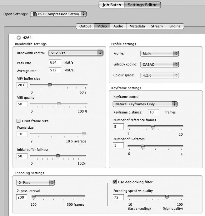
You’ll need to make some decisions to give the best compromise between quality and size. QuickTime Pro provides a fast and convenient way to create optimized videos. For more control, you can use Autodesk’s Cleaner (http://www.autodesk.com). Sorenson Video 3 Pro (http://www.sorensonmedia.com) can sometimes make videos smaller than H.264 at similar quality. Finally, Telestream’s Episode Pro (http://www.telestream.net/) offers maximum control over video compression with the ability to compress to H.264, Flash, iPod, and other formats (see Figure 6-5). It is an excellent application and can batch-compress into all the popular formats and workstreams.
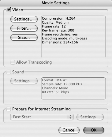
Figure 6-6 shows the settings we used to optimize a test video in QuickTime Pro.
The unoptimized 30-second video was 6.8 MB and the optimized version was 816 KB at 360 x 240 and 544 KB at 234 x 156 pixels in dimension. Because H.264 is what we recommend as the best codec, we will expand on its specifics.
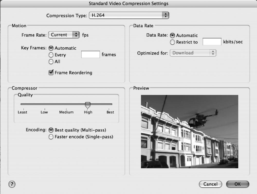
Figure 6-7 shows the standard video compression dialog for QuickTime Pro. You can see that we have chosen H.264 as our compression type. It’s helpful for you to understand this dialog’s three main sections: Motion, Data Rate, and Compressor.
The Motion section is where you can choose the frame rate (in fps) and the key frames. If you are planning to compress your video, you might want to choose something other than Current in the Frame Rate box because Current does not remove any frames. A good starting point is 15 fps; this alone results in a 50% reduction in size for video that is 30 fps (or, more accurately, 29.97 fps).
Also in the Motion section is a Key Frames area. A key frame is a frame of uncompressed data from which the frames in between the key frames key off. So, if you set the key frames to 15 (and your frame rate is 15 fps), you will be creating an uncompressed frame every second.
Tip
Always set your key frames to a multiple of your frame rate! For example, if your frame rate is set at 15 fps, you will want to set your key frames to 15, 30, 45, 60, 90, and so on.
H.264 has a great automatic key frame option that is worth trying. Also, you should make sure the Frame Reordering box is checked (unless you are using a real-time encoder for a live broadcast).
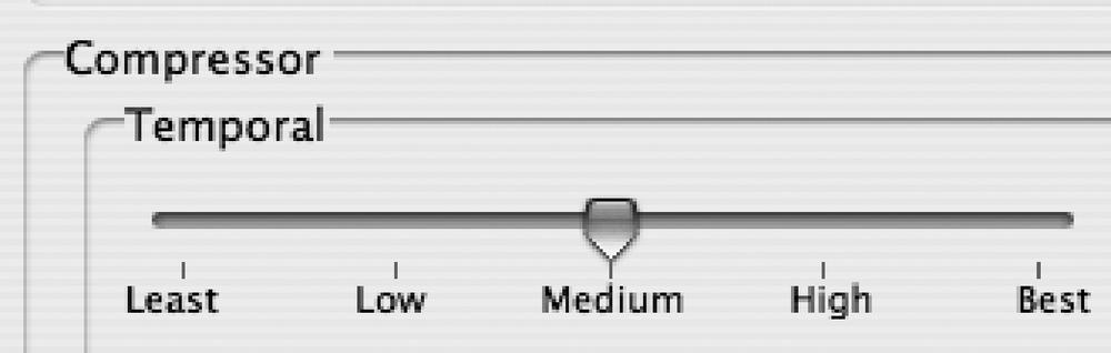
Next is the Compressor section, where you’ll find three options: Quality, Encoding, and Temporal. However, note that you don’t see the Temporal option in Figure 6-7 because it’s a hidden option that we will explain how to find shortly.
The Quality area is where you can control the look of individual frames. Set it to Medium and compress, and then see how large your movie is. You will be surprised how good a Medium setting can look. For Encoding, always click the “Best quality (Multi-pass)” radio button. Yes, it takes twice as long, but your movie can be half as small in file size.
Now, here is how to show the hidden Temporal slider. Put your cursor over the Quality slider and press the Option key (on a Mac) or the Alt key (on Windows). Notice that when you press the Option key the slider changes to read Temporal (see Figure 6-8). This means you can separate the spatial (frame-per-frame look) from the temporal (smoothness of playback or quality of delta frames).
The last section of the dialog is the Data Rate section. We recommend that you click the Automatic radio button for your first try, but if you want to try to make your movie smaller you can lower the data rate. Use Table 6-1 for reference.
Table 6-1. Video resolution and frame rate guidelines
Use scenario | Resolution and frame rate | Example data rates |
|---|---|---|
Mobile content | 176 x 144, 10–15 fps | 50–60 Kbps |
Internet/standard definition | 640 x 480, 24 fps | 1–2 Mbps |
High definition | 1280 x 720, 24 fps | 5–6 Mbps |
Full high definition | 1,920 x 1,080, 24 fps | 7–8 Mbps |
Closing credits. Creating optimized videos for the Web requires a number of coordinated steps.
First, create a clean, noise-free video with the minimum possible number of zooms, pans, and background detail and movement. Then prepare your video for compression by cropping fuzzy edges, adjusting contrast and gamma, and deleting any unnecessary frames. Finally, compress your video with a high-quality compressor such as Episode Pro. Use the data-rate formula (FPS * W * H)/30,000 as a starting point, and always use a two-pass variable bit rate (VBR) and a multiple of 10 times your fps for your key frames.
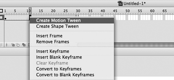
Some typical problems we see with Flash are unoptimized images and too many frames instead of tweened symbols. A tween is the calculation of all the changes between frames, which is more efficient than having a lot of frames instead (see Figure 6-9). You can significantly reduce the file size of Flash movies by optimizing your images in Photoshop, not in Flash. Reduce the number of frames, minimize the number of fonts, and tween between symbols.
Embedded JavaScript is widely used on the Web, with 84.8% of pages using some JavaScript.
JavaScript is used for form validation, menus and rollovers, browser sniffing, statistics, and more complex Ajax applications. You can accomplish a number of these techniques with more efficient methods, however.
You can use CSS to control drop-down menus and rollovers with the :hover pseudoclass (for more details, see Eric Meyer’s More Eric Meyer on CSS [New Riders].) Chapter 7 shows a drop-down menu conversion example that saved 46.4% off HTML file size by switching from JavaScript to CSS :hover to control the menu behavior. Typically, you’ll save 40% to 60% off HTML and JavaScript file sizes by converting to CSS :hover techniques, with a slight increase in CSS file size (which cache reliably). Now that Internet Explorer 7 and later support the :hover pseudoclass on the necessary elements, the :hover behavior hack that is in widespread use should eventually fall out of favor. [117] You can analyze server-side logfiles instead of using client-side statistics. Browser sniffing in particular can be done more efficiently with a tool such as BrowserHawk (discussed next).
Browser sniffing is one area where JavaScript is in widespread use. To minimize the JavaScript overhead that your users must download, you can substitute server-side or PHP and JSP sniffing instead. BrowserHawk from cyScape (http://www.cyscape.com) uses server-side browser sniffing or hybrid sniffing to detect a wide variety of parameters, including Flash, screen size, connection speed, cookies, and browser and software versions (see Figure 6-10).
Here is some sample code that shows how BrowserHawk is enabled in a page and some sniffed parameters:
<%
// First import the com.cyscape.browserhawk namespace
%>
<%@ page import = "com.cyscape.browserhawk.*" %>

<%
// Now we get an immutable (unchangeable) instance of the browser object which
// represents the "basic" properties this browser supports.
%>

<% BrowserInfo browser = BrowserHawk.getBrowserInfo(request); %>

<%
// At this point, our browser object contains all the basic browser capability
// information for the current visitor. Next, display this information to the screen
%>

Your browser is: <%= browser.getBrowser() %> <%= browser.getFullversion() %><P>

Your platform is: <%= browser.getPlatform() %><P>
Browser major version: <%= browser.getMajorver() %><P>
Browser minor version: <%= browser.getMinorver() %><P>
Container* browser: <%= browser.getContainerBrowser() %><P>
Container version: <%= browser.getContainerVersion() %><P>
Container full version: <%= browser.getContainerFullversion() %><P>
Supports AJAX? <%= browser.getXMLHttpRequest() %><P>
Supports ActiveX controls? <%= browser.getActiveXControls() %><P>
Browser data file version: <%= browser.getBDDVersion() %>, dated: <%= browser.
getBDDDate() %><P>
BrowserHawk version in use: <%= BrowserHawk.getVersion() %><P>

For extended properties that can change with each session, you use the following code:
<%
  // First we create the ExtendedOptions object.  This object is used to
  // set various preferences and options, such as selecting which
  // extended properties we want tested and related testing parameters.
  ExtendedOptions options = new ExtendedOptions();

  // Now we tell BrowserHawk which tests we want it to perform on the
  // browser. If there are other settings you want to check as well, you can
  // just add them to this list.   See the ExtendedOptions class in the
  // BrowserHawk documentation for more information.
 %>
options.addProperties("PersistentCookies, SessionCookies, JavaScriptEnabled, Width,
Height, WidthAvail, HeightAvail, Plugin_Flash, Broadband");

Session cookies enabled? <%= extBrowser.getSessionCookies() %><p>
Persistent cookies enabled? <%= extBrowser.getPersistentCookies() %><p>
JavaScript enabled? <%= extBrowser.getJavaScriptEnabled() %><p>
Screen resolution: <%= extBrowser.getWidth() %> x <%= extBrowser.getHeight() %><p>
Available browser window size: <%= extBrowser.getWidthAvail() %> x <%= extBrowser.
getHeightAvail() %><p>
Flash plug-in version installed: <%= extBrowser.getPluginFlash() %><p>
Broadband connection? <%= extBrowser.getBroadband() %><p>
You can also cache these results and get more granular data on the connection speed of the user, version numbers, and capabilities. Once you have sniffed the user’s browser, you can deliver conditional content based on these variables.
Using conditional server-side includes (XSSIs), you can create environment variables that closely mimic JavaScript-based sniffing. For example, this common JavaScript filter:
IS_IE = (document.all) ? true : false;
IS_MAC = (navigator.appVersion.indexOf(" Mac") != -1);
IS_OPERA = (navigator.userAgent.indexOf(" Opera") != -1);
IS_OPERAMAC = IS_OPERA && IS_MAC;<!--#if expr="$(HTTP_USER_AGENT) = /MSIE [4-9]//" -->
<!--#set var="isIE" value="true" -->
<!--#endif -->
<!--#if expr="$(HTTP_USER_AGENT) = /Mac/" -->
<!--#set var="isMAC " value="true" -->
<!--#endif -->
<!--#if expr="$(HTTP_USER_AGENT) = /Opera/" -->
<!--#set var="isOPERA" value="true" -->
<!--#endif -->
<!--#if expr="(${isOPERA} && ${isMAC})/" -->
<!--#set var="isOPERAMAC" value="true" -->
<!--#endif -->Now you can use these XSSI variables to conditionally include code within your XSSI includes without the need for JavaScript:
<!--#if expr="${isIE}" -->
    ie.js
<!--#elif expr="${isOPERAMAC}" -->
    operamac.js
<!--#elif expr="${isOPERA}" -->
    opera.js
...
<!--#endif -->
It is faster to set environment variables at the server by configuring your httpd.conf file using BrowserMatchNoCase. For example:
BrowserMatchNoCase "MSIE [4-9]" isIE
BrowserMatchNoCase Mac isMAC
BrowserMatchNoCase Opera isOPERA
After replacing as much JavaScript as possible with CSS and server-side techniques, optimize any remaining JavaScript to minimize file size. You can use abbreviated object, variable, and function names to shave bytes. You can automate the process by using a tool such as w3compiler to automatically abbreviate and whitespace-optimize your scripts.
Beyond minifying JavaScript, you can often refactor or rewrite procedures with less code to accomplish the same thing (see http://www.refactoring.com). Remember to measure first, then optimize. You can use a JavaScript profiler to locate performance bottlenecks. Mozilla’s Venkman JavaScript Debugger (http://www.mozilla.org/projects/venkman/) can profile JavaScript code.
Loop optimizations such as unwinding can also help you to gain some cycles to increase your JavaScript execution speed. Often, built-in functions perform faster than hand-crafted code. For advice on increasing execution speed and minifying JavaScript, read Chapter 8. Finally, combine and compress external JavaScript files to save HTTP requests and bandwidth where possible.
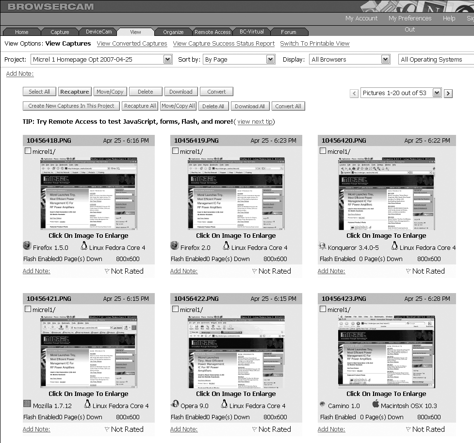
Using CSS to lay out your page can save you a significant amount of markup, typically 25% to 50%. [118] First look at the layout to see whether you can substitute CSS lists and positioned divs to simulate the effects that are typically done with tables. Next, strip down the content to structural markup and build it back up again using CSS style and positioning. Then test the new layout with different browsers. We recommend using BrowserCam (http://www.browsercam.com) to quickly test your new CSS layout on different browsers (see Figure 6-11).
You can use CSS to position your entire layout or to format smaller sections of your web pages. We often see tables used to format pages when CSS could have been used more efficiently. You can create multicolumn layouts using CSS floats and margins applied to divs (http://alistapart.com/topics/code/css/). You can make complex hierarchical menus by using lists controlled by CSS, not lists controlled by JavaScript as is usually the case, as described in More Eric Meyer on CSS. You can create simple rollover effects using CSS, with and without graphics. For examples of CSS rollover effects and menu conversion, see Chapter 7.
Replacing table layout with CSS layout certainly saves you bandwidth and reduces maintenance headaches. Stripping down your markup to bare structure and replacing any inline style with CSS rules will help fully optimize your HTML.
Inline style includes the deprecated font tag, inline style blocks, and nonbreaking spaces. Inline style such as:
<p style="font-size:12px;color:black;">Hardcoded text here.</p>
<p style="font-size:12px;color:black;">Inline style redux</p>
bulks up your code and makes it harder to make style changes. It is more efficient to abstract multiple duplicate styles into CSS rules, like so:
<style type="text/css">
p{font-size:12px;color:#000;}
</style></head></body>
<p>Unencumbered text here</p>
<p>Free and easy</p>
Replacing inline style, font tags, and nonbreaking spacing with CSS rules can reduce your HTML footprint significantly (by 15% to 20% or more), depending on the amount of embedded style. The key to this type of code cleanup is to plan ahead for targeting content elements with CSS using the CSS architecture you’ll read about in Chapter 7.
CSS architecture uses structural HTML markup (p, ul, dt, etc.) and labeled containers (#main, #nav, #footer) that allow simple type and descendant selectors to target noncontiguous content. Once your CSS architecture is in place, targeting similar content is only a matter of creating targeted CSS rules using selectors to style the same type of elements and declarations to apply your styles. You’ll learn more about optimizing your HTML with CSS, as well as shrinking your style sheets, in Chapter 7.
You can improve the perceived speed of your web page by loading something useful fast.
For example, the Weather Underground home page displays the weather search form quickly in the top-left corner of the screen (see Figure 6-12). Unlike other weather sites that require different elements to load first, Weather Underground gives priority to the most important part of the page first so that you can find the forecast for your area fast.
You can ensure that your useful content (i.e., content that users can navigate with) loads quickly by layering your tables or divs.

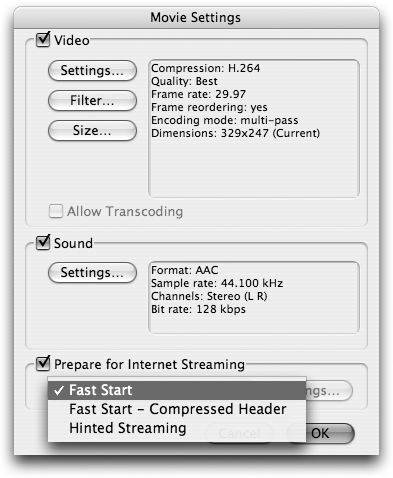
Multimedia can also benefit from fast start techniques. Flash presentations can load a separate file quickly while others stream in the background. Movies can load a static placeholder image or preview to show something quickly to help engage the user. QuickTime Pro lets you set up a movie to start playing from a web server before the movie has completely downloaded. This is called a “Fast Start” movie (see Figure 6-13).
Web page optimization is not only about raw speed, but also about managing your users’ experience.
External scripts referenced in the head of your pages are especially harmful because they delay the display of your body content. Delays before your body content displays make it more likely that users will bail out. Human-computer interaction (HCI) research has shown that delays before viewing pages are less frustrating than delays after a page has loaded. [119]
Post-loading delays are a common problem with Ajax-enabled pages. When it is poorly written, Ajax can make things especially difficult on narrowband users. Even with HTTP compression, the latency due to grabbing all those separate files can cause indeterminate delays. Ajax also introduces polling with the XMLHttpRequest object (XHR). XHR-based communication has efficiency issues that we’ll address in Chapter 8.
Webmasters are outsourcing web services with widgets. Widgets are third-party gizmos that embed everything from Google AdWords, Flickr images, and Twitter tweets to iTunes playlists. The problem with widgets is that they can delay the display of your web pages by many seconds and increase delay variability. Widgets are typically used with a snippet of external JavaScript, and their performance relies on the response time of the external server providing the service. Most web service providers lack the extreme data-farm resources and thus the responsiveness of a company such as Google. We’ve seen external survey widgets, Technorati blog tracking code, and even Google Analytics when it first launched actually hang browsers and cause web pages to time out. Removing these widgets or moving these third-party tags to the end of your markup can help to minimize customer impact.
Give your widgets a WEDJE. However, there is a better way. By using Widget Enabled DOM JavaScript Embedding (WEDJE), you can rewrite the widget embed code to effectively make your JavaScript work asynchronously. WEDJE creates a cross-platform, cross-browser defer by using the document object model (DOM) to append a div, create a script element, and then append the script element to the div, all with JavaScript. An example of the technique follows:
<script type="text/javascript">     // create div below
(function(){document.write('<div id="wedje_div_example">Loading widget...</div>'),
s=document.createElement('script'), // create script element
s.type="text/javascript";           // assign script to script element
s.src="http://www.example.com/scripts/widget.js";
                                    // assign script s to div element
setTimeout("document.getElementById('wedje_div_example').appendChild(s)",1);})()
</script>
When these elements are linked together in this way, browsers appear to decouple the loading and execution of the attached JavaScript, making widget execution asynchronous! Here is the matching external JavaScript file, widget.js, which grabs the div we created earlier and loads an image:
document.getElementById('wedje_div_example').innerHTML+='<img src="http://www.
example.com/images/example.gif" width="60" height="60" />';
Another option is to use iframes to load ads, but iframes can ruin the context-sensing abilities of contextual ads and so you must use them carefully. For more details on WEDJE, see Mike Davidson’s blog post on the subject at http://www.mikeindustries.com/blog/archive/2007/06/widget-deployment-with-wedje. (Note that this technique has some strange Internet Explorer 6-related issues, but you can filter with conditional comments to use on only Internet Explorer 7 and later.)
Chapter 9 has more coding details on delaying the loading of external scripts.
Web page optimization streamlines your pages to download and display faster. As your website performance improves, your bailout rates and bandwidth bills will go down while your conversion rates and profits will rise. In this chapter, you learned how to minimize HTTP requests, optimize graphics and multimedia, substitute server-side for client-side sniffing, and load JavaScript wisely.
To reduce the overhead of multiple objects that causes the majority of web page delay, minimize the number of objects referenced within your web pages. Also, put all of your images, still and motion, on a strict file size diet. Minimize the size of the head of your HTML, and layer your markup to display useful content quickly and maximize your potential search engine rankings. Finally, move your CSS to the top and your scripts to the bottom of your pages to enable progressive display.
[102] Chung, S. 2007. “The investigation and classifying the web traffic delay & Solution plans presentation.” In ICACT2007 2 (February 12–14, 2007): 1158–1161.
[103] In a July 2007 random survey of 500 pages indexed by Binghamton University’s Ryan Levering for this book, 62.6% of pages used the table tag and 85.1% used the div tag. Tables nested to an average maximum depth of 1.47, with an average number of 12.57 table tags per page. The average maximum HTML depth was 15.35, demonstrating how divs have replaced table nesting. The data for this web survey is available at http://www.websiteoptimization.com/secrets/web-page/survey.xls.
[104] Levering, R., and M. Cutler. 2006. “The Portrait of a Common HTML Web Page.” In DocEng ’06 (Amsterdam, The Netherlands: October 10–13, 2006), 200. Tables nested to an average maximum depth of 2.95.
[105] According to Levering’s 2007 survey, the average total image size was 118,683 bytes. The average total page size was 218,937 bytes, and 266,070 uncompressed. Thus, images make up at least 54.2% of the average web page.
[106] Levering and Cutler. “The Portrait of a Common HTML Web Page,” 200. More than 60% of the area above the fold is used for graphics in the average web page.
[107] Krishnamurthy, B., and C. Wills. 2006. “Cat and Mouse: Content Delivery Tradeoffs in Web Access.” In WWW 2006 (Edinburgh, Scotland: May 23–26, 2006), 337–346.
[108] Ibid., 346.
[109] Acharya, S., and B. Smith. 1998. “An Experiment to Characterize Videos Stored On the Web.” In MMCN 1998 (San Jose, CA: January 1998), 166–178.
[110] Li, M. et al. 2005. “Characteristics of Streaming Media Stored on the Web.” ACM Transactions on Internet Technology 5 (4): 601–626.
[111] Gill, P. et al. 2007. “YouTube Traffic Characterization: A View From the Edge.” In IMC 2007 (San Diego: October 24–26, 2007), 15–28. About 24% of videos are interrupted because of poor performance or poor content quality.
[112] Guo, L. et al. 2005. “Analysis of Multimedia Workloads with Implications for Internet Streaming.” In WWW 2005 (Chiba, Japan: May 10–14, 2005), 519–528.
[113] Gill, P. et al. “YouTube Traffic Characterization,” 20.
[114] Levering’s 2007 survey concluded that 32.8% used the font tag and only 58.5% used the h1 tag.
[115] Levering’s 2007 survey found that most frames are iframes (found in 51.2% of web pages), whereas only 0.8% are frames. Note that some dynamically created frames were not counted in this survey, so these figures will be higher.
[116] Gulliver, S., and G. Ghinea. 2006. “Defining User Perception of Distributed Multimedia Quality.” ACM Transactions on Multimedia Computing, Communications and Applications 2 (4): 241–257.
[117] The :hover behavior hack is a JScript behavior used to add the :hover pseudoclass to elements other than the anchor element in Internet Explorer 5 through 7, which do not properly support the :hover pseudoclass on all elements.
[118] According to Jeffrey Zeldman’s Designing with Web Standards (New Riders), converting to CSS layout typically saves from 25% to 50% off XHTML file size, and a net savings overall. We’ve found similar results in our conversions.
[119] Dellaert, B., and B. Kahn. 1999. “How Tolerable is Delay? Consumers’ Evaluations of Internet Web Sites after Waiting.” Journal of Interactive Marketing 13 (1): 41–54.