
Flex is well suited to rapid prototyping, so let's start building an application! The goal of this section is to illustrate the capabilities of Flex 2 right "out of the box" by developing an application by using the existing Flex 2 component set.
This Short Cut does not cover using the design mode of Flex Builder 2. All of the examples can be typed in the MXML editor of Flex Builder 2 or the text editor of your choice and compiled with the Flex 2 SDK.
Furthermore, this Short Cut will get your feet wet with the most important classes but is in no way an exhaustive manual. Your first stop for more information on the classes available in the Flex framework should be the Flex 2 documentation available on http://www.flex.org and bundled with your copy of Flex Builder 2. When in doubt, RTFM!
While you may be anxious to get coding, there is one concept that will help you tremendously if you understand it before writing your first line of MXML: all Flex is ActionScript, even MXML.
When you compile your Flex 2 project, your MXML files are actually turned into ActionScript 3.0 files as an intermediate step on the journey to a SWF. Anything that you program in MXML, you can program in ActionScript. MXML is a language in its own right, but you can think of it as another way of writing ActionScript. Below are the rules that define MXML.
When you write <mx:Button/> you're really just
talking about the Button class.
Write three <mx:Label/>s and
you will end up with three instances of Label.
Tags create instances of the class specified by the tag name.
When you write attributes into a tag, you are setting attributes
of that class instance: properties, event handlers, styles, and effect
triggers.In Figure
3, the tag named <mx:Button/> is creating an instance
of class Button, but also setting
its label and width properties, and its font-size and font-family styles.
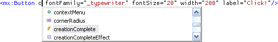
You can use Flex Builder 2's autocomplete feature to give you a hint about the type of the attribute being suggested. Above, the attribute starting with "c" could complete to a property (green circle), a style (purple box), an event (lightning bolt), or an effect trigger (sparkle).
Attributes of a tag become properties of the instance.
Most important of all attributes is the id attribute. The id attribute can be set on any tag. Like
(X)HTML's DOM, the id of an element
is the handle with which you can access it, but because tags turn into
class instances, the id becomes the
name of the instance. Assigning an id to a tag like
<Button id="mrClicker"/>
is the same as declaring in the same file:
public var mrClicker:Button;
The id
of a tag becomes the name of a public property containing
that instance.
In MXML, nesting is the metaphor for composition. That is, the following two lines represent the same concept:
<mx:Box><mx:Button/></mx:Box> <!-- create a button in a box -->
(new Box()).addChild(new Button()); //create a button in a box
Flex Builder 2 helps you even more when writing code in the MXML
editor. When you autocomplete with the cursor inside a tag, Flex
Builder will show you only tags that are allowed at the cursor
position, inside the owner tag. For instance, it won't show you the
<mx:Button/> tag in the
autocomplete list inside a Button
tag, because you can't place a Button inside another Button.
Child tags become child components.
Attribute Tags and Default Properties
Sometimes it's useful to put attributes inside a tag instead of an XML attribute, for example, when the attribute has several lines of content or other tags inside it. You can actually replace any attribute of a tag with a child tag whose name is the attribute name. You can tell at a glance when a tag represents an attribute because its tag name is lowercase.
<mx:Label text="My Label"/>
<mx:Label>
  <mx:text>My Label</mx:text>
</mx:Label>
<mx:Label>My Label</mx:Label>
All of the above labels are identical. The last example
illustrates a default property. When a
component has a default property set, and you include a plain text
node inside the tag, that text is assigned to the default property.
In this case, the default property of Label is text.
Each MXML file represents an AS3 class, with the name of the
file and its location in the folder structure defining its package and
class name. The contents of the MXML file are what the class will
create when you decide to instantiate and display it. The process is
logical. For example, the file fr/louvre/MonaLisa.mxml:
<?xml version="1.0" encoding="utf-8"?>
<mx:Canvas xmlns:mx="http://www.adobe.com/2006/mxml" width="210" height="310">
       <mx:toolTip>The Mona Lisa, by Leonardo da Vinci</mx:toolTip>
       <mx:Image source="monalisa.jpg" width="100%" height="100%"/>
</mx:Canvas>
creates a fr.louvre.MonaLisa
class which shows an image with a tooltip (note the lowercase: the
toolTip is a property of the
Canvas instance, not a class in its
own right).
The root tag of any MXML file is the class that it extends.
Every MXML file must have a root tag, so every class created from one
must extend something, even if that is Object. MonaLisa extends Canvas.
Moreover, now that you have a MonaLisa class, you can create instances of
it, either in MXML or ActionScript. By placing groups of interworking
components together in files you can segment your application into
many MXML files, just as you might segment a Flash movie into many
classes and many MovieClips.
You might include a MonaLisa in ActionScript like:
import fr.louvre.MonaLisa;
addChild(new MonaLisa());
but to reference the right class in an MXML file, you must use an XML namespace in the root tag:
<mx:Application xmlns:mx="http://www.adobe.com/2006/mxml" xmlns:louvre="fr.louvre.*">
       <louvre:MonaLisa />
</mx:Application>
In MXML, XML namespaces perform roughly the same duty that import statements do in ActionScript.
XML Namespaces
A namespace in XML serves the same purpose as a package
namespace in ActionScript, avoiding name collisions and organizing
classes. You may have noticed the prefix mx: in front of all the tags for built-in
Flex 2 components. This is required to identify the tag name as
belonging to the MXML namespace. This covers all classes defined by
Flex 2, and the mx namespace is
automatically defined when you create an MXML application in Flex
Builder 2. The syntax for declaring and using an XML namespace
is:
<rootTag xmlns:prefix="URI or package" ... > <prefix:childTag />
The prefix is used after the colon when you declare it, and before the colon when you are using it to specify where to look for a class. An XML namespace must have a unique identifier which tells the compiler what it is looking at, since the prefix is arbitrary and up to you to decide. When you write http://www.adobe.com/2006/mxml, the compiler does not really go out and check that URL, it is simply used to identify that you are referencing the MXML namespace.
Instead of creating your own schemas or pointing to a URL, you
use the package name when referring to a package. Also, you must
create a separate namespace for every class in a different package.
If you have the classes fruit.Apple, fruit.Orange, and cheese.Swiss, you must create two
namespaces, one for fruit.* and
one for cheese.*. You use the
namespace * to refer to the local
package.
In addition to grouping components that work together in a
functional unit, a single MXML file can embed ActionScript 3.0 code in
a Script block. These blocks should
contain the code inside a CDATA section, to ensure that you won't have
to escape stuff like a less-than comparison (remember, MXML is still
valid XML). Code from the Script block is inserted into the class that
is generated from your MXML, so you can operate in the scope of the
surrounding class, with the exception that import statements go inside
a script block (where normally they would appear inside the package
block but outside the class block). For instance:
<mx:Script>
       <![CDATA[
              private function taunt():void
              {
                     trace("IM IN UR CLASS ADDING TO UR METHODS");
              }
       ]]>
</mx:Script>
So, object-oriented programming introduces classes, which unite data and the operations on that data. Declarative markup languages like MXML can unite data, operations, and visual interfaces. How then, you might ask, can you maintain a separation of concerns, since the movement which led us to declarative markup in the first place has been advocating separation of behavior, style, and content? The simple answer is that it is up to your own coding style and discretion. As you will see, sometimes a full separation is misguided, and sometimes it is not possible.
Seeing Generated ActionScript
You can view the ActionScript files that your MXML compiles into, to use as a learning tool, and for figuring out rare compiler errors or warnings that refer to the generated ActionScript.
Simply pass the –keep
argument to the Flex compiler and on the next build, generated
ActionScript 3.0 files will appear in a generated/ folder.
For more information on how to set compiler arguments, please refer to the Flex documentation.
To illustrate how Flex excels at building applications, we are going to throw together a minimalist email client that actually reads email. We'll start with some very small pieces of the application and build it up. Source for the finished product is available for download from http://www.partlyhuman.com/books/flexshortcut/.
The very first class you will work with is an Application. A subclass of Application
defines a new Flex 2 application. We will create a file Mail.mxml with an empty application, so our
class Mail extends Application, and does nothing else:
<?xml version="1.0" encoding="utf-8"?>
<mx:Application xmlns:mx="http://www.adobe.com/2006/mxml"></mx:Application>
Run this application and you should see an empty screen (with Flex 2's signature gradient in the background).
We'll start with the mail composition window. We can create a
Panel, which is a container with
some trimmings for a title and a window-like border, to be our
composition window.
<mx:Panel width="75%" height="75%" layout="vertical" title="New Mail"/>
For most widths and heights you can set percent values as well
as numeric values. Plain numbers are measured as pixels, and
percentages represent a percentage of the available space. When
setting measurements in ActionScript, width and height attributes are used for pixel values,
and you must use separate parameters percentWidth and percentHeight to set measurements by
percentage.
Boxes are basic layout elements used to flow objects together.
You can use either a Box, or its
more specific subclasses, HBox and
VBox. An HBox is a horizontally flowing layout: as
you add elements, they flow from left to right like words in a line,
or as in HTML where the display
style is set to inline. A VBox is a vertically flowing layout: as you
add elements, they stack up from top to bottom like paragraphs or like
sequential HTML elements whose display styles are set to block, or are separated by <br/> tags. Boxes and Panels are both
containers, because they are intended to hold and
lay out other components.
A VBox or HBox can be created from a Box by setting the Box's
layout property to vertical or horizontal. A few other container components
support the layout property to
automatically act like a Box. For
example, that is what we did above when creating the Panel.
Let's create something to populate the Box and then go back to more useful layout
properties.
We'll start by adding the To: and
Subject: lines of the email composer. The
Label component is a one-line
non-interactive piece of text, perfect for labeling other
components.
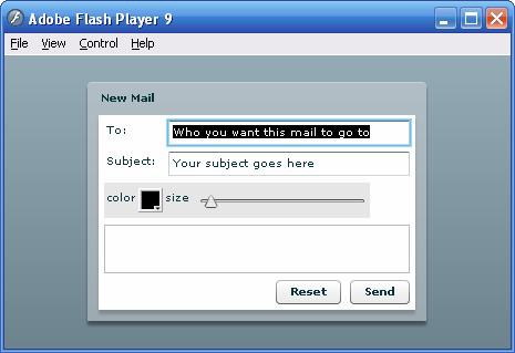
<mx:VBox width="100%" horizontalAlign="left">
       <mx:Label text="To:"/>
       <mx:Label text="Subject:"/>
</mx:VBox>
We can align the labels to the left, center, or right by
modifying the horizontalAlign style
of the VBox.
We need a place to type in those values so let's add some
TextInput controls next to their
labels. A TextInput is an area
where the user can place the cursor and type a single line of
text.
<mx:VBox width="100%">
<mx:HBox width="100%">
<mx:Label text="To:"/>
<mx:TextInput width="100%"/>
</mx:HBox>
<mx:HBox width="100%">
<mx:Label text="Subject:"/>
<mx:TextInput width="100%"/>
</mx:HBox>
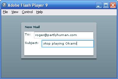
</mx:VBox>As seen in figure 4,
I've used a VBox to stack up the two lines vertically, and HBoxes to
horizontally align each line. Each holder is scaled up to 100% to fill the full horizontal width.
Without this, all the elements will take up their default or natural
size depending on their contents.
It looks pretty good, but we probably want the two text fields to line up on their left edge as well. We really want something like a table.
We can convert the rows of HBoxes to an actual grid with the
Grid component:
<mx:Grid width="100%">
       <mx:GridRow width="100%">
              <mx:GridItem><mx:Label text="To:"/></mx:GridItem>
              <mx:GridItem width="100%"><mx:TextInput width="100%"/></mx:GridItem>
       </mx:GridRow>
       <mx:GridRow width="100%">
              <mx:GridItem><mx:Label text="Subject:"/></mx:GridItem>
              <mx:GridItem width="100%"><mx:TextInput width="100%"/></mx:GridItem>
       </mx:GridRow>
</mx:Grid>
The Flex 2 Grid is analogous
to a table in HTML: the Grid is the
<table>, the GridRow is the <tr>, and the GridItem is the <td>.
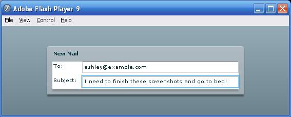
All of the 100% widths you
see above are required to make sure the TextInput fills up the GridRow, the GridRow fills up the Grid, and the Grid fills up the width of the Panel it's inside, as in Figure
5. This way we can create flexible layouts that stretch to fill
any width given to them.
You've already seen plenty of buttons in the previous examples, so with no ado, let's add a Cancel button and a Send button to the form.
We'll use an HBox at 100% width and right-aligned to tack the two buttons to the right side of the screen:
<mx:HBox width="100%" horizontalAlign="right">
       <mx:Button label="Reset"/>
       <mx:Button label="Send"/>
</mx:HBox>
Because the HBox takes up the whole width and the elements align to the right, the two buttons stick to the right side of the panel, no matter how wide it is.
Of course, you can't compose emails without a place to type the
body of the email. We will add a multiline text input area, or
TextArea, similar to the <textarea> tag in HTML. Because the
Panel is being laid out vertically, we'll put the TextArea in the
middle, between the input fields and the send buttons. We also want
this TextArea to take up all available space not just horizontally,
but vertically as well. The input fields and the send buttons are a
fixed height, but as the container grows vertically, you should get
more room for the body of your message:
<mx:TextArea width="100%" height="100%" verticalScrollPolicy="auto"/>
As you might guess, verticalScrollPolicy controls the use of
vertical scroll bars on the TextArea, and auto will draw the scrollbar only when
necessary (when there is more text in the TextArea than can fit in its
current size).
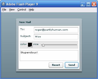
Let's add a few simple controls to tweak the appearance of the body text. We'll put them together on one line with some labels:
<mx:HBox horizontalGap="0" paddingTop="5" paddingBottom="5"
       backgroundAlpha="0.1" backgroundColor="black">

       <mx:Label text="color"/>
       <mx:ColorPicker id="fontColorPicker" selectedColor="black"/>

       <mx:Label text="size"/>
       <mx:HSlider id="fontSizeSlider" minimum="8" maximum="36" snapInterval="1"
              liveDragging="true" value="10"/>

</mx:HBox>
The ColorPicker tag creates a
color picker like those found in the Flash authoring tool, with a
pop-up palette. You can customize the colors shown in the palette, but
this example uses the defaults. The HSlider and VSlider tags create sliders that let the
user visually change a value within some range.
The additional properties on the outer HBox tag are styles that set the appearance of this row of controls and visually set them apart. (Styles are covered in depth in the next section.) We will end up with something like Figure 6.
We've put together something that looks decent. But of course, it doesn't do anything yet, and you can't get those emails of praise until the send button works!
Adding behavior to an MXML component like the new mail form we just built is fairly easy. There are no special behaviors, special ways of registering listeners, magic keywords, or incantations: all event-driven behaviors are simply part of the event model discussed in the last chapter.
Let's tackle a simple task and get the Reset button to clear all the fields of the
form. First, we'll ensure that the new mail form exists in its own
component. Then we'll write the code that resets the fields. Finally,
we'll use MXML event handlers to call the function.
The new mail form we've built is going to hold not just the visual interface, but behaviors appropriate for new mail forms; in other words, methods. Right now, we're looking at the problem: "where do I write the reset form code?" Rather than cramming all the functions we'll need for all the parts of the app, and all the tags that might be used in the app, in one huge file, we'll practice encapsulation and separation of concerns by placing all the related functions and components together in one class, remembering that each MXML file is a class.
All this really means is we create a MXML file, ComposeView.mxml, in the package com.partlyhuman.books.flexshortcut.mail and
move the Panel and its contents
into this file. As a recap, our ComposeView.mxml file should look like
this:
<?xml version="1.0" encoding="utf-8"?>
<mx:Panel xmlns:mx="http://www.adobe.com/2006/mxml" title="New Mail"
       width="75%" height="75%" layout="vertical"
       paddingLeft="5" paddingRight="5" paddingTop="5" paddingBottom="5">
       <mx:Grid width="100%">
              <mx:GridRow width="100%">
                     <mx:GridItem><mx:Label text="To:"/></mx:GridItem>
                     <mx:GridItem width="100%"><mx:TextInput
width="100%"/></mx:GridItem>
              </mx:GridRow>
              <mx:GridRow width="100%">
                     <mx:GridItem><mx:Label text="Subject:"/></mx:GridItem>
                     <mx:GridItem width="100%"><mx:TextInput
width="100%"/></mx:GridItem>
              </mx:GridRow>
       </mx:Grid>
       <mx:HBox horizontalGap="0" paddingTop="5" paddingBottom="5"
              backgroundAlpha="0.1" backgroundColor="black">
              <mx:Label text="color"/>
              <mx:ColorPicker id="fontColorPicker" selectedColor="black"/>
              <mx:Label text="size"/>
              <mx:HSlider id="fontSizeSlider" minimum="8" maximum="36"
snapInterval="1"
                     liveDragging="true" value="10"/>
       </mx:HBox>
       <mx:TextArea width="100%" height="100%" verticalScrollPolicy="auto"/>
       <mx:HBox width="100%" horizontalAlign="right">
              <mx:Button id="resetButton" label="Reset"/>
              <mx:Button id="sendButton" label="Send"/>
       </mx:HBox>
</mx:Panel>
And our application file can now reference this class by its tag:
<?xml version="1.0" encoding="utf-8"?>
<mx:Application xmlns:mx="http://www.adobe.com/2006/mxml"
       xmlns:mail="com.partlyhuman.books.flexshortcut.mail.*"
       verticalAlign="middle" horizontalAlign="center">
       <mail:ComposeView/>
</mx:Application>Recall that ActionScript may be added to an MXML class by using
a Script block. We'll use this to
add a method that resets the form. First, let's add ids to the two TextInputs and the TextArea
so we can reference them from our code. We'll call them toField, subjectField, and messageField. We'll call our method to reset
the form reset(), and we'll add
this code to ComposeView.mxml:
<mx:Script>
       <![CDATA[

       public function reset():void
       {
              toField.text = subjectField.text = messageField.text = null;
       }

       ]]>
</mx:Script>
This code sets the text
property of all the fields to null,
clearing out the view. The components with ids on them became public properties of the
class, and everything in the Script
block is inserted in the class, so reset() becomes an instance method of the
class, referencing instance variables in the class.
All that's left is to make the Reset button call reset() when it's clicked. When you create
components in MXML, you can use tag attributes to define event
handlers. Just type ActionScript directly inside the attribute:
<mx:Button label="Reset" click="reset()"/>
The click attribute
corresponds to the event named click. When the button fires the click event, the code written inside the
click event handler in the MXML is
executed. Once you attach this code, you should be able to click Reset
and see all the fields clear out.
Code you write inside an event handler attribute runs in the
scope of the class, not inside the event's target. You also have
access to event, the event object
itself in code you write in an event attribute, if you want to
manipulate it or pass it on to an external handler function. It's a
good idea to call functions for all but the simplest event-triggered
actions: it keeps you from writing code inside an attribute (where
it's very easy to invalidate your XML), separates visuals from
behavior, and gives you the option of triggering the behavior from
other events or other classes.
Working with the event model is also easy to do with
ActionScript. For instance, to add the same listener to the Reset
button, give it an id:
<mx:Button id="resetButton" label="Reset"/>
and add the listener using ActionScript in an appropriate part of your Script block:
resetButton.addEventListener("click", reset);However, typing a string like "click" is a dangerous thing. If you accidentally mistype it, the compiler can't catch your error. Because of this, and to help you with auto-complete in the editor, all of the special-value strings in the Flex and Flash APIs are exposed as public, static constants. So instead of writing "click" to refer to a mouse click, you should use:
resetButton.addEventListener(MouseEvent.CLICK, reset);
However, when using the ActionScript 3.0 event model, event
handler functions must accept the event as a
parameter. Our current reset()
method won't cut it! Here, step back and consider the intent of this
method. Is reset a method we want to make available to other methods
and from outside? If that is the case, we should not require its
callers to pass an event, because it might not be triggered by an
event. There are two approaches to this problem. The more structured
solution would be to create a handler function that calls
reset():
protected function onResetButtonClicked(event:Event):void
{
       reset();
}
This maintains a separation from the event handler and its
functionality. In fact, this is what the MXML compiler does for you
automatically. Any code you write inside the click attribute is inserted into a function
that is automatically created for it when your project
compiles:
public function __resetButton_click(event:flash.events.MouseEvent):void
{
       reset();
}
This also explains why a variable called event is available inside an event attribute
in MXML: the code ends up inside a function, which is passed a
parameter called event.
A useful hack allows the same method to act as both an event
handler and a standard public method. Allow the event parameter of the
method to default to null. In this
case we might, instead of adding a new function which calls reset(), simply change reset's signature
to:
public function reset(event:Event = null):void
Of course, this works only when your method doesn't need to depend on the event or other parameters. It looks a little sloppy, but it can be helpful.
One thing you might notice early on while using MXML classes is that you may not declare your own constructor methods. Even if you were able to run code in the constructor of an MXML class, it might not have the desired effect. Child components are created after construction time, so attempts to reference a child in the constructor results in an error.
Flex offers two events that you might want to capture to perform
initialization: initialize and
creationComplete. The first event,
initialize, will fire when your
component is constructed and children are processed, but before
anything is ready to actually appear on the screen. Conversely,
creationComplete fires after the
component has been created, added to a display list, measured, laid
out, and drawn. If your initialization code might depend on the
positions of its children, it would be better to perform it when this
event is fired.
These initialization events are useful for the mail client example. We can set some default instructional text to appear in the To and Subject fields (Figure 7), and have the text select itself when you click or tab into the fields, so that if you just start typing, it replaces the selection—the instructional text—with what you type:
<mx:Panel title="New Mail" ... initialize="onInitialize(event)">

protected function onInitialize(event:Event):void
{
       toField.text = "Who you want this mail to go to";
       subjectField.text = "Your subject goes here";
       toField.addEventListener(FocusEvent.FOCUS_IN, onFieldFocus);
       subjectField.addEventListener(FocusEvent.FOCUS_IN, onFieldFocus);
}

protected function onFieldFocus(event:Event):void
{
       var target:TextInput = event.target.owner as TextInput;
       if (target) target.setSelection(0, target.text.length);
}
This code utilizes another good technique: using event.target as the subject of your event
handling code. This way you can attach the same handler to multiple
components. Some safety is built in, too. The as test assigns null to target if the event
target's owner isn't a TextInput, and the if test will skip over the code which relies
on a method of TextInput if the target isn't a TextInput.
Binding is a powerful concept found in many declarative languages. Bindings create links between two values, using events to update one value when the other changes. In general, bindings can be one-way or two-way, but in Flex 2 they are all one-way.
If the evil Dr. Bad decides to take out an insurance policy and create a bomb which will go off if his heart stops, he might bind the bomb to his heart. Of course, in reality this might require some risky surgery, setting up a sensor, a radio transmitter, a cellular relay, and some complex detonation device, but in the movie world nobody cares about all that: it's just a binding! The same goes for bindings in Flex. In most cases, we don't have to write setter functions, dispatch events, subscribe to them and write update functions. With Flex 2, we set up the binding by referring to the property in a special syntax, and let it do all the hard work.
In our compose mail form, the color picker and size slider don't do anything yet. Let's use binding to make these components control the appearance of the body text. We want the font size to reflect the value of the size slider, and the font color to reflect the color selected in the color picker, even if they change (Figure 8). To put the bindings into action, just surround the property you want to bind to with curly braces:
<mx:TextArea width="100%" height="100%" verticalScrollPolicy="auto"
       id="messageField"
       fontSize="{fontSizeSlider.value}"
       color="{fontColorPicker.selectedColor}"/>
The example may be trivial, but there are many cases like this in real applications, and using binding can make quick work of them.
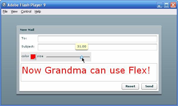
One thing that's interesting about this example is that it binds values of input components not just to properties, but also to styles.
The example uses one of three ways to bind data. By surrounding a property in curly braces, you tell the compiler to evaluate the property as a binding expression. This can also include ActionScript code: you could multiply a value by two, or concatenate a string onto the result, allowing you an opportunity to massage the data before it is applied.
Alternately, you can specify bindings free-floating rather than
directly on the destination property, by using the <mx:Binding> tag. These tags sit
outside of the objects they bind together, and define a source and a destination.
You can also create bindings in ActionScript with the mx.binding.utils.BindingUtils class. This
way provides the most control over how to deal with updates in the
source.
Curly brace binding has other applications, so you will find yourself using binding frequently without binding any properties or data. When there are no bindable properties in an expression surrounded by curly braces, the expression is simply evaluated.
In many cases, you will have to set a property of some tag to another object, or to some data. If you type in an ID or an expression into a tag, however, it will be interpreted literally, as a string. So, you may often use curly braces just to reference another object. For instance, we could set the default button of our form to the Send button:
<mx:Panel title="New Mail" ... defaultButton="{sendButton}">Binding to Constants
When you use strings in your code, you can replace these with
constants and bind to them. This works especially well when you have
to use these strings in a second place. For example, if you wanted
to check against the value of a string, or when you use the name property instead of id for something. (While the id becomes a property of the class, the
name just remains a string
defined on the instance you type it on).
Instead of:
<mx:TextInput id="input" text="Default value"/>
you might write:
private const INPUT_START_VALUE:String = "Default value";
<mx:TextInput id="input" text="{INPUT_START_VALUE}"/>
Doing it the latter way would permit you to see if the user has entered anything new in the field by comparing the text to the default value:
var isTextChanged:Boolean = (input.text != INPUT_START_VALUE);
Using this practice can help keep your code more maintainable, and prevent typo-related bugs, just like the built-in event names being stored as constants.
There are a lot of cases where binding can help you keep your code concise. Binding views to data (models) is extremely useful, as we will see in the next section. Binding components to keep their appearances in sync is common. Inspectors, user interfaces that allow you to see properties of on-screen objects updated real-time, are well suited to binding.
When you need to tightly control the order of operations, or perform complex pre- or post-commit operations, data binding may be too simple a mechanism. Rather than struggle with bending it to your will, use data binding to make code simple in simple cases.
Only bindable properties can be the source of bindings which update live. There are lots of properties in the Flex 2 framework that are already bindable. But to make your own properties bindable, you must use a metadata tag.
Metadata
Metadata are information that the Flex compiler uses to perform special actions. They are not technically part of the ActionScript 3.0 language, but compiler directives. Metadata are created with expressions in square brackets. The most common metadata you might use and their meanings are:
[Bindable]permits the property following it to be the source of bindings.[Embed]prompts the compiler to fetch an external asset and compile it into the SWF.[Event]defines events, which may be assigned handlers directly in the attributes of the tag.[Style]creates custom styles.
Many of these expressions are discussed in subsequent sections.
Simply precede the property you want to make bindable with the Bindable metadata tag:
[Bindable]
public var numToes:Number = 10;
You can also make getters bindable, and customize the Bindable
metadata tag to broadcast a specific event of your choosing when the
value updates. Bindable properties only work in classes which are able
to broadcast events. This includes all user interface components
defined by Flex, so if you are writing a non-visual class like a
model, just extend flash.events.EventDispatcher.
Data binding is particularly useful in a model-view-controller (MVC) architecture. You can build a lightweight view component, and instead of writing myriad functions to handle updating it, you can bind it directly to a model with data binding.
We'll see the simplicity of this approach by creating an inbox message list and reader component.
Embedding model data directly into your MXML is possible. It's not likely that you would do this except when testing or building very small applications. However, we do need to create some quick dummy data so we can build the view and test the bindings.
Let's sketch out an XML model for messages. Because XML is so easy to manipulate with E4X, and we don't have any object relational databases or heavy server side integration that necessitates building model classes for email messages, using XML is ideal.
Let's create a new MXML component—InboxView.mxml—for reading messages, and put
some dummy message data in it:
<mx:Panel xmlns:mx="http://www.adobe.com/2006/mxml" width="100%" height="100%"
       title="Messages">

       <mx:XMLList id="inbox">
       <message>
              <date>01/01/2006</date>
              <from>[email protected]</from>
              <to>[email protected]</to>
              <subject>Example Email</subject>
              <message>This is an example email.</message>
       </message>
       <!-- many, many more emails culled from my spam folder -->
</mx:XMLList>

</mx:Panel>
We can write XML inline in MXML. With HTML messages, though, it
would be advisable to enclose the contents of the message node in a CDATA block.
There are several built-in Flex components that are ideal for
displaying sets of data. List and
TileList are good for lists of
data, and they can be combined with item renderers to build a list of
interfaces more complex than a simple list of text. Tree, of course, is good for navigating
hierarchical data. We would like to see our inbox in a familiar grid
with columns that we can sort by and customize (Figure
9). Flex 2 has a component that is perfect for this, DataGrid.
Let's add in a DataGrid component to the viewer, customize its
columns, and then hook it up to our dummy data by binding its dataProvider property:
<mx:DataGrid id="messageList" width="100%" height="100%" dataProvider="{inbox}">
       <mx:columns>
              <mx:DataGridColumn dataField="from" headerText="Sender"/>
              <mx:DataGridColumn dataField="subject" headerText="Subject"/>
              <mx:DataGridColumn dataField="date" headerText="Date"/>
       </mx:columns>
</mx:DataGrid>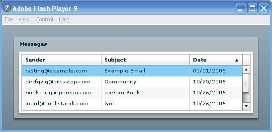
With just a few lines, we now have a scrollable list of
messages, resizable columns, and the ability to sort by any column
ascending or descending. But we're just getting started. The DataGrid
is a pre-made view suitable to display tabular data, which needs no
customization. It knew to look at each XML node in your list of
messages and pull out the <subject> child for the Subject field,
because you specified that in the dataField property of the Subject
column.
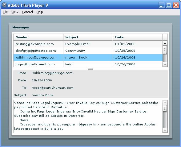
Let's build a custom view and tell it how to render its contents. Of course, this is going to be our reading pane, which shows the full email.
Our approach here is to make a "dumb" view. It will provide an empty slot for a model to be inserted, and binds to the properties of that model, so that when a model is provided, the view updates automatically.
We'll create another component for the message view—MessageView.mxml—and add in all the fields
we want to display. We should have a header block at the top and then
a big scrollable text area at the bottom:
<mx:VBox xmlns:mx="http://www.adobe.com/2006/mxml">

<!-- where the model will go -->
<mx:Object id="msg"/>

<mx:Grid id="header" backgroundColor="black" backgroundAlpha="0.1" width="100%">
<mx:GridRow>
       <mx:GridItem horizontalAlign="right"><mx:Label text="From:"/></mx:GridItem>
       <mx:GridItem><mx:Text truncateToFit="true" text="{msg.from}"/></mx:GridItem>
</mx:GridRow>
<mx:GridRow>
       <mx:GridItem horizontalAlign="right"><mx:Label text="Date:"/></mx:GridItem>
       <mx:GridItem><mx:Text truncateToFit="true" text="{msg.date}"/></mx:GridItem>
</mx:GridRow>
<mx:GridRow>
       <mx:GridItem horizontalAlign="right"><mx:Label text="To:"/></mx:GridItem>
       <mx:GridItem><mx:Text truncateToFit="true" text="{msg.to}"/></mx:GridItem>
</mx:GridRow>
<mx:GridRow>
       <mx:GridItem horizontalAlign="right"><mx:Label text="Subject:"/></mx:GridItem>
       <mx:GridItem><mx:Text truncateToFit="true" text="{msg.subject}"/></mx:GridItem>
</mx:GridRow>
</mx:Grid>

<mx:TextArea
       width="100%" height="100%"
       editable="false"
       verticalScrollPolicy="auto"
       htmlText="{msg.message}"/>

</mx:VBox>
We made this element a VBox instead of a full panel so we can
put it alongside the message list. Note how simple this is: we have an
object, msg, which all the
components bind their values to.
Now all we have to do is hook it up. We'll use a VDividedBox to split up the message list and
the reader pane. This container component splits the area it occupies
into two with a horizontal bar which the user can drag to change the
relative sizes of the upper and lower areas, like an HTML frameset
with a visible border. Of course, Flex 2 also provides an HDividedBox, which subdivides its area
horizontally.
Finally, we add an event handler to the change property of the DataGrid, which
copies the selectedItem from the
model into the reader's msg slot
for the model:
<mx:VDividedBox width="100%" height="100%" liveDragging="true">

<mx:DataGrid id="messageList" width="100%" height="100%"
   dataProvider="{inbox}"
   change="reader.msg = messageList.selectedItem">
   <mx:columns>
          <mx:DataGridColumn dataField="from" headerText="Sender"/>
          <mx:DataGridColumn dataField="subject" headerText="Subject"/>
                 <mx:DataGridColumn dataField="date" headerText="Date"/>
   </mx:columns>
</mx:DataGrid>

<mail:MessageView id="reader" width="100%"/>

</mx:VDividedBox>
Believe it or not, that's all it takes. The reader view updates its bindings and displays the email when you select it in the list (Figure 10).
Now that we've built a view and proven its ability to bind to a model, we can load in the email messages. Flex 2 gives you plenty of options for loading data with different approaches.
Flash Player 9 introduces new ways of loading assets over HTTP.
For external SWFs or images, there is a new flash.display.Loader class which handles
loading and displaying; for text, XML, URL-encoded variables, and raw
binaries, there is a new flash.net.URLLoader class. When requesting
information from a URL, both of these classes use a flash.net.URLRequest class to encapsulate
the URL along with other information about the request, such as
headers, MIME types, and form data.
In ActionScript 3.0, the XML
class is strictly a data type, and doesn't have loading capabilities
like previous versions of ActionScript. Instead, URLLoader handles all the loading, and we
use the top-level function XML() to
convert the text data loaded by the URLLoader into XML.
Note that this is one of several top-level functions that masquerade as a cast operator. However, it's a useful metaphor. Not only does it return an XML object, but it also translates the meaning of the string into its XML representation.
Using a URLLoader is similar
to using a MovieClipLoader from
ActionScript 2. First, you create the object. Then you subscribe to
its events, which include progress, completion, status, and error
events. Finally, you ask it to send the URLRequest and load the response. After
loading is complete, you can access the data loaded in the data property, which is untyped:
<!-- in MXML -->
<XMLList id="inbox"/> <!-- empty out the inbox XML but leave it as a holder -->

//inside Script block:
protected var loader:URLLoader;

public function updateMessages():void
{
       loader = new URLLoader();
       loader.addEventListener(Event.COMPLETE, onDataComplete);
       loader.load(new URLRequest(
"http://partlyhuman.com/books/flexshortcut/mail/services/inbox.xml"));
}

protected function onDataComplete(event:Event):void
{
       //.message is an E4X operator returning an XMLList
       //of all child nodes with node name <message>
       inbox = XML(loader.data).message;
}
Adding the above into InboxView.mxml and emptying out its XMLList tag will allow the mail list to load
its dummy messages from an external XML file.
The previous example works in either Flash 9 or Flex 2. However,
Flex 2 provides you with an even simpler approach in the HTTPService class. The HTTPService can be
used wherever a URLLoader could, but provides some advantages. You can
repeat the request trivially by calling send() on the HTTPService. You can bind
directly to the results of the last call to the service, negating the
need for an update function or an intermediary model location.
We could replace all the ActionScript using URLLoaders with a single Flex 2 tag:
<mx:HTTPService id="inbox" resultFormat="e4x"
       url="http://partlyhuman.com/books/flexshortcut/mail/services/inbox.xml"/>
We also change the DataGrid to bind directly to the result of the service, rather than binding to a model that we manually populate:
<mx:DataGrid id="messageList" ... dataProvider="{inbox.lastResult.message}">...Now all it takes is a call to inbox.send() to refresh the email list. So
whether the target is a plain XML file or a script that writes out
XML, HTTPService can make loading data trivial.
Modifying the URLLoader method to use REST is straightforward.
Simply add variables to the data
property of the URLRequest, either by setting data to a URL-encoded string, or by adding
them into a URLVariables object. Sending variables in the HTTP request
and loading the XML response is all it takes to use REST.
Below is a simple snippet that retrieves the latest photos uploaded to Flickr:
var request:URLRequest = new URLRequest("http://api.flickr.com/services/rest");
request.data = new URLVariables();
request.data.method = "flickr.photos.getRecent";
request.data.api_key = "<<my API key here>>";
request.method = URLRequestMethod.GET;
loader = new URLLoader();
loader.addEventListener(Event.COMPLETE, onComplete);
loader.load(request);
Of course, HTTPService is well suited to REST. The HTTPService
tag allows a request property to be
set on it with a variety of types.
<mx:HTTPService id="flickr" resultFormat="e4x"
       url="http://api.flickr.com/services/rest"/>

flickr.request = {
       method: "flickr.photos.getRecent",
       api_key: "<<my API key here>>"
};
flickr.send();
You can set the request
property in ActionScript, as above, or directly as an attribute on the
HTTPService tag in MXML. You can
use curly braces in the attribute to embed an object, or write the
attribute as a child node and use embedded XML to describe the
variables to send:
<mx:HTTPService ... request="{{method: 'flickr.photos.getRecent'}}"/>
<!-- identical to -->
<mx:HTTPService>
       <mx:request>
              <method>flickr.photos.getRecent</method>
       </mx:request>
</mx:HTTPService>The WebService class lets you
perform RPC (Remote Procedure Calls) over SOAP easily. As long as the
WebService object can locate and load a WSDL file—which describes the
operations the service supports and their parameters—you can access
operations on the service using dot notation, even if you don't
declare them ahead of time.
The WebService class must successfully load a WSDL file before any remote procedure calls are sent. Therefore, you should subscribe to the load event of a WebService and allow access only after the event is triggered.
This example and the viewer shown in Figure 11 uses a stock lookup service to get delayed stock quotes for a NASDAQ symbol;
<mx:Application xmlns:mx="http://www.adobe.com/2006/mxml" layout="vertical">
<mx:WebService id="stockService"
       wsdl="http://services.xmethods.net/soap/urn:xmethods-delayed-quotes.wsdl"
       load="searchButton.enabled = true;"
       fault="trace(event.fault.faultString)">
       <mx:operation name="getQuote" resultFormat="object">
              <mx:request>
                     <symbol>{symbolInput.text}</symbol>
              </mx:request>
       </mx:operation>
</mx:WebService>

<mx:HBox>
       <mx:Label text="Symbol name:"/>
       <mx:TextInput id="symbolInput" maxChars="5"/>
       <mx:Button id="searchButton" enabled="false" label="GO"
              click="stockService.getQuote.send();"/>
</mx:HBox>
<mx:Text text="{stockService.getQuote.lastResult}"/>
</mx:Application>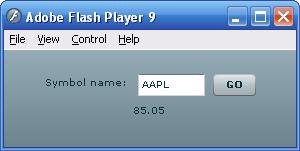
When the WebService above loads the WSDL file, it enables the
search button, which is disabled by default. This ensures that when
the getTemp object is called, it's
ready.
In the above example, the operation attribute of the WebService is
included for our own convenience and self-documentation. Because
information about the available operations is encoded in the WSDL
file, we could omit our own description of the getQuote operation, but we would have to
manually set the symbol parameter
before sending the procedure call rather than using binding. Using
data binding to bind a parameter directly to the value with which it
will be called is known as parameter
binding.
The WebService interface can be much more convenient than HTTPService, especially when calling many different methods, because one service reference can manage multiple operations.
For services that return data encoded in JSON, there is no
built-in converter. eval() is not
implemented in ActionScript 3, in order to keep the AS3 compiler out
of the Flash Player. However, Adobe Labs hosts a free project called
corelib, at http://labs.adobe.com/wiki/index.php/ActionScript_3:resources:apis:libraries,
which includes a JSON parser.
Neither Flex nor AS3 provide a special API for Flash Remoting
beside the Flex Data Services mentioned below. Remoting calls can be
performed using the NetConnection
API. Alternately you could use the MIT-licensed AS3 Lightweight
Remoting Framework by Danny Patterson, available at http://as3lrf.riaforge.org/.
The framework allows you to encapsulate a service, which supports
Flash Remoting like any other web service.
Flex Data Services (FDS) http://www.adobe.com/products/flex/dataservices/ is an Adobe product in the Flex family; it allows Flex 2 applications to communicate more intelligently and efficiently with the data tier. FDS is a Java application that runs on top of existing business logic on the server, and is agnostic of your choice of database communication. Though it is a separate application, Flex 2 contains features expressly for working with FDS. The product also must be purchased separately and comes in different editions and different price points.
FDS offers a whole slew of features, which may be split into categories: connectivity, RPC services, data management services, and message services.
FDS and Flex are able to communicate using AMF3, a binary, compressed format that retains typing. FDS can communicate with Flex through RTMP (Real-Time Messaging Protocol) or over HTTP, and falls back gracefully. FDS is able to queue messages for temporarily unreachable clients, and it can sustain a stateful transaction with Flex clients.
FDS proxies other remote services to provide centralized logging, security, configuration, and, potentially, localization.
Flex applications which use Flex Data Server to communicate with business tier applications can have up-to-date copies of data centralized without needing to worry about synchronization, locking, or updating. FDS can provide Flex applications with a copy of data that is automagically always up-to-date.
Finally, Flex Data Services enable real-time, push messaging from the server and mediated between peers.
For the first time, Flash Player 9 supports TCP/IP socket connections, allowing you to talk to arbitrary services with full control over the data you send and receive. Sockets are an abstraction of a TCP/IP connection as a stream. You can read as much as is available from the stream or write to it, in any combination of formats. To use a socket, you create it, connect to a server, read and write data to it, and close it.
Using sockets, we can connect our mail application to a real mail server. In order to make our mail application functional, we separate out the model into a central location, and create a POP3 client class, which retrieves the messages from a real mail server and populates the model as they are loaded.
Below is a condensed version of the POPConnection class. Please see the full
listing on this Short Cut's site. Communicating with a POP server
involves a series of steps. In order to talk to a POP server, it
must:
Send the username
Wait for a response
Send the password
Wait for a response
Request a list of messages
Parse the list of messages
Retrieve the messages one by one
Because the Socket exposes
only a single event for all incoming data, the class uses a state
variable and the last sent command to remember where it is in the
process and how to deal with received data. The class uses regular
expressions heavily to parse the server's responses into XML and
inserts the values into the data model with E4X:
final public class POPConnection extends EventDispatcher
{
       public function POPConnection(user:String, pass:String, host:String, port:int)
       {
              //...
              sock = new Socket();
              sock.addEventListener(Event.CONNECT, onConnected);
              sock.addEventListener(SecurityErrorEvent.SECURITY_ERROR, onError);
              sock.addEventListener(IOErrorEvent.IO_ERROR, onError);
              sock.addEventListener(ProgressEvent.SOCKET_DATA, onData);

              connect();
       }
       private function connect():void
       {
              //...
              sock.connect(host, port);
              //...
       }
       private function onData(event:Event):void
       {
              responseBuffer += sock.readUTFBytes(sock.bytesAvailable);

              //if the end of the buffer is the end-of-response marker
              {
                     processResponse();
              }
       }
       private function sendCommand(command:String, ... args):void
       {
              var output:String = command + " " + args.join(" ") + CMD_END;
              sock.writeUTFBytes(output);
              sock.flush();
              //start timeouts...
       }
       private function processResponse():void
       {
              var response:String = responseBuffer;
              var isOk:Boolean = (response.search(/^+OK/) == 0);
              switch (state)
              {
                     case POPState.CONNECTED:
                           if (isOk)
                           {
                                  state = POPState.WAIT_FOR_USER;
                                  sendCommand("USER", user);
                           }
                           break;
                     //other states for authentication...
                     case POPState.WAITING_MULTILINE:
                           if (command == "LIST")
                           {
                                  parseList(response);
                                  currentIndex = 1;
                                  getNextMessage();
                           } else if (command == "TOP" || command == "RETR") {
                                  if (isOk)
                                  {
                                         parseMessage(response);
                                         getNextMessage();
                                  } else {
                                         getNextMessage();
                                  }
                           }
                           break;
                     default:
                           state = POPState.TRANSACTION;
              }
              responseBuffer = "";
       }
       private function parseMessage(messageSrc:String):void
       {
              var inbox:XMLList = MessageRepository.getInstance().inbox;
              var msg:XML = inbox.(id == currentIndex)[0];
              var cut:int = messageSrc.indexOf(HEADER_END);
              var header:String = messageSrc.substring(0, cut);
              var message:String = messageSrc.substring(cut, messageSrc.length);

              var headers:Object = parseHeaders(header);
              msg.from = headers.from;
              msg.to = headers.to;
              msg.date = headers.dateparsed;
              msg.subject = headers.subject;
              msg.message = undoubleNewlines(message);
       }
}
Because the DataGrid is bound to the inbox XMLList, any change to the data is reflected in the list: as the POP client loads in messages one at a time, they appear in the reader progressively, letting you view messages without waiting for all of them to load.
Flex 2 makes it easy to add to, remove from, and change the user interface on the fly. You can present users with an interface that changes to suit the current task or their needs. However, using code to modify the interface can get messy: as the number of possible permutations of your component increases, you have to be more careful about managing every possible state transition. States provide structure and indication to changes in the user interface.
One of the benefits of Flex States is the fact that they are self-contained. You can encapsulate the steps necessary to transform one mode of the interface into another in a State, and give that State a name. Now, instead of inspecting your interface or checking on a manually updated variable to see what state the interface is in, you can simply inspect the current State's name.
Another benefit is that Flex figures out and performs the work necessary to transition from one State to another. You simply declare the properties which need to change, and when you request that State, the changes are applied.
Finally, if you use States in your application, you can use them as event triggers and you can apply transitions based on them.
If we want to be able to collapse the message list and hide the
reading pane in our mail application, we can create a state for this
appearance. All we have to do is specify what changes to make inside a
State tag, and give it a name to
reference. Then, all changes to the State are performed by setting
currentState to the name of a
State. The property currentState is
defined on all Flex UI components and refers to the name of the state
the component is in. To revert to the base state, simply set currentState to null. We add the following to InboxView.mxml:
<mx:states>
       <mx:State name="collapsed">
              <mx:SetProperty target="{reader}" name="height" value="0"/>
       </mx:State>
</mx:states>
This code says: there is one State in this component named
collapsed, which modifies the
height of the reader to be 0. Notice how binding is used to dereference
the id of the mail reader
pane.
You can add a button that triggers this change of state and collapses the viewer pane:
<mx:Button label="Hide Reader" click="currentState = 'collapsed'"/>
And it would be nice to bring back the reading pane by double-clicking a message in the list:
<mx:DataGrid id="messageList" ...
       doubleClickEnabled="true"
       doubleClick="currentState = null">...</mx:DataGrid>
Binding to Constants
Because you must refer to a State by its name, which is just a String, States are a
perfect place to apply the binding-to-constants practice. With a few
changes, you could make this code typo-proof. Just add constants for
every State you will be using in your class:
protected const STATE_COLLAPSED:String = "collapsed";
and then use curly braces to dereference them in place of typing in the name of the State:
<mx:State name="{STATE_COLLAPSED}">...
<mx:Button click="currentState = STATE_COLLAPSED"/>Setting a property is one of a few things States are allowed to do. They may also
Modify a style with
<mx:SetStyle/>Add children to the component with
<mx:AddChild/>Remove children with
<mx:RemoveChild/>Set an event handler with
<mx:SetEventHandler/>
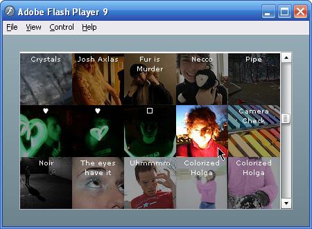
Let's move back to the canonical Flickr example. We want to be
able to look at a grid of photos, and see either the title or the
image itself. We're going to implement the two views of each image as
a State.
We use the same HTTPService code from earlier and utilize it to
generate a grid of photos. When we built the message list with a
DataGrid, we saw that a DataGrid already knows how to render its data.
Well, we can actually upgrade the abilities of this and other built-in
data components by giving them an itemRenderer: a class that performs the job
of displaying each piece of data. This way, a List can worry about
looking through the data, making the correct number of cells, aligning
them vertically, and scrolling them, while the itemRenderer worries about how to draw each
item. The TileList is another
built-in data component that can be assigned new renderers, and we let
it do the work of arranging the photos in a grid. Whereas a DataGrid
displays data in cells in a table, with one row per item, the TileList
displays its content aligned in a grid, with one cell per item and no
row or column headers:
<mx:Application xmlns:mx="http://www.adobe.com/2006/mxml" initialize="flickr.send()">

<mx:HTTPService id="flickr"
       url="http://api.flickr.com/services/rest"
       requestTimeout="5000"
       resultFormat="e4x">
       <mx:request>
              <method>flickr.people.getPublicPhotos</method>
              <user_id>40732543741@N01</user_id>
              <per_page>200</per_page>
              <api_key><!-- API key goes here --></api_key>
       </mx:request>
</mx:HTTPService>

<mx:TileList
       selectable="false"
       paddingLeft="0" paddingRight="0"
       columnWidth="75" rowHeight="75"
       width="100%" height="100%"
       dataProvider="{flickr.lastResult.photos.photo}"
       itemRenderer="com.partlyhuman.books.flexshortcut.flickr.FlickrTile"/>

</mx:Application>
The itemRenderer property of
the TileList specifies what class is created to populate each tile of
the grid. By giving it the name of the FlickrTile class, we specify that each tile
should be populated by a FlickrTile, which handles the visual
representation of a single row of data.
The rest of the application is in the FlickrTile class. Inside an item renderer,
there exists a data property that
is set to the row of data that the renderer is to represent. We use
E4X to grab the properties out of the XML and construct an image URL
with it, and use an Image to
display the image:
<mx:Canvas xmlns:mx="http://www.adobe.com/2006/mxml">

       <mx:Script><![CDATA[
              private function photoToImage(photo:*):String
              {
                     var p:XML = photo as XML;
                     return "http://static.flickr.com/" + p.@server + "/"
                           + p.@id + "_" + p.@secret  + "_s.jpg";
              }
       ]]></mx:Script>

       <mx:Image id="img" width="75" height="75" source="{photoToImage(data)}"/>

</mx:Canvas>
Now we add an overlay on top of the image with the title:
       <mx:HBox id="caption" width="75" height="75" backgroundColor="black">
              <mx:Text height="100%" width="100%"
                     truncateToFit="true" selectable="false" color="white"
                     text="{data.@title}"/>
       </mx:HBox>
Then add some states. This time instead of using a default state, we have two states, inactive and active:
       <mx:states>
              <mx:State name="inactive">
                     <mx:SetProperty target="{caption}" name="alpha" value="0.4"/>
              </mx:State>
              <mx:State name="active">
                     <mx:RemoveChild target="{caption}"/>
              </mx:State>
       </mx:states>
It's your choice whether to use multiple named states, or take
advantage of the default state. You can use a custom state as your
default state by setting currentState in the root tag of your
component. This way, we can forget about the base state: the
application will always be in only one of the two states we defined.
We also made the mouse trigger the state changes by adding events to
the root tag:
<mx:Canvas xmlns:mx="http://www.adobe.com/2006/mxml"...
       mouseOver="currentState='active'"
       mouseOut="currentState='inactive'"
       currentState="inactive">
And that's all. Now we can move the mouse around the grid to expose the photos behind the captions. As shown in Figure it's a micro-miniature browser.
States are useful for changes that are localized, and especially
for those that are in appearance only. Because you are able to run
arbitrary code when entering a state by attaching to the state's
enterState event, it is tempting to
use states to implement all kinds of changes. However, you will be
more successful if you use states to manage self-contained changes in
the user interface.
One weakness of states is that they are public: any outside
class can modify your class's currentState property, and by turn your
class's state. The convenience of states comes at the price of
encapsulation.
Styles make it easy to customize the appearance of everything in your application, and provide you with different ways to associate appearance with objects. Styles are fairly versatile: you can change styles at runtime to make your application more reactive, you can set them from MXML or ActionScript, and you can bind them to data sources.
In MXML, styles are set as attributes of tags. Unlike some declarative XML languages, in MXML, attributes for event names, styles, effect triggers, and instance properties all share the same namespace. You can use the icons on Flex Builder 2's autocomplete pop-up to differentiate, and to see which styles are available to which components. Alternately, you might use the Flex Properties panel in Flex Builder 2's design mode to see available styles, or reference the Styles section of the class's documentation.
Style names, when used in tag attributes, are subject to a
simple translation rule. A style name in a style sheet is allowed to
(and frequently does) use dashes to separate words, as in font-family. When written as an attribute in
a tag, the dashes are converted into camel case, as in fontFamily. This is programmatically done,
so even custom styles you create can be converted. Furthermore, you
are allowed to use either the dash or the camel case form of a style
in a style sheet: either is accepted.
To change the appearance of a single instance (Figure 13), you can use inline styles:
<mx:Text width="100%" text="Dull, boring, lacks style. Lacks impact."/>
<mx:Text width="100%"
       fontSize="18"
       color="white"
       fontFamily="Futura"
       fontStyle="italic"
       text="CLOSABILITY makes PRODUCTIVITY THRIVE in WEB DESIGN MODELOLOGY"/>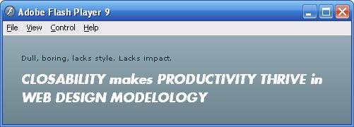
There are a handful of styles you will find yourself using frequently in Flex 2. Many of these appear identical to W3C CSS styles, but they are often slightly different, and these differences can easily become problematic, so these caveats are included in the list.
Common styles and notes
fontFace | Comma-separated lists
are not supported. Use |
fontSize | All measurements are in pixels. Do not append any units. |
paddingLeft, paddingRight,... | There is no Combined shortcuts ( |
color, backgroundColor | Named colors, |
backgroundAlpha | Alpha values are real numbers between 0 and 1. |
borderStyle, borderSides | Instead of setting
|
horizontalCenter, verticalCenter | Allows you to position based on a center line rather than top left. Setting 0 for both values places the center of an object at the center of its parent. |
horizontalGap, verticalGap | Modifies spacing of
layout containers like |
As mentioned above, all measurements are in pixels and no value
should include units. Another important point is that the x, y,
width, and height properties are
not styles and cannot be controlled by a style.
However, top, bottom, left, and right are styles with the same meanings as
W3C CSS.
To set styles on a single component instance using ActionScript,
use setStyle(styleName, value), for
example:
<mx:Button id="myButton" click="myButton.setStyle('borderColor', 'red')" label="Red"/>Depending on the particular style, setting a style on a container component may also set it on the container's children. This is a different phenomenon than cascading styles, because it refers not to style rules but to display lists. Called style inheritance, it typically applies to color and text styles. The Flex 2 Language Reference documents the inheritance property of every style.
Flex 2 supports cascading stylesheets, with the same syntax as W3C CSS and the same cascading model, but with much different support for selectors. When beginning to use Flex 2 style sheets, I would advise you to forget everything you know about CSS. Or at least, put it away for the next time you use HTML+CSS.
You can write CSS directly inside a Style block in MXML, or you can reference an
external CSS file:
<mx:Style source="styles.css"/>
However, you can only pull in CSS style blocks from the root
Application of your project. If you
are working on a large application, you might consider splitting your
styles into several .css files that
address different subsystems. This is especially beneficial if you are
working on a project which publishes multiple SWFs sharing some code:
you can include different .css files
in each top level Application which only contain styles used in that
application.
While you work with CSS, keep in mind that Flex compiles this,
too, into ActionScript. Your CSS files are not
loaded or applied at runtime. However, not all hope is lost for
switching styles at runtime. The StyleManager class lets you view and modify
styles and even add new selectors while your application is running.
While you can't simply load in a new style sheet, you can use
ActionScript to modify cascading styles and see your application refresh
with those changes.
The major difference between W3C CSS and Flex 2 stylesheets is the kinds of selectors that are supported.
Use type selectors to set styles for every instance of a certain
class. This can refer to not only built-in components like ComboBox and ProgressBar but to MXML and ActionScript
classes you write yourself. Much like you could use the following line
in W3C CSS to make all ordered and unordered lists appear
white:
ul, ol {color: white}You could likewise use the following in Flex 2 CSS to make all Labels and Texts appear white:
Label, Text {color: white}Use class selectors to create a common style that any instances can use. To use a class selector, just come up with a class name, define it in CSS with the styles you would like it to apply, and set the class name on the instances you want to appear that way.
For instance, you can create a red class that only a few specific components on screen will use:
<mx:Style>
       .red {color: red}
</mx:Style>
<mx:Button styleName="red" label="Red Button"/>
<mx:Label styleName="red" label="Red Label"/>
<mx:Button label="Normal Button"/>
Nomenclature here gets confusing because, of course, we already
have a much different concept of what a "class" is. So while this is
still called a "class selector," you use the styleName attribute to apply style classes
in your tags instead of class, as
you would in HTML.
Be aware: you cannot use multiple style classes on a single
element like HTML allows in code, like <a
class="external, big">.
Like W3C CSS's * selector,
the global selector in Flex 2 CSS
applies to everything, though it is the most general rule and can be
overridden by a more specific rule. This can be useful for setting a
global font, or even better, to speed up or disable animations in all
the Flex 2 components at once.
global {
       openDuration: 0;
       closeDuration: 0;
}No selectors beyond the three listed above are implemented. This means you cannot use:
Type-specific classes like
Button.bigButtonidselectors like#logoAny kinds of descendant or familial selectors like
Panel LinkButtonPseudoclasses like
.fancyLabel:hover
Flex 2 delivers a one-two punch with the lack of selector
support and classification of visual properties like width and height as non-styles. While there are good
reasons for these to not be styles, it means that many times you may
end up with most of the visual appearance stored in an external CSS
file but some remaining embedded firmly in MXML. The lack of selectors
means you may also have no choice but to construct unwieldy style
class names in an attempt to avoid name collisions when targeting
specific components in (globally scoped) stylesheets.
If it makes sense, you might choose to inline styles for styles unique to instances, or create "microclasses" instead of style classes. For example, if you wanted to achieve this effect:
#topPanel Button.redButton {background-color: red; width: 50}You might decide that instead of making a .topPanelRedButton style class, you might
actually make a RedButton.mxml
class, perhaps in the same package as your topPanel, consisting
of:
<mx:Button backgroundColor="red" width="50"/>
Best practices of the web standards community would have us commit to a separation of content and style. However, content in Flex 2 applications often comes from an external source and are used to populate a view. So when you write views in MXML, you are specifying presentation that is already loosely coupled to content. Separating presentation further into structure and style is the purpose of externalizing CSS, and it is useful for writing components that may be reused with a different style. On the other hand, for one-off components, you may be hurting yourself by putting the style in a separate file as the rest of the MXML presentation.
Using external CSS—given its limitations—may either simplify or complicate your code. Find a strategy that works well with your style and your application, depending on its complexity and organization.