
Converting Arrow Diagrams to Bar Charts
While an arrow diagram is essential to do a proper analysis of the relationships between the activities in a project, the best working tool is the bar chart. The people doing the work will find it much easier to see when they are supposed to start and finish their jobs if you give them a bar chart. The arrow diagram in Figure 7-3 has been portrayed as a bar chart in Figure 7-4, making use of what was learned about the schedule from the network analysis.
Figure 7-4. Bar chart schedule for yard project.
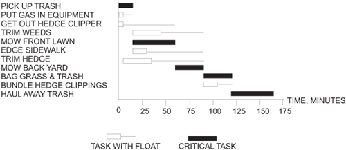
Note that the critical path in the bar chart is shown as solid black bars. Bars with float are drawn hollow with a line trailing to indicate how much float is available. The task can end as late as the point at which the trailing line ends.
This is fairly conventional notation. Scheduling software always allows you to print a bar chart, even though a CPM network is used to find the critical path and to calculate floats. One caution: Many programs display the critical path in red on a color monitor and often color started tasks with green or blue. When these bars are printed on a black-and-white printer, all of them may look black, implying that they are all critical, confusing the people trying to read them. It is usually possible to have the computer display shading or cross-hatching instead of color so that when they are printed in black-and-white, there will be no ambiguity.