
Chapter 11: CSS and Scrolling
Smooth scrolling previously required the use of JavaScript to calculate the speed and timing of a scrolling operation. Developers of a certain age may remember using the animate() method of the jQuery JavaScript library, or the MooTools Fx.Scroll() class to make a page scroll to a given location.
Similarly, carousels and slide shows often required JavaScript libraries. Perhaps you’ve tried a slide show such as Flickity or FlexSlider that uses JavaScript to animate the position of a scrolling container by updating its transform value.
In this chapter, we’ll look at two CSS features—the scroll-behavior property, and CSS Scroll Snap—that make it possible to create jump links that scroll smoothly, and carousels that require minimal amounts of JavaScript, if any.
Scrolling and Vestibular Disorders
Smooth scrolling may cause dizziness for people who have vestibular disorders. Use the prefers-reduced-motion media feature and @media to reduce or disable scrolling for visitors who’ve indicated a preference.
Dump the Jump: Smooth Internal Links with scroll-behavior
The scroll-behavior property manages the behavior of scrolling when caused by navigation, or the invocation of a CSSOM scrolling method—scroll(), scrollTo(), scrollBy(), or scrollIntoView(). Other methods of scrolling, such as with a pointer device, aren’t affected by the scroll-behavior property.
Initially, the value of scroll-behavior is auto. This value causes an instant scroll. An instant scroll is less of a scroll and more of a jump to the desired location within the document. You can also use smooth, which causes what we generally think of as scrolling behavior: the content glides to the requested point.
What Is a Scrolling Box?
Smooth scrolling only works when the element has a “scrolling box”. An element or a viewport has a scrolling box when:
- the element or viewport has a scrolling mechanism
- the element overflows its content area and the used value of the
overflow-xoroverflow-yproperty is something other thanhiddenorclip
Here’s an example:
<!DOCTYPE html>
<html>
    <head>
        <meta charset="utf-8">
        <title>scroll-behavior</title>

        <style>
            ul {
                display: flex;
                list-style: none;
                padding: 1rem;
                gap: 1rem;
                justify-content: center;
            }

            .scroll-container {
                width: 50%;
                margin: auto;

                /*
                 * When the container has a fixed height, its contents may
                 * overflow it
                 */
                height: 30rem;

                /*
                 * Can also use `overflow` as a property. Value can also be
                 * `scroll`
                 */
                overflow-y: auto;

                scroll-behavior: smooth;
            }

            /*
             * Remember, motion can make some people dizzy!
             */
            @media screen and ( prefers-reduced-motion ) {
                .scroll-container {
                    scroll-behavior: auto;
                }
            }

            .scroll-container div {
                /*
                 * Total height of child divs are large enough or contain
                 * enough content to overflow their parent container
                 */

                height: 50vh;
            }
        </style>
    </head>
    <body>
        <nav>
            <ul>
                <li><a href="#A">A</a></li>
                <li><a href="#B">B</a></li>
                <li><a href="#C">C</a></li>
                <li><a href="#D">D</a></li>
            </ul>
         </nav>

        <div class="scroll-container">
            <div id="A">A</div>
            <div id="B">B</div>
            <div id="C">C</div>
            <div id="D">D</div>
        </div>
    </body>
</html>
Clicking any of the navigation links triggers a smooth, gliding-style scroll to the linked <div>.
For non-root elements, the element must have a fixed height, set using the height or max-height properties in order for scroll-behavior to have an effect. The value of overflow should also be scroll or auto. The root <html> element takes on the dimensions of the viewport. Content that exceeds the viewport dimensions creates both an overflow and a scrolling mechanism. As a result, scroll-behavior: smooth works for the <html> element without any additional properties.
The <body> element, however, is a bit of a special case. Body elements rarely generate a scrolling box, in part because content rarely overflows them. Body elements grow and shrink with the dimensions of their child content. That means if you apply scroll-behavior to a <body> element, you’ll also need to set the height, width, and overflow values of its parent. Applying scroll-behavior to the root element, on the other hand, works similarly, and requires fewer bytes.
Unfortunately, this version of the CSSOM specification didn’t include a way for developers to have control over how the page scrolls beyond smooth and “not-smooth” (better known as the auto value). We can’t use an easing function, or set a scroll duration.
Instead, scroll-behavior: smooth uses a browser-defined timing function and duration. Depending on the browser, scroll-behavior may also follow conventions of the operating system on which it runs. If you want to shape how the scroll works—for example, whether the timing function is linear or ease-in, or how many milliseconds it should take—you’ll need to use JavaScript.
Scroll Snap
Sometimes the inability to control what happens when scrolling ends is the problem you’d like to solve. For example, it can be tricky to create a slide show that always centers a photo without doing a lot of potentially intensive DOM operations. This is where CSS Scroll Snap shines. Scroll Snap makes it easy to set the alignment of content within a scroll container.
Scroll Snap versus Scroll Snap Points
You may have heard of an earlier, similar feature known as “Scroll Snap Points”. Scroll Snap Points was deprecated in favor of Scroll Snap. You may see some old web tutorials that reference the earlier specification. One clear way to tell whether the tutorial is up to date is to look for the presence of properties with a scroll-snap-points prefix, or mentions of scroll-snap-type-x and scroll-snap-type-y. The MDN Web Docs have a guide to Scroll Snap browser compatibility.
Creating a Scroll Snap Container
Again: an element is a scroll container when the total width and/or height of its children (along with any margins or gaps) overflows its horizontal or vertical dimension. To make it a scroll snap container, we need to add the scroll-snap-type property. Here’s an example. First, let’s look at our markup:
<div class="scroll-container">
    <p>A</p>
    <p>B</p>
    <p>C</p>
    <p>D</p>
    <p>E</p>
    <p>F</p>
    <p>G</p>
    <p>H</p>
    <p>I</p>
</div>
This markup is simple. We have a containing <div> element, with a class name of scroll-container. Its children are all <p> elements. We we could just as well use <div> or <img> elements as child elements. Here’s the CSS:
.scroll-container {
    display: flex;
    gap: 2rem;

    /*
     * These two properties force the element to be a scrolling
     * container. The value of overflow should be auto or scroll
     */
    width: 100vw;
    overflow-x: auto;

    /*
     * Makes the element a Scroll Snap container
     */
    scroll-snap-type: x mandatory;
}

.scroll-container p {
    /*
     * Makes every flex item exactly 40vw. The total width of
     * the children overflows the width of the container
     */
    flex: 0 0 40vw;

    /*
     * Where to snap after scrolling
     */
    scroll-snap-align: none center;
}
The scroll-snap-type property indicates two things: the Scroll Snap axis and its strictness. In this example, we’ve used scroll-snap-type: x mandatory. That first value, x, means that our container will scroll horizontally; mandatory indicates that the container must snap to a position when it isn’t being scrolled.
You must specify the scroll axis for scroll-snap-type. In addition to none (the initial value), and CSS global values, the value of scroll-snap-type can be any of the following:
inline: scrolls in the inline direction—horizontally for languages written and read from left to right or right to left, and vertically for vertical writing modesblock: scrolls in the block direction—vertically for languages written and read from left to right or right to left, and horizontally for vertical writing modesx: scrolls horizontallyy: scrolls verticallyboth: scrolls both horizontally and vertically
Since the scroll axis is a mandatory value, it must be listed first. The Scroll Snap strictness value, on the other hand, is optional. Its value can be one of the following:
none: no snapping occursproximity: may snap to a position after a scrolling operation completes, at the discretion of the user agentmandatory: must snap to a snap position when there’s no scrolling operation in progress
If you don’t indicate the strictness of a Scroll Snap, the browser uses proximity. Using mandatory, however, ensures that the browser snaps to the position you indicate.
The scroll-snap-type property sets the scrolling behavior on the containing element. For the snap to work, we also need to indicate how child elements should be aligned within the container when a scrolling operation completes.
Aligning Scrolled Elements with scroll-snap-align
As shown in the example above, Scroll Snap also requires the scroll-snap-align property. This property gets applied to the children of a Scroll Snap container. It accepts up to two values: the first indicates the snapping alignment along the block axis, while the second indicates the snapping alignment along the inline axis:
.scroll-container p {
    scroll-snap-align: none center;
}
The CSS above says to the browser: “Don’t snap vertical scrolling, and snap horizontal scrolling to the center position of each child element.” The image below shows the effect. Our child element is centered within the Scroll Snap container.

The following properties are valid scroll-snap-align values, and the property accepts up to two snap alignment positions:
none: initial value; don’t snap scroll in either directionstart: snap to the start of the element’s boxend: snap to the end of the element’s boxcenter: snap to the middle of the element’s box
When scroll-snap-align has a single position, that value is used for both axes. In other words, scroll-snap-align: center is the same as scroll-snap-align: center center. Whether start and end align to the right or left edge depends on the writing mode of the document.
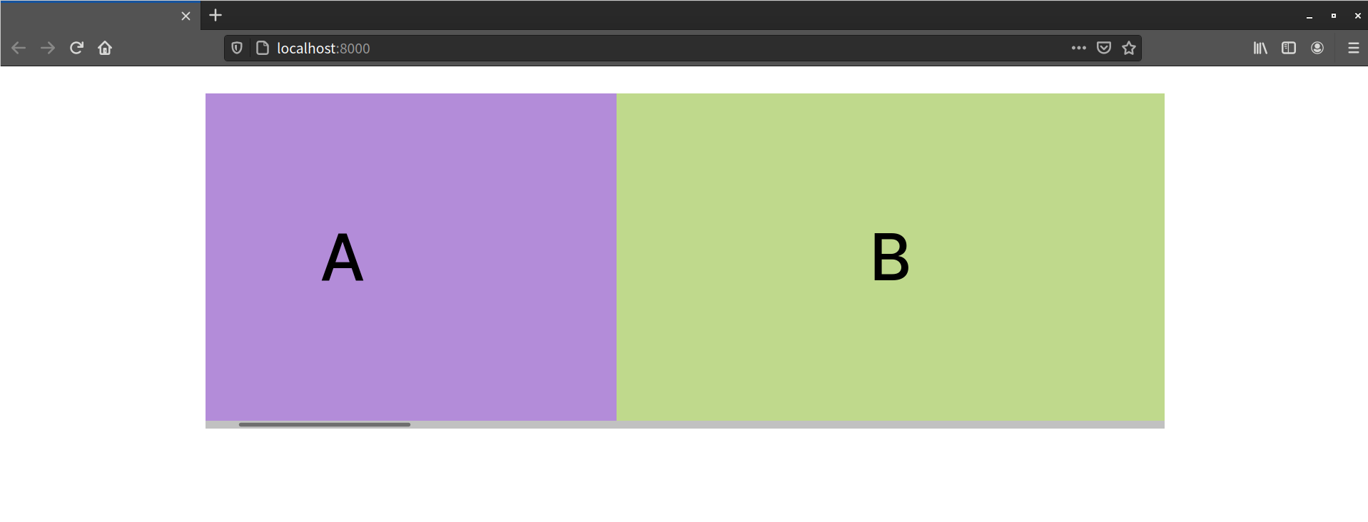
Let’s change the value of scroll-snap-align from none center to none start. Now, instead of our child element being centered within the snapport, its starting edge is aligned to the starting edge of the container, as pictured below.

Using scroll-snap-align: none end or scroll-snap-align: end, on the other hand, aligns the ending edge of our child element to the ending edge of the container.
Don’t Break Scrolling!
Avoid using hidden with the overflow properties. Yes, it eliminates scrollbars. Unfortunately, overflow: hidden also breaks keyboard and pointer device scrolling in Firefox and Safari. Using arrow or Page Up/Page Down keys won’t work. Neither will scrolling via a trackpad, mouse, or swipe gesture. Using overflow: hidden also breaks gesture and pointer device scrolling in Chromium-based browsers.
Instead, use the scrollbar-width property to hide scrollbars. The scrollbar-width property accepts three possible values: none, thin, and auto, which is the initial value. Adding scrollbar-width: none to a Scroll Snap container hides the scrollbar while maintaining the ability to scroll the container.
To date, Firefox (versions 64 and later) is the only browser to support scrollbar-width. At the time of writing, Chromium’s support is in progress. Until it’s ready, use the ::-webkit-scrollbar pseudo-class and display: none to hide scrollbars in both Chromium and WebKit-based browsers. Here’s an example:
.scroll-container::-webkit-scrollbar {
    display: none;
}
.scroll-container {
    display: flex;
    width: 70vw;
    overflow-x: auto;
    scroll-snap-type: inline mandatory;
    scroll-padding: 0rem;
    scrollbar-width: none;
}
If you do hide scrollbars, offer some visual indication that there’s more content available and provide an alternative way to scroll through it. You may, for example, add Back and Forward buttons and define a click handler that uses the Element.scrollBy() function. For example:
const moveIt = ( evt ) => {
    /* If this is not a scrolling control, do nothing */
    if( evt.type === 'click') {
        if( ! evt.target.classList.contains('scroll-trigger') ) return;
    }

    /* Divide by 2 to reduce the distance scrolled */
    let xScrollBy = ( scrollContainer.clientWidth / 2 );

    /* Negate the scrollBy value if the back arrow was clicked */
    if( evt.target.dataset.direction === 'back' ) {
        xScrollBy = xScrollBy * -1;
    }

    const scrollContainer = document.querySelector('.scroll-container');

    /*
     scrollBy can accept arguments in the form (x-distance, y-distance ),
     or a dictionary that contains `top`, `left`, and/or `behavior`
     properties.

     Instead of setting `behavior` as an option, we could also apply
     the CSS `scroll-behavior` property to `.scroll-container`.
    */
    const scrollByOptions = {
        left: xScrollBy,
        behavior: 'smooth'
    }
    scrollContainer.scrollBy( scrollByOptions );
}

/* Take advantage of event delegation */
document.body.addEventListener( 'click', moveIt );
This ensures that your site’s visitors know that there’s more to view.
When using navigation buttons, as shown here, you’ll also need to indicate how the scroll should behave. Browsers treat a button click more like a link click than a scroll wheel; the scrolling behavior will be an instant scroll, instead of a smooth one. To fix this, add scrolling-behavior: smooth to the container element, or include behavior: 'smooth' in the dictionary parameter that you pass to the scrolling function.
Optimizing the Scroll Viewing Area with scroll-padding
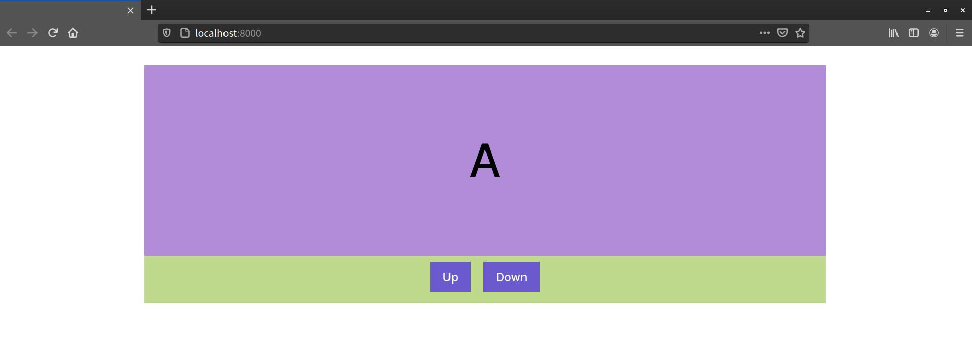
Sometimes you’ll want to ensure that your content isn’t obscured by a fixed or absolutely positioned element. For instance, you may have controls that are positioned at the bottom of the container, as shown in the image below, which depicts a Scroll Snap container with scrolling controls for the container. The controls are absolutely positioned, within an element that contains both the Scroll Snap container and buttons.
This is when the scroll-padding property comes in handy. As the specification explains, the scroll-padding property defines the optimal viewing region of a scrollport. It adds space within the scrolling container, but doesn’t change its dimensions. This is true even if the computed value of its box-sizing property is border-box.
Scrollports and Snapports
A scrollport is the viewable area of a scrolling container. The snapport is the scrollport plus any offsets specified with scroll-padding.
Let’s look at an example. We’ll use markup from earlier in this section, and add additional elements for our controls:
<div class="slideshow">
    <p class="controls">
        <button type="button" data-direction="back">Up</button>
        <button type="button" data-direction="forward">Down</button>
    </p>

    <div class="scroll-container">
        <p>A</p>
        <p>B</p>
        <p>C</p>
        <p>D</p>
        <p>E</p>
        <p>F</p>
        <p>G</p>
        <p>H</p>
    </div>
</div>
Let’s pair the above markup with the CSS shown below:
.slideshow {
    position: relative;
}
.controls {
    position: absolute;
    bottom: 0;
    z-index: 1;
    display: flex;
    gap: 2rem;
    justify-content: center;
    width: 100%;
}
.scroll-container {
    width: 70vw;
    height: 50vh;
    margin: auto;
    overflow-y: auto;
    scroll-snap-type: block mandatory;
}
.scroll-container p {
    margin: 0;
    height: 80%;
    scroll-snap-align: end none;
}
This gives us the layout we saw pictured at the beginning of this section. Without scroll-padding, each child element gets partially obscured by the controls at the end of each scrolling operation. You can see this in the image below.
Let’s add a scroll-padding declaration to our scroll container:
.scroll-container {
    width: 70vw;
    height: 50vh;
    margin: auto;
    overflow-y: auto;
    scroll-snap-type: block mandatory;

    /* Total height of the control container and its vertical margin */
    scroll-padding: 0 0 68px;
}
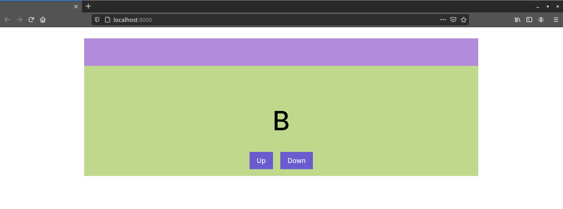
Now at the end of each scrolling operation, the end of the child element aligns with the edge of the Scroll Snap container, plus 68 pixels.

As you may have gathered from its syntax, scroll-padding is a shorthand property for physical longhand properties. Values follow the same order and syntax as margin or padding: top, right, bottom, left. You can use lengths or percentages for values, but negative values are invalid.
All Scroll Containers
The scroll-padding property applies to scroll containers of every type, not just Scroll Snap containers.
If you only want to set padding along a single edge, use physical properties instead. The physical longhand scroll-padding properties are as follows:
scroll-padding-topscroll-padding-rightscroll-padding-bottomscroll-padding-left
For padding that adjusts with the writing mode, use flow-logical longhand properties:
scroll-padding-inline-startscroll-padding-block-startscroll-padding-inline-endscroll-padding-block-end
Like other logical properties, which edge these properties affect depends on the document’s writing mode. In languages written horizontally from left to right, scroll-padding-inline-start is the left edge of the container and scroll-padding-block-start is its top edge. For horizontal, right-to-left languages, scroll-padding-inline-start is the right edge. For vertical, right-to-left languages, scroll-padding-block-start is the right edge. For vertical, left-to-right languages, it’s the left.
Using scroll-padding only affects a scrolling axis when there’s something to scroll. Adding left or right scroll padding has no effect when using scroll-snap-type: y. Similarly, scroll-padding-top makes no difference when the scroll direction is horizontal.
Shifting Box Alignment with scroll-margin
The scroll-margin property, on the other hand, applies to the children of a scroll container. It adjusts the area of the box that gets aligned to the snapport. It doesn’t change the dimensions of the box to which it’s applied, but instead shifts its alignment position by the provided length. Let’s revisit our CSS from the scroll-snap-align section:
.scroll-container p {
    scroll-snap-align: none center;
}
Without scroll-margin, each child of a Scroll Snap container will be centered within the snapport, as pictured below.

Let’s add a right scroll-margin value of 200 pixels:
.scroll-container p {
    scroll-snap-align: none center;
    scroll-margin: 0 200px 0 0;
}
Now the center of our child element is shifted to the left by 200 pixels, due to this extra right margin, as shown below.

Values for scroll-margin must be lengths. Negative values are perfectly valid, and scroll-margin uses the same ordering as margin. Let’s change our right scroll-margin value to a negative value.
.scroll-container p {
    scroll-snap-align: none center;
    scroll-margin: 0 -200px 0 0;
}
Now the center of our child element has been pulled 200 pixels to the right, as pictured below. This is, in effect, the same as using a positive scroll-margin-left value.

Much like scroll-padding, the scroll-margin property is a shorthand for the physical longhand properties. Values are ordered the same way as margin and scroll-padding too: top, right, bottom, and left. You can also specify a margin value based on the inline or block direction:
scroll-margin-topscroll-margin-rightscroll-margin-bottomscroll-margin-left
Logical longhand properties are:
scroll-margin-inline-startscroll-margin-block-startscroll-margin-inline-endscroll-margin-block-end
Here, too, scroll-margin only affects the margin of a box along the axis of the overflowing content. If the scrolling direction is vertical, adding scroll-margin-left, scroll-margin-right, or either of the scroll-margin-inline-* properties, won’t affect box alignment within the scrollport.
To date, there isn’t a way to change the Scroll Snap timing function using CSS. If you want that level of control, you’ll still need to use JavaScript.
Conclusion
You’ve made it to the end of this chapter! You should now know:
- how to create smooth scrolling jump links without JavaScript
- how to create a carousel or slide show using a minimal amount of JavaScript
There’s an area of CSS that’s a little more experimental than the features we’ve discussed in the book so far: using CSS with SVG. SVG (which stands for Scalable Vector Graphics) uses markup to describe how images should be rendered onscreen. Because SVG is markup, we can use many CSS properties with SVG elements. We can also express some SVG attributes using CSS properties. We’ll dig into the details in the next chapter.