
WHAT YOU WILL LEARN IN THIS CHAPTER
In the previous chapter, you learned about the various layouts that you can use to position your views in an activity. You also learned about the techniques you can use to adapt to different screen resolutions and sizes. In this chapter, you will take a look at the various views that you can use to design the user interface for your applications.
In particular, you will learn about the following view groups:
Basic views — Commonly used views such as the
TextView,EditText, andButtonviewsPicker views — Views that enable users to select from a list, such as the
TimePickerandDatePickerviewsList views — Views that display a long list of items, such as the
ListViewand theSpinnerViewviews
Subsequent chapters will cover the other views not covered in this chapter, such as the date and time picker views and other views for displaying graphics, etc.
To get started, let's explore some of the basic views that you can use to design the UI of your Android applications:
These basic views enable you to display text information, as well as perform some basic selection. The following sections explore all these views in more detail.
When you create a new Android project, Eclipse always creates the main.xml file (located in the res/layout folder), which contains a <TextView> element:
<?xml version="1.0" encoding="utf-8"?>
<LinearLayout xmlns:android="http://schemas.android.com/apk/res/android"
    android:orientation="vertical"
    android:layout_width="fill_parent"
    android:layout_height="fill_parent"
    >
<TextView
    android:layout_width="fill_parent"
    android:layout_height="wrap_content"
    android:text="@string/hello"
    />
</LinearLayout>
The TextView view is used to display text to the user. This is the most basic view and one that you will frequently use when you develop Android applications. If you need to allow users to edit the text displayed, you should use the subclass of TextView, EditText, which is discussed in the next section.
Note
In some other platforms, the TextView is commonly known as the label view. Its sole purpose is to display text on the screen.
Besides the TextView view, which you will likely use the most often, there are some other basic controls that you will find yourself frequently using: Button, ImageButton, EditText, CheckBox, ToggleButton, RadioButton, and RadioGroup:
Button— Represents a push-button widgetImageButton— Similar to the Button view, except that it also displays an imageEditText— A subclass of theTextViewview, except that it allows users to edit its text contentCheckBox— A special type of button that has two states: checked or uncheckedRadioGroupandRadioButton— TheRadioButtonhas two states: either checked or unchecked. Once aRadioButtonis checked, it cannot be unchecked. ARadioGroupis used to group together one or moreRadioButtonviews, thereby allowing only oneRadioButtonto be checked within theRadioGroup.ToggleButton— Displays checked/unchecked states using a light indicator
The following Try It Out provides details about how these views work.
TRY IT OUT: Using the Basic Views
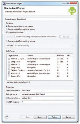
codefile BasicViews1.zip available for download at Wrox.comUsing Eclipse, create an Android project and name it as shown in Figure 4-1.
Note
For subsequent projects that you will create in this book, the various fields for the project will adopt the following values:
Application Name: <project name>
Package name: net.learn2develop.<project name>
Create Activity: MainActivity
Min SDK Version: 9
Modify the
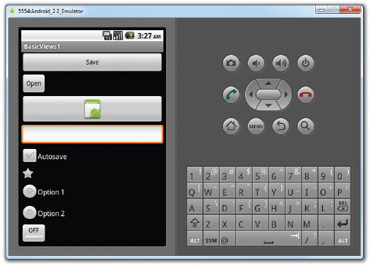
main.xmlfile located in theres/layoutfolder by adding the following elements shown in bold:<?xml version="1.0" encoding="utf-8"?> <LinearLayout xmlns:android="http://schemas.android.com/apk/res/android" android:orientation="vertical" android:layout_width="fill_parent"android:layout_height="fill_parent"><Button android:id="@+id/btnSave"android:layout_width="fill_parent"android:layout_height="wrap_content"android:text="Save" /><Button android:id="@+id/btnOpen"android:layout_width="wrap_content"android:layout_height="wrap_content"android:text="Open" /><ImageButton android:id="@+id/btnImg1"android:layout_width="fill_parent"android:layout_height="wrap_content"android:src="@drawable/icon" /><EditText android:id="@+id/txtName"android:layout_width="fill_parent"android:layout_height="wrap_content" /><CheckBox android:id="@+id/chkAutosave"android:layout_width="fill_parent"android:layout_height="wrap_content"android:text="Autosave" /><CheckBox android:id="@+id/star"style="?android:attr/starStyle"android:layout_width="wrap_content"android:layout_height="wrap_content" /><RadioGroup android:id="@+id/rdbGp1"android:layout_width="fill_parent"android:layout_height="wrap_content"android:orientation="vertical" ><RadioButton android:id="@+id/rdb1"android:layout_width="fill_parent"android:layout_height="wrap_content"android:text="Option 1" /><RadioButton android:id="@+id/rdb2"android:layout_width="fill_parent"android:layout_height="wrap_content"android:text="Option 2" /></RadioGroup><ToggleButton android:id="@+id/toggle1"android:layout_width="wrap_content"android:layout_height="wrap_content" /></LinearLayout>To see the views in action, debug the project in Eclipse by selecting the project name and pressing F11.
Figure 4-2 shows the various views displayed in the Android Emulator.
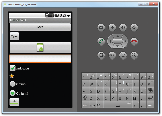
Click on the various views and note how they vary in their look and feel. Figure 4-3 shows the following changes to the view:
How It Works
So far, all the views are relatively straightforward — they are listed using the <LinearLayout> element, so they are stacked on top of each other when they are displayed in the activity.
For the first Button, the layout_width attribute is set to fill_parent so that its width occupies the entire width of the screen:
<Button android:id="@+id/btnSave"android:layout_width="fill_parent"android:layout_height="wrap_content"android:text="Save"/>
For the second Button, the layout_width attribute is set to wrap_content so that its width will be the width of its content — specifically, the text that it is displaying (i.e.,"Open"):
<Button android:id="@+id/btnOpen"android:layout_width="wrap_content"android:layout_height="wrap_content"android:text="Open"/>
The ImageButton displays a button with an image. The image is set through the src attribute. In this case, you simply use the image used for the application icon:
<ImageButton android:id="@+id/btnImg1"android:layout_width="fill_parent"android:layout_height="wrap_content"android:src="@drawable/icon"/>
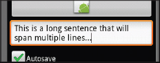
The EditText view displays a rectangular region where the user can enter some text. You set the layout_height to wrap_content so that if the user enters a long string of text, its height will automatically be adjusted to fit the content (see Figure 4-4).
<EditText android:id="@+id/txtName"android:layout_width="fill_parent"android:layout_height="wrap_content"/>
The CheckBox displays a checkbox that users can tap to check or uncheck it:
<CheckBox android:id="@+id/chkAutosave"android:layout_width="fill_parent"android:layout_height="wrap_content"android:text="Autosave"/>
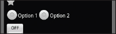
If you do not like the default look of the CheckBox, you can apply a style attribute to it to display it as some other image, such as a star:
<CheckBox android:id="@+id/star"
    style="?android:attr/starStyle"
    android:layout_width="wrap_content"
    android:layout_height="wrap_content" />
The format for the value of the style attribute is as follows:
?[package:][type:]name.The RadioGroup encloses two RadioButtons. This is important because radio buttons are usually used to present multiple options to the user for selection. When a RadioButton in a RadioGroup is selected, all other RadioButtons are automatically unselected:
<RadioGroup android:id="@+id/rdbGp1"android:layout_width="fill_parent"android:layout_height="wrap_content"android:orientation="vertical"> <RadioButton android:id="@+id/rdb1"android:layout_width="fill_parent"android:layout_height="wrap_content"android:text="Option 1"/>
<RadioButton android:id="@+id/rdb2"android:layout_width="fill_parent"android:layout_height="wrap_content"android:text="Option 2"/> </RadioGroup>
Notice that the RadioButtons are listed vertically, one on top of another. If you want to list them horizontally, you need to change the orientation attribute to horizontal. You would also need to ensure that the layout_width attribute of the RadioButtons are set to wrap_content:
<RadioGroup android:id="@+id/rdbGp1"android:layout_width="fill_parent"android:layout_height="wrap_content"android:orientation="horizontal"> <RadioButton android:id="@+id/rdb1"android:layout_width="wrap_content"android:layout_height="wrap_content"android:text="Option 1"/> <RadioButton android:id="@+id/rdb2"android:layout_width="wrap_content"android:layout_height="wrap_content"android:text="Option 2"/> </RadioGroup>
Figure 4-5 shows the RadioButtons displayed horizontally.
The ToogleButton displays a rectangular button that users can toggle on and off by clicking it:
<ToggleButton android:id="@+id/toggle1"android:layout_width="wrap_content"android:layout_height="wrap_content"/>
One thing that has been consistent throughout this example is that each view has the id attribute set to a particular value, such as in the case of the Button:
<Buttonandroid:id="@+id/btnSave"android:layout_width="fill_parent"android:layout_height="wrap_content"android:text="Save"/>
The id attribute is an identifier for a view so that it may later be retrieved using the View.findViewById() or Activity.findViewById() methods.
Now that you have seen how the various views look for an activity, the following Try It Out demonstrates how you can programmatically control them
The ProgressBar view provides visual feedback of some ongoing tasks, such as when you are performing a task in the background. For example, you might be downloading some data from the Web and need to update the user about the status of the download. In this case, the ProgressBar view is a good choice for this task.
TRY IT OUT: Using the ProgressBar View
codefile BasicViews2.zip available for download at Wrox.comUsing Eclipse, create an Android project and name it as BasicViews2.
Modify the
main.xmlfile located in theres/layoutfolder by adding the following code in bold:<?xml version="1.0" encoding="utf-8"?> <LinearLayout xmlns:android="http://schemas.android.com/apk/res/android" android:orientation="vertical" android:layout_width="fill_parent" android:layout_height="fill_parent" ><ProgressBar android:id="@+id/progressbar"android:layout_width="wrap_content"android:layout_height="wrap_content"/> </LinearLayout>In the
MainActivity.javafile, add the following statements in bold:package net.learn2develop.BasicViews2; import android.app.Activity; import android.os.Bundle;
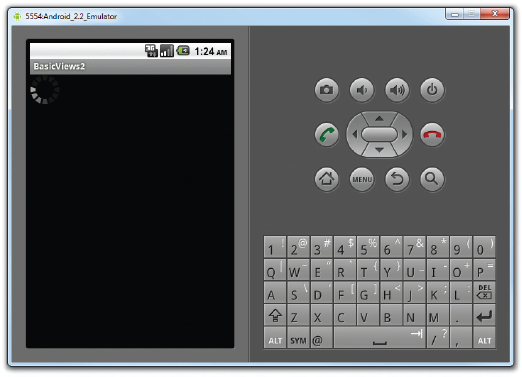
import android.os.Handler;import android.widget.ProgressBar;public class MainActivity extends Activity {private static int progress;private ProgressBar progressBar;private int progressStatus = 0;private Handler handler = new Handler();/** Called when the activity is first created. */ @Override public void onCreate(Bundle savedInstanceState) { super.onCreate(savedInstanceState); setContentView(R.layout.main);progress = 0;progressBar = (ProgressBar) findViewById(R.id.progressbar);//---do some work in background thread---new Thread(new Runnable(){public void run(){//---do some work here---while (progressStatus < 10){progressStatus = doSomeWork();}//---hides the progress bar---handler.post(new Runnable(){public void run(){//---0 - VISIBLE; 4 - INVISIBLE; 8 - GONE---progressBar.setVisibility(8);}});}//---do some long lasting work here---private int doSomeWork(){try {//---simulate doing some work---Thread.sleep(500);} catch (InterruptedException e){e.printStackTrace();}return ++progress;}}).start();} }Press F11 to debug the project on the Android Emulator. Figure 4-6 shows the
ProgressBaranimating. After about five seconds, it will disappear.
How It Works
The default mode of the ProgressBar view is indeterminate — that is, it shows a cyclic animation. This mode is useful for tasks that do not have a clear indication of when they will be completed, such as when you are sending some data to a web service and waiting for the server to respond. If you simply put the <ProgressBar> element in your main.xml file, it will display a spinning icon continuously. It is your responsibility to stop it when your background task has completed.
The code that you have added in the Java file shows how you can spin off a background thread to simulate performing some long-running tasks. To do so, you use the Thread class together with a Runnable object. The run() method starts the execution of the thread, which in this case calls the doSomeWork() method to simulate doing some work. When the simulated work is done (after about five seconds), you use a Handler object to send a message to the thread to dismiss the ProgressBar:
//---do some work in background thread---
new Thread(new Runnable()
{

    public void run()
    {
        //---do some work here---
        while (progressStatus < 10)
        {
            progressStatus = doSomeWork();
        }

        //---hides the progress bar---
        handler.post(new Runnable()
        {
            public void run()
            {
                //---0 - VISIBLE; 4 - INVISIBLE; 8 - GONE---
                progressBar.setVisibility(8);
            }
        });
    }

    //---do some long lasting work here---
    private int doSomeWork()
     {
        try {
            //---simulate doing some work---
            Thread.sleep(500);
        } catch (InterruptedException e)
        {
            e.printStackTrace();
        }
        return ++progress;
    }
}).start();
When the task is completed, you hide the ProgressBar by setting its Visibility property to GONE (value 8). The difference between the INVISIBLE and GONE constants is that the INVISIBLE constant simply hides the ProgressBar (the region occupied by the ProgressBar is still taking up space in the activity). The GONE constant removes the ProgressBar view from the activity and does not take up any space on it.
The next Try It Out shows how you can change the look of the ProgressBar.
TRY IT OUT: Customizing the ProgressBar View
Using the same project created in the previous Try It Out, modify the
main.xmlfile as shown here:<?xml version="1.0" encoding="utf-8"?> <LinearLayout xmlns:android="http://schemas.android.com/apk/res/android" android:orientation="vertical" android:layout_width="fill_parent" android:layout_height="fill_parent" > <ProgressBar android:id="@+id/progressbar" android:layout_width="wrap_content" android:layout_height="wrap_content"style="?android:attr/progressBarStyleHorizontal"/> </LinearLayout>Modify the
MainActivity.javafile by adding the following statements in bold:/** Called when the activity is first created. */ @Override public void onCreate(Bundle savedInstanceState) { super.onCreate(savedInstanceState); setContentView(R.layout.main); progress = 0; progressBar = (ProgressBar) findViewById(R.id.progressbar);progressBar.setMax(200);//---do some work in background thread--- new Thread(new Runnable() { public void run() { //---do some work here---while (progressStatus < 100){ progressStatus = doSomeWork();//---Update the progress bar---handler.post(new Runnable(){public void run() {progressBar.setProgress(progressStatus);}});} //---hides the progress bar--- handler.post(new Runnable() { public void run(){ //---0 - VISIBLE; 4 - INVISIBLE; 8 - GONE--- progressBar.setVisibility(8); } }); } //---do some long lasting work here--- private int doSomeWork() { try { //---simulate doing some work---Thread.sleep(50);} catch (InterruptedException e) { e.printStackTrace(); } return ++progress; } }).start(); }Press F11 to debug the project on the Android Emulator.
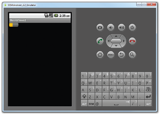
Figure 4-7 shows the
ProgressBardisplaying the progress. TheProgressBardisappears when the progress reaches 50%.
How It Works
To make the ProgressBar display horizontally, simply set its style attribute to ?android:attr/progress BarStyleHorizontal:
<ProgressBar android:id="@+id/progressbar"android:layout_width="wrap_content"android:layout_height="wrap_content"style="?android:attr/progressBarStyleHorizontal"/>
To display the progress, call its setProgress() method, passing in an integer indicating its progress:
//---Update the progress bar---handler.post(new Runnable(){public void run() {progressBar.setProgress(progressStatus);}});
In this example, you set the range of the ProgressBar from 0 to 200 (via the setMax() method). Hence, the ProgressBar will stop and then disappear when it is halfway through (since you only continue to call the doSomeWork() method as long as the progressStatus is less than 100). To ensure that the ProgressBar disappears only when the progress reaches 100%, either set the maximum value to 100, or modify the while loop to stop when the progressStatus reaches 200, like this:
//---do some work here---
while (progressStatus < 200)The AutoCompleteTextView is a view that is similar to EditText (in fact it is a subclass of EditText), except that it shows a list of completion suggestions automatically while the user is typing. The following Try It Out shows how to use the AutoCompleteTextView to automatically help users complete the text entry.
TRY IT OUT: Using the AutoCompleteTextView
codefile BasicViews3.zip available for download at Wrox.comUsing Eclipse, create an Android project and name it BasicViews3.
Modify the
main.xmlfile located in theres/layoutfolder as shown here in bold:<?xml version="1.0" encoding="utf-8"?> <LinearLayout xmlns:android="http://schemas.android.com/apk/res/android" android:orientation="vertical" android:layout_width="fill_parent"android:layout_height="fill_parent" > <TextView android:layout_width="fill_parent" android:layout_height="wrap_content" android:text="Name of President"/><AutoCompleteTextView android:id="@+id/txtCountries"android:layout_width="fill_parent"android:layout_height="wrap_content" /></LinearLayout>Add the following statements in bold to the
MainActivity.javafile:package net.learn2develop.BasicViews3; import android.app.Activity; import android.os.Bundle;
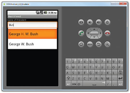
import android.widget.ArrayAdapter;import android.widget.AutoCompleteTextView;public class MainActivity extends Activity {String[] presidents = {"Dwight D. Eisenhower","John F. Kennedy","Lyndon B. Johnson","Richard Nixon","Gerald Ford","Jimmy Carter","Ronald Reagan","George H. W. Bush","Bill Clinton","George W. Bush","Barack Obama"};/** Called when the activity is first created. */ @Override public void onCreate(Bundle savedInstanceState) { super.onCreate(savedInstanceState); setContentView(R.layout.main);ArrayAdapter<String> adapter = new ArrayAdapter<String>(this,android.R.layout.simple_dropdown_item_1line, presidents);AutoCompleteTextView textView = (AutoCompleteTextView)findViewById(R.id.txtCountries);textView.setThreshold(3);textView.setAdapter(adapter);} }Press F11 to debug the application on the Android Emulator. As shown in Figure 4-8, a list of matching names appears as you type into the
AutoCompleteTextView.
How It Works
In the MainActivity class, you first create a String array containing a list of presidents' names:
String[] presidents = {
    "Dwight D. Eisenhower",
    "John F. Kennedy",
    "Lyndon B. Johnson",
    "Richard Nixon",
    "Gerald Ford",
    "Jimmy Carter",
    "Ronald Reagan",
    "George H. W. Bush",
    "Bill Clinton",
    "George W. Bush",
    "Barack Obama"
};
The ArrayAdapter object manages the array of strings that will be displayed by the AutoCompleteTextView. In the preceding example, you set the AutoCompleteTextView to display in the simple_dropdown_item_1line mode:
ArrayAdapter<String> adapter = new ArrayAdapter<String>(this,
        android.R.layout.simple_dropdown_item_1line, presidents);
The setThreshold() method sets the minimum number of characters the user must type before the suggestions appear as a drop-down menu:
textView.setThreshold(3);
The list of suggestions to display for the AutoCompleteTextView is obtained from the ArrayAdapter object:
textView.setAdapter(adapter);
Selecting the date and time is one of the common tasks you need to perform in a mobile application. Android supports this functionality through the TimePicker and DatePicker views. The following sections show how to make use of these views in your activity.
The TimePicker view enables users to select a time of the day, in either 24-hour mode or AM/PM mode. The following Try It Out shows you how to use it.
TRY IT OUT: Using the TimePicker Wiew
codefile BasicViews4.zip available for download at Wrox.comUsing Eclipse, create an Android project and name it BasicViews4.
Modify the
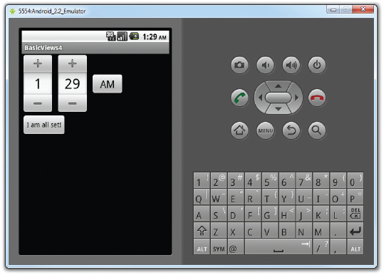
main.xmlfile located in theres/layoutfolder by adding the following lines in bold:<?xml version="1.0" encoding="utf-8"?> <LinearLayout xmlns:android="http://schemas.android.com/apk/res/android" android:orientation="vertical" android:layout_width="fill_parent" android:layout_height="fill_parent" ><TimePicker android:id="@+id/timePicker"android:layout_width="wrap_content"android:layout_height="wrap_content"/><Button android:id="@+id/btnSet"android:layout_width="wrap_content"android:layout_height="wrap_content"android:text="I am all set!"/> </LinearLayout>Press F11 to debug the application on the Android Emulator. Figure 4-9 shows the
TimePickerin action. Besides clicking on the plus (+) and minus (−) buttons, you can use the numeric keypad on the device to change the hour and minute, and click the AM button to toggle between AM and PM.Back in Eclipse, add the following statements in bold to the
MainActivity.javafile:package net.learn2develop.BasicViews4; import android.app.Activity; import android.os.Bundle;
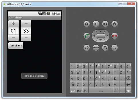
import android.view.View;import android.widget.Button;import android.widget.TimePicker;import android.widget.Toast;public class MainActivity extends Activity {TimePicker timePicker;/** Called when the activity is first created. */ @Override public void onCreate(Bundle savedInstanceState) { super.onCreate(savedInstanceState); setContentView(R.layout.main);timePicker = (TimePicker) findViewById(R.id.timePicker);timePicker.setIs24HourView(true);//---Button view---Button btnOpen = (Button) findViewById(R.id.btnSet);btnOpen.setOnClickListener(new View.OnClickListener() {public void onClick(View v) {Toast.makeText(getBaseContext(),"Time selected:" +timePicker.getCurrentHour() +":" + timePicker.getCurrentMinute(),Toast.LENGTH_SHORT).show();}});} }Press F11 to debug the application on the Android Emulator. This time, the
TimePickerwill be displayed in the 24-hour format. Clicking theButtonwill display the time that you have set in theTimePicker(see Figure 4-10).
How It Works
The TimePicker displays a standard UI to enable users to set a time. By default, it displays the time in the AM/PM format. If you wish to display the time in the 24-hour format, you can use the setIs24HourView() method.
To programmatically get the time set by the user, use the getCurrentHour() and getCurrentMinute() methods:
Toast.makeText(getBaseContext(), "Time selected:" + timePicker.getCurrentHour() +":" + timePicker.getCurrentMinute(),Toast.LENGTH_SHORT).show();
Note
The getCurrentHour() method always returns the hour in 24-hour format, i.e., a value from 0 to 23.
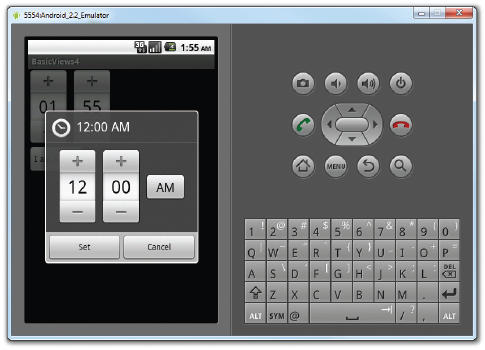
While you can display the TimePicker in an activity, a better way is to display it in a dialog window, so that once the time is set, it disappears and doesn't take up any space in an activity. The following Try It Out shows how to do just that.
TRY IT OUT: Using a Dialog to Display the TimePicker View
Using the same project created in the previous Try It Out, modify the
MainActivity.javafile as shown here:package net.learn2develop.BasicViews4; import android.app.Activity; import android.os.Bundle; import android.view.View; import android.widget.Button; import android.widget.TimePicker; import android.widget.Toast;
import android.app.Dialog;import android.app.TimePickerDialog;public class MainActivity extends Activity { TimePicker timePicker;int hour, minute;static final int TIME_DIALOG_ID = 0;/** Called when the activity is first created. */ @Override public void onCreate(Bundle savedInstanceState) { super.onCreate(savedInstanceState); setContentView(R.layout.main);showDialog(TIME_DIALOG_ID);timePicker = (TimePicker) findViewById(R.id.timePicker); timePicker.setIs24HourView(true); //---Button view--- Button btnOpen = (Button) findViewById(R.id.btnSet); btnOpen.setOnClickListener(new View.OnClickListener() { public void onClick(View v) { Toast.makeText(getBaseContext(), "Time selected:" + timePicker.getCurrentHour().toString() +":" + timePicker.getCurrentMinute().toString(), Toast.LENGTH_SHORT).show(); } }); }@Overrideprotected Dialog onCreateDialog(int id){switch (id) {case TIME_DIALOG_ID:return new TimePickerDialog(this, mTimeSetListener, hour, minute, false);}return null;}private TimePickerDialog.OnTimeSetListener mTimeSetListener =new TimePickerDialog.OnTimeSetListener(){public void onTimeSet(TimePicker view, int hourOfDay, int minuteOfHour){hour = hourOfDay;minute = minuteOfHour;Toast.makeText(getBaseContext(),"You have selected : " + hour + ":" + minute,Toast.LENGTH_SHORT).show();}};}Press F11 to debug the application on the Android Emulator. When the activity is loaded, you can see the
TimePickerdisplayed in a dialog window (see Figure 4-11). Set a time and then click the Set button. You will see the Toast window displaying the time that you just set.
How It Works
To display a dialog window, you use the showDialog() method, passing it an ID to identify the source of the dialog:
showDialog(TIME_DIALOG_ID);
When the showDialog() method is called, the onCreateDialog() method will be called:
@Override
   protected Dialog onCreateDialog(int id)
   {
       switch (id) {
           case TIME_DIALOG_ID:
               return new TimePickerDialog(
                   this, mTimeSetListener, hour, minute, false);
        }
       return null;
    }
Here, you create a new instance of the TimePickerDialog class, passing it the current context, the callback, the initial hour and minute, as well as whether the TimePicker should be displayed in 24-hour format.
When the user clicks the Set button in the TimePicker dialog window, the onTimeSet() method will be called:
private TimePickerDialog.OnTimeSetListener mTimeSetListener =
    new TimePickerDialog.OnTimeSetListener()
    {
        public void onTimeSet(
        TimePicker view, int hourOfDay, int minuteOfHour)
        {
            hour = hourOfDay;
            minute = minuteOfHour;
            Toast.makeText(getBaseContext(),
               "You have selected : " + hour + ":" + minute,
               Toast.LENGTH_SHORT).show();
        }
    };
Here, the onTimeSet() method will contain the hour and minute set by the user via the hourOfDay and minuteOfHour arguments, respectively.
Another view that is similar to the TimePicker is the DatePicker. Using the DatePicker, you can enable users to select a particular date on the activity. The following Try It Out shows you how to use the DatePicker.
TRY IT OUT: Using the DatePicker View
Using the same project created in the previous Try It Out, modify the
main.xmlfile as shown here:<?xml version="1.0" encoding="utf-8"?> <LinearLayout xmlns:android="http://schemas.android.com/apk/res/android" android:orientation="vertical" android:layout_width="fill_parent" android:layout_height="fill_parent" ><DatePicker android:id="@+id/datePicker"android:layout_width="wrap_content"android:layout_height="wrap_content" /><TimePicker android:id="@+id/timePicker" android:layout_width="wrap_content" android:layout_height="wrap_content" /> <Button android:id="@+id/btnSet" android:layout_width="wrap_content" android:layout_height="wrap_content" android:text="I am all set!" /> </LinearLayout>Press F11 to debug the application on the Android Emulator. Figure 4-12 shows the
DatePickerandTimePickerviews.Back in Eclipse, add in the following statements in bold to the
MainActivity.javafile:package net.learn2develop.BasicViews4; import android.app.Activity; import android.os.Bundle; import android.view.View; import android.widget.Button; import android.widget.Toast; import android.app.Dialog; import android.app.TimePickerDialog; import android.widget.TimePicker;
import android.widget.DatePicker;public class MainActivity extends Activity { TimePicker timePicker;DatePicker datePicker;int hour, minute; static final int TIME_DIALOG_ID = 0; /** Called when the activity is first created. */ @Override public void onCreate(Bundle savedInstanceState) { super.onCreate(savedInstanceState); setContentView(R.layout.main); //showDialog(TIME_DIALOG_ID); timePicker = (TimePicker) findViewById(R.id.timePicker); timePicker.setIs24HourView(true);datePicker = (DatePicker) findViewById(R.id.datePicker);//---Button view--- Button btnOpen = (Button) findViewById(R.id.btnSet); btnOpen.setOnClickListener(new View.OnClickListener() { public void onClick(View v) { Toast.makeText(getBaseContext(),"Date selected:" + datePicker.getMonth() + 1 +"/" + datePicker.getDayOfMonth() +"/" + datePicker.getYear() + " " +"Time selected:" + timePicker.getCurrentHour() + ":" + timePicker.getCurrentMinute(), Toast.LENGTH_SHORT).show(); } }); } @Overrideprotected Dialog onCreateDialog(int id) { switch (id) { case TIME_DIALOG_ID: return new TimePickerDialog( this, mTimeSetListener, hour, minute, false); } return null; } private TimePickerDialog.OnTimeSetListener mTimeSetListener = new TimePickerDialog.OnTimeSetListener() { public void onTimeSet( TimePicker view, int hourOfDay, int minuteOfHour) { hour = hourOfDay; minute = minuteOfHour; Toast.makeText(getBaseContext(), "You have selected : " + hour + ":" + minute, Toast.LENGTH_SHORT).show(); } }; }Press F11 to debug the application on the Android Emulator. Once the date is set, clicking the
Buttonwill display the date set (see Figure 4-13).

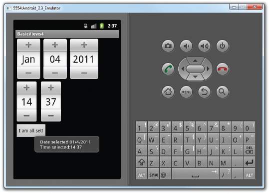
Like the TimePicker, you call the getMonth(), getDayOfMonth(), and getYear() methods to get the month, day, and year, respectively:
"Date selected:" + datePicker.getMonth() + 1 +
"/" + datePicker.getDayOfMonth() +
"/" + datePicker.getYear() + "
" +
Note that the getMonth() method returns 0 for January, 1 for February, and so on. Hence, you need to add a one to the result of this method to get the month number.
Like the TimePicker, you can also display the DatePicker in a dialog window. The following Try It Out shows you how.
TRY IT OUT: Using a Dialog to Display the DatePicker View
Using the same project created in the previous Try It Out, add the following statements in bold to the
MainActivity.javafile:package net.learn2develop.BasicViews4; import android.app.Activity; import android.os.Bundle; import android.view.View; import android.widget.Button; import android.widget.Toast; import android.app.Dialog; import android.app.TimePickerDialog; import android.widget.TimePicker; import android.widget.DatePicker;
import android.app.DatePickerDialog;import java.util.Calendar;public class MainActivity extends Activity { TimePicker timePicker; DatePicker datePicker; int hour, minute;int yr, month, day;static final int TIME_DIALOG_ID = 0;static final int DATE_DIALOG_ID = 1;/** Called when the activity is first created. */@Override public void onCreate(Bundle savedInstanceState) { super.onCreate(savedInstanceState); setContentView(R.layout.main);//showDialog(TIME_DIALOG_ID);//---get the current date---Calendar today = Calendar.getInstance();yr = today.get(Calendar.YEAR);month = today.get(Calendar.MONTH);day = today.get(Calendar.DAY_OF_MONTH);showDialog(DATE_DIALOG_ID);timePicker = (TimePicker) findViewById(R.id.timePicker); timePicker.setIs24HourView(true); datePicker = (DatePicker) findViewById(R.id.datePicker); //---Button view--- Button btnOpen = (Button) findViewById(R.id.btnSet); btnOpen.setOnClickListener(new View.OnClickListener() { public void onClick(View v) { Toast.makeText(getBaseContext(), "Date selected:" + datePicker.getMonth() + "/" + datePicker.getDayOfMonth() + "/" + datePicker.getYear() + " " + "Time selected:" + timePicker.getCurrentHour() + ":" + timePicker.getCurrentMinute(), Toast.LENGTH_SHORT).show(); } }); } @Override protected Dialog onCreateDialog(int id) { switch (id) { case TIME_DIALOG_ID: return new TimePickerDialog( this, mTimeSetListener, hour, minute, false);case DATE_DIALOG_ID:return new DatePickerDialog(this, mDateSetListener, yr, month, day);} return null; }private DatePickerDialog.OnDateSetListener mDateSetListener =new DatePickerDialog.OnDateSetListener(){public void onDateSet(DatePicker view, int year, int monthOfYear, int dayOfMonth){yr = year;month = monthOfYear;day = dayOfMonth;Toast.makeText(getBaseContext(),"You have selected : " + (month + 1) +"/" + day + "/" + year,Toast.LENGTH_SHORT).show();}};private TimePickerDialog.OnTimeSetListener mTimeSetListener = new TimePickerDialog.OnTimeSetListener() { public void onTimeSet( TimePicker view, int hourOfDay, int minuteOfHour) { hour = hourOfDay; minute = minuteOfHour; Toast.makeText(getBaseContext(), "You have selected : " + hour + ":" + minute, Toast.LENGTH_SHORT).show(); } }; }Press F11 to debug the application on the Android Emulator. When the activity is loaded, you can see the
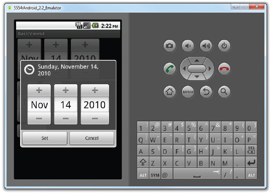
DatePickerdisplayed in a dialog window (see Figure 4-14). Set a date and then click the Set button. The Toast window will display the date you have just set.
How It Works
The DatePicker works exactly like the TimePicker. When a date is set, it fires the onDateSet() method, where you can obtain the date set by the user:
public void onDateSet(
DatePicker view, int year, int monthOfYear, int dayOfMonth)
{
    yr = year;
    month = monthOfYear;
    day = dayOfMonth;
    Toast.makeText(getBaseContext(),
             "You have selected : " + (month + 1) +
             "/" + day + "/" + year,
             Toast.LENGTH_SHORT).show();
}
Note that you have to initialize the three variables — yr, month, and day — before showing the dialog:
//---get the current date---
Calendar today = Calendar.getInstance();
yr = today.get(Calendar.YEAR);
month = today.get(Calendar.MONTH);
day = today.get(Calendar.DAY_OF_MONTH);
showDialog(DATE_DIALOG_ID);
If you don't, you will get an illegal argument exception error during run time ("current should be >= start and <= end") when you create an instance of the DatePickerDialog class.
List views are views that enable you to display a long list of items. In Android, there are two types of list views: ListView and SpinnerView. Both are useful for displaying long lists of items. The following Try It Outs show them in action.
The ListView displays a list of items in a vertically scrolling list. The following Try It Out demonstrates how to display a list of items using the ListView.
TRY IT OUT: Displaying a Long List of Items Using the ListView
Using Eclipse, create an Android project and name it BasicView5.
codefile BasicViews5.zip available for download at Wrox.comModify the
MainActivity.javafile by inserting the statements shown here in bold:package net.learn2develop.BasicViews5; import android.app.Activity; import android.os.Bundle;
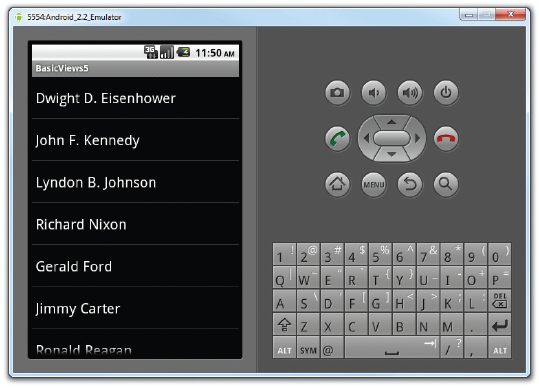
import android.app.ListActivity;import android.view.View;import android.widget.ArrayAdapter;import android.widget.ListView;import android.widget.Toast;public class MainActivity extendsListActivity{String[] presidents = {"Dwight D. Eisenhower","John F. Kennedy","Lyndon B. Johnson","Richard Nixon","Gerald Ford","Jimmy Carter","Ronald Reagan","George H. W. Bush","Bill Clinton","George W. Bush","Barack Obama"};/** Called when the activity is first created. */ @Override public void onCreate(Bundle savedInstanceState) { super.onCreate(savedInstanceState);//setContentView(R.layout.main);setListAdapter(new ArrayAdapter<String>(this,android.R.layout.simple_list_item_1, presidents)); }public void onListItemClick(ListView parent, View v, int position, long id){Toast.makeText(this,"You have selected " + presidents[position],Toast.LENGTH_SHORT).show();}}Press F11 to debug the application on the Android Emulator. Figure 4-15 shows the activity displaying the list of presidents' names.
Click on an item. A message containing the item selected will be displayed.
How It Works
The first thing to notice in this example is that the MainActivity class extends the ListActivity class. The ListActivity class extends the Activity class and it displays a list of items by binding to a data source. Also, note that there is no need to modify the main.xml file to include the ListView; the ListActivity class itself contains a ListView. Hence, in the onCreate() method, there is no need to call the setContentView() method to load the UI from the main.xml file:
//---no need to call this---
//setContentView(R.layout.main);
In the onCreate() method, you use the setListAdapter() method to programmatically fill the entire screen of the activity with a ListView. The ArrayAdapter object manages the array of strings that will be displayed by the ListView. In the preceding example, you set the ListView to display in the simple_list_item_1 mode:
setListAdapter(new ArrayAdapter<String>(this,
    android.R.layout.simple_list_item_1, presidents));
The onListItemClick() method is fired whenever an item in the ListView has been clicked:
public void onListItemClick(
ListView parent, View v, int position, long id)
{
    Toast.makeText(this,
        "You have selected " + presidents[position],
        Toast.LENGTH_SHORT).show();
}
Here, you simply display the name of the president selected using the Toast class.
The ListView is a versatile control that you can further customize. The following Try It Out shows how you can allow multiple items in the ListView to be selected and how you can enable filtering support.
TRY IT OUT: Customizing the ListView
Using the same project created in the previous section, add the following statements in bold to the
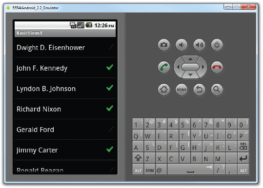
MainActivity.javafile:/** Called when the activity is first created. */ @Override public void onCreate(Bundle savedInstanceState) { super.onCreate(savedInstanceState); setContentView(R.layout.main);ListView lstView = getListView();//lstView.setChoiceMode(0); //CHOICE_MODE_NONE//lstView.setChoiceMode(1); //CHOICE_MODE_SINGLElstView.setChoiceMode(2); //CHOICE_MODE_MULTIPLElstView.setTextFilterEnabled(true);setListAdapter(new ArrayAdapter<String>(this, android.R.layout.simple_list_item_checked, presidents)); } public void onListItemClick( ListView parent, View v, int position, long id) {//---toggle the check displayed next to the item---parent.setItemChecked(position, parent.isItemChecked(position));Toast.makeText(this, "You have selected " + presidents[position], Toast.LENGTH_SHORT).show(); }Press F11 to debug the application on the Android Emulator. You can now click on each item to display the check icon next to it (see Figure 4-16).
How It Works
To programmatically get a reference to the ListView object, you use the getListView() method, which fetches the ListActivity's list view. You need to do this so that you can programmatically modify the behavior of the ListView. In this case, you used the setChoiceMode() method to tell the ListView how it should handle a user's click. For this example, you set it to 2, which means that the user can select multiple items:
//lstView.setChoiceMode(0); //CHOICE_MODE_NONE
//lstView.setChoiceMode(1); //CHOICE_MODE_SINGLE
lstView.setChoiceMode(2);   //CHOICE_MODE_MULTIPLE
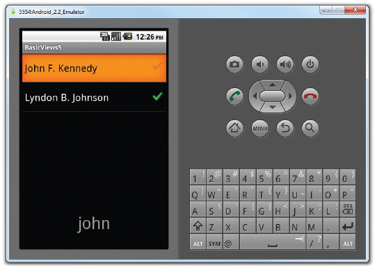
A very cool feature of the ListView is its support for filtering. When you enable filtering through the setTextFilterEnabled() method, users will be able to type on the keypad and the ListView will automatically filter to match what you have typed:
lstView.setTextFilterEnabled(true);
Figure 4-17 shows the list filtering in action. Here, all items in the list that contain the word "john" will appear in the result list.
To display the check icon displayed next to each item, use the setItemChecked() method:
//---toggle the check displayed next to the item---parent.setItemChecked(position, parent.isItemChecked(position));
The preceding statement will toggle the check icon for each item when you click on it.
While this example shows that the list of presidents' names is stored in an array, in a real-life application it is recommended that you either retrieve them from a database or at least store them in the strings.xml file. The following Try It Out shows you how.
The ListView displays a long list of items in an activity, but sometimes you may want your user interface to display other views, and hence you do not have the additional space for a full-screen view like the ListView. In such cases, you should use the SpinnerView. The SpinnerView displays one item at a time from a list and enables users to choose among them.
The following Try It Out shows how you can use the SpinnerView in your activity.
TRY IT OUT: Using the SpinnerView to Display an Item at a Time
Using Eclipse, create an Android project and name it as BasicViews6.
codefile BasicViews6.zip available for download at Wrox.comModify the
main.xmlfile located in theres/layoutfolder as shown here:<?xml version="1.0" encoding="utf-8"?> <LinearLayout xmlns:android="http://schemas.android.com/apk/res/android" android:orientation="vertical" android:layout_width="fill_parent" android:layout_height="fill_parent" ><Spinnerandroid:id="@+id/spinner1"android:layout_width="wrap_content"android:layout_height="wrap_content"android:drawSelectorOnTop="true" /></LinearLayout>Add the following lines in bold to the
strings.xmlfile located in theres/valuesfolder:<?xml version="1.0" encoding="utf-8"?> <resources> <string name="hello">Hello World, MainActivity!</string> <string name="app_name">BasicViews6</string><string-array name="presidents_array"><item>Dwight D. Eisenhower</item><item>John F. Kennedy</item><item>Lyndon B. Johnson</item><item>Richard Nixon</item><item>Gerald Ford</item><item>Jimmy Carter</item><item>Ronald Reagan</item><item>George H. W. Bush</item><item>Bill Clinton</item><item>George W. Bush</item><item>Barack Obama</item></string-array></resources>Add the following statements in bold to the
MainActivity.javafile:package net.learn2develop.BasicViews6; import android.app.Activity;
import android.os.Bundle;
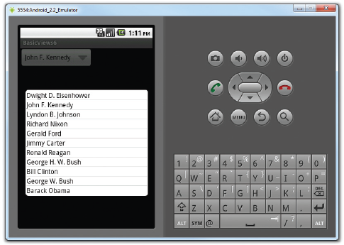
import android.view.View;import android.widget.AdapterView;import android.widget.AdapterView.OnItemSelectedListener;import android.widget.ArrayAdapter;import android.widget.Spinner;import android.widget.Toast;public class MainActivity extends Activity {String[] presidents;/** Called when the activity is first created. */ @Override public void onCreate(Bundle savedInstanceState) { super.onCreate(savedInstanceState); setContentView(R.layout.main);presidents =getResources().getStringArray(R.array.presidents_array);Spinner s1 = (Spinner) findViewById(R.id.spinner1);ArrayAdapter<String> adapter = new ArrayAdapter<String>(this,android.R.layout.simple_spinner_item, presidents);s1.setAdapter(adapter);s1.setOnItemSelectedListener(new OnItemSelectedListener(){ @Overridepublic void onItemSelected(AdapterView<?> arg0, View arg1,int arg2, long arg3){int index = arg0.getSelectedItemPosition();Toast.makeText(getBaseContext(),"You have selected item : " + presidents[index],Toast.LENGTH_SHORT).show(); } @Overridepublic void onNothingSelected(AdapterView<?> arg0) {}});} }Press F11 to debug the application on the Android Emulator. Click on the
SpinnerViewand you will see a pop-up displaying the list of presidents' names (see Figure 4-18). Clicking on an item will display a message showing you the item selected.
How It Works
The preceding example works very much like the ListView. One additional method you need to implement is the onNothingSelected() method. This method is fired when the user presses the Back button, which dismisses the list of items displayed. In this case, nothing is selected and you do not need to do anything.
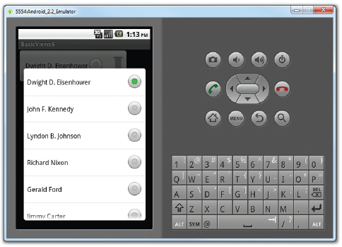
Instead of displaying the items in the ArrayAdapter as a simple list, you can also display them using radio buttons. To do so, modify the second parameter in the constructor of the ArrayAdapter class:
ArrayAdapter<String> adapter = new ArrayAdapter<String>(this,
    android.R.layout.simple_spinner_dropdown_item, presidents);
This will cause the items to be displayed as a list of radio buttons (see Figure 4-19).
This chapter provided a brief look at some of the commonly used views in an Android application. While it is not possible to exhaustively examine each view in detail, the views you learned about here should provide a good foundation for designing your Android application's user interface, regardless of its requirements.