25
Captchas
ALLOWING PEOPLE TO take the next step with you through your web site, be that a newsletter sign up or a contact form submission, is exactly what you are aiming for at the end of the day. Creating barriers within that process can only hurt you. One of the biggest barriers are misguided Captcha forms. You may not have heard of the term but I am sure you have seen these forms. Captcha is that box that asks you to type in the “words” you see in a box to confirm that you are an actual human being. I understand the purpose of the Captcha, which is to stop spam robots.87
And if you have ever been a victim of one of these spam bots hitting your site, the onslaught of spam submissions is practically unbearable. However, shifting the onus of proof to the potential subscriber or client can cause you to frustrate and possibly lose that person. I am not stubborn enough to think that people pound the keyboard and in fits of rage refuse to fill out the word “duck” that they see in a box. The problem with trying to verify if someone is human, as opposed to an automated program, is that they’re too hard to read and end up frustrating your potential user/ customer. Recently I tried to sign up for a premium membership to a video-hosting site and was presented with this at checkout. See Figure 23.1.88
Figure 23.1 Captcha Box
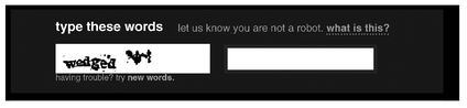
I actually have better than 20/20 vision. I have a somewhat strong command of the English language and did really well on my grade three test about letters, shapes, and sizes, but I could not tell you what that second word is if you offered to pay me a million dollars. It looks like a poorly drawn bat, one that you would sketch out with your friend on a napkin in a bar to visualize the plot of Batman Returns—but there was not enough room to type that.89
The result of this bat Captcha is that the company lost the sale. I tried to refresh the Captcha three more times and the same hilarity ensued. If you use Captcha on your site, test it out once in awhile to see if you can actually read it. It may be one of the reasons you are not getting the number of submissions you want.
Pop-Ups
Back in the 1990s (or the Stone Age in Internet years) somebody got the brilliant idea to create a pop-up page—sort of like a virtual jack-in-the-box, except you weren’t expecting it, nor did you ask for it. A virtual kick in the face to say Hey! Look at me! Like the child who did not get enough attention from his parents, the pop-up was eventually scorned and sent away to its room. Browsers were installed with pop-up blockers and banned from many sites.
Fast-forward to present day and there is a new breed of pop-up ads, ones that hover over the page.90 This is what amazes me about business and human beings in general. People fight to get rid of an annoyance and business fights to get around them to continue to annoy them. The thing about pop-ups is that they are fairly effective at building a list, but when you kick your market in the face with one, you are not considering how many people you turned away with them. The pop-up is almost created out of a fear that people will leave your site without signing up for your newsletter. But you should really be focusing on creating valuable and compelling content with an easy option for people to receive more. That could be a well-highlighted subscribe box on the right side of your blog or a postscript (P.S.) at the bottom of a great post reminding people that if they want to continue to receive this great content all they have to do is fill out the form beside the post.
..................Content has been hidden....................
You can't read the all page of ebook, please click here login for view all page.