
Figure 10-1: The relationships among the four houses of quality.
Chapter 10
Customer and Value-Stream Tools
In This Chapter
![]() Looking at customer focused tools
Looking at customer focused tools
![]() Using value-stream tools
Using value-stream tools
![]() Working with basic process tools
Working with basic process tools
No matter where you work or play, having the right tools for the job is important. Imagine trying to play a round of golf with a hockey stick, or scaling a mountain in flip-flops. You wouldn’t. To maximize your performance and results, you would get the right “tools” for the job, whether that job is a round of golf, a mountain trek, or a Lean transformation.
In this chapter, we introduce you to the Lean tools used to understand the customer and the value stream. With these tools, you can capture the customer’s wants and needs, evaluate the value stream, and work with basic data. Along with the flow and pull tools described in Chapter 11, the perfection tools in Chapter 12, and the management tools in Chapter 13, these tools are part of the overall Lean toolbox. You need all these tools to support Lean practices.
Communing with the Customer
In any business, really understanding who your customer is and what your customer is all about is vital — but this is particularly true for anyone embarking on a Lean journey because Lean is all about delivering what the customer values. The tools in this section help you capture the voice of the customer, understand the customer’s wants versus needs, and evaluate the competitive marketplace.
Capturing the voice of the customer
You not only need to know what the customer wants; you have to translate that information into language that the various parts of your organization can understand — and use. The house of quality, one of the main tools of Quality Function Deployment (QFD), is the most popular and effective tool for making this translation. The house of quality is essentially a sophisticated product planning matrix.
The house of quality is really more like a neighborhood of quality, by the time you’re finished with it! Each matrix defines the relationship between what you’re trying to accomplish and how you’ll accomplish it. Figure 10-1 shows the interrelationship of the houses of quality, outlined here:
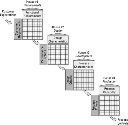
![]() The first house translates the voice of the customer (VOC) into functional requirements.
The first house translates the voice of the customer (VOC) into functional requirements.
![]() The second house translates the functional requirements into product-design requirements. In a service environment, it translates functional into service-design requirements.
The second house translates the functional requirements into product-design requirements. In a service environment, it translates functional into service-design requirements.
![]() The third house translates product-design requirements into process-design requirements; in a service environment, service-design requirements into process-design requirements.
The third house translates product-design requirements into process-design requirements; in a service environment, service-design requirements into process-design requirements.
![]() The fourth house translates the process-design requirements into process-control requirements.
The fourth house translates the process-design requirements into process-control requirements.
You gather the VOC through any and all means, including customer surveys, focus groups, personal interviews, product clinics, customer service and warranty data, or third-party industry reports. Multifunctional teams work together to construct the various houses. Having marketing involved in the fourth house is just as important as having manufacturing involved in the first house — they complete the picture. It’s marketing’s job to make sure the customer’s voice is properly translated into tech-speak, but it’s everyone’s job to understand the customer and how everyone impacts customer satisfaction.
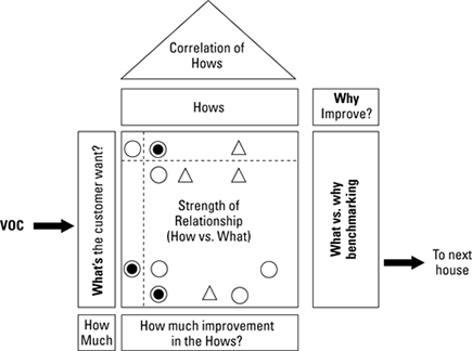
Inside the interior of the house of quality are a series of matrices. Figure 10-2 shows the interior floor plan of the house of quality. You construct from left to right. The filled circles indicate a strong relationship; the open circles, a moderate relationship; and the triangles, a weak relationship.
Figure 10-2: The interior structure of a house of quality.
Understanding customer satisfaction
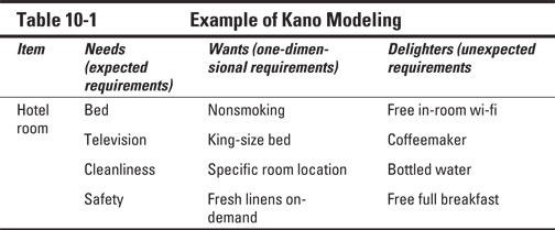
Kano modeling is a way to differentiate the customer’s requirements into needs, wants, and delighters. When you’re capturing the VOC, the customer may not explicitly state all of their requirements — or your opportunities for customer value. Kano modeling provides you with another way of understanding your customer (see Chapter 6 for more on Kano modeling). Table 10-1 shows you an example of data for a Kano model.
Sizing up the competition
Benchmarking is the process you use to compare your products, processes, or services usually against your direct competitors. You should benchmark yourself against the best in the world in a given segment or activity: you may not be a retail store, but you can compare your customer service against the highly touted Apple Store or Nordstrom’s — and you should!
Benchmarking steps
Individuals or teams, depending on the scope of the study, do benchmarking. It is important that the people involved in the study have practical and technical skills to be able to understand the information thoroughly and use the data properly.
The first step in benchmarking is to identify what you’re evaluating (that is, the key characteristics of the activity, product, or service). Then you make your comparisons against your direct competitors and the best in the world for that particular characteristic. Based on those comparisons, you evaluate how you perform, identify gaps, and then brainstorm ways to close the gaps. You might try to directly copy and incorporate your findings into your process. You could create new ways to adapt their ideas to your system. Or your team could innovate to try to surpass the market standard.
 Benchmarking is not a one-time process. The market is always changing, and your competitors are always on a quest to unseat the market leader. Think about sports teams — they’re always jockeying for the number-one position, overall as well as in key performance areas. By analyzing these areas of performance and then making adjustments to their training process, player rosters, and strategies, coaches around the world strive to be the best in their realm.
Benchmarking in action
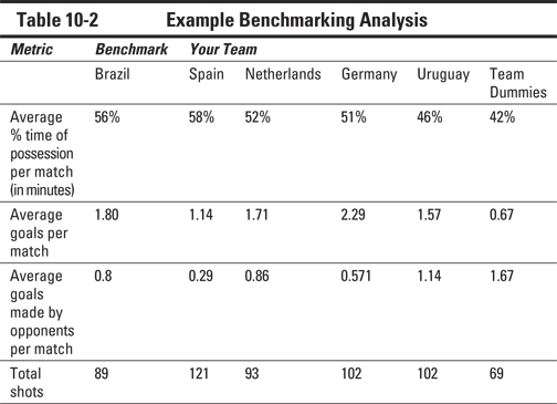
Nowhere is benchmarking more apparent than in the World Cup. Once every four years, the world stops to watch the top countries vie for the title of best of the best. Traditionally, Brazil has always been one to beat; this soccer behemoth has dominated the game for decades. Although they may not always win, Brazil is always at the top of the list of the ones to watch.
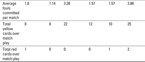
In the two years prior to the finals, qualifying matches are played to narrow the field. During that time, all the coaches — from small Caribbean islands to the traditional powerhouses of Brazil, the Netherlands, Spain, Germany, and Italy — are benchmarking their play and adjusting their strategies in hopes of qualifying their country’s team for the finals. Table 10-2 shows average key metrics, from a sampling of five matches, used to evaluate team performance.
The benchmarking process does not end here. The coach and staff must do something with the data to create change, improve skills, and modify strategy. For Team Dummies, these are the general steps you would follow and repeat continuously:
1. Establish target performance goals for your team.
2. Study the competition (match films, player positioning, or training regimes).
3. Brainstorm ideas for improvement.
4. Create and implement a game plan.
5. Evaluate performance over a set period of time.
Your overall strategy would address the fundamentals of running and passing, how and where the bodies are positioned on the field, the array of players used, and which players occupy which positions. The detailed game plan might include drills to improve free kicks, training sessions at higher altitudes or humidity levels to build up resistance for real game conditions, or experimenting with different players in different roles. The benchmarking process provides a foundation and direction for improvement.
 When benchmarking the competition, you evaluate not only overall performance, but also the performance of the parts. The automotive industry for years has used teardown rooms. Within the room are a collection of the manufacturers’ vehicles alongside vehicles from the competition. Typically, an entire vehicle is parked in front of tables full of disassembled components of the same model. Representatives from various functional areas spend hours evaluating the parts and the parts in context of the overall vehicle, in order to plan their next iteration of product or gain ideas to solve ongoing product issues. Teardown rooms are an effective strategy if your company is product based.
Working with the Value Stream
The customer-related tools help you understand what your customer wants. The value stream is how you provide goods and services to meet those needs. Chapters 7 and 8 help you understand how to analyze the value stream — through value-stream mapping. The tools presented here are supplementary to the value-stream map.
Quantifying the value stream
When you’re quantifying the value stream, three measurement tools are beneficial: takt time, box scores, and lead time.
Takt time
Takt time sets the pace for the value stream based on the rate of customer demand. Takt time is the total net daily operating time divided by the total daily customer demand. (You can find out more about takt time in Chapter 7.)
Box scores
Lean box scores — like the box scores of professional baseball — summarize and track performance to key metrics. Table 10-3 is an example of a box score. (We discuss box scores in greater detail in Chapter 7.)
Table 10-3 An Example of a Box Score
|
Metric |
Current State |
Ideal State |
|
Total average value-added time |
40.4 minutes |
37.2 minutes |
|
Total average non-value-added time |
746.6 minutes |
0 minutes |
|
Total average lead time |
787 minutes |
37.2 minutes |
|
Changeover time, between types |
10 minutes |
1 minute |
|
Actual cycle time |
113 seconds |
54 seconds |
|
Takt time, seconds |
54 seconds |
54 seconds |
Lead time
Lead time is the elapsed time for one item to make it through the system from the initial step to customer shipment (for example, when you make an online purchase, lead time is from receipt of your order to the shipment of that order). Understanding the lead time and percentage of value-added time of a process are critical in Lean. Although this information is displayed on the value-stream map, teams often use a lead-time reduction chart to consider just the lead time.
The lead-time reduction chart is a simple Ladder diagram. The chart is constructed top to bottom on a sheet of paper. The beginning of the process starts at the top of the page. The steps are listed in sequence, with non- value-added activities on the left side and value-added activities on the right side. Draw the boxes in proportion to time, visually depicting the percentage of value-added and non-value-added time. Figure 10-3 shows an example lead-time reduction chart.
Figure 10-3: A lead-time reduction chart helps you consider — you guessed it! — lead time.
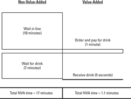
After you make the lead-time reduction chart, you work to eliminate the non-value-added activities and minimize the time required for the value-added ones.
On the case like Sherlock: Investigating your value stream like a detective
Detectives learn early-on the importance of asking the right questions. You start by covering all the basics and then dive deeper to uncover the truth. When you analyze your value stream, be the ace detective. In the following sections, we show you how.
The 5 Ws — and 1 H
What, when, why, where, who — and how. Sounds simple enough. Yet time after time, teams don’t have the patience to dig up the true answers to these questions when analyzing the value stream. Half of the equation is asking these key questions; the other half is really listening to the answer. After you’ve listened, ask clarifying questions to ensure that you truly understand what’s happening in the value stream and why it’s happening.
This tool is useful in many scenarios within Lean, whether you’re proactively improving a situation or reactively solving issues.
Lean is a people-focused methodology. “Who?” is one of the questions, but it is not the first question asked nor is it the only question asked. Point and blame is not the name of the Lean game.
Spending three, four, or even five days observing one process is not unusual. Let the process “talk” to you. You’re looking for waste — muda, mura, and muri (see Chapter 2). You may not spot examples of each right away, but given enough time, chances are you will.
Spaghetti diagrams
Spaghetti diagrams, also known as Layout diagrams, are really helpful when you’re analyzing the flow of traffic or movement of people and product. Think about the last time you misplaced something in your house. If you created a spaghetti diagram of that mad search to find that important paper or set of keys, it would look something like Figure 10-4.
You think this example is far-fetched? Most spaghetti diagrams look worse. People don’t realize how much wasted travel or movement occurs. Every day, people look for tools, information, and parts — particularly at the beginning of Lean, before standards are implemented and enforced. In the beginning, just mapping the movement is enough to show you one place to start. As you progress, you can add more details, like the distance traveled or the effort involved.
Figure 10-4: Where the !@#$ did I put my keys? An example of a spaghetti diagram.
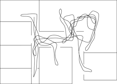
Spaghetti diagrams are simple to make and very eye-opening. In Chapter 16, you find a case study where the team used spaghetti diagrams when analyzing the layout of a lab in their hospital. Here’s how to make and use one:
1. Get a layout or blueprint of the area.
2. Pick the subject to follow.
This subject can be materials, information or people.
3. Record every movement of the target until it’s finished.
4. When the diagram is finished, brainstorm ways to eliminate the excessive travel.
5. Improve the process or job design to eliminate the excess movement.
You may want to do this during a kaizen event.
 Spaghetti diagrams are important tools for information technologists. Data and network diagrams can reveal waste in the flow of information processing — both at the logical level and at the physical implementation level.
Using color can give you additional insight from your spaghetti diagrams. If you’re tracking components and assemblies, you can use certain colors for components and others for assemblies. If you’re mapping a work team, you can use one color for each team member or job function. You can see things like where how parts can end up in the wrong place or where people are crashing into or tripping over each other. This additional information will enable you to create better solutions and a safer work environment.
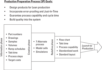
Ahead of the Curve – Using 3P
The impact you can make on the value-stream before you implement your initial process is far greater than what you can do tweaking an existing process. The 3P methodology (Production Preparation Process) enables you to prevent waste in the process before you purchase the first piece of equipment or locate the workstation. In the early stages of product or process design, you bring together a multi-disciplined team to design the most effective process to meet the voice of the customer requirements. You can also apply 3P to relocation projects or product redesigns.
Here are the basic steps of the 3P:
1. Identify the product or process needs. Use the data from QFD, product prototypes, marketing information, or any other data that’s fundamental in helping you understanding the customer requirements.
2. Diagram the requirements. Use a fishbone diagram (see Chapter 12) or another graphic tool so you can understand the requirements in basic terms or keywords.
Breaking down the functional requirements into the most basic description possible will open up creativity. For example, think about the difference between “contain liquid” (basic) versus “fill water bottle” (specific).
3. Find and evaluate nature for inspiration. Have your team identify where in nature your functions occur. After you have identified examples and understand the essence of what occurs in the natural world, you can translate how the natural examples apply to your situation. Look for simplicity. For example, if you need to move a large group of people, you may look how ants, flocks of birds, or herds of cattle move as large groups for inspiration.
4. Identify design alternatives. Your team will subdivide into smaller teams to design process/product alternatives based on the ideas found in Step 3. Your goal is to find the simple, flexible, smallest solution to meet your customer’s needs.
Seven is your magic number. Create seven design alternatives before you select one to move forward. Six is too few to tap into your team’s collective creativity, and eight is too many.
5. Build prototypes and mock-ups. Cardboard, Styrofoam, duct tape, and Velcro are your friends during this phase of the process. Create, revise, and refine the prototypes until you have a process that meets all the customer requirements. Identify a lead solution to carry forward in the process.
6. Conduct a design review with the key stakeholders, including the original design team. Review the lead design solution with the multidisciplinary team to ensure that you are meeting all of the customer requirements with the solution.
7. Implement the design solution. After your team has selected the solution to move forward, create the implementation plan. Include the project leader, resources, timing, budget, responsibility allocation, and process in your plan.
3P is applied commonly in product manufacturing. If you search the web for examples of 3P, you will find a wide variety of applications. In healthcare, you will find applications in places like hospital pharmacies and intensive care unit designs. The common thread is in bringing together the people who have to interact and live with the environment, process, and products every day, so they can provide input in the design phase — before the first machine, desk, computer, or counter is installed. This process leads to increased customer satisfaction, reduced costs, engaged people and improved processes from the beginning.
Figure 10-5 shows you a graphical overview of the 3P methodology.
Figure 10-5: Overview of the 3P methodology.
Working with Software Tools
Lean practitioners regularly debate whether the best way to gather data and create initial charts in a team environment is manual versus computer-generated. When working in a local team setting to establish initial value streams and analysis, many teams find it easier to engage everyone by using simple manual methods: whiteboards, paper drawings, and even yellow- stickies. At the enterprise level or in an information systems-enabled environment, most teams now maintain data and analyses with software tools after the initial creation. Several software platforms exist to aid in the creation of value-stream maps, houses of quality, and data analysis charts.
Lean practitioners use both specialized and general-use programs. Programs like Visio enable you to quickly draw spaghetti, arrow, and affinity diagrams. Tools like Lean View have value-stream mapping capability while enterprise-class architecture software like ARIS allows you to produce VSMs and connect them to process flows, organizational charts, systems, metrics, applications, and data. QFD/Capture is one of the better known house-of- quality construction packages. On the Internet, you can also find templates that function in Excel for everything from house of quality to spaghetti diagrams. (See Chapter 19 for other places to go for assistance.) See Chapter 12 for additional information about software tools used for supporting Lean methods.
..................Content has been hidden....................
You can't read the all page of ebook, please click here login for view all page.