Chapter 7
Customizing PivotCharts
In This Chapter
![]() Selecting chart types and options
Selecting chart types and options
![]() Changing a chart’s location
Changing a chart’s location
![]() Formatting the plot and chart area
Formatting the plot and chart area
![]() Formatting 3-D charts
Formatting 3-D charts
Although you usually get pretty good-looking pivot charts by using the wizard, you’ll sometimes want to customize the charts that Excel creates. Sometimes you’ll decide that you want a different type of chart … perhaps to better communicate the chart’s message. And sometimes you want to change the colors so that they match the personality of the presentation or the presenter. In this chapter, I describe how to make these and other changes to your pivot charts.
Selecting a Chart Type
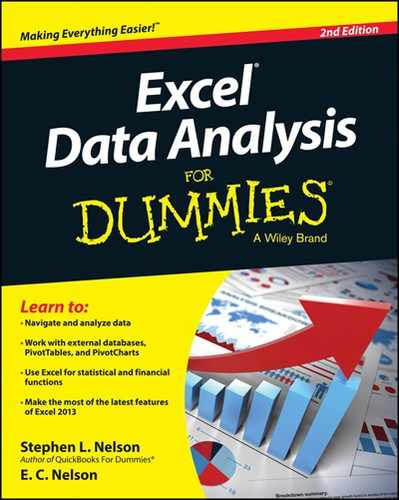
The first step in customizing a pivot chart is to choose the chart type that you want. When the active sheet in an Excel workbook shows a chart or when a chart object in the active sheet is selected, Excel adds the Design tab to the Ribbon to allow you to customize the chart. The second command from the right on the Design tab is Change Chart Type. If you click the Change Chart Type command button, Excel displays the Change Chart Type dialog box, as shown in Figure 7-1.
 In Excel 2007 and Excel 2010, you use the Design and Layout tabs to fiddle around with your charts, so the location of the command buttons you click appear in different places. The Change Chart Type command button, for example, appears as the leftmost command on the Design tab.
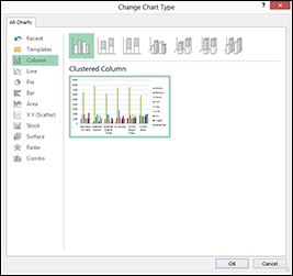
Figure 7-1: Select your chart type here.
The Change Chart Type dialog box has two lists from which you pick the type of chart that you want. The left chart type list identifies each of the 11 chart types that Excel plots. You can choose chart types such as Column, Line, Pie, Bar, and so on. For each chart type, Excel also displays several subtypes; pictographs of these subtypes display on the right side of the Change Chart Type dialog box. You can think of a chart subtype as a flavor or model or mutation. You choose a chart type and chart subtype by selecting a chart from the chart type list and then clicking one of the chart subtype buttons. In the area beneath the chart subtypes, Excel displays a picture of how the selected chart and subtype look.
Working with Chart Styles
Excel provides several dozen chart styles on the Design tab. As with chart layouts, you select a chart style by clicking its button. Also as with chart styles, the Design tab provides space for only a subset of the available chart style buttons to be displayed at a time. You need to scroll down to see the other chart style options.
Excel 2007 and 2010 also provides several chart layouts on the Design tab of the Ribbon. You choose a chart layout by clicking its button. Do note that although the Design tab provides space for a limited chart layout buttons to be displayed at a time, you can scroll down and see other chart layout options, too.
Changing Chart Layout
Excel provides a nifty set of commands you can use to customize just about any element of your pivot chart, including titles, legends, data labels, data tables, axes, and gridlines.
Chart and axis titles
The Chart Title and Axis Titles commands, which appear when you click the Design tab’s Add Chart Elements command button, let you add a title to your chart titles to the vertical, horizontal, and depth axes of your chart.
In Excel 2007 and Excel 2010, you use the Chart Title and Axis Titles commands on the Layout tab to add chart and axis titles.
After you choose the Chart Title or Axis Title command, Excel displays a submenu of commands you use to select the title location. After you choose one of these location-related commands, Excel adds a placeholder box to the chart. Figure 7-2, for example, shows the placeholder added for a chart title. To replace the placeholder title text, click the placeholder and type the title you want.
If you click the chart title once you’ve replaced the placeholder, Excel opens a Format Chart Title pane along the right edge of the Excel program window (see Figure 7-3). This pane provides buttons you can use to control the appearance of the title and the box the title sits in.
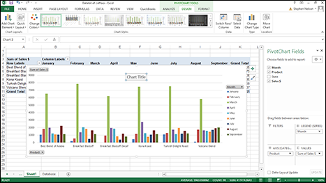
Figure 7-2: A chart title placeholder.
Figure 7-3: The Format Chart Title pane.
The Format Chart Title pane, for example, provides a set of Fill options that let you fill in the chart title box with color or a pattern. (If you do select a fill color or pattern, Excel adds buttons and boxes to the set of Fill options so you can specify what the color or pattern should be.)
The Format Chart Title pane also provides buttons and boxes for you to specify how you want any lines drawn or fill for the title or its box to look in terms of thickness, color, and style. The pane provides buttons and boxes for specifying any special effects, including shadowing, glow, edge softening, and the illusion of three-dimensionality. And the pane provides buttons and boxes for controlling the sizing and setting other properties of the title.
 You click the little icons at the top of a pane to flip between the different settings a pane supplies. In the case of the Format Chart Title pane, for example, you click the icons that look like a paint can, a pentagon and a box with measurement marks to access the Fill & Line, the Effects and then the Size & Properties settings. Different Excel formatting panes provide different sets of formatting options. So go ahead and experiment with your options here to get comfortable with the options you have for your pivot charts.
In Excel 2007 and Excel 2010, you use the Format Chart Title dialog box rather than the Format Chart Title pane to customize the appearance of the chart title. To display the Format Chart Title dialog box, click the Layout tab’s Chart Title command button and then choose the More Title Options command from the menu Excel displays.
Chart legend
Use the Add Chart Element⇒Legend command on the Design tab to add or remove a legend to a pivot chart. When you click this command button, Excel displays a menu of commands with each command corresponding to a location in which the chart legend can be placed. A chart legend simply identifies the data series plotted in your chart.
You can also choose the More Legend Options command, which is the last command on the Legend menu, to display the Format Legend pane. (See Figure 7-4.) The Format Legend dialog box allows you to select a location for the legend and also to specify how Excel should draw the legend.
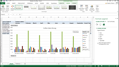
Figure 7-4: The Format Legend pane.
In Excel 2007 or Excel 2010, you use the Legend command on the Layout tab to add or remove a legend to a pivot chart and to customize a legend. Note that in Excel 2007 or Excel 2010, the More Legend Options command displays a format Legend dialog box rather than a Format Legend pane.
Chart data labels
The Data Labels command on the Design tab’s Add Chart Element menu allows you to label data markers with values from your pivot table. When you click the command button, Excel displays a menu with commands corresponding to locations for the data labels: None, Center, Left, Right, Above, and Below. None signifies that no data labels should be added to the chart and Show signifies heck yes, add data labels. The menu also displays a More Data Label Options command. To add data labels, just select the command that corresponds to the location you want. To remove the labels, select the None command. Figure 7-5 shows a chart with data labels.
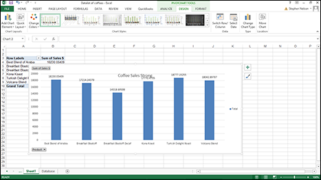
Figure 7-5: A chart with data labels.
If you want to specify what Excel should use for the data label, choose the More Data Labels Options command from the Data Labels menu. Excel displays the Format Data Labels pane (see Figure 7-6). Check the box that corresponds to the bit of pivot table or Excel table information that you want to use as the label. For example, if you want to label data markers with a pivot table chart using data series names, select the Series Name check box. If you want to label data markers with a category name, select the Category Name check box. To label the data markers with the underlying value, select the Value check box.
In Excel 2007 and Excel 2010, the Data Labels command appears on the Layout tab. Also, the More Data Labels Options command displays a dialog box rather than a pane.
Different chart types supply different data label options. Your best bet, therefore, is to experiment with data labels by selecting and deselecting the check boxes in the Label Contains area of the Data Labels tab.
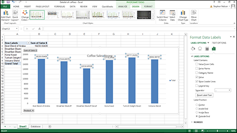
Figure 7-6: Set data labels here.
The Label Options tab also provides a Separator drop-down list box, from which you can select the character or symbol (a space, comma, colon, and so on) that you want Excel to use to separate data labeling information.
Selecting the Legend Key check box tells Excel to display a small legend key next to data markers to visually connect the data marker to the legend. This sounds complicated, but it's not. Just select the check box to see what it does. (You have to select one of the Label Contains check boxes before this check box is active.)
Chart data tables
A data table just shows the plotted values in a table and adds the table to the chart. A data table might make sense for non-pivot charts, but not for pivot charts. (A data table duplicates the pivot table data that Excel creates as an intermediate step in creating the pivot chart.) Nevertheless, just because I have an obsessive-compulsive personality, I’ll explain what the Data Table tab does.
When you choose the Data Table command from the Add Chart Element menu, Excel displays a menu of commands: None, Show Data Table, Show Data Table With Legend Keys, and More Data Table Options. To add a data table to your chart, select the Show Data Table or the Show Data Table with Legend Keys command. Figure 7-7 shows you what a data table looks like.
Figure 7-7: Add a data table to a chart here.
After you add a data table, Excel opens the Format Data Table pane to the window (see Figure 7-8). You can use its buttons to add horizontal and vertical lines and a border to the data table. And the pane also includes a check box you can use to use add and remove a legend.
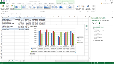
Figure 7-8: The Format Data Table pane lets you specify where the data table appears and how it looks.
Chart axes
The Axes command on the Add Chart Element menu provides access to a submenu of that let you add, remove, and control the scaling of the horizontal and vertical axes for your chart simply by choosing the command that corresponds to the axis placement and scaling you want. The Primary Horizontal and Primary Vertical commands on the Axes submenu work like toggle switches, alternatively adding and then removing an axis from your chart.
You can also choose the More Axis Options command to display the Format Axis pane (see Figure 7-9).
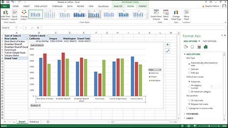
Figure 7-9: Control axis appearance, scaling, and placement with the Format Axis pane.
The best way to find out what the Format Axis pane’s radio buttons do is to just experiment with them. In some cases, selecting the different axis radio button has no effect. For example, you can’t select the Date Axis option under Axes Type unless your chart shows time series data — and Excel realizes it.
If you’re working with Excel 2007 or Excel 2010, you use the Axes command on the Layout tab (which displays the Format Axis dialog box) to change the appearance of the chart axes.
You can select the Format Axis pane’s Categories in Reverse Order check box to tell Excel to flip the chart upside down and plot the minimum value at the top of the scale and the maximum value at the bottom of the scale. If this description sounds confusing — and I guess it is — just try this reverse order business with a real chart. You’ll instantly see what I mean.
Chart gridlines
The Gridlines command on the Add Chart Element menu displays a submenu of commands that enables you to add and remove horizontal and vertical gridlines to your chart. To add or remove gridlines to either axis, simply select the appropriate command from the Primary Horizontal Gridlines or Primary Vertical Gridlines menu. Note, too, that the More Gridlines Options command, the last one listed on the Gridlines menu, displays the Format Major Gridlines pane (see Figure 7-10). Use this pane's boxes and buttons to customize the appearance of the gridlines.
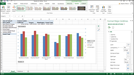
Figure 7-10: The Format Gridlines dialog box.
In Excel 2007 and Excel 2010, the Gridlines command on the Layout tab displays the menu of commands that enables you to add and remove horizontal and vertical gridlines to your chart.
Changing a Chart’s Location
When you choose the Design tab’s Move Chart Location command, Excel displays the Move Chart dialog box, as shown in Figure 7-11. From here, you tell Excel where it should move a chart. In the case of a pivot chart, this means that you’re telling Excel to move the pivot chart to some new chart sheet or to a worksheet. When you move a pivot chart to a worksheet, the pivot chart becomes a chart object in the worksheet.
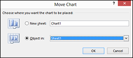
Figure 7-11: Move a pivot chart from here.
To tell Excel to place the pivot table on to a new sheet, select the New Sheet radio button. Then name the new sheet that Excel should create by entering some clever sheet name in the New Sheet text box.
To tell Excel to add the pivot chart to some existing chart sheet or worksheet as an object, select the Object In radio button. Then select the name of the chart sheet or worksheet from the Object In drop-down list box.
Check out Figure 7-12 to see how a pivot chart looks when it appears on its own sheet.
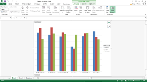
Figure 7-12: Give a chart its own sheet.
Formatting the Plot Area
If you right-click a pivot chart's plot area — the area that shows the plotted data — Excel displays a shortcut menu. Choose the last command on this menu, Format Plot Area, and Excel displays the Format Plot Area pane, as shown in Figure 7-13. This dialog box provides several collections of buttons and boxes you can use to specify the line background fill color and pattern, the line and line style, any shadowing, and any third-dimension visual effect for the chart.
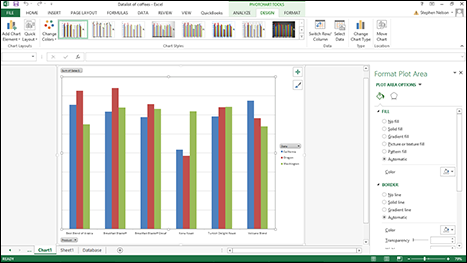
Figure 7-13: Add fill colors for a plot area here.
For example, to add a background fill to the plot area, select Fill from the list box on the left side of the Format Plot Area pane. Then make your choices from the radio buttons and drop-down lists available.
I could spend pages describing in painful and tedious detail the buttons and boxes that these formatting choices provide, but I have a better idea. If you’re really interested in fiddling with the pivot chart plot area fill effects, just noodle around. You'll easily be able to see what effect your changes and customizations have.
Formatting the Chart Area
If you right-click a chart sheet or object outside of the plot area and then choose the Format Chart Area command from the shortcuts menu, Excel displays the Format Chart Area pane (see Figure 7-14). From here, you can set chart area fill patterns, line specifications and styles, shadowing effects, and 3-D effects for your charts.
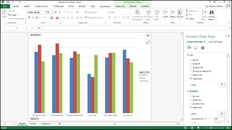
Figure 7-14: The Format Chart Area pane.
Chart fill patterns
The Fill options of the Format Chart Area pane look and work like the Fill options of the Format Plot area pane. (Refer to Figure 7-13.) To choose a fill pattern, select the Solid Fill, Gradient Fill, or Picture or Texture Fill options. Use the Color drop-down list to select the fill color and the Transparency slider button or spin box to select the color transparency.
Note: Different fill pattern options have different buttons and boxes.
Chart area fonts
To format chart text, right-click the text. When you do, Excel displays the formatting menu — which means you have access to its buttons and boxes for changing the font, adding boldfacing and italics, resizing the font, coloring the font, and so forth.
If you have questions about which formatting buttons and boxes do what, don’t worry. As you make your changes, Excel updates the chart text.
Formatting 3-D Charts
If you choose to create a three-dimensional (3-D) pivot chart, you should know about a couple of commands that apply specifically to this case: the Format Walls command and the 3-D View command.
Formatting the walls of a 3-D chart
After you create a 3-D pivot chart, you can format its walls if you want. Just right-click the wall of the chart and choose the Format Walls command from the shortcut menu that appears. Excel then displays the Format Walls pane. The Format Walls pane provides the expected fill, line, line style, and shadow formatting options as well as a couple of formatting options related to the third dimension of the chart: 3-D Format and 3-D Rotation.
In Excel 2007 or Excel 2010, when you choose the Format Walls command, Excel displays a dialog box and not a pane. The dialog box works just like the pane, however.
The walls of the 3-D chart are its sides and backs — the sides of the 3-D cube, in other words.
Use the 3-D Format options to specify the beveling, illusion of depth, contouring, and surface of the 3-D chart. Use the 3-D Rotation options to specify how you want to rotate, or turn, the chart to show off its three-dimensionality to maximum effect. Note that the 3-D Rotation options also include buttons you can click to incrementally rotate the chart.
Using the 3-D View command
After you create a 3-D pivot chart, you can also change the appearance of its 3-D view. Just right-click the chart and choose the 3-D View command from the shortcut menu that appears. Excel then displays the Format Chart Area dialog box (as shown earlier in Figure 7-14 and which I discussed earlier).