Chapter 15
Ten Tips for Visually Analyzing and Presenting Data
In This Chapter
![]() Using the right chart type
Using the right chart type
![]() Using your chart message as the chart title
Using your chart message as the chart title
![]() Being wary of pie charts
Being wary of pie charts
![]() Considering pivot charts for small data sets
Considering pivot charts for small data sets
![]() Avoiding 3-D charts
Avoiding 3-D charts
![]() Never using 3-D pie charts
Never using 3-D pie charts
![]() Being aware of the phantom data markers
Being aware of the phantom data markers
![]() Using logarithmic scaling
Using logarithmic scaling
![]() Remembering to experiment
Remembering to experiment
![]() Getting Tufte
Getting Tufte
This isn’t one of those essays about how a picture is worth a thousand words. In this chapter, I just want to provide some concrete suggestions about how you can more successfully use charts as data analysis tools and how you can use charts to more effectively communicate the results of the data analysis that you do.
Using the Right Chart Type
What many people don’t realize is that you can make only five data comparisons in Excel charts. And if you want to be picky, there are only four practical data comparisons that Excel charts let you make. Table 15-1 summarizes the five data comparisons.
Table 15-1 The Five Possible Data Comparisons in a Chart
|
Comparison |
Description |
Example |
|
Part-to-whole |
Compares individual values with the sum of those values. |
Comparing the sales generated by individual products with the total sales enjoyed by a firm. |
|
Whole-to-whole |
Compares individual data values and sets of data values (or what Excel calls data series) to each other. |
Comparing sales revenues of different firms in your industry. |
|
Time-series |
Shows how values change over time. |
A chart showing sales revenues over the last 5 years or profits over the last 12 months. |
|
Correlation |
Looks at different data series in an attempt to explore correlation, or association, between the data series. |
Comparing information about the numbers of school-age children with sales of toys. |
|
Geographic |
Looks at data values using a geographic map. |
Examining sales by country using a map of the world. |
If you decide or can figure out which data comparison you want to make, choosing the right chart type is very easy:
- Pie, doughnut, or area: If you want to make a part-to-whole data comparison, choose a pie chart (if you’re working with a single data series) or a doughnut chart or an area chart (if you’re working with more than one data series).
- Bar, cylinder, cone, or pyramid: If you want to make a whole-to-whole data comparison, you probably want to use a chart that uses horizontal data markers. Bar charts use horizontal data markers, for example, and so do cylinder, cone, and pyramid charts. (You can also use a doughnut chart or radar chart to make whole-to-whole data comparisons.)
- Line or column: To make a time-series data comparison, you want to use a chart type that has a horizontal category axis. By convention, western societies (Europe, North America, and South America) use a horizontal axis moving from left to right to denote the passage of time. Because of this culturally programmed convention, you want to show time-series data comparisons by using a horizontal category axis. This means you probably want to use either a line chart or column chart.
- Scatter or bubble: If you want to make a correlation data comparison in Excel, you have only two choices. If you have two data series for which you’re exploring correlation, you want to use an XY (Scatter) chart. If you have three data series, you can use either an XY (Scatter) chart or a bubble chart.
- Surface: If you want to make a geographic data comparison, you’re very limited in what you can do in Excel. You might be able to make a geographic data comparison by using a surface chart. But, more likely, you need to use another data mapping tool such as MapPoint from Microsoft.
 The data comparison that you want to make largely determines what chart type you need to use. You want to use a chart type that supports the data comparison that you want to make.
Using Your Chart Message as the Chart Title
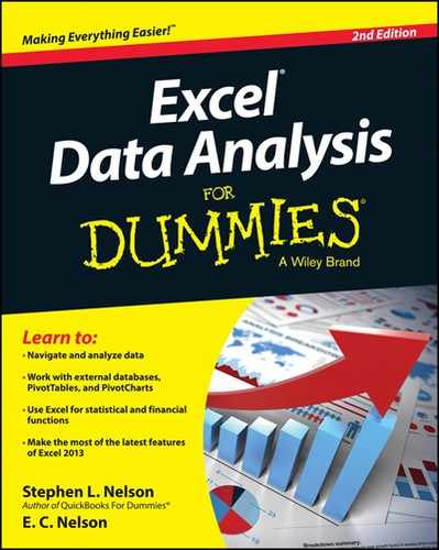
Chart titles are commonly used to identify the organization that you’re presenting information to or perhaps to identify the key data series that you’re applying in a chart. A better and more effective way to use the chart title, however, is to make it into a brief summary of the message that you want your chart to communicate. For example, if you create a chart that shows that sales and profits are increasing, maybe your chart title should look like the one shown in Figure 15-1.
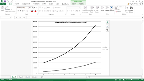
Figure 15-1: Use a chart’s chart message as its title.
 Using your chart message as the chart title immediately communicates to your audience what you’re trying to show in the chart. This technique also helps people looking at your chart to focus on the information that you want them to understand.
Beware of Pie Charts
You really want to avoid pie charts. Oh, I know, pie charts are great tools to teach elementary school children about charts and plotting data. And you see them commonly in newspapers and magazines. But the reality is that pie charts are very inferior tools for visually understanding data and for visually communicating quantitative information.
Almost always, information that appears in a pie chart would be better displayed in a simple table.
Pie charts possess several debilitating weaknesses:
- You’re limited to working with a very small set of numbers.
This makes sense, right? You can’t slice the pie into very small pieces or into very many pieces without your chart becoming illegible.
- Pie charts aren’t visually precise.
Readers or viewers are asked to visually compare the slices of pie, but that’s so imprecise as to be almost useless. This same information can be shown much better by just providing a simple list or table of plotted values.
- With pie charts, you’re limited to a single data series.
For example, you can plot a pie chart that shows sales of different products that your firm sells. But almost always, people will find it more interesting to also know profits by product line. Or maybe they also want to know sales per sales person or geographic area. You see the problem. Because they’re limited to a single data series, pie charts very much limit the information that you can display.
Consider Using Pivot Charts for Small Data Sets
Although using pivot tables is often the best way to cross-tabulate data and to present cross-tabulated data, remember that for small data sets, pivot charts can also work very well. The key thing to remember is that a pivot chart, practically speaking, enables you to plot only a few rows of data. Often your cross-tabulations will show many rows of data.
However, if you create a cross-tabulation that shows only a few rows of data, try a pivot chart. Figure 15-2 shows a cross-tabulation in a pivot table form; Figure 15-3 shows a cross-tabulation in a pivot chart form. I wager that for many people, the graphical presentation shown in Figure 15-3 shows the trends in the underlying data more quickly, more conveniently, and more effectively.
Figure 15-2: A pivot table cross-tabulation.
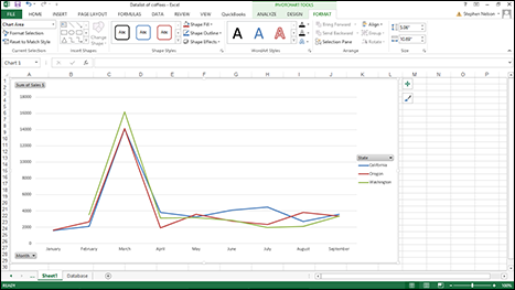
Figure 15-3: A pivot chart cross-tabulation.
Avoiding 3-D Charts
In general, and perhaps contrary to the wishes of the Microsoft marketing people, you really want to avoid three-dimensional charts.
The problem with 3-D charts isn’t that they don’t look pretty: They do. The problem is that the extra dimension, or illusion, of depth reduces the visual precision of the chart. With a 3-D chart, you can’t as easily or precisely measure or assess the plotted data.
Figure 15-4 shows a simple column chart. Figure 15-5 shows the same information in a 3-D column chart. If you look closely at these two charts, you can see that it’s much more difficult to precisely compare the two data series in the 3-D chart and to really see what underlying data values are being plotted.
Now, I’ll admit that some people — those people who really like 3-D charts — say that you can deal with the imprecision of a 3-D chart by annotating the chart with data values and data labels. Figure 15-6 shows the way a 3-D column chart would look with this added information. I don’t think that's a good solution because charts often too easily become cluttered with extraneous and confusing information. Adding all sorts of annotation to a chart to compensate for the fundamental weakness in the chart type doesn’t make a lot of sense to me.
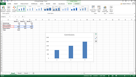
Figure 15-4: A 2-D column chart.

Figure 15-5: A 3-D column chart.
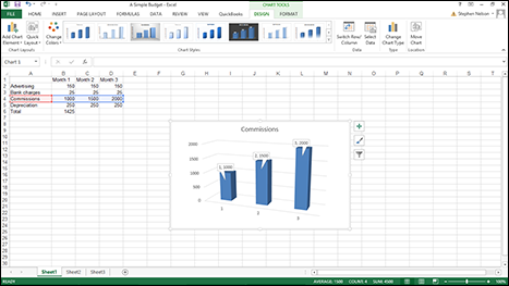
Figure 15-6: Adding too much detail to 3-D charts can make them hard to read.
Never Use 3-D Pie Charts
Hey, here’s a quick, one-question quiz: What do you get if you combine a pie chart and three-dimensionality? Answer: A mess!
Pie charts are really weak tools for visualizing, analyzing, and visually communicating information. Adding a third dimension to a chart further reduces its precision and usefulness. When you combine the weakness of a pie chart with the inaccuracy and imprecision of three-dimensionality, you get something that really isn’t very good. And, in fact, what you often get is a chart that is very misleading.
Figure 15-7 shows the cardinal sin of graphically presenting information in a chart. The pie chart in Figure 15-7 uses three-dimensionality to exaggerate the size of the slice of the pie in the foreground. Newspapers and magazines often use this trick to exaggerate a story’s theme.
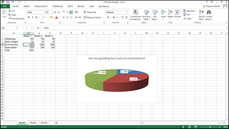
Figure 15-7: Pie charts can be misleading.
You never want to make a pie chart 3-D.
Be Aware of the Phantom Data Markers
One other dishonesty that you sometimes see in charts — okay, maybe sometimes it's not dishonesty but just sloppiness — is phantom data markers.
A phantom data marker is some extra visual element on a chart that exaggerates or misleads the chart viewer. Figure 15-8 shows a silly little column chart that I created to plot apple production in the state of Washington. Notice that the chart legend, which appears off to the right of the plot area, looks like another data marker. It’s essentially a phantom data marker. And what this phantom data marker does is exaggerate the trend in apple production.
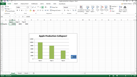
Figure 15-8: Phantom data markers can exaggerate data.
Use Logarithmic Scaling
I don’t remember much about logarithms, although I think I studied them in both high school and college. Therefore, I can understand if you hear the word logarithms and find yourself feeling a little queasy. Nevertheless, logarithms and logarithmic scaling are tools that you want to use in your charts because they enable you to do something very powerful.
With logarithmic scaling of your value axis, you can compare the relative change (not the absolute change) in data series values. For example, say that you want to compare the sales of a large company that’s growing solidly but slowly (10 percent annually) with the sales of a smaller firm that's growing very quickly (50 percent annually). Because a typical line chart compares absolute data values, if you plot the sales for these two firms in the same line chart, you completely miss out on the fact that one firm is growing much more quickly than the other firm. Figure 15-9 shows a traditional simple line chart. This line chart doesn’t use logarithmic scaling of the value axis.
Now, take a look at the line chart shown in Figure 15-10. This is the same information in the same chart type and subtype, but I changed the scaling of the value axis to use logarithmic scaling. With the logarithmic scaling, the growth rates are shown rather than the absolute values. And when you plot the growth rates, the much quicker growth rate of the small company becomes clear. In fact, you can actually extrapolate the growth rate of the two companies and guess how long it will take for the small company to catch up with the big company. (Just extend the lines.)
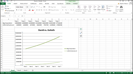
Figure 15-9: A line chart that plots two competitors’ sales but without logarithmic scaling.
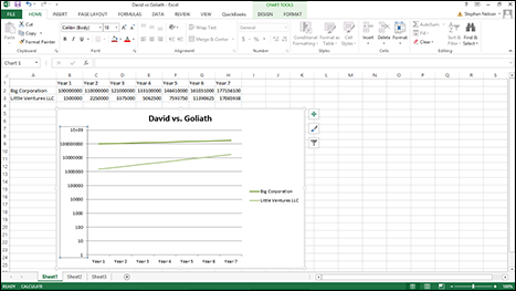
Figure 15-10: A simple line chart that uses logarithmic scaling of the value axis.
To tell Excel that you want to use logarithmic scaling of the value axis, follow these steps:
- Right-click the value (Y) axis and then choose the Format Axis command from the shortcut menu that appears.
- When the Format Axis dialog box appears, select the Axis Options entry from the list box.
- To tell Excel to use logarithmic scaling of the value (Y) axis, simply select the Logarithmic Scale check box and then click OK.
Excel re-scales the value axis of your chart to use logarithmic scaling. Note that initially Excel uses base 10 logarithmic scaling. But you can change the scaling by entering some other value into the Logarithmic Scale Base box.
Don’t Forget to Experiment
All the tips in this chapter are, in some ways, sort of restrictive. They suggest that you do this or don’t do that. These suggestions — which are tips that I’ve collected from writers and data analysts over the years — are really good guidelines to use. But you ought to experiment with your visual presentations of data. Sometimes by looking at data in some funky, wacky, visual way, you gain insights that you would otherwise miss.
There’s no harm in, just for the fun of it, looking at some data set with a pie chart. (Even if you don’t want to let anyone know you’re doing this!) Just fool around with a data set to see what something looks like in an XY (Scatter) chart.
In other words, just get crazy once in a while.
Get Tufte
I want to leave you with one last thought about visually analyzing and visually presenting information. I recommend that you get and read one of Edward R. Tufte’s books. Tufte has written seven books, and these three are favorites of mine: The Visual Display of Quantitative Information, 2nd Edition, Visual Explanations: Images and Quantities, Evidence and Narrative, and Envisioning Information.
These books aren’t cheap; they cost between $40 and $50. But if you regularly use charts and graphs to analyze information or if you regularly present such information to others in your organization, reading one or more of these books will greatly benefit you.
By the way, Tufte’s books are often hard to get. However, you can buy them from major online bookstores. You can also order Tufte’s books directly from his website: www.edwardtufte.com. If you’re befuddled about which of Tufte’s books to order first, I recommend The Visual Display of Quantitative Information.