
CHAPTER 12
Presenting Model Output
Once a model has been built, you then need to display its results clearly and concisely to get your message across, via a written report or oral presentation. The output and presentation of the results are just as important as the rest of the model-building process, because there is no point in having a fantastically built model that none of the decision-makers knows about or is able to interpret. This final stage of the model-building process is sometimes not given much focus by modellers, particularly those whose skills are often more analytical than visual.
PREPARING AN ORAL PRESENTATION FOR MODEL RESULTS
Many analysts and modellers would agree that public speaking is not their favourite part of the job and whilst it might be fun to imagine your senior management in their underwear, it might be more helpful to be prepared and follow these basic tips.
As the person who knows the model best, financial modellers are often requested to communicate the results of the financial model as a formal presentation to the board or senior management. Understandably, many detail-oriented analysts often find that it is quite a challenge to distil their 20MB financial model that has taken weeks to build into a 10-minute presentation.
Although most senior management may not be interested in seeing the model itself, they might like to see live and changing scenarios. If the model is built correctly, you'll be able to make a single change to the input assumptions and the audience will be able to see the effects of these changing scenarios in real time. Make sure that you test all possible inputs in advance—nothing looks less professional than a #REF! error during a live sensitivity analysis.
Not all presentations require you to use PowerPoint, and it's not always appropriate, but in this kind of environment, where it is necessary to convey lots of information, having the summary tables or charts on a slide behind you while you are speaking will be helpful. It can also help to take the focus off you if you are a little nervous.
Follow these basic rules of presentations:
- Only display one key message per slide. Don't crowd it or try to convey too much at once.
- Give them a more detailed report to look through, but what you show on the screen should be a very concise summary of this report.
- Make sure the font is big enough and clear on a data projector. Test it in advance if you can—sometimes colours look great on a monitor, but washed out when projected on the wall.
- If you are showing the model itself on the screen, increase the zoom in Excel so that your audience can see the numbers. Test this in advance, and remember you'll only be able to show a small portion of the screen in this way.
- Use charts and graphics to display your message. Generally, the output from a model will be numerical, and charts are a great way of showing this. Research also shows that audience attention and retention of information increases significantly when graphics are used instead of pure text in presentations.
Most importantly, be prepared for questions regarding the output, inputs, assumptions, or workings of the model. Make sure that you can defend the assumptions that have been made or the way something has been calculated. If you are not comfortable with some of the assumptions, say so up front. The model output is only as good as the assumptions that have gone into it, so you need to make sure that the audience accepts the key assumptions before they will accept the model results.
If you have the opportunity, spend some time with the key audience members in advance and walk them through the assumptions and methodology of the model. They might have some questions or comments that you have not anticipated, and it will give you a chance to make changes or prepare your answers to likely questions in advance.
Summarising and Displaying Model Results
If you have a 10-minute slot during which you need to convey the high-level output of the model, you probably need about four slides. If we have put together a business case for a new product, for example, outputs for a typical financial model may include:
1. A summary of projected cash flows or profitability. You won't be able to fit more than about 5 years onto a PowerPoint slide, so if you need to show 20 years, just show Years 1, 5, 10, 15, and 20, for example.
2. Key assumptions. Use your judgement here to choose which assumptions are important. Select the ones that either impact the model the most, or that you are most certain of.
3. Scenarios analysis. You'll probably be able to fit only four to five scenarios on a slide comfortably, so choose wisely. At a minimum, display best-case, base-case, and worst-case scenarios. See “Scenarios and Sensitivity Analysis in a Business Case” in Chapter 11 for greater detail on how to create these.
4. Results of sensitivity testing. Show the results of tweaking a single assumption. For example, if we were to get our customer take-up amount wrong by 1 percent, this will cause a $500,000 change to the NPV—and this is something the audience most certainly needs to be aware of.
If you have longer than 10 minutes, you might be able to show the model itself, if the presentation is more of a workshop than a formal presentation. In either case, you should be able to give each person a hardcopy summary report of the first few pages of the model with more detailed numbers than you have been able to include in the PowerPoint presentation. If the model has been well written, each page will form the backup data and source information for the model and can be printed or distributed if the recipient of the summary results requests further information.
PREPARING A GRAPHIC OR WRITTEN PRESENTATION FOR MODEL RESULTS
Charts are a way to present a series of data in a visual presentation so that patterns of information can be identified. Charts can be a powerful tool for the end user if they are built correctly and help simplify and summarise data.
A common mistake many analysts make is to try to put as much information as possible into one chart in an attempt to make it look impressive. In reality, the chart just looks cluttered and fails to get the message across. Remember that charts are for the purpose of visually presenting information that is easier to digest than the raw data. When creating a chart, balance the amount of information presented along with the formatting. It may be more useful to create two charts, dividing up the information, rather than putting it all on one chart. Consider Figure 12.1.

FIGURE 12.1 Line Chart with Multiple Series
Is this chart useful? There is so much data presented that the chart has no real value. Also, the type of chart isn't necessarily the best choice. Consider instead Figure 12.2.

FIGURE 12.2 Chart on Two Different Axes and Chart Types (Combo Chart)
With the same set of data, we have created a different chart that gives us much more intelligence, using less of the data. In Figure 12.2, a viewer can see at a glance the trend in revenues and profitability. It also shows the composition of marketing and G&A (general and administrative) expenses month to month. Note that using a stacked bar chart allows the user to see the total expenses, including Cost of Goods Sold (COGS). Compare this to the original line chart, and you can see it is almost impossible to compare the expenses in the line chart, as there is so much interference.
By breaking up the data into two chart types on two separate axes, and limiting the information presented, we have gone from useless and confusing to informative and interesting.
Additional Tips for Charting
Use the following tips to really make your charts have an impact:
- Reduce clutter by representing less data, using fewer words in the legend, and avoiding unnecessary labels.
- Use gridlines sparingly. Let the relative ups and downs of the chart speak for themselves.
- Limit the number of bars to seven in a bar chart; limit the number of lines to three in a line chart.
- Use standard imagery instead of special artwork; it's too distracting (i.e., a stack of coins to represent an expense rather than a standard bar).
- Choose your x- and y-axis ranges so that space is utilised effectively.
- If you have fewer than 12 periods for a time-series chart, consider using a bar chart instead of a line chart.
- Avoid the use of 3D charts. Remember: Keep things simple!
- Be cautious of excessive use of colours and shading.
- If the data has no natural order, sort the data from largest to smallest.
CHART TYPES
Before looking at how to build charts from a technical perspective, let's first look at which chart to use. The most common types of charts are line and bar charts, but there are many other charting options Excel has to offer, and which chart types will display the data in the best, most visual way really depends on the available data and the message you are trying to convey.
Choosing a Chart Type
The first step in creating a useful chart is to choose the correct type of chart. Bar charts, pie charts, line charts, areas, scatter plots, donuts, radars, and bubbles are all options. Which one makes the most sense? Note that when displaying the information outputs of a typical financial model, line and bar charts are the predominant types of charts used, but this is not always the case. It's quite a skill to choose the most appropriate chart to display the output information in the best possible way.
Sometimes it's a matter of trial and error. The best way to choose a chart is to try several different charts to get a sense of which one is the best. Fortunately, it's very easy to flick between different chart types in Excel.
Summary of Common Charts and Applications
Table 12.1 is a brief summary of different chart types and their uses for displaying data graphically. The next section describes in detail what each of these charts does and what sort of data it best displays.
TABLE 12.1 What Type of Chart Best Fits Your Data?
| Chart Type | Suitable for … | Application in Financial Models |
| Line | Trend and functional relations; useful for spotting trends | Very useful for time series |
| Pie | Single series of positive percentages or ratios | Useful, but often overused |
| Column | Data point (Y) variation over a short range of values (X). Suitable for comparison of data points | Very useful for comparison |
| Bar | Same as column charts | Very useful |
| Radar |
Displaying multivariate information for statistical analysis |
Rarely used |
| 3D | Showing data three-dimensionally instead of two-dimensionally (e.g., cone chart) | Not recommended |
| Area | Similar to the line chart; represents variation of data points relative to each other | Sometimes used |
| Donut | Stacking multiple pie charts | Rarely used |
| Bubble | Enhancing scatter plots with additional variable | Sometimes used |
Take a look at the sales data and the chart options in Figure 12.3. Which chart type would best represent the sales data to show a regional comparison? We need to create a chart to visually display to our readers the output of our analysis, which is to compare the departments to each other. Which would be the best fit to get our message across?

FIGURE 12.3 Comparison of Single Series Chart Types
Line charts and area charts are best for showing the connection between the data points, usually in time series, which is not the case, so they are not particularly useful in this situation.
The column or bar chart is best for comparing this kind of information, as we can easily see which area is the highest and which is the lowest. The pie chart shows the proportion and looks visually pleasing, but it is not as good for showing comparisons between the data points.
Detailed Chart Types
Figure 12.3 shows six different chart types that are readily available in Excel. Some of these charting options are better choices than others, so let's go into each of these chart types in a little more detail.
- Line charts. These are lines joining data points to display the information. Line charts are most appropriate for indicating trends. Like column charts, the simplicity of these charts makes them a favourite in displaying data. While column and line charts can be used interchangeably, line charts are best used for trending information and columns are better to study absolute data metrics.
We can see in Figure 12.3 that a line chart is not the most appropriate method of displaying these different costs, as it insinuates that there is some connection between the data points.
There are also stacked line and 100 percent stacked line chart options in Excel, as there are with column charts. Sometimes line charts convey information in a more meaningful manner when the data points are marked. Excel offers the line chart with marker options for this purpose.
For detailed instructions on how to build a basic line chart, see the supplementary materials available at www.plumsolutions.com.au/book.
- Pie charts. Pie charts have variable size sectors indicating the percentage of each variable in the overall picture. Pie charts are great for displaying ratios or percentage information, such as market share or penetration. They are very popular, particularly among graphic designers, but are notoriously poor for displaying information. In Figure 12.3, the pie chart is visually appealing, but it conveys very little information and makes it difficult to compare which department has the highest expense.
- Column charts. Column charts are one of the most commonly used charts available in Excel, and they are a staple of presenting unrelated data points graphically. The height of the columns indicates the value or the parameter on the y-axis, while the width indicates the value along the x-axis. Column charts are a very effective method of displaying a message instantly, due to the simple format in which they represent the information. We can see in Figure 12.3 that the column chart is the most accurate way of displaying the sales data in this situation—this one is the best choice for the message we are trying to get across with our data.
- Bar charts. Bar charts are transposed column charts. They represent the same information as column charts from a different perspective. Most times the choice between column and bar charts will depend on how you want to represent the information depending on the space constraints of the display area. Most commonly, bar charts are used to represent time or future projections along the x-axis. See Figure 12.3.
- 3D charts. Excel also offers 3D versions of these column charts as bar, cylinder, and cone charts. Whilst 3D bar and cylinder charts are easy to comprehend, understanding cone charts can get complicated, so they are not very commonly used to display data. In general, 3D charts do not convey any more information than 2D charts, so usually a 2D chart is a simpler and clearer way of displaying information. Figure 12.3 shows an example of a 3D chart with a cone shape, which is an extremely poor way of comparing the four sales figures because the pointy tip of the cone is much more difficult to compare to other results than a flat column.
- Radar charts. Radar charts plot the points on a circular axis rather than an x- and y-axis. Hence, the data points are indicated by their relative distances from the centre. They are easy enough to build, but can be confusing and are not particularly good at displaying quantitative information and, therefore, are not commonly used. See Figure 12.3.
Another Example with More Data
Figure 12.3 showed a one-series situation where we had only four numbers to plot. What if we need to show more data on our chart with multiple series? Figure 12.4 shows expenses that have been split into three types: Staff Costs, Admin, and IT. Let's look at a few ways we can display this data in a chart.

FIGURE 12.4 Comparison of Multi-series Chart Types
Excel offers multiple variations in column, bar, and line charts, such as the seven listed below. Some of them are very effective in conveying the message, while others may look good but distract from your main point.
- Clustered column charts. These are multiple series of basic column charts arranged next to each other. Instead of creating multiple charts for similar information, it may sometimes be better to use the clustered charts instead. However, you must ensure that columns are not too congested, as that would defeat the purpose. A clustered column chart is a good option for Figure 12.4, as there are only three departments and three expense types. It provides a good comparison between the numbers without appearing too cluttered.
- Clustered bar charts. This is also a good way to display the data, although we often reserve the x-axis for time series, so a clustered column is probably a more commonly used solution, and therefore may be more easily understood by the reader.
- Stacked column charts. These are a variation on a basic column chart, with multiple variables stacked on top of each other. They are particularly good for showing proportionate totals. For example, in Figure 12.4, not only can we see how the regions compare to each other, but how much each department contributes to the costs in total. It does, however, make the comparison between IT costs more difficult, for example, so this is where the intention of your message becomes important. If your focus is on total costs, I would choose a stacked column, but if you'd like to compare each of the data points, then a clustered column would be more appropriate.
Note that including a data table will add more detail to the stacked column chart, and help the reader to compare the values in the upper stacks. See “Handy Charting Hints” later in this chapter for instructions on how to add a data table.
- 100 percent stacked column charts. As the name suggests, these are column charts that stack on a percentage basis. They are most appropriate for use in comparing data where we are comparing percentages and ratios rather than an absolute number. When using 100 percent stacked column charts, make sure that the labels clearly show that it is displaying percentages rather than absolute numbers. In Figure 12.4, the percentages are very similar, so not a particularly helpful way of displaying the data in this case!
- Stacked line charts. As with the single series described above, the stacked line is not a helpful way of displaying the data in Figure 12.4.
- Area charts. Area charts are similar to line charts but have a shaded area below. Like line charts, they are good for displaying data that is connected. These can be stacked or not stacked, similar to column charts. Figure 12.4 shows a stacked area chart—again, not a particularly effective way of displaying four different regions with no connection between them.
- Donut charts. Visually, donut charts are pie charts with a hole in the centre. While it may not seem like a big difference at first, this gap in the donut hole allows several series to be stacked in the same chart, which may or may not be a good idea. Pie charts can be used to represent a single series of values; multiple series require a separate chart for each series. This can be overcome with donut charts, where multiple series can be stacked centrally.
However, interpreting donut charts can become cumbersome if there's too much data. If you want to use this chart, you need to plan it properly and make it as intuitive as possible. Consider Figure 12.5. We want to show the Australian population and see if there is any correlation to land area. This donut chart is interesting but quite difficult to interpret.

FIGURE 12.5 Donut Chart
Combination Charts Sometimes using the same chart type to represent different data metrics is not very effective. In such cases, using a combination of chart types can be a very powerful solution. One of the most popular representations is the combination of column and line charts. Such combinations can convey a lot of information without cluttering the chart. These are particularly useful in dashboard reporting and other instances where you want to display as much information as possible in a small amount of space.
Quite often we might want to show two different measures, such as number of units and profit, on the same chart. For instructions on how to do this, see “Charting with Two Different Axes and Chart Types” later in this chapter.
Consider Figure 12.6, which also displays the population versus the land area. Whilst not as visually appealing as the donut chart, it is somewhat easier to interpret, and we can see that there is very little correlation between population and land area.

FIGURE 12.6 Combination Chart
Map Charts An even better way of displaying this data would be to show it on a filled map. Using exactly the same data, we can show it visually on a map as shown in Figure 12.7. It's not necessary to add the land area to this map to show our message, as the area is shown in the chart. Population density is shown by the darker colours, which works in a similar way to the colour scales in conditional formatting.

FIGURE 12.7 Map Chart
Bubble Chart Bubble charts are another type of chart to consider if you need to show multiple dimensions, and the data is not location-specific. Bubble charts are an enhancement to scatter charts and can compare three characteristics: not only plotting the x- and y-axis, but also reflecting the bubble size for each category. Detailed instructions can be found later in this chapter for how to build a bubble chart. See Figure 12.8.

FIGURE 12.8 Bubble Chart
WORKING WITH CHARTS
The following outlines some of the most commonly used features of charting. Note that in later versions of Excel, a lot of the options that used to appear in the ribbon in earlier versions have now been moved to the chart itself. The Layout tab is no longer in the ribbon, and most of these options have been moved to the chart. You'll notice that when you click on the chart, several new icons appear on the right, as shown in Figure 12.9. These three options are:

FIGURE 12.9 Editing from the Chart
- The plus sign will add chart elements, such as titles and labels to the chart.
- The paintbrush will help you to change the colours and styles of the chart.
- The filter is a quick way to change the data, series, or names.
All the features in these options can also be accessed by right-clicking the chart or via the Chart Design tab, which will appear in the ribbon once the chart has been clicked upon. This is the same in Excel for Mac, however, this is the only way to make these changes on a Mac because, in the current version, the three options do not appear to the right of the chart when you click on it. Chart changes on a Mac can be made through the Adding Chart Elements on the Chart Design tab in the ribbon, as shown in Figure 12.10.

FIGURE 12.10 Adding Chart Elements in Excel for Mac
Changing the Type of Chart
Displaying data graphically is usually an iterative process, and if you create a chart based on your model data and it doesn't look quite right, it is relatively quick and easy to change the chart type displayed.
To change the chart type, display the Change Chart Type dialog box by right-clicking on the chart area and selecting Change Chart Type from the drop-down menu that appears.
Choose the chart you'd like to display and click OK. Note that you can also change the chart type through the Design tab on the ribbon.
Changing the Source Data
You can also quite easily change the source data for your chart while retaining the original chart type.
In Figure 12.11, the pie chart is based on sales data per region (B2 through to B5). To depict expenses per region (E2 through to E5), you would need to change the source data.

FIGURE 12.11 Pie Chart Depicting Units Sold Data
The easiest way to change the source data is to simply click on the chart until the source data is highlighted. We can see in Figure 12.11 that the source data is in columns A and B. Now, just hover the mouse on the blue line to the right of column B, and drag it across to column E as shown in Figure 12.12. This works in any kind of chart where you can see the source data on the same page.

FIGURE 12.12 Changing the Data Source to Depict Expenses
If the data is not on the same page, or if the change is more complex, then this quick tip may not work and so you'll need to do it the long way, with the seven steps that follow.
- Right-click on the chart area and click Select Data from the menu that appears.
- The Select Data Source dialog box will be displayed.
- The field called Chart Data Range at the top of the dialog box shows the range of cells used in the data source for the chart.
- Click on the series name (Units sold, in this case) and click Edit.
- Select the new data range from the sheet with your mouse.
- When you have completed your data selection, the new data range reference will appear in the Edit Data Source dialog box. Click OK.
- The chart will change to reflect the new data.
If you want to change the title of the chart to something more interesting than Expenses, simply click on the title, and type over it.
Remember that if you change the underlying data in the model, the chart will change as well. You'd hope so, as that's really the point of financial modelling.
Saving a Chart as a Template
If you've spent a lot of time getting the axes, colours, and formats the way you want them, you can save this chart as a template to use again and again.
To save the chart template:
- Once you are happy with the way the chart looks, right-click on the chart and select Save as Template.
- Save it in your desired location.
To use the chart template on a new or existing chart:
- Select a data range and on the Insert tab on the ribbon, click Recommended Charts, which is located at the lower right of the Charts button group to create a new chart, or right-click on an existing chart and select Change Chart Type.
- On the All Charts tab, press Templates to show your saved templates.
- Select the template you'd like to use. See Figure 12.16.

FIGURE 12.16 Using a Chart Template
HANDY CHARTING HINTS
Here are some handy charting hints:
- The formatting on most of the areas of the chart can be changed by double-clicking on the area you wish to change. You can play with this to make your graph look more attractive.
- The legend on the right-hand side can be resized, moved, or deleted by selecting it.
- If the chart has been inserted in the worksheet, rather than on its own page, it can easily be dragged around the worksheet or resized.
- Align charts by holding down the ALT key whilst you drag with the mouse to “snap to grid” and make the chart line up in the corner of the cell. This works with form controls, buttons, and other images inserted onto the sheet.
- If you hide data in your source sheet, this will not show on the chart. Test this by hiding one of the columns on the Financials sheet and check that the month has disappeared on the chart. You can change the options under Select Data Source so that it displays hidden cells. See Figure 12.17.

FIGURE 12.17 Changing the Hidden and Empty Cells Option
- The chart can be changed to a different type of chart (e.g., a bar chart or a pie chart) by right-clicking and selecting Change Chart Type.
- Including a data table (not to be confused with a sensitivity analysis data table we covered in Chapter 11) that shows actual values below the chart is a great way to display the information visually while still providing detailed data.
To add the data table, click on the chart to make the Design tab appear and on the Design tab click on the drop-down under Add Chart Element on the far left-hand side. Select Data Table as shown on the left in Figure 12.18, and choose from with or without Legend Keys. Unless you are using Excel for Mac, you can also click on the chart, select the Chart Elements icon (the + symbol), and select the Data Table option, also shown on the right of Figure 12.18.

FIGURE 12.18 Line Chart with Data Table
- Charts can be pasted directly into Microsoft Word or PowerPoint. Note that if you simply copy and paste, the links to the underlying data in Excel will be maintained. This is fine, if you want to be able to edit the Excel data and have the chart update. Normally, when you've copied and pasted a chart into Word or PowerPoint, you have finished it and don't want the chart to change at all. Therefore, it needs to be pasted as a picture. Copy the chart and then Paste Special, pasting the chart into the destination document as a picture to make sure that the chart does not change.
DYNAMIC NAMED RANGES
A common problem in creating charts for modelling is that the size of the source data can change, and cause errors. The problem with specifying a range is that if someone adds data to the right or below the table, it will not be included in the range, and therefore will not show in the chart. Look at the problem shown in Figure 12.19. We have some data used to create a chart. The user has now entered some additional data in row 8, but this has not been included in the chart, because it was created using the static range A1:B7. You can find these templates, along with the accompanying models to the rest of the screenshots in the book, at www.plumsolutions.com.au/book.

FIGURE 12.19 New Data Not Included in Formula
There are two ways of making your chart more dynamic:
- Structured reference table. By far the easiest way is to turn the data into a table, and then use the table reference to create the chart. Any additional data appended to the table will automatically be included in the chart. For more information on how to create tables, see the section “Structured Reference Tables” in Chapter 8.
- Dynamic named range. It's not always practical to turn your data into a structured reference table, and therefore we need to make the named range change size depend on the amount of data in the range, which will, in turn, affect the data included in the chart.
Let's explore how to create a dynamic named range and include it in a formula or chart. Be warned, it's not for the fainthearted! Before we start, you should be familiar with the concept of named ranges from Chapter 5, and the OFFSET function from Chapter 6.
Let's start by defining an ordinary named range called Exp_data by highlighting the data in the range and typing the name in the Name box in the top left-hand corner. Now, if a user wants to add data to this table (e.g., another expense item in row 8, or another city in column J), this new data will not be included in the range.
To make this named range dynamic, first we need to work out how big the range is. We'll do this using a COUNTA formula in row 1 and column A. This counts the number of cells that are not blank. We can include this in the OFFSET, but use the result of the COUNTA function to specify the number of rows and columns in the range.
Note that the data needs to be a block, with no blank rows or columns, as this could throw the formula off by a row or column, and there needs to be a value in cell A1.
Go to the Name Manager, and edit the named range you have just created. However, instead of putting the absolute range of A1:I8 in the Refers To box, enter the formula

Note that it's important to include the absolute references in the range. This is telling the named range to start at A1 and go as far up and down as there is data (within the range A1:Z5000). We are using the height and width sections of the OFFSET function in this case.
See Figure 12.20. You can now refer to this named range in formulas and charts, knowing that additional data will always be captured within the range.

FIGURE 12.20 New Data Included in Named Range, and Formula
Using a Dynamic Range Name in a Chart
Dynamic named ranges are helpful when you are creating a chart with a variable number of values. For example, let's say you are creating a chart based on a financial model that contains a variable number of tenants. We know that users are unlikely to need to model more than 5 or 10 tenants in the model, but we've made the model flexible so that users can enter up to 25 tenants, just in case they need that many. If we set up the chart allowing for 25 tenants, it would look perfectly ridiculous. See Figure 12.22.

FIGURE 12.22 Chart with Variable Number of Tenants
The chart looks much better if we include only the tenants that actually have data in the chart. See Figure 12.23.
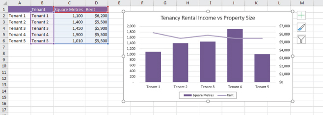
FIGURE 12.23 Chart with Fixed Number of Tenants
However, using an ordinary chart, we'd need users to go into the source data and change the chart range manually, which would be time-consuming and error-prone. The alternative is to create dynamic named ranges in the source data, and then refer to the named ranges when creating the chart. This way the range (and therefore the labels picked up in the chart) will automatically expand and contract, depending on whether the cells contain data or not. Unused tenancy cells will remain blank and will not be included in the chart. See the following four steps.
Referring to a multi-dimensional range like the one shown in the first example in Figure 12.20 in a chart will not work. To create a chart using this data, you would need to create a separate named range for each series, for example, one for Superannuation, one for Workers Comp, and so on, which somewhat defeats the purpose of having a dynamic named range.
- To make this chart dynamic, create three dynamic named ranges, one for each series, as shown in Figure 12.24.

FIGURE 12.24 Create Three Dynamic Named Ranges, One for Each Series in the Chart
- Next, create the chart normally and then go into the Select Data Source dialog box by right-clicking on the chart and click on Select Data.
- Go into each of the two series “Square Metres” and “Rent” and edit the data source. Replace the series values with the dynamic named range, such as “Sqm_data”, as shown in Figure 12.25. Note that unlike other named range references, you must leave the sheet reference intact. If you can't remember the name, try using the F3 shortcut.

FIGURE 12.25 Referring to the Named Range in the Chart Series
- Edit the “Horizontal” Axis Labels in the Data Source to refer to the dynamic named range you have created for the tenant names.
Test the data by adding or deleting tenants, and make sure the chart changes accordingly.
CHARTING WITH TWO DIFFERENT AXES AND CHART TYPES
One of the best ways of analysing the output of your model is to plot two different variables on the same chart so that we can understand trends and look for correlations in the data. Sometimes the only way to spot a trend or an anomaly in the model is to look at it graphically. For example, how does our overall revenue compare to headcount? Surely as revenue increases so should headcount, and if it doesn't we need to understand why. What if we compare regions and their number of units sold and profit? Surely the regions with the highest number of units sold should be the most profitable. This may not necessarily be the case, and there's no better way to analyse this than with a chart plotting both pieces of information on two separate axes. Let's take a look at some data, and plot the number of units sold and the profits using two different chart types on two axes.
If we have the data shown in Figure 12.26, we can create a chart to compare units sold and profits. The easiest way to select the ranges is to highlight the data in columns A, B, and D by holding down the Control key, as shown in Figure 12.26. Hold down the Command key instead of Control if you are using Excel for Mac.

FIGURE 12.26 Selecting Non-consecutive Ranges by Holding Down the Control Key
Creating a Combo Chart
- Select Recommended Charts from the Insert tab on the ribbon. The Insert Chart dialog box will appear.
- Select the All Charts tab, and select Combo, which can be found at the bottom of the dialog box, as shown in Figure 12.27.

FIGURE 12.27 Insert Chart Dialog Box
Alternatively, you can select the Combo icon directly from the ribbon in the Charts section of the Insert tab.
- Click on Secondary Axis for one Series Name, which will move it to the other axis, and press OK.
- Insert a title and an axis label from the Chart Elements option, which appears when you click on the chart.
- Your completed chart should look like Figure 12.28.

FIGURE 12.28 Completed Combo Chart
BUBBLE CHARTS
Bubble charts are a variation of other types of graphs, combining elements from column and scatter charts. They give the user a way to compare values based on the relative size of the bubble, as well as the location within the chart. They are most useful when there are three data points to display.
Let's say you have collected the historical information about your company's profits and number of staff by year as shown in Figure 12.29.

FIGURE 12.29 Data Shown in a Two-Dimensional Chart
Since you have three data points, it is difficult to represent this as a 2D graph. Consider the following example of how the data could be charted as shown in Figure 12.29. It can be difficult to compare the relativity of the profits and number of staff. Essentially, having all of the information in this format loses the intended purpose.
In this situation, we can consider using a bubble chart. The same data presented in a bubble chart tells a different story. You are able to compare the profits and staff by using the vertical rise of each bubble (profit) and its corresponding y-axis value, along with comparing the staff numbers by looking at the size of the bubbles.
Creating a bubble chart is a bit more involved than a standard bar chart, but the few extra steps are worthwhile. See the following 12 steps.
- Open up a blank worksheet and start by entering the data, as shown in Figure 12.29.
- The columns are reflected on the bubble chart, as shown:
- The first column contains the values for the horizontal x-axis and it must contain numerical data—text such as Area A, Area B, and so on will not show up on the x-axis.
- The second column contains the values for the vertical y-axis.
- The third column will be shown as the size of the bubble.
- The first trick with a bubble chart is that all data needs to be formatted as Number; otherwise, it will not be properly displayed. Change the formatting to ensure the data has been formatted as a number.
- We can now create a bubble chart from this data. The easiest way to do this is to highlight the whole range C2:E7 and create the chart. It is important to remember NOT to include the headers—another trick with bubble charts. Doing so will cause errors.
- Select either the 2D or 3D bubble chart from the X Y (Scatter) in the Charts section on the Insert tab, and the basic bubble chart will appear automatically. See Figure 12.30.

FIGURE 12.30 Inserting the Bubble Chart
- The chart should now look something like Figure 12.30 (although the colours and background might look a little different, depending on which version of Excel you are using).
- If the series legend appears, select and delete it.
- Add the title “Profit & No Staff”.
- Right-click on the bubbles to select them all, then choose Add Data Labels, or add them via the Chart Elements option.
- The default will be the profit amounts. To change this, right-click again on the bubbles, and choose Format Data Labels.
- Under Label Options, unselect Y Value, select Bubble Size, and also select Center under label position as shown in Figure 12.31.

FIGURE 12.31 Changing the Labels
- To bold the data labels, you can highlight them first, then press Control+B.
Your bubble chart should look something like Figure 12.32.

FIGURE 12.32 Completed Bubble Chart
CREATING A DYNAMIC CHART
When creating charts in financial models or reports, we should still follow best practice and try to make our models as flexible and dynamic as we can. As discussed in Chapter 3, “Best-Practice Principles of Modelling”, we should always link as much as possible in our models, and this goes for charts as well. It therefore makes sense that when we change one of the inputs in our model, this should be reflected in the chart data, as well as the titles and labels.
Let's do a simple example with 13 steps to see how we can make our charts more dynamic. If you had the temperature data as shown in Figure 12.33, we could create a comparison chart whereby the user could compare the temperature between months in different cities. You can find this template, along with the accompanying models to the rest of the screenshots in this book, at www.plumsolutions.com.au/book.

FIGURE 12.33 Creating the “Active Range”
- Create drop-down boxes in cells P2 and Q2 from which the users can select the months they wish to compare. See “Using Validations to Create a Drop-Down List” in Chapter 7 for how to do this.
- Link the cities in column O.
- In columns P and Q, create formulas that will become the “active range” for our chart and automatically pick up the months selected in the drop-downs. There are several formulas that could be used here, but I have chosen one of my favourites, the SUMIF function in this instance. If you choose the SUMIF, your formula in cell P3 should look like this:
 .
. - Copy it across and down the whole of the range P3:Q6.
- Try changing the months, and check that it is picking up the correct temperatures for each city. Your model should look something like Figure 12.33 so far.
- Next, create a clustered column chart from the active range. It should look something like Figure 12.34.

FIGURE 12.34 Creating a Chart Based on the Active Range
- Try changing the drop-down boxes, and you'll notice that the data will change.
- Add a data table by checking the Data Table checkbox on the Chart Elements option on the chart, or by selecting Data Table from the Add Chart Elements on the Design tab in the ribbon.
- Remove the legend and change the colours if you wish.
- Now we want to create a title for this chart, but we'd like to make it very obvious what is contained in the chart, so we'd like to include the months selected by the user in the chart title as well. In cell O1, create some linked text that we will use for our chart title. For a recap on how to combine text and cells together, see the section “Linked Dynamic Text Assumptions Documentation” in Chapter 3.
- Your formula in cell O1 should look something like this: ="Temperature Comparison for "&P2&" and "&Q2".
- Insert a chart title if one is not already showing, and click on the title in the chart. Now, go to the formula bar, press “=”, and click on cell O1. The text in cell O1 will now appear on the chart, as shown in Figure 12.35.

FIGURE 12.35 Completed Dynamic Chart
- Try changing the months in cells P2 and Q2, and watch the chart change.
Additional Exercise
Try creating some additional commentary in a cell in your sheet, such as the maximum temperature for the selected period. Your formula would be
Add a text box into the chart, by clicking on the Text Box icon in the Text group on the Insert tab in the ribbon, and then link that text box to the single cell in the same way as you linked the chart title above. Your chart should look something like Figure 12.36.

FIGURE 12.36 Completed Dynamic Chart with Linked Text Box
WATERFALL CHARTS
Waterfall charts, also called bridge or stepped charts, have become popular in recent years, particularly when displaying the output of a financial model. A waterfall chart displays very effectively the incremental impact of each period of time or unit. It is a type of bar chart where the value of the second bar generally begins where the first one finished. To illustrate, a waterfall chart might look something like Figure 12.37.

FIGURE 12.37 Completed Company Profit Waterfall
Despite their popularity, waterfall charts were only relatively recently added as a standard chart type in Excel, and to create one in a version prior to Excel 2016 can get very complicated. Please refer to the supplementary content for this chapter, which can be found at www.plumsolutions.com.au/book, for detailed instructions on how to create a waterfall chart in previous versions of Excel using the “dummy stack” and the up/down bars method.
Let's say you have a forecast for cash inflows and outflows for the next six months (see the data list that follows).
| Month | Cash |
| Jan | $250 |
| Feb | $200 |
| Mar | $1,000 |
| Apr | −$500 |
| May | $650 |
| Jun | $800 |
You could forecast it as a cumulative bar chart. See Figure 12.38. But we'd like to see the incremental contribution of each month individually, which will add a new dimension to the analysis.

FIGURE 12.38 Cumulative Bar Chart
Contrary to popular belief, you don't need fancy software to build a basic waterfall chart. They are really not that difficult to build in Excel and are achieved with a few little tricks, as shown in the following list of four steps.
- Open a blank worksheet and start by entering the dates and your cash amount in columns A and B, as shown.
- Highlight all the data and select the Waterfall Chart icon from the Charts section of the Insert tab on the ribbon; the chart will appear as shown in Figure 12.39.

FIGURE 12.39 Creating a Waterfall Chart - The legend does not add much to the chart, so you can remove it by clicking on it and pressing delete.
- Change the chart title by clicking on it and typing over the words “Chart Title”.
If you'd like to show the total amount on the waterfall chart, add it by following these further four steps:
- Add the total in row 8 by adding the formula =SUM(B2:B7) to cell B8.
- Add this to the chart by clicking on the chart, and resizing the source data by dragging the range down one cell as shown in Figure 12.40. Alternatively, you can change the source data range of the chart by right-clicking on the chart, choosing Select Data, and manually changing the chart data range.

FIGURE 12.40 Editing the Source Data Range of the Waterfall Chart
- You'll notice that the Total amount appears as a separate column at the end, added to the previous columns, which is incorrect. To show this as a total, simply right-click on the Total column (making sure to select only that column and not the entire series), and select Set as Total, as shown in Figure 12.41.

FIGURE 12.41 Setting the Total Column
- This will change the last column to show only the total and your completed waterfall chart should look something like Figure 12.42.

FIGURE 12.42 Completed Waterfall Chart
There are then a few optional changes you can make:
- Change the colours of the columns if desired; three different colours are recommended—one for the positive values, one for the negative values, and one for the total.
- If you remove the gridlines by selecting them with the mouse and pressing delete, the connected lines between the columns will show more clearly.
- If you wish to remove the connector lines, right-click on the lines and select Format Data Series. In the Series Options which appear on the right-hand side, untick the “Show connector lines” box.
SUMMARY
Presenting the completed model is a part of the model-building process that is typically not done well by most financial modellers. The majority of the focus has been on the building, structure, design, and layout, and on getting accurate calculations and results.
When senior managers or clients commission a financial model to be built, they are less interested in the structure or calculations of the model than they are in the output and the results of scenario analysis and sensitivity testing. Quite often the modeller does not consider how to best present and communicate these results to senior managers or clients.
It's important that at the end of the model-building process, the modeller spends some time thinking about what the viewer of the model needs to see, whether it is a report, a chart, or a table, and how best to communicate both verbally and visually the methodology, assumptions, and results of the model in the clearest and most informative way.